
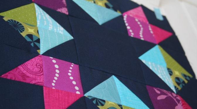
Forget orange! Navy is the new black. I’ve heard it whispered among quilters here and there, but never being a navy person myself, I was reluctant to buy it. After stretching out of my comfort zone and choosing navy blue as my background/negative space for my recent project, I’m a navy convert.
I traditionally tend toward black and grey as my dark contrasting colors, both in quilting and in my own attire. Navy is just so…. eh, navy. Bleh. Boring. BUT, when you take navy and pair it with bright jewel tones like magenta, turquoise, gold, and that perfect shade of grass green, it really shines. It’s not as completely dark as black, so it adds a little bit of color, and I would almost say bright color, although I know that’s going against all color description “rules”. Navy blue as a “bright” color? No way! But just look!

It shines. Am I right?


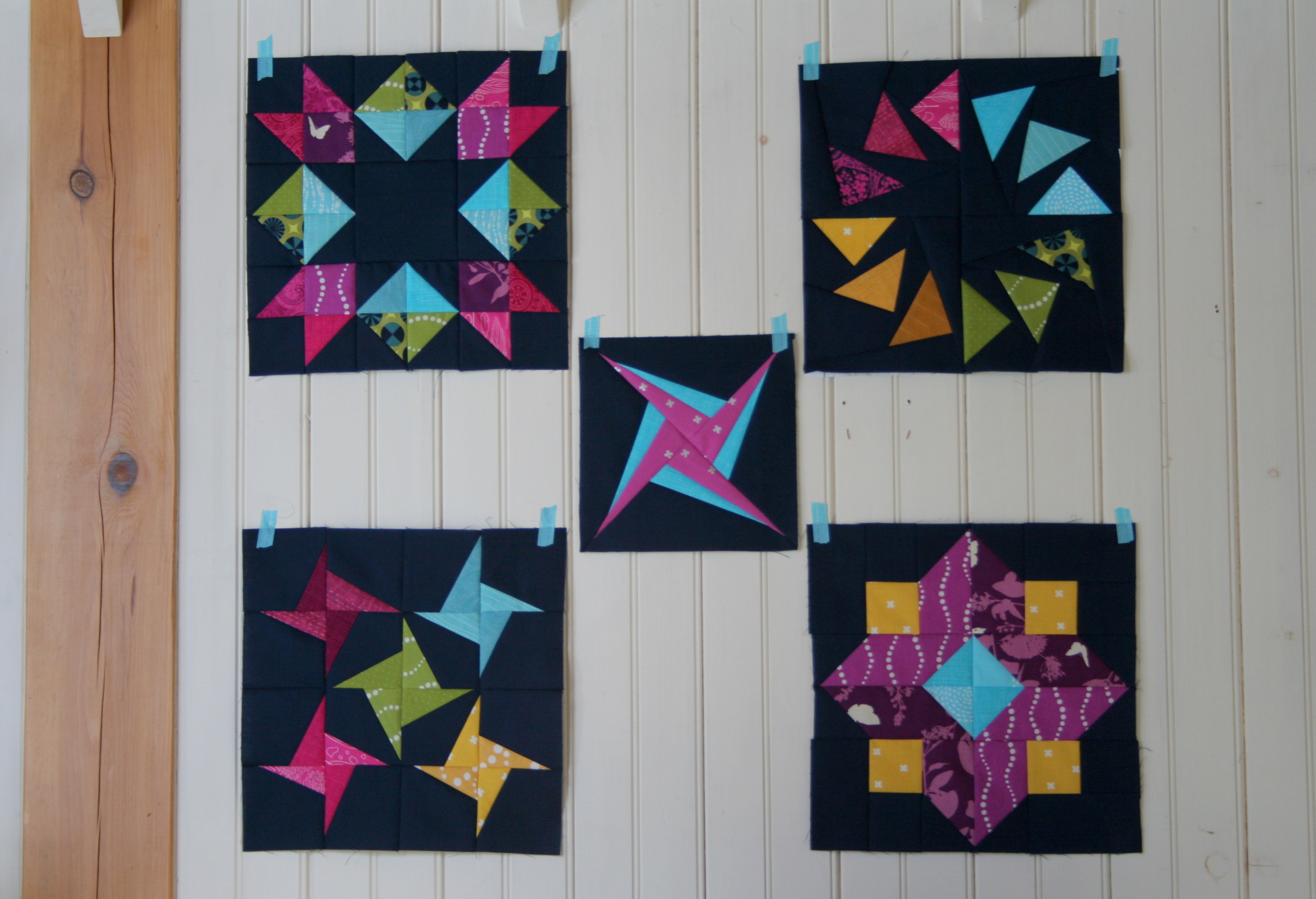
I’m registered for Lee Heinrich‘s Off the Grid: Creating Alternate Layouts workshop at QuiltCon next week, and we are required to make a number of quilt blocks in advance so that when we get to the workshop, we can really focus on layout. I wanted to stretch my comfort zone a little, and rather than go with brown and orange (blech), I opted to try navy paired with my favorite colors–bright jewel tones. I am LOVING the outcome and have a feeling this will not be my last time using navy in a star role in a quilt.

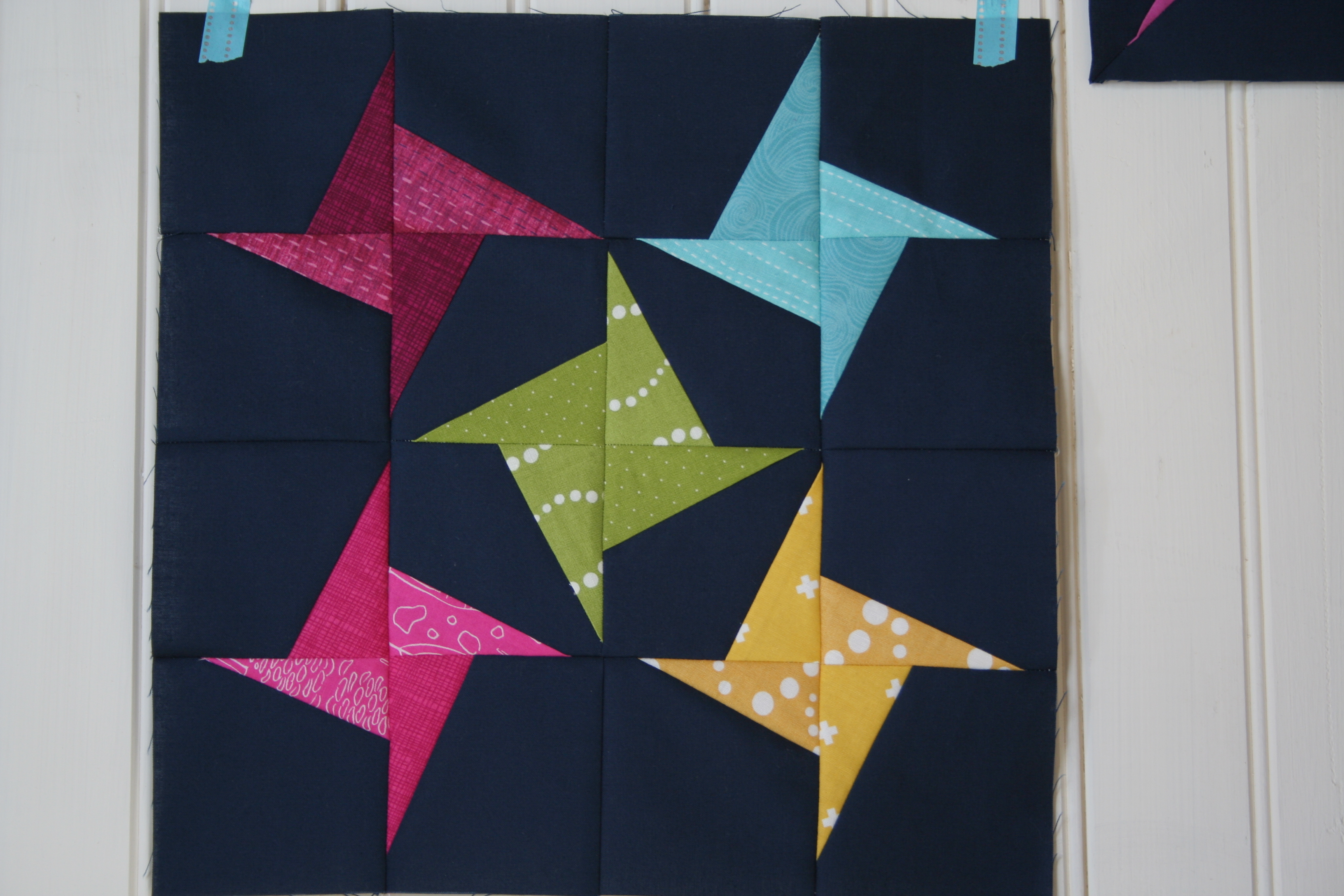
So far I have four 12 1/2″ blocks and one 8 1/2″ blocks complete (I forgot to allow for seam allowance on one side of the paper piecing template for the small one, so it should have been 9 1/2″ but oh well), and I am going to try to make a few more blocks before heading to Austin next week. The supplies list calls for 5-20 blocks but I know there’s no way I’ll finish 20 blocks on top of the rest of my QuiltCon to-do list! I don’t really like the first block I made (bottom right), so while I will take it with me, I might have to do some serious surgery before including it in whatever finished layout I choose.
I would love to hear your favorite star-style block pattern, since I think I want to make all of the blocks unique, but with the same color theme. What block do you think would go well with the ones I have so far?
I’m linking up with WiP Wednesday with Lee at Freshly Pieced, where she is making her demo blocks for the class I’m taking!!

I think any angular blocks would work well. There’s a few in the Summer Sampler Series, also the Solstice Star Series. Then there’s all the blocks in the Vintage Quilt Revival too (if you already have that). Also, some tiny plus blocks could be cute as fillers. Really, I love any block in these colors. I love navy (especially Kona Storm) so I don’t think you could go wrong. 😀
LikeLike
hmmm… you might have just won a non-navy-loving convert here. Really great contrast! The dark color really needs to the bold colors to take it from boring to wow. I actually think that both stars that Lee talked about on her blog post could work too. Enjoy your trip!
LikeLike
YES NAVY!!! It is so going to be the new hotness. 😀 Or maybe I just hope it will be because I’ve been driving the navy train for a while now. lol The blocks turned out beautifully!
LikeLike
The navy does work really well with the bright jewel tones!! Although, I’m an easy one to sway because I love any shade of blue! 🙂 In terms of star blocks, I would recommend falling in love with Wombat Quilt’s free paper piecing page: http://wombatquilts.com/free-paper-piecing-patterns/. A Hunter’s star would be great and compliment the one in the upper left of your photo but still be different. And with your paper piecing skills, you could rock so many of the beauties on the page linked above… 🙂
LikeLike
These are great! What about a big churn dash or my favorite- a dresden plate?
LikeLike
Loving the navy background in your blocks – the colours just pop!!
LikeLike
Navy is wonderful! I started loving it last year. Love it with new grass green and grey. Your colors look fab with it!
Stars……Fresh Lemons Quilts has Radiant Splendor, although it is not 12.5 in. (It is 20.5″) http://www.freshlemonsquilts.com/?p=3501
Faith also has a bunch of star blocks in her Solstice Stars QAL: http://www.freshlemonsquilts.com/?page_id=1534
And Lee at Freshly Pieced has a bunch to choose from on her Summer Sampler Series: http://www.freshlypieced.com/p/summer-sampler-series.html ( I think you can also access the Summer Sampler from Fresh Lemons as well…….
LikeLike
Absolutely love this! It is beyond beautiful! I never thought navy would make such a lovely background color!
LikeLike
I absolutely love your color choices. As for my favorite star, I’m not sure I have a favorite. But I’ve always liked the humble friendship star. My husband and I recently watched “Marco Polo” on Netflix and I noticed that Kublai Kahn’s throne room had a tile floor that featured offset friendship stars as a negative space design. If you ever watch that show, keep a lookout for that floor. You’ll know it when you see it.
LikeLike
OMG that blue really does shine!! This is going to be a spectacular quilt! I’m a sucker for Dutchman’s Puzzle, it would look fabulous in your chosen colors! Can’t wait to see this one come together. Have fun at QuiltCon!
LikeLike
Navy is my favourite background colour too – i love Kona Navy it is a really deep dark colour. I love the radiant splendour block that is a great suggestion!
LikeLike
Um these blocks with navy as a background just blew my mind, like for real, mind blowing *poof* kind-of stuff. I’ve tinkered with black but wasn’t in love and I’ve used multiple shades of grey but this has a couple light bulbs going off for sure!
LikeLike
Yes – I think that the navy adds something. It actually reads as a colour rather than a neutral and emphasizes those other gorgeous colours. Re: the block you are struggling – I think it is because the values (the two pinks) are different so one fades away. I suspect if you put the bright pink opposite a bright green it would work. The blocks are stunning!! I agree that the website Fresh Lemon Quilts will have lots of modern options.
LikeLike
Loving the Navy here; I agree that it makes a great neutral. I’ve been pulled towards navy dresses, lately too, instead of my usual black.
LikeLike
You are so right! Navy is a great color choice for the background. I keeping seeing creative background colors that aww me – I need to take the plunge myself!
LikeLike
The navy really makes the colors pop here. And by “pop” I mean look luscious and bright and wonderful! I saw a snapshot of these on Instagram, and they look even better here. I am definitely a fan of navy as the new black 🙂
LikeLike
Kitty, do love the navy! When I saw you hang these blocks in our class it really inspired me to go outside of my comfort zone of black, grey and white low volume prints for background fabrics. It was great meeting you and getting to chat in class. Look forward to following your blog. Blessings, Rachael
LikeLike