
Many makers have a signature style, a color palette they visit again and again, or perhaps an aesthetic that just makes their heart sing and their makes shine. We all know how much I love a rainbow, but recently I’ve felt the need to dive into other color combinations and experiment elsewhere. I’ve tried color combinations that have felt way out of my comfort zone, played with more monochromatic palettes, and have experimented with predetermined colors (paired with improv, no less!). While I do love the makes I’ve created through these experiments, I’ve realized that I truly love a rainbow gradient, but more specifically, I’m drawn strongly to tertiary colors.
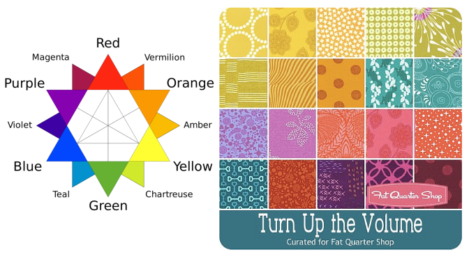
 As a refresher, the tertiary colors are the ones that fall between the primary and secondary colors, namely: Vermillion (red-orange), Amber (orange-yellow), Chartreuse (yellow-green, or lime), Teal (green-blue), Violet (blue-purple), and Magenta (purple-red). Thank you, Wikipedia for the great graphic! Even when a project isn’t a full rainbow spectrum, if it consists of tertiary colors it still makes my heart sing. Primaries? Not so much. Secondaries? Meh. Tertiaries? Oh, yesssss! All the colors? Even better!
I’ve decided that once a few last non-rainbow projects are completed, I am going to let go of my hesitancy to creating rainbow-everything. I will embrace my rainbow-loving self and create a rainbow-filled world! I have some really fun projects on the horizon and I can’t wait to share them with you! Do you have a specific color combination that makes your heart sing and your eyes turn into hearts? Tell me about it in the comments and enter to win a great bundle of some of MY favorites!
Giveaway Time!
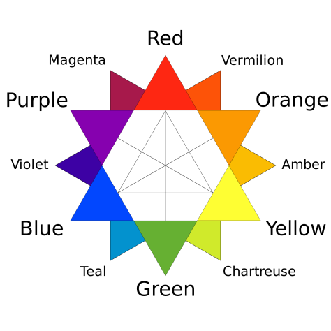
 Today’s giveaway is generously sponsored by the Fat Quarter Shop. When it was time to select the giveaway bundle for the month, this lovely Turn Up the Volume bundle curated by Rebecca Mae Designs caught my eye. Can you tell why? Tertiary colors!! It’s jam packed with vibrant, stash building tertiary colors. Now you have a chance to build your tertiary color stash in a big way (20 fat quarters-big… that’s 5 yards of fabric!).
To enter the giveaway today, let me know what colors you find yourself using again and again. Leave a comment and make sure I’m able to get ahold of you if you win. If you’re a follower of Night Quilter, leave a second comment telling me how you follow for a second entry. Tell me how you follow Fat Quarter Shop (facebook, twitter, Instagram, their blog Jolly Jabber, etc.) for a third entry.
This giveaway is open to US and international participants. The giveaway will be open until Tuesday 5/10 at 8pm EST when I’ll select the winner randomly with random.org. Good luck! This giveaway is now closed. Congratulations to Delaine!!
Thanks again to the Fat Quarter Shop! Blog sponsors help me to keep this blog going by helping cover the costs of hosting, photography equipment, supplies, and of course time. Sweet, precious time. Many many thanks to all who support me!

I use blue’s, green’s and white over and over again! 🙂 Love those colors. 🙂 Hope I win! 😀
LikeLike
I don’t find myself uing particular colours but rather selected designers. I have a few favourites and I love to work with most if not all of their collections regardless of colour.
LikeLike
I follow you on Bloglovin and IG
LikeLike
I follow The Fat Quarter Shop on fb, IG and Bloglovin
LikeLike
My colors and my style of prints for sure 🙂 I could marry those with some Kaffe and get some seriously cool results 🙂
LikeLike
Yellow and fuchsia are my happy colors….I always enjoy my project more when they are around!
LikeLike
I am particularly drawn to anything in the blue family, the more saturated, the better! Cool colours are my favourites!
LikeLike
I follow you on IG & via email.
LikeLike
I follow the Fat Quarter Shop on FB, IG, & via email.
LikeLike
I tend towards saturated colors and tend towards the chartreuse/teal/violet w/ a little of magenta and vermillion (rarely amber). Rarely use primaries if ever. I follow Night Quilter via FB. FQS I am on their email list.
LikeLike
Most of my quilts has yellow.
LikeLike
I follow you by email!
LikeLike
I follow you on Facebook.
LikeLike
I too am a tertiary lover…plus grey any shade any design. I seem to shy away from primary colors. To me they are too harsh. I had not followed you before but now that I have found you I plan on following.
LikeLike
I seem to be using lots of yellow fabric. Bright and cheerful.
LikeLike
I follow you on facebook.
LikeLike
Grey. It makes perfect background for all my rainbow projects, lol.
LikeLike
I follow you via bloglovin since you are one of my kind 🙂
LikeLike
I keep getting drawn to teals and purples.
LikeLike
I follow you on Instagram
LikeLike
I follow FatQuarterShop on Instagram, and my browser’s refresh button. 🙂
LikeLike
I use blues, greens, yellows and reds. I need this bundle to expand the colors I use.
patsystitch@gvtc.com
LikeLike
I am drawn to secondary colors.
LikeLike
I am drawn to blues, acid yellows, and greys (low volumes in black, white, grey). I do love rainbow quilts but I have hardly any oranges and purples in my stash.
LikeLike
i’m always using orange and grey if I can, love them
LikeLike
i follow you through email
LikeLike
I follow you by Feedly and Instagram
LikeLike
I follow Fat Quarter shop by newsletter, Instagram, and Facebook
LikeLike
Blue! I am always using blue. 🙂
LikeLike
I’m often coing back to orange… Rainbow and strong collors. I follow FQS by newsletter.
LikeLike
I am partial to colors with the warm hue.
LikeLike
I love red, but I am starting to use grays instead of whites as backgrounds. I also love turquoise. Thanks for the chance to win a neat prize.
joyecox@yahoo.com
LikeLike
I love Scrap quilts the most. But when I want just a calmer look, I have a tendency to still go for bright colors with flowers of all varieties and then pair it with solid. Playing and discovering fabrics is such a fun adventure. I found your site through facebook and would love to win this fabric. Just gorgeous! Thank you for the opportunity!
LikeLike
I follow the Fat Quarter Shop by email! Thank you again and have a fantastic creative day!
LikeLike