
Many makers have a signature style, a color palette they visit again and again, or perhaps an aesthetic that just makes their heart sing and their makes shine. We all know how much I love a rainbow, but recently I’ve felt the need to dive into other color combinations and experiment elsewhere. I’ve tried color combinations that have felt way out of my comfort zone, played with more monochromatic palettes, and have experimented with predetermined colors (paired with improv, no less!). While I do love the makes I’ve created through these experiments, I’ve realized that I truly love a rainbow gradient, but more specifically, I’m drawn strongly to tertiary colors.
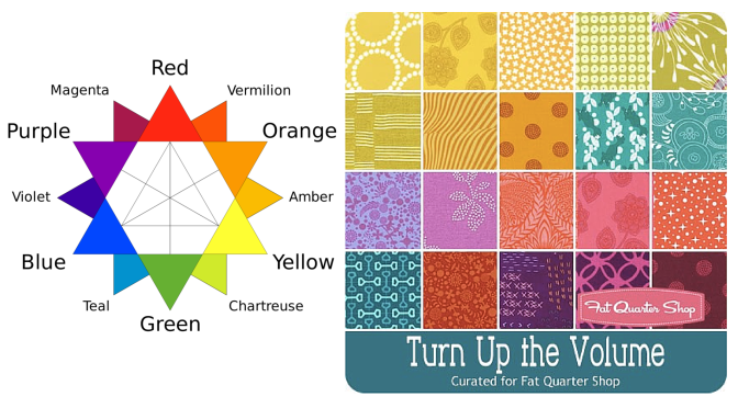
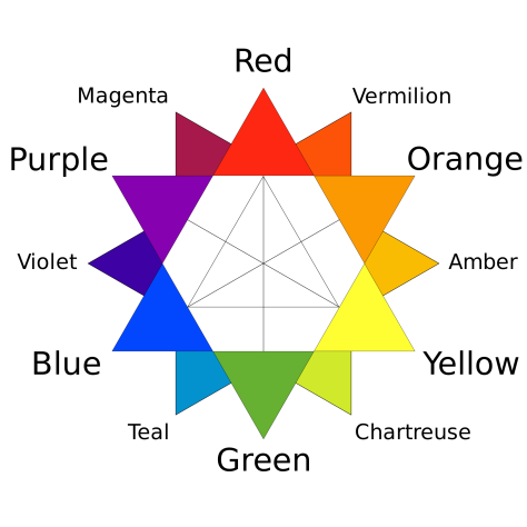 As a refresher, the tertiary colors are the ones that fall between the primary and secondary colors, namely: Vermillion (red-orange), Amber (orange-yellow), Chartreuse (yellow-green, or lime), Teal (green-blue), Violet (blue-purple), and Magenta (purple-red). Thank you, Wikipedia for the great graphic! Even when a project isn’t a full rainbow spectrum, if it consists of tertiary colors it still makes my heart sing. Primaries? Not so much. Secondaries? Meh. Tertiaries? Oh, yesssss! All the colors? Even better!
I’ve decided that once a few last non-rainbow projects are completed, I am going to let go of my hesitancy to creating rainbow-everything. I will embrace my rainbow-loving self and create a rainbow-filled world! I have some really fun projects on the horizon and I can’t wait to share them with you! Do you have a specific color combination that makes your heart sing and your eyes turn into hearts? Tell me about it in the comments and enter to win a great bundle of some of MY favorites!
Giveaway Time!
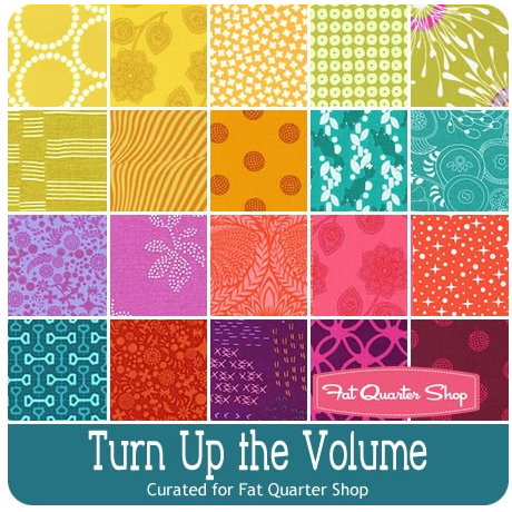 Today’s giveaway is generously sponsored by the Fat Quarter Shop. When it was time to select the giveaway bundle for the month, this lovely Turn Up the Volume bundle curated by Rebecca Mae Designs caught my eye. Can you tell why? Tertiary colors!! It’s jam packed with vibrant, stash building tertiary colors. Now you have a chance to build your tertiary color stash in a big way (20 fat quarters-big… that’s 5 yards of fabric!).
To enter the giveaway today, let me know what colors you find yourself using again and again. Leave a comment and make sure I’m able to get ahold of you if you win. If you’re a follower of Night Quilter, leave a second comment telling me how you follow for a second entry. Tell me how you follow Fat Quarter Shop (facebook, twitter, Instagram, their blog Jolly Jabber, etc.) for a third entry.
This giveaway is open to US and international participants. The giveaway will be open until Tuesday 5/10 at 8pm EST when I’ll select the winner randomly with random.org. Good luck! This giveaway is now closed. Congratulations to Delaine!!
Thanks again to the Fat Quarter Shop! Blog sponsors help me to keep this blog going by helping cover the costs of hosting, photography equipment, supplies, and of course time. Sweet, precious time. Many many thanks to all who support me!

I follow FQS on FB x
Iain.ross30 at gmail dot com
LikeLike
I follow you via blog lovin. X
Iain.ross30 at gmail dot com
LikeLike
That’s a tricky one, I never seem to have enough red but I feel like I use a lot of blues! thanks for the giveaway
LikeLike
I follow FQS on IG and Facebook
LikeLike
I follow you on IG and via feedly – thanks
LikeLike
The colors that make me really smile when i put them together are a soft teal blue matched with sage green. I love the “Turn Up The Volume” fabric line. It has my two favorites in several designs. I love the muted colors. They make me happy!!
LikeLike
I follow the Fat Quarter Shop via Facebook, Instagram and direct email marketing from them. That way I don’t miss a sale.
LikeLike
I am following the Night Quilter blog on Instagram. I am happy to see your work and ideas. I really hope I win that yummy fabric!
LikeLike
I like lots of combinations and most of them are bright. Not sure I could choose just one. Lately I do use aqua with a lot of things.
LikeLike
I follow your blog by email.
LikeLike
I tend to use lots of blue.
LikeLike
I get the Fat Quarter Shop’s newsletter
LikeLike
My favorite tertiary color is teal. I use it a lot in my sewing. Thanks for the giveaway. Camille(at)focus20(dot)com
LikeLike
I follow you by email . Camille(at)focus20(dot)com
LikeLike
I follow FQS through email as well. Camille(at)focus20(dot)com
LikeLike
I use lots of black and red
LikeLike
your post made me realize that I’m a tertiary gal too! But the murky sort of tertiaries…..yes! mauve, fern, mustardy beige…..that kind of thing.
LikeLike
following via bloglovin
LikeLike
And fqs by email
LikeLike
I love blue color, but righ tnow I’m quilting with a lot of green fabrics!
LikeLike
Love blues, but right now I’m using a lot of green fabrics!
LikeLike
I love blues but right now I’m using a lot of green fabrics in my quilt!
LikeLike
Can’t see my comments…
If you see me, I’m following you with Bloglovin
LikeLike
And I follow FQS via Facebook, blog, what else? Oh ya, Twitter and Instagram!!
LikeLike
Love tertiary colours especially Teals and chartreuse. Follow you on bloglovin.
LikeLike
I follow FQS by email and their videos on youtube
LikeLike
I follow Night Quilter with bloglovin
LikeLike
I, too, have a weakness for chartreuse and teal.
LikeLike
I follow you on instagram
LikeLike
I also follow fat quarter shop on instagram.
LikeLike
I find myself using blues and cream or tan a lot. Thanks!
LikeLike
I follow you on Bloglovin. Thanks!
LikeLike
I follow Jolly Jabber on Bloglovin and receive their newsletter. Thanks!
LikeLike
I find myself using navy, teal, pinks and low volumes…but you so enlightened me with this post today — I love rainbows also but not straightforward rainbows for the most part, they must include some tertiary colors! Yay for knowledge! 🙂
LikeLike
I follow you on IG
LikeLike
I follow fat quarter shop on IG too
LikeLike
I follow you on bloglovin.
LikeLike
I use blue, over and over and over and then I swing over to orange .
LikeLike
I am a big rainbow fan too but a more candy version, so pink, aqua, lemon yellow, etc. and I like cool colours
LikeLike
I follow you via Bloglovin
LikeLike
I follow the FQS on Instagram
LikeLike
I love using pink and blue
LikeLike
I follow you via e-mail!
LikeLike
I follow FQS via email as well
LikeLike
I love the corals and purples. I am working on My Daughter’s Quilt with Rebecca mae designs. That would be a wonderful to win her FQ bundle. She has helped me several times with my colors on this quilt. Sherri Noel is an incredible artist. Check out her scrappy sampler with Kaffe Fassett fabric Omg. Fat Quarter Shop I read the Jolly Jabber and watch her on you tube. I love her new videos of the vintage blocks and free patterns. angie from sioux city at g mail dot com. Thanks
LikeLike
I hadn’t realised it but when you mentioned tertiary colours a lightbulb went on! Me too! In particular right now I’m crushing hard on magenta and find myself reaching for it (or ahem, buying it…) again and again. Especially with teal or amber. One day though I want to make a monochromatic quilt. Red or blue maybe. Or maybe chartreuse just to be different 😉
LikeLike
I love gray. Shot cottons are also a fan favourite!
Great giveaway.
LikeLike
I use teal a TON.
LikeLike
I follow you on IG. Plus you have a shortcut on my I-Phone. That should count twice. Ha!
LikeLike
I follow Fat Quarter Shop on IG as well.
LikeLike