I’m excited to share that I’ve finally sewn the final seam in the Eye Spy Picnic Plaid quilt top I’ve been making for my son Max. I absolutely love this quilt, made using the Scrappy Picnic Plaid quilt pattern by Lee Heinrich from Freshly Pieced, which was part of the 2016 Quilter’s Planner. I used all fabrics from my stash, a large part of which were Alison Glass fabrics. It was sort of my safety net, as this was one of my first truly “scrappy” quilts and I wanted to be sure I would love it. The vibrant colors and heavy hand of Alison Glass fabric contributions worked; I love this quilt!
 If you remember, I began this quilt as part of the 2016 Quilter’s Planner Sew Along back in October of 2016 and made fairly solid progress until around December. Then the holidays and life got in the way of things and with the culmination of the sew along, this project fell back into the endless WIPs list. I think my last update here was in November. Yikes.
 Recently, as I finished my last few deadline projects, I decided that it was high time for me to actually finish some of the works in progress I’ve been making at a snail’s pace for my family. I completed the final piecing of these blocks as a leader-ender project with other deadline sewing projects, and just this week, I finally sewed that final seam! That feeling of finally finishing a quilt top never gets old, does it?!
 Since this quilt is slated for my nearly 5 year old son Max, I asked him to show me his favorite block. He took a quick look and pointed out a sweet and subtle yellow rabbit block, which surprised me a bit since in the past he’s claimed the turquoise scientist dog, the purple pony, or the green robot as his favorite block.
 I thought maybe he had chosen the rabbit block as his favorite since it was closest and he was pretty enthralled in picking daffodils when I asked him outside, so when we returned in and out of the sun, I laid the quilt top out on the floor and asked him again to show me his favorite. True to form, he replied with a good dose of sass, “I already told you. It’s this one!” But of course.
 We played a quick game of eye spy with the quilt on his lap, and I got a brief glimpse into the fun that will ensue when this quilt is actually fully quilted and bound. I have a feeling that favorite blocks will change like the wind, and there will be hours of fun centered around seeking out the little details in each print.
 Max’s exploration of the quilt top resulted in a climb up and over, a flop all around, and culminated in a dramatic roll right off the couch (of course). This will be a fun family quilt for sure.
I pieced this top using my go-to 50wt Aurifil 2600-Dove thread. I’m still trying to decide how to quilt this, and whether to use Dove to quilt with an all-over design, or to break it down into sections and use coordinating colors for more dense quilting. Max’s birthday is June 14th, so part of me wants to try to shoot for completing it in time to gift it to him then, which makes me lean toward a more simple, all over quilting design, or straight lines to stabilize without going too crazy with quilting. Then again, this quilt will definitely see a lot of use, so denser quilting might be a better choice, even if it means it’s not finished in time for birthday gifting. What would you do?
 I used four main strategies in piecing this quilt to ensure I would love the outcome despite any fear of scrappy quilts:
- Rainbow ordered block arrangement
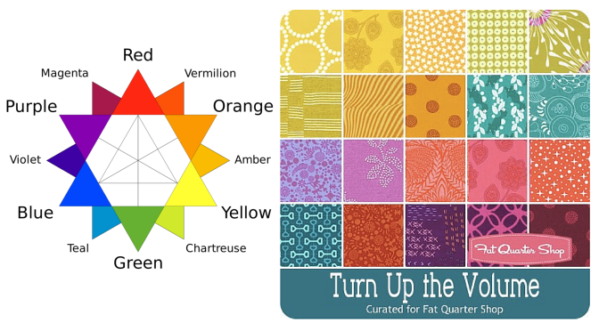
- Bright colors including as much Alison Glass fabric as I could (easy from my stash!)
- The middle grey squares are all the same solid Robert Kaufman Kona fabric (medium grey)
- The black and white diamonds are all made from the same black (an unknown black with silver stars) and white (Lizzy House Twinkle Twinkle in White Metallic from her Whisper Palette for Andover Fabrics) to provide some visual consistency.
Now that I’ve made one scrappy, rainbow-ordered quilt, I absolutely understand the draw, and I don’t think I would need as many safety nets in place to ensure I love the outcome for the next one! Sticking to planned color placement and using fabrics I love would be sufficient.
What are some of your favorite patterns for using scraps?
Special thanks to everyone who sent “eye spy” appropriate scraps a couple years ago during the Instagram Quilty Wishes event. I have more to use, but this quilt would not have been possible without your contributions!
I’m linking up with Crazy Mom Quilts Finish it up Friday and TGIFF which is over with Leanne at Devoted Quilter this week, and boy it feels good to have this flimsy finished! Perhaps I should get Amanda Jean’s new book No Scrap Left Behind, too!

 Corresponding solids from left to right:
 Corresponding solids from left to right:
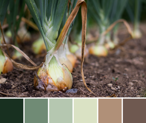 Corresponding solids from left to right:
 Corresponding solids from left to right:
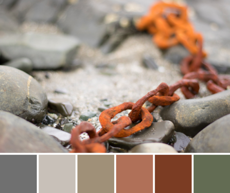 Corresponding solids from left to right:
 First up is my ongoing epic
  Another project I’m plugging away on is a fun one for Andover Fabrics. They were awesome enough to send some Alison Glass Handcrafted Patchwork to me, as well as some yardage of Constellation by Lizzy House from her Whisper Palette collection. I picked up some Andover textured solid from my LQS
  I’ve also been out on three different quilt photography adventures with my amazingly gifted quilt holding assistant, aka my husband. We have been having a blast photographing the quilts for this year’s
  There are many other fun projects waiting patiently on the decks, including a Terrazzo Quilt (pattern by
 Corresponding solids from left to right:
 Corresponding solids from left to right:
 Corresponding solids from left to right:
 Inside near a bright window = dancing shadows
 Outside in direct bright sunlight = garishly bright with dark shadows
 Outside in a shady spot without direct sun = gentle and flat, and with a little bit of lightening in a photo editor, it creates the bright photo with soft shadows that was used to create the color palette above.
 Corresponding solids from left to right:
 Corresponding solids from left to right:
 Corresponding solids from left to right:
 Corresponding solids from left to right:
 Corresponding solids from left to right:
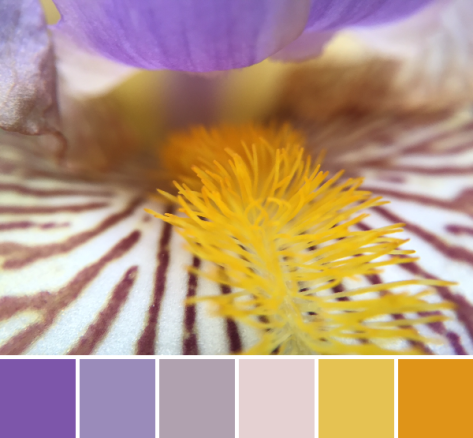 Corresponding solids from left to right:
 Isn’t it amazing how simply moving insanely close to a flower changes the entire aesthetic!? I feel like I say it almost every time, but it’s a whole new, beautiful world in there!
 Corresponding solids from left to right:
 This grass-covered dune was gorgeous as a whole, too, and I was happy to see a nice solid fence and signage clearly explaining the importance of looking without touching (or walking).
 Corresponding solids from left to right: