![]() It’s finally time to share one of the big “secret sewing” projects I’ve been working on behind the scenes for the past few months! Those of you who are also on social media have most likely seen the announcement that I have teamed up with six (6) other pattern designers to launch a new company called Quilt Theory. Today is my day to introduce you to my pattern called Ocean Path, its inspiration and creation, and tell you a bit more about Quilt Theory. You also will have a chance to win a copy of my pattern, Quilt Theory coloring pages, and all of my Art Gallery Pure Elements scraps (enough to get you amply started on your very own Ocean Path Quilt) and Aurifil thread.
It’s finally time to share one of the big “secret sewing” projects I’ve been working on behind the scenes for the past few months! Those of you who are also on social media have most likely seen the announcement that I have teamed up with six (6) other pattern designers to launch a new company called Quilt Theory. Today is my day to introduce you to my pattern called Ocean Path, its inspiration and creation, and tell you a bit more about Quilt Theory. You also will have a chance to win a copy of my pattern, Quilt Theory coloring pages, and all of my Art Gallery Pure Elements scraps (enough to get you amply started on your very own Ocean Path Quilt) and Aurifil thread.
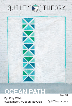
Ocean Path
 First, I’d like to introduce you to Ocean Path, my contribution to the debut Quilt Theory pattern line. Our underlying theme for this first collection of patterns was “Where can your quilt take you?” since the designers that comprise Quilt Theory live all across the country.
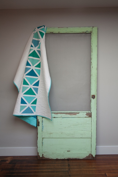
 Living in midcoast Maine, an ocean path felt like the perfect inspiration for my quilt. I wanted to embrace the simple beauty of nature while providing a pattern that could be adapted to fit any color scheme, style, or decor.
 I should note here that the stunning photos included in this post were taken by Michelle Bartholomew all the way across the country in Washington state. Michelle is the mastermind behind Quilt Theory, a talented quilter and photographer, and I’m so grateful to be working with her!

There’s something about the simple beauty of the ocean–the clean lines, soothingly subtle color play, and oh so much space to breathe that makes my heart happy–-and I aimed to captured it all in this simple yet striking pattern. I would like to think that you can take a stroll along the coast through the making of the Ocean Path quilt.
 Using simple construction from easily cut triangles and sashing, this quilt comes together in a breeze. Generous negative space provides room for intricate free motion quilting, or you could finish it with simple modern straight line quilting.
 Many thanks to Art Gallery Fabrics for providing the beautifully soft Pure Elements fabric for this quilt. I used Tile Blue PE-418, Emerald PE-417, Ocean Waves PE-442, Warm Wave PE-464, and Mirage Blue PE-424 for the feature triangles. The background and sashing are Snow PE-433. The backing is Seawater NE-123 from Skopelos by Katarina Roccella, which is the absolute perfect fabric to back this design!
 I quilted Ocean Path with echoing, organic triangles within each colored portion using 50wt Aurifil variegated 4654-Seamist. I quilted the bulk of the background with organic horizontal wavy lines with 50wt 2021-Natural White using the walking foot on my Bernina 560, and went a little wild and free motion quilted pebbles into all of the sashings between the triangles and drifting out into the wavy lines. It was one of those times that once I had the vision in my head, there was no turning back. I’m excited to report that it turned out pretty much the way I hoped! I did all of my piecing with 50wt Aurifil 2021-Natural White and 2600-Dove. Many thanks to Aurifil for providing the thread!
I think Ocean Path would look equally striking in many other color combinations–from fiery reds and oranges on a dark background, to the soothing calm of cool colors on a light background. I can’t wait to see your version!
 All of the Quilt Theory patterns are simple enough to be printed on 4″x6″ cards or a single page downloadable pdf. At only $3 each, they are perfect for gift giving or collecting, too!
About Quilt Theory
Let me tell you a bit more about the designers behind Quilt Theory.

In February 2016, a group of quilters connected to cultivate relationships with others running businesses in the quilting industry. A tight-knit group was quickly woven together as we shared successes, answered questions, and supported one another. What started as a way to collect real-time insight and expertise quickly evolved into an opportunity to collaborate.
Our goal at Quilt Theory is to create simple and modern quilt patterns, and we challenged ourselves to design a line of patterns printed on small cards. As a group, we have become a strong team as we worked through pattern writing, testing, editing, and quilting.

Quilt Theory designers have been featured in 20+ major quilting publications and international quilt exhibits. Combined, we have 47 years of quilting experience, and we are excited to share our debut collection for Fall 2016.
How to buy or stock Quilt Theory patterns
You can buy either individual or a pattern collector’s package of PDF patterns through our Quilt Theory website right now!
Pattern cards will be coming soon to a local quilt shop near you! If you are a quilt shop and want to carry our patterns, set up a wholesale account here, or order through Checker Distributors.
Want to buy the cards, but don’t own a quilt shop? Let your local quilt shop know you want them to carry Quilt Theory patterns (click for a handy note to send to your favorite local quilt shop!)
Now, for the Giveaway!
 To celebrate the launch of Quilt Theory, I am giving away a copy of my pattern, Ocean Path (printed or PDF, your choice!) along with a PDF of all of the Quilt Theory Coloring Pages. I’m also including all of the fabric leftover from the making of my quilt, which contains enough fabric to get you amply started on your Ocean Path quilt, plus the rest of my large spool of color coordinating 50wt variegated Aurifil thread in 4654-Seamist.
To enter the giveaway today, tell me what color way you would use to create Ocean Path. Leave a comment and make sure I’m able to get ahold of you if you win. For an additional entry, leave another comment telling me how you follow Night Quilter (email list, instagram, facebook, twitter, blog follower, etc.) Follow Quilt Theory (facebook, twitter, Instagram, etc.) and tell me how in a third comment for a third entry.
This giveaway is open to US and international participants. The giveaway will be open until Sunday, October 16th, at midnight eastern time when I’ll select the winner randomly with random.org. Giveaway is open to participants 18 years or older. *If you buy my pattern and then you win it, I’ll refund you or let you pick out another free Quilt Theory pattern! This giveaway is now closed! A winner will be announced shortly!
Be sure to visit the rest of the Quilt Theory designers this week during our blog hop.
Quilt Theory Release Blog Hop Schedule
Friday 10/7 – Quilt Theory
Saturday 10/8 – Yvonne @Quilting Jetgirl
Monday 10/10 – Daisy @Ants to Sugar
Tuesday 10/11 – Cheryl @Meadow Mist Designs
Wednesday 10/12- Kitty @Night Quilter <—-You are here!
Thursday 10/13 – Michelle @Michelle Bartholomew
Friday 10/14 – Stephanie @Late Night Quilter
Saturday 10/15 – Lorinda @Laurel Poppy and Pine
Monday 10/17 – Quilt Theory
I’m linking up with Crazy Mom Quilts’ Finish it up Friday!

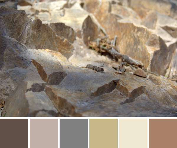
 Corresponding solids from left to right:
 Corresponding solids from left to right:
 Corresponding solids from left to right:
 Corresponding solids from left to right:
 Corresponding solids from left to right:
 First up is my ongoing epic
  Another project I’m plugging away on is a fun one for Andover Fabrics. They were awesome enough to send some Alison Glass Handcrafted Patchwork to me, as well as some yardage of Constellation by Lizzy House from her Whisper Palette collection. I picked up some Andover textured solid from my LQS
  I’ve also been out on three different quilt photography adventures with my amazingly gifted quilt holding assistant, aka my husband. We have been having a blast photographing the quilts for this year’s
  There are many other fun projects waiting patiently on the decks, including a Terrazzo Quilt (pattern by
 Corresponding solids from left to right:
 Corresponding solids from left to right:
 Corresponding solids from left to right:
 Inside near a bright window = dancing shadows
 Outside in direct bright sunlight = garishly bright with dark shadows
 Outside in a shady spot without direct sun = gentle and flat, and with a little bit of lightening in a photo editor, it creates the bright photo with soft shadows that was used to create the color palette above.
 Corresponding solids from left to right:
 Corresponding solids from left to right:
 Corresponding solids from left to right:
 Corresponding solids from left to right:
 Corresponding solids from left to right:
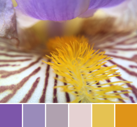 Corresponding solids from left to right:
 Isn’t it amazing how simply moving insanely close to a flower changes the entire aesthetic!? I feel like I say it almost every time, but it’s a whole new, beautiful world in there!
 Corresponding solids from left to right:
 This grass-covered dune was gorgeous as a whole, too, and I was happy to see a nice solid fence and signage clearly explaining the importance of looking without touching (or walking).
 Corresponding solids from left to right: