Tag Archives: photography

Quilt Photography Tips

I’ve long been a fan of the Summer Sampler Sew Along put together by Lee Heinrich, Katie Blakesley, and Faith Jones each summer, so when Katie asked me if I would be a “guest expert” for her 2022 Summer Quilt Along, I couldn’t say no. Plus, what a great spark to get me writing here again!

I used my Summer Sampler 2019 quilt top as my example quilt for this post, which I assembled in my own alternate layout to create space for me to participate in the fun of the sew along without the stress of “keeping up” and making every block. You can see (or buy) this year’s sampler here. If you’re participating in this year’s Sew Along, you might be at the point where you are almost ready to photograph your finished quilt top!! If you’re not there yet, no worries–these tips are timeless. Just bookmark this post, and come back when you’re ready.

I could easily talk for weeks about quilt photography, but wanted to share two of my top tips for photographing your quilts (or quilt tops!) since sometimes a little bit can go a long way. If you want to dive into quilt photography more deeply, be sure to check out my on-demand class Take Great Quilt Photos Now!

Light

First and foremost, LIGHT is the most important thing to consider when taking photos. I’m a big fan of capturing natural light, so I almost always take larger quilts outside for photos. In addition to having abundant natural light outside, there are gorgeous natural locations that help complement and celebrate the quilt being photographed and it’s wicked fun to find them!

That said, a bright overcast day provides the ideal lighting for photography. That’s right–overcast. I can’t tell you how many times I’ve heard someone say, “I finished my quilt but I haven’t been able to take any photos because the sun hasn’t been out!” You don’t want direct sun for photos, and I’ll show you why:

My Earth Song Quilt (an alternate layout using blocks from the 2019 Summer Sampler Sew Along) photographed in a gorgeous spot at Medomak Family Retreat Center in bright direct sun.
Add a bit of wind, a different angle, a few more wrinkles, and you can really see how bright direct sun is not your friend when you’re talking quilt photography.
My Earth Song Quilt photographed in a gorgeous spot at Medomak Family Retreat Center on a wonderfully overcast day.

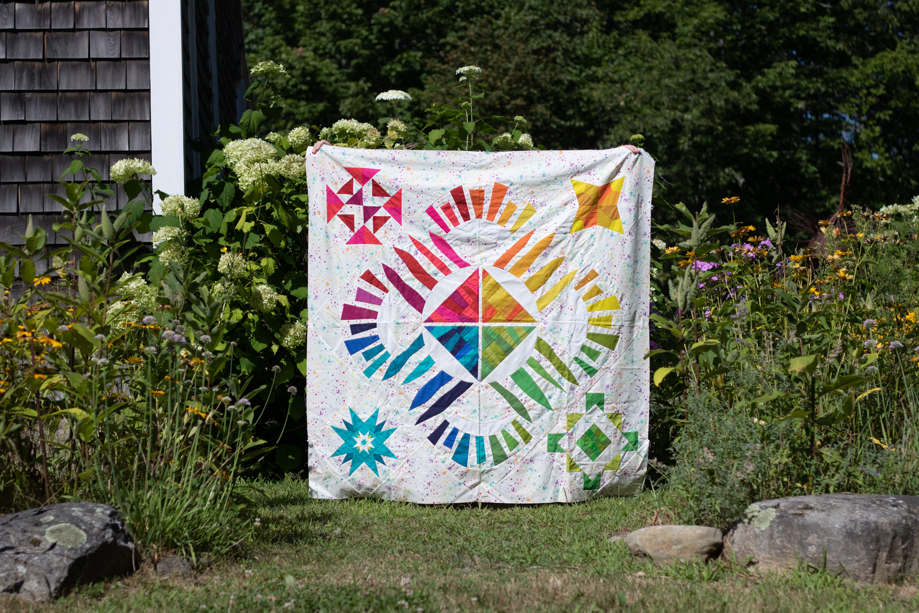
As you can hopefully clearly see in the photos above, the quilt photographed in the full shade/overcast day is the most accurate, vibrant representation of the fabrics and colors in the quilt.

Bright direct sunlight washes out colors and creates dark harsh shadows in every little wrinkle or wave of the quilt. When you’re photographing a finished, fully quilted quilt, you can imagine the shadows that are created along every stitch line. If you have the flexibility to wait until an overcast day, I strongly recommend you do that for your next quilt photos. If you live in a place that rarely has clouds, taking photos early in the morning or right before dusk will be your best bet!

Clear Communication

Photographing a finished quilt often requires a quilt holder, and I’ve often heard questions about how to “get your quilt holder to….” do any number of things. The answer is a tool that will take you far in every relationship, even beyond the relationship of you as quilt-maker/photographer and your quilt holder: clear communication.

BEFORE you head out to the gorgeous location you’ve chosen for quilt photos, have a solid conversation with your quilt holder about your hopes and expectations for the photos and quilt display. Especially if your quilt holder is not a quilter themselves, taking the time to clearly show and explain how you want them to hold the quilt will make the actual photography much much smoother.

Personally, when I’m taking quilt photos, I want to see as little of the holder as possible. My partner Garrett is my usual quilt holder, and he knows that I don’t want to see him (hah!). For these photos, my friend Allie aka Exhausted Octopus stood in as my quilt holder, and did a great job being invisible behind the winner photo (above). You can see her fingers a bit along the top edges, but that’s it.

I am a big fan of saying yes and talking about what you CAN do, but I think for this, it might be easiest to show you a bunch of commonly seen photo scenarios, with what not to do, and things you can communicate to your quilt holder BEFORE the photoshoot (in a kind and supportive way, of course!) Please note that everyone’s definition of a good quilt photo is different–so if you enjoy using any of these photo styles, that’s ok! This is just based on my own personal preferences when taking photos of quilts in beautiful locations.

What not to do…

I DON’T want to see your legs.

I DON’T want to see your head or arms.

I DON’T want the quilt to be crooked. This is something that is sometimes difficult for the quilt holder to perceive while standing behind the quilt with their arms extended, so you can use an “in the field” communication code when actively taking photos. I will say “level!” and my quilt holder will level the top of the quilt, and I’ll either reply with “other way!” if they angle it more, or “good!” when it’s perfectly level and I’m ready to take the photo.

I DON’T want the corners of the quilt to fold over–I want to see the full quilt if at all possible. This is something that is easily attained with hand placement when holding. When the quilt holder grips the quilt right inside each corner, it allows the quilt to be fully displayed and still have the actual corners visible. Note that some quilts are just too large to hold, in which case I’ll bring two quilt holders along–and sometimes chairs for them to stand on–so that one can hold each corner.

I don’t want there to be a sag along the top of the quilt. Before photoshoots I’m always sure to establish that if I say “taught!” when my quilt holder is holding the quilt, that means that there is a slight sag at the top of the quilt and they need to gently pull their hands away from each other a bit to tighten it up.

Code words often shouted from photographer to quilt holder include:

Taught! (to straighten the top of the quilt)

Level!… other way! …. good!

Head/arms/feet (if they are showing)

Break! (if I’m changing settings on my camera, I make sure to tell my quilt holder so that they can rest their arms!)

The conversations that happen before the photoshoot are absolute gold, and can make the process more enjoyable for everyone. As with everything, the more you practice the quilt holding, the communicating about it, and the photography of quilts in unique and gorgeous locations, the easier it will get. You’ll build a relationship with a quilt holder who knows exactly how you like your quilts to be held for photos AND you get gorgeous quilt photos that show off the full glory of your quilt without any distracting bits. If that’s not a win-win-win, I don’t know what is.

I hope these tips are helpful to you and you enjoy documenting your gorgeous makes in stunning locations. You take so much time and put so much love into making the quilt top, taking a gorgeous photo to document it is absolutely worth it! I go into much more detail in my on-demand class Take Great Quilt Photos Now! so check that out.

Also be sure to check out all of the other great tips shared by the other Guest Experts–you can see all of the Sew Along posts here and there are tips ranging from fabric selection to organizing your sewing space. Many thanks to Katie for inviting me to be a part of this, and happy sewing everyone!

A New Face and a Full Week

Happy Monday morning! I have a few quick reminders to share today for the week ahead, as well as a silly story from over the summer.

American Patchwork Quilting Pocast episode 333 Kitty Wilkin (1)First of all, today’s the day that I will be a guest on Pat Sloan’s American Patchwork & Quilting podcast, streaming live at 4pm EST and available for download at 6pm–I hope you’ll tune in! You can listen on your computer, subscribe by iTunes (search American Patchwork & Quilting), or download to a player. If you can’t listen in during the live broadcast at 4pm, you can download the episode (Episode 333) anytime after 6pm. You can read more about my experiences chatting with Pat here.

grand opening needle & footSecond, today kicks off a fun Blog Hop celebrating the expansion of my quilty friend Bernie’s Etsy shop Needle & Foot, which now hosts a selection of modern fabrics. See the kick off blog post and lineup here at Needle & Foot, and visit Cheryl at Meadowmist Designs for the first stop! Come back Wednesday for a chance to enter a great giveaway, and to see what I made! In addition to the giveaways throughout the hop, Bernie is offering everyone a coupon code to her new shop.  Use the code NANDFREADERS15 for 15% off any order over $5.00 (the coupon code will be active through Sunday, March 26th).

old headshot new headshotAnd finally, a new face! Since the photos were taken over the summer and I never shared, I thought it was high time I updated my headshot photo! While I still think I look much like the old photo, it was taken nearly a decade ago on the windy moors of England. It was time for a new one. So this summer, I requested that my husband, aka fearless quilt holder assistant, take some new headshots for me.

garrett headshot
This is what he did when I was trying to take a photo to show him the desired framing for the photo.

In his typical form, he made the process fun, giving goofy prompts to generate the proper variety of faces. A model I am not, and a photographer he is not… yet I think we got some winners!

kitty headshots c/o garrett“You’re fun and sassy and having a great time…”

kitty headshots c/o garrett“So endearing and sweet…”

kitty headshots c/o garrett“…so you’re walking along and begin to realize there might be a snail in your shoe…”

So which am I really? Not sure, but I ultimately decided on a different headshot altogether; one that I think is a bit less dramatic, but still looks ok and looks like me.

kitty headshots c/o garrettI will be slowly updating my blog and other social media to have this photo, but thought it would be fun to share the process.  Really, the snail in the shoe prompt was too silly not to share… what would your face look like if you were walking along and slowly began to realize that there miiiiight be a snail in your shoe…?

With that, have a great week!

Color Inspiration Thursday {74}

I have had some fun this week searching out some of the colors in nature less commonly seen in my color palettes, as you helped me name last week: white, grey, blue, and purple. I have also been getting more comfortable with a new camera, since I very recently upgraded our nearly 10 year old Canon with a newer version. Upon reading up on editing RAW photo files in preparation for the big Quilter’s Planner photo shoot, I also made the executive decision to begin a trial version of Photoshop and Lightroom just last night (or should I say, early this morning?). Combine all of those three things together, and that makes for a lot of late nights and fun photo experimentation. AND some really fun color palettes! All color palettes were created using Play Crafts’ Palette Builder 2.1 and my photographs.

white flat lay color palette natureCorresponding solids from left to right:
Kona Sky, Kona Silver, Kona Cloud, Bella Baby Blue, Bella Petal Pink, Kona Zucchini

Corresponding Aurifil thread from left to right:
2024 – White
2560 – Iris
2606 – Mist
2564 – Pale Lilac
2562 – Lilac
5015 – Gold Yellow

Since low volume fabrics are among my favorites, I decided to begin by searching for white. I enlisted the help of my big kids and we gathered all of the white and light grey flowers and treasures we could find around our yard and garden. Since I wanted to emphasize the white, we laid them out on a big white poster board. Through this whole search for white-rich color palettes, I’ve discovered that it is quite difficult to find a palette created from nature without the green, yellow, or pinks sneaking in. For the palette above, I ignored the green in creating the palette, even though, for me, the green jumps out at you in the photo.

Since I am getting the hang of a new camera, I wanted to experiment with the quality of light in different places, so before photographing in earnest, I took simple top-down photos in a few different locations: inside near a bright window, outside in direct bright sunlight, and outside in a shady spot. It’s amazing how simply moving the location of the photo subject changes the quality of the color so drastically. Here are my unedited photos in each location, to show you the differences:

inside near windowInside near a bright window = dancing shadows

outside in direct sunOutside in direct bright sunlight = garishly bright with dark shadows

outside in a shady spotOutside in a shady spot without direct sun = gentle and flat, and with a little bit of lightening in a photo editor, it creates the bright photo with soft shadows that was used to create the color palette above.

I decided to try my favorite, macro photography, to see if I could isolate some fully white-spectrum photos. Lo, once again, this just proved that pink and yellow love to sneak into the whites! I also discovered that it is quite difficult to get true white to pull from a photograph. Greys and beige, yes. But white? No such luck.

white attempt yellow color paletteCorresponding solids from left to right:
Kona Blue Bell, Kona Silver, Bella Saffron, Bella Longhorn, Kona Cheddar, Kona Limestone

Corresponding Aurifil thread from left to right:
5008 – Sugar Paper
2560 – Iris

2318 – Cachemire
2930 – Toast
6010 – Toast
2324 – Stone

I knew that the golden center of this flower would pull through just as strongly if not more so than the white, but how could I resist? Such a gorgeous bloom, and a soothing palette. In quilting, I love good contrast and a crisp aesthetic, which often is aided by using a low volume/white or dark/black background fabric. This palette is one that I could definitely see myself using, perhaps in a gender neutral baby quilt, or summery pillow. I probably would drop the Stone and pick up pure White, though, even though it didn’t push through in the actual photo.

white snuck pink color paletteCorresponding solids from left to right:
Bella Lt Blue, Kona Thistle, Kona Lupine, Kona Plum, Kona Cloud, Kona Sky

Corresponding Aurifil thread from left to right:
2612 – Arctic Sky
2510 – Lt Lilac
2566 – Wisteria
4030 – Plum
2560 – Iris
2710 – Lt Robins Egg

Ahh Thistle, Lupine, Plum; what gorgeous colors! This is a palette that appears in my creations often, although usually with some other colors joining ranks. Again, despite the attempt to find a fully white-grey palette, this was another no-go. Clearly, Mother Nature likes color, too! I still love the photos and resulting palettes, even if they don’t quite fulfill the request for low volume color palettes. I will keep hunting, and look forward to sharing my finds with you next week!

****

Reminder!! The Christmas in July Pattern Bundle Sale ends today at 3pm EST!! It’s your last chance to get a fabulous deal on 23 versatile patterns from some of your favorite designers, including Meadowmist Designs, Quilting Jetgirl, Quiet Play, Blossom Heart Quilts, Live Love Sew, 13 Spools, and many more! At the end of the sale, this bundle of patterns will no longer be available, so get it while you can! As an added bonus, everyone who buys it HERE is entered to win a Quilter’s Planner 2017 Starter Kit. Creativity overload (in a totally great way!)! **The sale is now over!

Also, my giveaway for the Raindrop fat quarter bundle by Rashida Coleman-Hale for Cotton + Steel Fabrics, sponsored by Fat Quarter Shop ends tonight at 8pm! Comment on my post HERE to enter to win if you haven’t already!

Colour Block Challenge Hosted by Gnome Angel

Those who know me know I love color, the brighter and bolder the better! I also love quilt photography and fun styling of process photos, and continuously aim to improve the clarity and aesthetic pull of my photographs. So when Angie at Gnome Angel announced a fun little challenge called the Colour Block Challenge (yes, colour with a ‘u’!) that includes bright color and fun photo styling, I immediately wanted to play. With a to-do list a mile long and only wee bits of time in which to complete it, I wasn’t sure I’d be able to squeeze in making a block for it though. Then, Angie gave me just the gentle nudge I needed–she tagged me on Instagram saying she was personally challenging me, since she knew how much I would LOVE to play. Then and there, I knew I was going to make time to play and participate no matter what–don’t you love when quilting friends really know you and help encourage you to have some extra fun!?

Take a colour themed quilt block photo and win! Find out more at www.gnomeangel.com
Take a colour themed quilt block photo and win! Find out more at http://www.gnomeangel.com

I read through Angie’s fabulous tutorial on how to make awesome color (er,… colour) flat lay photos, selected fabrics that I felt complimented the block well but also would lend themselves to some fun color scavenger hunts around the house, and went wild.

I took a full Finn nap-time (a serendipitously long one at that!) to make a new Farmer’s Wife block with the colour challenge in mind. This was doubly great, since I’ve been wanting to make more Farmer’s Wife blocks, but they always seem to drop to the bottom of my list. This project has jump-started my desire to catch up with some blocks, AND has reminded me how much I love foundation paper piecing (FPP)! I plan to FPP more of my future Farmer’s Wife blocks, since I was able to make the entire block during the span of one nap time. Knowing that I can accomplish something like making an entire block during one nap helps me feel like I’m set up for success and ready to dive in. Everyone loves a finish, even if it’s a single block!

colour block challenge by gnomeangel turquoise Once my block was complete, I wandered the house in search of colorfully turquoise objects. As Angie suggests, I gathered a lot and generally laid them out around the block on a big white foam board.

colour block challenge by gnomeangel turquoise I arranged and rearranged, and rearranged some more. Without sharing all her secrets (you can go and read her awesome tutorial on how to succeed with these colour flat lay photos here), Angie was so right that the magic happens as you get closer and closer with your photo.

colour block challenge by gnomeangel turquoise I think I spent more time rearranging the items than making the block, and remembering where they all went when I was done was another interesting challenge. I honestly had such a fun time laying this out. I already have another idea I want to try, which almost ALWAYS happens when I divert from my project to-do list to play, but I have to get one deadlined tutorial finished before I play more with this idea. I have a feeling my kids will love helping me with these photo flat lays, too. I made this one while the big kids were away on their grand adventure with my parents, so they didn’t get to help this time around. Just one more reason to make the time to play juuuuuust one more time *wink* (we all know I’m not finished with these color block flat lays!)

colour block challenge gnomeangel nightquilter entryThe challenge is being held on Instagram, so here was my final entry (above). Looking at it again, my camera photos look brighter than the one I took with my phone. Note taken for next time! You have two more days to post your entries, so if you are on Instagram, I definitely recommend you play, or at least check out the hashtag #colourblockchallenge to feast your eyes upon a gorgeous world of quilty color (you can view the tag online, even if you don’t have a smart phone or an Instagram account).

Since I love close up detail photos, here is a little tour of the silly items I found for this challenge. Who knew that we had so many turquoise bits and bobs around the house!?

colour block challenge by gnomeangel turquoise frogZippers and frogs, and pencils, oh my!

colour block challenge by gnomeangel turquoise ribbon boynton
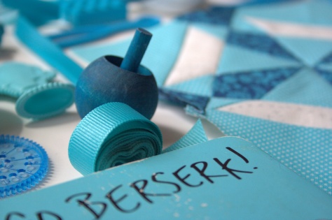
Checking the kids’ bookshelf was a great tip by Angie. Sandra Boyton’s Hippos Go Berserk is a must read, especially when you love turquoise, math, and silliness (like I do!).

colour block challenge by gnomeangel turquoise sharkThis smiley shark had as much fun as I did, I think! Legos are an immediate win, and the little bobbin minders that Sarah from Sarah Goer Quilts sent me a few months ago kicked off my color hunt. No turquoise lay would be complete without an Elsa shoe, too, glittering in the background.

So much fun! Thank you, Angie, for the push to play. I had SO much fun with this!


Putting it in Perspective

Earlier this week marked two years since I first began writing this blog. That’s right… two years. It feels like such a short time, yet I feel like so much has happened here–sharing stories and inspiration, making friends, keeping on top of project progress (or lack thereof!), improving techniques together, and so much more. It has been a full two years, and I’m so grateful to you for joining me on my journey.

I’ve always been one to set my goals high, which often is a good thing. If there’s a technique or project I want to try, I just go for it. If I want to create my own patterns, I dive in. If I want to go to QuiltCon, I make it happen (at least last year!). But with lofty goals and high expectations comes that nagging feeling that I’m just not cutting it. There are bound to be deadlines that come and go without the project being finished (I’m still working on one such project). There are goals that I set that just can’t be met, not due to any lack of desire or drive, but because of the many hats I wear as maker, wife, and full time mom. My husband has often commented on how my daily to-do lists assume superhuman ability, and it is important to remember that I am only human. A thrice needed mama human, at that.

With a few missed deadlines and a couple looming ones, paired with the general excitement on social media from everyone attending QuiltCon this year, I’ve been feeling a bit overwhelmed and disappointed with myself. Seeing the reminder pop up a couple days ago that it is my 2-year blogoversary really helped me back up and put it all into perspective. I’ve been quilting and designing intentionally for only two years. Yet, really, I’ve accomplished a lot! Most importantly, I work daily to balance time with my family with my creative life and I think I’m more consistently finding that balance, and missing QuiltCon this year is a result of that. I would say that’s a win.

Plus, I found that my work is “out in the wild” in a couple of new, exciting places. It’s always fun to see that others are inspired enough by your work to share it, especially in big publications.

amy butler issue 3 blossomMy quilt photography appears in Issue 3 of Amy Butler’s Blossom eMagazine in an article written by Stephanie at Late Night Quilter about the Supernova Friendship Swap that happened last year.

typewriter and supernova swap block 1The above photo is the full title page spread, which is pretty awesome to see.

dropcloth color wheel rainbow quiltThe second fun appearance is of my rainbow embroidery sampler, which is included in an article on About.com. You can visit the article here, and be inspired by all sorts of fun rainbow embroidery projects. Maybe, just maybe, this will be the push I need to be brave, tackle circles, and finish this rainbow color wheel. But not until after I finish my deadline projects. Life goes on. The projects will be there.

I’m sharing my reflection on the whole maker-mom journey in the hopes that it may help you put your own life in perspective when needed. The next time you’re feeling down about the project you didn’t finish, or the technique you just can’t get (yet!), take a step back and look for the good. It’s there. It just has a habit of getting buried by everything else, at least for me. Keep on making with a smile, set your sights high, and take it one step at a time.

Enjoy the journey, and thank you for joining me on mine. I sure am enjoying it!

QuiltCon 2015 Reflection: Learning

The weeks leading up to QuiltCon registration, one suggestion echoed in the blogosphere from people who had attended the previous QuiltCon: don’t pack your schedule too tightly. I decided that I would take two all-day workshops and sign up for three lectures on the other two days, limiting the lectures more because I wasn’t sure how I would do in a lecture with my hearing as it is (I’m severely hard of hearing) and less because I thought I would need more time to see the quilts and visit the vendors and booths. Even still, before heading to QuiltCon, I made all sorts of tentative plans for “down time”–maybe a pedicure? maybe some blogging? Hah! Down time? What is that!? There was none. Zero. Zilch. As I said in my previous post, if there were four of me, maybe there might have been a bit of down time. With just me, myself, and I: no chance. But boy did I learn a LOT. Here is a bit of a synopsis of the classes and lectures I attended.

Value with Cheryl Arkison {Workshop}

I kicked off the entire QuiltCon experience with a full-day workshop on Value with Cheryl Arkison. Since I arrived late Wednesday evening after an entire day of flying, and stayed with my awesome friend Michelle (the other half of the Late Night Quilter blog) about 45 minutes away from the convention center, we decided to register Thursday morning. That means we arrived at around 8:20am, I registered in my first whirlwind flurry of adventure, and then rushed off to find the classroom in time for the 9am start.

Of course I arrived to the class with my required pre cut fabric squares sorted in rainbow order. That’s just how I am. I’m a color girl. But I went to QuiltCon hoping to try new things and stretch out of my comfort zone. Cheryl’s class was the perfect opening.

rainbow order for value class

Cheryl’s class was great. She reviewed the basics of value, and emphasized how value is the *relative* light or darkness of a fabric. This is best seen when it comes to fabrics of medium value: a medium reads as a dark when paired with a very light fabric, but a medium reads as a light when paired with a very dark fabric. It’s all relative. Cheryl showed us the fairly well known and infinitely helpful trick of taking a photo of fabrics and converting it to black and white to see how each fabric “reads” value-wise, and we went to work sorting our fabrics. Here is a portion of my initial sort, with (left to right) lights, mediums, and darks.

value comparison

As you can see when it is converted to black and white, there are a few fabrics in the medium pile that really belong with the darks, and at least one (maybe two) in the dark pile that would belong better with the mediums. After fixing those fabrics, we were ready to pair. Here’s the key hint for making value work in your quilt: start by pairing the medium pile. If you pair a medium with a really truly dark, or a clearly very light, you’re all good. If you pair all of the darks and lights first, then you are stuck with a bunch of mediums with no clearly value-different pair.

Of course I started pairing my fabrics by color: light blue with dark blue; light pink with dark pink, etc.  After a moment, Cheryl said, “Try to pair your fabrics looking at value withOUT thinking about color” with a nice, long, sidelong glance in my direction. Sigh. Okay, okay! It was just the push I needed to really step outside of my comfort zone and (painfully, I might add) I started pairing fabrics trying my hardest not to mind color. It was HARD for me, let me tell you!

But I did it, and after creating half square triangles (HST) out of our pairings and playing with some arrangements, I found one that I was happy with and that is VERY different than anything I would put together by my own forces.

value based quilt

One thing I realized through these exercises, though, is that as much as I liked the look of the quilt in a photograph or from very far away, when I look at it up close, it still grates on me a bit because of the inadvertent color pairings. Cheryl was extremely helpful in helping me overcome my smooth color aesthetic obsession, and gave me some tips on how to focus on value while still maintaining or creating some control of color. I definitely want to play some more with value, maybe with a bit more predetermined organization of color. I would highly recommend Cheryl as a teacher and sharer of inspiration, so if you ever have a chance to learn from her, do it!

I also thought it was awesome that later in the week, after a lecture by Carolyn Friedlander, I was talking with Carolyn and Cheryl and Krista Hennesbury (another awesome quilter blogger and the recipient of my Schnitzel and Boo mini swap a month or so ago) about something Carolyn had said in her lecture–when you try a new skill, sometimes you will love it, but if it doesn’t work for you, feel free to toss it aside and use the techniques that DO work for you. Cheryl brought up my in-person aversion to the value-focused and color-ignored quilt arrangements and said that if I found it didn’t work for me, I could just choose not use it. I’m not ready to give up on value-focused quilts, but it is really interesting to see how different people are aesthetically drawn to different styles, and that’s okay.

Color for the Modern Quilter with Heather Jones {Lecture}

I actually was able to hear much of the lectures, since I made it a point to sit front and center, which was quite exciting for me. Heather Jones lecture on color was a great review of color theory, which is the science of mixing colors.  She went over the basics of color (primary, secondary, tertiary colors, shades, tones, hues, saturation, temperature, etc.), shared some actual color theory, and showed some lovely examples and inspiration photos. One tip Heather suggested was to use the color key on the selvedge of the fabric. I had never even thought of using the color key to help find coordinating and complimentary fabrics; I always just thought those colorful dots on the selvedge were there to look pretty and add interest. *mind blown* Another bit I found particularly interesting is that tone on tone fabrics often “read” as solids. That makes a whole lot of sense, since I find myself particularly drawn to solids and tone on tone fabrics. Using tone on tone fabrics is my sneaky way of getting a very solid look while still technically using prints!

How to take Better Quilt Photos with Meg Cox {Lecture}

This lecture was great because it confirmed many of my thoughts on quilt photography, and added a few key tips and bits of new information. Meg Cox‘s impressive background and experience at the Wall Street Journal definitely gave her lecture an extra “wow, she absolutely knows what she’s talking about!”, and it was fun to see examples of both good and not-so-good (okay, horrible) quilt photos. She confirmed that in order for your photos to be stellar, using a camera instead of an iPhone is a must. MUST.  (Of course I’m promptly breaking that rule with this post, since many of my lecture and classroom photos were taken with my phone due to lack of light and tripod availability). I had recommitted to using only high quality camera photos for my blog a few months ago, and have been really working at improving my blog photos taken with my Canon Rebel XT.

I went away from this lecture inspired that I’m on the right track, with a list of camera functions I need to better master, and a few indoor photography props I hope to buy. One big tip that I found VERY useful and can’t wait to implement is using Daylight Balanced Compact Fluorescent CFL Bulbs to light indoor photo shoots. Getting sufficient light for indoor photos is something I struggle with, so I’m looking forward to giving these bulbs a try! (Disclosure: Amazon affiliate link above)

Architexture, Quilts, and Us with Carolyn Friedlander {Lecture}

carolyn friedlander lecture

I wasn’t quick enough to register for a full day workshop with Carolyn, so I was excited to get in on this lecture of hers. If you are a regular reader of my blog, my fangirl status of everything Carolyn Friedlander is no secret. I love her work. I love her background. I love her sources of inspiration. I love how real she is. I think part of why I’m so drawn to Carolyn’s work is its simple aesthetic and seemingly mundane source of inspiration. Carolyn studied and worked as an architect before becoming a quilt pattern and fabric designer. I worked as an environmental scientist wetland and land use specialist for 6+ years before becoming a momma (and aspiring quilt designer), so I spent much of that time working closely with landscape architects.

At this lecture, I loved listening to Carolyn talk about architecture and her sources of inspiration, since it all hits so close to home for me. She finds inspiration in the world around her, as do I. She finds hers particularly in architecture; I find mine in the complex architecture of nature. I loved how she explained pattern design as “solving a problem”. Carolyn walked through her design process: think of a design for a finished product, and then solve the problem of finding the best method of obtaining the desired outcome. This is how she got into needle-turn applique, and what sparked the discussion about us quilters seeking new knowledge and techniques, but needing to find the techniques that work for us as individuals in solving our own pattern design “problems”. I am looking forward to hearing more from Carolyn and hope to be able to attend a full class taught by her one day. She’s such a huge inspiration to me!

Off the Grid: Alternate Quilt Layouts with Lee Heinrich {Workshop}

lee heinrich alternate grid workshop

I closed out my first QuiltCon experience with another full day workshop: an alternate layout class taught by Lee Heinrich from Freshly Pieced. Lee is another one of my big quilt inspirations. I love her simple and bold aesthetic, and even during her presentation, I could pick out the sample quilts that she had designed and made since they were always the ones I instinctually reacted to with “Wow, I LOVE that one”. Her workshop was super helpful, finally putting names and technical know-how to my current method of “oh, that looks good” or “oh, that doesn’t look good”. It was fascinating to go through each “alternate layout” method and see how it worked (or didn’t work) with our quilt blocks. Different types of quilt blocks definitely lent themselves to different layout styles. For my blocks, I almost went with a modular layout with variable framing, but because I had very varied sized blocks, I ultimately opted for paneling so as to avoid trapping negative space between the blocks. Imagine the navy blue background extending all the way to the edges of the design board:

IMG_1694

I would definitely recommend taking a class with Lee if you get the chance, too. This workshop was very well organized, with an introduction in the beginning, and then a break after each category or style of alternate grid layouts to allow us to try the methods with our own blocks. While we played, we not only had the input of our group members, but Lee would also circle the room providing feedback and suggestions. Next, she would explain and show examples of the next category or style of alternate grid layouts, and then we would again have a chance to try them with our blocks. It was a fantastic way to not only learn about many different layout options, but also see how they worked with a set of our own prepared blocks.

lee heinrich and meOne aspect of Lee’s class that really resonated with me is the idea of going “off the grid” as far as quilt layout, but still using the grid as a guide. It is a much more organized and sense-filled method than my usually slap-blocks-up-on-my-design-wall-until-they-look-good method. The outcome is fresh and modern, yet with that balanced feel that is so difficult to attain without any grid at all. I am very much looking forward to utilizing some of the different layout styles in my future quilts. Lee has a great reflection about the presences of alternate grid layouts in the QuiltCon quilt show that I highly suggest reading HERE.

As you can see, my whirlwind QuiltCon experience included a TON of learning and inspiration. I’m excited to start using this inspiration in future quilt designs and projects and I will be sure to point out aspects of future quilts where the skills and styles I learned are implemented. Now, where to begin?

Dusting off the Old Canon

Up until this point, all of the photographs on my blog have been taken with my iPhone camera. *hangs head* Yes, even the ones in the post Beauteous, Bountiful, Botanical Blue! There, I admitted it. It’s time, though, for me to dust off my old Canon Rebel XT and start taking REAL camera photos.

2014-04-30 13.26.44

I am a very aesthetically-driven person, and fabulous photos are what first draw me into a blog, and then ensure that I stick around to follow future posts. Even great content, without clear or aesthetically composed photos, is less desirable to me than a blog with lots of eye candy and occasional tidbits of helpful wisdom. When a blog has BOTH fabulous photos and consistently helpful or interesting content, I’m an immediate fan and follower.

I’m trying to use my blog as a way to show the world what I am creating, and without great photographs to let my readers see the depth of beauty I see, that won’t happen. I think I take decent photos with my phone, and to honest, it has been a challenge to re-learn how to use my Canon to take great indoor photos. It’s a work in progress. Outside with perfect natural light it’s a cinch, but inside my fairly dark craft cave-loft, taking clear photographs is a lot more challenging. But I plan to try.

Tripod clamped to the back of a chair. This picture was obviously taken with my phone!

I bought a new camera battery charger and a clamp-on tripod for my Canon, hoping those tools will help. Next up is to figure out how to improve the lighting. Any suggestions, short of finding a different room in which to photograph?

Here are some comparison shots to see the difference between my iphone photos and Canon with tripod photos (without editing and with some editing in Picassa):

My current quilt-in-progress

iPhone photo
iPhone photo

Canon photograph with no editing

Canon photo with no editing

Canon photograph with editing
Canon photo with editing

My cutting table

iPhone photo
iPhone photo

Canon photo without editing
Canon photo with no editing

Canon photo with editing

So what do you think? Which photos are your favorite?

If you are a craft blogger, how do you take the perfect photos?  I need some tips!

Beauteous, Bountiful, Botanical Blue!

Today is our last day in New Jersey before heading back home to thawing Maine. I’ve heard from friends that the snow is disappearing, grass is finally showing in spots, and the flowers are even beginning to pop up out of the cold earth, but I’m still thoroughly enjoying my last moments in the peak of hot New Jersey spring. It’s been especially hot and sunny this week, which has been a special treat. I admire the flowers every day, especially the growing sea of Siberian Squill in my mom’s garden.

2014-04-11 11.51.37-1

Yesterday I noticed that one of my travel knitting projects perfectly matches the beauteous, bountiful, botanical blue of the Siberian Squill sea. I just couldn’t resist a photo shoot.

2014-04-12 18.45.41This is the Julian Vest by Raya Budrevich knitted in size 4 for my son. I’m using Cascade 220 Wool dye lot 9603 Country Blue Yarn for this project. I’m SO close to finishing this vest; I only need to pick up stitches to do the finishing around the neck and arm holes. Novice knitter as I am, I forgot to bring my double pointed needles. The finishing will have to wait. In the meantime, feast your eyes on this beauty! Nature and knitting in perfect harmony:

2014-04-12 18.40.41

2014-04-12 18.39.42

2014-04-12 18.44.42

2014-04-12 18.41.35


~~~~~~~~~~~~~~~~

A Note on Lighting

One of my goals as a blogger is to continuously improve my photographs. I am so drawn to aesthetics, I feel like clear and artistically taken photographs are key to having a beautiful blog that begs to be read (or at least gazed upon). I’ve often heard that cloudy days are better for photography than sunny days, but haven’t ever been in a position to test it out. After yesterday’s experiment, I’m convinced that photographing in shade or on cloudy days is best for color! Yesterday, I noticed the jiving nature-to-knitting colors in the bright sun of morning and did my first impromptu photo shoot:

Beautiful blue in the bright sun.

2014-04-12 10.43.06

Later in the evening, after the flowers and garden were in full shade, I decided to do a repeat photo shoot. You can see in the top photos–the ones I chose to use for the bulk of the blog post–how vivid and rich the blue appears in the shady photos. It’s the same exact vest in just about the same exact spots, yet the colors are very different. Here are some side-by-sides for comparison (sun on the left; shade on the right):

Image-1

Photos taken in both sun and shade have their value, but I definitely prefer the shady photos for accuracy of color and clarity of the knitting. Which do you prefer?