“Gardens are not made by singing ‘Oh, how beautiful!’ and sitting in the shade.”
― Rudyard Kipling, Complete Verse
Today’s color inspiration brings us into my vegetable garden. From afar it looks like a fenced in plot of weeds and wildflowers. Pass through the gate, wade through the grasses and clover, though, and you will see three little somewhat tended garden beds, gleefully holding a bunch of delicious veggies. Get a little bit closer, and you have the photos shared here today. Want to sing “oh, how beautiful!” while we sit in the shade and enjoy today’s color inspiration? Let’s! This year my garden is severely neglected, but has been weeded just enough for it to do its job: produce food for our family. Balance and nurture, right? Color palettes are made using Play Crafts’ Palette Builder 2.1 and my photographs, craftily taken at such a scale so as to crop out the weeds!
 Corresponding solids from left to right:
Kona Limestone, Bella Clover, Bella Terrain Cactus, Kona Basil, Kona Grass Green, Kona Black
Corresponding Aurifil thread from left to right:
2324 – Stone
5010 – Beige
5024 – Dark Brown
5021 – Light Grey
5018 – Grass Green
2692 – Black
Our first stop is with the hardy, delicious, and dare I say–GIANT–kale. We eat kale in egg scrambles, as kale chips, in soups and stews, stir-fries, and more. Kale does amazingly well in our garden and climate, so each plant grows about 3 1/2 feet tall and 2 feet across. Each leaf is as big as my son’s head. One of these years, I’ll realize that even with our family of five, we only need two kale plants, not eight. In the meantime, kale abounds! I love how intricately frilly each leaf is! The range of greens is amazing, too, including everything from earthy subdued to vibrant and fresh. Mmm!
 Corresponding solids from left to right:
Kona Forest, Bella Dill, Bella Thistle, Kona Smoke, Bella Parfait Pink, Kona Pearl Pink
Corresponding Aurifil thread from left to right:
2892 – Pine
2890 – Dk Grass Green
1140 – Bark
2606 – Mist
2515 – Lt Orchid
2405 – Oyster
Next up we have Yarrow. Honestly, when I ordered these seeds from our local organic seed company Johnny’s Seeds, I thought the yarrow would be white or yellow. To my pleasant surprise, it bloomed this beautiful pink! Yarrow is a great companion plant to many vegetables and is one of those plants you should feel free to plant all over your garden. It repels soil nematodes, aphids, bean beetles, and many more. I planted mine near my brussel sprouts, kohrabi, and kale and it is doing its job well so far!
 Corresponding solids from left to right:
Kona Hunter Green, Bella Betty’s Teal, Bella Green Tea, Bella Fig Tree Cream, Bella Paper Bag, Bella Etchings Charcoal
Corresponding Aurifil thread from left to right:
4026 – Forest Green
2850 – Med Juniper
5014 – Marine Water
5020 – Light Military Green
2375 – Antique Blush
1140 – Bark
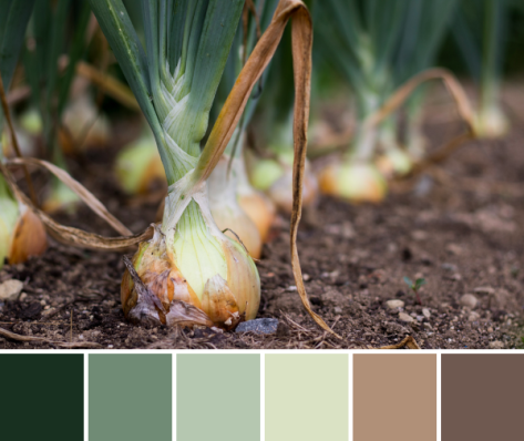
Finally, onions. Onions are my garden pride and joy (very quickly followed by carrots!). After experimenting with a few different varieties of onions, trying seeds vs. sets, I finally discovered the type of onion that thrives well in our area: Copra onions. These are storage onions that I will soon pull, cure in the dry, sunny garden bed, then braid to hang in my kitchen. I learned all of this from a local friend, since I saw a braid of huge gorgeous onions hanging in her kitchen a few years ago and asked if she would teach me everything she knew. She did, and I’m so grateful. I grew less onions this year than last, but they should still last me far into the frigid snowy days of winter. And that earthy color palette that results just embraces the richness of a garden, doesn’t it!?
How does your garden grow?
 Corresponding solids from left to right:
 Corresponding solids from left to right:
 Corresponding solids from left to right:
 Corresponding solids from left to right:
 Corresponding solids from left to right:
 Inside near a bright window = dancing shadows
 Outside in direct bright sunlight = garishly bright with dark shadows
 Outside in a shady spot without direct sun = gentle and flat, and with a little bit of lightening in a photo editor, it creates the bright photo with soft shadows that was used to create the color palette above.
 Corresponding solids from left to right:
 Corresponding solids from left to right:
 Corresponding solids from left to right:
 Corresponding solids from left to right:
 This mini quilt finishes at 24″ square, and its creation coincided with the fabulous bloom of peonies in our garden. It features a new die called
 The colors of the peonies and the colors in the quilt meld so beautifully together! I really could not help but take a million photos of this quilt with the gorgeous color gradient of peonies from my garden, but since it’s Thursday, I figured a combination of Color Inspiration Thursday and a heads-up about my Sizzix tutorial would be perfectly acceptable.
 Ahhh peonies! Such an inspiration!
 Corresponding solids from left to right:
 I love the natural ombres and vibrant colors found in nature and thoroughly enjoy combining natural inspiration with quilty projects. It is so fun to try to stitch the beauty around me into the quilts in my hands!
 Corresponding solids from left to right:
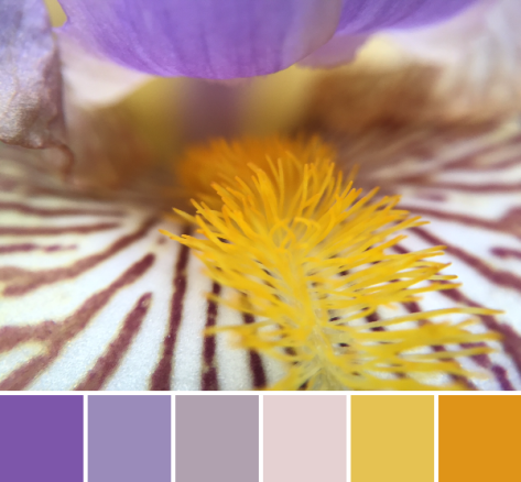 Corresponding solids from left to right:
 Isn’t it amazing how simply moving insanely close to a flower changes the entire aesthetic!? I feel like I say it almost every time, but it’s a whole new, beautiful world in there!
 Corresponding solids from left to right:
 This grass-covered dune was gorgeous as a whole, too, and I was happy to see a nice solid fence and signage clearly explaining the importance of looking without touching (or walking).
 Corresponding solids from left to right: