Tag Archives: design

Constant Flux Three Ways

There’s something about making a pattern your own that is especially desirable for many makers. Whether through varied fabric choices, changes in color and value placement, or even addition of new features, taking a set pattern and making it look distinctly yours is satisfying. I also have a really hard time following a pattern without adding at least a *little* change to make it my own, even, as it seems, with patterns I designed myself!

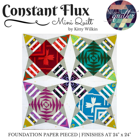
As I photographed my latest Constant Flux Christmas mini quilt top, I realized that I’ve sewn up my Constant Flux foundation paper pieced pattern in three very distinctly different ways. One was even so distinctly different I decided a stand-alone pattern was the best route, since explaining my section-grouping might not be the easiest to do! I thought it would make a fun blog post to show you different ways you can take one pattern (Constant Flux, in this case) and make it look completely uniquely different.

constant flux mini quilt
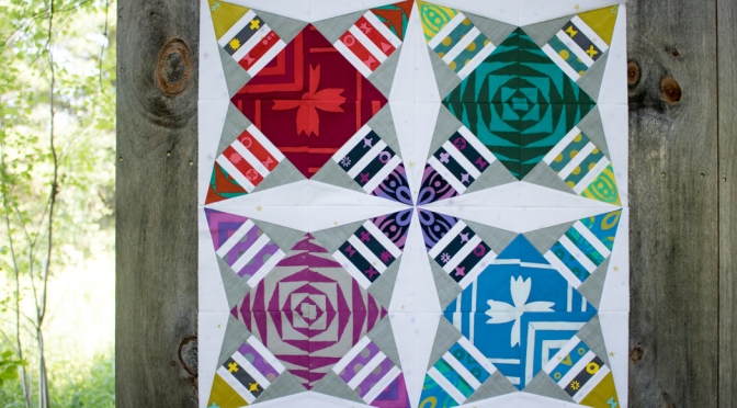
When I first designed Constant Flux, I was aiming for a pattern that was fun and geometric, but allowed for meticulous cutting fun. I used Alison Glass Handcrafted fabrics from Andover, and my focus was on the big scale prints in that line. With meticulous cutting and careful placement, the radiating pattern is clear, with the white star-like secondary pattern for some added interest.

alison glass constant flux mini quilt for andover
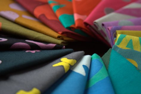
Then Alison Glass came out with her Seventy-six fabric line and Andover Fabrics asked if I would make a mini quilt for their booth at QuiltCon. How could I resist!? I had been wanting to sew up a Constant Flux quilt in a different colorway anyway, and in looking at Alison’s fabrics, I wanted to use all of the colors.

applique embroidered bee from alison glass fabric constant flux detailI had recently discovered Nichole Vogelsinger’s Boho Embroidery book, and really wanted to incorporate a Wild Boho-style embroidered applique in the center, so I rotated the blocks 90 degrees. Same exact blocks and pattern as my original Constant Flux, only rotated and shrunk to 80% so that the scale of the bee fit better. Constant Flux a second way.

constant flux christmas foundation paper pieced pattern
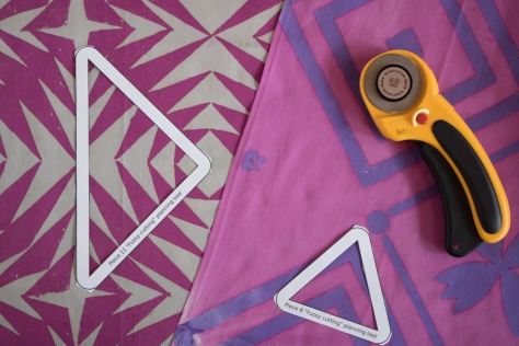
Finally, while playing around with color placement options on my original Constant Flux pattern, I discovered that when arranged a certain way, it looked very much like a Christmas wreath! Because this required merging large sections of the pattern into one fabric instead of many, I decided that it was high time I tackle a holiday pattern, and I made three new templates to make Constant Flux Christmas come together smoothly and easily. It is closely derived from the original pattern, and if you have the original Constant Flux pattern you can technically make the Christmas version if you have a strong understanding of foundation paper piecing and how to join pieces to make it happen. I created a separate pattern to make it easier for everyone. That brings us Constant Flux a third way.

I wonder what it will look like in my fourth rendition?

Do you follow patterns to a T, or do you change things? I’m always curious to hear, since from talking to other quilters, it seems that we fall into two pretty clear camps: those who follow patterns meticulously, and those who just can’t seem to follow the pattern as written and must change or add some feature nearly every time. I clearly fall into the latter. I’d love to know what camp you fall into!


Constant Flux: Flimsy Finish & Pattern Release

It’s no secret that I love to design foundation paper pieced patterns. You’ve seen me create the likes of Lupine, Love Struck, Bean SproutLove is the Key, Fish Panels, Buoys, and more. Recently, though, I’ve been wanting to play more with geometric foundation paper pieced patterns, and I’m excited to share my very first one with you today!

constant flux pattern coverConstant Flux is an easy, very beginner-friendly, and diverse pattern. There are no tricky angles, odd shapes, or difficult joins, yet the design options are boundless. The mini quilt consists of four 12″ blocks, finishing at 24″, but it’s easy to make a quilt of any size by simply making more blocks or adding borders!

alison glass handcrafted patchwork fabric andoverAndover Fabrics asked me a while back if I would do a guest post on their blog. Of course I said yes, and decided to share a foundation paper piecing tutorial to try to spread the love of this oft-disparaged quilting style. This pattern is the result, and the tutorial will be posted on the Andover blog soon, so keep your eye out for it! The tutorial will take you step by step through how to foundation paper piece this pattern, which in turn can be applied to all other foundation paper pieced patterns! I’ll be sure to link to it as soon as it’s live. In the meantime, go ahead and buy the pattern and start choosing your fabrics!

fussy cutting for foundation paper piecingI created my version of Constant Flux inspired by Handcrafted Patchwork by Alison Glass from Andover Fabrics and just had to keep her gorgeous large motifs intact, so the pattern includes tools to help you plan meticulously cut elements if you so desire. I also include measurements for precutting fabric to make the process move more smoothly, so be sure to check out the tutorial early next week.

constant flux mini quilt
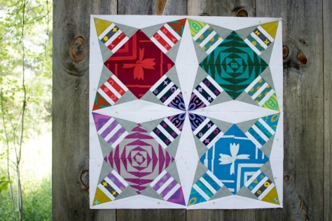
Constant Flux is available in my Craftsy store (and Payhip for those of you in the EU) and will be on sale for only $5 for the first week, after which it will return to its normal price of $8.

The name of Constant Flux makes me happy because of the play on words. The visual aspect of the pattern strongly elicits movement, thus the “Flux” part. Yet aspects of the quilt can be meticulously cut as exact replicas, which is where the “Constant” part of the name comes in. Depending on the way you look at it, the constant can imply both that the movement is happening at all times, or that there are some things that are constant despite the movement! Constant Flux.

Constant Flux color options
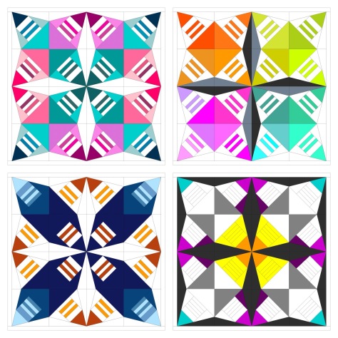
For now, I haven’t quilted my first one and I already want to make Constant Flux in a different colorway. Look at all of the options I came up with in just a short moment of color arrangement play! The pattern comes with a full page coloring sheet so that you can explore your options before diving in. That bottom right version is calling to me–which one would you make first?!

I’d love to see what you create, so when you stitch up your Constant Flux quilt, please tag #constantfluxquilt and @nightquilter so that I can see your creation!

I’m linking up with Crazy Mom Quilts Finish it up Friday, Needle & Thread Thursday, and TGIFF. Happy stitching!

Color Inspiration Thursday {75}

Over the past two weeks, we’ve been searching for colors rarely seen in my previous color palettes, namely white, grey, blue, and purple. Last week, we attempted some white palettes and settled for white with a pop of color. This week, I’m sharing a couple of palettes addressing the purples and blues. We tried something a bit new for the second palette, but I don’t think it will be the last time we try it! Color palettes were created using Play Crafts’ Palette Builder 2.1 and my photographs, with conveniently matched cotton solids and Aurifil threads in case a palette so inspires you to sew!

purple blue color palette natureCorresponding solids from left to right:
Kona Black, Kona Shadow, Bella Baby Blue, Bella Aubergine, Kona Storm, Bella Betty’s Blue

Corresponding Aurifil thread from left to right:
2692 – Black
2615 – Aluminum
2562 – Lilac
2566 – Wisteria
2745 – Midnight
4140 – Wedgewood

Purple, lovely purple! Literally one, maybe two days after deciding to seek less frequent colors in nature, one of my kids spotted this pinecone refuse left by some critter alongside a hiking path. I went to investigate in response to, “What’s this, mama?” and viola! Purple! and a bit of blue! I love when my kids find little treasures out in the natural world, since that spark of wonder is what makes the world go ’round! I certainly will do all I can to keep it going as long as I have a speck of influence, and will cherish the treasures found.

reverse color scavenger hunt blue violet Corresponding solids from left to right:
Bella Stone, Kona Surf, Kona Ocean, Kona Copen, Kona Periwinkle, Kona Blueberry

Corresponding Aurifil thread from left to right:
2605 – Grey
2525 – Dusty Blue Violet

2780  – Dk Delft Blue
2725 – Lt Wedgewood
2720 – Lt Delft Blue
2770 – V Lt Delft

For this palette, we tried something a bit different. There are bits of blue appearing around our gardens–blueberries are beginning to ripen, the blue bachelor button buds are ready to pop any day, and the borage is flowering its fuzzy blue blooms. But no where is there a strongly dominant blue; it is mixed in with the rest of the colorful bits of beauty but alone would not hold its own in a color palette.

To combat that, I decided to try a reverse color scavenger hunt. I picked a couple of borage flowers and gave my oldest the challenge of finding things in the house that matched the color perfectly. Borage is a tricky color–a blueish violet that’s very soft and subtle, but she managed to find one book that was an absolute perfect match: a little book called the Dali Lama’s Book of Love & Compassion, a sweet little collection of positive reflections that was a gift from my husband way back before we were even engaged. Everything else we tried was either too blue or too purple, so I headed up and grabbed some blue-violet Aurifil spools to see if we could get lucky. Sure enough, 2525-Dusty Blue Violet is the perfect match! If you look at the matching Aurifil threads pulled from the palette, the second coordinating color is exactly that! Once again, Aurifil has the perfect match.

It has been fun to seek the rarer colors, and I still have yet to find a convincingly grey palette, nor have I fully succeeded with a white one, so I will keep looking! I challenge you to spot some odd colors in the world around you this week–where do you see blue? purple? or any other unusual colors that stand out to you? Let me know in the comments, or link to a photo!

Enjoy the search!

Color Inspiration Thursday {67}

Last weekend, we took advantage of the gorgeous spring weather and headed down to hike Mt. Battie in Camden, Maine. Flowers have not yet made their way out, but I found lots of color along the trail. It was also really nice to actually hike, probably for the first time in nearly six years. My oldest was at a playdate, so my husband carried Max and I carried Finn, meaning we could travel the path at an adult’s pace instead of a 3-6 year old’s pace. I love hiking with kids, but it was a nice change of pace to get to work a bit. It was a lovely day! This week’s color inspiration comes from some photos I took along the trail. Color palettes are made using Play Crafts’ Palette Builder 2.1 and my photographs.

moss color inspiration paletteCorresponding solids from left to right:
Bella Lead, Bella Soft Finish Black, Kona Sweet Pea, Kona Palm, Bella Grass, Bella Zen Grey

Corresponding Aurifil thread from left to right:
1246 – Grey
4241 – V Dk Grey
2900 – Lt Khaki Green
5021 – Light Grey
2908 – Spearmint
2600 – Dove

I was excited to see quite a bit of green along the path, even if none of it was new growth. The moss, lichens, and wintergreen ferns growing on the rocks on the forest floor gave me a much needed dose of green goodness.

lichen bark color paletteCorresponding solids from left to right:
Bella Etchings Slate, Bella Wisteria, Bella Indigo, Kona Ash, Bella Betty’s Brown, Bella Peacoat

Corresponding Aurifil thread from left to right:
2900 – Lt Kakhy Green
2524 – Grey Violet
2568 – Mulberry
2600 – Dove
5013 – Asphalt
2785 – V Dk Navy

Again, these lichens caught my eye from their textured perch on the trees. I love the purples that are pulled from this photo.

orange blue lichen stone color paletteCorresponding solids from left to right:
Bella Paper Bag, Kona Herb, Bella Night Sky, Bella American Blue, Bella Betty’s Blue, Kona Surf

Corresponding Aurifil thread from left to right:
2335 – Lt Cinnamon
5010 – Beige
1248 – Grey Blue
1158 – Med Grey
4140 – Wedgewood
2735 – Med Blue

I couldn’t resist including this third palette, featuring some gorgeous orange lichen on a large stone. The shadowed lighting helped the blue to shine, but I wish the brightness of that orange came through better. Imagine that left-most color cranked up a notch or two. Such a gorgeous partnership of colors! I am wishing my geological knowledge was stronger, but lo I’m more a botanist. I want to say this is granite since it’s wasn’t layered like slate, but I can’t be sure.

And now, just for fun, a few more photos from our hike.

mt battie family hike
My handsome husband, all suited up with our 3-year old, ready to hike!

mt battie family hike

mt battie family hike
This kid was telling everyone along the trail “shhhh! the Tick-Tock Crock is here!”, but I think he took his imaginative play to heart a bit. He was pretty serious during the hike.
mt battie family hike
It’s always fun when my husband takes some turns with the camera. Look, I was there, too!
mt battie family hike
Fishing for the Tick-Tock Crock.

mt battie family hike

Color Inspiration Thursday {64}

We have walked to school more times this winter than we have gotten snow, which is just one clue that our Maine winter weather is definitely out of whack. Despite the lack of fresh powder, last weekend we decided to have a family fun day out in what little snow there is. I pulled Max and Finn around the yard in a sled, we all played on the snowy swing set, we sledded down hills, and Finn had his first roll-around in the white stuff. Even without our typical couple feet of snow, we had fun and enjoyed some winter beauty all together. The photos in today’s color palettes were taken during our fun afternoon outside. Color palettes were made using Play Crafts’ Palette Builder 2.1 and my photos. Matching solids are a combination of Robert Kaufman’s Kona cottons and Moda’s Bella solids. Matching solids and Aurifil threads is one of the awesome perks of using Play Crafts’ tool!

color inspiration color paletteCorresponding solids from left to right:
Kona Pewter, Kona Hibiscus, Bella 30’s Blue, Bella Amelia Blue, Kona Regal, Kona Leprechaun

Corresponding Aurifil thread from left to right:
2605 – Grey
2465 – V Dk Brown
4140 – Wedgewood
2730 – Delft Blue
2745 – Midnight
2890 – Dk Grass Green

There is not much color to be found outside these days, except that of the brightly colored snowsuits of my children. I couldn’t resist turning this one into a color palette, and the resulting color combination is bright and bold.

color inspiration color paletteCorresponding solids from left to right:
Bella Soft Finish Black, Kona Coal, Bella Blue, Bella Periwinkle, Kona Ash, Bella Sienna

Corresponding Aurifil thread from left to right:
4241 – V Dk Grey
1158 – Med Grey

5008 – Sugar Paper
4140 – Wedgewood
2600 – Dove
2372 – Dk Antique Gold

During my sled rounds, I was searching for any bits of color other than the ubiquitous browns, greys, subtle blues, and whites in the winter environment around me. This milkweed pod caught my eye with its hint of orange, and with the blurry blues of the background, it makes a fun palette. While the color reads more like a brown here, I swear in real life if felt like a radiant pop of orange in an otherwise barrenly brown landscape. Feel free to take poetic license and orangey-up that Sienna! I definitely could see a successful quilt in these colors.

Where is your favorite place to find color inspiration during the bleak days of winter?


Dropcloth Color Wheel Embroidery Finish… but only the Beginning!

I’ve officially completed my first ever embroidery sampler, and I must say I’m hooked! It has been the perfect project to just pick up here and there while snuggling a sleeping baby and playing with two big kids.

dropcloth color wheel embroidery sampler finish aurifil 12wtI stitched this Color Wheel sampler by Rebecca Ringquist of Dropcloth using Aurifil 12wt cotton in the following colors (for when you want to get your own sampler to embroider, since I’ve had a few people ask about details!):

2884 Green Yellow
1147 Light Leaf Green
1148 Light Jade
4140 Wedgewood
2525 Dusty Blue Violet
2784 Dark Navy
2515 Light Orchid
2540 Medium Lavender
5002 Medium Red

1154 Orange
2145 Yellow Orange
2120 Canary

I love the shine of the stitches created by the Aurifil 12wt, and I’ve already mentioned how nice it was to work with a thread that wasn’t strandy or prone to unravel.

dropcloth color wheel embroider sampler finish aurifil 12wtInitially I thought I might finish the sampler in a hoop and hang it in my craft loft as is, but the colors are just so gorgeous that I feel a strong need to draw them out into an even larger creation. I scanned the sampler and played with it in Inkscape a bit to determine a course of action, and I think I’m going to aim to make a larger color wheel using coordinating fabric–mostly Alison Glass Sun Prints, although I’m sure none of you are surprised at that!

dropcloth color wheel embroidery sampler finish aurifil 12wtOnce I visited my fabric stash and did a trial fabric pull, I was completely convinced that a larger quilted color wheel is the way to go.

alison glass carolyn friedlander fabric rainbow Really, can you blame me for wanting to use these fabrics in every.single.project!?

dropcloth color wheel embroidery sampler finish aurifil 12wt

dropcloth color wheel embroidery sampler finish aurifil 12wtI will most likely include my favorite neutral, Robert Kaufman Essex yarn dyed linen in charcoal as the background, although I’m liking the bright colors’ contrast on a lighter background, too.

dropcloth color wheel embroidery sampler finish aurifil 12wtSo, once again, I’ve finished a project only to turn it into a larger, more complex project. But as usual, I am very excited about this project extension! I will be trying my first inset circle as well as practicing curved sewing, in which I have only dabbled early in my quilting foray. I’m also I’m eager to hand quilt the next phase of the project with the Aurifil 12wt to help tie the entire color wheel together.

dropcloth color wheel embroidery sampler finish aurifil 12wtI’m linking up my Dropcloth Color Wheel Embroidery Sampler finish with Crazy Mom Quilts Finish it Up Friday & TGIFF, even though it’s only the beginning of the next phase of the project. Let the rainbow wheel stitching begin!

Color Inspiration Thursday {52}

Fifty-two weeks of color inspiration! I’ve officially provided a year’s worth of color inspiration, and hopefully you enjoy it as much as ever! Today’s inspiration comes from tiny baby feet and gorgeous lupine, since I couldn’t resist creating a lupine palette! Color palettes are created using Play Crafts’ Palette Builder 2.1 and my photographs, matched with Kona cottons & Moda Bella solids and Aurifil thread.

lupine color paletteCorresponding solids from left to right:
Bella Hyacinth, Kona Geranium, Kona Mulberry, Kona Lavender, Kona Laurel, Kona Limelight

Corresponding Aurifil thread from left to right:
2566 – Wisteria
4030 – Plum

4225 – Eggplant
2520 – Violet
2890 – Dk Grass Green
1147 – Lt Leaf Green

I couldn’t resist making a palette out of at least one of my lupine photos from earlier this week. A gorgeous range of purples, a splash of pink, contrasting with shades of green, this palette captures the essence of a lupine field.

baby toes color palette turquoise peachCorresponding solids from left to right:
Kona Delft, Kona Blue, Bella Robin’s Egg, Bella American Blue, Kona Salmon, Bella Bunny Hill Pink

Corresponding Aurifil thread from left to right:
4140 – Wedgewood
2710 – Lt Robins Egg

6720 – Slate
1310 – Med Blue Grey
2220 – Lt Salmon
2314 – Beige

Baby toes! Back when my sister was in grammar school, I remember hearing about she and my mom going to some fashion event with the Girl Scouts, where “professionals” helped the scouts determine what colors look best with each girl’s complexion. The reason this particular outing sticks in my mind is that they came back with the news that the color turquoise looks great with EVERY complexion and skin tone. In the decade since learning this fact, turquoise has become my favorite color and therefore graces the family wardrobe numerous times. While the colors in this palette don’t read as straight turquoise, the pairing of the range of blues with the salmony pink baby toes makes me happy. I would most definitely use this palette in a quilt, either for a baby, or perhaps for a breezy summer beach house.

Just for fun, here are some more photos from my baby Finn photo shoot. It’s wild to think that three weeks ago, this big baby boy was still in my belly!

baby feet

finn at 3 weeks old

finn at 3 weeks old asleep

colo coordinated baby snuggles
Color coordinated baby snuggles. Three weeks ago today, he was still growing on the inside. Babies grow fast!

For those of you who have been following my Color Inspiration posts for a while, or even if you haven’t, what is your favorite color palette from the past year? Is there one photo or palette that sticks out in your mind? Certain colors that call to you? I’d love to know! Here’s a quick link to all of my color inspiration posts for reference: Night Quilter’s Color Inspiration Thursday: The First Year

Beginning is the Hardest Part

I did it! 17 days after Finn’s birth, I finally turned on the sewing machine and did some machine stitching. That sure beats the six weeks I waited after Max was born before realizing that I could make progress in tiny baby steps. Beginning is the hardest part, so hopefully now that I’ve begun, I will be able to sew for 10-20 minutes per day (or more likely, night). Of course I began a new project while I was at it.

snuggling kiddos under rainbow quiltAfter seeing my kiddos curled up under Maddie’s Rainbow Jellyroll Quilt, I decided that my boys really need quilts of their own. I knew I wanted to keep it simple and use a rainbow of color (why not? I love rainbows; kids love rainbows; my stash is a rainbow… perfect!), and inspiration struck in the form of a sneak peek Instagram post of a mini quilt made by Kim at _glass_half_full.

rainbow low volume fabric pullI sketched out some ideas for enlarging the quilt, decided on a 7×7 grid of 9″ blocks for a 63″ square finished quilt size, and then came the fun part: fabric pull! I pulled out all of my low volumes for the background, and decided to put the gorgeous rainbow fat eighths bundle I won from Pile O’ Fabric back in April to good use.

new fabric rainbow fat eighth roll

rainbow fat eighths bundle winnings from pileofabricTypically when there’s a bundle or collection of fabrics, I’ll like most of them, but not all. This bundle is an exception, as are many of Alyssa’s bundles at Pile O’ Fabric. I honestly love every. single. print. in this bundle. It’s a collection of 35 fat eighths, five (5) each of red, orange, yellow, green, blue, purple, and pink. They are mostly the color-heavy “basics” that read as one color in particular. It’s ideal for a rainbow quilt, and I’m excited to add these fabrics to my stash.

Rainbow Strip Quilt progressThe blocks sew up very quickly; I’ve already made 6 of the necessary 49 blocks. It doesn’t look like much yet, but I am hoping that as more blocks are added and you can see the design better, it will start to be a bit more exciting. A quilt like this might be best seen either super close so that the fabric details are there, or complete and in full so that the overall aesthetic is there.

I haven’t yet squared up the bottom left red block, since I haven’t decided if the diagonal path of the low volume print will drive me nuts or not, and whether I should re-stitch it with the print parallel to the red strip. What would you do? I’m trying really hard not to micromanage the piecing of this quilt, and to let the somewhat scrappy randomness evolve on its own.

Koi and carrot crops
Koi and carrot
red cross hatch and botanics
Red crosshatch and botanics

Baby steps. Even they will result, one day, in a baby quilt. 🙂

I’m linking up with Molli’s Sunday Stash, since I’m finally sharing this gorgeous rainbow fat eighths bundle, as well as Monday Makers & Design Wall.

Color Inspiration Thursday {50}

I promised some baby fingers and toes for this week’s color inspiration, but forgot how difficult it is to photograph a squirmy baby, especially the flailing limbs. This week I’ll be sharing one baby color palette, since I never tire of looking at this little miracle, and also a couple of palettes from photographs of the gorgeous flowers my brother and sister-in-law sent. Color palettes are made using Play Crafts’ Palette Builder 2.1 and my photographs.

baby color paletteCorresponding solids from left to right:
Kona Taupe, Kona Pale Flesh, Kona Iron, Kona Aqua, Kona Old Green, Bella Green

Corresponding Aurifil thread from left to right:
2375 – Antique Blush
2420 – Fleshy Pink
5008 – Sugar Paper
5007 – Grey Blue
2850 – Med Juniper
5014 – Marine Water

I am still in the thick of newborn baby blissland, made sweeter by the fact that little Finn is actually sleeping fairly well now that my milk has come in. I attribute a lot of that to the fact that we co-sleep and he can snuggle me all night long, but whatever the case may be, I feel rested and in love. I know that there surely will be sleepless nights–probably many consecutive sleepless nights–but for now I’m enjoying this wonderful rested and full-hearted time.

pink flower color paletteCorresponding solids from left to right:
Bella Wisteria, Kona Geranium, Bella Cherry, Bella Peony, Bella Plum, Bella Etchings Slate

Corresponding Aurifil thread from left to right:
2524 – Grey Violet
4030 – Plum
1103 – Burgundy
2479 – Med Orchid
2566 – Wisteria
5004 – Grey Smoke

A few days after Finn was born, we received the sweetest delivery–a florist’s van dropped off a gorgeous vase and bouquet of flowers from my brother and sister-in-law in New Jersey. Their divine smell has been wrapping us in love daily, and the colors brighten the room.

purple and lime flower color paletteCorresponding solids from left to right:
Kona Mulberry, Kona Magenta, Bella Purple, Kona Lavender, Kona Medium Grey, Kona Lime

Corresponding Aurifil thread from left to right:
4225 – Eggplant
2545 – Med Purple
2525 – Dusty Blue Violet
2520 – Violet
2625 – Arctic Ice
1231 – Spring Green

I absolutely love this palette! I’m not usually a big purple person, but that pop of lime green does it for me! I can see this being a really fun palette for a quilt for a purple-loving person. The grey adds some balance and the lime green adds interest. I might even lime-up the green a bit more–maybe Kona wasabi style?

Color Inspiration Thursday {48}

The garden continues to burst forth with flowers of every size, shape, and color, and I continue to draw inspiration and excitement from the abundant beauty. Today’s inspiration includes more photographs from my garden, transformed into color palettes using Play Crafts’ Palette Builder 2.1.

baby pink color palette flowersCorresponding solids from left to right:
Bella Lt Blue, Bella Glacier, Kona Ballerina, Kona Silver, Bella Home Town Sky, Kona Grasshopper

Corresponding Aurifil thread from left to right:
2560 – Iris
1126 – Blue Grey
2562 – Lilac
2405 – Oyster
5014 – Marine Water
1114 – Grass Green

This tree smells divine. It’s called Pink Silver Bells (Halesia monticola) and certainly lives up to its name. It’s tough to see the bell-like shape of the flowers from this palette photo, but here’s another look:

pink silver bells tree floweringThe flowers feel so dainty and delicate, and the pale baby pink compliments them perfectly.

bright pink fuscia color palette flowersCorresponding solids from left to right:
Kona Pewter, Bella Etchings Charcoal, Bella Boysenberry, Kona Plum, Bella Berrylicious, Kona Bright Pink

Corresponding Aurifil thread from left to right:
2610 – Lt Blue Grey
1140 – Bark
2345 – Raisin
4030 – Plum
2479 – Med Orchid
2450 – Rose

If you look down after photographing the Pink Silver Bells, you immediately kick the pink up a notch to one of my favorites: bright, bold, sassy fuchsia. I was anti-pink for a long, long time, but especially lately, I’ve embraced it in both quilting and wardrobe. It’s just so bright and cheerful, how can you resist!? Not to mention the fact that it pairs swimmingly with turquoise, my tip top favorite color. I definitely would use this color palette in a quilt, but if you had told me 10 years ago that I would consider making an entirely pink quilt, I would have laughed and said you were crazy.

lilacs color paletteCorresponding solids from left to right:
Bella Steel, Bella Mauve, Bella Amelia Lavender, Bella Betty’s Brown, Bella Baby Blue, Kona Geranium

Corresponding Aurifil thread from left to right:
2610 – Lt Blue Grey
2566 – Wisteria
2524 – Grey Violet
5013 – Asphalt
2562 – Lilac
4030 – Plum

Lilacs are an annual reminder to enjoy every minute and always take time to stop and smell the flowers. If you don’t, you will miss them! As soon as the lilacs begin to flower, I cut some for our table so that we all can enjoy them to the fullest. I love that this year, my 5 yr old daughter has made it a daily routine to go out and smell the lilacs upon returning home from school. Like mommy, like daughter!

Our house smells divine, thanks to one bouquet of lilacs on the kitchen table. Can you smell them from there?