

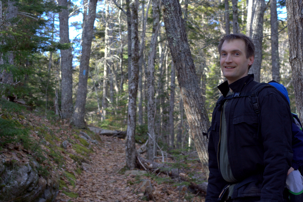
Last weekend, we took advantage of the gorgeous spring weather and headed down to hike Mt. Battie in Camden, Maine. Flowers have not yet made their way out, but I found lots of color along the trail. It was also really nice to actually hike, probably for the first time in nearly six years. My oldest was at a playdate, so my husband carried Max and I carried Finn, meaning we could travel the path at an adult’s pace instead of a 3-6 year old’s pace. I love hiking with kids, but it was a nice change of pace to get to work a bit. It was a lovely day! This week’s color inspiration comes from some photos I took along the trail. Color palettes are made using Play Crafts’ Palette Builder 2.1 and my photographs.
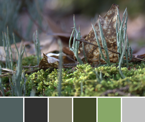 Corresponding solids from left to right:
Bella Lead, Bella Soft Finish Black, Kona Sweet Pea, Kona Palm, Bella Grass, Bella Zen Grey
Corresponding Aurifil thread from left to right:
1246 – Grey
4241 – V Dk Grey
2900 – Lt Khaki Green
5021 – Light Grey
2908 – Spearmint
2600 – Dove
I was excited to see quite a bit of green along the path, even if none of it was new growth. The moss, lichens, and wintergreen ferns growing on the rocks on the forest floor gave me a much needed dose of green goodness.
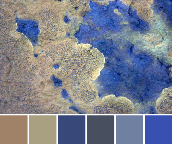
 Corresponding solids from left to right:
Bella Etchings Slate, Bella Wisteria, Bella Indigo, Kona Ash, Bella Betty’s Brown, Bella Peacoat
Corresponding Aurifil thread from left to right:
2900 – Lt Kakhy Green
2524 – Grey Violet
2568 – Mulberry
2600 – Dove
5013 – Asphalt
2785 – V Dk Navy
Again, these lichens caught my eye from their textured perch on the trees. I love the purples that are pulled from this photo.
 Corresponding solids from left to right:
Bella Paper Bag, Kona Herb, Bella Night Sky, Bella American Blue, Bella Betty’s Blue, Kona Surf
Corresponding Aurifil thread from left to right:
2335 – Lt Cinnamon
5010 – Beige
1248 – Grey Blue
1158 – Med Grey
4140 – Wedgewood
2735 – Med Blue
I couldn’t resist including this third palette, featuring some gorgeous orange lichen on a large stone. The shadowed lighting helped the blue to shine, but I wish the brightness of that orange came through better. Imagine that left-most color cranked up a notch or two. Such a gorgeous partnership of colors! I am wishing my geological knowledge was stronger, but lo I’m more a botanist. I want to say this is granite since it’s wasn’t layered like slate, but I can’t be sure.
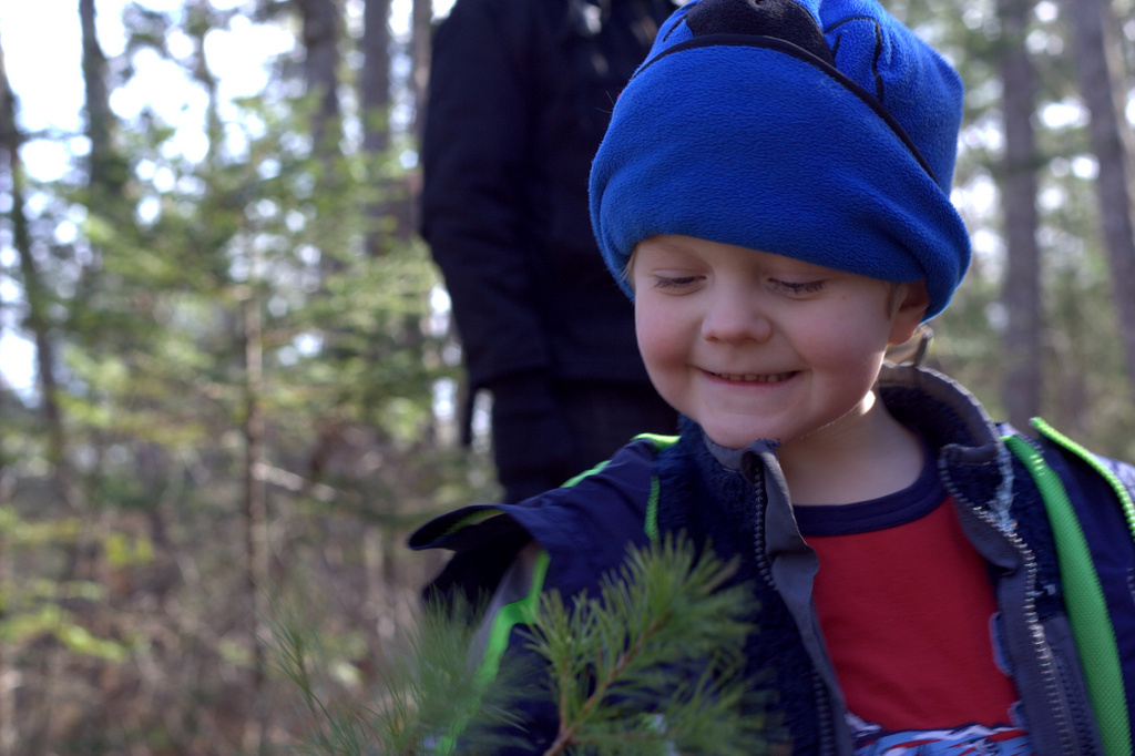
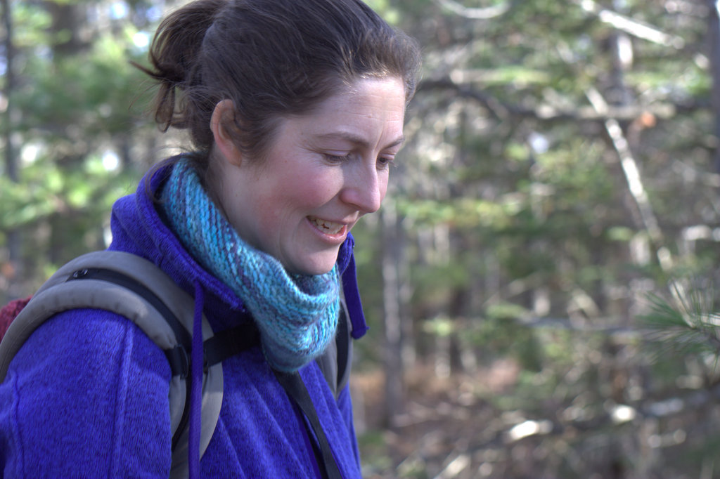
And now, just for fun, a few more photos from our hike.


As a geologist, it’s hard to tell what the rock is with the purple lichen, but my guess is sandstone, with limestone a close second! (Hint – look for fossils. Fossils make it more likely the rock is limestone.) For granite, you should be able to see the minerals that make up the rock. They could be big or small – it depends on how fast the rock cooled from lava/magma. Okay, now I want to go on a hike and see some rocks! Thank goodness, I am planning a trip to Austin for Easter weekend. (Lots of limestone there!) I look forward to your color pics – they always make me see the little things in a different way.
LikeLike
I, too, enjoy these color palettes. It helps to train the eye to see color better. As far as applying them to quilts, however, I think there are too many colors in the color chips. I think that using all of the colors in the palette would be too color confused. I read somewhere that if you have red and blue together then you shouldn’t add purple (the reason being that red and blue mixed equals purple). Likewise, yellow and blue means don’t use green.
Also, I think it is a good general rule that 3-5 colors is plenty–of course there are exceptions.
Looks like a fun hike. Bt I’m always nervous of ticks–which are becoming a real health hazard.
LikeLike
Thanks for sharing pictures of your hike. The color palette link is really fun. I helps me look more closely at a picture to find some of the colors that might make a quilt “pop”. Very fun.
LikeLike
What a gorgeous place – and such beautiful colours. I don’t blame you for enjoying the trail. And not at a snail’s pace like it is walking my dog who bounces five feet from smell to smell. I refuse to put my nose to the ground to try and see what is so appealing.
LikeLike
What a beautiful day for a hike–and the colors you discovered are wonderful! So nice to see you in a photo. Did you make that lovely, soft scarf around your neck?
LikeLike
I struggle with colors so your color inspiration has truly helped me.
LikeLike
Looks like a lovely day. We’ve never done any hiking as a family, but I look forward to exploring a little with the kiddos this summer. I suspect we may not get very far along the trail, but there’s no question they’ll have fun!
LikeLike
I love to hike as well, it was great to see the colour inspirations you found on the trail. They are lovely. Thanks so much for stopping by my blog, otherwise I would have never found yours. Following you now 🙂
-Soma
LikeLike
I love hiking too. Now that my youngest is 8, we’re able to keep a faster pace and tackle longer/more intense hikes and it’s so fun to be able to explore a little more! Your pictures are beautiful, both the colour palette ones and the ones of the family. It looks like it was a great day. Here’s hoping the spring and summer offer lots more hiking times 🙂
LikeLike