
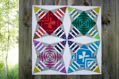
It’s no secret that I love to design foundation paper pieced patterns. You’ve seen me create the likes of Lupine, Love Struck, Bean Sprout, Love is the Key, Fish Panels, Buoys, and more. Recently, though, I’ve been wanting to play more with geometric foundation paper pieced patterns, and I’m excited to share my very first one with you today!
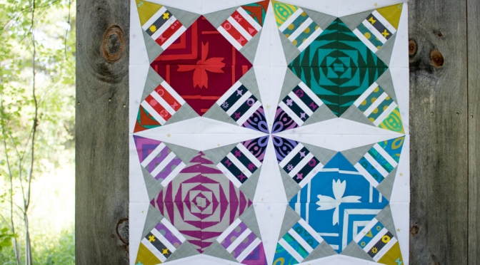
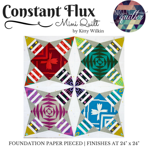 Constant Flux is an easy, very beginner-friendly, and diverse pattern. There are no tricky angles, odd shapes, or difficult joins, yet the design options are boundless. The mini quilt consists of four 12″ blocks, finishing at 24″, but it’s easy to make a quilt of any size by simply making more blocks or adding borders!
 Andover Fabrics asked me a while back if I would do a guest post on their blog. Of course I said yes, and decided to share a foundation paper piecing tutorial to try to spread the love of this oft-disparaged quilting style. This pattern is the result, and the tutorial will be posted on the Andover blog soon, so keep your eye out for it! The tutorial will take you step by step through how to foundation paper piece this pattern, which in turn can be applied to all other foundation paper pieced patterns! I’ll be sure to link to it as soon as it’s live. In the meantime, go ahead and buy the pattern and start choosing your fabrics!
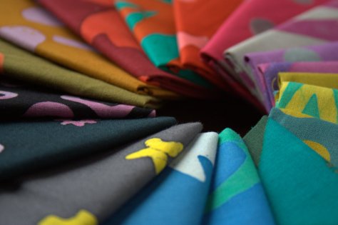
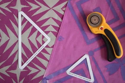 I created my version of Constant Flux inspired by Handcrafted Patchwork by Alison Glass from Andover Fabrics and just had to keep her gorgeous large motifs intact, so the pattern includes tools to help you plan meticulously cut elements if you so desire. I also include measurements for precutting fabric to make the process move more smoothly, so be sure to check out the tutorial early next week.
 Constant Flux is available in my Craftsy store (and Payhip for those of you in the EU) and will be on sale for only $5 for the first week, after which it will return to its normal price of $8.
The name of Constant Flux makes me happy because of the play on words. The visual aspect of the pattern strongly elicits movement, thus the “Flux” part. Yet aspects of the quilt can be meticulously cut as exact replicas, which is where the “Constant” part of the name comes in. Depending on the way you look at it, the constant can imply both that the movement is happening at all times, or that there are some things that are constant despite the movement! Constant Flux.
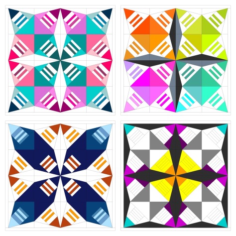 For now, I haven’t quilted my first one and I already want to make Constant Flux in a different colorway. Look at all of the options I came up with in just a short moment of color arrangement play! The pattern comes with a full page coloring sheet so that you can explore your options before diving in. That bottom right version is calling to me–which one would you make first?!
I’d love to see what you create, so when you stitch up your Constant Flux quilt, please tag #constantfluxquilt and @nightquilter so that I can see your creation!
I’m linking up with Crazy Mom Quilts Finish it up Friday, Needle & Thread Thursday, and TGIFF. Happy stitching!

 First up is my ongoing epic
  Another project I’m plugging away on is a fun one for Andover Fabrics. They were awesome enough to send some Alison Glass Handcrafted Patchwork to me, as well as some yardage of Constellation by Lizzy House from her Whisper Palette collection. I picked up some Andover textured solid from my LQS
  I’ve also been out on three different quilt photography adventures with my amazingly gifted quilt holding assistant, aka my husband. We have been having a blast photographing the quilts for this year’s
  There are many other fun projects waiting patiently on the decks, including a Terrazzo Quilt (pattern by
 Corresponding solids from left to right:
 Corresponding solids from left to right:
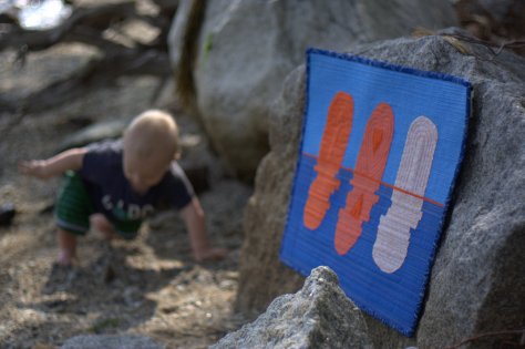
 I recently finished and gifted this mini quilt to a fellow quilting friend as part of a small private swap, and now that it has been received, I can tell you all about it! I entitled it, “Let Your Heart Shine True”, and it’s meant to be a visual representation of the fact that the goodness in your heart shines through, despite any missteps, mistakes, wrong words, or other things we personally may feel will tarnish or cloud our good intentions. It was made for Yvonne of
  This is my first attempt at a “statement quilt”, per se. My thought was that the quilt would show the large pieces on top as representing “people”, and the rippled reflection below being the public perception of the person. When mistakes are made, things are said in a not so clear way, or even just general awkward social interactions happen, those are the ripples that cause the reflection to be jarred and shaken. Yet despite the ripples and the jolted reflection, the heart remains intact and unbroken. If you lead with the heart, your good intentions ultimately must become known, no matter how many times you need to back pedal or rephrase things to clarify your meaning. I thought creating a statement quilt for Yvonne was fitting, since she has created a number of quilts as part of her
  The construction of this mini quilt was a fun multi-step process. I began by needle-turn appliquéing the rounded pieces onto panels of background fabric. I cut the bottom pieces with an identical free-style rounded top, but with much longer length since I planned to cut and resew it many times. Once they were appliquéd onto the background fabric, I cut random, varied width strips from the bottom ones, off-set it enough to wobble but not extend beyond the width of the finished panel, and resewed it. Each one was cut and re-sewn six or seven times to create the rippled effect. Let me tell you–that first cut into the needle-turned mound was a bit nerve-wracking! It was another one of those times I just had to trust that the vision in my head would translate well to reality.
 After rippling all three reflections, I squared each panel and sewed them together creating a horizon with a very narrow, approximately 1/8″ strip of solid orange fabric (Kona Persimmon, I think!). Yvonne’s favorite colors are blue and orange, which clearly influenced my fabric selection. I used some of our mutual favorite oranges from Carolyn Friedlander, and added some sketch by Timeless Treasures and an unknown solid from my early quilting days stash. I bound it in blue Mercury by Alison Glass, including a bit of framing while adding a bit from another mutually adored fabric designer.
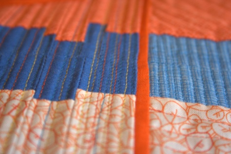 After that, the quilt begged for some more quilting, so I added random rows in yellow, gold, and orange for interest (40 wt 1135-Pale Yellow, 50 wt 5022-Mustard, and 50 wt 1154-Dusty Orange respectively). Both the top and bottom ended up pretty thoroughly matchstick quilted, but I really like the addition of the yellow, gold, and orange thread in the bottom, as well as the added interest of using a slightly heavier weight thread as the yellow. It reminds me of light reflecting off the ripples in a pond, which is perfect given the intention of the quilt.

 Corresponding solids from left to right:
 Inside near a bright window = dancing shadows
 Outside in direct bright sunlight = garishly bright with dark shadows
 Outside in a shady spot without direct sun = gentle and flat, and with a little bit of lightening in a photo editor, it creates the bright photo with soft shadows that was used to create the color palette above.
 Corresponding solids from left to right:
 Corresponding solids from left to right:

 As an extra special incentive, if you buy the bundle from me, you will also be entered to win a Quilter’s Planner 2017 Starter Kit, which includes a 2017 Quilter’s Planner as well as pens, stickers, and highlighters to help you stay organized, productive, and inspired! (Note: The winner will receive the starter kit as soon as it’s available, expected to be shipping in October). Congratulations to Sharon, the winner of the Quilter’s Planner Starter Kit!
 You will get immediate digital download of all of the patterns shown above, plus:

 Thanks to the
 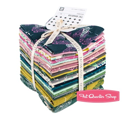 To enter the giveaway today, tell me what you like to do on rainy days. Leave a comment and make sure I’m able to get ahold of you if you win. For an additional entry,
 Corresponding solids from left to right:
 Corresponding solids from left to right:

 I’m also joining in with a talented group of pattern designers to bring you a great Christmas in July pattern bundle in a couple of weeks. Mark your calendars for July 11th, since the sale will kick off at 3pm EST and will run for only 72 hours! I can assure you won’t want to miss this bundle, since it includes a great variety of both holiday themed and general purpose patterns of all sorts. I’ll be including my two best selling foundation paper pieced patterns, Lupine & Love Struck in the bundle. There will be prizes to be won, AND every person who buys the bundle from me will be entered into the running for a Quilter’s Planner 2017 Starter Kit, which includes a 2017 planner as well as pens, clips, & highlighters to help you stay organized.