
Many makers have a signature style, a color palette they visit again and again, or perhaps an aesthetic that just makes their heart sing and their makes shine. We all know how much I love a rainbow, but recently I’ve felt the need to dive into other color combinations and experiment elsewhere. I’ve tried color combinations that have felt way out of my comfort zone, played with more monochromatic palettes, and have experimented with predetermined colors (paired with improv, no less!). While I do love the makes I’ve created through these experiments, I’ve realized that I truly love a rainbow gradient, but more specifically, I’m drawn strongly to tertiary colors.
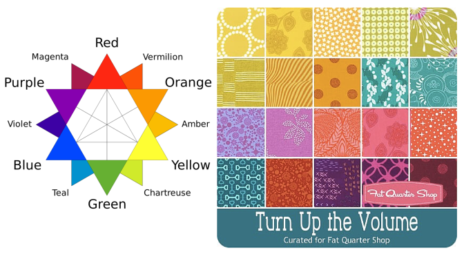
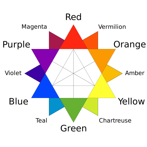 As a refresher, the tertiary colors are the ones that fall between the primary and secondary colors, namely: Vermillion (red-orange), Amber (orange-yellow), Chartreuse (yellow-green, or lime), Teal (green-blue), Violet (blue-purple), and Magenta (purple-red). Thank you, Wikipedia for the great graphic! Even when a project isn’t a full rainbow spectrum, if it consists of tertiary colors it still makes my heart sing. Primaries? Not so much. Secondaries? Meh. Tertiaries? Oh, yesssss! All the colors? Even better!
I’ve decided that once a few last non-rainbow projects are completed, I am going to let go of my hesitancy to creating rainbow-everything. I will embrace my rainbow-loving self and create a rainbow-filled world! I have some really fun projects on the horizon and I can’t wait to share them with you! Do you have a specific color combination that makes your heart sing and your eyes turn into hearts? Tell me about it in the comments and enter to win a great bundle of some of MY favorites!
Giveaway Time!
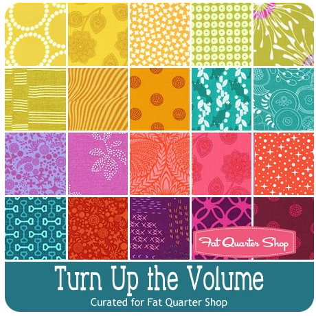 Today’s giveaway is generously sponsored by the Fat Quarter Shop. When it was time to select the giveaway bundle for the month, this lovely Turn Up the Volume bundle curated by Rebecca Mae Designs caught my eye. Can you tell why? Tertiary colors!! It’s jam packed with vibrant, stash building tertiary colors. Now you have a chance to build your tertiary color stash in a big way (20 fat quarters-big… that’s 5 yards of fabric!).
To enter the giveaway today, let me know what colors you find yourself using again and again. Leave a comment and make sure I’m able to get ahold of you if you win. If you’re a follower of Night Quilter, leave a second comment telling me how you follow for a second entry. Tell me how you follow Fat Quarter Shop (facebook, twitter, Instagram, their blog Jolly Jabber, etc.) for a third entry.
This giveaway is open to US and international participants. The giveaway will be open until Tuesday 5/10 at 8pm EST when I’ll select the winner randomly with random.org. Good luck! This giveaway is now closed. Congratulations to Delaine!!
Thanks again to the Fat Quarter Shop! Blog sponsors help me to keep this blog going by helping cover the costs of hosting, photography equipment, supplies, and of course time. Sweet, precious time. Many many thanks to all who support me!

Thanks for all the eye candy! I love working with all shades of green and purple.
LikeLike
I follow your lovely blog via Bloglovin Kitty. Thanks for all that you share.
LikeLike
I follow the Fat Quarter shop via Facebook, and the Jolly Jabber via Bloglovin.
LikeLike
I tend to use the blues in almost every quilt!
LikeLike
I follow Night Quilter via bloglovin
LikeLike
I follow FQS all over the place, FB, bloglovin, YouTube, IG
LikeLike
I love these fat quarters! I am always drawn to the bright colors! I tend to use a lot of purples and blues and reds. 🙂
LikeLike
I follow you right here on WordPress!
LikeLike
I love fat quarter shop and follow them pretty much everywhere! Facebook, instagram, by email.
LikeLike
What a gorgeous bunch of fabrics, and they really do seem very much like your colours, Kitty! Thanks for the chance to win. I find myself always drawn to blue. It doesn’t really matter what shade, just so long as it’s blue 🙂
LikeLike
I follow you on Bloglovin and IG.
LikeLike
I follow FQS on IG too 🙂
LikeLike
Very cool I use a lot of blues… happyness04431@yahoo.com
LikeLike
Love FQ shop i got them on facebook,bloglovin, pinterest…. happyness04431@yahoo.com
LikeLike
I love orange, though intend to hoard it more than use it, lol. I would love that bundle. Thanks for the opportunity to win!
LikeLike
I follow on Bloglovin!
LikeLike
I always us a variety of colors so never just one
LikeLike
I use purple and brown.
LikeLike
I follow you on Feedly and also received your emails.
LikeLike
Blues and/or teals find their way into my quilts all the time.
LikeLike
I follow Night Quilter by email.
LikeLike
I follow Fat Quarter Shop by email.
LikeLike
I follow FQS on Facebook
Dmac5958ataoldotcom
LikeLike
I love bright colors most of my quilts are full of brights. I follow you by email.
LikeLike
I use a lot of blue ones 🙂
LikeLike
Blue and black are the colours I find myself using repeatedly.
LikeLike
I love teals with orange and chartreuse!
LikeLike
I tend to use an analogous range the most and primarily cool colors. Like you, I’ve tried other color combos and eventually come back to the analogous colors. Good for you to understand your color personality.
LikeLike
I’m a new follower on Bloglovin.
LikeLike
I love colour! However, boring as it sounds, a fave combo is black, grey, white, and one colour – gold, red, lime green, purple, whatever. annesimonot@sasktel.net
LikeLike
I follow you on IG. (annsim64)
LikeLike
I follow FQS on IG. (annsim64)
LikeLike
Teal!! Alllllll the teal. 🙂
LikeLike
Greens are definately my primary color! I tend to pair it with Yellows, browns and darler shades of grey, though when paired with Amber/rusty colors, my heart truly DOES sqeal a bit!
LikeLike
Blues take the lead, though lately I’m drawn to bold, saturated colors from the entire spectrum.
LikeLike
I follow the FQ Shop’s Jolly Jabber through Feedly.
LikeLike
I just found your website today, and am also following Night Quilter through feedly. Great articles!
LikeLike
I’ve been obsessed with teals, mustard yellows and greys for about a year. Love this bumdle. Such saturated colors!
LikeLike
I love reds and teals and seem to be drawn to them when buying fabrics.
I follow fat quarter shop on Facebook and Instagram
I follow late night quilters on Facebook.
LikeLike
I follow you on IG (@Roussy82)
LikeLike
I would love the teals paired with the magenta. I like the jewel tones.
LikeLike
I follow FQ via IG, Facebook, and the website 🙂
LikeLike
I mainly follow Late Night Quilter via Facebook and IG.
LikeLike
I find myself gravitating to red violet a LOT……. I wondered about this lately and had a vivid recollection from grade school and how red violet was always my favorite crayon color….go figure! 🙂
LikeLike
I follow you on FB and Bloglovin’
LikeLike
I follow FQ shop via FB, Instagram and Bloglovin…I also should have mentioned in my other entry, I follow you on Instagram as well!
LikeLike
I am drawn a LOT toward teals, purples, and those luxuerious greens- like peacocks, but I grew up with peacocks in the same town and their child-like crys freak me out so no on actual peacocks, though I adore their feathers. When making quilts for others I have been finding myself using a lot of blacks and blues bizzarely enough.
LikeLike
All the colors! I have a pile selected for a project with tertiary colors that I have not started yet
LikeLike
Just started following you on instagram
LikeLike
I follow FQS on Facebook and email
LikeLike