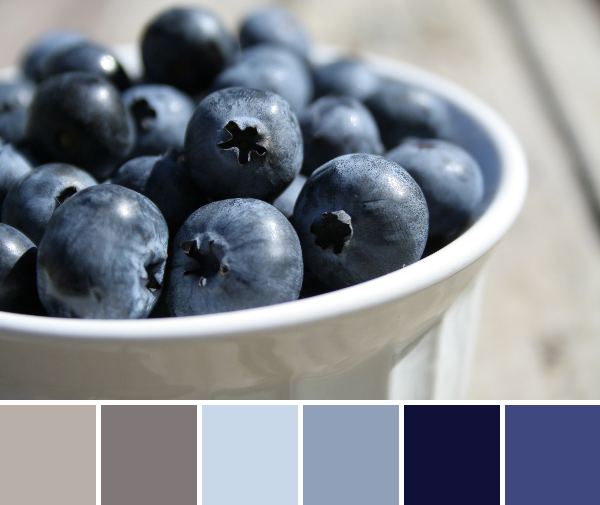
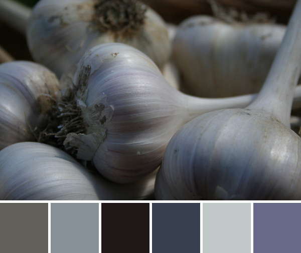
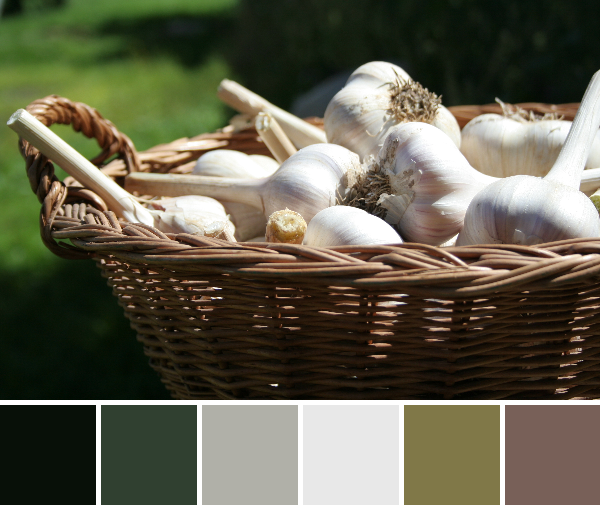
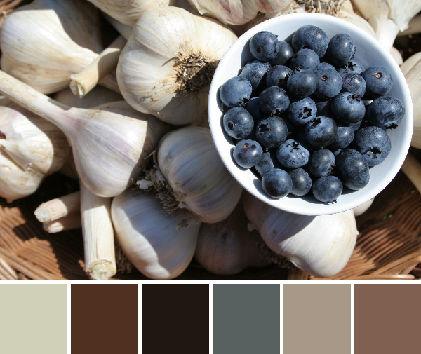
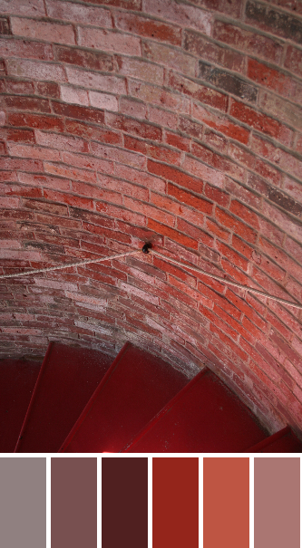
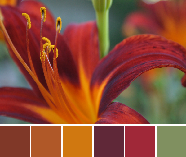
Welcome to Color Inspiration Thursday. It’s a two-posts-in-one-day kind of day here, so I will keep this one aesthetic. Color palettes are made using Play Crafts’ Palette Builder 2.1 and my photographs. Your inspiration this week comes from two very different locales. The first photos are from more of my garden harvest. We have had tomatoes galore, which means fresh tomato on everything, salsa, salsa, more salsa, and tomato sauce!
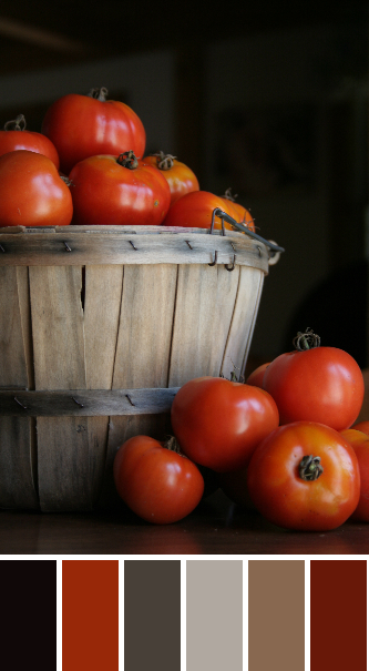
Corresponding Kona cottons from left to right:
Black, Poppy, Chocolate, Smoke, Taupe, Paprika
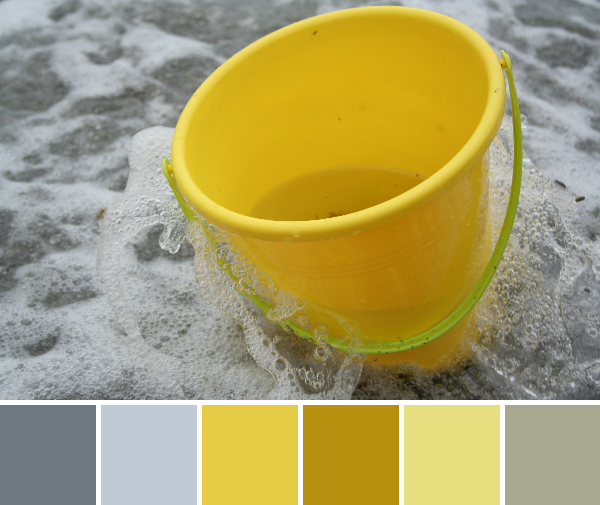
Add a helpful two-year old and your palette changes a bit:
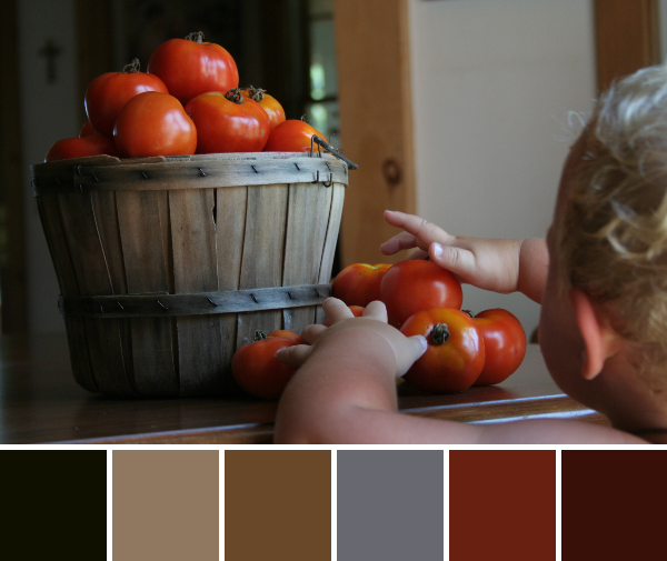
Corresponding Kona cottons from left to right:
Black, Taupe, Earth, Coal, Paprika, Mahogany
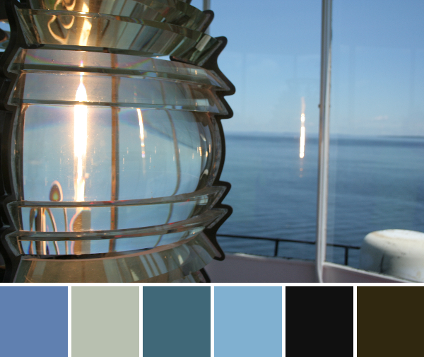
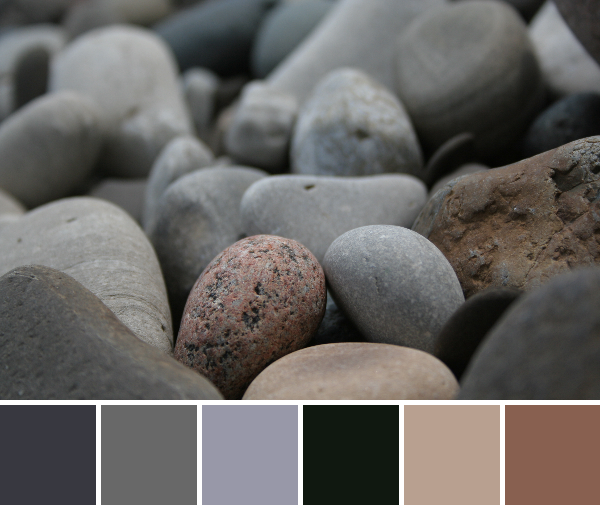
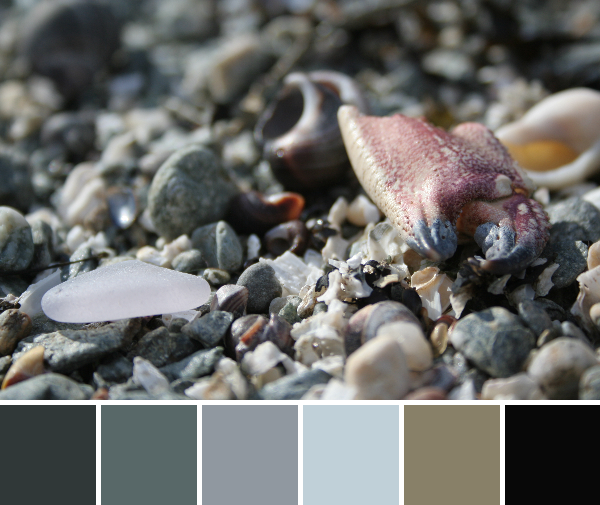
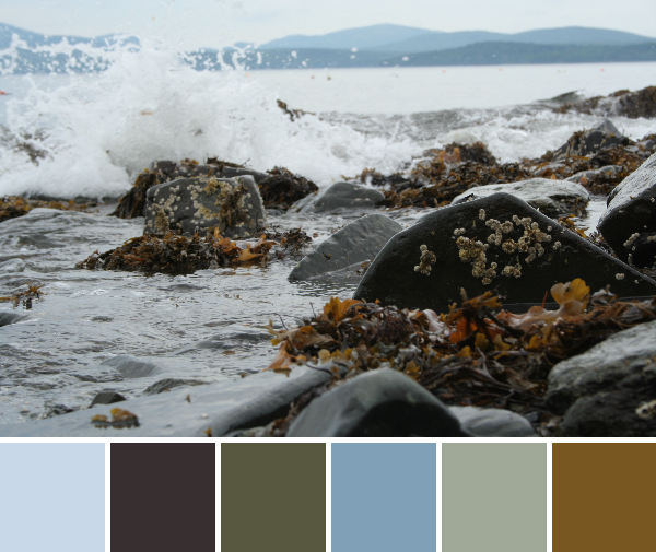
The next photos are from Holbrook Island, off the coast of Maine.
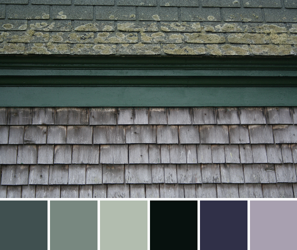
Corresponding Kona cottons from left to right:
Coal, Steel, Ash, Black, Windsor, Pewter
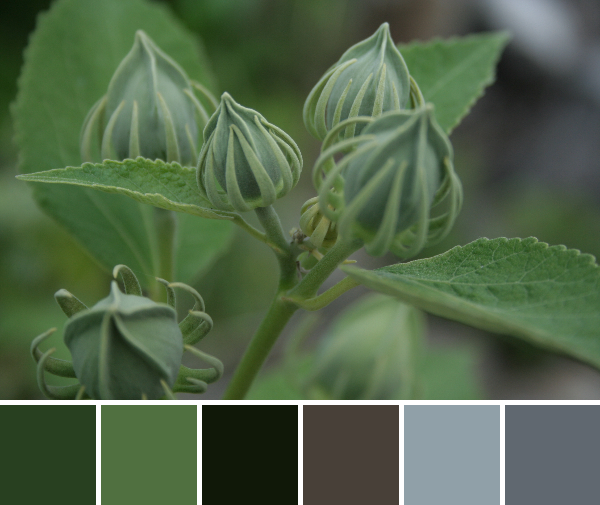
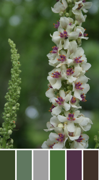
Sometimes simple, “plain” things are beautiful. I found this roof-to-wall transition quite aesthetically pleasing, and I love the combination of violets and seafoam greens that result. The seafoam green is a bit lost in the Kona matches, but I might tweak my fabric choices if using this palette in the future so that the green is more prominent.
Corresponding Kona cottons from left to right:
Basil, Grass Green, Moss, Spring, Espresso, Steel
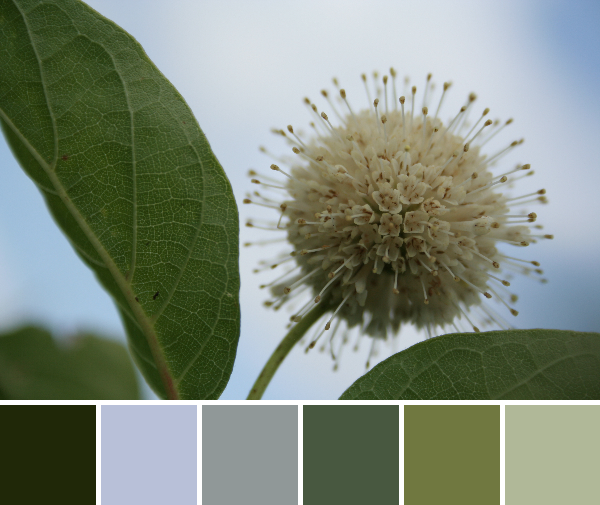
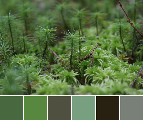
With beautiful beaches on the outskirts, deep dark pine forest on the inside, Holbrook Island Sanctuary State Park is a gorgeous place to explore. The forest floor was covered with moss and lichens, which created another little world best seen from an inch or two away while laying on your belly.
Corresponding Kona cottons from left to right:
Steel, Charcoal, Ash, Buttercup, Deep Rose, Denim
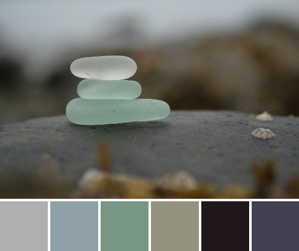
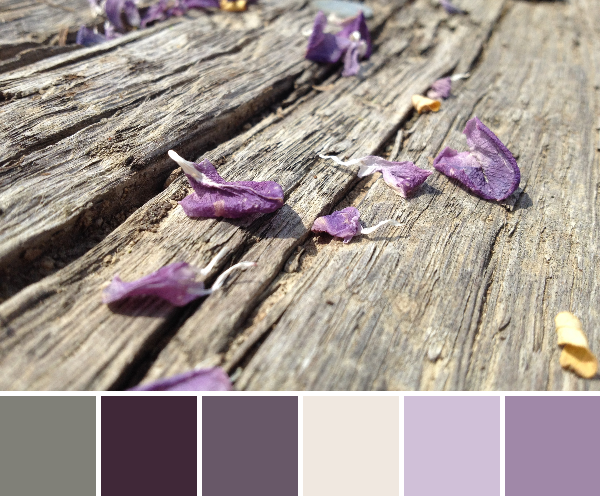
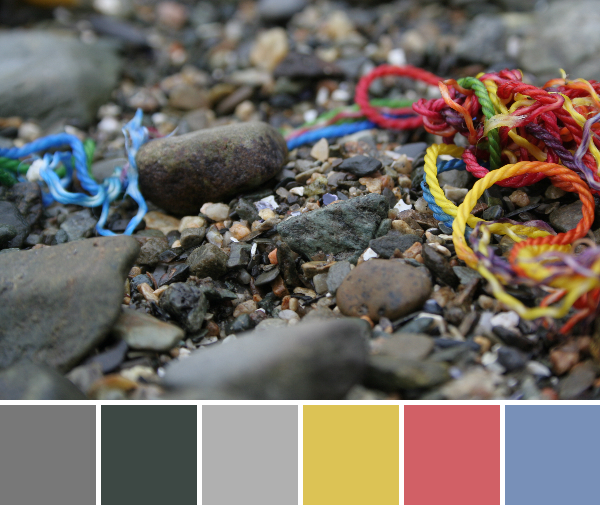
These rainbow strings were washed up on the rocky beach, which adds a fun pop of color to an otherwise stony palette. I kind of love this one!
Which palette is your favorite this week?