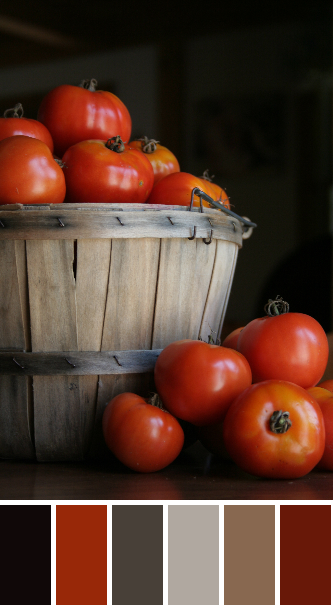
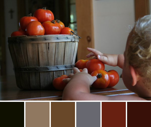
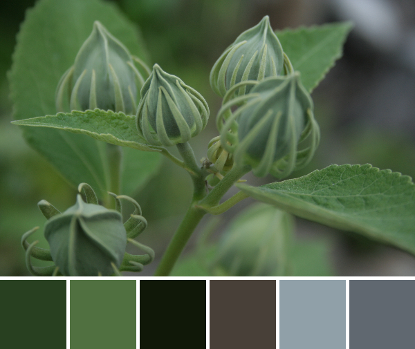
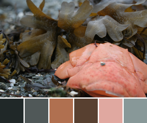
This week’s color inspiration brings us back to the garden and the late summer blooms that abound. There always seems to be something flowering in our garden, and even with the harvest of fruits and veggies swelling, now is no exception. Color palettes are created using Play Crafts’ Palette Builder 2.1 and my own photographs, taken today.
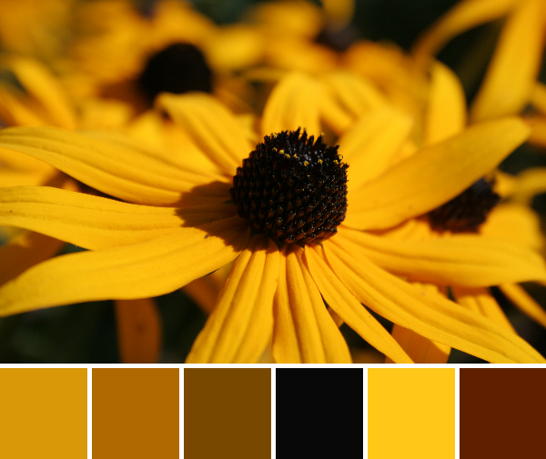
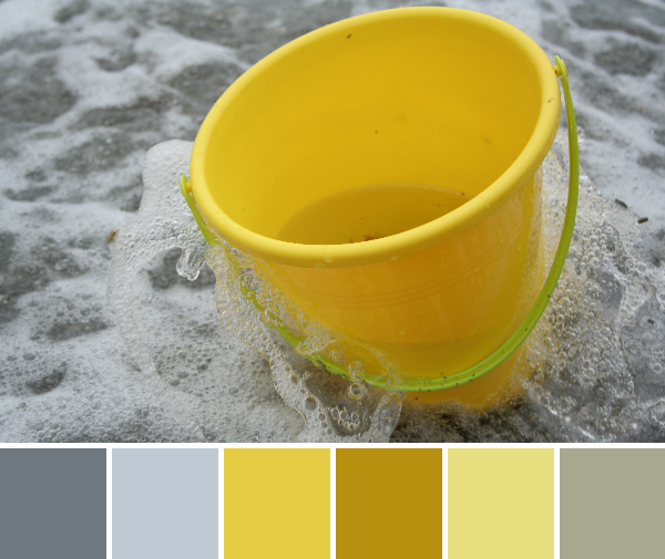
Corresponding Kona cottons from left to right:
Sunny, Yarrow, Gold, Black, Corn Yellow, Paprika
I don’t think I’ll ever tire of these beauties. Bright golden yellow black-eyed susans are scattered throughout our garden and fields and seem to flower for much of the summer. While I can’t see myself making a quilt that’s entirely yellow, it’s an awfully cheerful color palette.
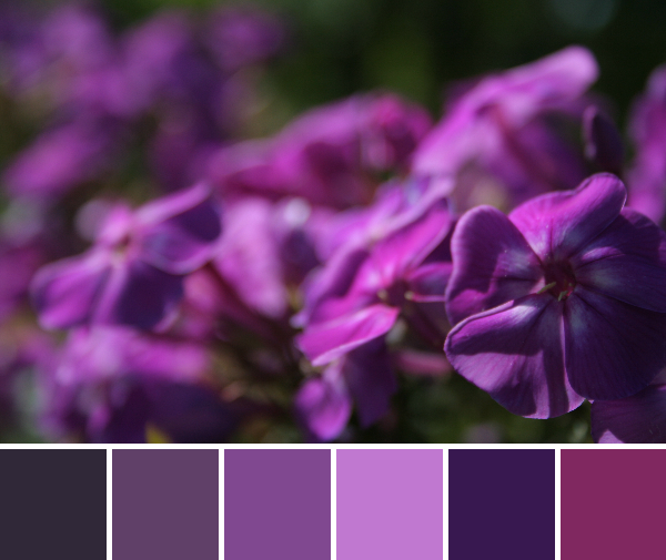
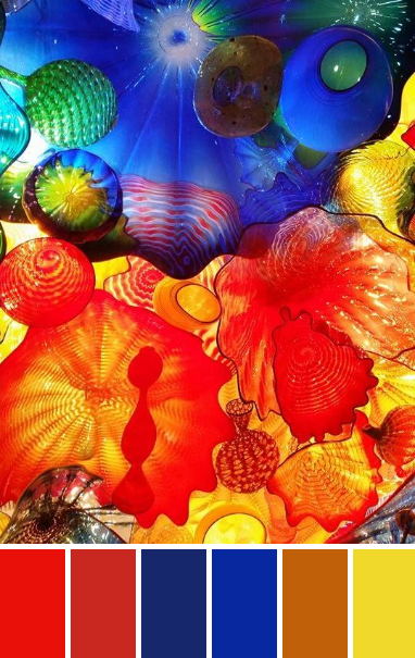
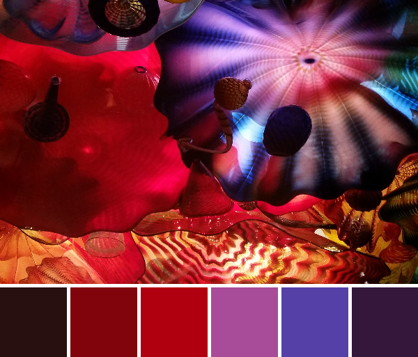
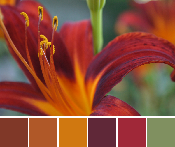
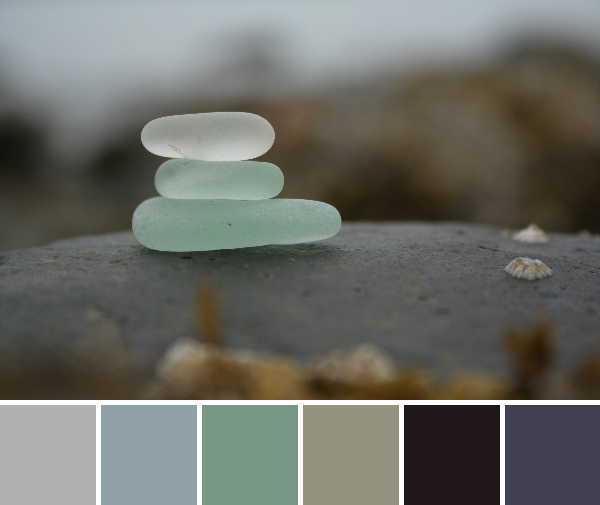
Corresponding Kona cottons from left to right:
Charcoal, Purple, Magenta, Violet, Dark Violet, Cerise
This palette features my favorite seasonal colors: radiant orchid and magenta. I love the range of purples in this palette and can definitely see it making its way into a quilt of the future!
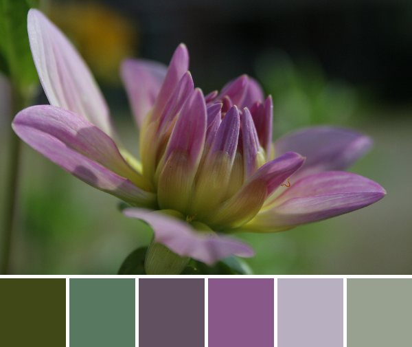
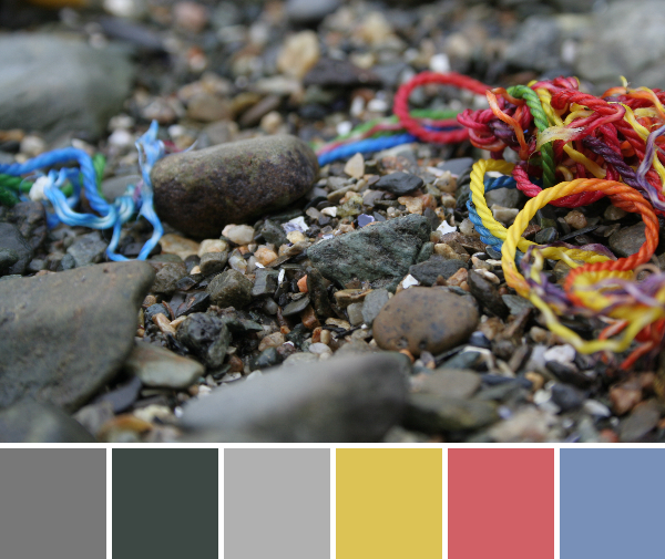
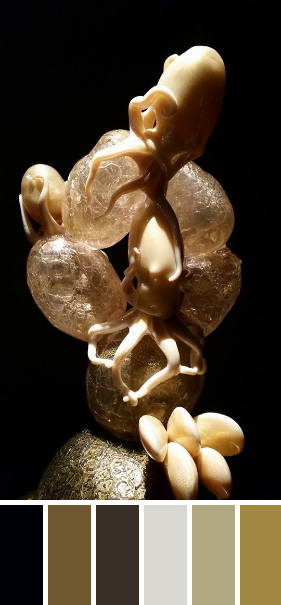
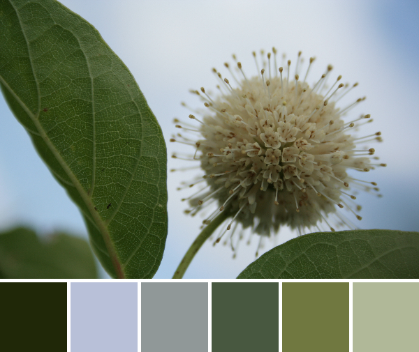
Corresponding Kona cottons from left to right:
Palm, Laurel, Coal, Crocus, Iron, Raffia
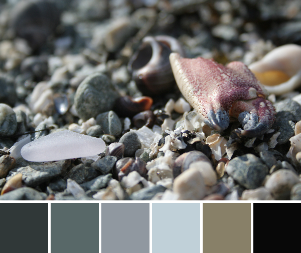
This year I’m thrilled that I got my dahlias into the ground in time for flowers. The gorgeous blooms have been brightening our kitchen table for the past week or so, and they just keep coming. These colors are stunning together, but my favorite part about this photo is the inch worm explorer; do you see him?
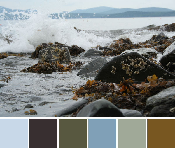
Quiltspiration 365
For those of you who are looking for quilty inspiration for every day of the year, I’ve teamed up with a group of quilting bloggers to provide exactly that. Search for tag #quiltspiration365 on Twitter, Instagram, and Facebook to see new inspiration each day, or visit these Quiltspiration bloggers:
- On Friday, Chelsey from Nini & the Sea shared her inspiration from France.
- On Sunday, Caroline showed how changing the color completely changes the look of your quilt.
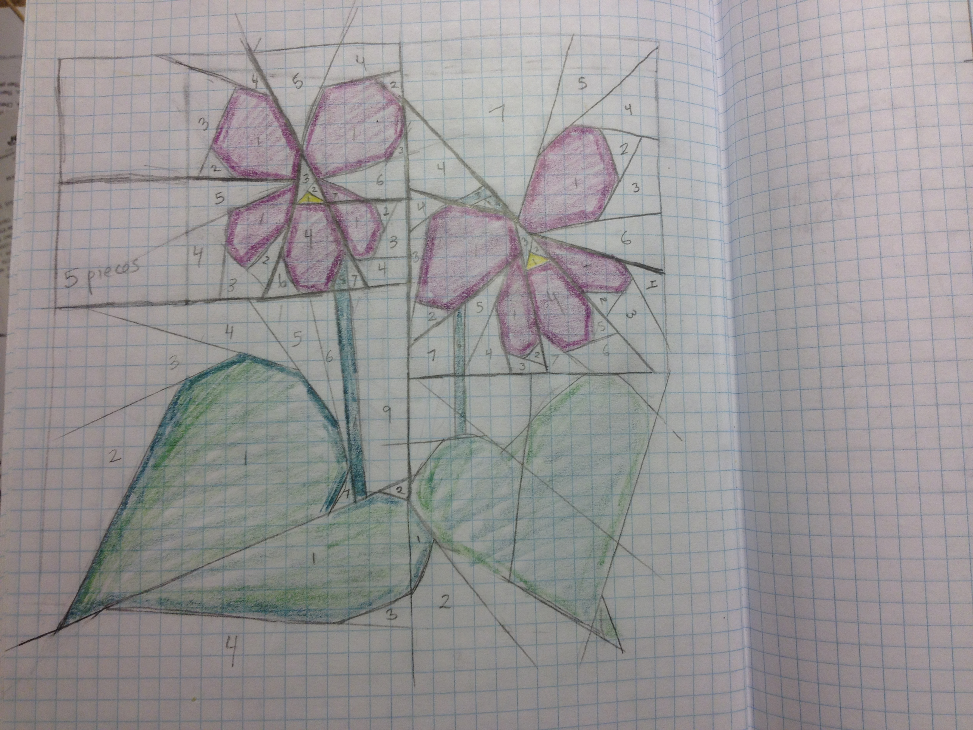
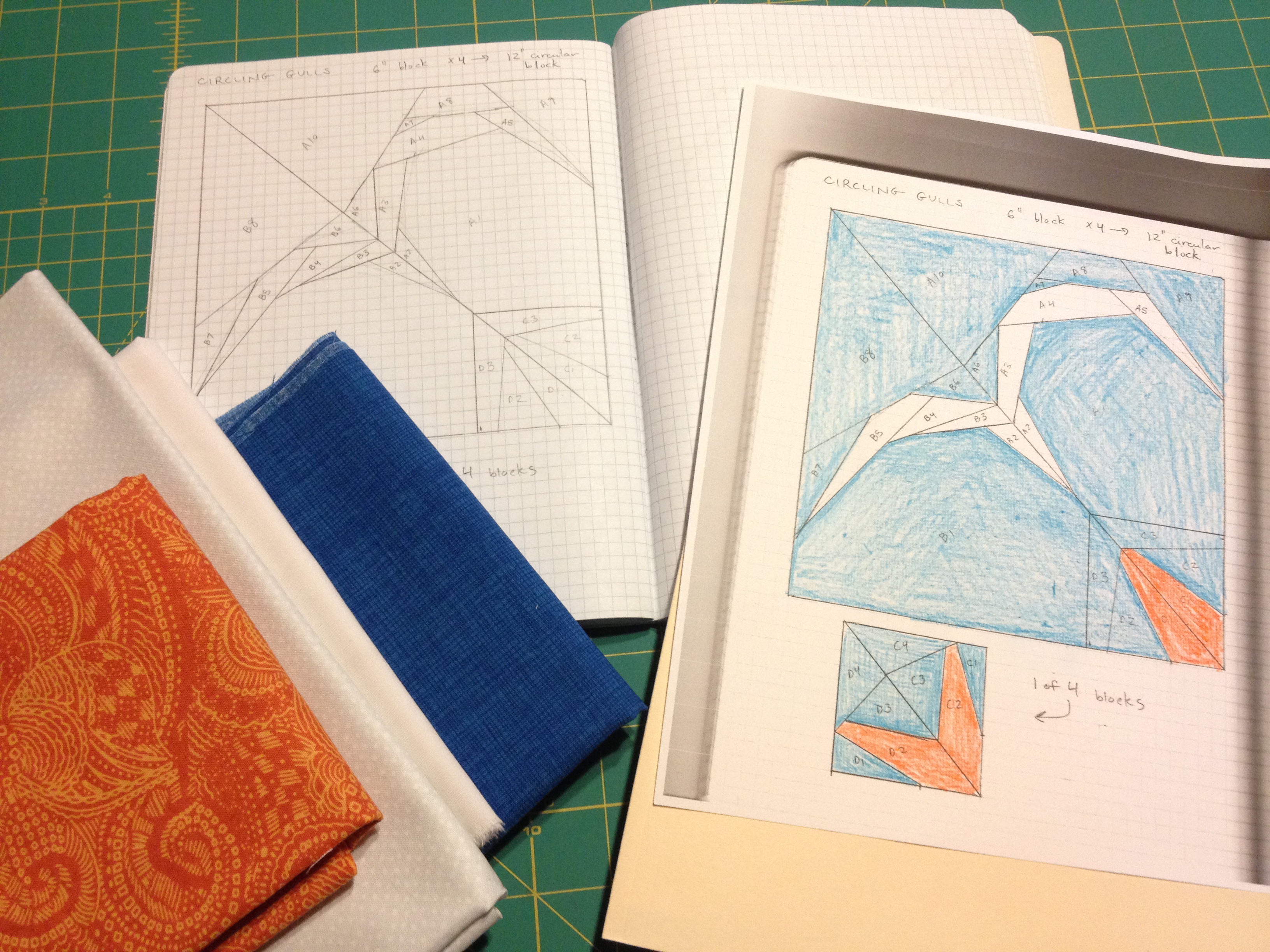
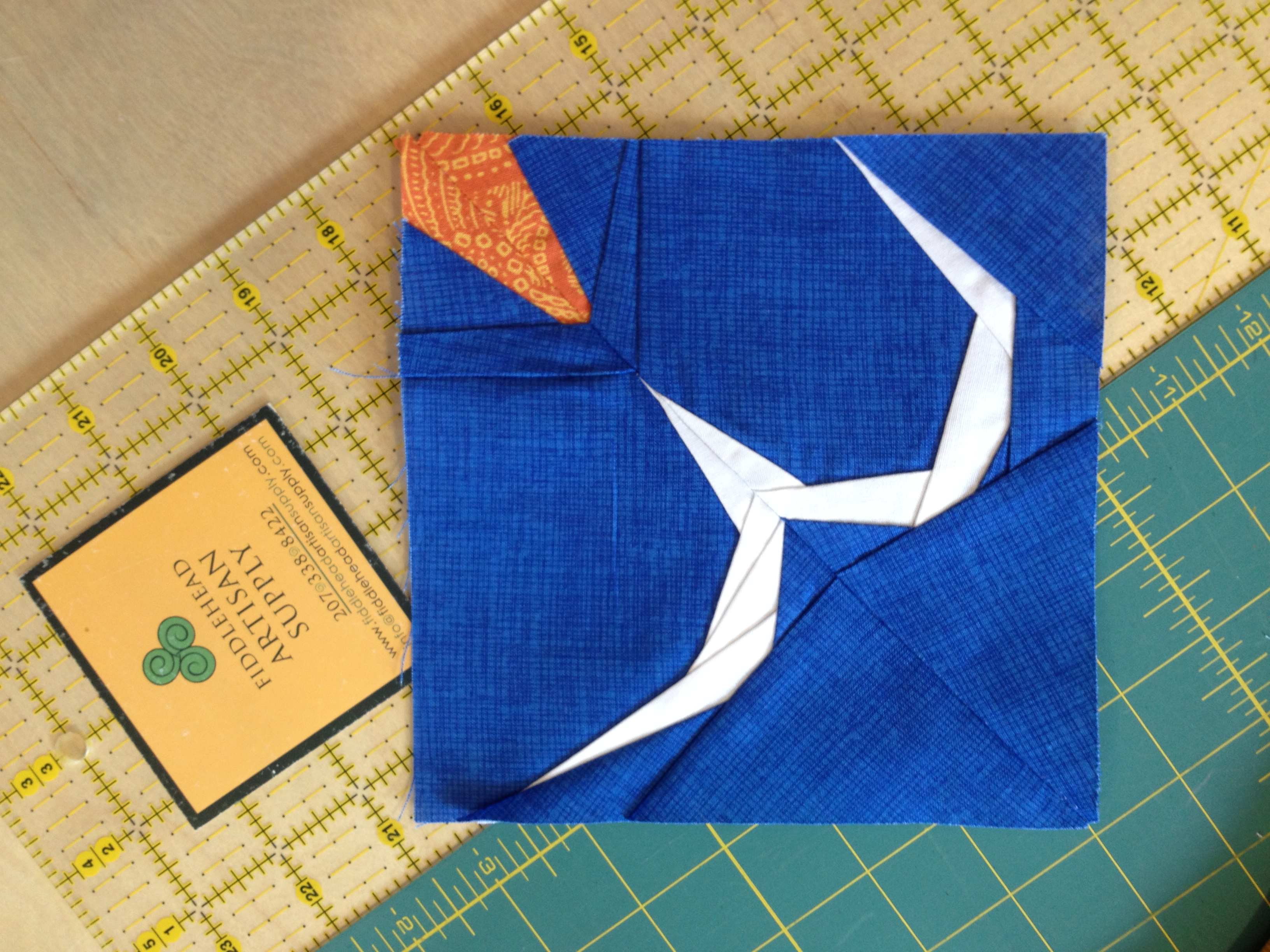
- On Monday, Laura shared a tiny paper piecing pattern inspired by a morning walk.
- On Tuesday, Jennifer shared a photo mosaic inspired by the bright and cheery colors of summer.
- On Wednesday, Brenna shared how her love of textiles inspires her quilting.