One of my favorite parts about traveling is the variety of new sights that you get to see. I like to look at things from an up-close-and-personal perspective, especially when it comes to nature. With my background in environmental science and ecology, I like to think that I see differences and similarities in landscape and vegetation that a normal passerby may not notice. Nature is endlessly beautiful, and when seen from an intimate distance, that beauty is intensified greatly. Here are some bits of beauty as seen in my travels over the past week.
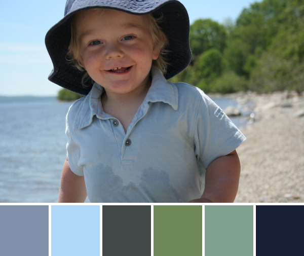
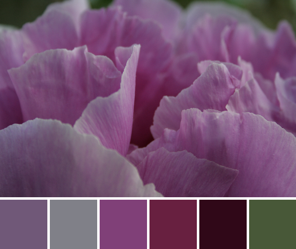
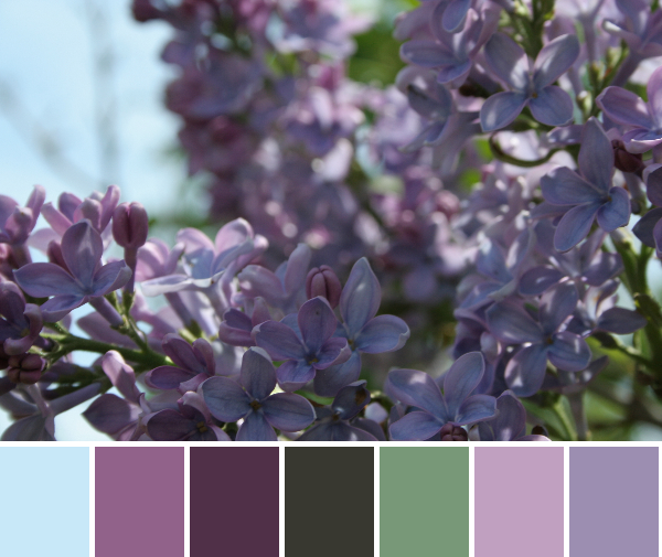
These color palettes are created using Play Crafts’ Palette Builder 2.1 and my photographs.
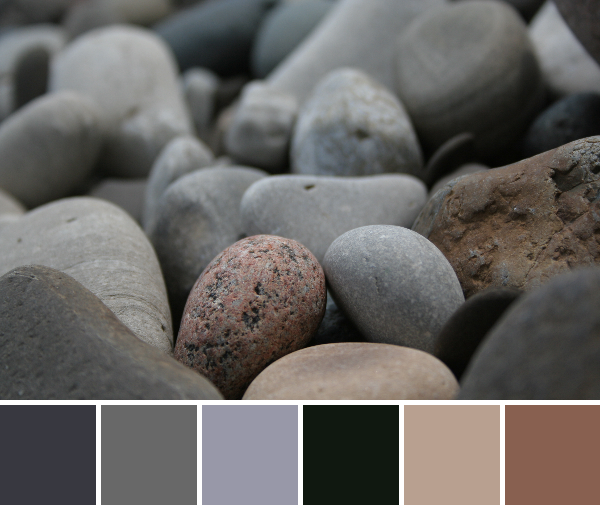
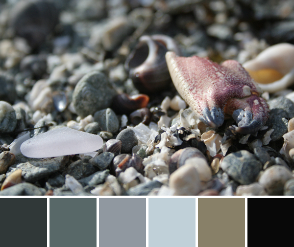
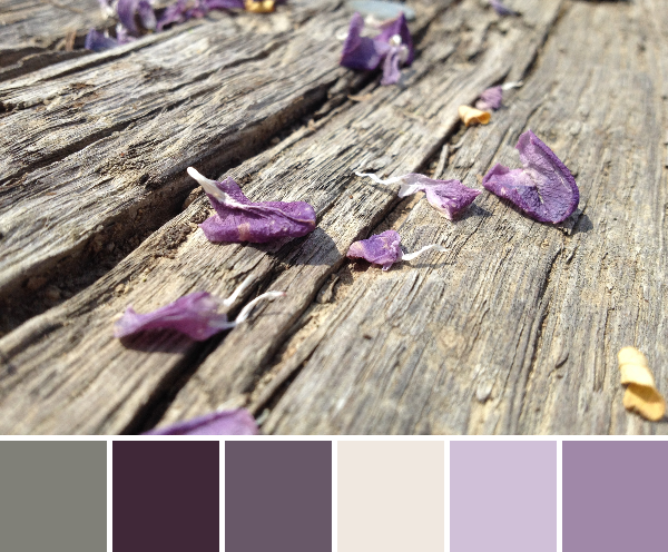
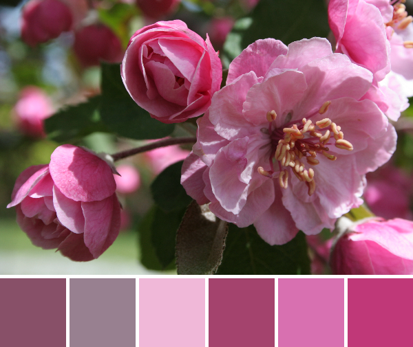
Corresponding Kona cottons from left to right:
Charcoal, Coal, Pewter, Black, Stone, Taupe
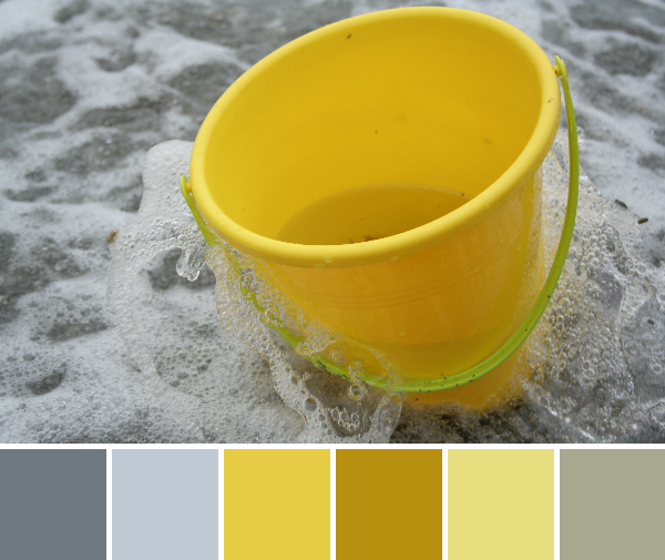
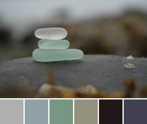
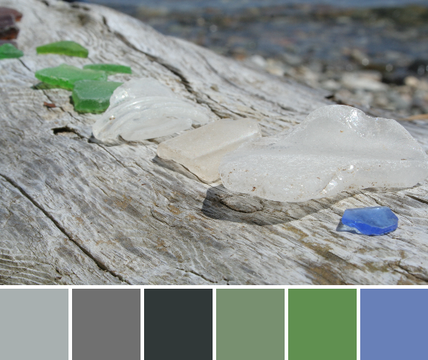
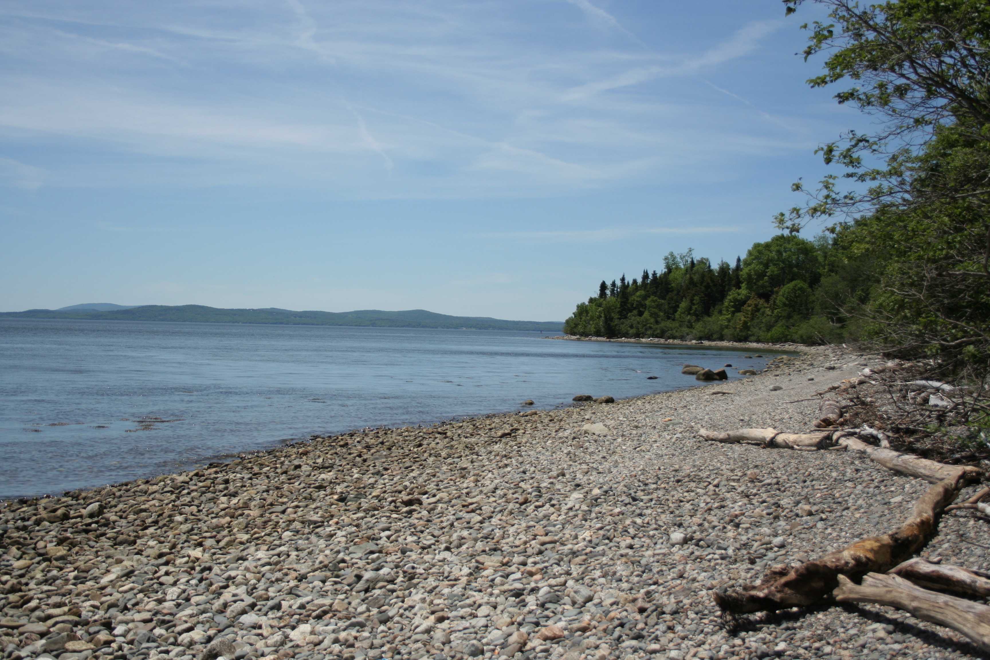
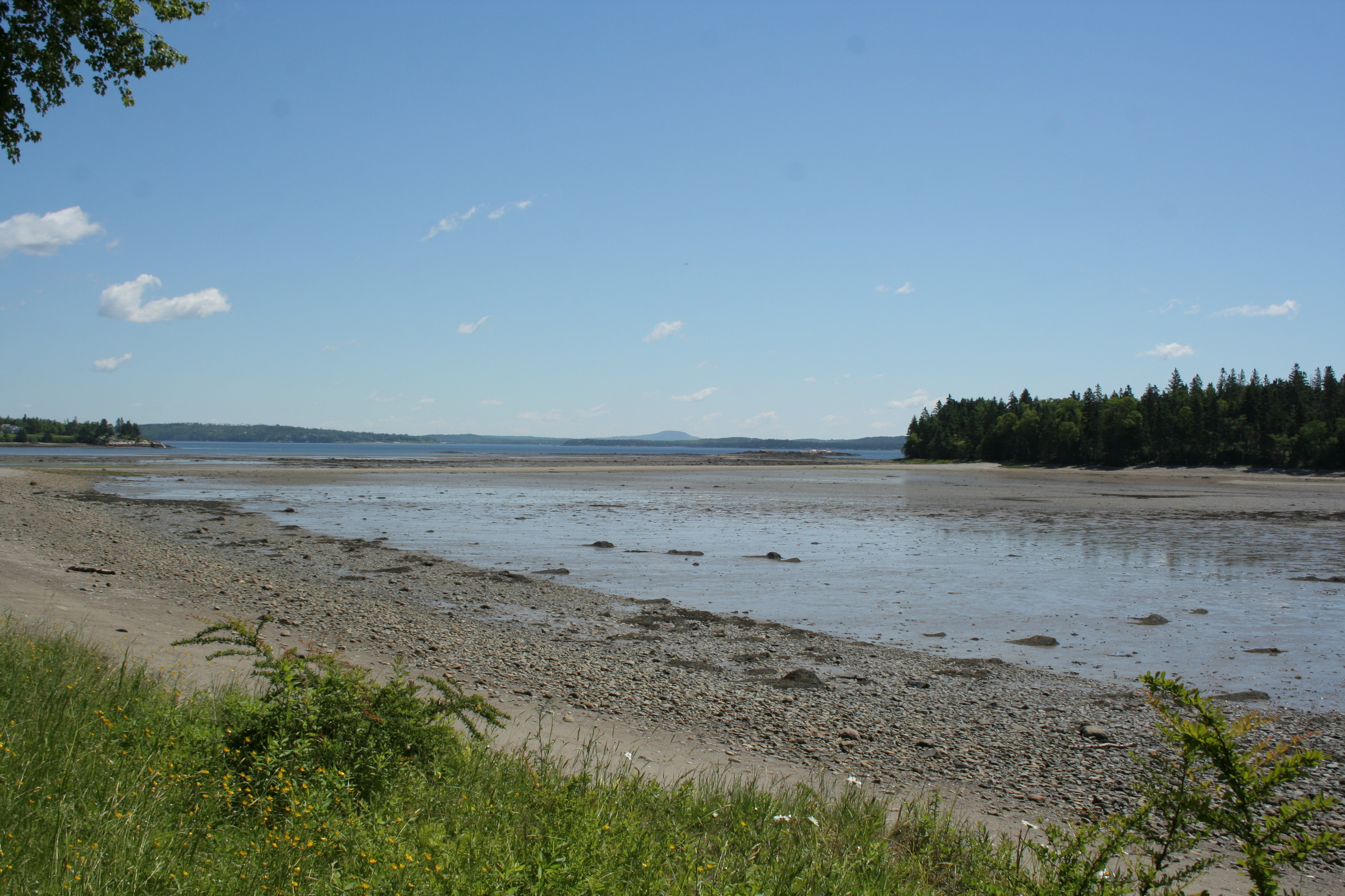
The beach on Lake Erie is a nice balance of fine sand and smooth rocks of varying sizes. I’ve become accustomed to the rocky Maine coast, and the beaches here in Ohio are a gentle respite from those footwear-requiring, albeit beautiful, beaches. Varied rock types, including many conglomerates and fossils can be found along the beaches, which add to the aesthetic.
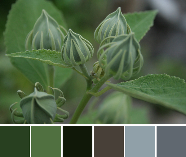
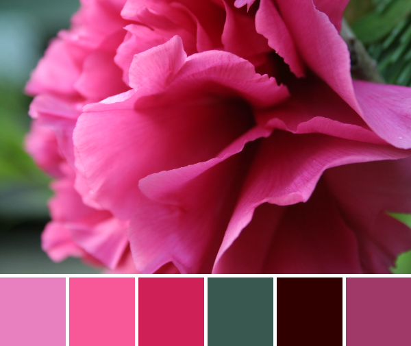
Corresponding Kona cottons from left to right:
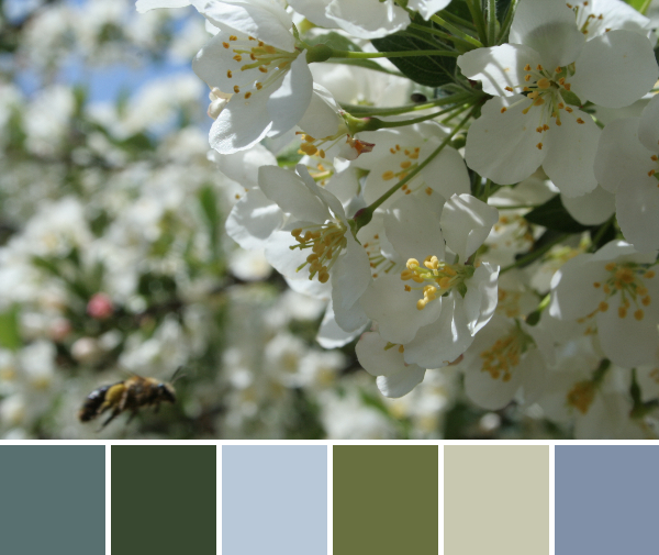
Palm, Laurel, Black, Chocolate, Shale, Coal
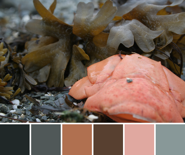
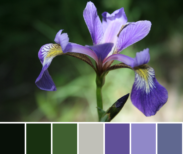
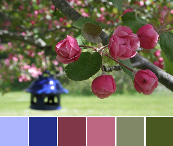
These green buds were too awesome to pass by. It’s another earthy, dark palette, but the balance of green and shady grey-blues with the dark black/brown are a beautiful embodiment of green goodness.
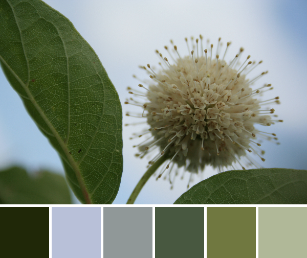
Corresponding Kona cottons from left to right:
Evergreen, Fog, Shale, Palm, Ivy, Parsley
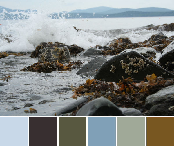
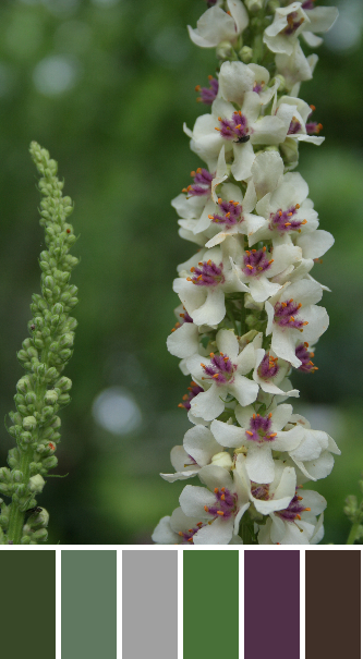
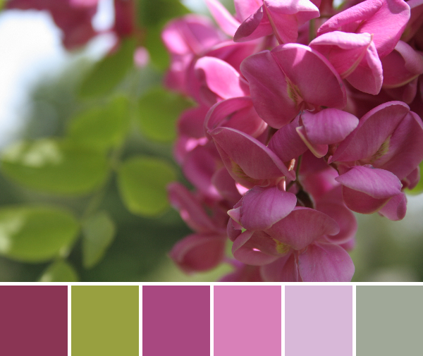
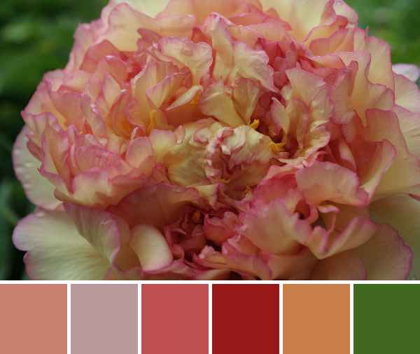
Buttonbush is a wetland shrub typically found in standing water. When I was a wetland scientist doing delineations, we LOVED finding buttonbush since it is an obligatory wetland plant and therefore a clear indicator of the wetland area, not to mention its gorgeous and whimsical flower. This palette is included more for the novelty of the plant than the colors, but it’s another lighter variation on the green and blue nature palette.
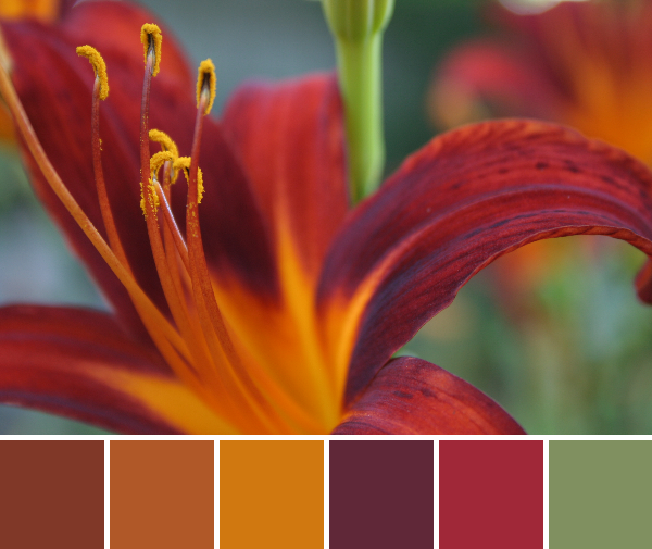
Corresponding Kona cottons from left to right:
Spice, Gold, Amber, Garnet, Rich Red, Peridot
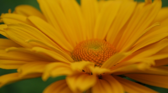
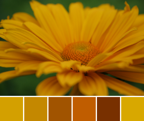
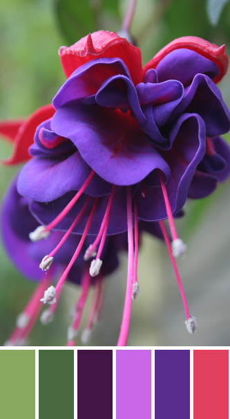
I wouldn’t leave you without at least one big burst of color! This tiger lily from my mom’s garden just burns with vibrancy! While tiger lilies bloom in the height of summer, I can’t help but feel a bit of autumn in this palette. I’m a summer lover, though, so I am NOT hurrying autumn along by any stretch. I just need to make that clear. I’ll take summer for as long as I can have it!
Enjoy! I’d love to see what you create with these palettes.