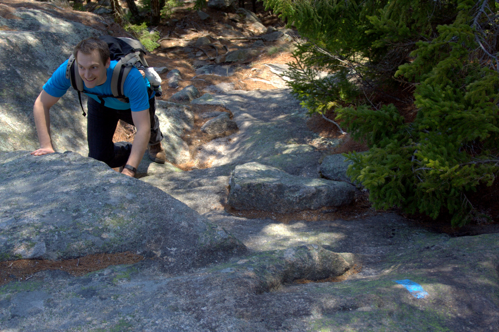
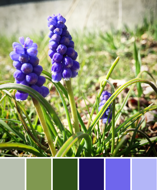
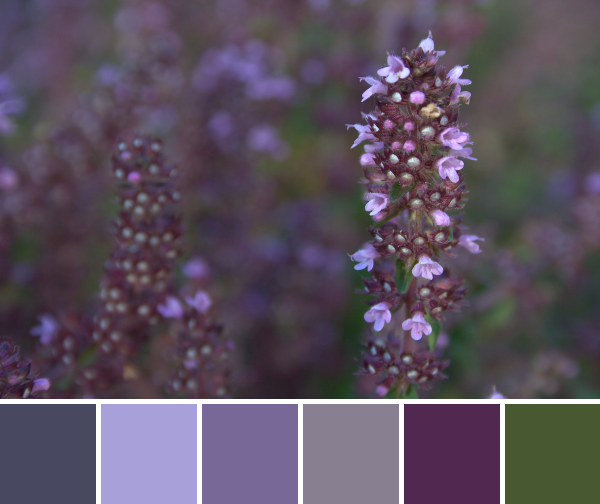
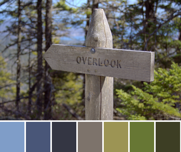
This past weekend, my husband and I sought out a new trail to hike, and aimed to find one that we would not be able to tackle with a 3 and 6 year old in tow. Our big kids had just left for a grand adventure–a week in NJ with Grandma & Pop Pop, flying solo for the first time ever. With Finn in a carrier, we were aiming to hike up a mountain and get some much desired fresh air, burning muscles, and a view. We found exactly what we were seeking in the Mansell Mountain Trail in Southwest Harbor, Maine. We found it by watching 1 Minute Hikes with Aislinn, and you can watch her video of the hike here (watching it again, I’m realizing we hiked the trail backwards). It’s a pretty neat tool for those looking for new hikes in Maine (although I don’t really know why it’s called “1 minute hikes” since the hike certainly didn’t take us one minute, and the video is longer than a minute… but still, a useful tool!) This week’s color inspiration hails from photos I took along the hike. Color palettes were made using Play Crafts’ Palette Builder 2.1, and the matching Kona cotton and Moda Bella solids and Aurifil threads are my favorite perk of using the Palette Builder.
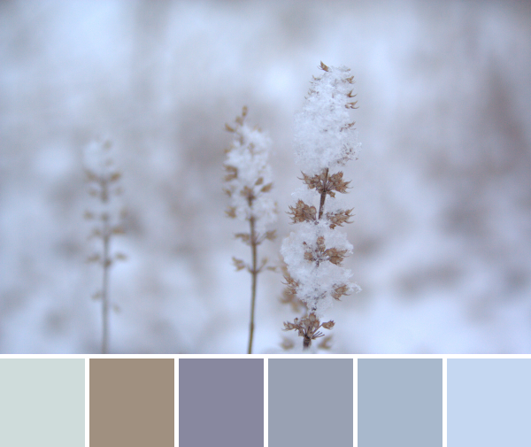
 Corresponding solids from left to right:
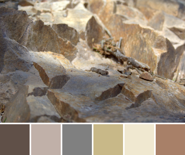
Bella Chocolate, Bella Stone, Bella Etchings Slate, Kona Scone, Bella Snow, Bella Paper Bag
Corresponding Aurifil thread from left to right:
1140 – Bark
5011 – Rope Beige
2625 – Arctic Ice
5010 – Beige
2311 – Muslin
2335 – Lt Cinnamon
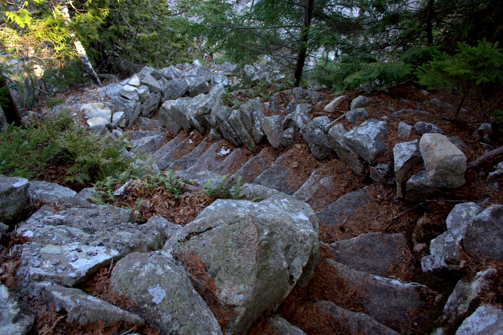
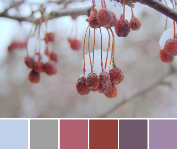
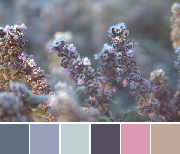
The climb up Mansell Mountain was very steep, so my gaze was often on the ground right in front of my face, finding hand-holds in some cases. I marveled in the variations of texture and color as we climbed up the mountain, and this one spot in particular caught my eye. I love the play of shadow in the crevasses, and could even see this transcribed into a full quilt. It reminds me of barren desert cliffs, and without the tiny twig for perspective, I’d almost think I were overlooking some barren landscape.
 Corresponding solids from left to right:
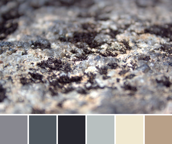
Bella Graphite, Kona Coal, Kona Charcoal, Bella Zen Grey, Bella Snow, Kona Cobblestone
Corresponding Aurifil thread from left to right:
5004 – Grey Smoke
1158 – Med Grey
2785 – V Dk Navy
2600 – Dove
2311 – Muslin
2375 – Antique Blush
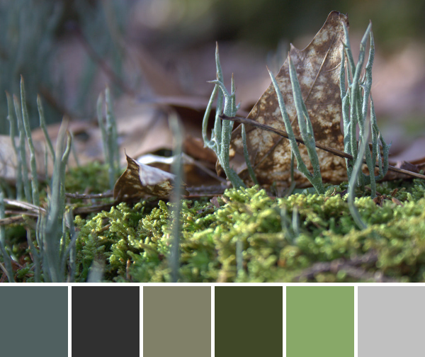
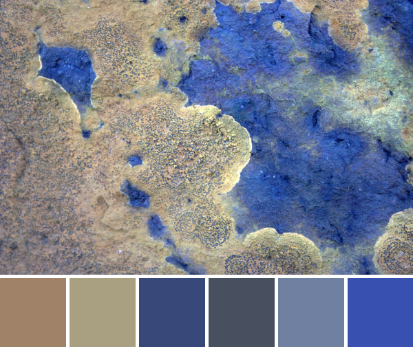
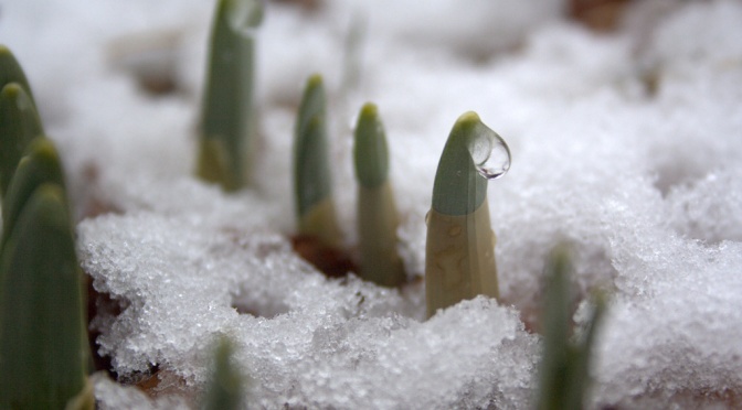
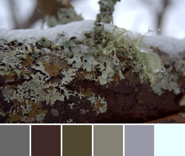
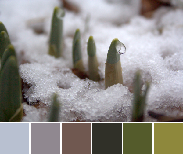
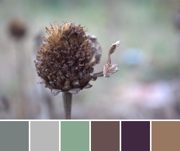
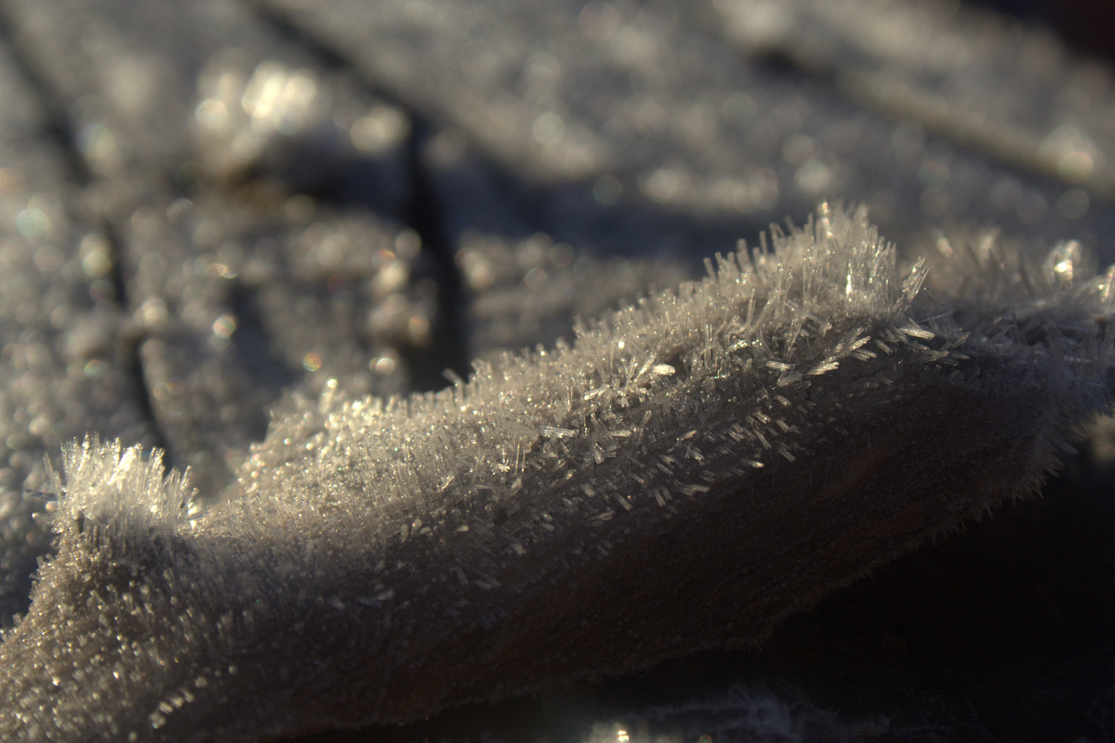
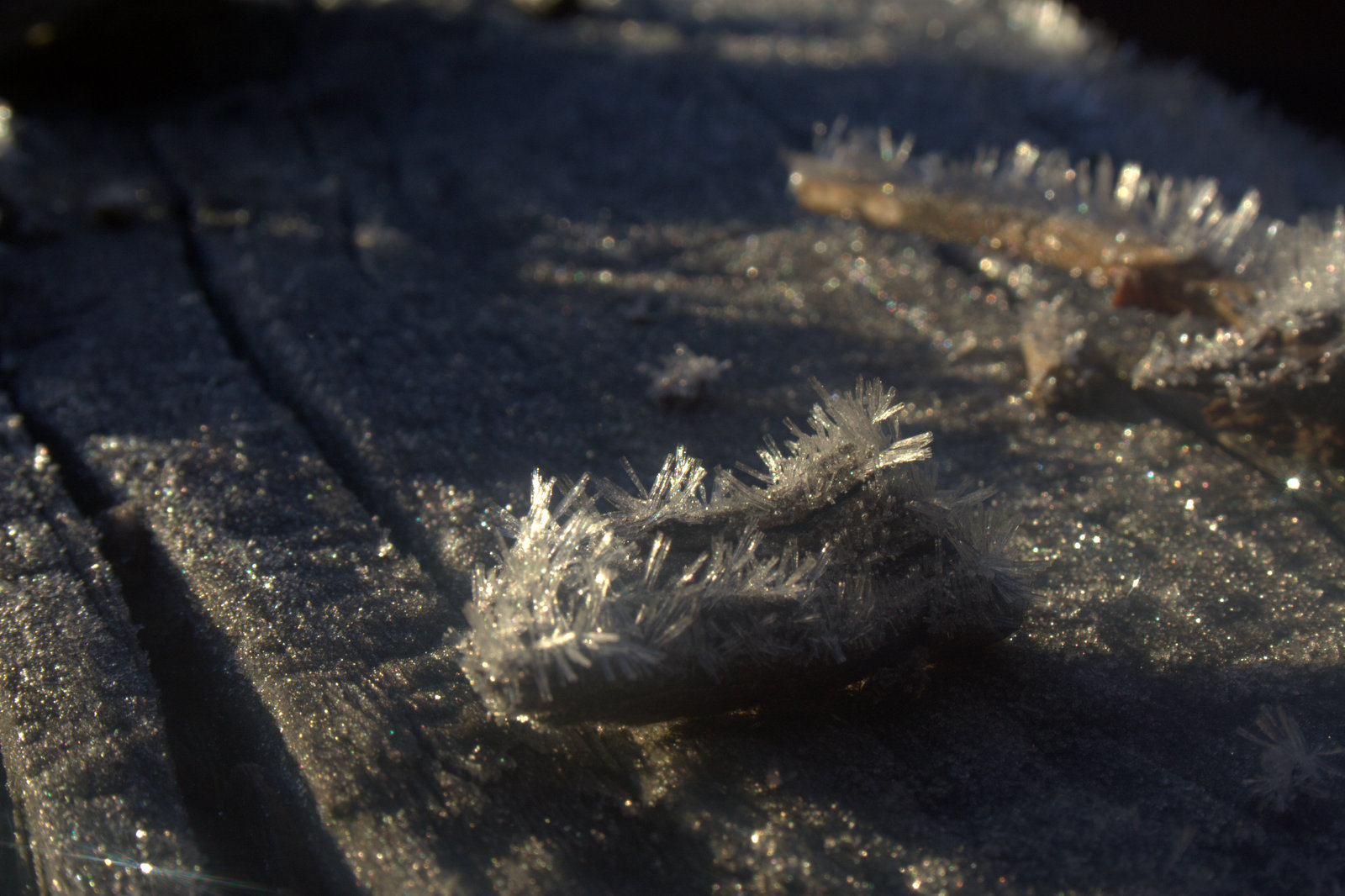
I love this photo and palette since it’s a perfect example of the benefit of taking a *really* close look at the world around you. These tiny almost crystalline bits of lichen could have easily been tromped over without a second glance. Looking closely, though, you see it’s a beautiful little varied world full of greys, beige, and a hint of peach. Call me weird, but I think it’s quite beautiful.
To give you some perspective, here is a series of photos showing you a lengthening view of what you see in the color palette above. If you take a step backward, you see this:
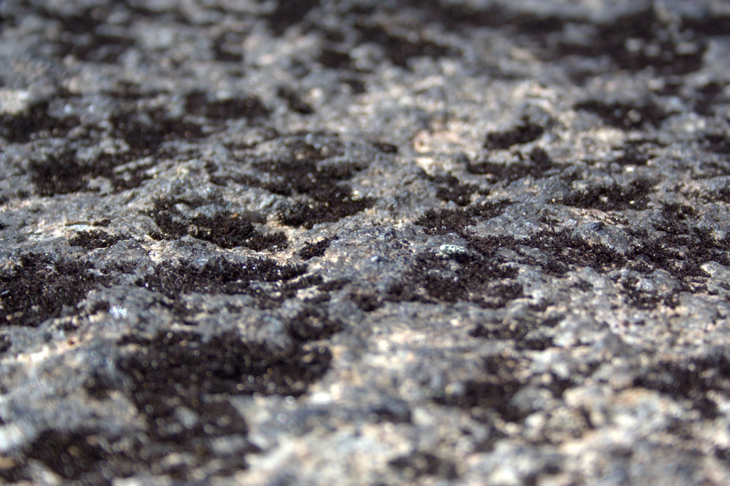
Take another step back and you see:
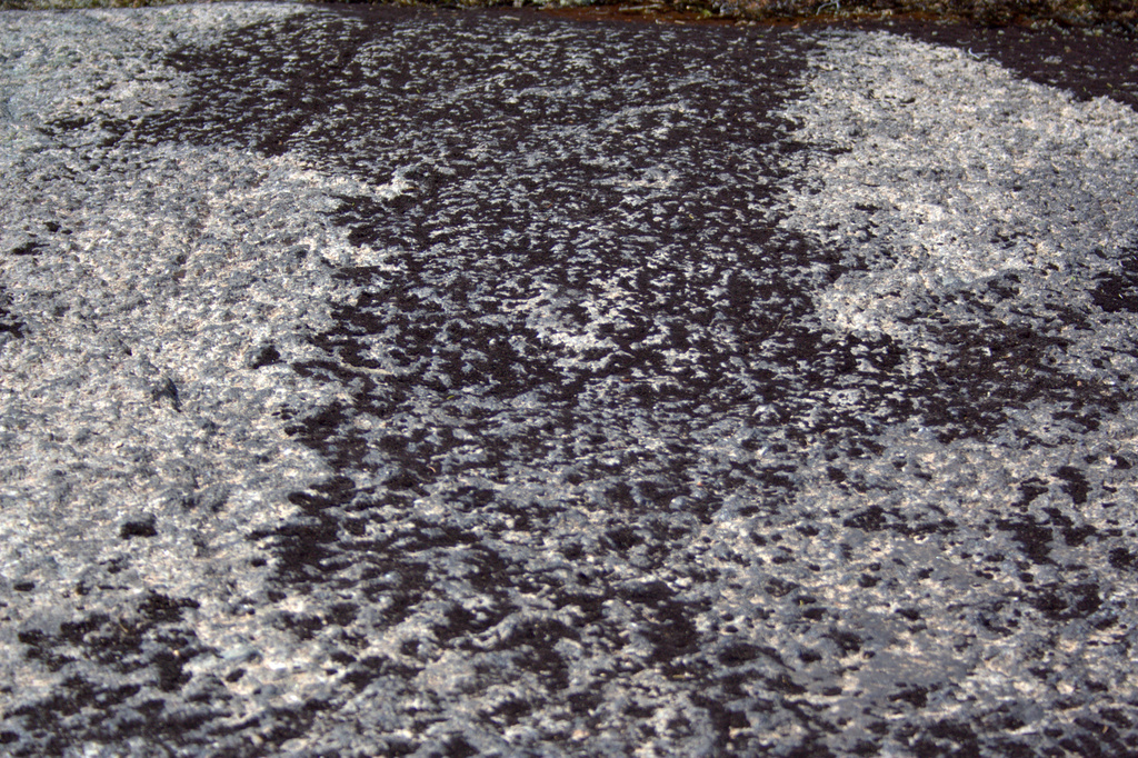
With one more step back, here’s what you would see as you’re hiking along the trail:
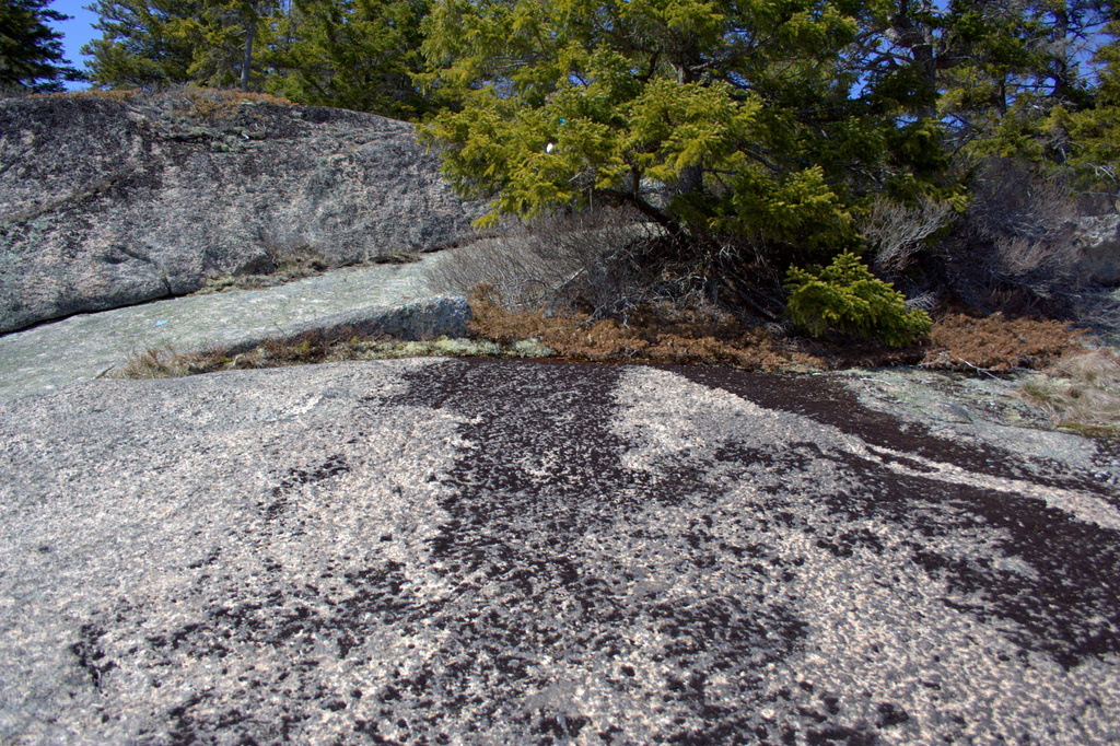
It’s amazing how the appearance of the world changes as you take a closer look! This “dirty rock” is actually a tiny world of beauty. Amazing!
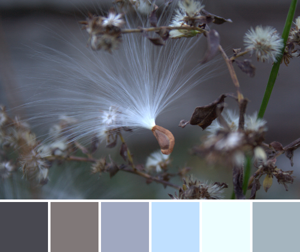
 Corresponding solids from left to right:
Kona Cotton Candy Blue, Bella Admiral Blue, Bella Washed Black, Bella Etchings Slate, Bella Fig Tree Olive, Bella Evergreen, Kona Moss
Corresponding Aurifil thread from left to right:
2770 – V Lt Delft
1310 – Med Blue Grey
2630 – Pewter
2325 – Linen
5010 – Beige
2887 – Olive
2905 – Army Green
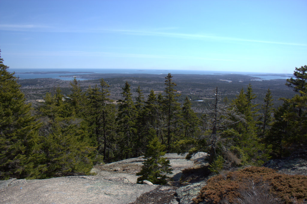
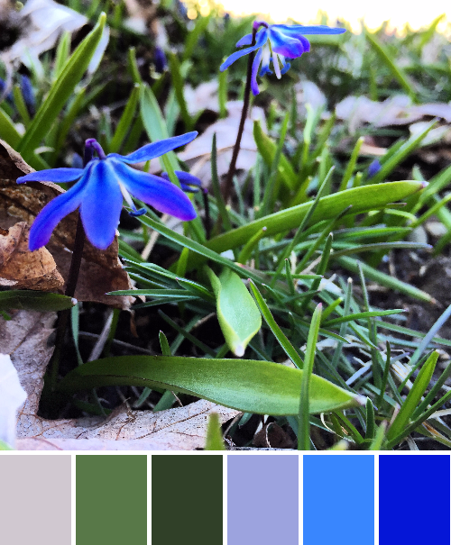
We were seeking great views, and we found them indeed. Photos don’t do the hike justice at all, but I’ll include some more below. A mountain face of stone stairs, wooden slats across wet areas, pristine babbling streams winding along next to the path, sun on our backs, and a view that just cannot be portrayed. It was a lovely day!