Category Archives: Life

Around the World Blog Hop

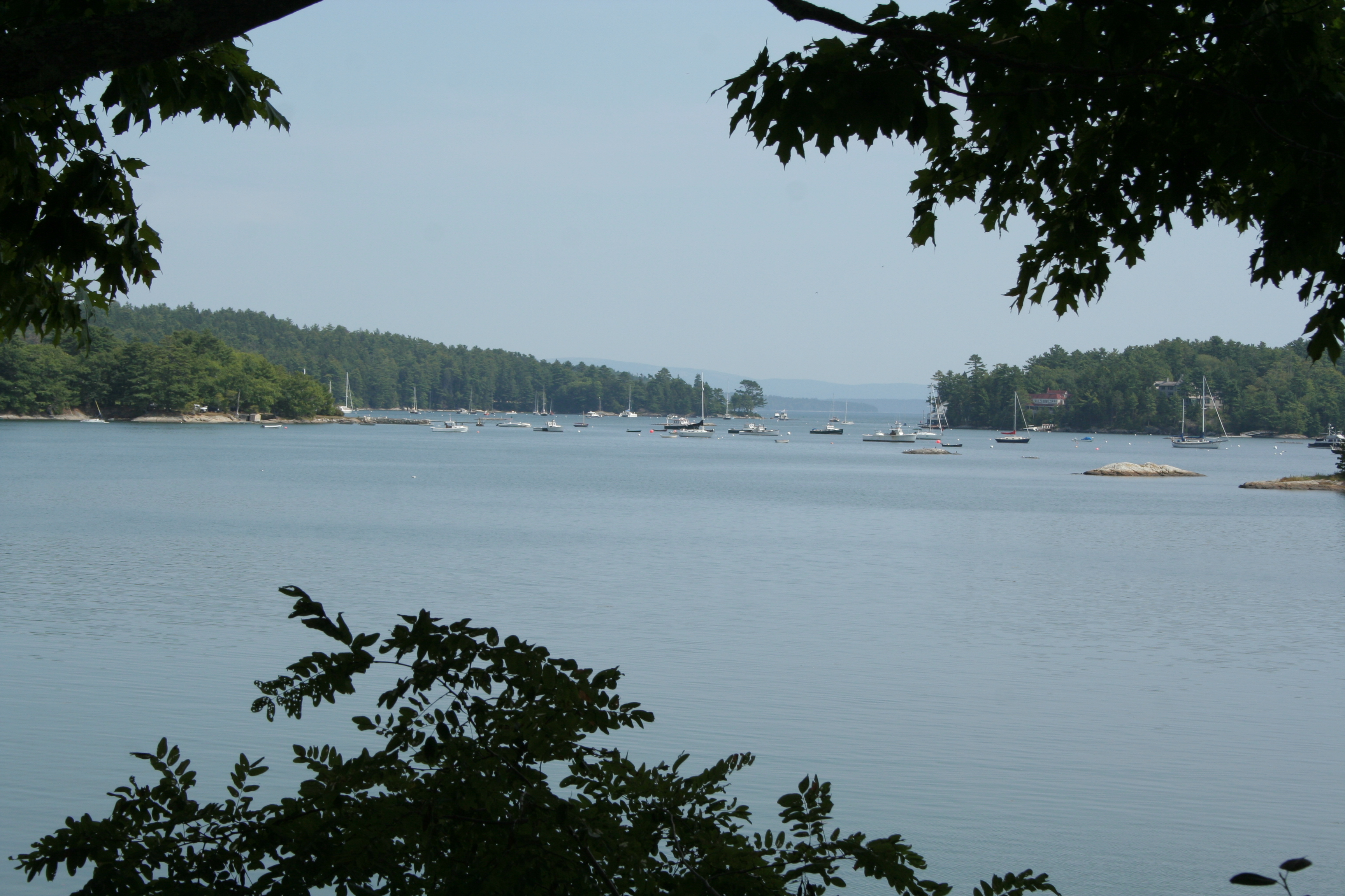
Welcome to rural Maine, your next stop on the Around the World Blog Hop! Stephanie from Late Night Quilter tagged me last week, and as she explained, the hop is like a giant blogosphere tag game where those tagged can share a bit about their creative process as well as what they are working on. Sounds like fun!

I met Stephanie less than a year ago, but I already feel like we’re sewing soul sisters. To start, we have completely unplanned, practically identical blog names that pretty much describe our lives. Since meeting Stephanie, we’ve teamed up (with Michelle, too!) on a number of fun ventures, such as starting up the Late Night Quilters Club on facebook, opening a Late Night Baby Etsy shop, and planning an awesome time at QuiltCon in February 2015! Stephanie is an awesome writer and quilter, and recently started a longarm quilting and pattern design business with her other half, Michelle.

Now, back to the hop!

What am I working on?

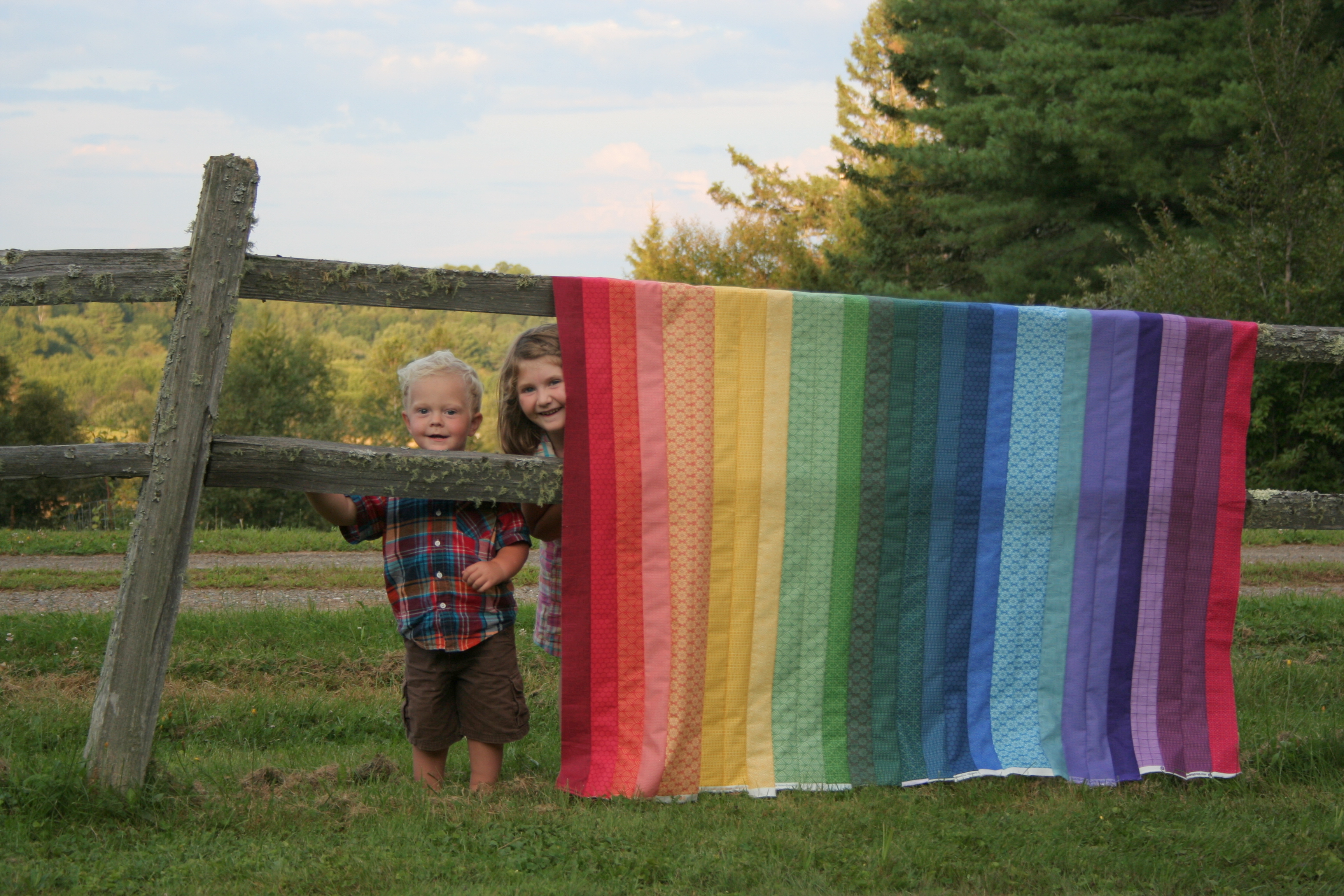
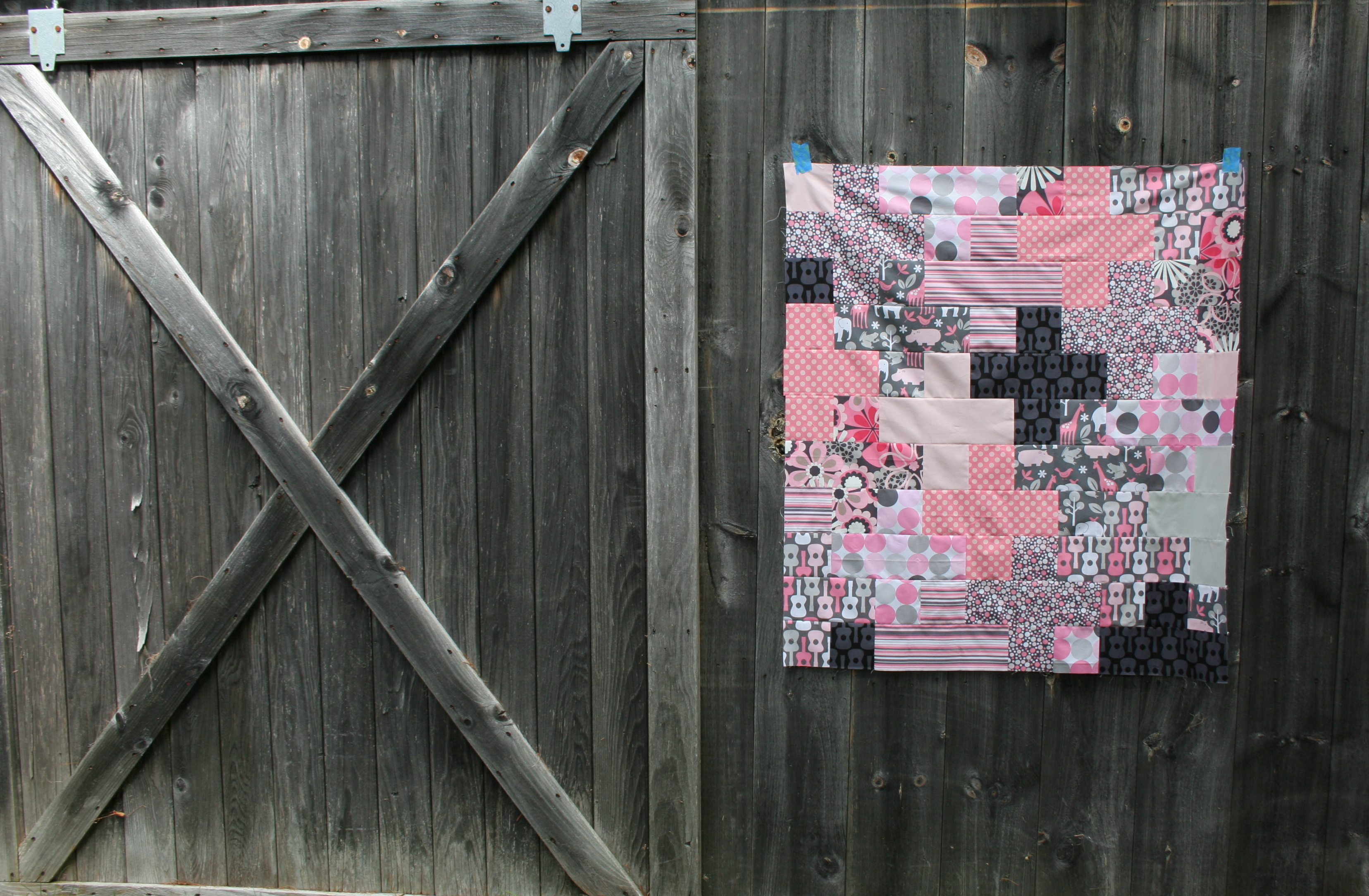
I’ve been finding ways to make more sewing time, and have actually been making decent progress on some projects. I recently completed two quilt tops: the rainbow jellyroll quilt for my daughter, and a pink and grey baby plus quilt that will be listed in the Late Night Baby shop.

helpful kids and a rainbow jellyroll quilt
Rainbow jellyrolly quilt top.
pink and grey baby plus quilt top finish
Pink and grey baby plus quilt.

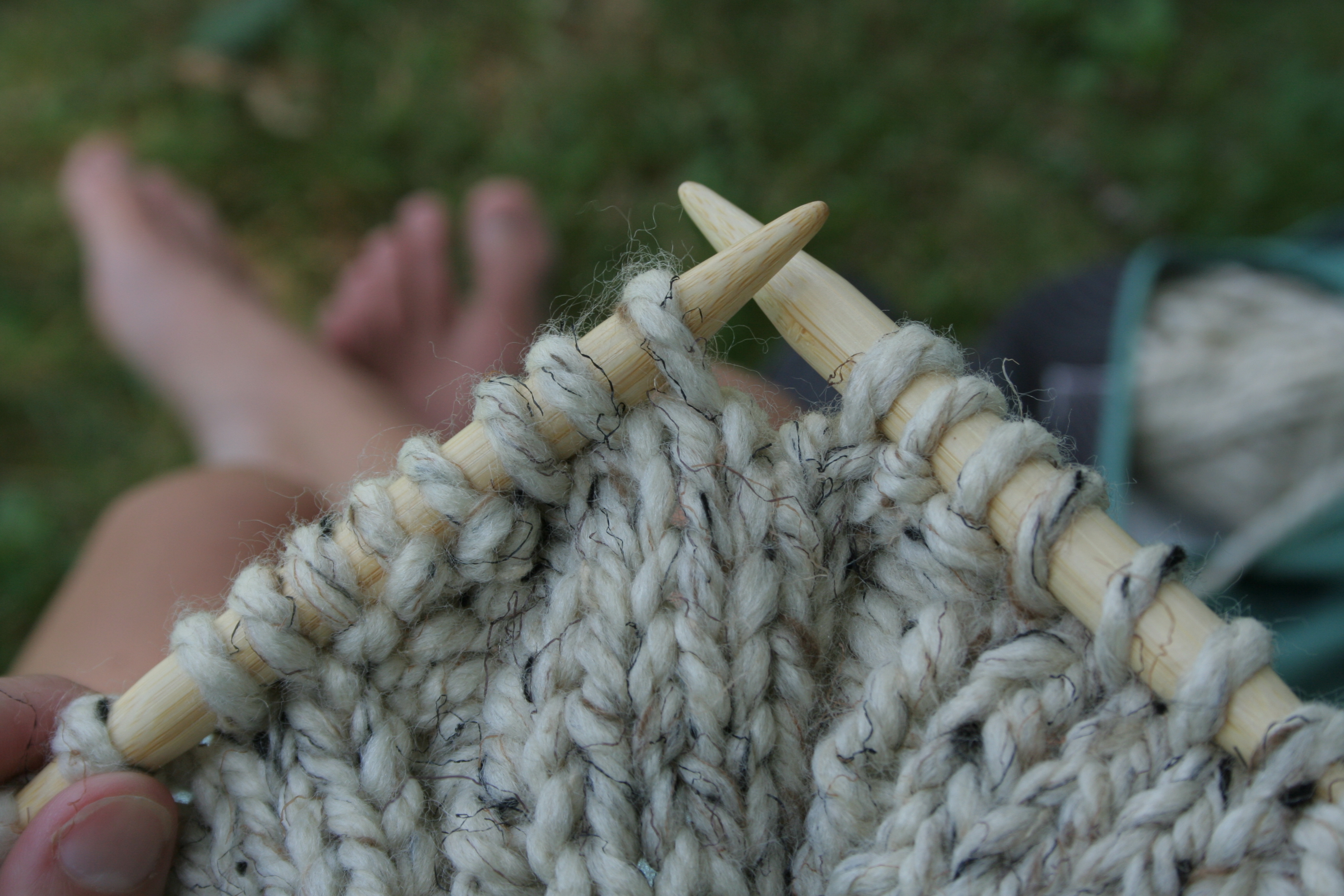
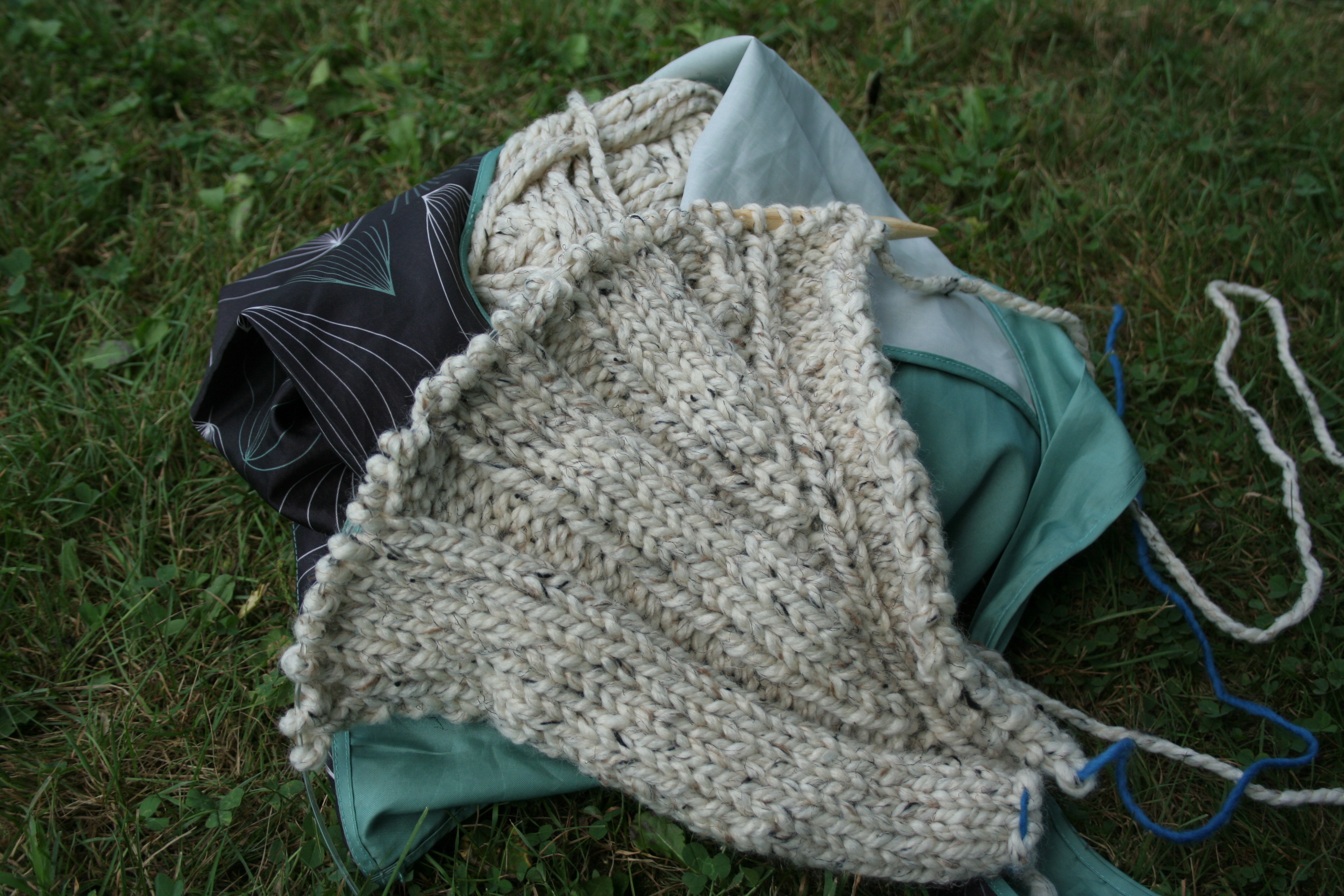
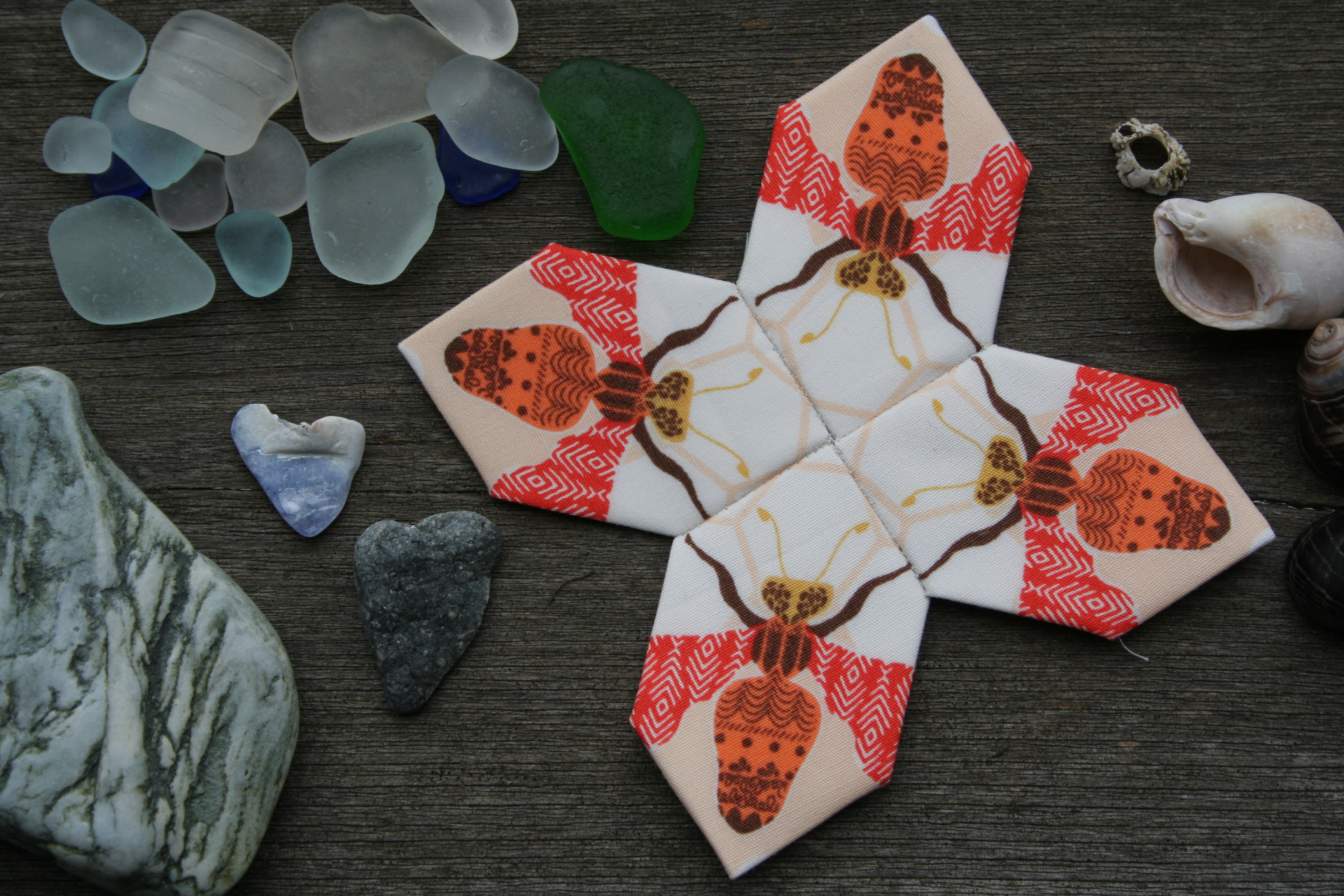
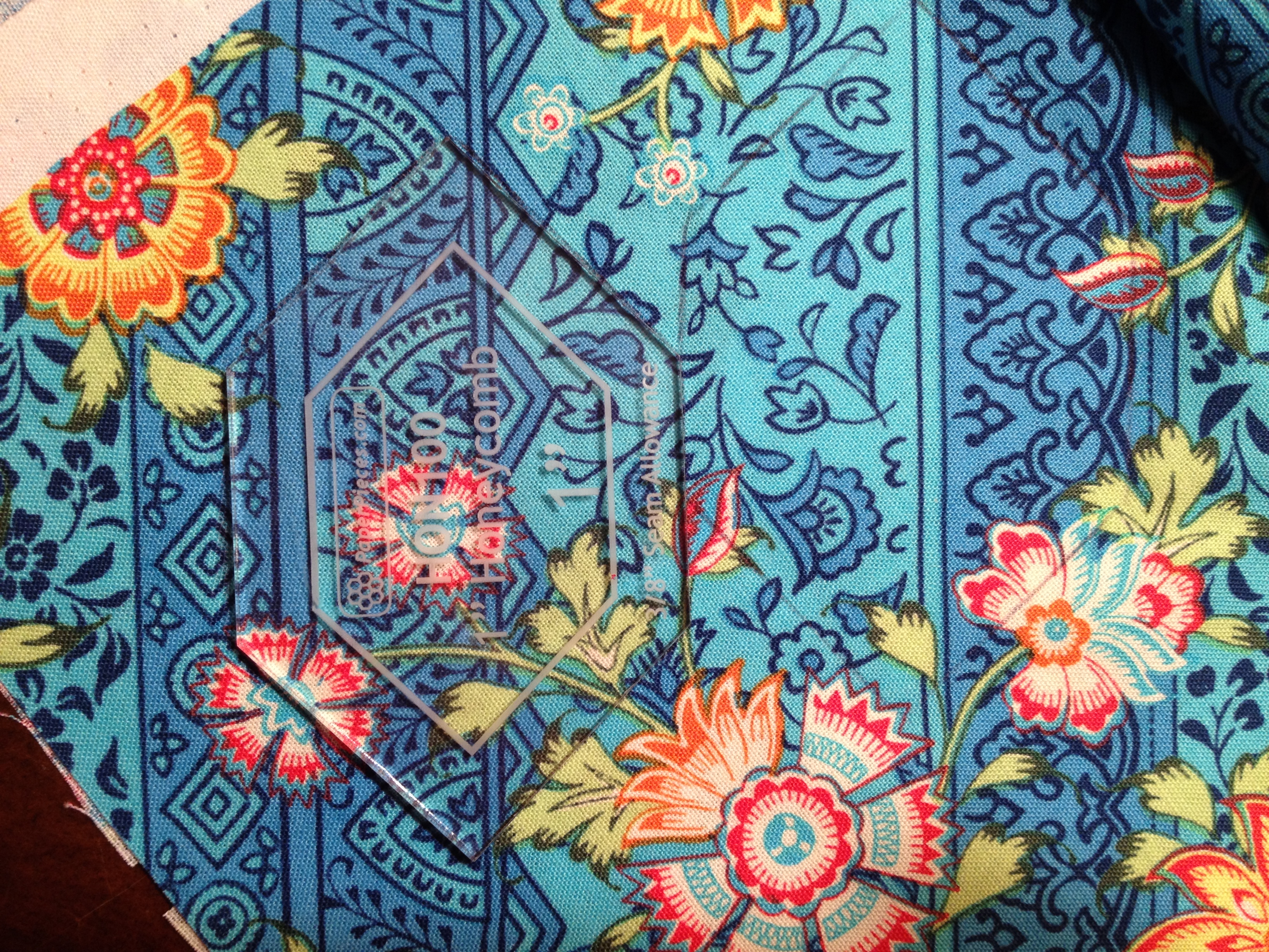
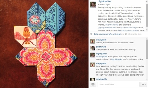
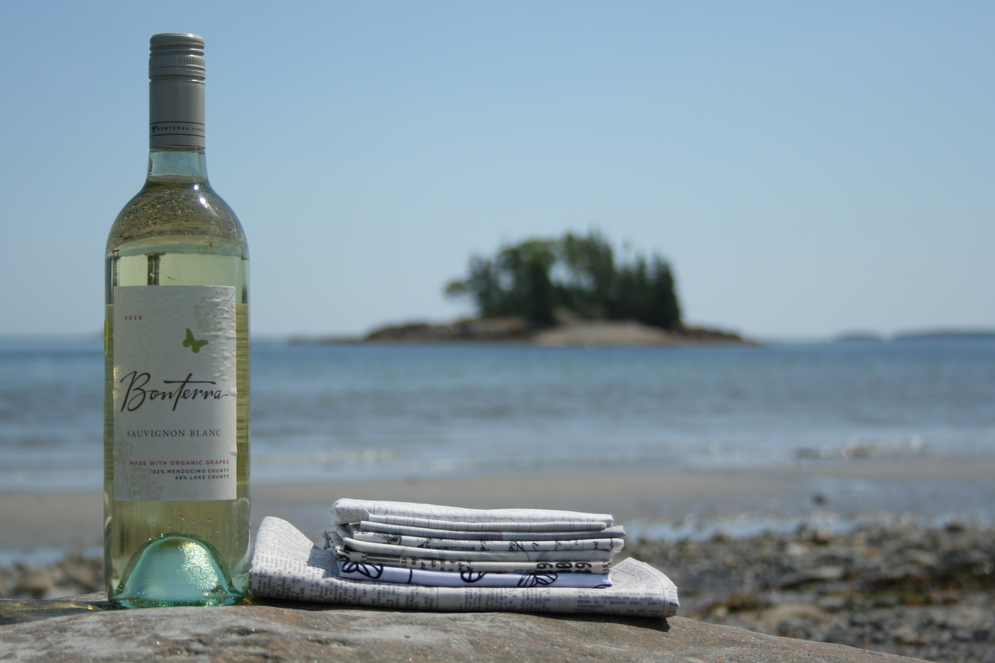
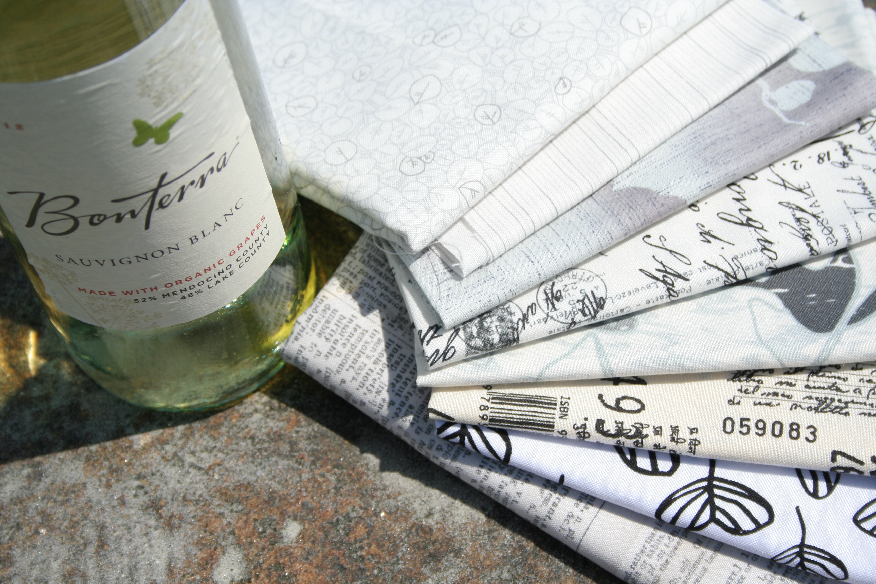
I’ve also been making some (secret) progress on my July Supernova Swap blocks, but can’t show you any more than this tiny peek:

supernova swap block peek
Sneak peek at my July Supernova Swap blocks.

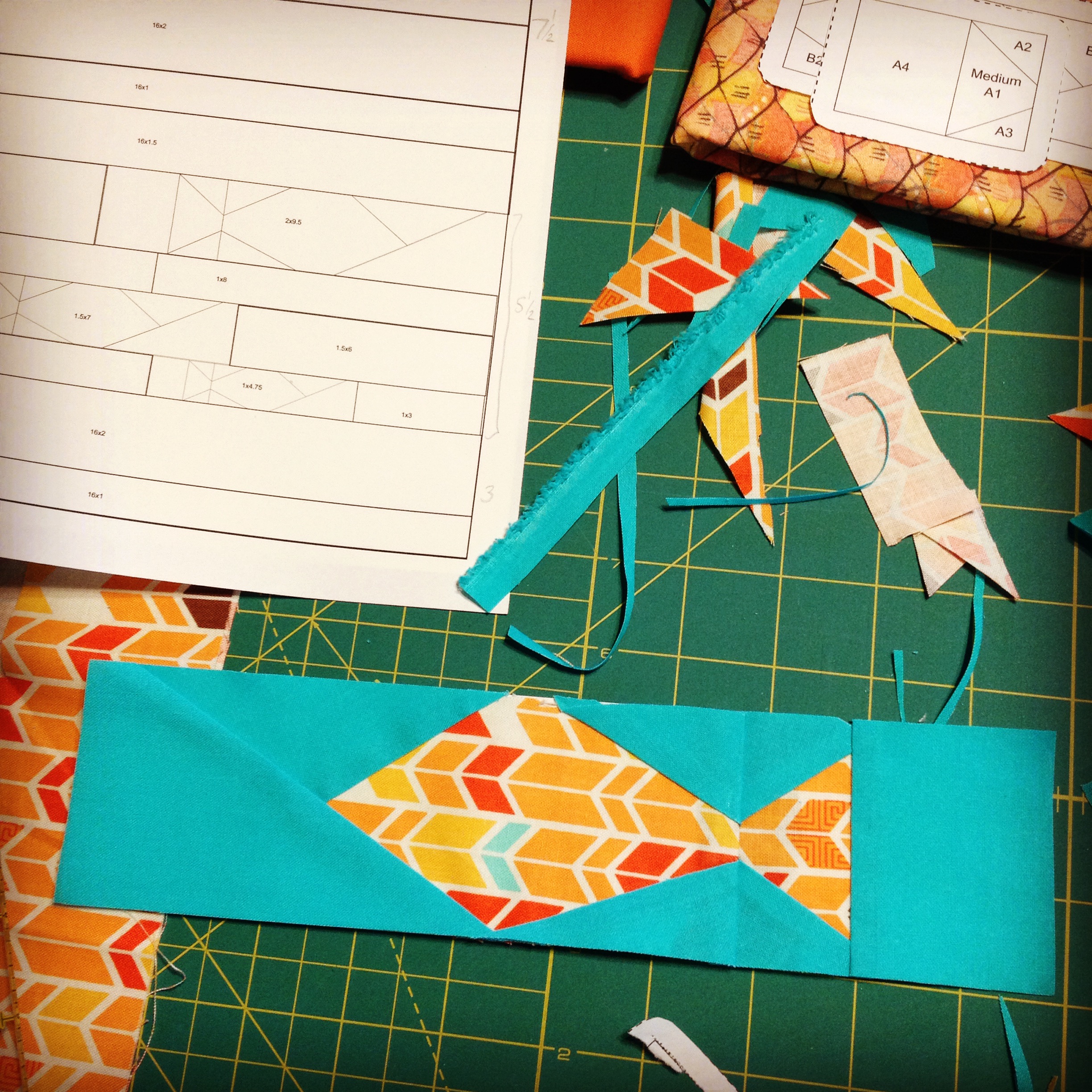
In my pattern design world, I’ve finished the sketch out phase of a new pattern, completed the fabric pull for the testing phase, and then realized I forgot to make the paper piecing pattern a mirror image before printing. Oops!

Fabric pull for testing out my new paper pieced pillow pattern.
paper piecing pattern test fish
My IG post when I realized I had forgotten to mirror-image my pattern before testing. Fishie swimming against the current… oops!

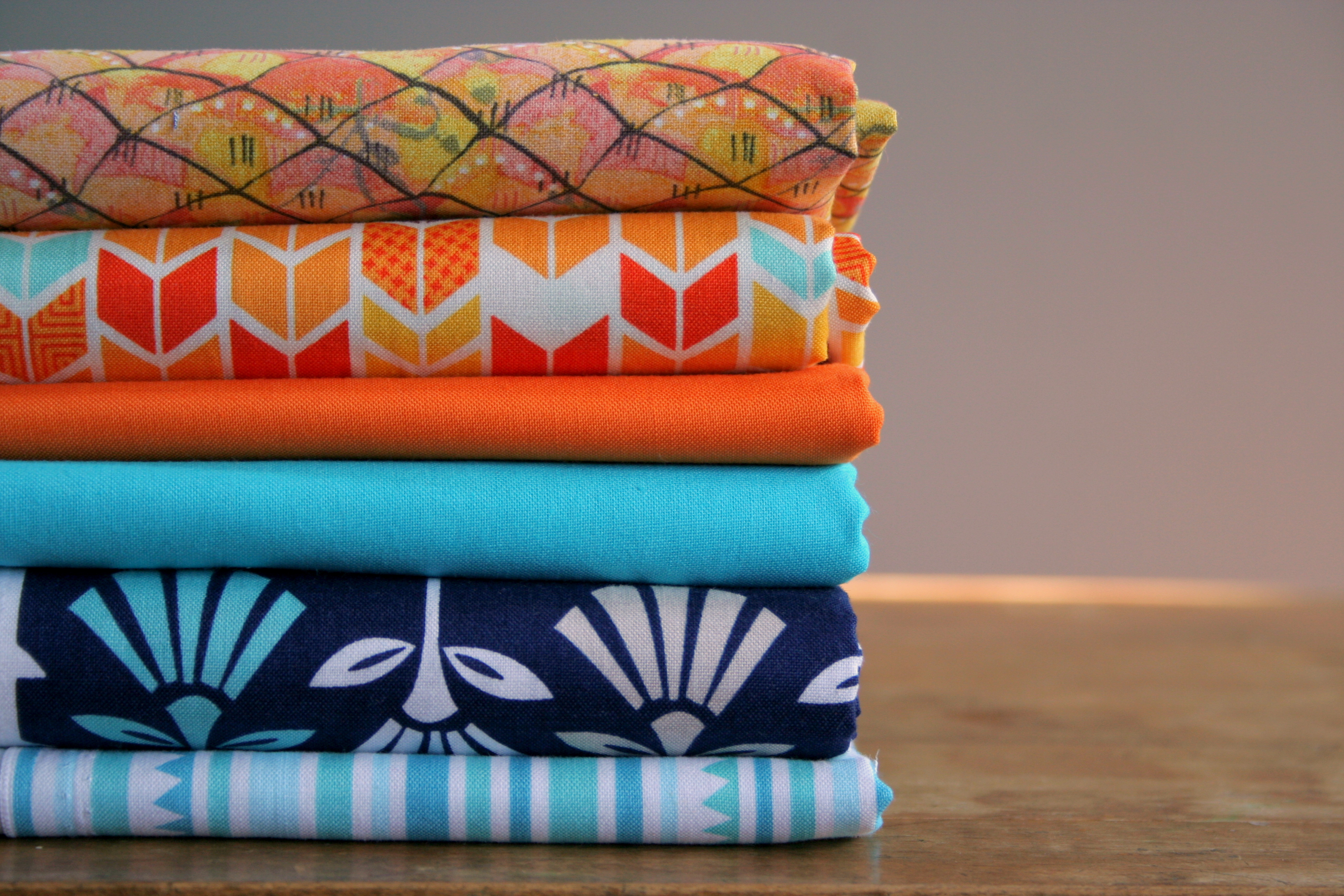
As is my nature, I am working on quite a few projects in addition to these, including my first foray into English Paper Piecing (to be a table runner one day), a couple other paper piecing patterns in the early design phases, the very first quilt I’m making for myself, and about five+ projects that I’m itching to begin but haven’t truly started yet.

How does my work differ from others in its genre?

This is such a tricky questions, since no two quilts or quilters are the same. How do you define a quilt’s genre? There is so much debate about what makes a modern quilt, and honestly I’d rather be sewing than debating whether I’m sewing a modern quilt or not! I’m not sure I’ve decided on my quilting style just yet, and perhaps I never will. I definitely am drawn to more “modern” quilt designs, and I LOVE modern fabric. I still feel like a lot of my work embraces the traditional, and my paper piecing patterns are inspired by nature and my love of aesthetic flow. It reminds me of what my brother said about me in high school: You’re a jock, nerd, geek who listens to punk music and wears preppy clothes. Basically, I’m me. And my quilts are mine.

Recent quilty works, from top left to right: 1. Lupine paper piecing pattern, 2. Buoys 1 & 2 paper piecing patterns, 3. Circling gulls paper piecing pattern, 4 (bottom left). Lucy Boston Patchwork of the Crosses, 5. My first quilt made for myself... still in progress!
Recent quilty works, from top left to right: 1. Lupine paper piecing pattern, 2. Buoys 1 & 2 paper piecing patterns, 3. Circling gulls paper piecing pattern, 4 (bottom left). Lucy Boston Patchwork of the Crosses, 5. My first quilt made for myself… still in progress!

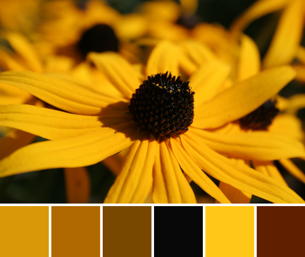
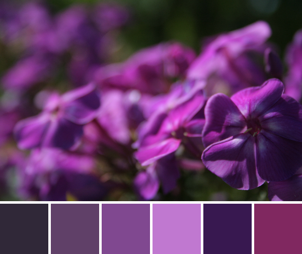
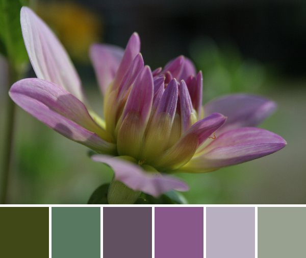
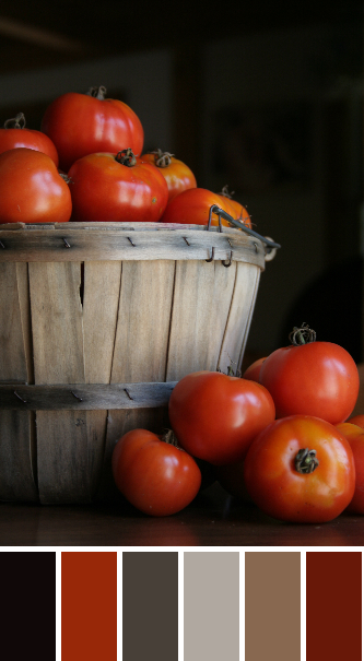
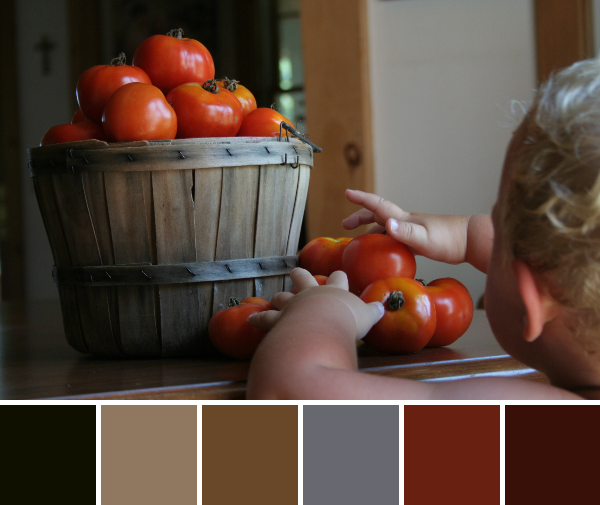
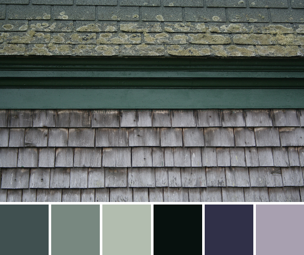
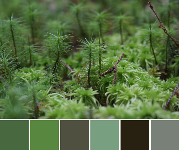
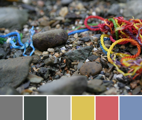
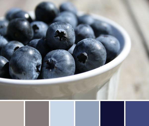
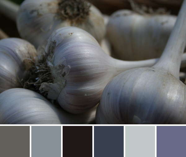
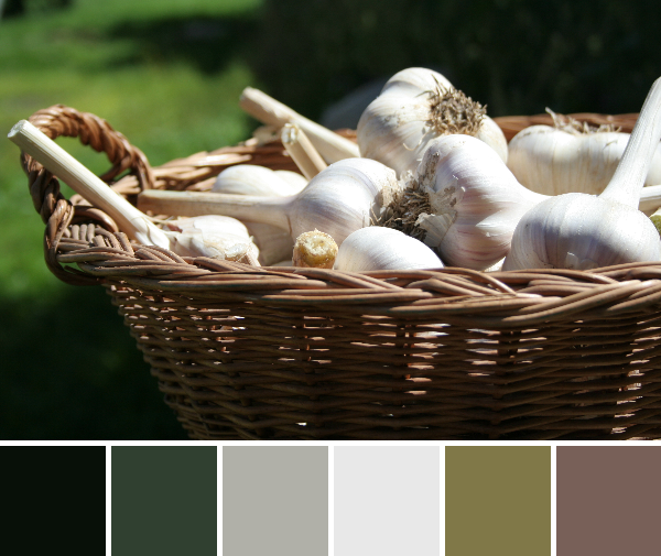
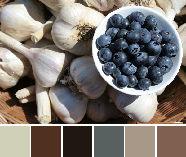
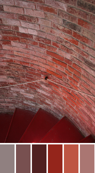
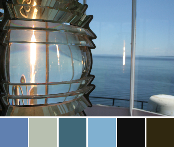
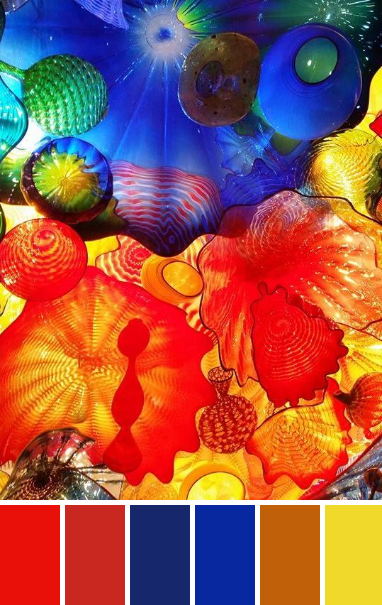
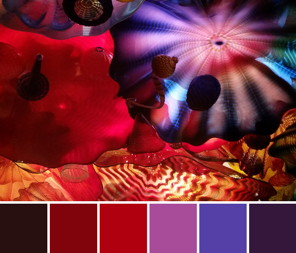
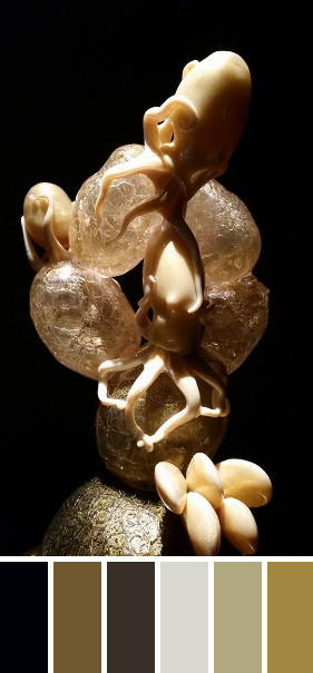
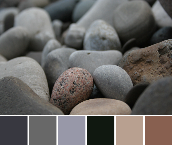
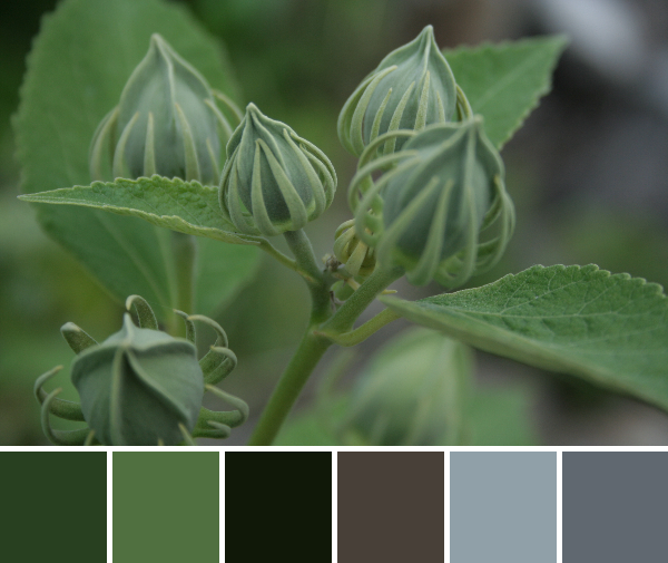
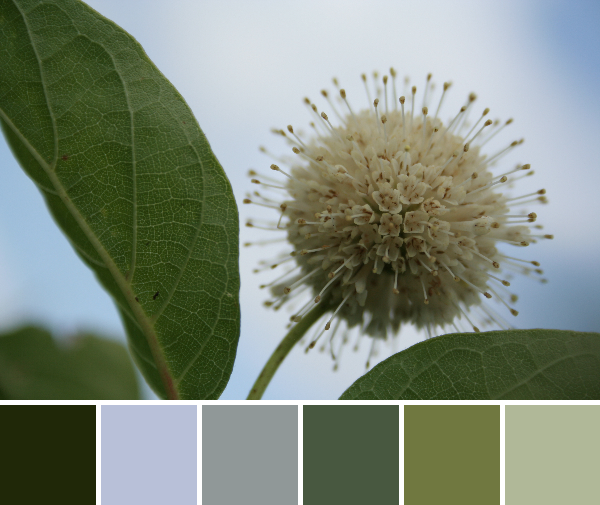
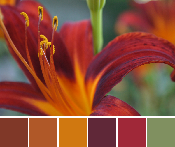
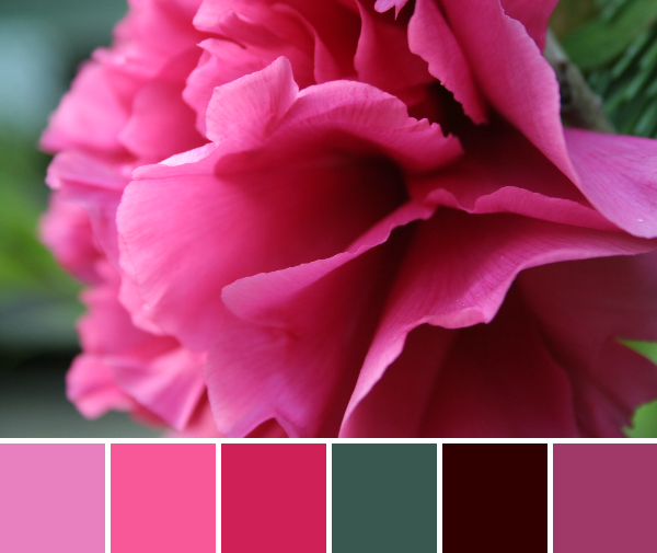
As for my blogging, my love of nature and photography can been seen weekly with my Color Inspiration Thursday posts, where I create a color palette from some of my photographs. Nature geek photographer, meet quilting.

bright pink peony color palette
An example color palette from my weekly Color Inspiration Thursday posts.

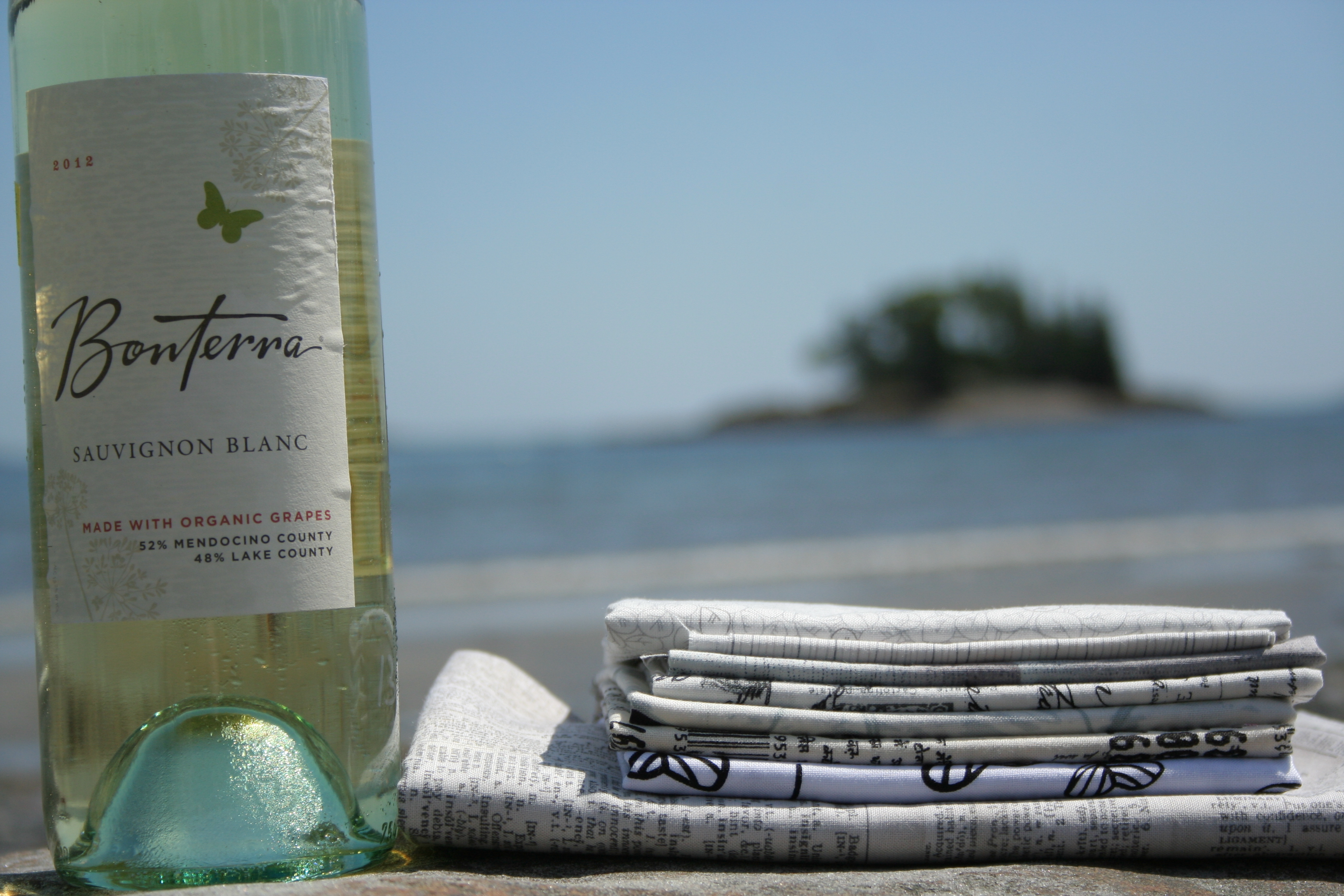
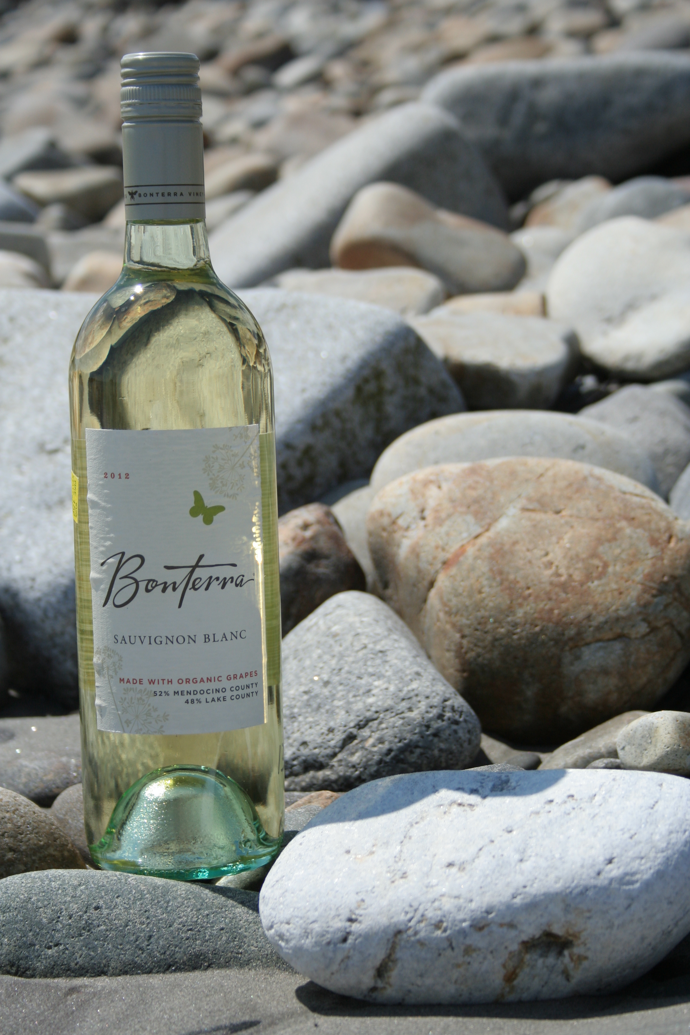
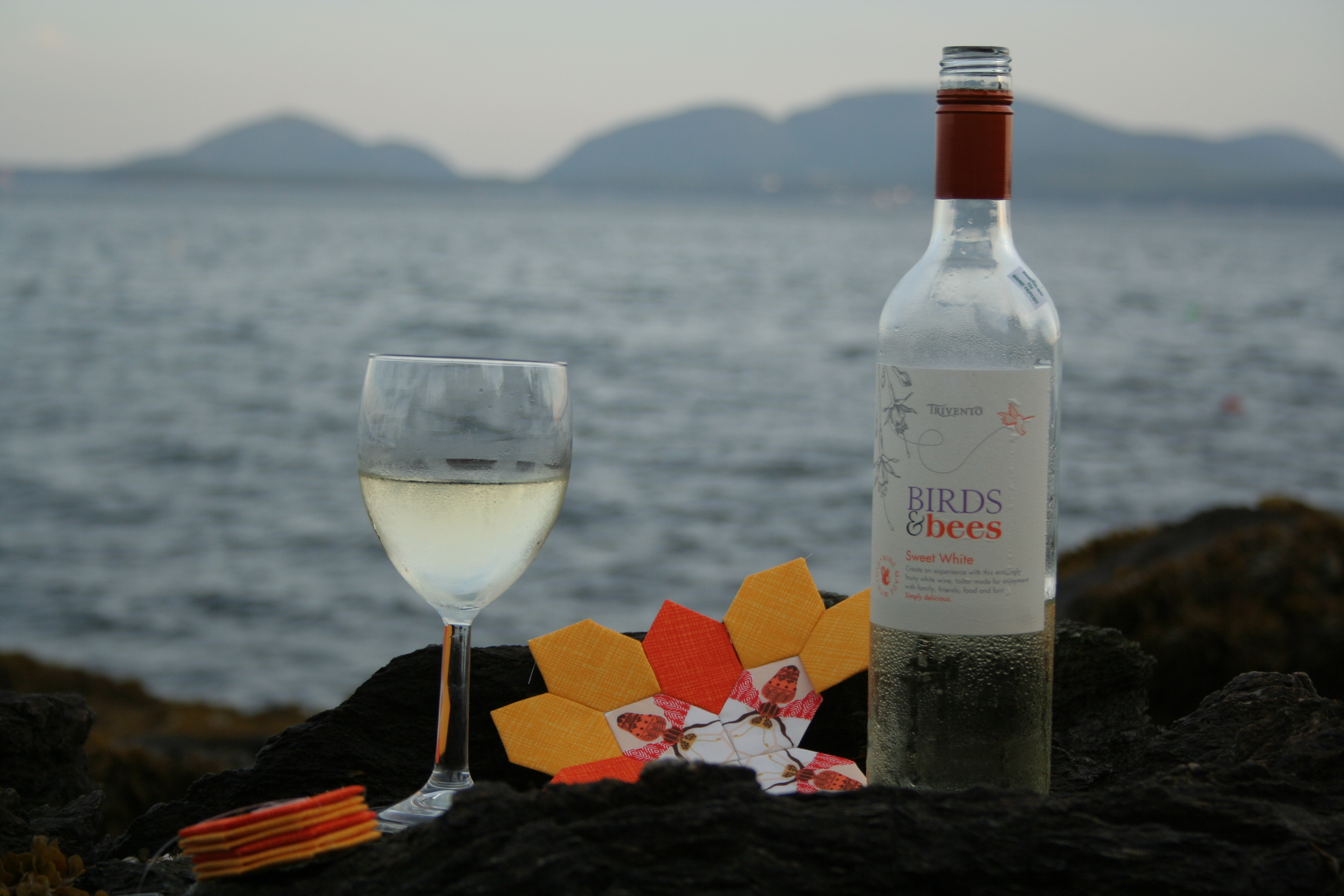
I’ve also started having fun blogging about my forays into pairing wine and fabric. You know you want to check out those posts! There are many more to come, don’t you worry.

pairing wine and fabric
Find the perfect fabric for this wine? Don’t mind if I do…


Why do I write/create what I do?

My Let’s Get Acquainted blog post from a few months ago answers this question fairly well. The bottom line is that I’m a stay at home mom of a two year old and a four year old, and I’ve discovered that I must create something each day in order to stay sane (at least somewhat sane). Taking time to sew and blogging about it forces me to take a little bit of time for myself, even if it’s only 20 minutes a day. Thank you, blogosphere, for holding me accountable for doing something for me: quilting.

How does my writing/creative process work?

I have a rapid fire mind that is constantly thinking of new ideas of fun projects, things to make, patterns to design, etc. I’ve always been a creative person, and quilting is just one more outlet for that creativity. As far as pattern design, I start off with inspiration, which can come from literally anywhere–a pattern on a building, a sight along a walk, a burst of color–, it becomes an idea in my head, then I sketch it out in my grid notebook, tweak it a bit until I’m satisfied with it, scan it, pull it up in Inkscape, and turn it into a pattern. I usually have fabric already in mind in that original vision, so that part’s all taken care of from the get-go, too (for better or for worse, as you’ll see below).

Inspiration for my buoy 1, 2 & 3 patterns.

As for making quilts, I’m very drawn to the aesthetic flow of a quilt, especially relating to color. Usually it’s a color combination or flow that draws me to a pattern, and then I go from there. I’m really bad at following patterns to their fruition, and usually just use them as a jumping-off place. Choosing fabrics for a project is the hardest part for me, I think in part due to the fact that I typically already have the “perfect” fabric in mind before heading to the quilt shop. Maybe I need to just design fabric, too?

Now that you’ve visited my design space in rural Maine, I’m tagging these three awesome bloggers. Go check them out!

Laura from Adventures of a Quilting Diva: Laura is my partner for the Supernova Friendship Block Swap, and a fellow paper piecing and quilt pattern designer. She’s also the mastermind behind the #quiltspiration365 group of bloggers with a mission to provide inspiration every day of the year.

Anne from Play Crafts: I use Anne’s Palette Builder 2.1 every single week to create my Color Inspiration Thursday posts. She’s a computer programmer AND a quilt designer, and creates some awesomely beautiful stuff. Anne is one of my quilting superstars, who I’ve been following from my very first foray into quilty blogging.

Yanic from Family, Faith, Food, and Fabric: While not a strictly quilting blog, Yanic blogs from the heart about many things I relate to and enjoy reading about. Her blog name sums it up well.

To check out more of the stops in this wild, world-wide blog hop, here’s an easy link to a google search for posts: Around the World Blog Hop blog posts. Enjoy hopping!


Color Inspiration Thursday {17}

This week’s color inspiration brings us back to the garden and the late summer blooms that abound. There always seems to be something flowering in our garden, and even with the harvest of fruits and veggies swelling, now is no exception. Color palettes are created using Play Crafts’ Palette Builder 2.1 and my own photographs, taken today.

sunny yellow color palette

Corresponding Kona cottons from left to right:
Sunny, Yarrow, Gold, Black, Corn Yellow, Paprika

I don’t think I’ll ever tire of these beauties. Bright golden yellow black-eyed susans are scattered throughout our garden and fields and seem to flower for much of the summer. While I can’t see myself making a quilt that’s entirely yellow, it’s an awfully cheerful color palette.

magenta purple color palette

Corresponding Kona cottons from left to right:
Charcoal, Purple, Magenta, Violet, Dark Violet, Cerise

This palette features my favorite seasonal colors: radiant orchid and magenta. I love the range of purples in this palette and can definitely see it making its way into a quilt of the future!

dahlia color palette with inch worm

Corresponding Kona cottons from left to right:
Palm, Laurel, Coal, Crocus, Iron, Raffia

This year I’m thrilled that I got my dahlias into the ground in time for flowers. The gorgeous blooms have been brightening our kitchen table for the past week or so, and they just keep coming. These colors are stunning together, but my favorite part about this photo is the inch worm explorer; do you see him?

Quiltspiration 365

For those of you who are looking for quilty inspiration for every day of the year, I’ve teamed up with a group of quilting bloggers to provide exactly that. Search for tag #quiltspiration365 on Twitter, Instagram, and Facebook to see new inspiration each day, or visit these Quiltspiration bloggers:


Color Inspiration Thursday {16}

Welcome to Color Inspiration Thursday. It’s a two-posts-in-one-day kind of day here, so I will keep this one aesthetic. Color palettes are made using Play Crafts’ Palette Builder 2.1 and my photographs. Your inspiration this week comes from two very different locales. The first photos are from more of my garden harvest. We have had tomatoes galore, which means fresh tomato on everything, salsa, salsa, more salsa, and tomato sauce!

tomato color palette

  Corresponding Kona cottons from left to right:
Black, Poppy, Chocolate, Smoke, Taupe, Paprika

Add a helpful two-year old and your palette changes a bit:

tomatoes and a helper color palette

 Corresponding Kona cottons from left to right:
Black, Taupe, Earth, Coal, Paprika, Mahogany

 The next photos are from Holbrook Island, off the coast of Maine.

earthy palette

 Corresponding Kona cottons from left to right:
Coal, Steel, Ash, Black, Windsor, Pewter

Sometimes simple, “plain” things are beautiful. I found this roof-to-wall transition quite aesthetically pleasing, and I love the combination of violets and seafoam greens that result. The seafoam green is a bit lost in the Kona matches, but I might tweak my fabric choices if using this palette in the future so that the green is more prominent.

lichen moss color palette

 Corresponding Kona cottons from left to right:
Basil, Grass Green, Moss, Spring, Espresso, Steel

With beautiful beaches on the outskirts, deep dark pine forest on the inside, Holbrook Island Sanctuary State Park is a gorgeous place to explore. The forest floor was covered with moss and lichens, which created another little world best seen from an inch or two away while laying on your belly.

rainbow thread on rocky beach color palette

 Corresponding Kona cottons from left to right:
Steel, Charcoal, Ash, Buttercup, Deep Rose, Denim

These rainbow strings were washed up on the rocky beach, which adds a fun pop of color to an otherwise stony palette. I kind of love this one!

Which palette is your favorite this week?


Blue Hill Fair Quilt Submission

Yesterday I dropped two small, machine quilted wall-hangings at the Blue Hill Fair in Blue Hill, Maine. This is my first time ever showing anything at a fair, and will be the first public display of my quilts. I’m excited and nervous all at once!

blue hill fair maine

Entering my quilts in the fair was surprisingly simple. The website simply said to bring the quilts to the fairgrounds on the Tuesday or Wednesday prior to the fair. I sought out a woman from my church who is very well versed in the local quilt scene and active in the local quilt guild last Sunday, and confirmed the simplicity in entering quilts in the fair. I was worried about getting the quilts ready to hang or display and she gave me a priceless tip: they don’t need to have a hanging sleeve or dowel since they will typically display quilts with clips. That saved me a good hour of hand-stitching!

It took only about five minutes to hand my quilts over and give them the necessary information. It almost seemed too easy, but I suppose when they have hundreds of people entering all sorts of handcrafted everything, efficiency is key.

blue hill fair tagsI went with my mother-in-law and aunt, since 1) they had been to the fair before and knew generally where the quilt display building was, and 2) it was about 45 minutes away so we decided to make a day of it with the kids at the local park and beach. After submitting my quilts, we headed to Blue Hill Park for a picnic, and then the kids played on the playground while I got some rare mommy time. I sat in the shade and worked on the knitted Katniss cowl I’m making in exchange for a logo design, enjoying the cool breeze and the gorgeous view of the harbor.

knitting

Katniss cowl progress

My gorgeous view of Blue Hill Harbor.
Swimming in the harbor at Blue Hill Park.

This morning I read a post by Yvonne from Quilting Jetgirl about her experience entering quilts in her local fair, and now I’m even more excited. I didn’t realize that judges actually filled out a score card and left comments about your entered quilts. The Blue Hill Fair begins this evening and runs through Monday, September 1st, and I think my family will be going this evening. I will be sure to take photos of my quilts on display, and I’m eager to see the other quilts, too!

As for what quilts I entered, you will just have to wait and see, since I didn’t get good photographs before drop-off.


Color Inspiration Thursday {15}

As summer drags to its end, harvest time picks up speed. We’ve been picking veggies galore from our garden over the past weeks, and preserving as much and as fast as we can. Our garlic and blueberries have done especially well this year, and are slowly filling our pantry and freezer. We’ve made a batch of salsa from garden tomatoes, peppers, onions, garlic, and cilantro, and I’m hoping to make pickles soon since our pickling cucumbers are multiplying quickly. Green beans and kale have been (or will be soon, in the case of kale) blanched and frozen, and we’ve eaten garden broccoli a few times already. I love this time of year.

This week your color inspiration comes from some of my garden harvest photos made into color palettes with Play Crafts’ Palette Builder 2.1. May you be inspired to quilt, create, and grow healthy goodness in your own backyards!blueberries color palette

 Corresponding Kona cottons from left to right:
Ash, Steel, Baby Blue, Dresden Blue, Regal, Regatta

I love this palette, but I’m already a huge fan of blue. The grays paired with the range of beautiful blues makes this a palette that is sure to be seen in a project of mine someday in the future.


garlic color palette

  Corresponding Kona cottons from left to right:
Mushroom, Steel, Black, Charcoal, Shadow, Slate


garlic color palette

  Corresponding Kona cottons from left to right:
Black, Evergreen, Ash, Silver, Ivy, Mushroom


garlic and blueberries harvest color palette

 Corresponding Kona cottons from left to right:
Parchment, Mocha, Espresso, Coal, Stone, Taupe

Earthy palettes galore today. Kona earthy neutrals have really been prominent in my garden photos, and I love it! I’m all about a bright rainbow quilt any day, but there is something sophisticated and soothing about an earth-tone quilt with just a tad of natural color.

Have you made an earth-toned quilt? Do they make you as happy as brightly colored quilts?

Who Are You Calling “Fussy”?!

Sometimes there’s a saying that is so commonly used that you don’t even think twice about it. Last month, while on vacation with my family, my brother Steven commented on how cool my specifically planned cutting looked in my English paper piecing project. I told him how in the quilting world it’s called “fussy cutting”, and how much fun I was having with this, my first foray into it. He looked at me with an almost offended air, repeating with disdain, “fussy cutting”?!

english paper piecing at the ocean
Fussy cutting in practice for my Lucy Boston Patchwork of the Crosses center.

Steven is an artist who lives in San Francisco among many other artists of various trades. Perhaps this is why he was so taken aback by the terminology paired with quilters’ practice of selectively cutting a fabric based upon a particular element or design. He reasoned, “You wouldn’t call Michelangelo a “fussy” painter. You might call him meticulous, or careful, but never fussy.”  He has a point.

Dictionary.com offers this definition for the word fussy:

fussy

[fuhs-ee]

adjective, fussier, fussiest.

1. excessively busy with trifles; anxious or particular about petty details.
2. hard to satisfy or please:
a fussy eater.
3. (of clothes, decoration, etc.) elaborately made, trimmed, or decorated:
All the bric-a-brac gave the room a fussy, cluttered look.
4. full of details, especially in excess:
His writing is so fussy I lose the thread of the story.”

It’s true; the definition of the word fussy holds a decidedly negative air. “Petty details”?  “…a fussy, cluttered look.” Losing the thread of the story because of the fussy writing. None of these definitions or examples are very flattering. Personally, I think that fussy cutting in quilting is a skill and style that deserves a more complimentary, positive name. Then again, it’s just a word, right?
Choosing a design to selectively cut. From @nightquilter on Instagram

This conversation got me thinking: who coined the term “fussy cutting” and when did it start getting popular? I wonder if it was a saying created by the quilters, or by those seeing the completed work. A bit of googling uncovered the fact that the first evidence of selectively cutting motifs from fabric was the development of Broderie Perse in England in the 1700’s (from answers.com, so take it for what it is). The article goes on to explain that “…this technique was used by women of wealth, who had the leisure time to devote to this style of applique. Their goal was to make a “best” quilt that would be shown off to friends or used on special occasions.” In other words, it was women of wealth who could afford the time and fabric to select only very specific features to make a “best” quilt, leaving the fussy cut refuse to waste or other small, non-functional projects. Was the term “fussing cutting” created by those of lesser social status out of semi-contempt of those who could afford such fabric waste and leisure?

In searching more, in an interview with Eleanor Burns conducted in 1999, she casually mentions that she and her sister may have coined the term “fussy cutting”. Here’s an excerpt of the interview:

Brenda Horton (BH): Now you called your sister the fussy one but you “fussy cut” sometimes on your patterns, is that where you got the term?

Eleanor Burns (EB): Yes, she told me “fussy cut.” What’s really interesting, we may have coined the word “fussy-cut” but now it’s a standard in the industry. And that’s really fun to see something you started as just common terminology.

MF: Explain to us what “fussy-cut” is.

EB: Fussy-cut means you would have a large floral design with a lot of flowers. You might just specially cut out one flower and use that one flower repeat throughout your quilt, so it’s just specially cut out of the fabric to use in a certain piece. It puts together a really pretty design– fussy.

It doesn’t sound very disparaging, although between sisters, perhaps there is a bit of a teasing tone? What do you think?

Assiduous cutting with Amy Butler's Lark fabric.
Assiduous cutting with Amy Butler’s Lark fabric.

For me, I can no longer say “fussy cutting” without thinking of my conversation with my brother. Here’s my IG post from the night of the conversation:

fussing cutting IG postI wrote: Testing out my fussy cutting choices for my next #patchworkofthecrosses. Talking with my artist brother, we decided that “fussy cutting” is quite pejorative. So now, it will be punctilious, meticulous, assiduous, deliberate… but never “fussy”. Who’s with me!? #assiduouscutting not #fussycutting 🙂 Thanks, @vanfremdling and thanks to@goinghometoroost and @amybutlerdesign for the fantastic fabric for my @kickassiduouscutting !! #epp

I’m sure that “fussy cutting” will still be part of my quilting lingo, since when in Rome! However, I will also be using “assiduous cutting”, “meticulous cutting”, and “punctilious cutting” interchangeably. Personally, I lean toward “assiduous cutting” since then I can say I’m doing some “kick-ass-iduous cutting” tonight!

What do you think? Do you think “fussy cutting” has a derogatory inclination? If you are a quilt historian and have any more information regarding the origination of the term “fussy cutting”, I’d love to know!

Until then, have fun with your punctilious, meticulous, assiduous, deliberate, and okay… sometimes fussy… cutting. I know I will!


Color Inspiration Thursday {14}

Color is everywhere. Sometimes, the coordination of complementary colors is what attracts your interest; sometimes the play of very different or unexpected colors stands out; and sometimes the complete saturation of one color is striking enough to draw your eye. This week’s color inspiration palettes come from color-rich scenes from a fairly common structure: a lighthouse. As always, my photographs are created into palettes using Play Crafts’ Palette Builder 2.1.

red brick lighthouse stairs color palette

Corresponding Kona cottons from left to right:
Pewter, Earth, Cocoa, Poppy, Sienna, Taupe

Last weekend, my family and I took a lovely day trip to Owls Head, Maine, and began our day with a visit to the Owls Head Lighthouse. When entering the lighthouse, the red stairs circling up the red brick interior struck me as very beautiful. Having my camera ever at the ready, I took a few photos, carefully keeping the sunspots out of the frame. Subtle, earthy reds.

owls head lighthouse light color palette

Corresponding Kona cottons from left to right:
Delft, Ash, Everglade, Dresden Blue, Black, Chestnut

Once at the top, I was greeted with another beautiful sight. The bright blue sky and blue ocean, reflected through and by the lighthouse light made a peacefully blue-heavy scene. Ideally I would have loved to wait until some tall, gorgeous sailing ship was in the background, but there’s only so much one can do when two little kids are waiting. Beautiful lighthouse blues.

Do you prefer palettes created primarily from a single color, or those featuring multiple colors?

Search facebook, instagram & twitter for #quiltspiration365 for a quilting inspiration for every day of the year (more on this soon!)

A Perfect Pair: Wine and Fabric {Blanc & Low Volume}

Last month I had a revelation during some early evening vacation hand-stitching: wine and fabric go splendidly together. My first serendipitous pairing of wine and fabric has resulted in a habit of maybe choosing wine based upon its fabric-pair-ability, and in seeing various types of wine and fabric mates all over the place.

While my first wine and fabric duo were quite specific, pairing the specific wine with a single fabric line, this match is a bit more general: Sauvignon Blanc pairs wonderfully with low volume & mostly-white fabrics. This is good news for all of us! The next time you’re working on a project involving low volume prints, you know a Sauvignon Blanc will be just the varietal for you (especially on these hot summer nights)!pairing wine and fabric low volumes

Bonterra has been producing wine from 100% organic grapes since 1993, and they passionately believe that organic grapes make better wine. Since I already opt for as much organic food as I can, and after trying their Sauvignon Blanc, I can’t disagree.

bonterra sauvignon blancWhat is wine? Some might say it’s a fine beverage meant for a glass. We won’t argue with that. But we at Bonterra believe that a wine should also be a perfect expression of the grape from which it’s made and the land on which those grapes are grown. (from Bonterra’s website)

Yes! I would add that wine should also be paired with a fabric that is a perfect expression of the varietal or flavor. I have decided to step up to that task. I grabbed a stack of some of my favorite low volume, mostly white fabrics, and a bottle of Bonterra Sauvignon Blanc and headed to Crescent Beach in Owls Head, Maine for a photo shoot. Crescent Beach has gorgeous fine white sand that sparkles in the sunlight, a rarity in Maine where rocky coasts are the norm. The stones that meet high tide are smooth, round, and often white, so I knew this was the perfect location for the blanc-low volume shoot.

wine and fabric pairing sauvignon blanc and low volumes

wine and fabric pairing sauvignon blanc and low volumes

wine and fabric pairing sauvignon blanc and low volumes

The perfect pair:

Fabric
Any low volume or primarily white fabrics.
My stash grab includes:

      Collection/Designer/Manufacturer

  • Botanics/Carolyn Friedlander/Robert Kaufman Fabrics
  • Some unknown sketchy cloud print
  • April in Paris-French Themed, Script Noir//Timeless Treasures
  • Koyoto Garden/Lori Mason/Andover Fabrics
  • Comma/Zen Chic/Moda Fabrics
  • Sylvia/Lotta Jansdotter/Winham Fabrics
  • Eclectic Elements/Jim Holtz/Coats

Wine
Varietal: Sauvignon Blanc
Producer: Bonterra
Vintage: 2013

Description of wine from the label: Intense aromas of grapefruit, citrus, kiwi and fresh cut grass greet the nose. As you drink, the crisp acidity gives the wine a fresh vibrant feel with flavors of grapefruit, lime zest and grass that closes with favors of melon and a nice tart finish.

A perfect pair, indeed.


Color Inspiration Thursday {13}

Sometimes you see a burst of color so amazing, you just can’t let it go. That happened to me yesterday, when my cousin Kayley posted these amazing photos of glass sculptures created by Dale Chihuly, seen at Chihuly Garden and Glass in Seattle, Washington. Kayley is visiting our aunt in Seattle, and her photos are just amazing! They are taken with her camera phone, but the back-lit glass sculptures look so vibrant that I feel like I could reach out and touch them. Most of the photos are detail shots taken of a suspended 1,400-piece, 100-foot-long sculpture.

Part of Dale Chihuly's suspended 1,400-piece, 100-foot-long sculpture in the Chihuly Garden and Glass in Seattle, Washington.
Part of Dale Chihuly’s suspended 1,400-piece, 100-foot-long sculpture in the Chihuly Garden and Glass in Seattle, Washington.

I think you will agree that these photos just begged to be turned into quilt-inspiration color palettes!

These beautiful palettes are created with Play Crafts’ Palette Builder 2.1 and photographs taken by my talented cousin Kayley Gallagher.

rainbow blown glass palette

   Corresponding Kona cottons from left to right:
Tangerine, Lipstick, Ocean, Royal, Cedar, Citrus

I absolutely love this color palette! Consisting almost entirely of primary colors, it is bright and cheerful. I think it would make a great kids’ quilt.

glass art color paletteCorresponding Kona cottons from left to right:
Mahogany, Poppy, Lipstick, Plum, Surf, Hibiscus

This palette makes me think of the purple hat ladies. Purple hat ladies make me think of fun-loving, bold and beautiful women who do what they want without concerning themselves with what others may think.  Can you tell that I hope to join their ranks someday? What fun! Passionate reds and purples, with a bit of rich mahogany make this another vibrant palette.

Neutrals color palette

Corresponding Kona cottons from left to right:
Black, Sable, Cappuccino, Shadow, Parsley, Honey

This palette isn’t colorful, but sometimes we need to focus on neutrals. This earthy palette has a good balance of neutrals and achromatic colors and would make a lovely subtle quilt or foundation for a quilt with a splash of additional color (maybe a bright Leprechaun green to pull from that subtle kona Parsley?) Plus, what an amazing glass squid sculpture!

rainbow color palette glass art

Corresponding Kona cottons from left to right:
Slate, Lime, Wheat, Lipstick, Rose, Corn Yellow

I’ll leave you with one more rainbow color palette to cap off this week. This photo features all the colors of the rainbow, which is well represented in the resulting palette. I don’t know about you, but I’m on a definite rainbow gradient quilting kick lately. You can’t go wrong with rainbow!

Special thanks to Kayley this week for letting me use her photographs to help inspire more colorful creative works of art. Enjoy!

Color Inspiration Thursday {12}

One of my favorite parts about traveling is the variety of new sights that you get to see. I like to look at things from an up-close-and-personal perspective, especially when it comes to nature. With my background in environmental science and ecology, I like to think that I see differences and similarities in landscape and vegetation that a normal passerby may not notice. Nature is endlessly beautiful, and when seen from an intimate distance, that beauty is intensified greatly. Here are some bits of beauty as seen in my travels over the past week.

These color palettes are created using Play Crafts’ Palette Builder 2.1 and my photographs.

lake erie stone color palette

 Corresponding Kona cottons from left to right:
Charcoal, Coal, Pewter, Black, Stone, Taupe

The beach on Lake Erie is a nice balance of fine sand and smooth rocks of varying sizes. I’ve become accustomed to the rocky Maine coast, and the beaches here in Ohio are a gentle respite from those footwear-requiring, albeit beautiful, beaches. Varied rock types, including many conglomerates and fossils can be found along the beaches, which add to the aesthetic.

green color palette

 Corresponding Kona cottons from left to right:
Palm, Laurel, Black, Chocolate, Shale, Coal

These green buds were too awesome to pass by. It’s another earthy, dark palette, but the balance of green and shady grey-blues with the dark black/brown are a beautiful embodiment of green goodness.

buttonbush color palette

 Corresponding Kona cottons from left to right:
Evergreen, Fog, Shale, Palm, Ivy, Parsley

Buttonbush is a wetland shrub typically found in standing water. When I was a wetland scientist doing delineations, we LOVED finding buttonbush since it is an obligatory wetland plant and therefore a clear indicator of the wetland area, not to mention its gorgeous and whimsical flower. This palette is included more for the novelty of the plant than the colors, but it’s another lighter variation on the green and blue nature palette.

tiger lily palette red and orange

 Corresponding Kona cottons from left to right:
Spice, Gold, Amber, Garnet, Rich Red, Peridot

I wouldn’t leave you without at least one big burst of color! This tiger lily from my mom’s garden just burns with vibrancy!  While tiger lilies bloom in the height of summer, I can’t help but feel a bit of autumn in this palette. I’m a summer lover, though, so I am NOT hurrying autumn along by any stretch. I just need to make that clear. I’ll take summer for as long as I can have it!

Enjoy! I’d love to see what you create with these palettes.