

I’ve long been a fan of the Summer Sampler Sew Along put together by Lee Heinrich, Katie Blakesley, and Faith Jones each summer, so when Katie asked me if I would be a “guest expert” for her 2022 Summer Quilt Along, I couldn’t say no. Plus, what a great spark to get me writing here again!
I used my Summer Sampler 2019 quilt top as my example quilt for this post, which I assembled in my own alternate layout to create space for me to participate in the fun of the sew along without the stress of “keeping up” and making every block. You can see (or buy) this year’s sampler here. If you’re participating in this year’s Sew Along, you might be at the point where you are almost ready to photograph your finished quilt top!! If you’re not there yet, no worries–these tips are timeless. Just bookmark this post, and come back when you’re ready.
I could easily talk for weeks about quilt photography, but wanted to share two of my top tips for photographing your quilts (or quilt tops!) since sometimes a little bit can go a long way. If you want to dive into quilt photography more deeply, be sure to check out my on-demand class Take Great Quilt Photos Now!
Light
First and foremost, LIGHT is the most important thing to consider when taking photos. I’m a big fan of capturing natural light, so I almost always take larger quilts outside for photos. In addition to having abundant natural light outside, there are gorgeous natural locations that help complement and celebrate the quilt being photographed and it’s wicked fun to find them!
That said, a bright overcast day provides the ideal lighting for photography. That’s right–overcast. I can’t tell you how many times I’ve heard someone say, “I finished my quilt but I haven’t been able to take any photos because the sun hasn’t been out!” You don’t want direct sun for photos, and I’ll show you why:
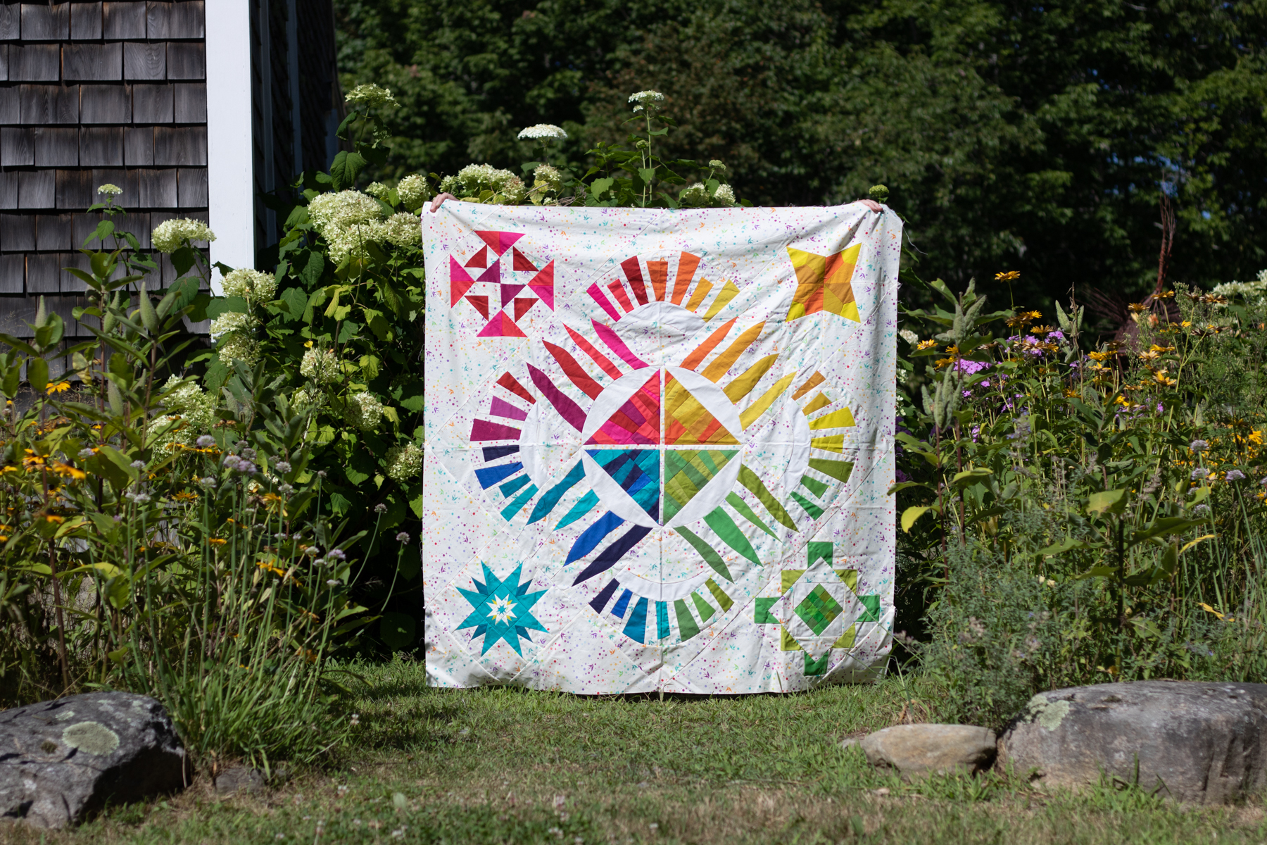

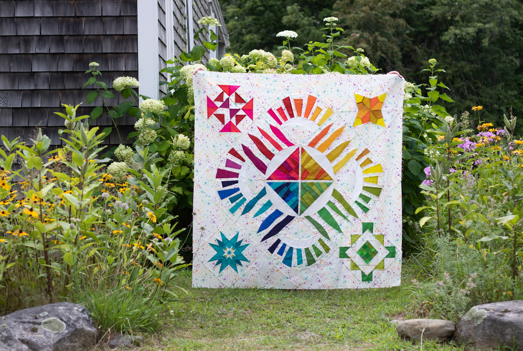
As you can hopefully clearly see in the photos above, the quilt photographed in the full shade/overcast day is the most accurate, vibrant representation of the fabrics and colors in the quilt.
Bright direct sunlight washes out colors and creates dark harsh shadows in every little wrinkle or wave of the quilt. When you’re photographing a finished, fully quilted quilt, you can imagine the shadows that are created along every stitch line. If you have the flexibility to wait until an overcast day, I strongly recommend you do that for your next quilt photos. If you live in a place that rarely has clouds, taking photos early in the morning or right before dusk will be your best bet!
Clear Communication
Photographing a finished quilt often requires a quilt holder, and I’ve often heard questions about how to “get your quilt holder to….” do any number of things. The answer is a tool that will take you far in every relationship, even beyond the relationship of you as quilt-maker/photographer and your quilt holder: clear communication.
BEFORE you head out to the gorgeous location you’ve chosen for quilt photos, have a solid conversation with your quilt holder about your hopes and expectations for the photos and quilt display. Especially if your quilt holder is not a quilter themselves, taking the time to clearly show and explain how you want them to hold the quilt will make the actual photography much much smoother.
Personally, when I’m taking quilt photos, I want to see as little of the holder as possible. My partner Garrett is my usual quilt holder, and he knows that I don’t want to see him (hah!). For these photos, my friend Allie aka Exhausted Octopus stood in as my quilt holder, and did a great job being invisible behind the winner photo (above). You can see her fingers a bit along the top edges, but that’s it.
I am a big fan of saying yes and talking about what you CAN do, but I think for this, it might be easiest to show you a bunch of commonly seen photo scenarios, with what not to do, and things you can communicate to your quilt holder BEFORE the photoshoot (in a kind and supportive way, of course!) Please note that everyone’s definition of a good quilt photo is different–so if you enjoy using any of these photo styles, that’s ok! This is just based on my own personal preferences when taking photos of quilts in beautiful locations.
What not to do…

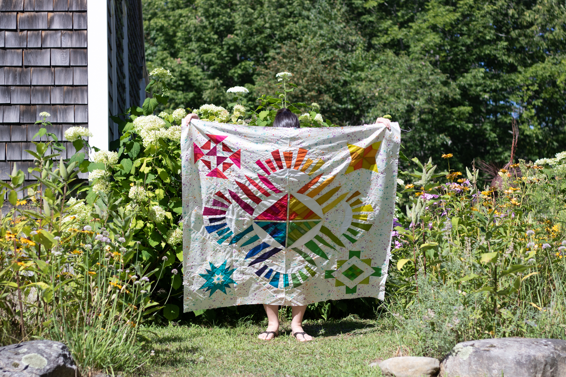
I DON’T want to see your legs.

I DON’T want to see your head or arms.
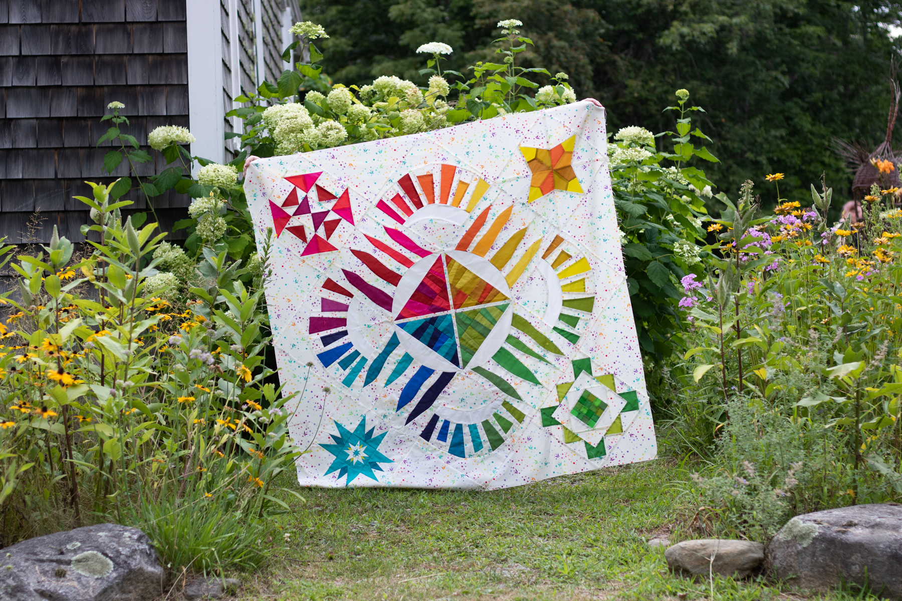
I DON’T want the quilt to be crooked. This is something that is sometimes difficult for the quilt holder to perceive while standing behind the quilt with their arms extended, so you can use an “in the field” communication code when actively taking photos. I will say “level!” and my quilt holder will level the top of the quilt, and I’ll either reply with “other way!” if they angle it more, or “good!” when it’s perfectly level and I’m ready to take the photo.

I DON’T want the corners of the quilt to fold over–I want to see the full quilt if at all possible. This is something that is easily attained with hand placement when holding. When the quilt holder grips the quilt right inside each corner, it allows the quilt to be fully displayed and still have the actual corners visible. Note that some quilts are just too large to hold, in which case I’ll bring two quilt holders along–and sometimes chairs for them to stand on–so that one can hold each corner.

I don’t want there to be a sag along the top of the quilt. Before photoshoots I’m always sure to establish that if I say “taught!” when my quilt holder is holding the quilt, that means that there is a slight sag at the top of the quilt and they need to gently pull their hands away from each other a bit to tighten it up.
Code words often shouted from photographer to quilt holder include:
Taught! (to straighten the top of the quilt)
Level!… other way! …. good!
Head/arms/feet (if they are showing)
Break! (if I’m changing settings on my camera, I make sure to tell my quilt holder so that they can rest their arms!)
The conversations that happen before the photoshoot are absolute gold, and can make the process more enjoyable for everyone. As with everything, the more you practice the quilt holding, the communicating about it, and the photography of quilts in unique and gorgeous locations, the easier it will get. You’ll build a relationship with a quilt holder who knows exactly how you like your quilts to be held for photos AND you get gorgeous quilt photos that show off the full glory of your quilt without any distracting bits. If that’s not a win-win-win, I don’t know what is.
I hope these tips are helpful to you and you enjoy documenting your gorgeous makes in stunning locations. You take so much time and put so much love into making the quilt top, taking a gorgeous photo to document it is absolutely worth it! I go into much more detail in my on-demand class Take Great Quilt Photos Now! so check that out.

Also be sure to check out all of the other great tips shared by the other Guest Experts–you can see all of the Sew Along posts here and there are tips ranging from fabric selection to organizing your sewing space. Many thanks to Katie for inviting me to be a part of this, and happy sewing everyone!
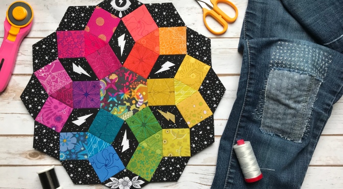
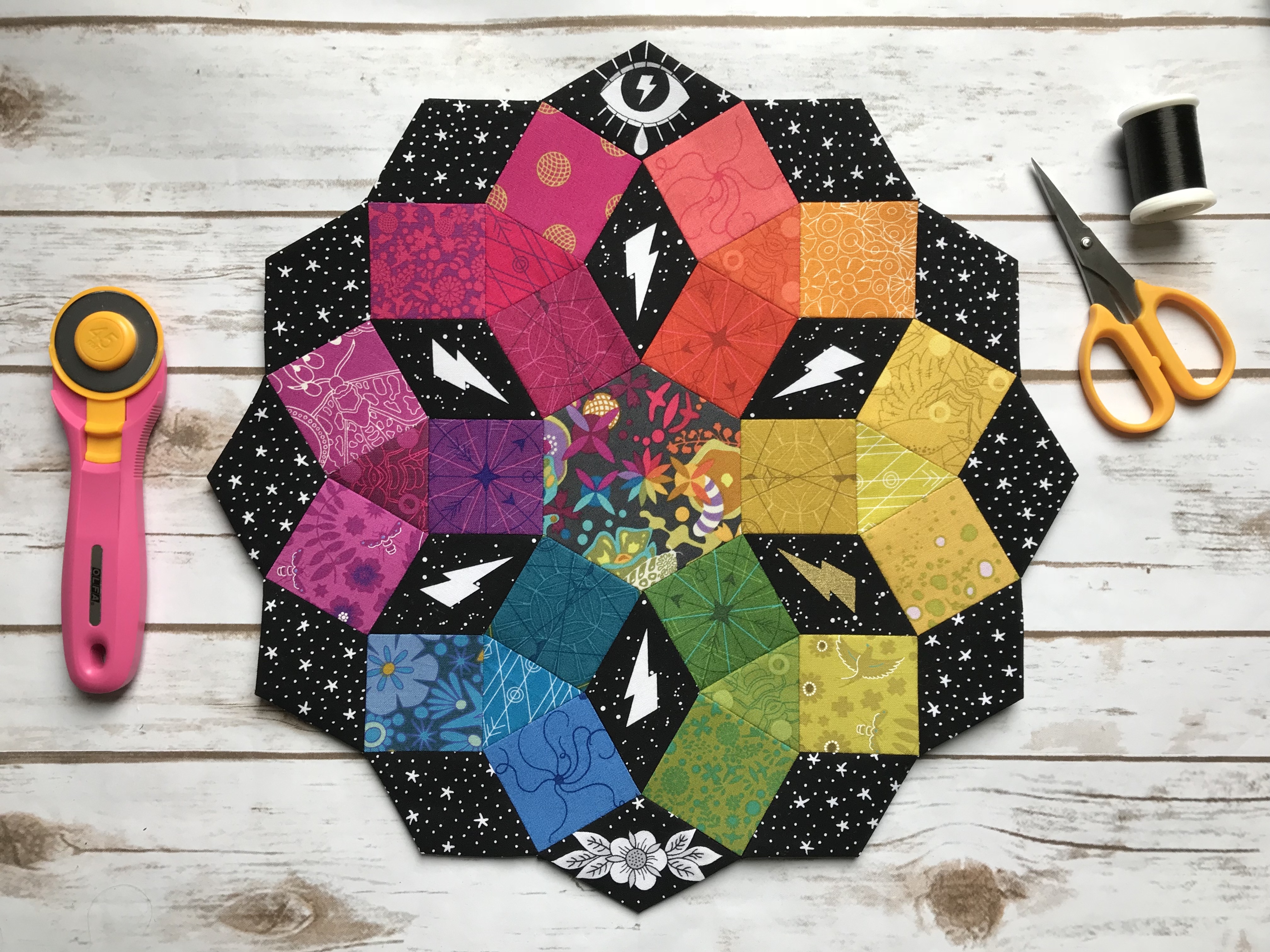 I headed off to QuiltCon with an English Paper Piecing (EPP) project–the Mandolin Quilt Block by Jodi at Tales of Cloth. I had gotten a bit further than
 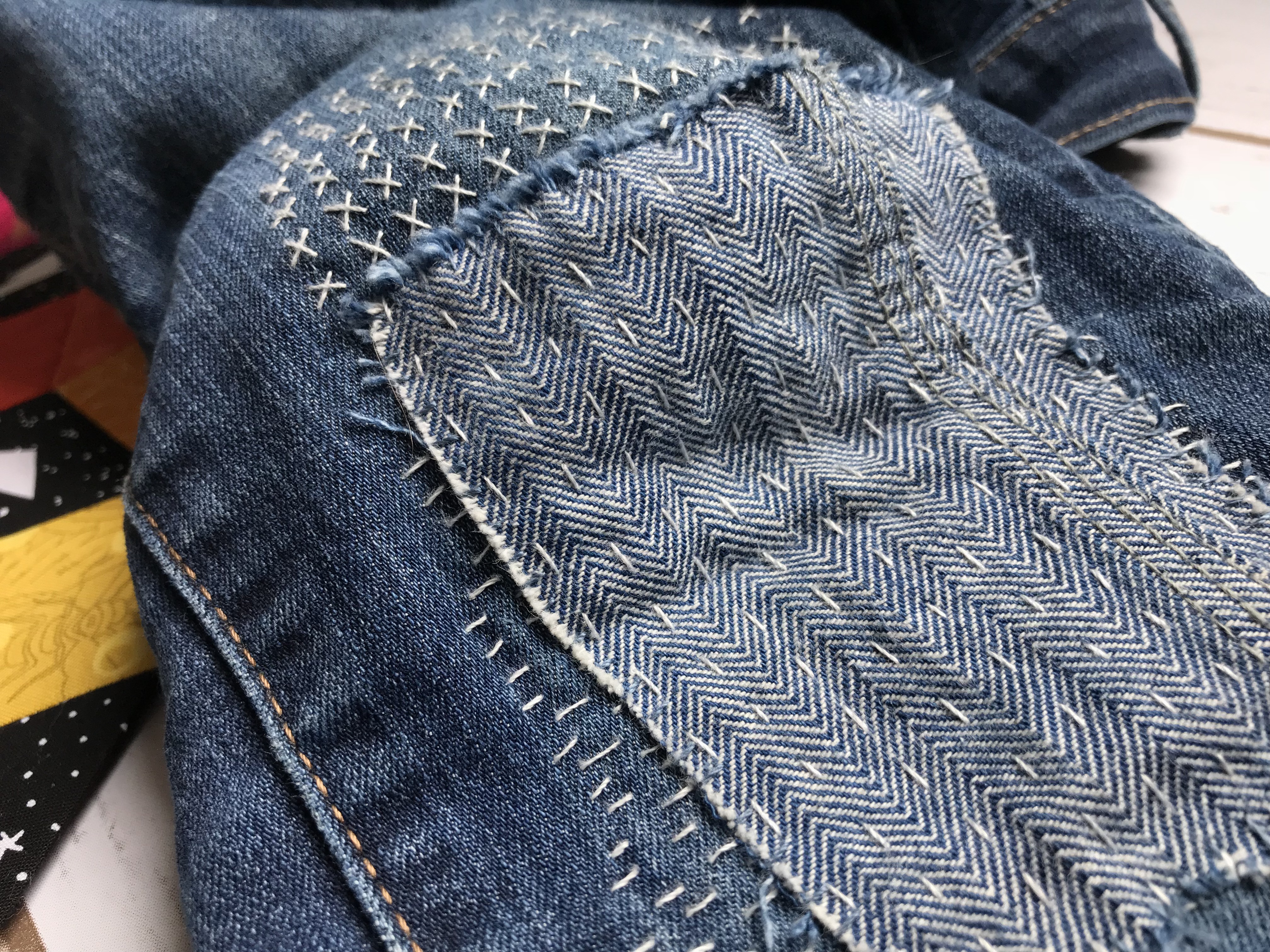 While I was traveling, the mending on my most-worn jeans began to wear through, but fortunately I was able to pick up a mending kit from the
 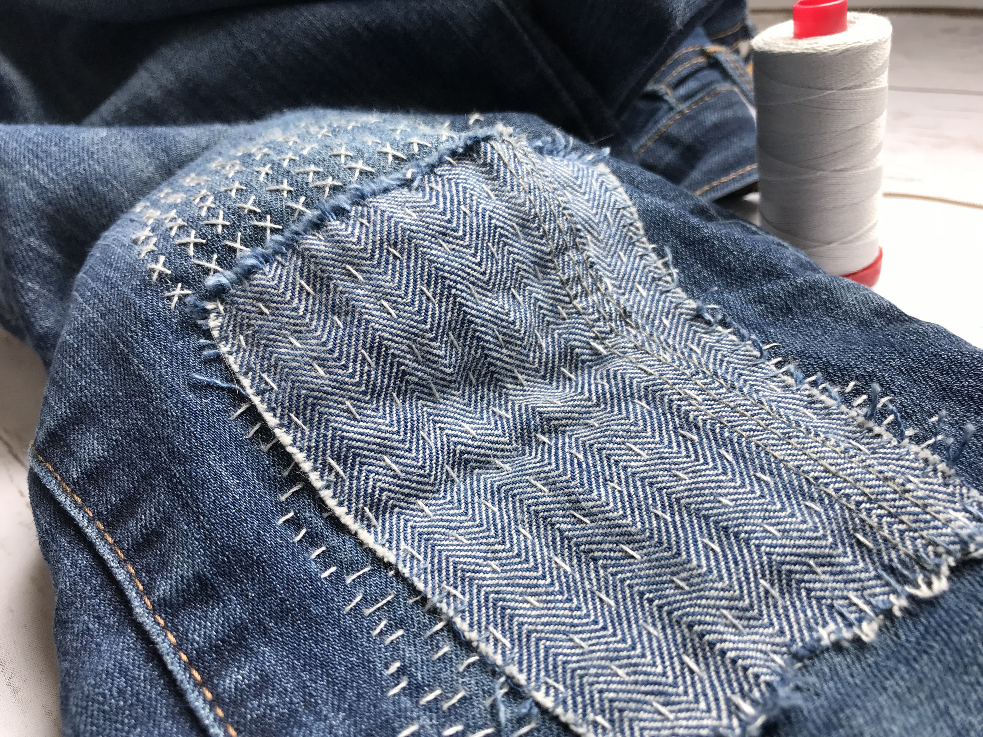 I used the 12wt
 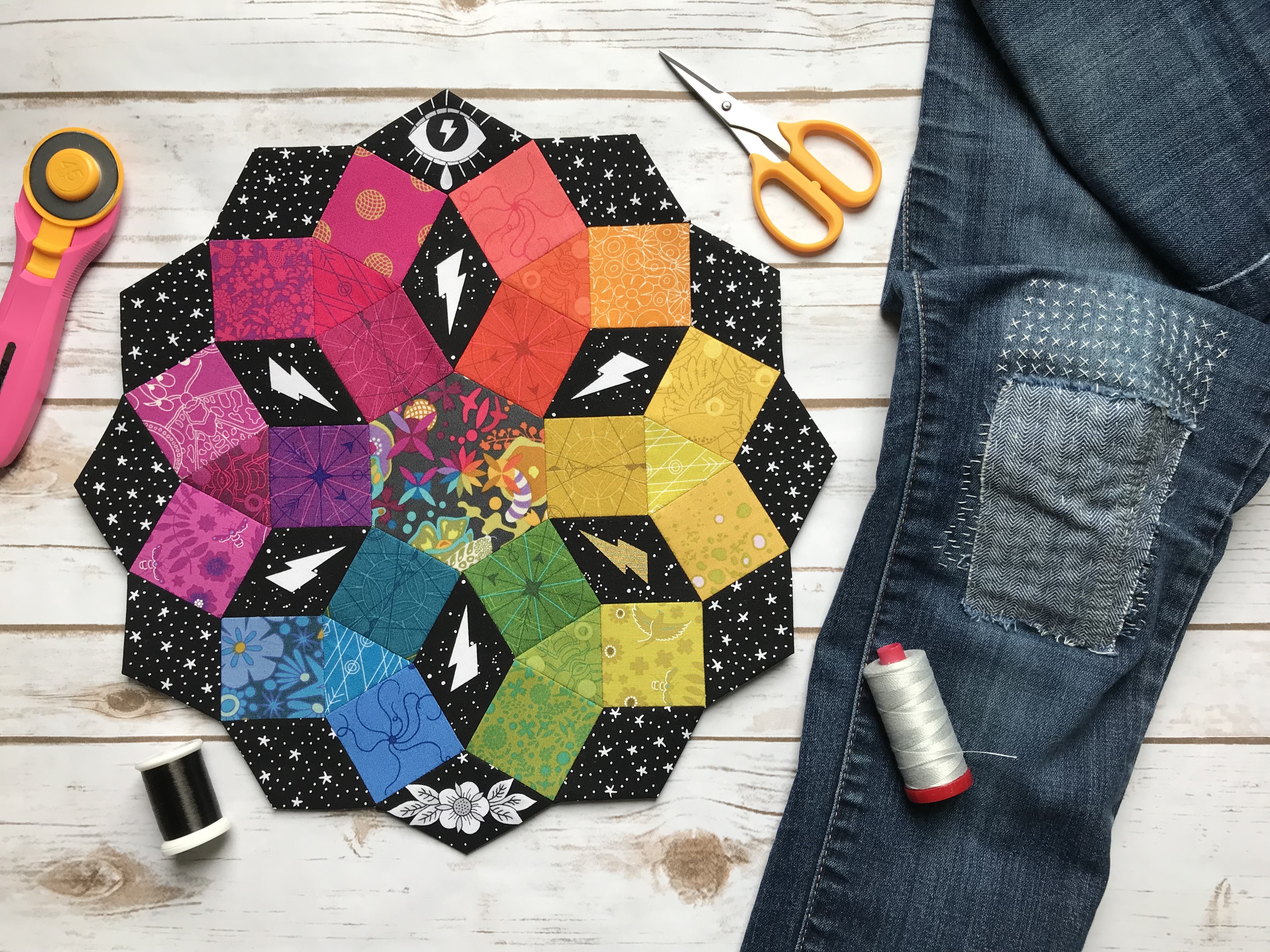 My long flight back to NJ after QuiltCon allowed me to finish both of these hand stitching projects, which felt pretty amazing since I typically make progress at a snail’s pace.
 Feast your eyes upon this! Can you blame me!? I mean, seriously…. is there anyone who doesn’t love a rainbow? Here’s a quick introduction to the line, with attention drawn to a few details I especially love, and far too many photos, as is my style.
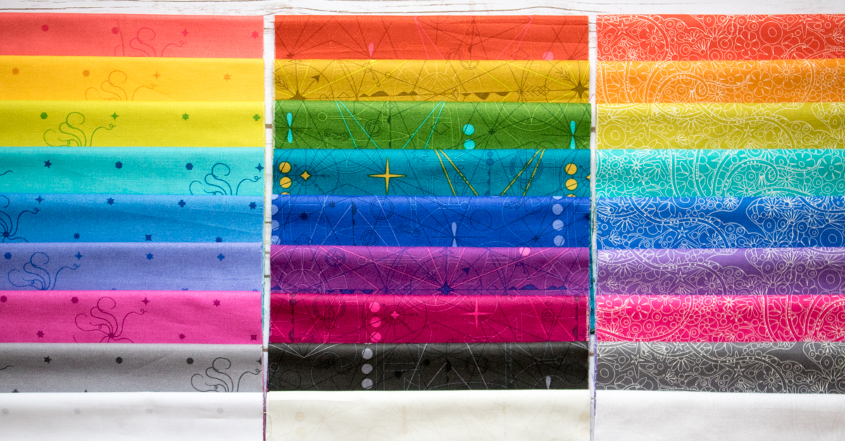
 Diatom reminds me a bit of Insignia, with its large solid portions, only a bit softer. I love how the colors play wonderfully together, yet you can get different value play within each color.
 Compass is definitely the boldest in color, and I love the addition of complementary colored details on some of the fabrics.
 With the dense white sketch-like pattern on Depths, it reads the lightest in color.
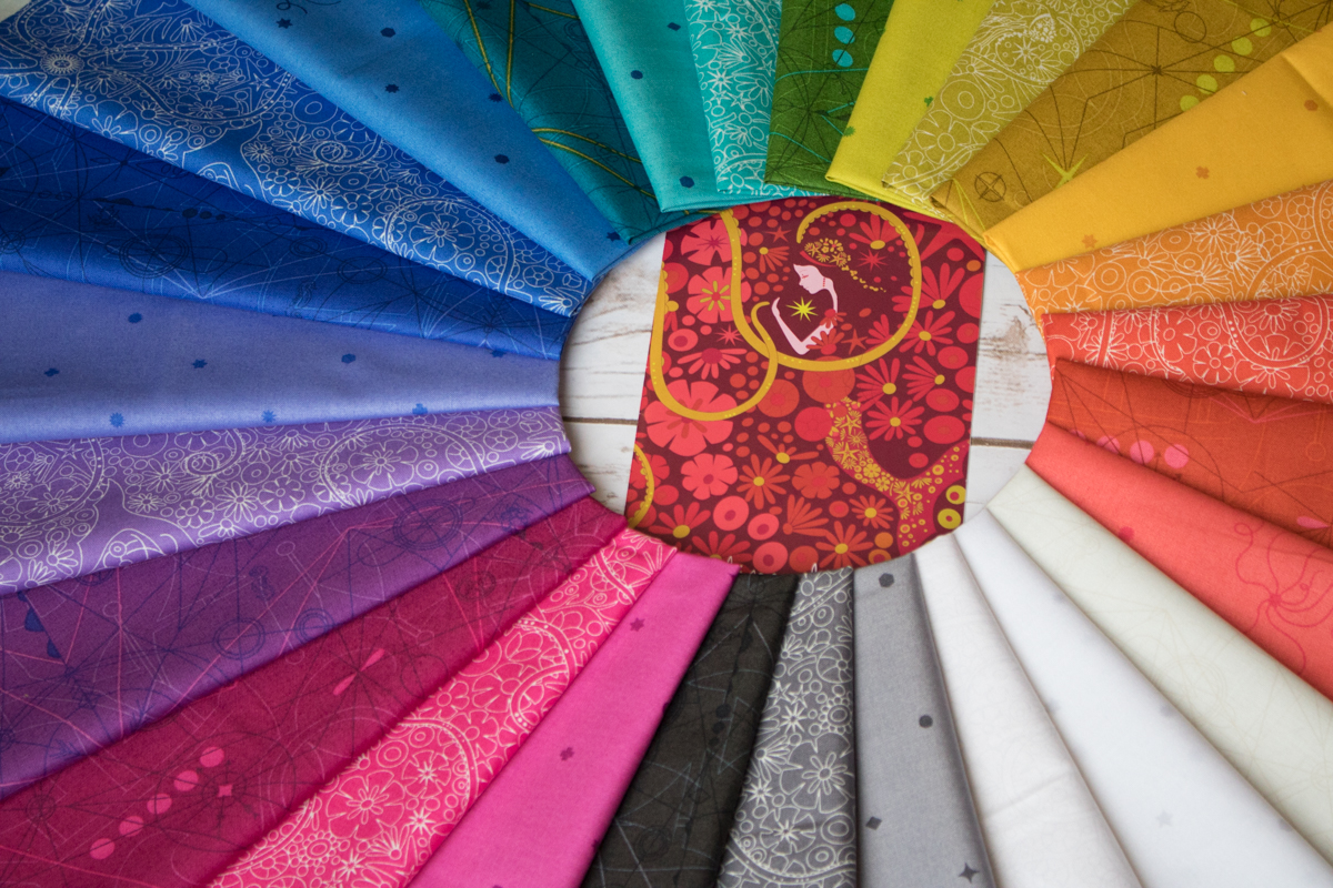 The designs are reminiscent of Alison’s most recent fabric line
 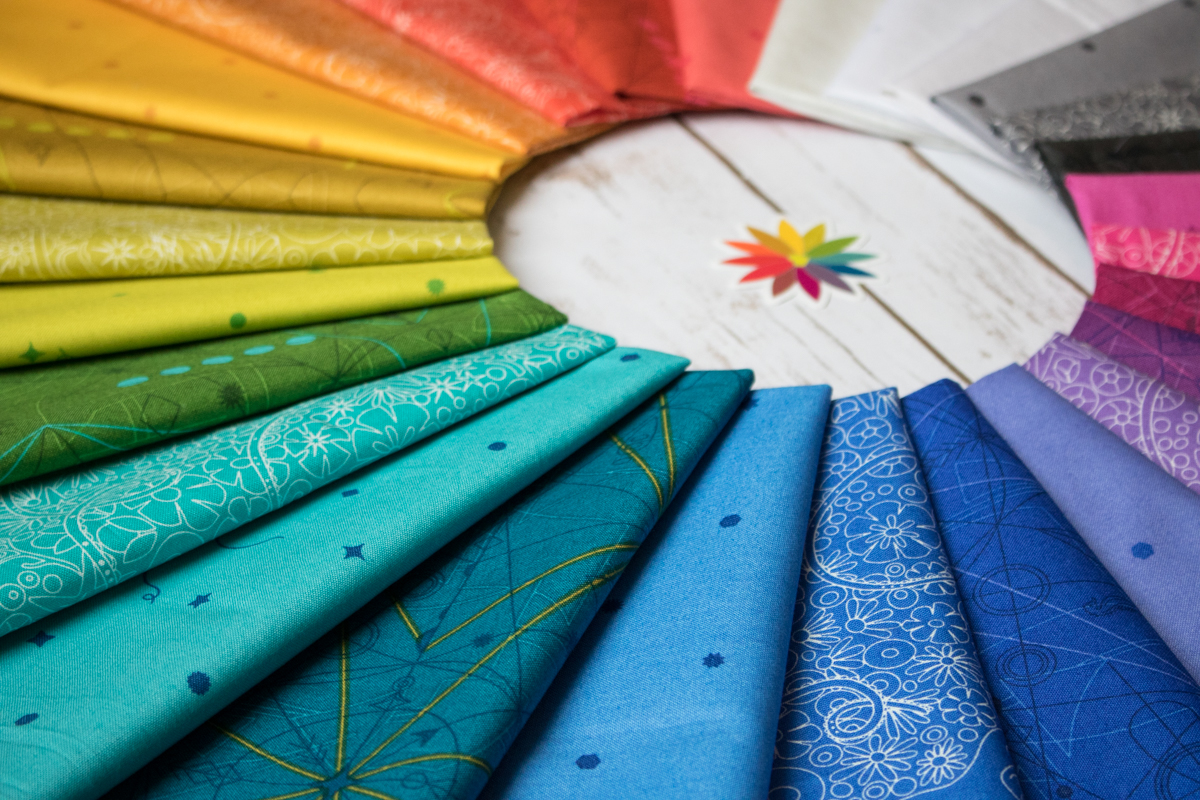 Together, these fabrics make a rainbow that fits in wonderfully with the rest of my rainbowtized stash (let’s be honest, it’s probably 90% Alison Glass fabrics anyway), and I can’t wait to work them into my projects. I already have two new rainbow project ideas in the works, even though I really could do with some project finishing before I begin more new ones (shhh).
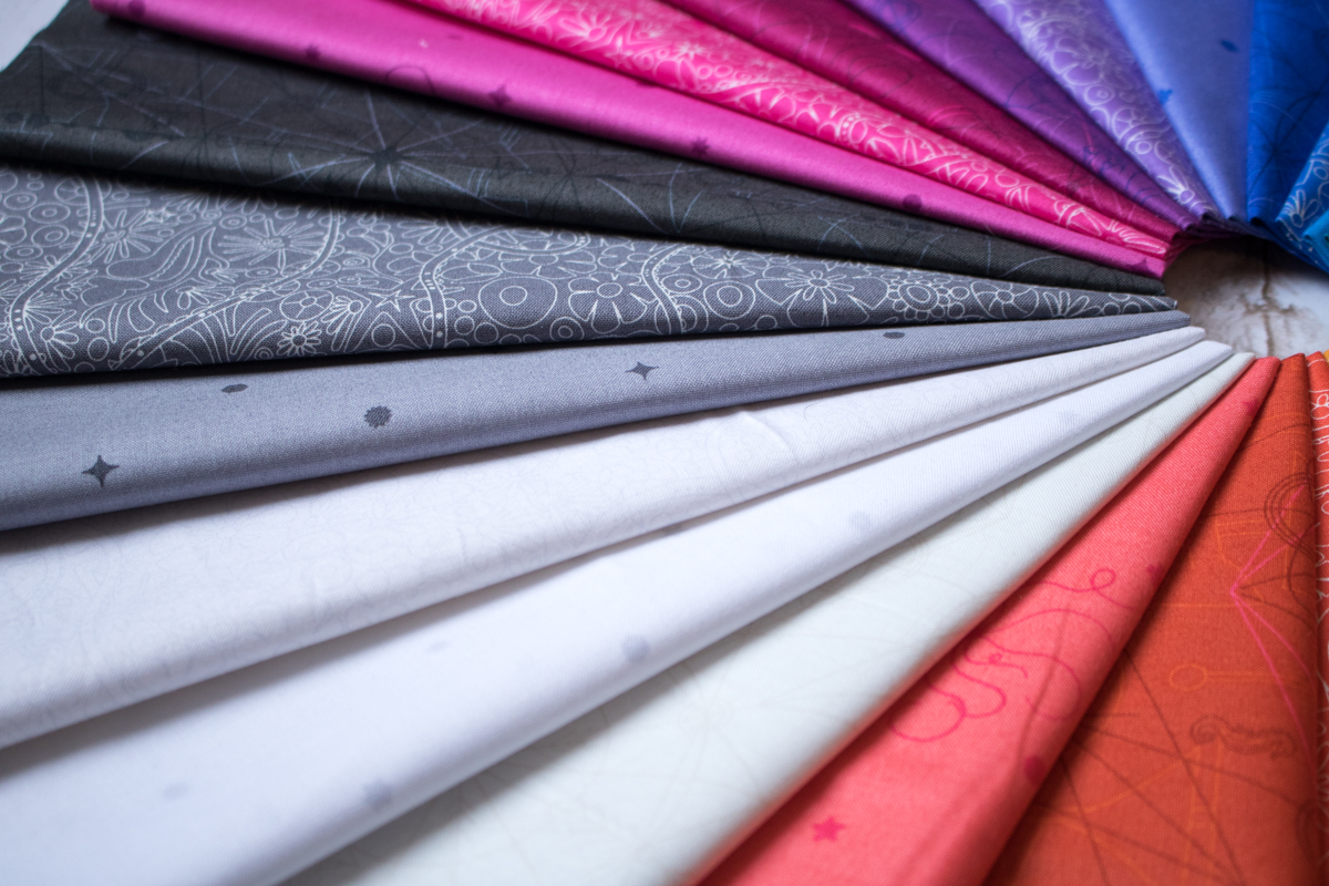 I also love that Alison includes white and grey versions of each print, since both act as the perfect neutral to help the rainbow truly pop. She’s thought of everything.
 Soooooo so pretty! I’m thinking I’ll use these in an EPP project or two, and I’m planning on using mostly this line (with a few other Alison Glass fabrics of old) in my