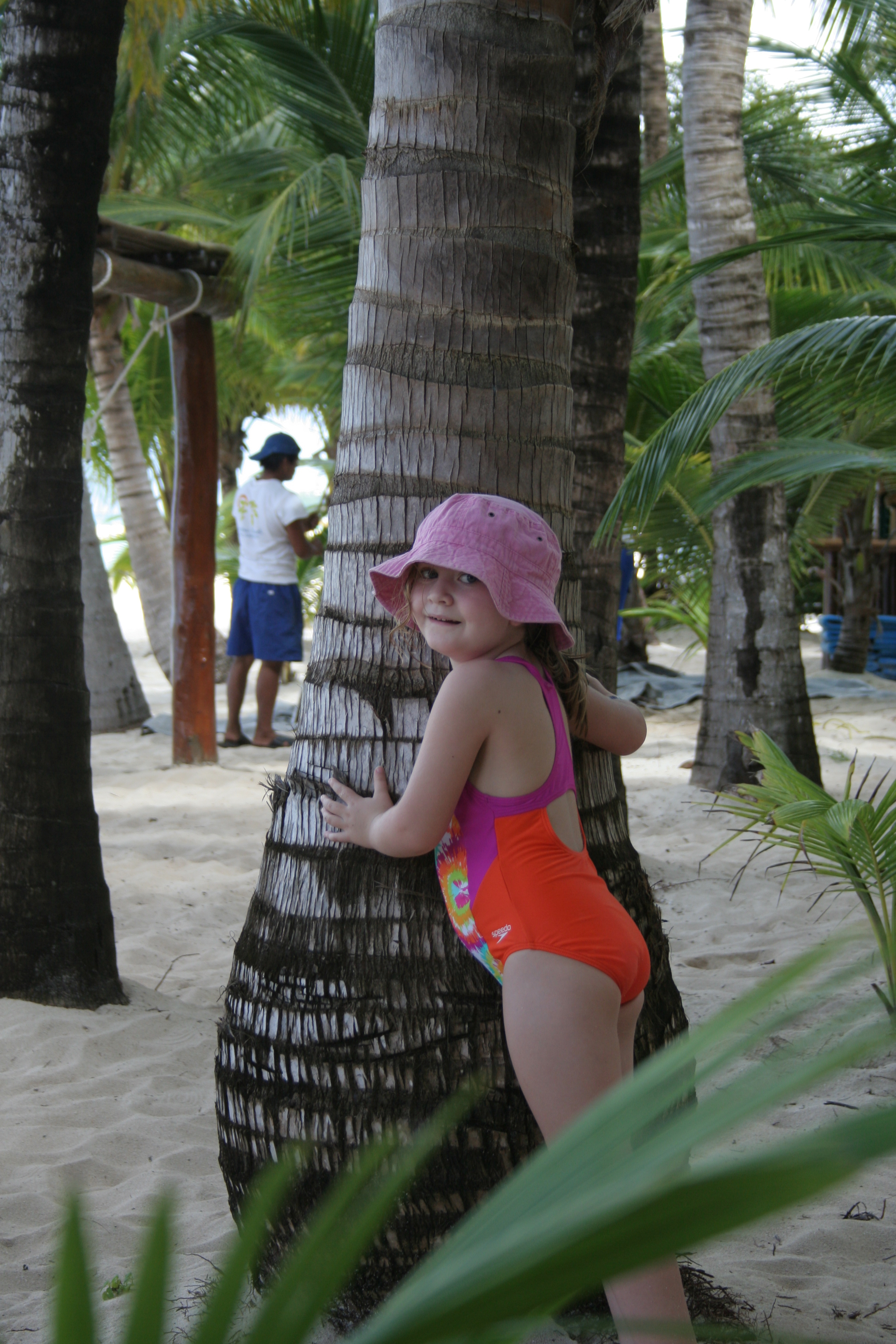
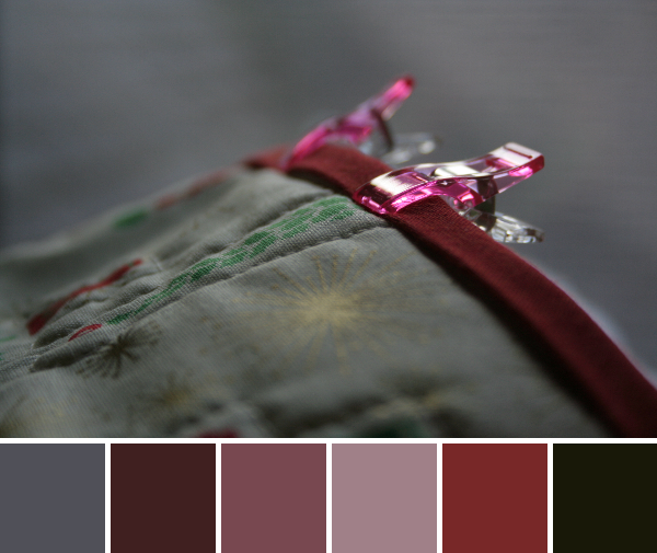
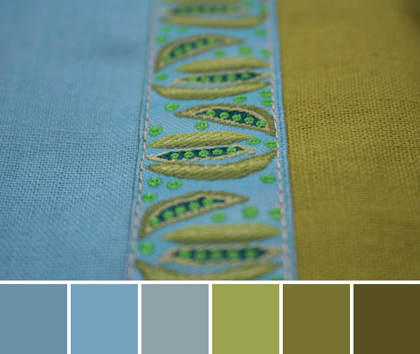
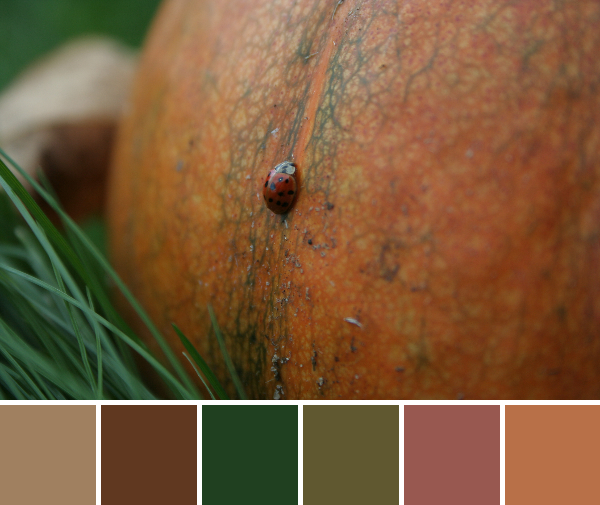
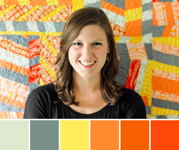
It seems the online quilting world has become a swarm of buzzing bees in preparation for QuiltCon. Either we are frantically prepping for our classes, making our handmade accessories, and plotting the long journey, or we are vicariously living through all of the other ubiquitous Instagram and blog posts about QuiltCon. I admit, I’m one of those bees. I’m super excited to be attending QuiltCon, my first ever quilting event, and am definitely caught up in the energy and excitement. This buzz of excitement around QuiltCon got me thinking about color inspiration, and I thought it was the perfect time for another People Palette. Stage left, enter the Modern Quilt Guild email introducing their new staff members, with the bright and colorful Riane Menardi introductory photo. Viola! Our next People Palette:
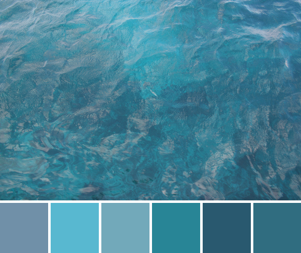
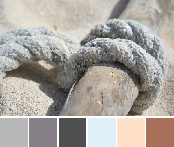
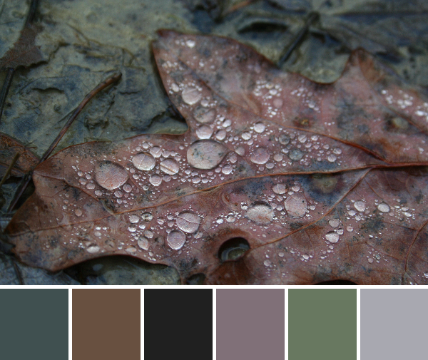
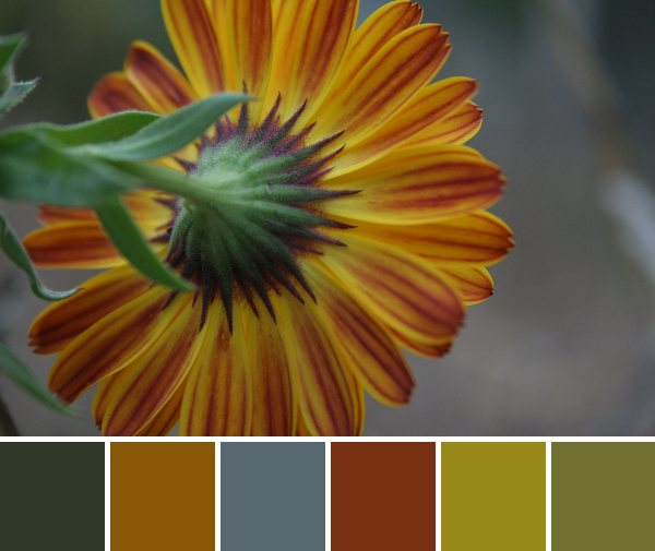
Corresponding solids from left to right:
Bella Etchings Stone, Bella Pond, Bella Lemon, Bella Amelia Orange, Kona Kumquat, Kona Tangerine
Corresponding Aurifil thread from left to right:
5020 – Light Military Green
2850 – Med Juniper
1135 – Pale Yellow
2150 – Pumpkin
5009 – Medium Orange
1154 – Dusty Orange
Meet Riane (pronounced Ree-ann). She’s the new Communications Manager at the Modern Quilt Guild (MQG). Trust me, she’s great at what she does! I contacted her yesterday morning asking if she would be interested in this last minute whirlwind People Palette moment of stardom (I’m a busy bee preparing for QuiltCon, remember? I’m drinking the last-minute-nectar this week!), and by noon all the photos were sent, questions answered, and communication clearly and efficiently handled. Awesome.
For a little bit of background, here is an excerpt from her MQG intro:
My background is in journalism, but I’ve done just about everything under the sun in communications. I worked for ReadyMade magazine before it was put to rest (R.I.P.), and then went on to help indie handmade companies do promotions, events and social media. I also worked as a community builder for a startup handmade marketplace (not Etsy, but close). And for the past year, I’ve been with an agency, helping clients run marketing campaigns and communications. I also contribute words, designs and project management to Fresh Quilts from time to time.
I’m based in the sweet, sweet heartland of Des Moines, Iowa, and when I’m not sewing or writing, you can find me sipping craft beer, doing yoga or cycling (but only in weather over 50 degrees).
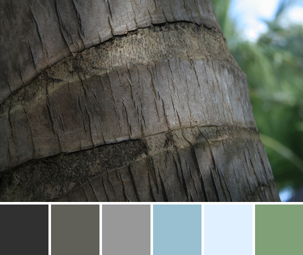
The quilt behind Riane is one that she designed, and which was featured in Fresh Quilts magazine. The pattern is available in the most recent issue (though a new one is due out soon, so you may have to backorder it).

I asked Riane to answer three short questions to help the world get to know the color inspiration star of the week a little more intimately:
Where do you fit into the worldwide family tree of quilting?
I love this question. Right now, I would say that I’m that independent, fun-loving niece who’s trying to learn as much as possible from the amazing, crazy and inspirational women in her life (aunts, grandmothers, cousins, etc.). I’m like a sponge — trying new things, going new places and developing my personal style, but all while remembering the lessons and wisdom learned from my quilt family.
My favorite branches to swing from, however, are the ones where we play with modern minimalism, neutral linens and the sweet, sweet joys of hand-quilting (especially sashiko).
-and if you want to get technical-
I am the new Communications Manager for the MQG and a contributor and project editor for Fresh Quilts magazine.
What is your least favorite mode of transportation?
Walking in heels. I love heels, but I always seem to encounter a TON of unexpected walking when I’m in my highest get-ups. And while I generally rely on my trusty (Kia Soul) steed to get me from here to there, my favorite mode of transportation would probably be via camel, if I had that option. They’re such badasses!
If you could choose anyone, who would you choose as your mentor?
Dustin Hoffman, hands down. Have you ever seen the movie Stranger Than Fiction? Ever since I first watched it, Dustin Hoffman has been my spirit animal. Even though he’s (probably?) not a quilter, I’d like him to guide me through life with his calm, quirky wisdom.
You can find Riane in the bloggy quiltiverse here:
– – – – – – – – – – – – –
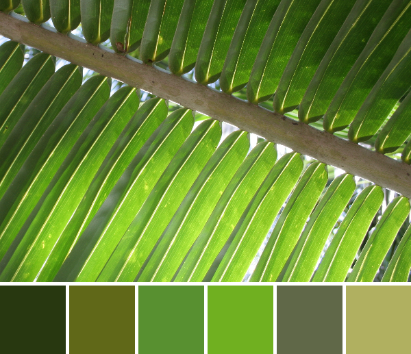
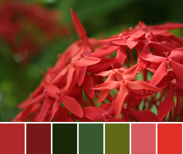
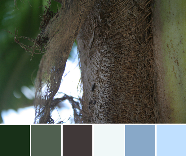
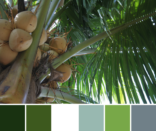
All color palettes are created using Play Crafts’ Palette Builder 2.1 and photos were provided by Riane.