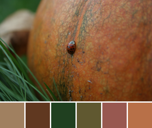
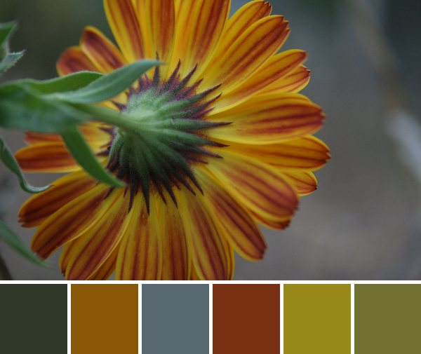
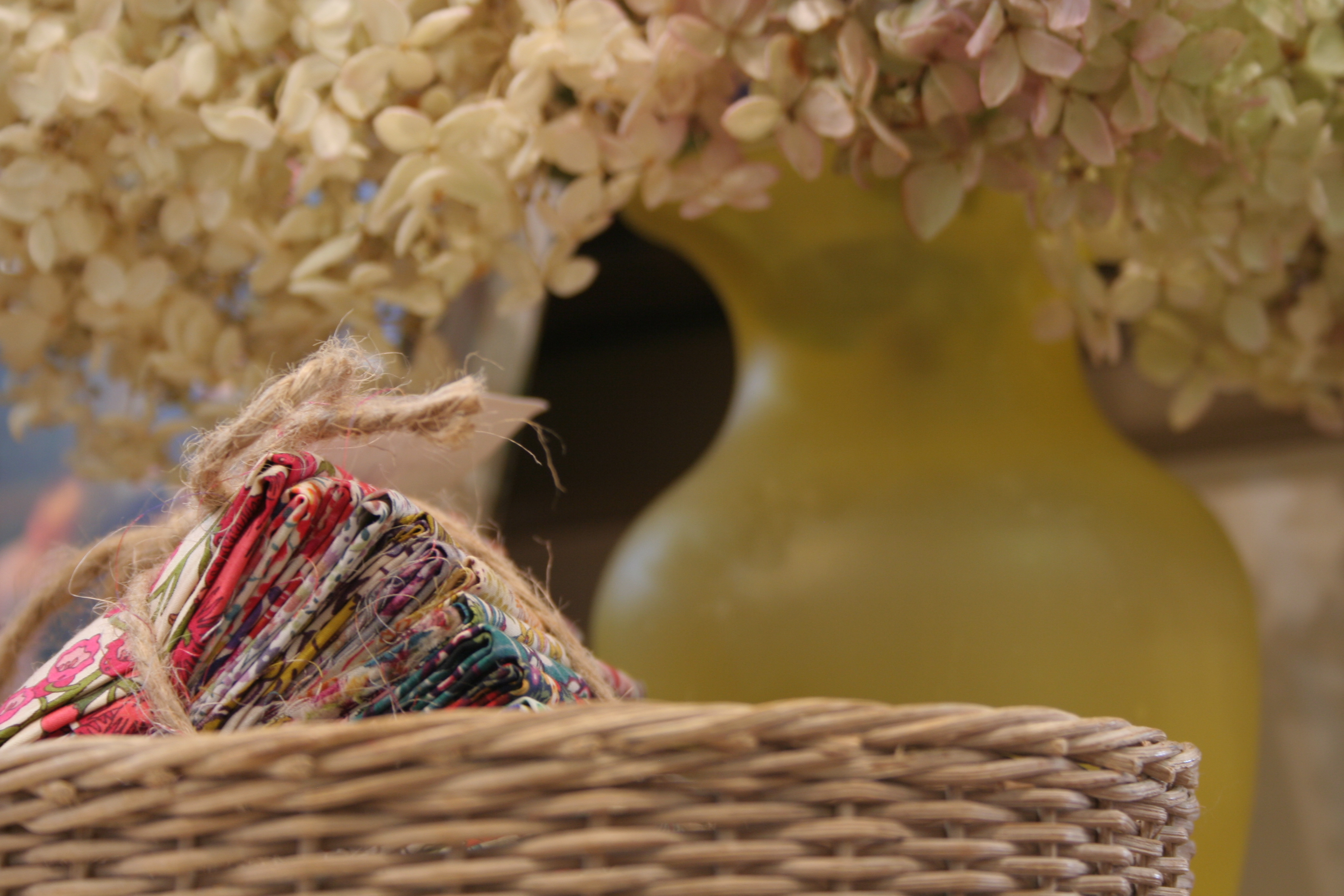
What a difference one week makes this time of year! Last week, we barely had buds on the trees, and this week the garden is blooming with life! Today’s color inspiration comes (finally) from my garden. Color palettes are created using Play Crafts’ Palette Builder 2.1 and my photographs.
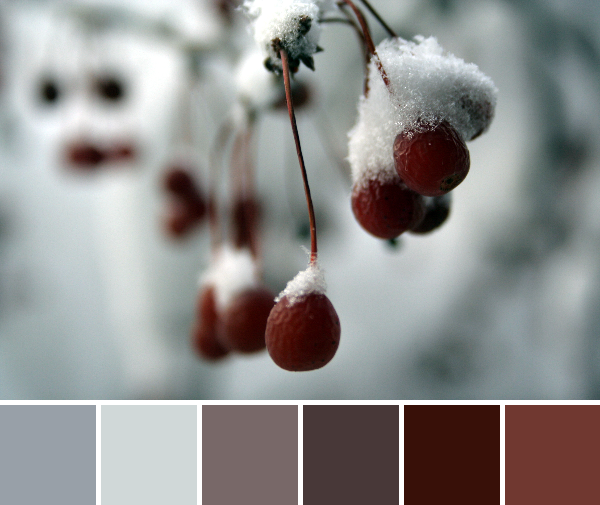
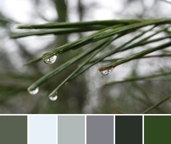
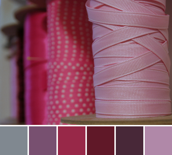
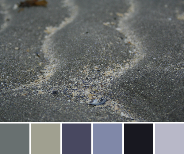
Corresponding solids from left to right:
Bella Stone, Kona Shadow, Kona Blue Bell, Kona Graphite, Bella Eggplant, Bella Parchment
Corresponding Aurifil thread from left to right:
2605 – Grey
2600 – Dove
5088 – Sugar Paper
1246 – Grey
2468 – Dk Wine
2315 – Pale Flesh
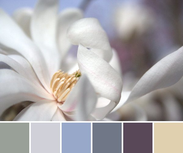
Our magnolia trees are blooming, painting the yard with gentle whites and vivid pinks . I love that we have multiple magnolia trees, since they are usually one of the first signs that spring is truly here. Their blooms burst seemingly all in one day, another flower blooming each minute. Late last week, on one of the first truly warm days, my five year old noticed this phenomenon and said, “Mom, another flower opens every minute!”

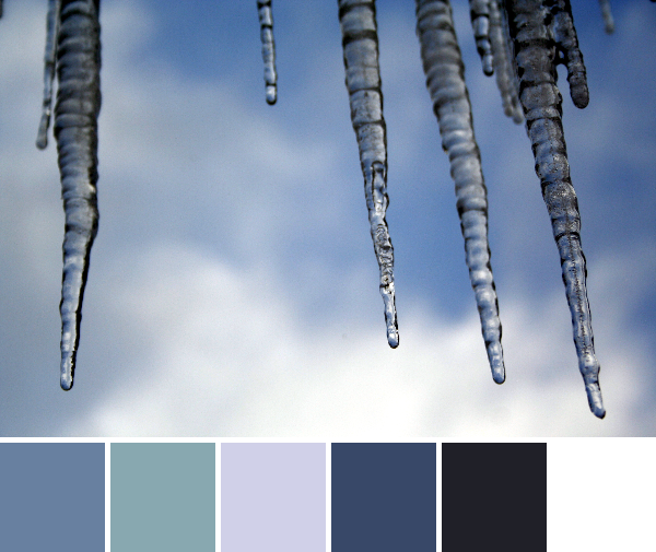
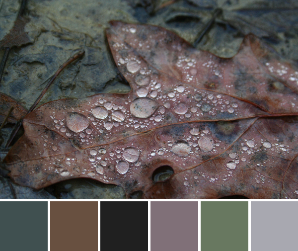
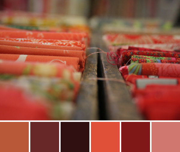
Corresponding solids from left to right:
Kona Espresso, Bella Etchings Charcoal, Bella Plum, Bella Petal Pink, Bella Etchings Slate, Bella Barn Door
Corresponding Aurifil thread from left to right:
5024 – Dark Brown
2370 – Sandstone
2566 – Wisteria
2562 – Lilac
2325 – Linen
2345 – Raisin
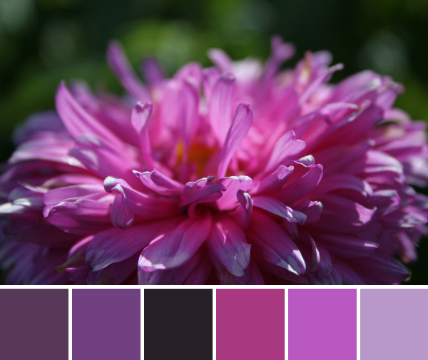
I personally prefer the pink magnolias, but perhaps it’s because range of bright pinks really cheers me up after a drab colorless winter. They are a little slower to fully bloom, but I’m patient.

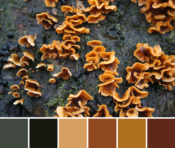
Corresponding solids from left to right:
Kona Blue Bell, Kona Graphite, Kona Amber, Kona Citrus, Bella Pesto, Kona Pickle
Corresponding Aurifil thread from left to right:
6720 – Slate
1126 – Blue Grey
2145 – Yellow Orange
2120 – Canary
5015 – Gold Yellow
5016 – Olive Green
My first garden-inspired color inspiration post of spring wouldn’t be complete without some daffodils. The family who owned the house before we did planted about a thousand daffodils. I’m not exaggerating, either. We have at least six different varieties, and they are everywhere: along just about every garden border, forming sunny circles around trees, even just popping up in the grass in some spots where clearly there used to live another decorative tree of some sort. This time of year, our table is adorned with vases and mason jars full of daffodils picked with glee by my kiddos.
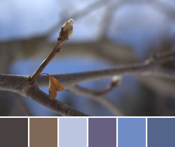
Color is slowly popping up between the tufts of green. We even have a tulip peeking out:

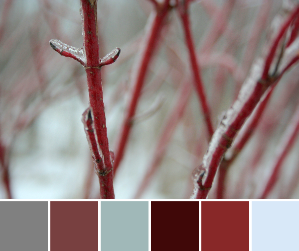
And one of my favorite colors of blue hides beneath the daffodil stalks:
Spring is here!!