I’ve long been a fan of the Summer Sampler Sew Along put together by Lee Heinrich, Katie Blakesley, and Faith Jones each summer, so when Katie asked me if I would be a “guest expert” for her 2022 Summer Quilt Along, I couldn’t say no. Plus, what a great spark to get me writing here again!
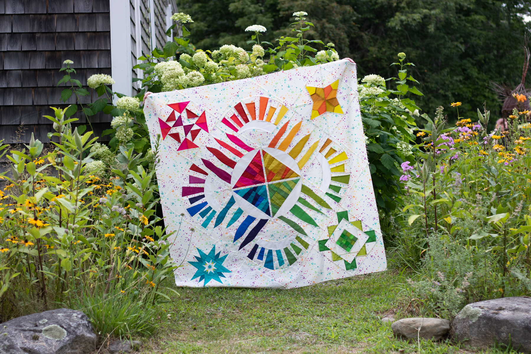
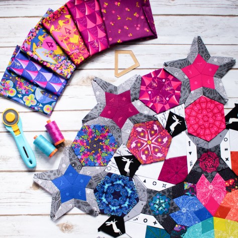
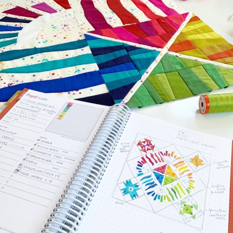
I used my Summer Sampler 2019 quilt top as my example quilt for this post, which I assembled in my own alternate layout to create space for me to participate in the fun of the sew along without the stress of “keeping up” and making every block. You can see (or buy) this year’s sampler here. If you’re participating in this year’s Sew Along, you might be at the point where you are almost ready to photograph your finished quilt top!! If you’re not there yet, no worries–these tips are timeless. Just bookmark this post, and come back when you’re ready.
I could easily talk for weeks about quilt photography, but wanted to share two of my top tips for photographing your quilts (or quilt tops!) since sometimes a little bit can go a long way. If you want to dive into quilt photography more deeply, be sure to check out my on-demand class Take Great Quilt Photos Now!
Light
First and foremost, LIGHT is the most important thing to consider when taking photos. I’m a big fan of capturing natural light, so I almost always take larger quilts outside for photos. In addition to having abundant natural light outside, there are gorgeous natural locations that help complement and celebrate the quilt being photographed and it’s wicked fun to find them!
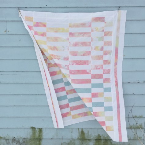
That said, a bright overcast day provides the ideal lighting for photography. That’s right–overcast. I can’t tell you how many times I’ve heard someone say, “I finished my quilt but I haven’t been able to take any photos because the sun hasn’t been out!” You don’t want direct sun for photos, and I’ll show you why:
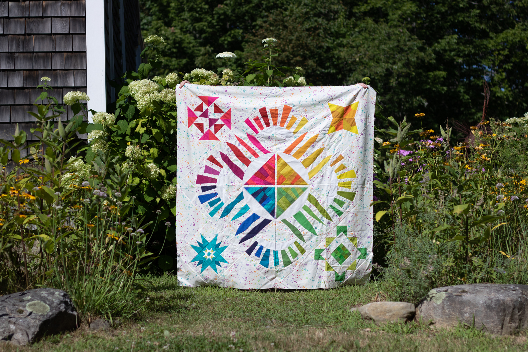
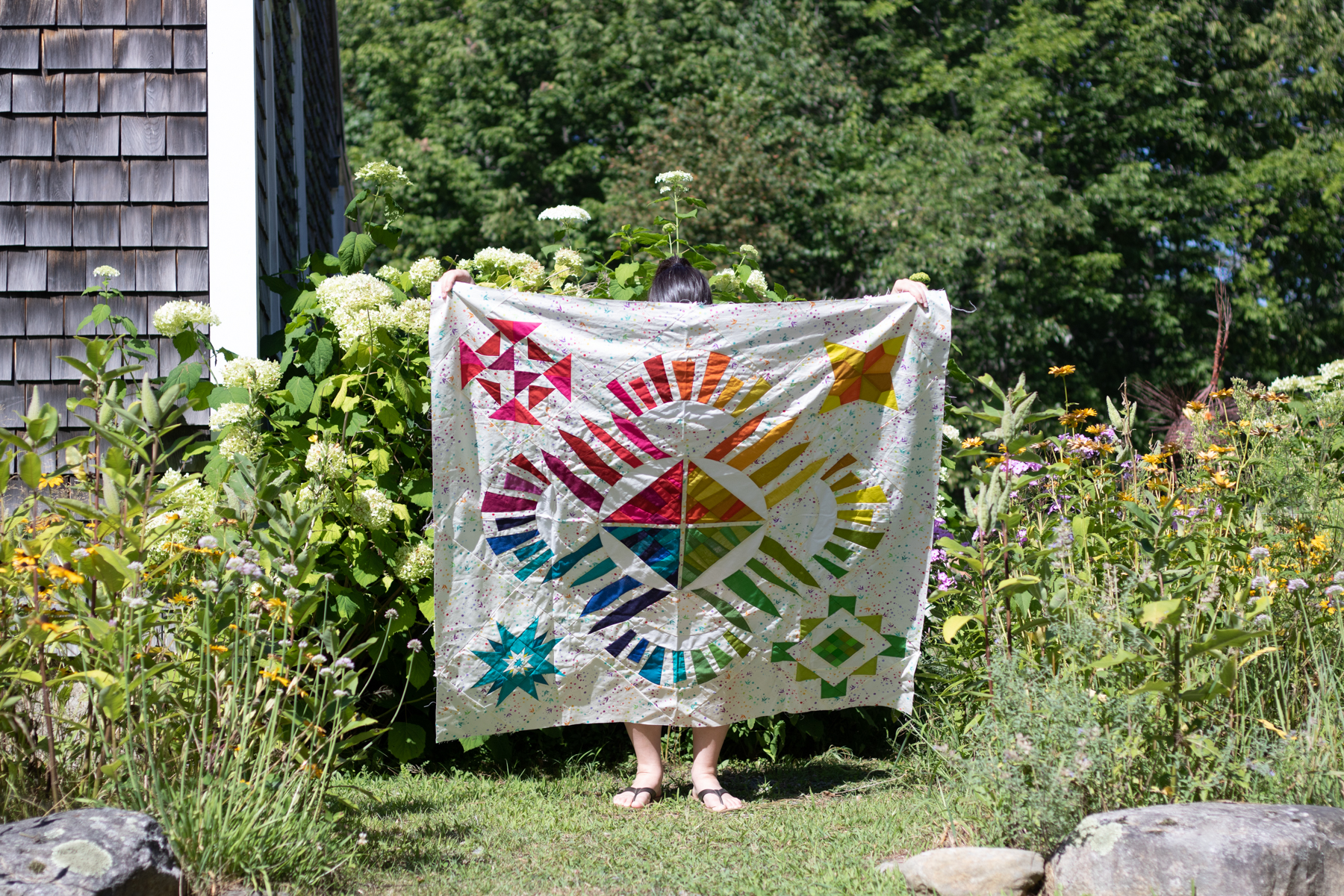

As you can hopefully clearly see in the photos above, the quilt photographed in the full shade/overcast day is the most accurate, vibrant representation of the fabrics and colors in the quilt.
Bright direct sunlight washes out colors and creates dark harsh shadows in every little wrinkle or wave of the quilt. When you’re photographing a finished, fully quilted quilt, you can imagine the shadows that are created along every stitch line. If you have the flexibility to wait until an overcast day, I strongly recommend you do that for your next quilt photos. If you live in a place that rarely has clouds, taking photos early in the morning or right before dusk will be your best bet!
Clear Communication
Photographing a finished quilt often requires a quilt holder, and I’ve often heard questions about how to “get your quilt holder to….” do any number of things. The answer is a tool that will take you far in every relationship, even beyond the relationship of you as quilt-maker/photographer and your quilt holder: clear communication.
BEFORE you head out to the gorgeous location you’ve chosen for quilt photos, have a solid conversation with your quilt holder about your hopes and expectations for the photos and quilt display. Especially if your quilt holder is not a quilter themselves, taking the time to clearly show and explain how you want them to hold the quilt will make the actual photography much much smoother.
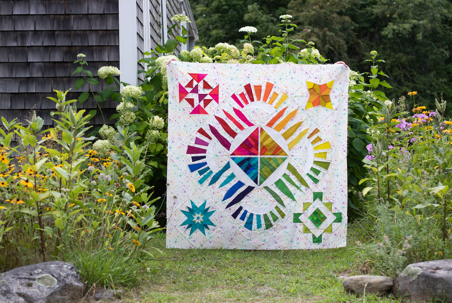
Personally, when I’m taking quilt photos, I want to see as little of the holder as possible. My partner Garrett is my usual quilt holder, and he knows that I don’t want to see him (hah!). For these photos, my friend Allie aka Exhausted Octopus stood in as my quilt holder, and did a great job being invisible behind the winner photo (above). You can see her fingers a bit along the top edges, but that’s it.
I am a big fan of saying yes and talking about what you CAN do, but I think for this, it might be easiest to show you a bunch of commonly seen photo scenarios, with what not to do, and things you can communicate to your quilt holder BEFORE the photoshoot (in a kind and supportive way, of course!) Please note that everyone’s definition of a good quilt photo is different–so if you enjoy using any of these photo styles, that’s ok! This is just based on my own personal preferences when taking photos of quilts in beautiful locations.
What not to do…

I DON’T want to see your legs.

I DON’T want to see your head or arms.
I DON’T want the quilt to be crooked. This is something that is sometimes difficult for the quilt holder to perceive while standing behind the quilt with their arms extended, so you can use an “in the field” communication code when actively taking photos. I will say “level!” and my quilt holder will level the top of the quilt, and I’ll either reply with “other way!” if they angle it more, or “good!” when it’s perfectly level and I’m ready to take the photo.

I DON’T want the corners of the quilt to fold over–I want to see the full quilt if at all possible. This is something that is easily attained with hand placement when holding. When the quilt holder grips the quilt right inside each corner, it allows the quilt to be fully displayed and still have the actual corners visible. Note that some quilts are just too large to hold, in which case I’ll bring two quilt holders along–and sometimes chairs for them to stand on–so that one can hold each corner.

I don’t want there to be a sag along the top of the quilt. Before photoshoots I’m always sure to establish that if I say “taught!” when my quilt holder is holding the quilt, that means that there is a slight sag at the top of the quilt and they need to gently pull their hands away from each other a bit to tighten it up.
Code words often shouted from photographer to quilt holder include:
Taught! (to straighten the top of the quilt)
Level!… other way! …. good!
Head/arms/feet (if they are showing)
Break! (if I’m changing settings on my camera, I make sure to tell my quilt holder so that they can rest their arms!)
The conversations that happen before the photoshoot are absolute gold, and can make the process more enjoyable for everyone. As with everything, the more you practice the quilt holding, the communicating about it, and the photography of quilts in unique and gorgeous locations, the easier it will get. You’ll build a relationship with a quilt holder who knows exactly how you like your quilts to be held for photos AND you get gorgeous quilt photos that show off the full glory of your quilt without any distracting bits. If that’s not a win-win-win, I don’t know what is.
I hope these tips are helpful to you and you enjoy documenting your gorgeous makes in stunning locations. You take so much time and put so much love into making the quilt top, taking a gorgeous photo to document it is absolutely worth it! I go into much more detail in my on-demand class Take Great Quilt Photos Now! so check that out.

Also be sure to check out all of the other great tips shared by the other Guest Experts–you can see all of the Sew Along posts here and there are tips ranging from fabric selection to organizing your sewing space. Many thanks to Katie for inviting me to be a part of this, and happy sewing everyone!


 I’m excited to share a fun little post I wrote for the Aurifil blog,
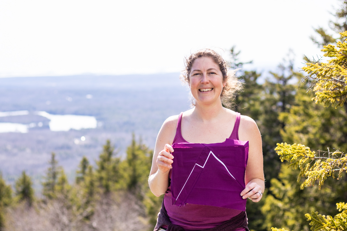
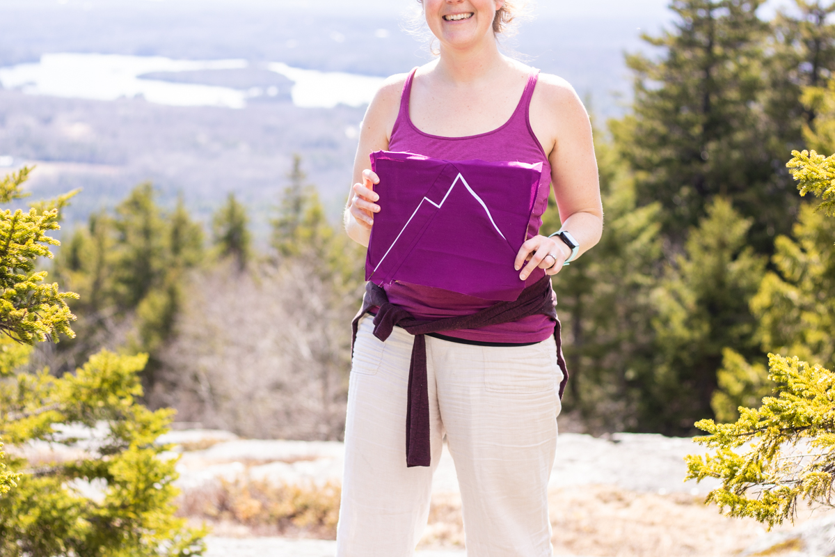
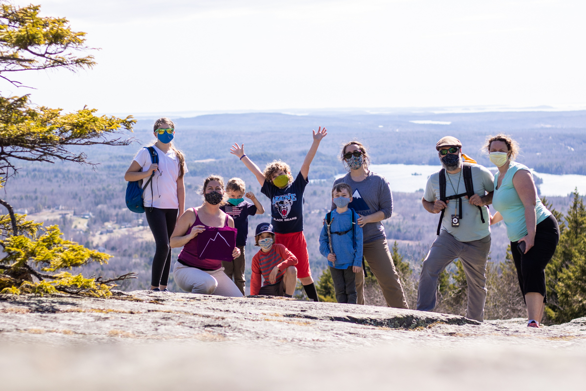
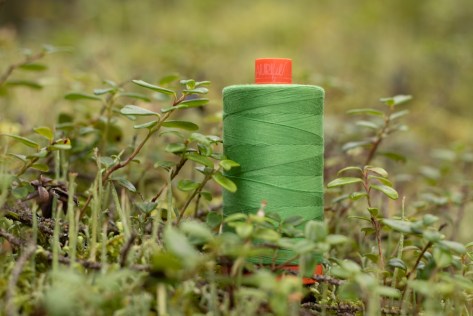
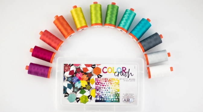
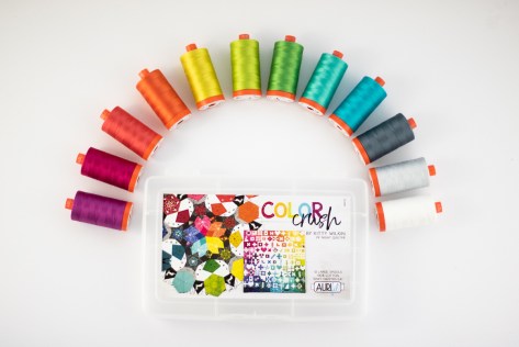
  We had a super fun kick off party in Austin at QuiltCon, and then shortly upon returning home, the COVID-19 Pandemic hit and life was turned on its head. Fast forward a full year. Now that vaccine distribution is increasing, spring is beginning to show its face once more, and things are possibly looking up, I thought I’d finally share a introduction of the specific threads I selected for inclusion in Color Crush, as seen in their natural habitats.
 While the whole world was locked down, my family and I found solace in nature. As any good tree hugging quilting photographer would do, I brought my threads along on many hikes and adventures, seeking out their natural habitats and color inspiration roots. My Color Crush threads trekked in every season, and I highly recommend heading over to the
 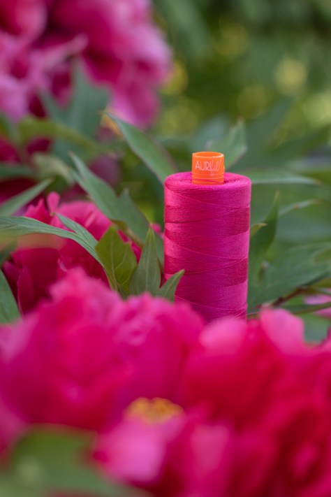 Enjoy the journey, and let me know which photo was your favorite!!
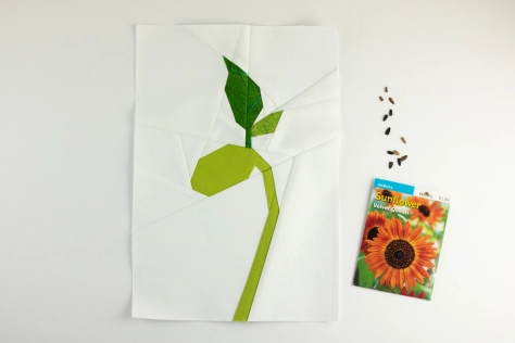 With a focus on hope and new beginnings, I thought today would be the perfect day to re-release my updated Bean Sprout block pattern, since there’s nothing like a freshly sprouted plant to celebrate spring, new life, and the wonder of discovery. As many of you likely know, I’ve been working with the amazing
  With a bit more pattern details, more professional layout, and an added block size (welcome, dear 4″x6″ block!), the newest Bean Sprout block pattern includes all of the great things from the original 2016 design, but in a clearer, crisper presentation. You can buy it now from my
 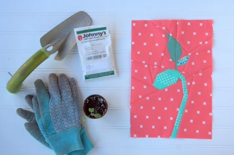 You can see a few other versions of this block I’ve sewn up in the past in its
  I particularly love the idea of a pillow, and very well might be making another one of these someday soon. I’d love to see what YOU make with the pattern, so please use #beansproutblock and tag me
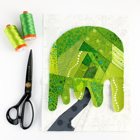
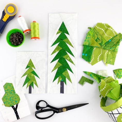 Since our self-isolation has begun, I’ve found myself sewing trees. They are a brief respite from the realities of life these days. As I’ve sewn more, I realize that I’m just trying to grow some hope, grow some patience, grow some resilience. I’ve started using the hashtag
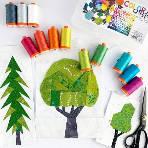
 I once again plan to be gentle with myself, with soft guidelines of “growing hope”, which I imagine will mostly be in the form of sewing and designing trees, working on putting my Plant Worry, Grow Hope quilt together, and maybe spending sunny days in the garden, literally growing hope in the form of vegetable and flower seeds. I have not yet decided whether I will include weekend days or not, and will feel it out as I go.
 I last participated in the 100 day project back in 2018 when I embarked upon
 Amanda
 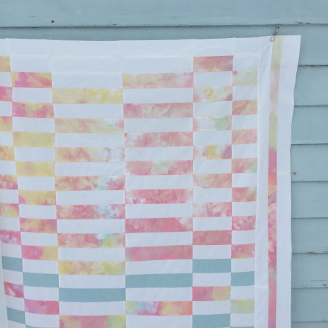 Note that Amanda chose to add her own personal touch by sewing vertical stripes into the side borders; that bit is not included in the Staggered pattern.
 Anja of
 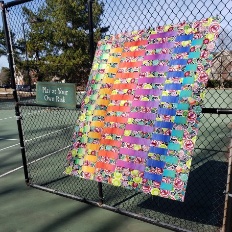 Darlene
  For this quilt, she used Giucy Giuce’s Spectrastic fabrics paired with Libs Eliott’s Venom fabric for the background, both by Andover fabrics, and it’s so much fun. I love how adding a non-solid background fabric changes the aesthetic of Staggered. You can find Darlene on Instagram
  Natasha
 Shannon Spicer
 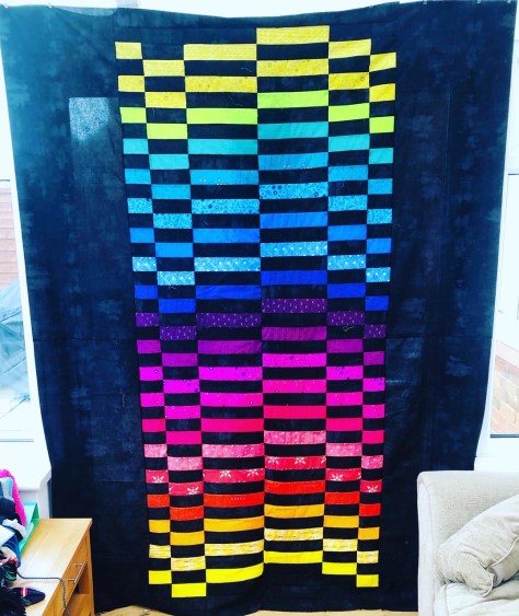 Kerry of
 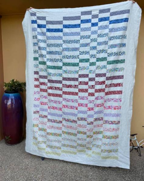 Ultimately I decided to widen the center of the Twin size so that the overall aesthetic and assembly for each size was more similar, so the Twin version included in the Staggered pattern is this one, with two additional columns. Debbie Griffiths
 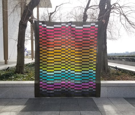 She used an Alison Glass Sun Print 2016 jelly roll plus the “Path” (text) prints from the Sun Print 2019 with Robert Kaufman Manchester Metallic in Licorice (black with gold sparkle) as the background, and holy smokes does it shimmer and shine!!! Alyson had a pretty epic photo shoot for this quilt, too, complete with video to show how much the gold metallic shines in the sun when the wind blows.
 You can start to see the gold glimmer in this photo, but be sure to head over to her Instagram feed at
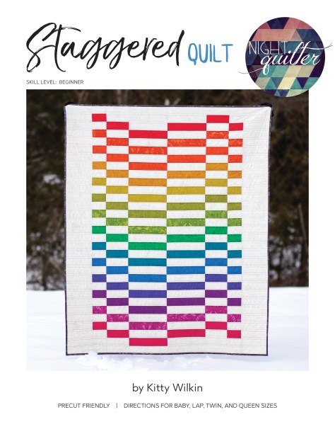
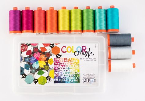
 I have been using Aurifil thread since early in my quilting days, and once I tried my first spool, I was immediately sold on how silky smooth and strong it is. It leaves hardly any lint in my machine, especially compared to the older hand-me-down threads I had been using before switching entirely to Aurifil. Not only that, the range of available colors has my rainbow-loving heart swooning. Paired with Aurifil’s commitment to seeking the most sustainable options: using 100% cotton thread, putting their most recent thread addition on a wooden spool, going plastic neutral in 2019, and a continuing focus on
 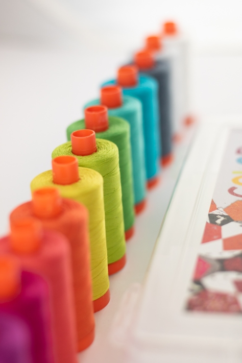 Over the past few years, I’ve found myself grabbing the same set colors of thread for most of my projects, and so finally I decided to reach out to Aurifil to see if they would still be interested in my curating a thread collection, since they had mentioned it a while back. I was excited to receive a resounding yes, and then the fun began!
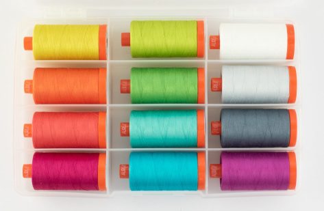 I carefully considered each of the colors of thread *I* always use, trying to decide if it would be a universally helpful color to have, and have very intentionally decided upon this spectrum of luscious, vibrant, tertiary-heavy threads. Here are just a couple of the projects on which I’ve personally used these threads recently:
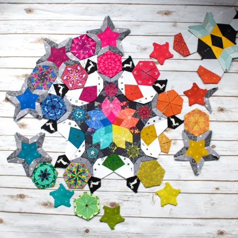

 If you want to purchase Color Crush and your local quilt shop doesn’t currently stock it, please ask them to special order. Any shop can grab it from a distributor of course, but ANY shop can purchase directly from
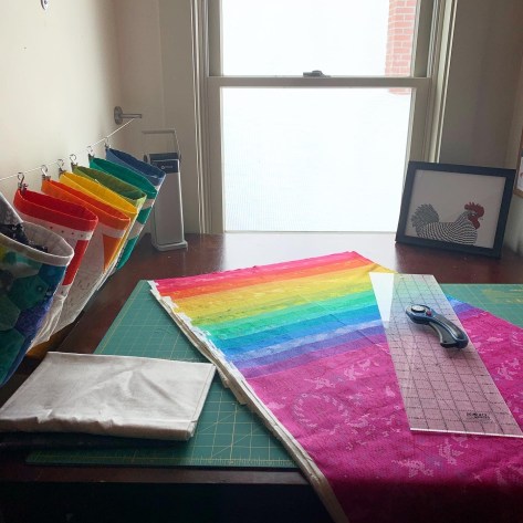 I recently faced the demon that was my chaotic sewing space and have been organizing with the help of my dear friend Alessandra. Yesterday when I shared the above photo of my newly cleared cutting table on Instagram, there were many questions about my rainbow of skinny bins hanging along the side of it. My skinny bins were made using a tutorial I wrote for Quilt Theory years ago, for a fabulous fabric party hosted by
  A few weeks ago, many fabric and thread companies were kind enough to send color cards to the Quilt Theory team to help with our planning. While brainstorming different ways to store and use these color cards, I realized that
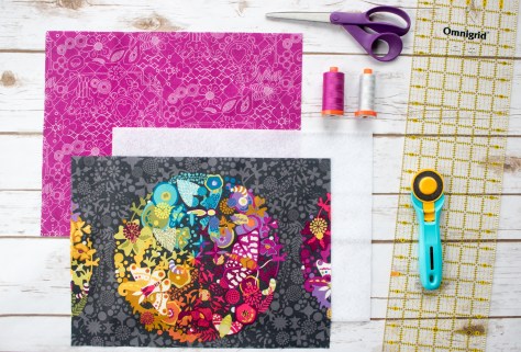
 Sew the short ends right sides together using a ⅜” seam allowance. You will have a tube with both ends open. Press seam open.
 Centering your pressed seam (3 ½” of fabric should be on either side of the seam), press the tube flat, creating clear side creases.
 Measure and mark 1 ⅞” (1 ½” from the bottom seam stitch line) up and 1 ½” in from the side on each bottom corner, as illustrated above.
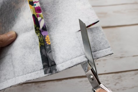 Carefully cut out the marked squares and discard.
 Opening the bin, fold the recently cut opening so that the bottom seam and side pressed seam match, right sides facing.
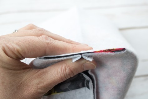 Carefully pin or hold in place, and sew along the opening with a ¼” seam. Be sure to backstitch at the beginning and end. Repeat for the other bottom corner.
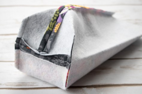 Your bin exterior should look like the photo above.
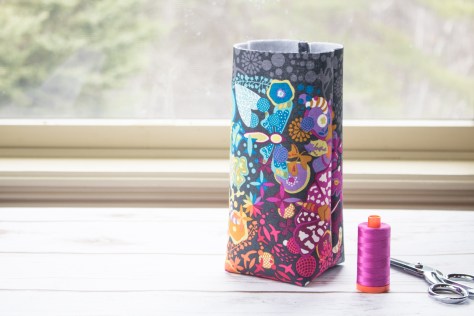 Turn bin right side out, press out the bottom corners, admire, and set aside the exterior of your bin.
 Repeat Steps 2 through 7 with the lining fabric to create the lining of the bin.
 With right sides out, carefully slide the lining fabric into the exterior of the bin, aligning the back seams and pressing the bottom corners into each other so that it fits snuggly. The exterior and lining should be wrong sides facing each other and the lining should extend about 1” above the top of the exterior.
 Fold the lining down toward the outside of the bin so that the raw edge of the lining meets the raw edge of the exterior (approx ½”).
 Fold again, so that the lining folds down over the exterior, with all raw edges contained inside the folds. Press carefully around the top edge of the bin so that your fold stays in place. You can pin or clip, or live on the wild side and simple feed carefully by hand as you stitch it down.
 I used my Aurifil 50wt 2600-Dove and a 3.0 stitch length so that it provided a bit of interest matching the pattern on the Alison Glass Sun Print Grow in Pansy I used for the lining.
 Feel free to personalize the outer panel, too! Add-on exterior patterns may be available one day if the desire is high. Please use
  If you don’t yet have an Aurifil thread color card, ask your local quilt shop or order from
 With my new love of running, and the start of a new year and decade upon us, I decided to pull inspiration from the temperature quilts people make to track the high and low temperatures through the course of a year and make a color-coded quilt tracking the miles I run or hike in 2020. Sharing this idea on Instagram, a good number of fellow running quilters expressed interest in joining the fun and making their own, so I thought I’d outline my thought process and plan here in as much detail as possible.
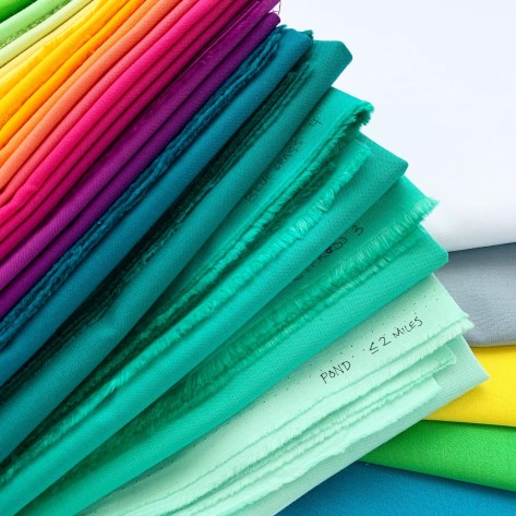 The foundational idea behind my plan is to coordinate colors of fabric with a certain number of miles run or hiked. Years ago I cut up my Kona color card and attached magnets for easy use, and this was a perfect opportunity to pull them out and work on a color flow I liked. I am hoping to train for my first full marathon this year, so I knew I needed colors for 1-2 mile runs all the way through 20+ miles. I chose colors I liked the most for the lower miles, since I know that many of my runs will be between 2-6 miles long and I want a quilt that’s heavy in my favorite colors! I then built a color flow from there, working my way all the way up to 21+ miles. Here are the colors I chose in case you want to use the same:
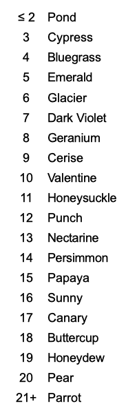
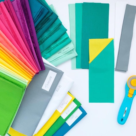 I will designate races with a Kona Citrus yellow top corner using the stitch and flip method of adding the corner. (I’m starting my year with a 5k race so I have that block ready to go for January 1st, as seen above).
 I will cut each run/hike mile block at 3.5″ x 9″, which means they will finish at 3″x8.5″. Initially, I was planning on cutting them to finish at 3″x9″ but by cutting to 9″, that will allow me to use smaller cuts of fabric (1/4 yard cuts and FQs) efficiently.
 I will be tracking all of my miles on a