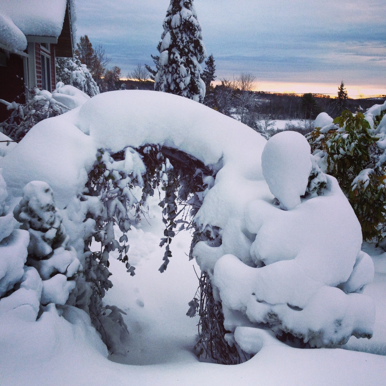
Thursday has come and gone, and here I am without a color inspiration post up yet. I spent the day yesterday sewing up a storm while my mother-in-law played with my son and my daughter was in preschool. After school was full-on family time. It’s the time of year where family and holiday projects and deadlines come first, and I’ve decided I officially will be taking a little break from this blog after today. Between my daughter’s birthday, Christmas, traveling, and other obligations, it’s just the right thing for me to do. I plan to return the week of January 12th, 2015, refreshed, renewed, and with a stockpile of fabulous photographs for posts in the new year. Wild! I still will be posting to Instagram (probably, although with less regularity and probably more random content), so I’d love to see you there. I wish you all a wonderful holiday and happy new year, and look forward to returning to this amazing and supportive blogospheric quilt guild!
With that, here is the color inspiration for the week! Hopefully it will hold you over for the next few weeks. Palettes are made with Play Crafts’ Palette Builder 2.1 and my photographs.
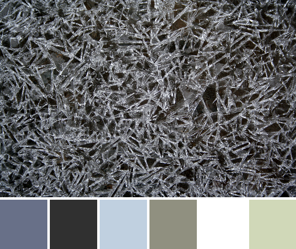
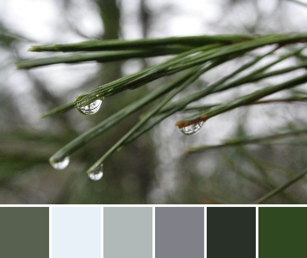
Corresponding Kona cottons from left to right:
Slate, Charcoal, Baby Blue, Stone, White, Parchment or Limestone
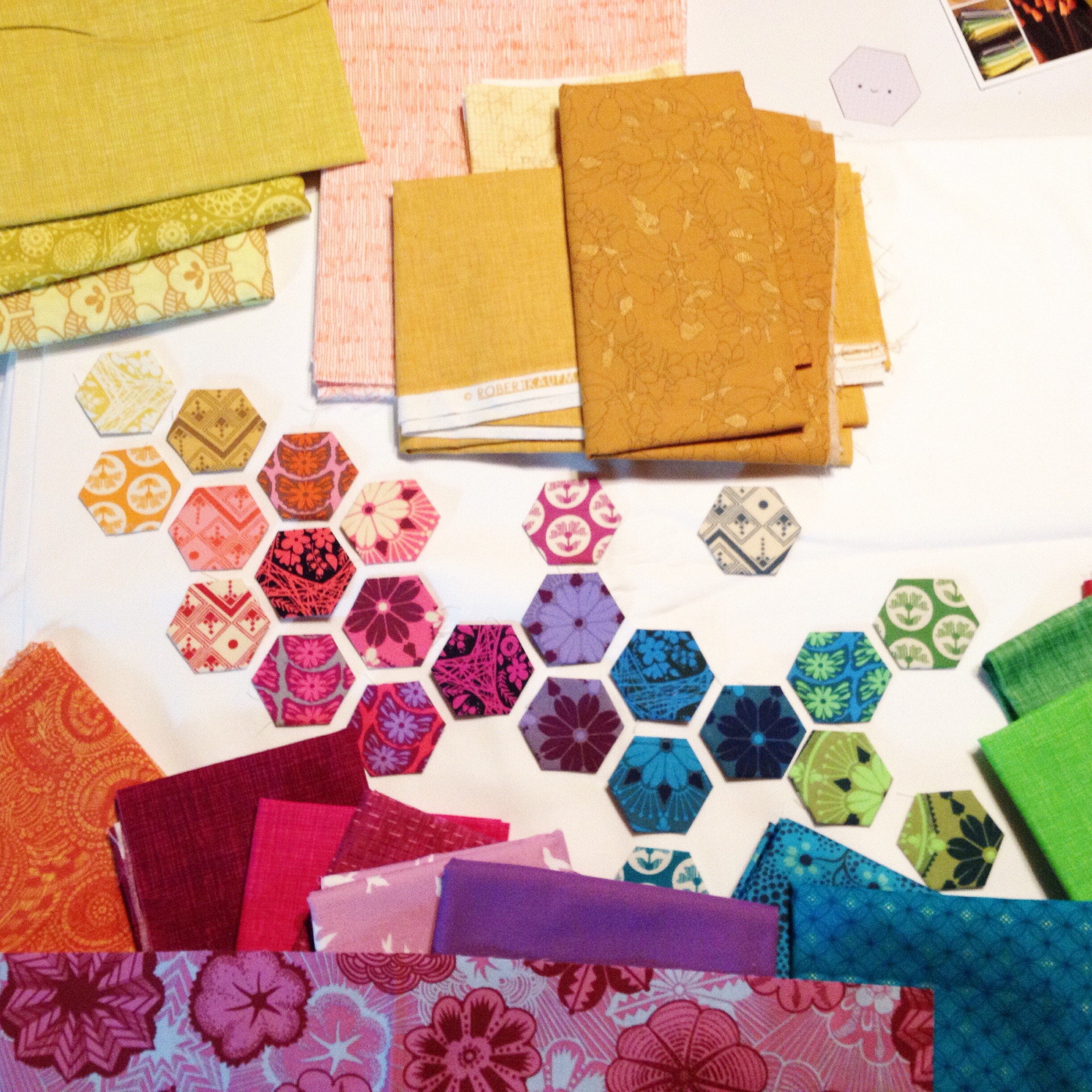
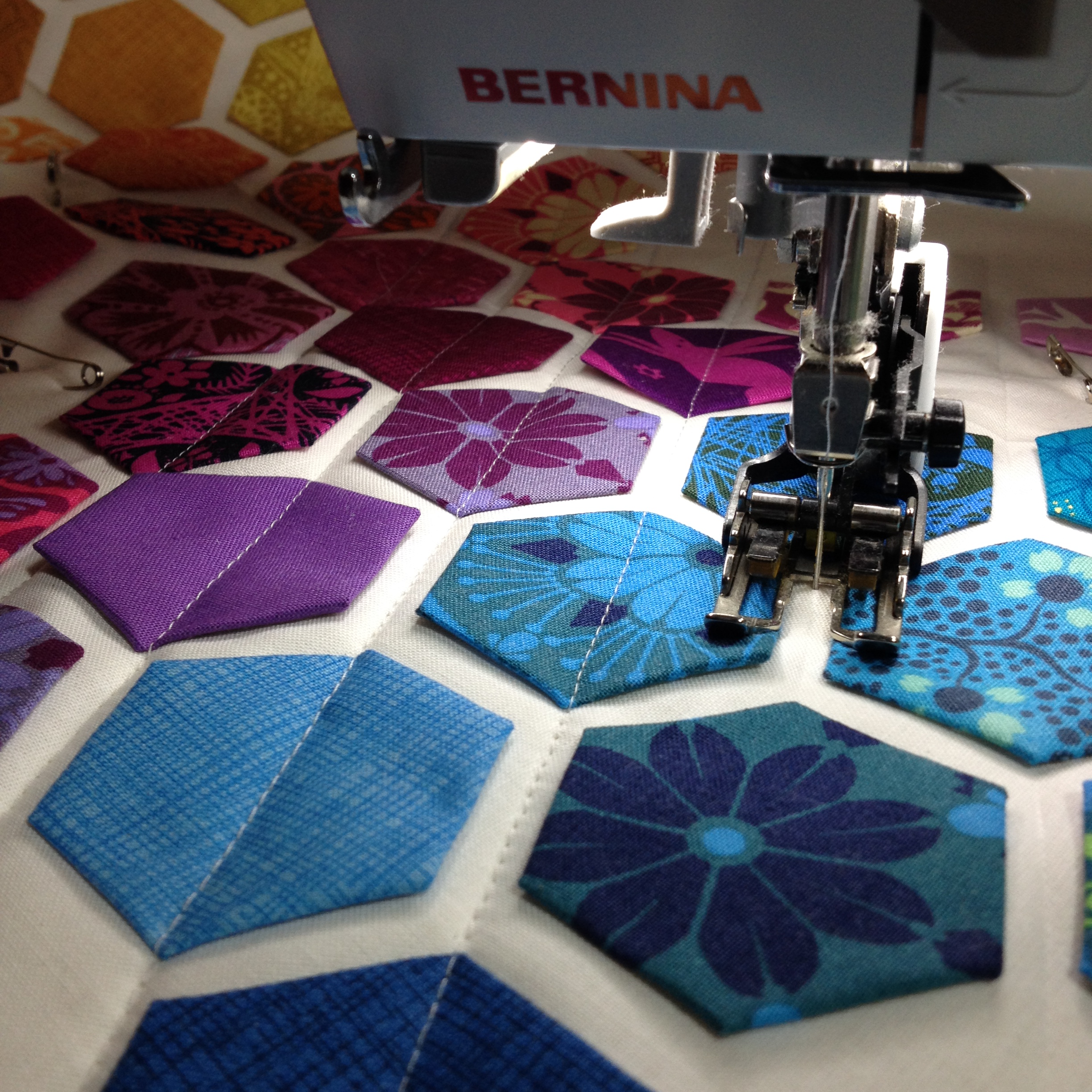
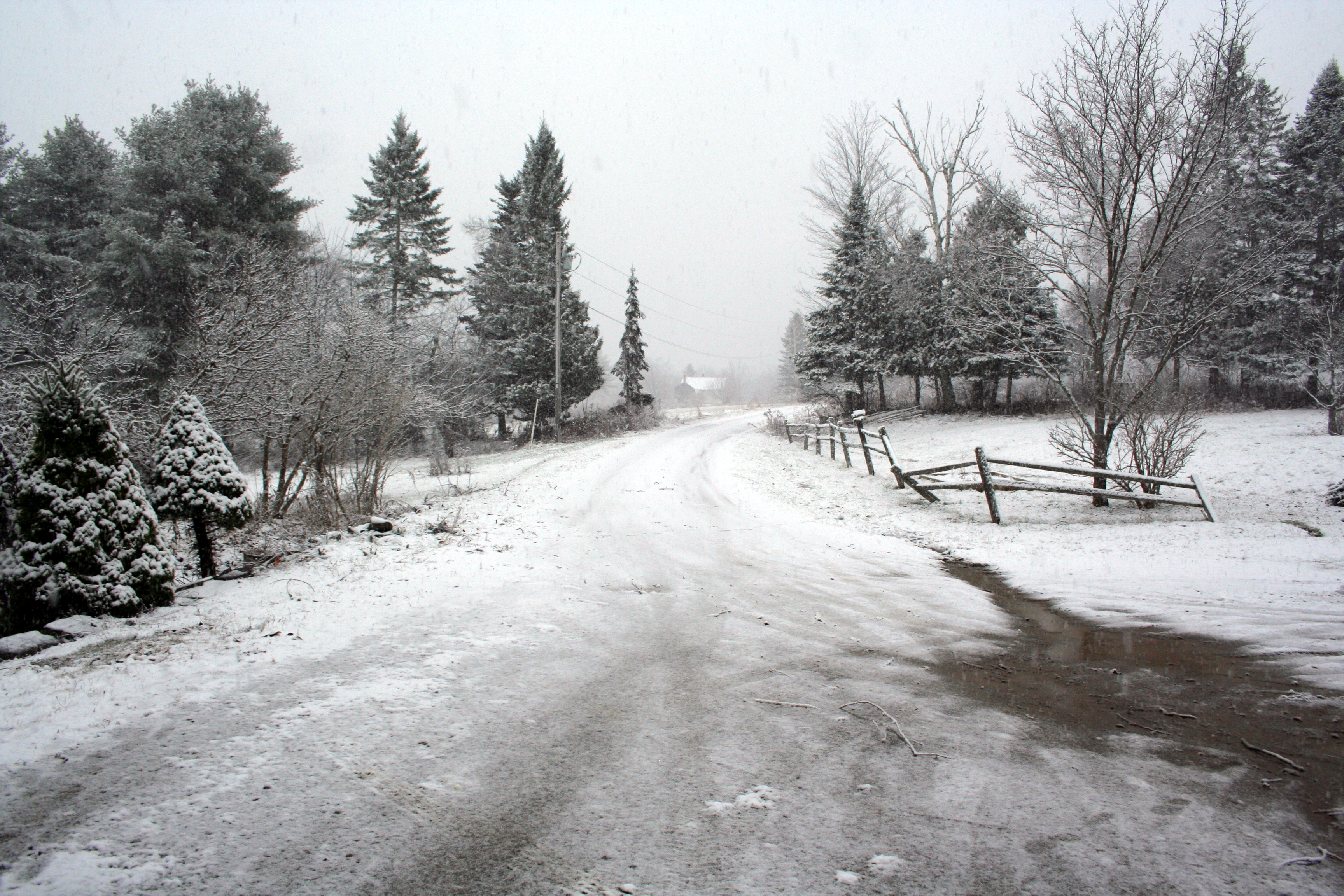
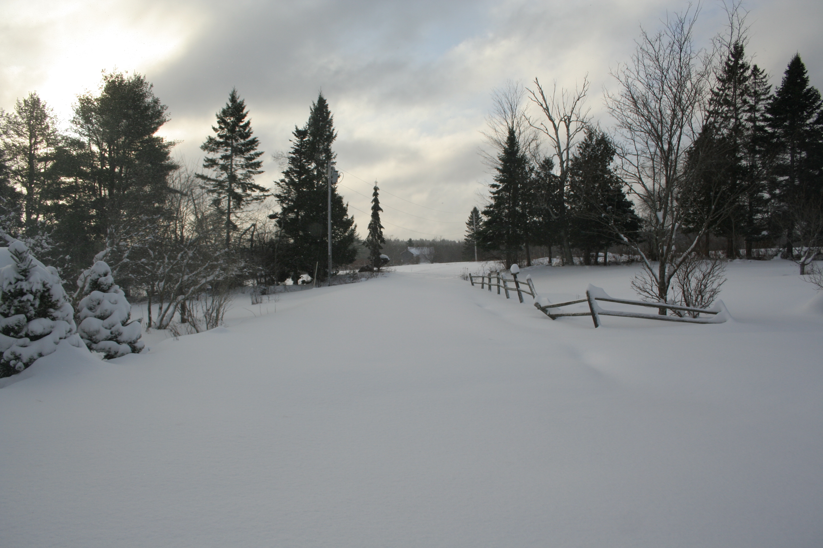
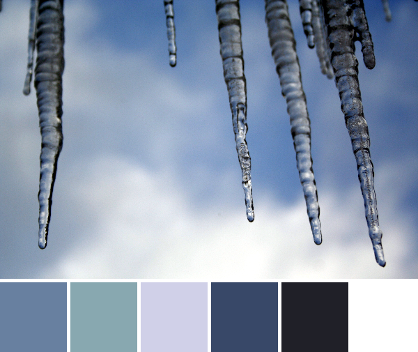
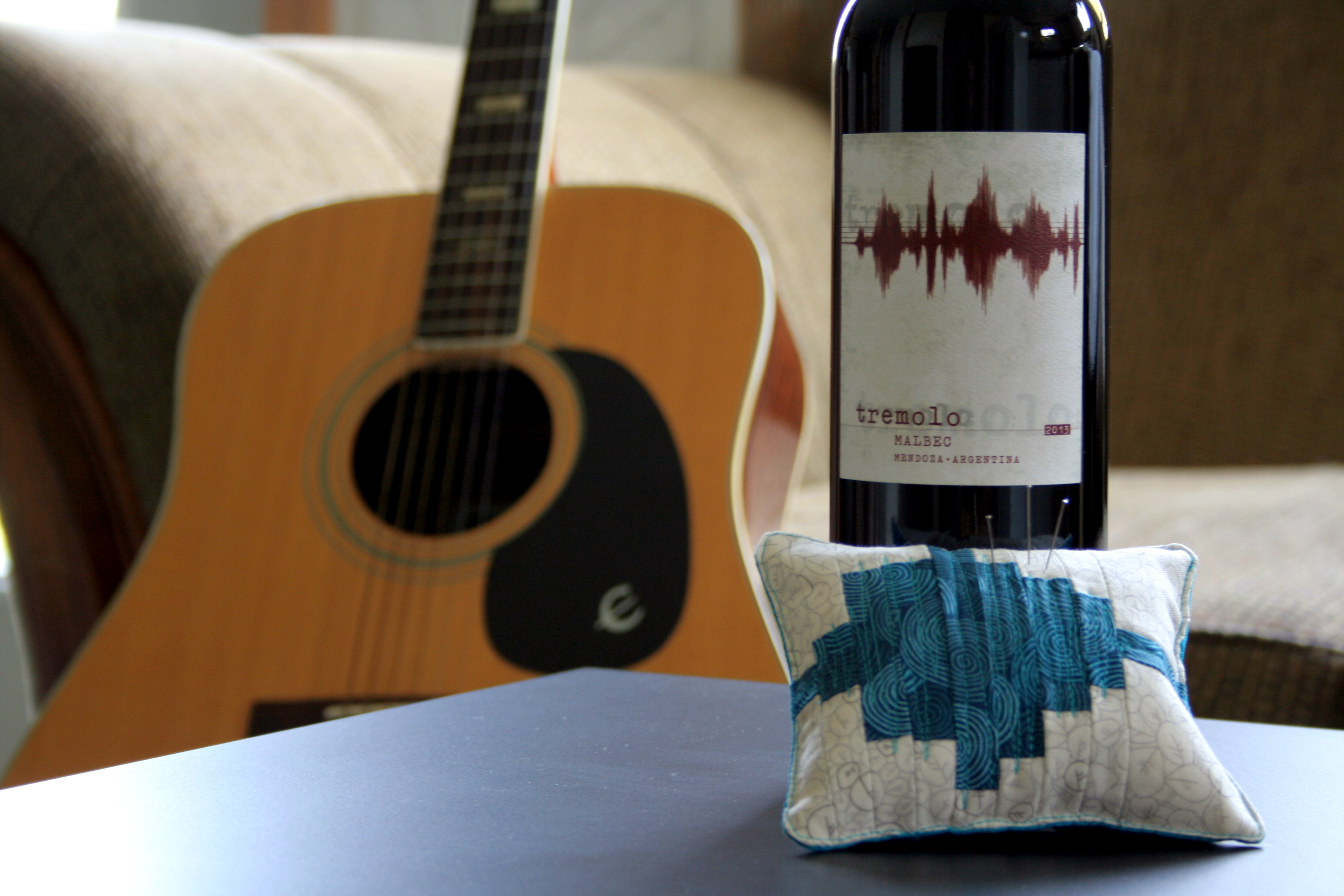
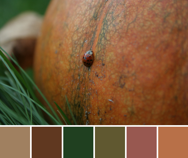
This amazingly intricate and fractured ice palace was on top of a mud puddle in our driveway. Yes, a mud puddle! Nature is amazing, and these little pockets of icy beauty are no exception! I began with a plan to post another frosty-filled color palette post, since we have had some wonderful frosty and icy days. But then I decided I really wanted to add in some color. Thinking about where I see the most color these days, I realized the answer was probably my sewing projects! So the next two palettes are pulled straight from some of my sewing sneak peek photographs.
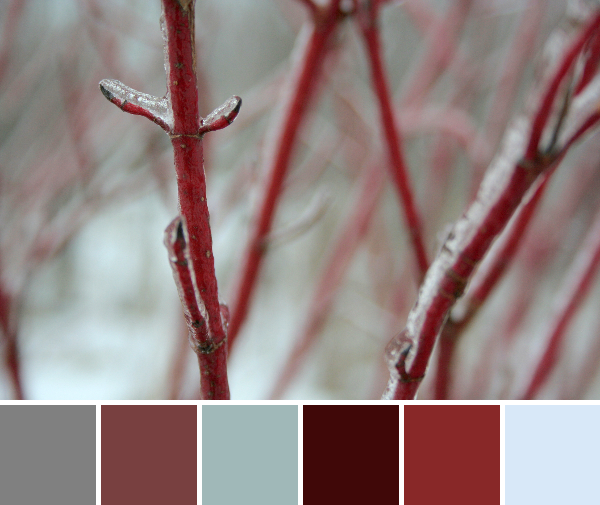
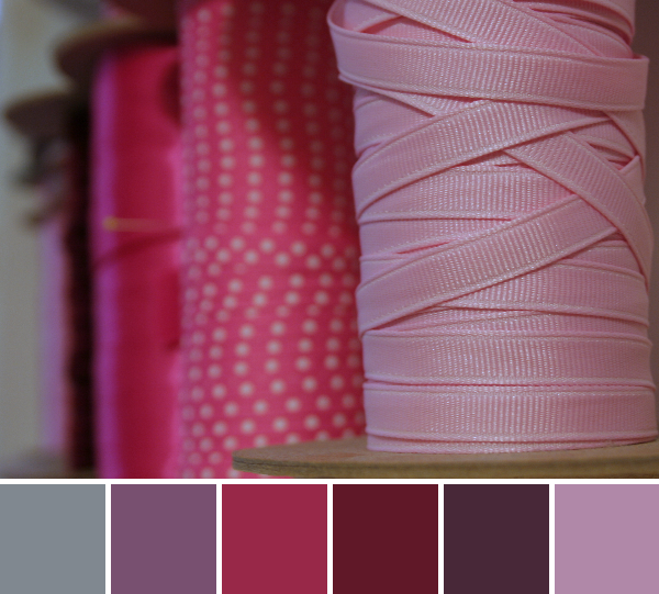
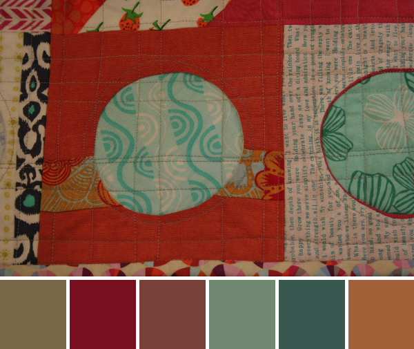
Corresponding Kona cottons from left to right:
Coal, Burgundy, Crimson, Pewter, Wine, Espresso
Corresponding Aurifil thread from left to right:
1158 – Med Grey
1130 – V Dk Bark
2468 – Dk Wine
2562 – Lilac
2355 – Rust
5024 – Dark Brown
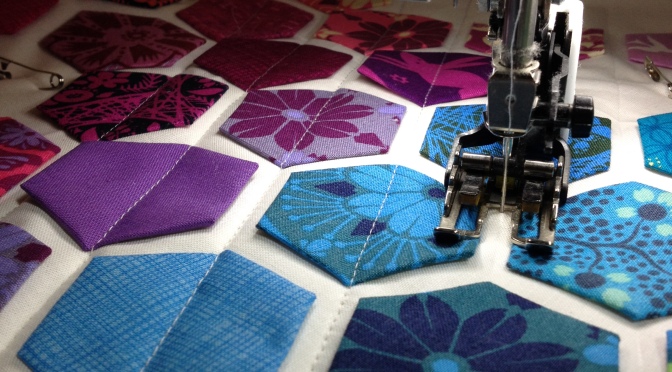
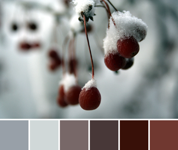
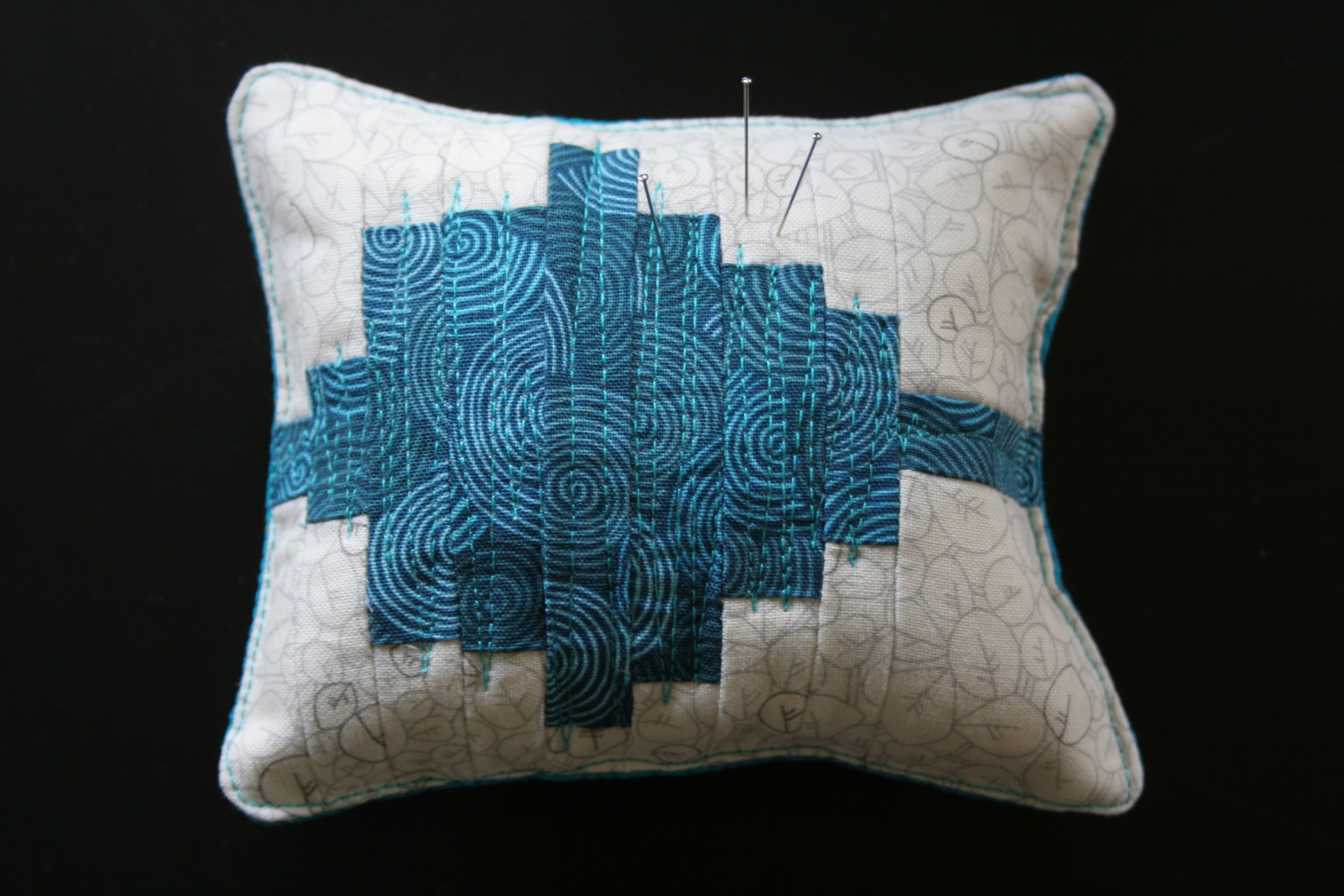
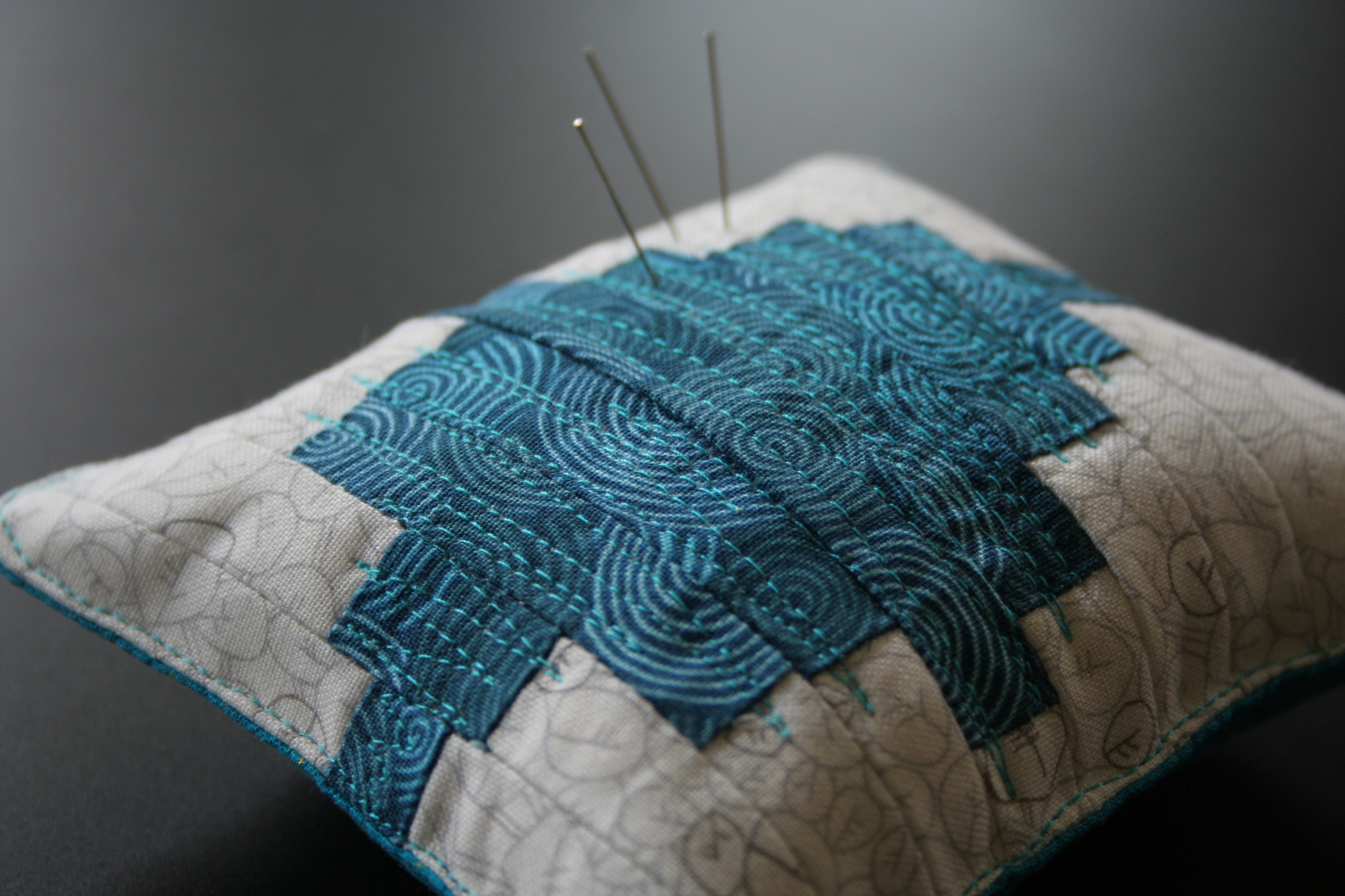
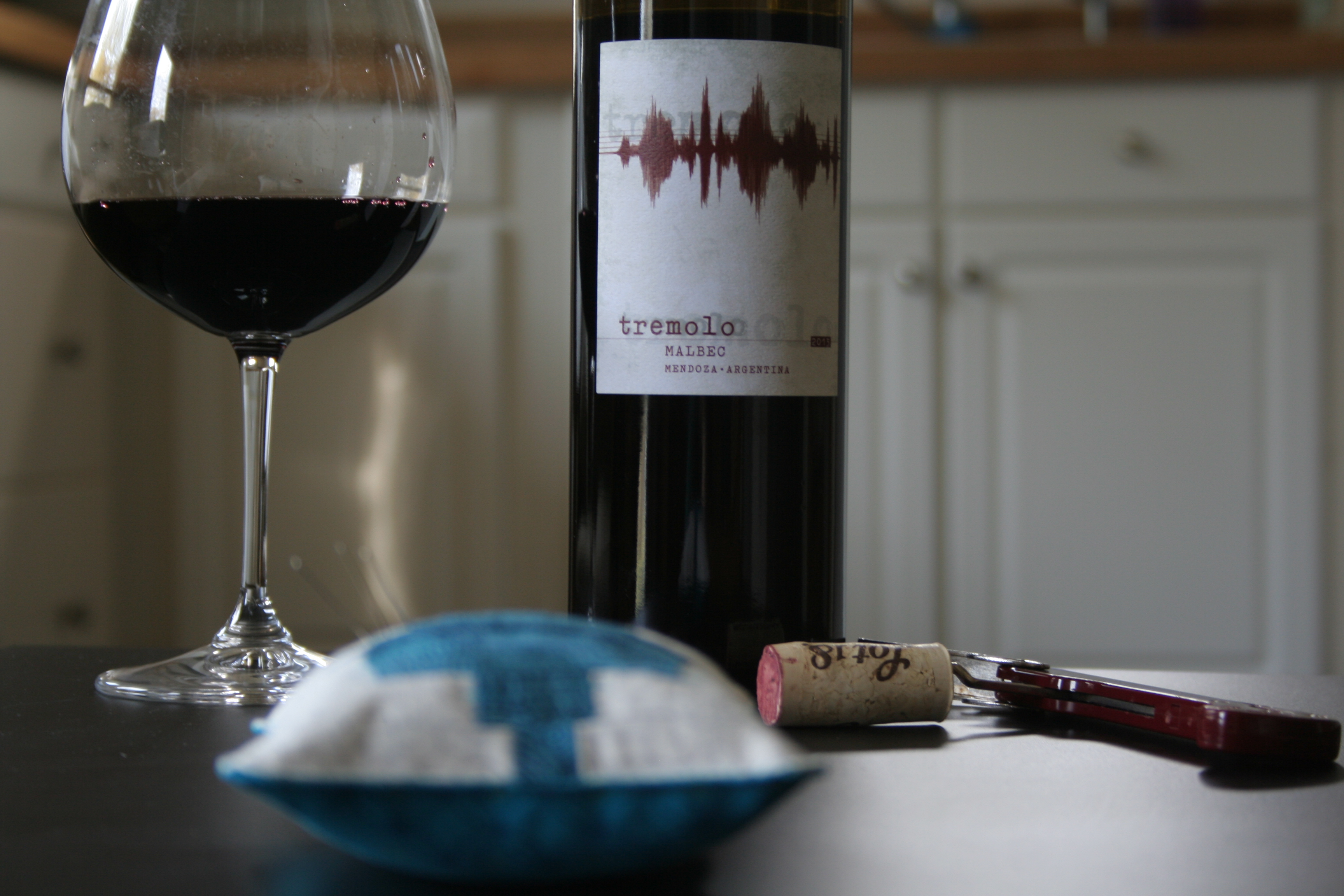
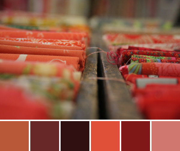
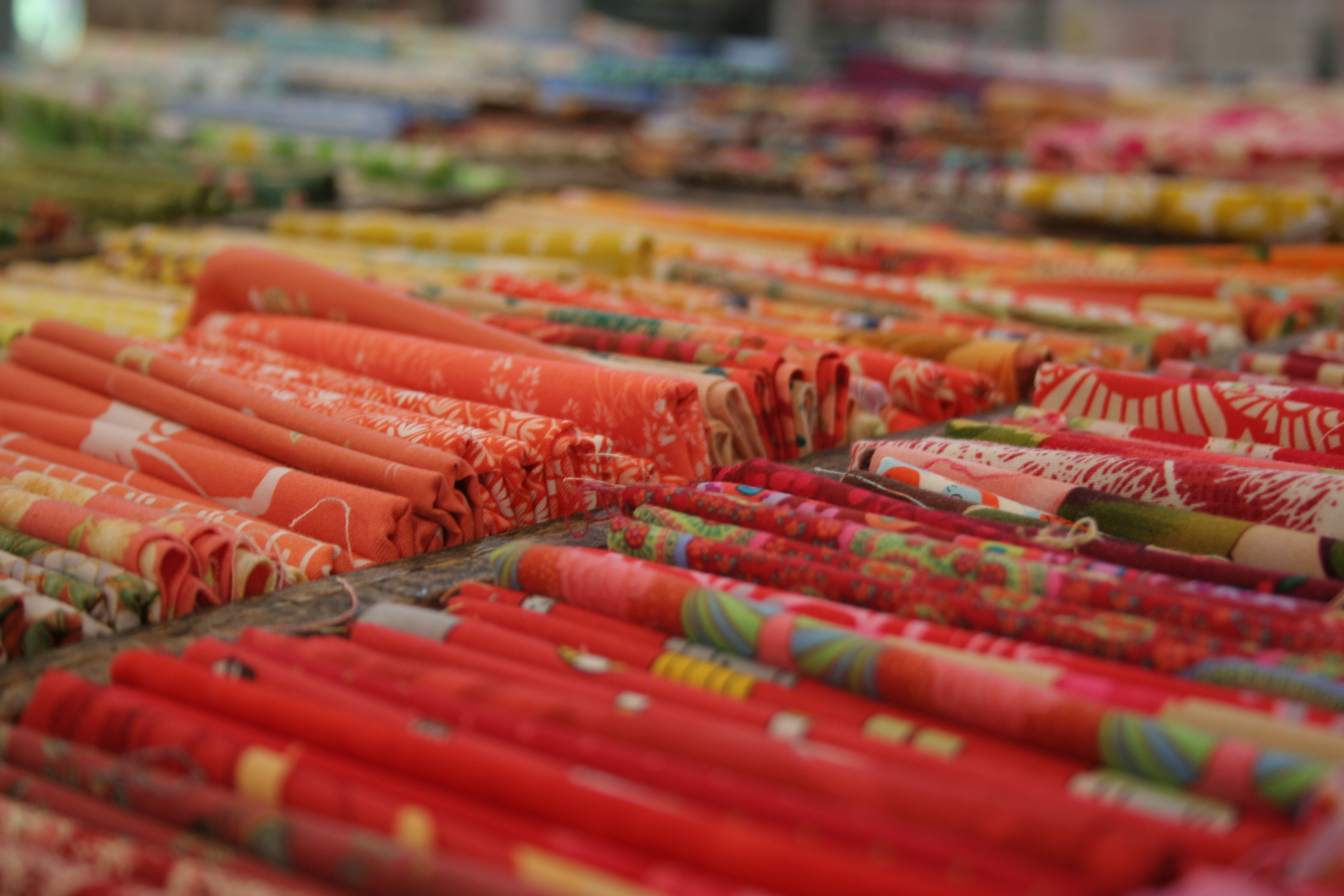
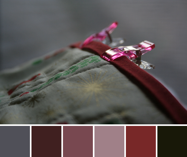
This gorgeous palette of reds and pinks and the glisten of the clover clip make me think of Christmas. So pretty!
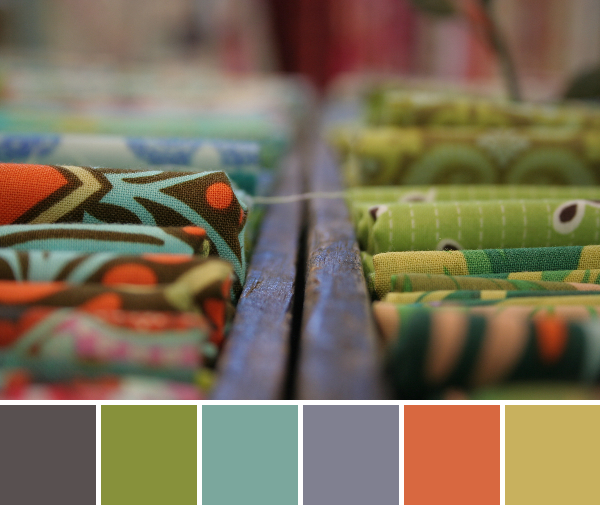
Corresponding Kona cottons from left to right:
Graphite, Dresden Blue, Titanium, Olive, Ivy, Avocado
Corresponding Aurifil thread from left to right:
1126 – Blue Grey
2815 – Teal
5008 – Sugar Paper
2910 – Med Olive
1318 – Dk Sandstone
4173 – Dk Olive
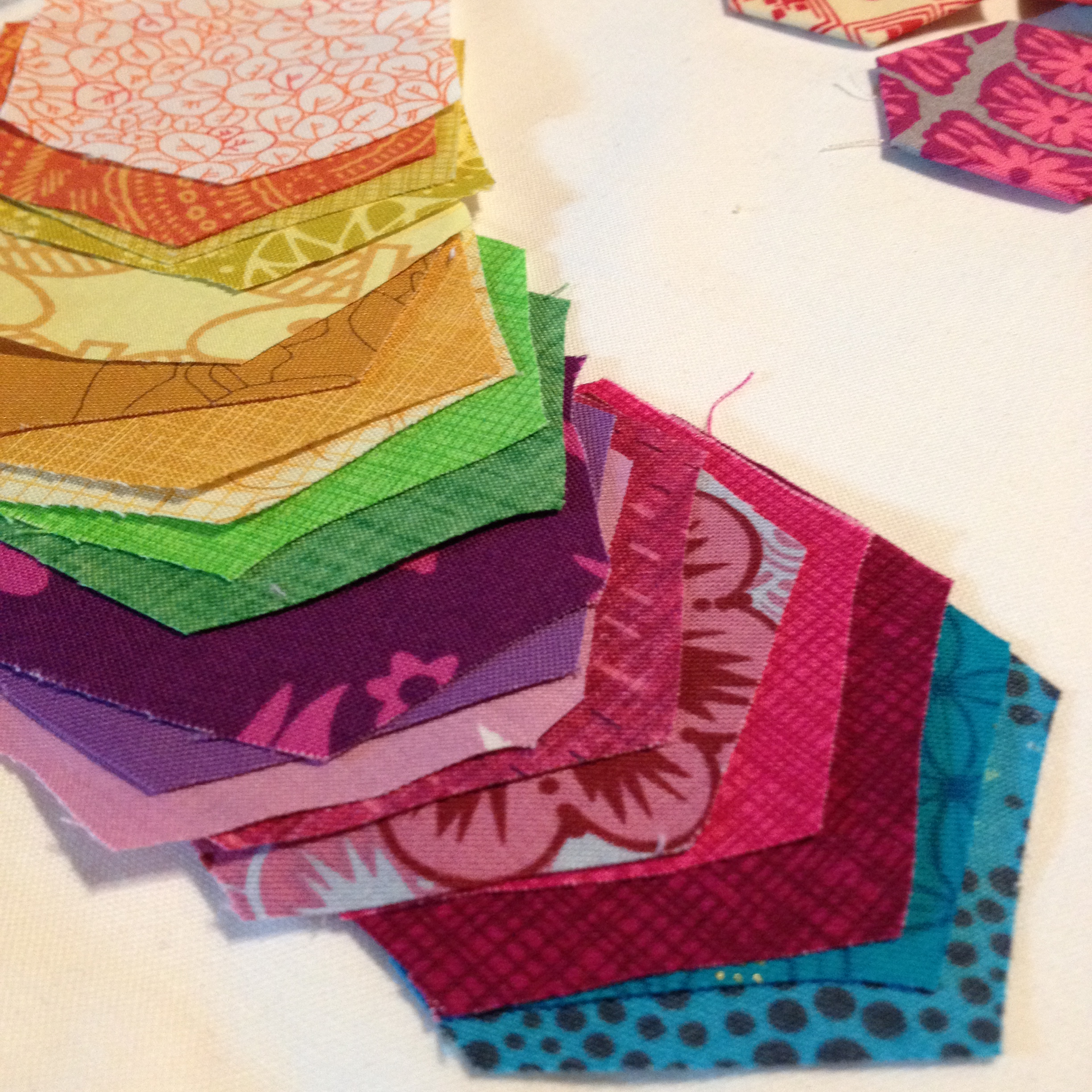
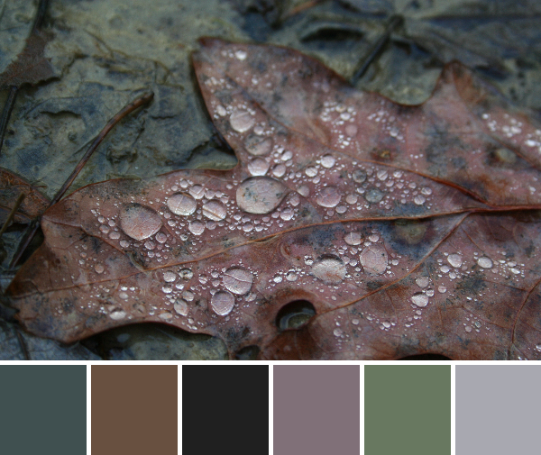
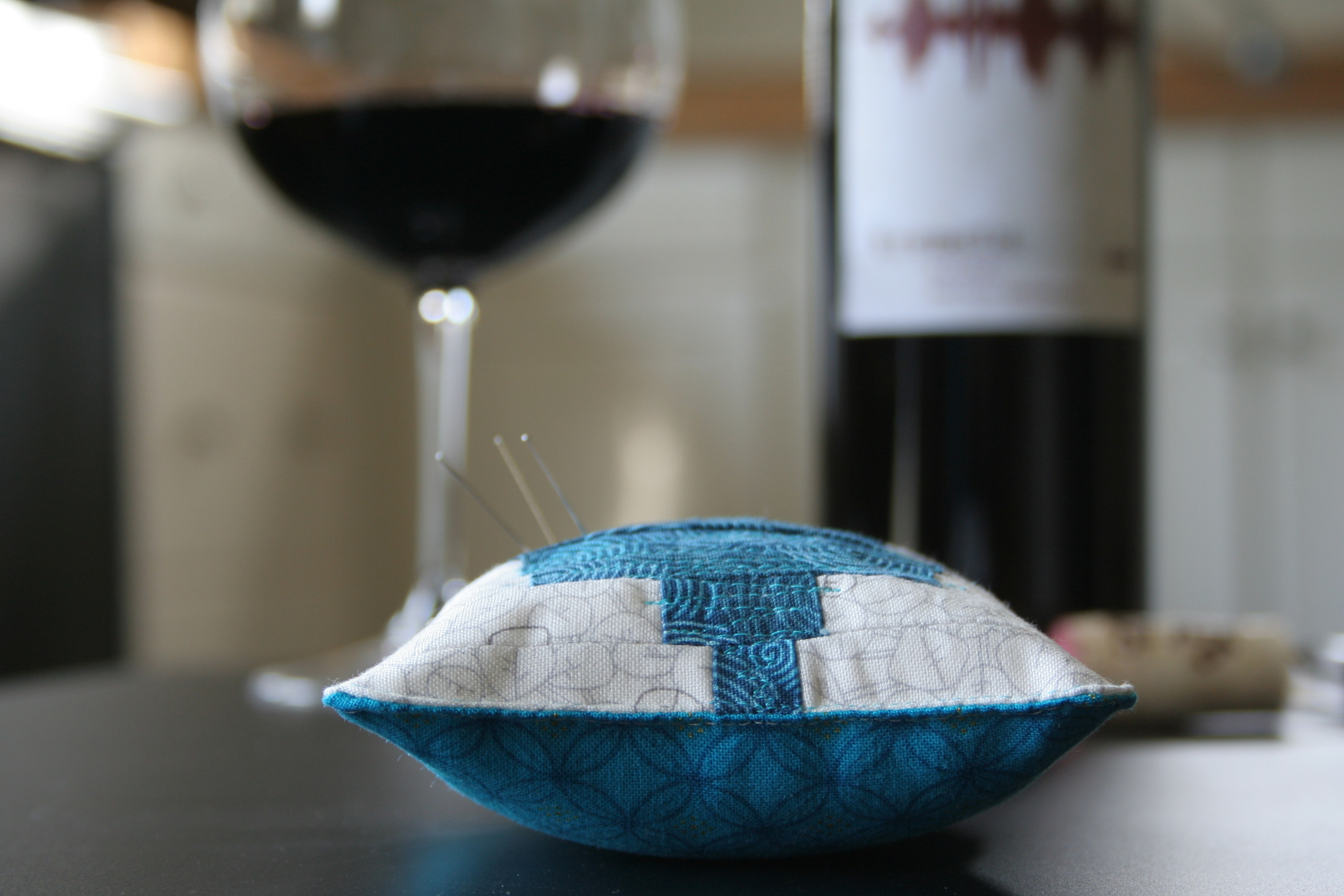
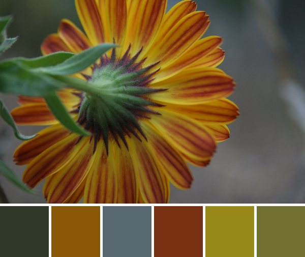
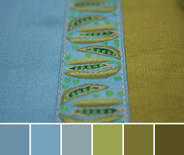
A bright sweet pea palette ranging through teals and lime greens, a sneak peek at a secret holiday project. Oh, I have so much to show you when I return from my little vacation! Have wonderful holiday and new year!