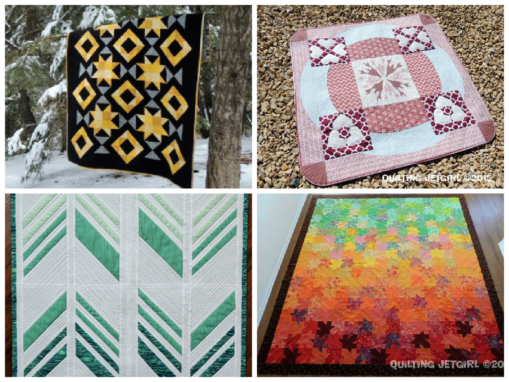
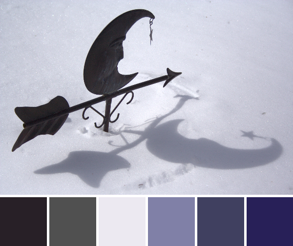
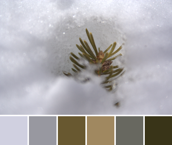
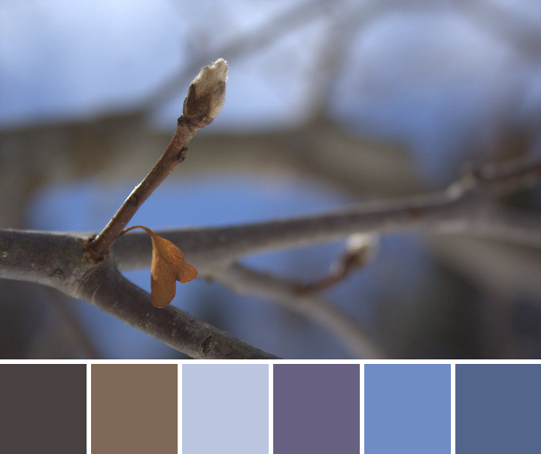
Ahh, spring! Color is everywhere, sun is slowly warming the soil, and the world is coming back to life. Spring is my favorite season, until summer comes along… and then fall with the crispness and the gorgeous leaves, followed by that first gorgeous snow that makes me love winter. I guess I’m just grateful to live in a place with clearly defined and vastly different seasons. The constantly changing environment keeps the wonderment fresh.
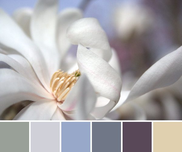
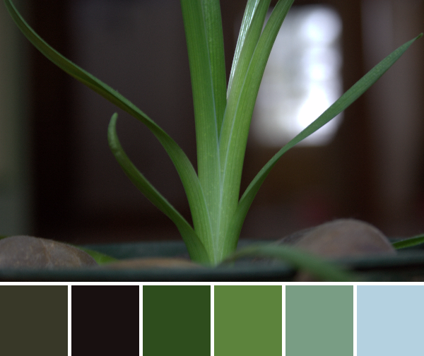
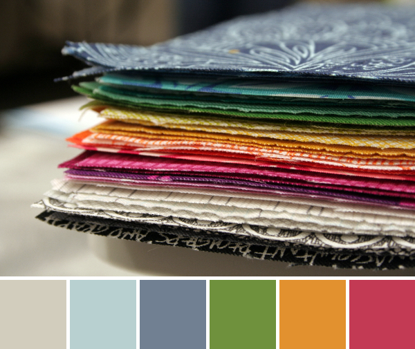
Today’s color inspiration is again from my garden, with color palettes made using Play Crafts‘ wonderful Palette Builder 2.1. The matching Kona & Bella solids and Aurifil thread is also a perk of the palette builder–if you haven’t tried it, I would definitely suggest taking a moment to make palettes out of your favorite photos. It might change the way you see the world–or do you already see the world in fabric and thread?

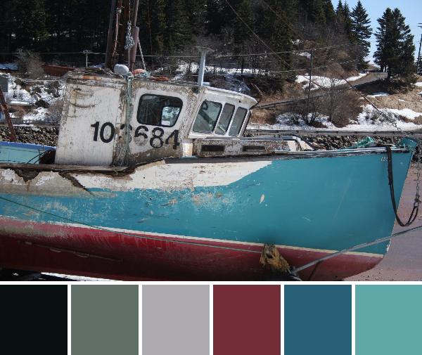
Corresponding solids from left to right:
Bella Dusty Jade, Bella Betty’s Teal, Kona Graphite, Bella Christmas Green, Kona Jungle, Bella Sprout
Corresponding Aurifil thread from left to right:
2845 – Lt Juniper
2850 – Med Juniper
1246 – Grey
2892 – Pine
2890 – Dk Grass Green
1114 – Grass Green
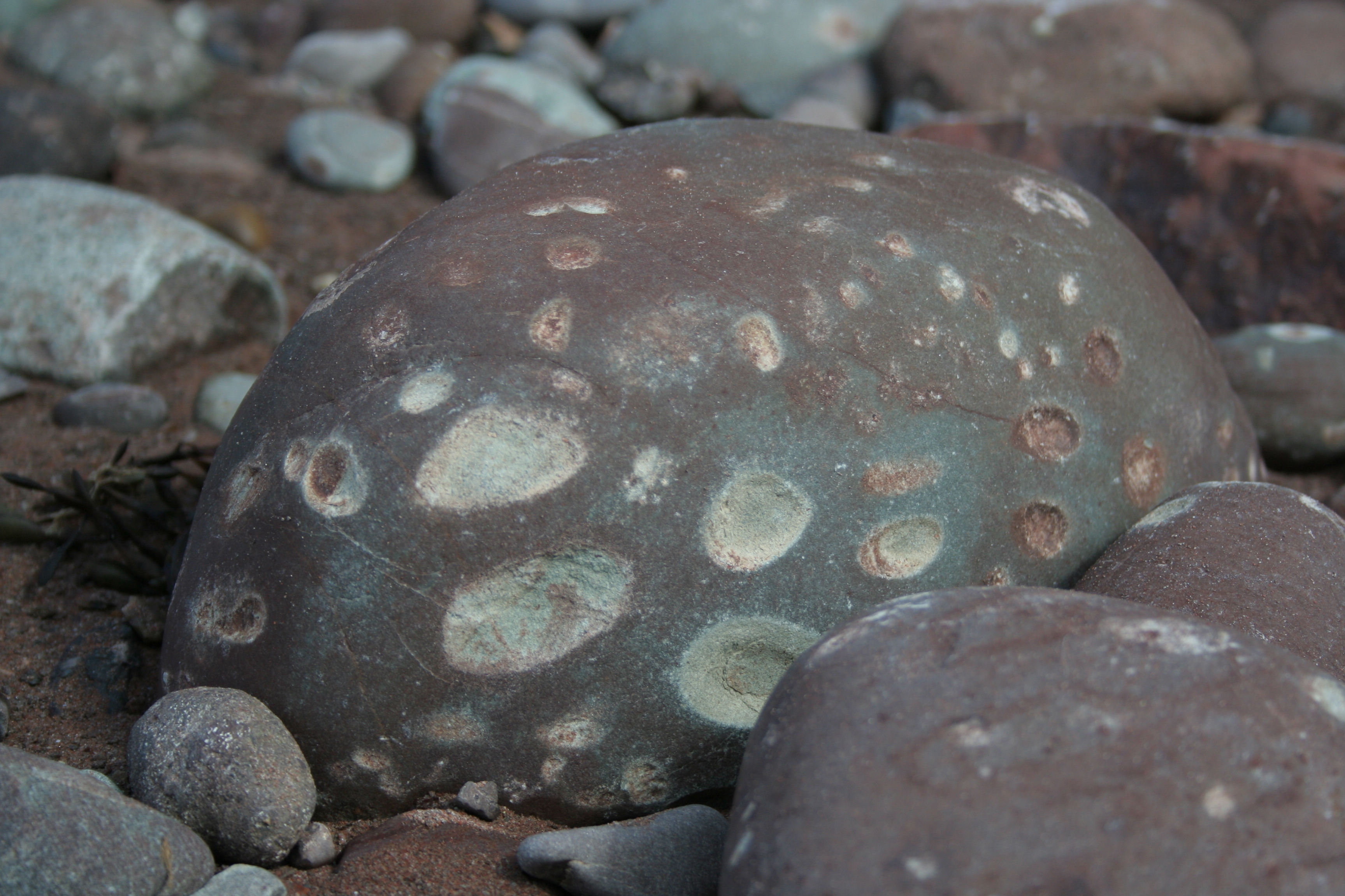
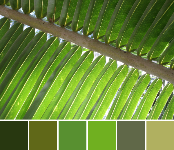
On a whim, I did a quick google search for green after creating this palette. I felt like this photo and resulting palette said so much, yet I couldn’t quite put it to words. An interesting website on color psychology pretty much nailed my sentiment. Green…
There’s much more reflection on the color green here, if you are interested. Maybe I need more green in my fabric stash?

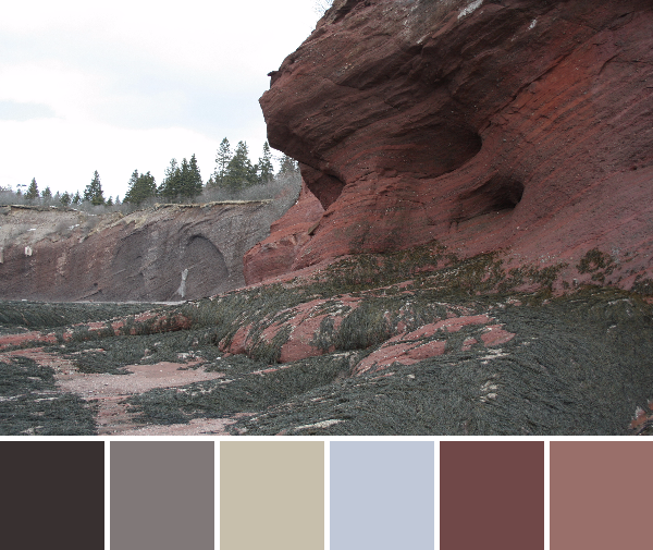
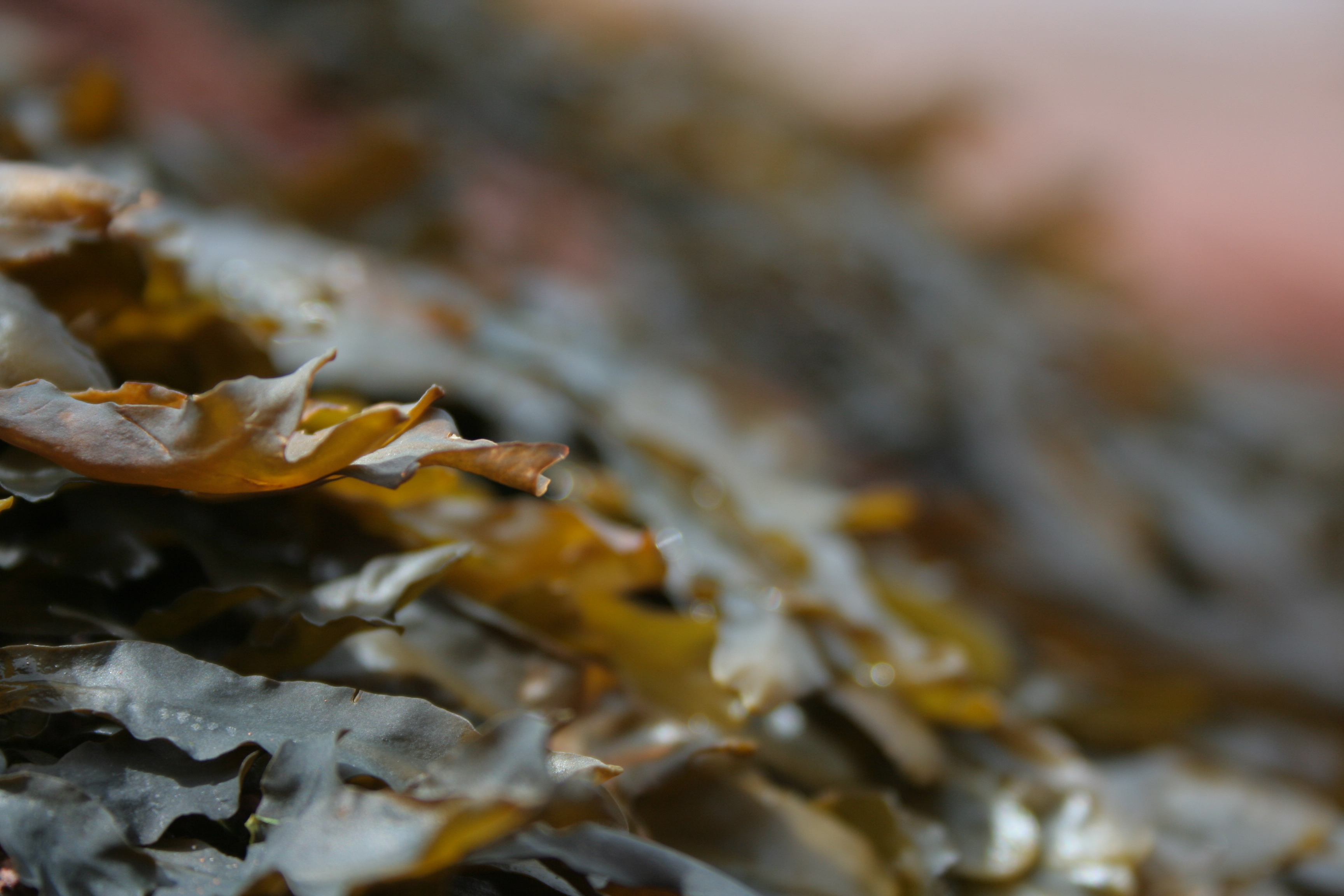
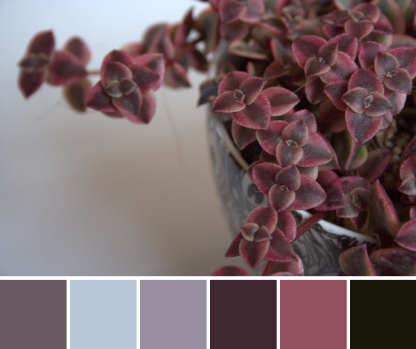
Corresponding solids from left to right:
Bella Ochre, Bella Shocking Pink, Kona Mango, Bella Kansas Red, Bella Pine, Kona Pickle
Corresponding Aurifil thread from left to right:
2930 – Toast
2215 – Peach
2210 – Caramel
2385 – Terracotta
5013 – Asphalt
5016 – Olive Green
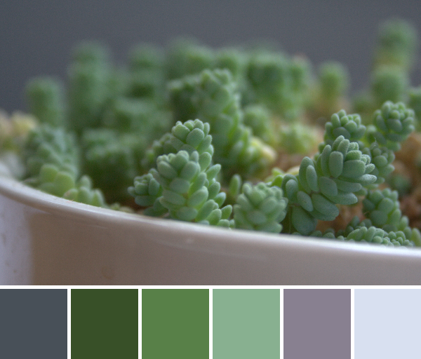
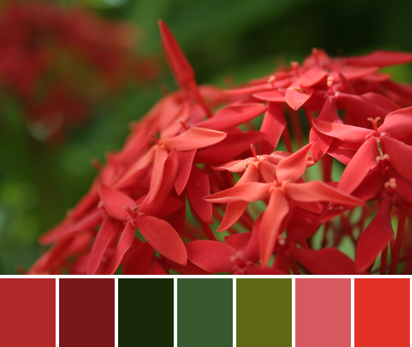
Ahhh, finally some more color! I love this range of oranges, with a nice anchoring dark green and a splash of Pickle! How can you go wrong with Kona Pickle?

Corresponding solids from left to right:
Bella Fig Tree Apricot, Bella Amelia Orange, Kona Cedar, Kona Nectarine, Kona Moss, Kona Evergreen
Corresponding Aurifil thread from left to right:
2930 – Toast
2210 – Caramel
2350 – Copper
2215 – Peach
4173 – Dk Olive
2570 – Aubergine
Here’s just one more photo to share the smooth silkiness of the tulip petals. This palette would make a fabulous spring quilt, perhaps with some added low volumes. Simple, cheerful, full of new life.
What is your favorite sign of spring?