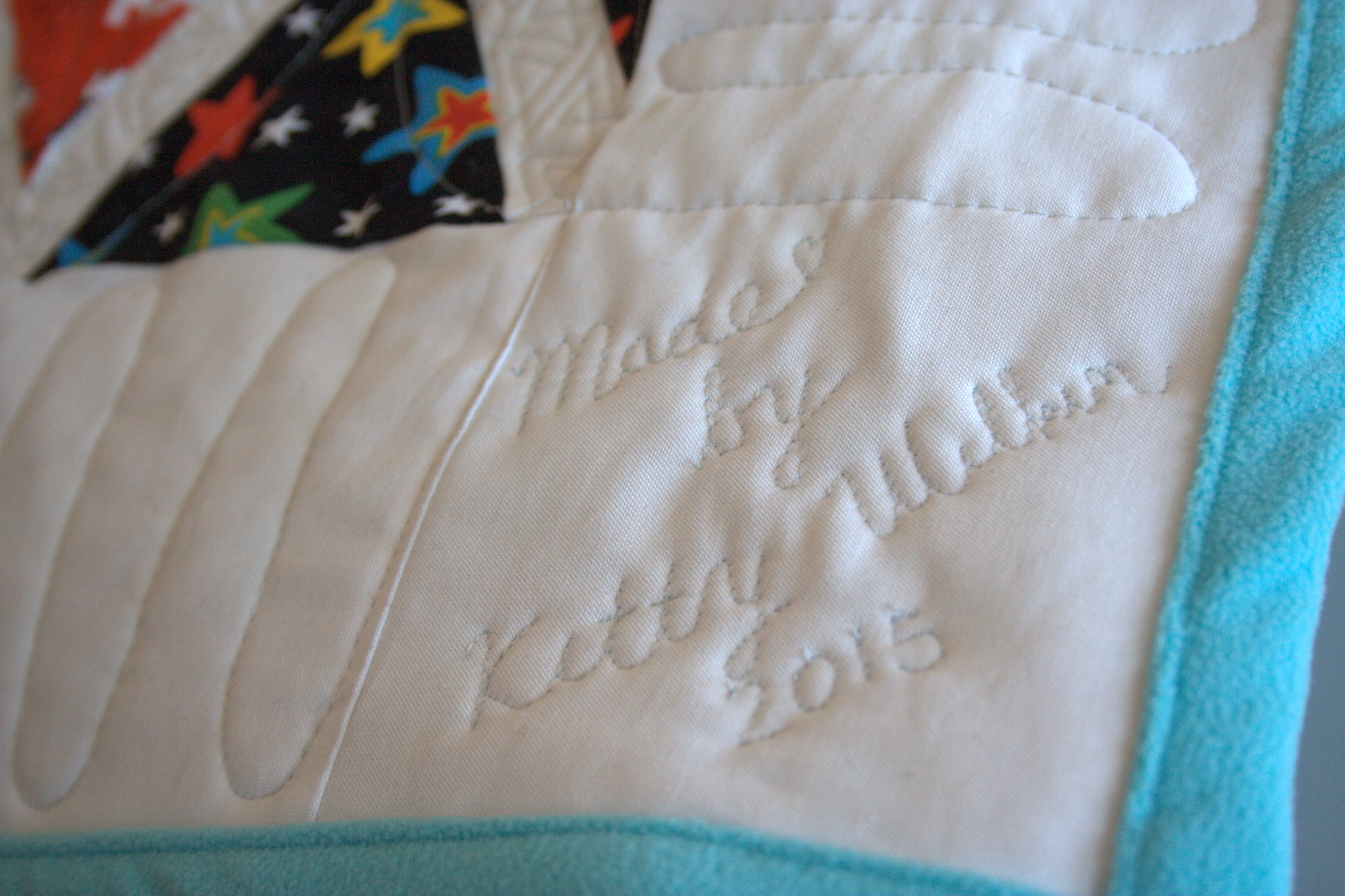
This past weekend, my husband and I escaped for a long weekend getaway to the Bay of Fundy. It was our first trip alone together since our almost 5 1/5 year old daughter was born, and with another baby expected in the next month or so, it was most likely our last for another couple of years. A babymoon, if you will. We made the most of it and adventured more than we would be able to with little kids in tow, and relaxed more than we would be able to with little kids in tow. It’s all about balance.
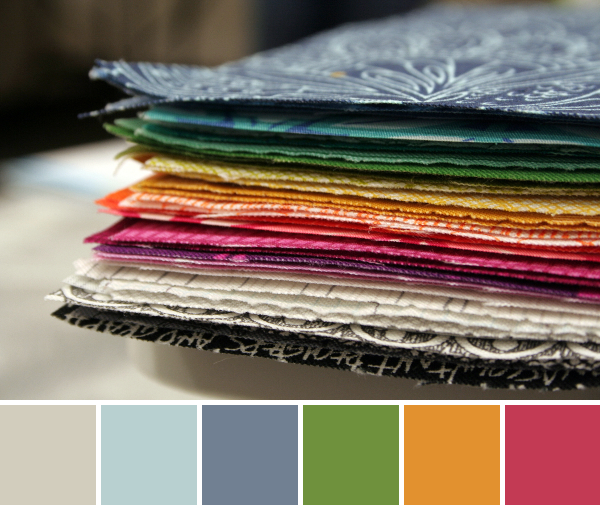
 The Bay of Fundy is known for having the highest tidal range in the world. I’ve wanted to travel to the Bay of Fundy in Canada since my estuarine ecology studies in college. There’s something about 40 foot tides and vast mud flats that makes me happy. Our short timeframe and my 8 months pregnant body didn’t really allow for as much exploring as I’d have liked, but we had a great time anyway. Today I’ll be sharing some color palettes from photographs taken on our trip, created with Play Crafts’ Palette Builder 2.1.
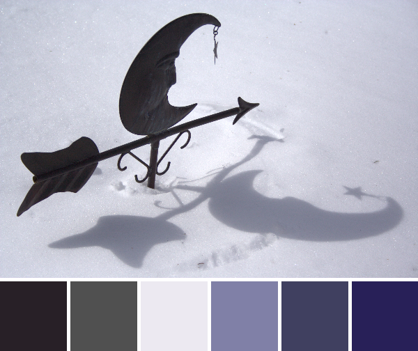
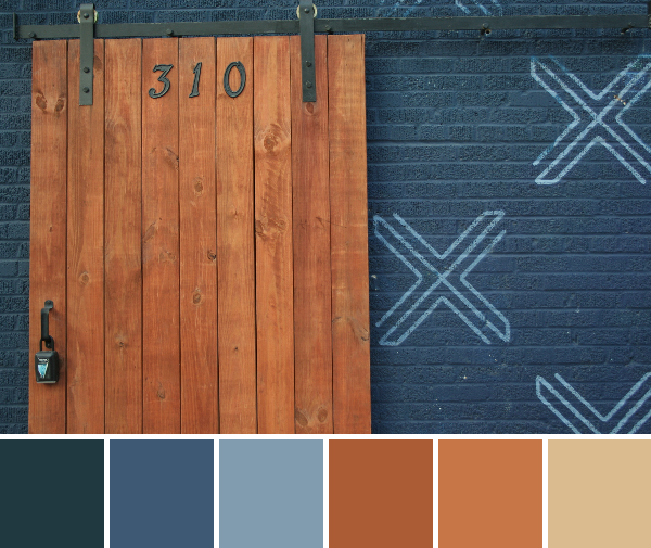
 Corresponding solids from left to right:
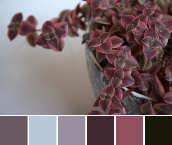
Kona Lake, Bella Etchings Charcoal, Kona Slate, Bella Navy, Kona Black, Bella Dusty Jade
Corresponding Aurifil thread from left to right:
2715 – Robins Egg
1158 – Med Grey
4140 – Wedgewood
2784 – Dk Navy
2692 – Black
2845 – Lt Juniper
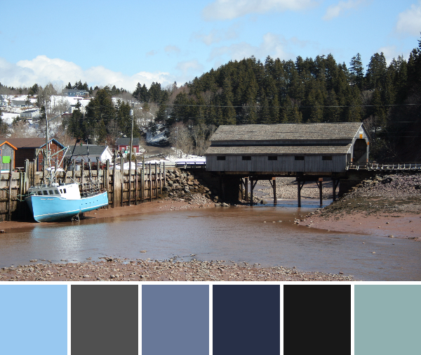
Low tide on the Bay of Fundy means boats are grounded, many feet below the dock. I loved how the blue of the boat hull matched the sky.
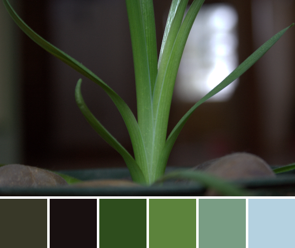
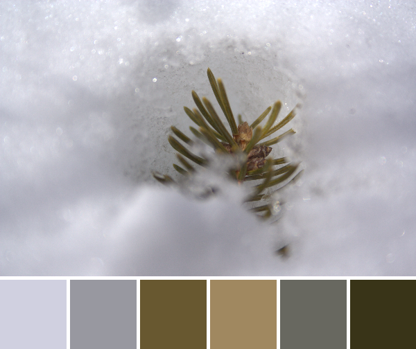
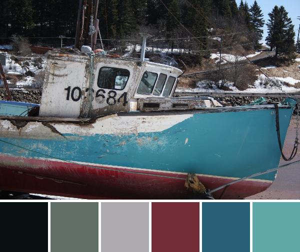
 Corresponding solids from left to right:
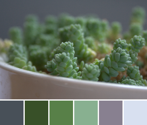
Bella Soft Finish Black, Bella Etchings Slate, Bella Tan, Bella Platinum, Kona Mocha, Kona Taupe
Corresponding Aurifil thread from left to right:
1285 – Med Bark
2625 – Arctic Ice
5011 – Rope Beige
2560 – Iris
2468 – Dk Wine
2375 – Antique Blush
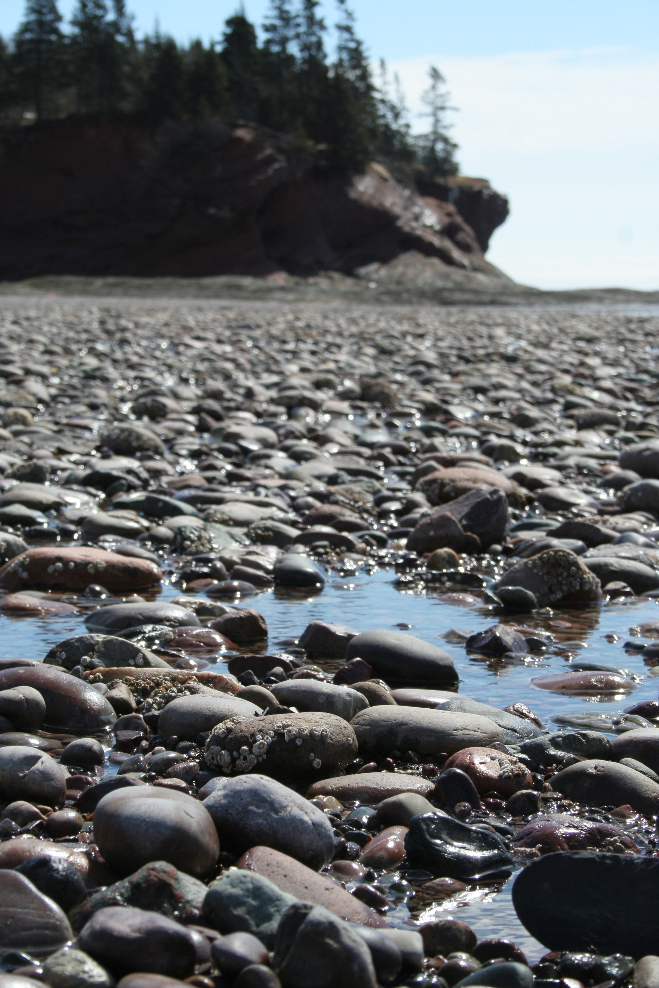
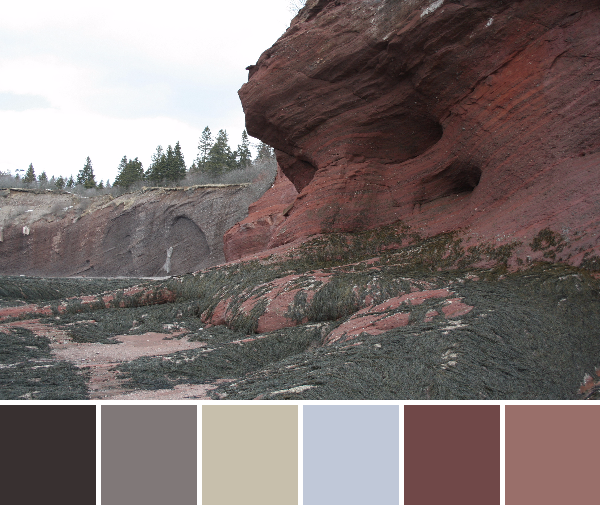
The geology at the Bay of Fundy was decidedly red-brick colored. Between the red mud and the red rocks, there was a heavy theme of brick (marsala!?) in my photographs. The rocks exposed at low tide are shaped by the tides, the strength of the rocks, and the presence of the joints in the rocks. The rock in the cliffs the stacks are being cut from are arkosic sandstone and coarse poorly sorted conglomerates (thank you, Wikipedia–geologists, please correct me if I’m wrong!). We loved exploring caves carved into the soft red sandstone at St. Martin’s Caves. Isn’t the power of nature amazing!?
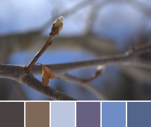
 Corresponding solids from left to right:
Kona Black, Bella Lead, Bella Stone, Kona Crimson, Kona Teal Blue, Bella Caribbean
Corresponding Aurifil thread from left to right:
2692 – Black
1246 – Grey
2606 – Mist
2345 – Raisin
1310 – Med Blue Grey
2850 – Med Juniper
This boat has seen better days, but never have I seen one more full of character! I think because of the drastic change in tide each day, the sides of the boats moored to the dock get a beating. It’s still gorgeous, though!
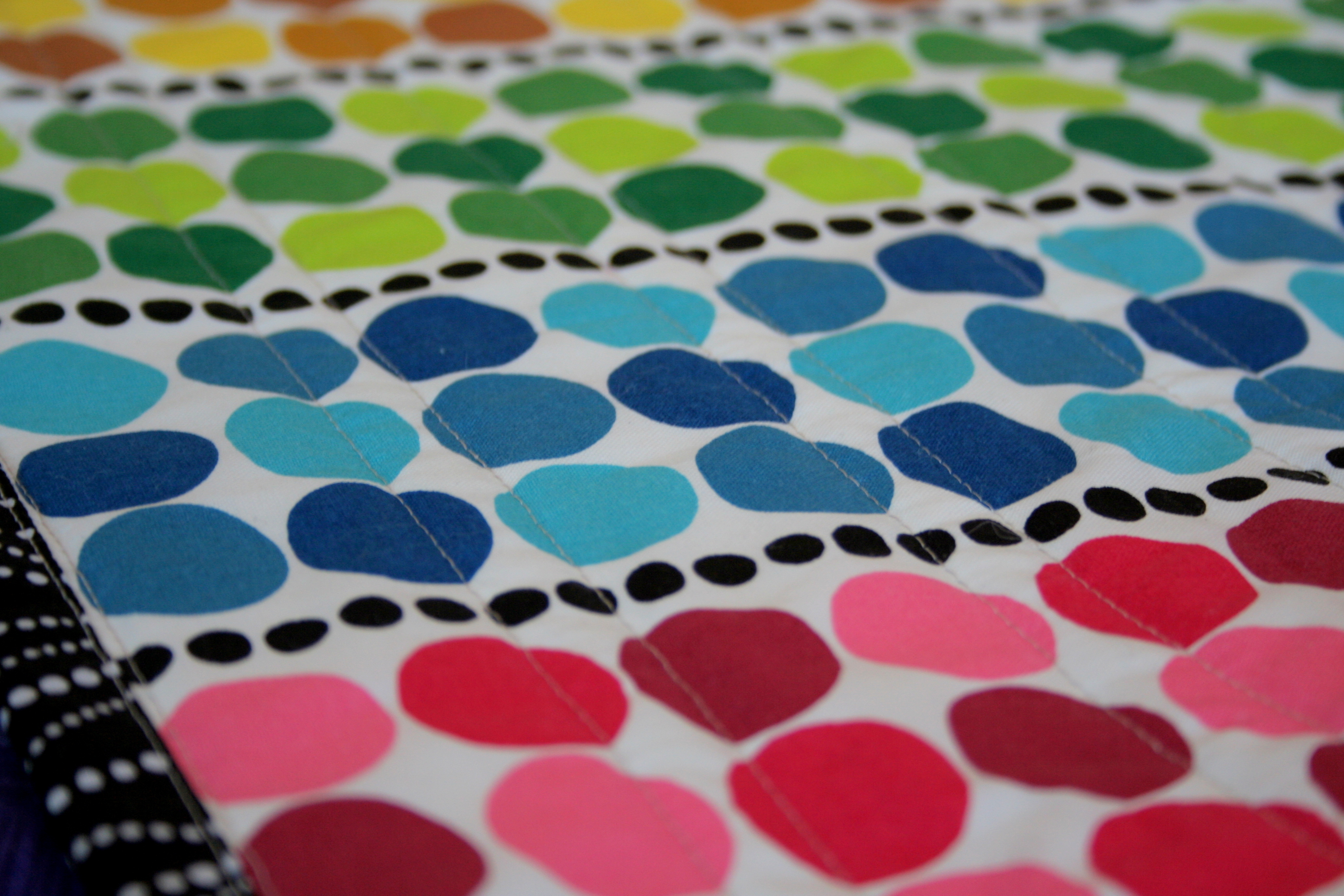
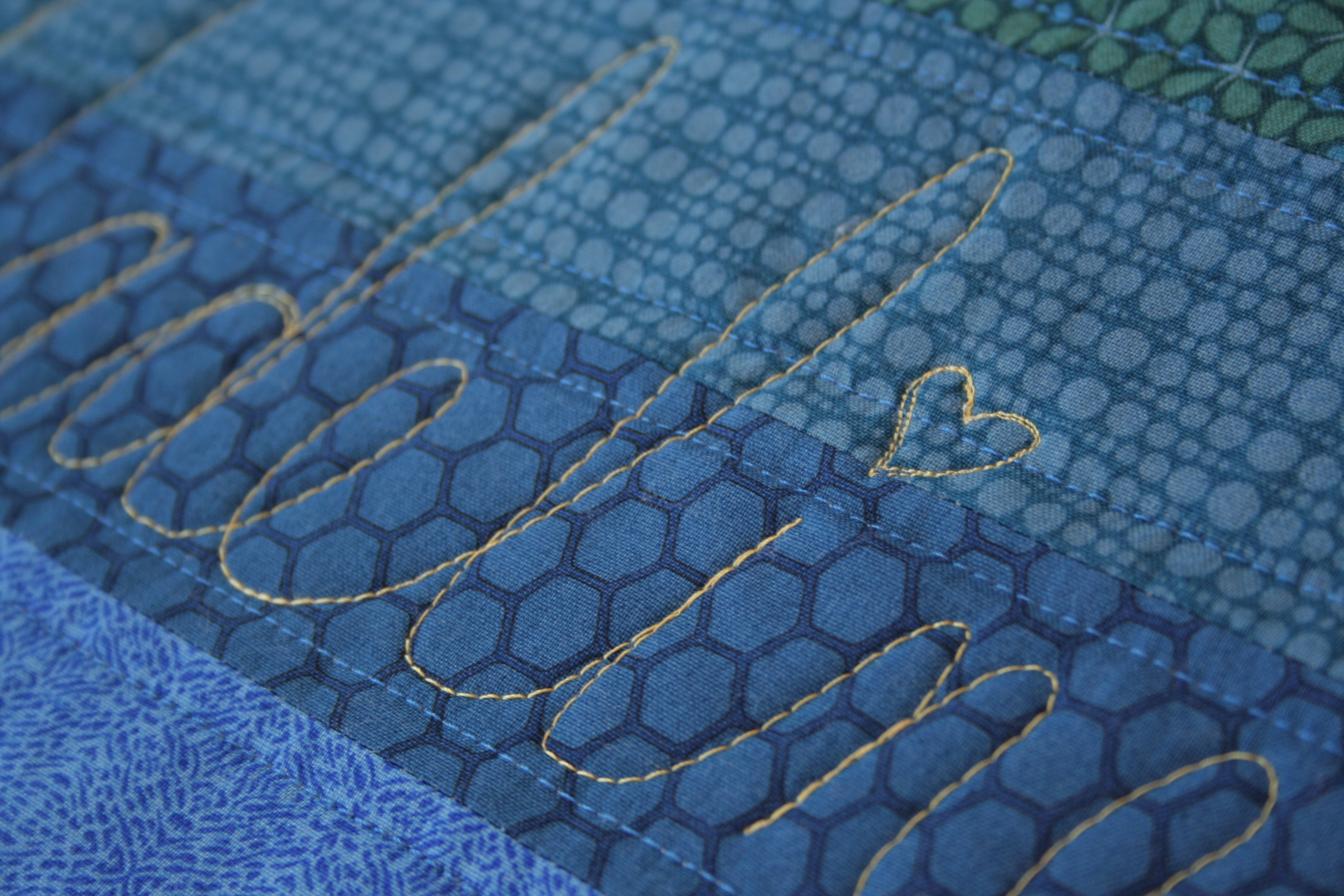
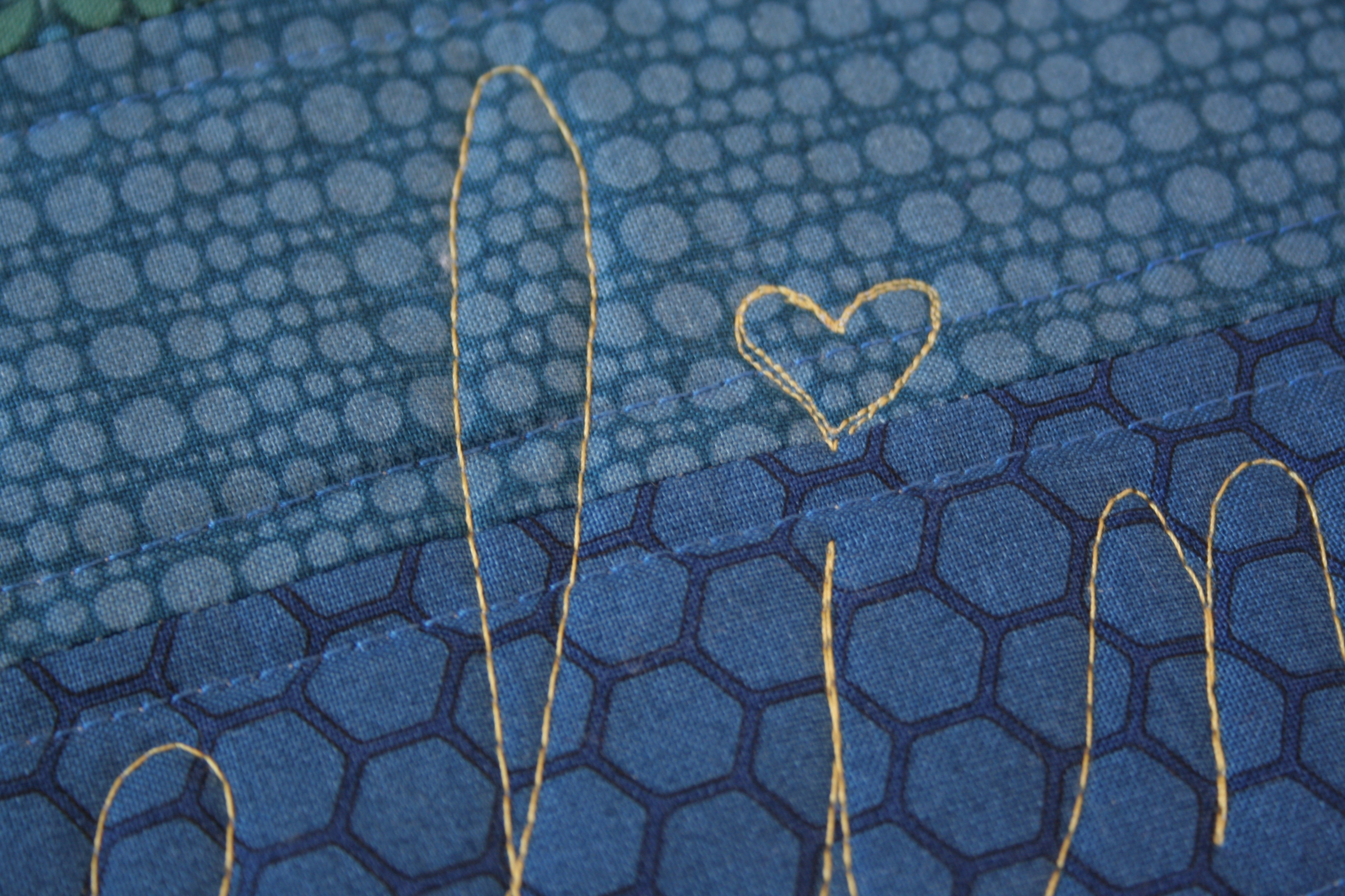
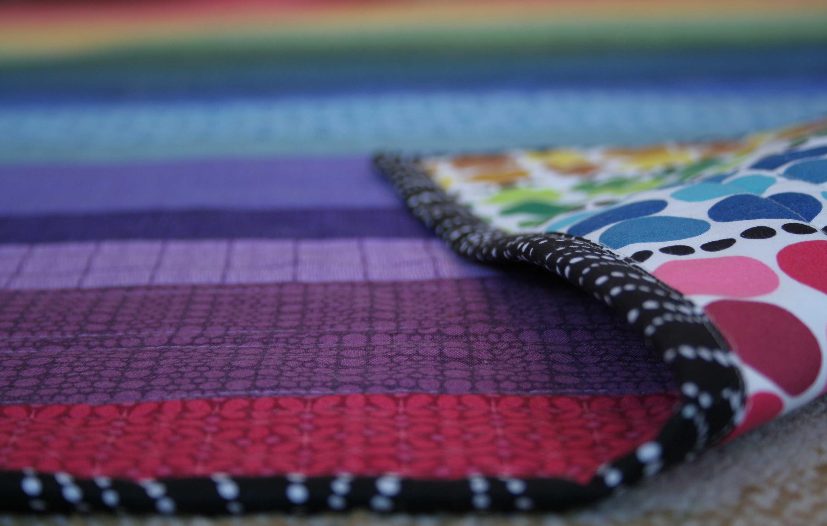
Not only did color abound, but there was plenty of texture and pattern to be enjoyed as well.
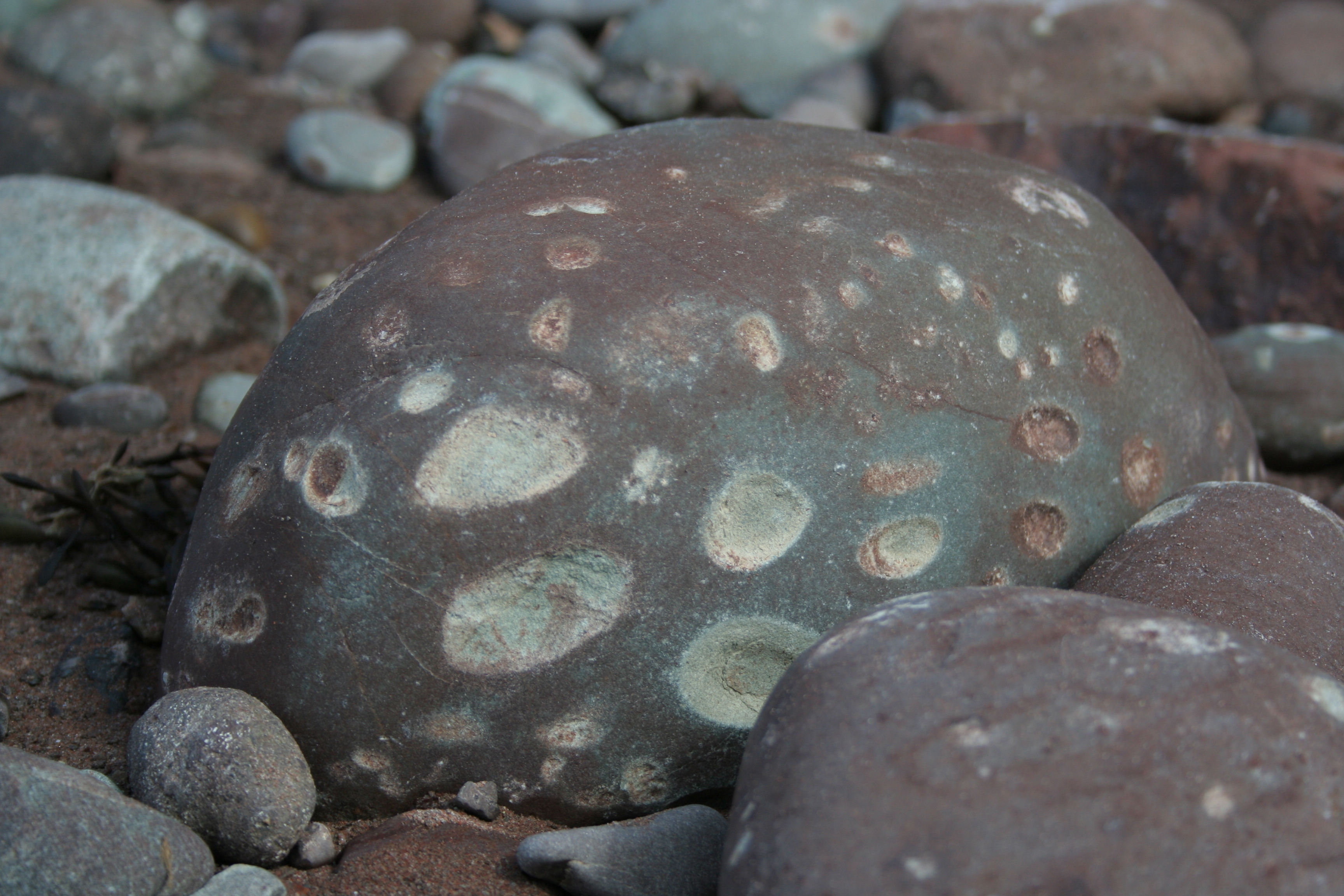 Rocks as pocked and battered as this one littered the beach. I suppose this is what happens when 40 feet worth of tides come in and out each day, rolling and bashing the rocks against each other.
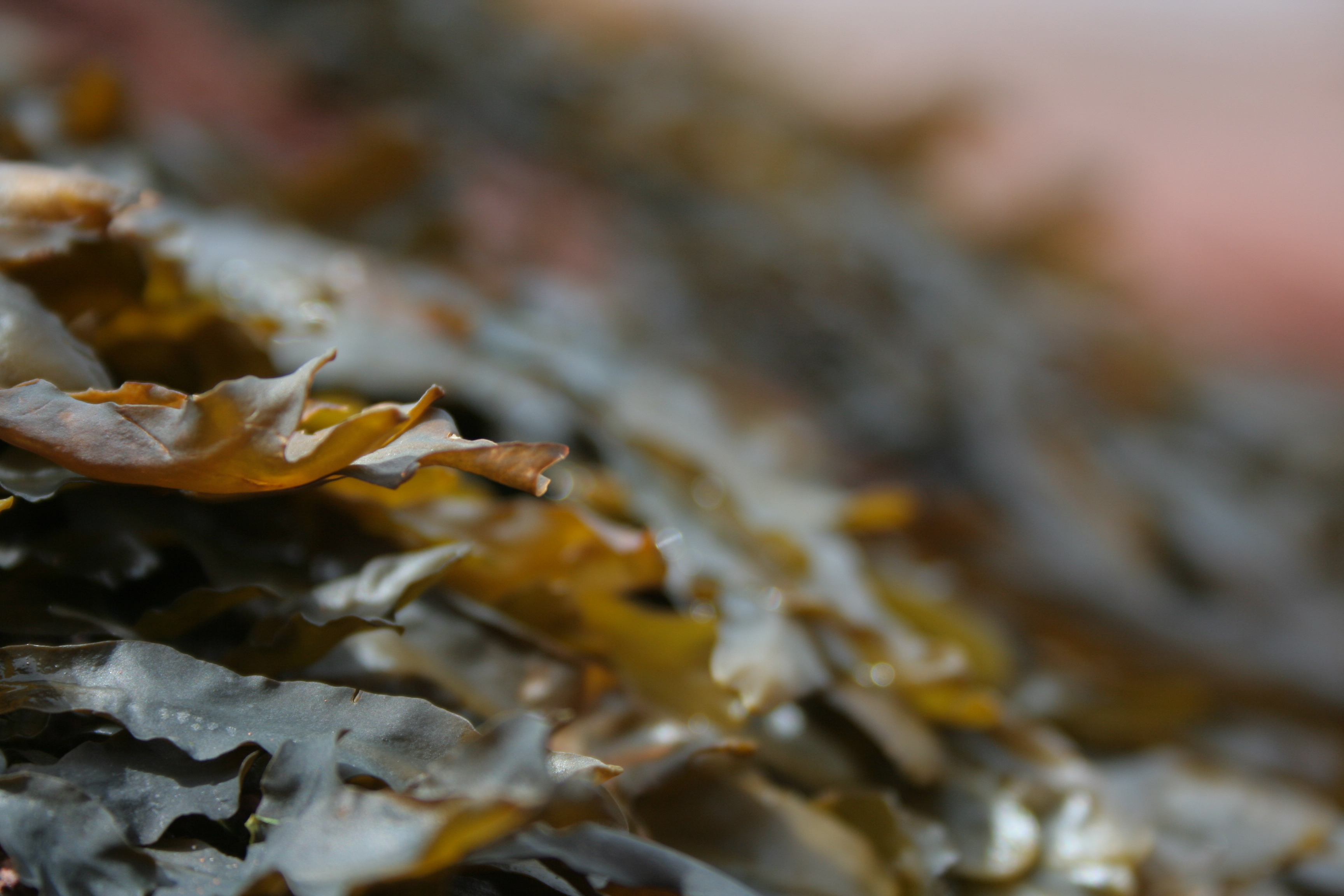 Seaweed. Gorgeous. This feathery seaweed covered the exposed rocks, creating a seascape of brown-green-red as far as the eye could see.
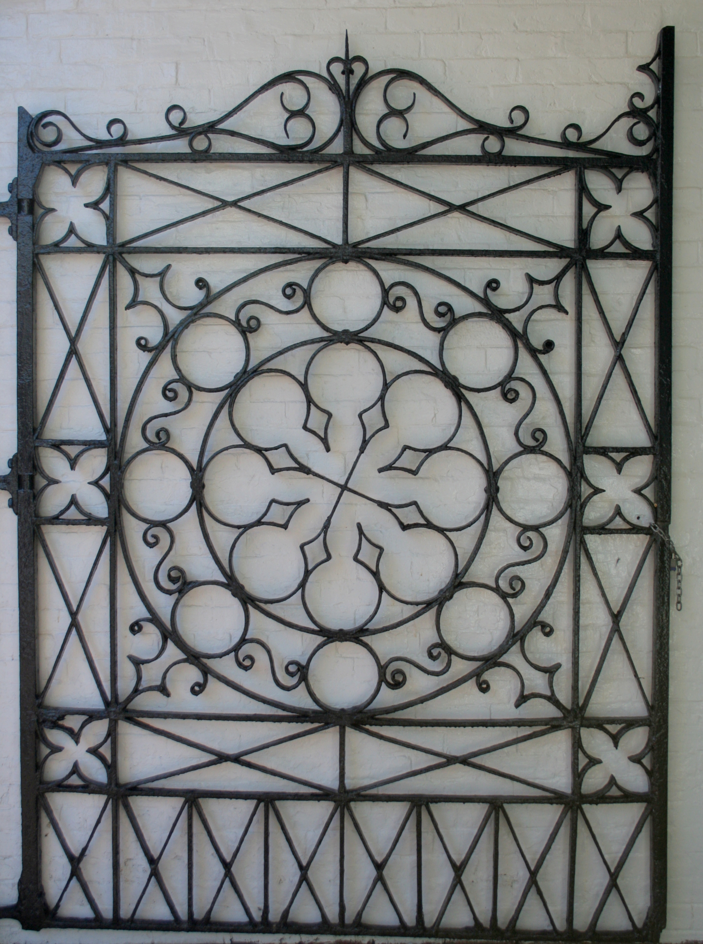 I loved the gate at City Market in St. John’s. It’s a lovely balance of geometry and balanced aesthetic. Quilt inspiration is everywhere!
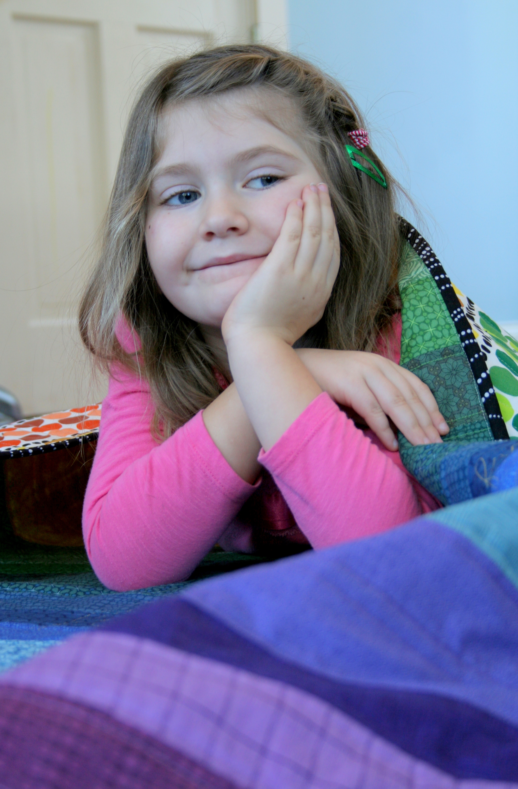
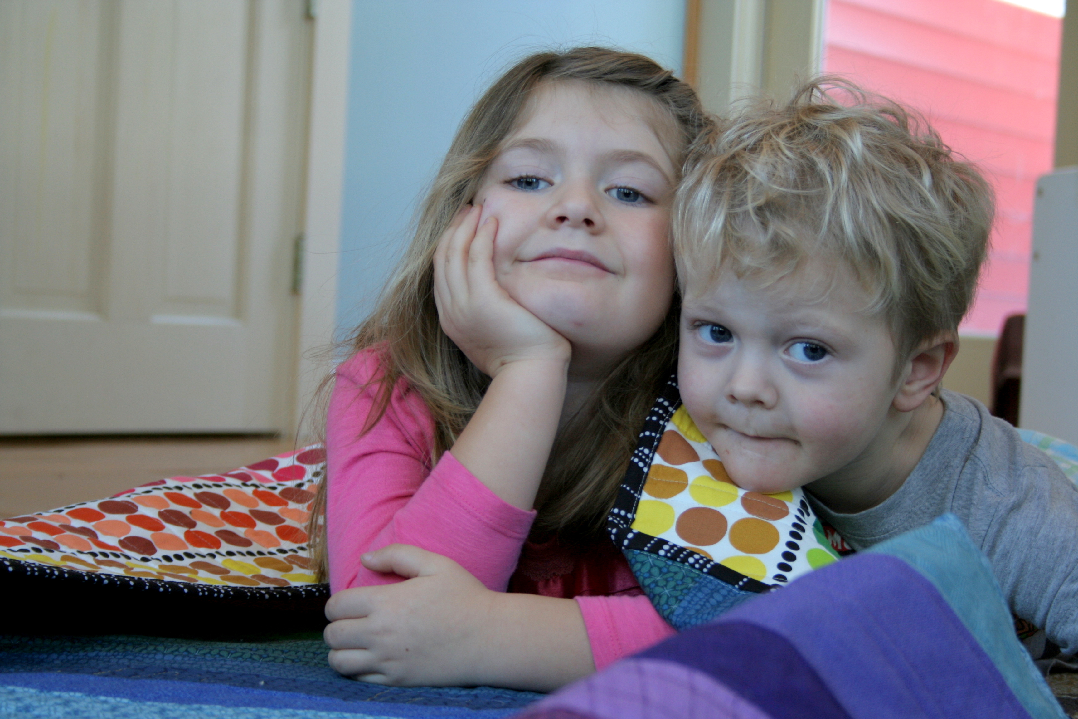
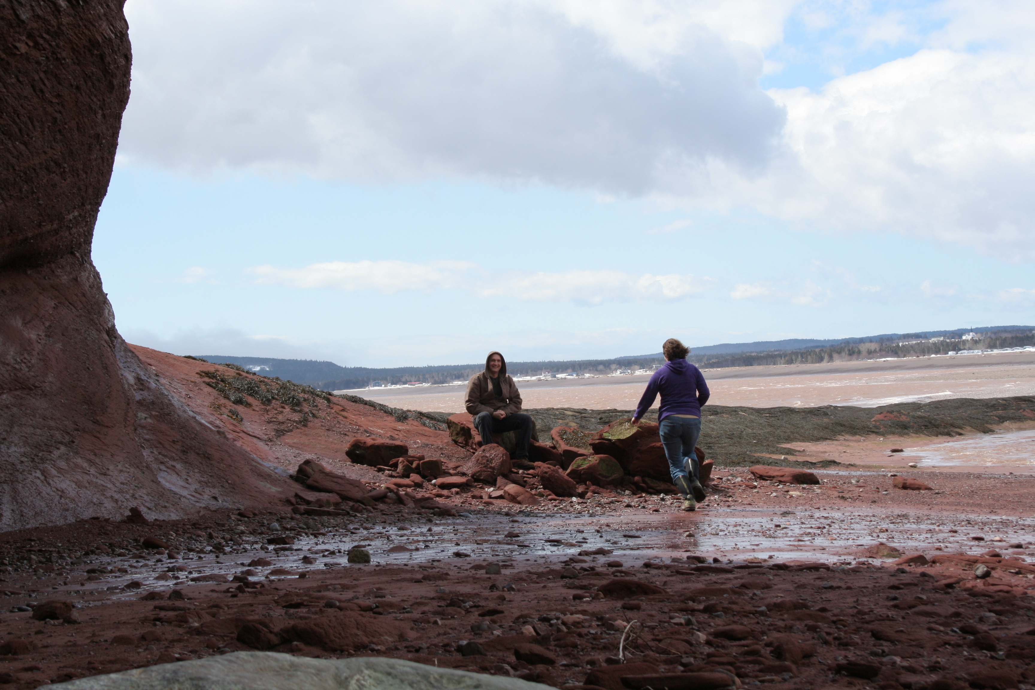
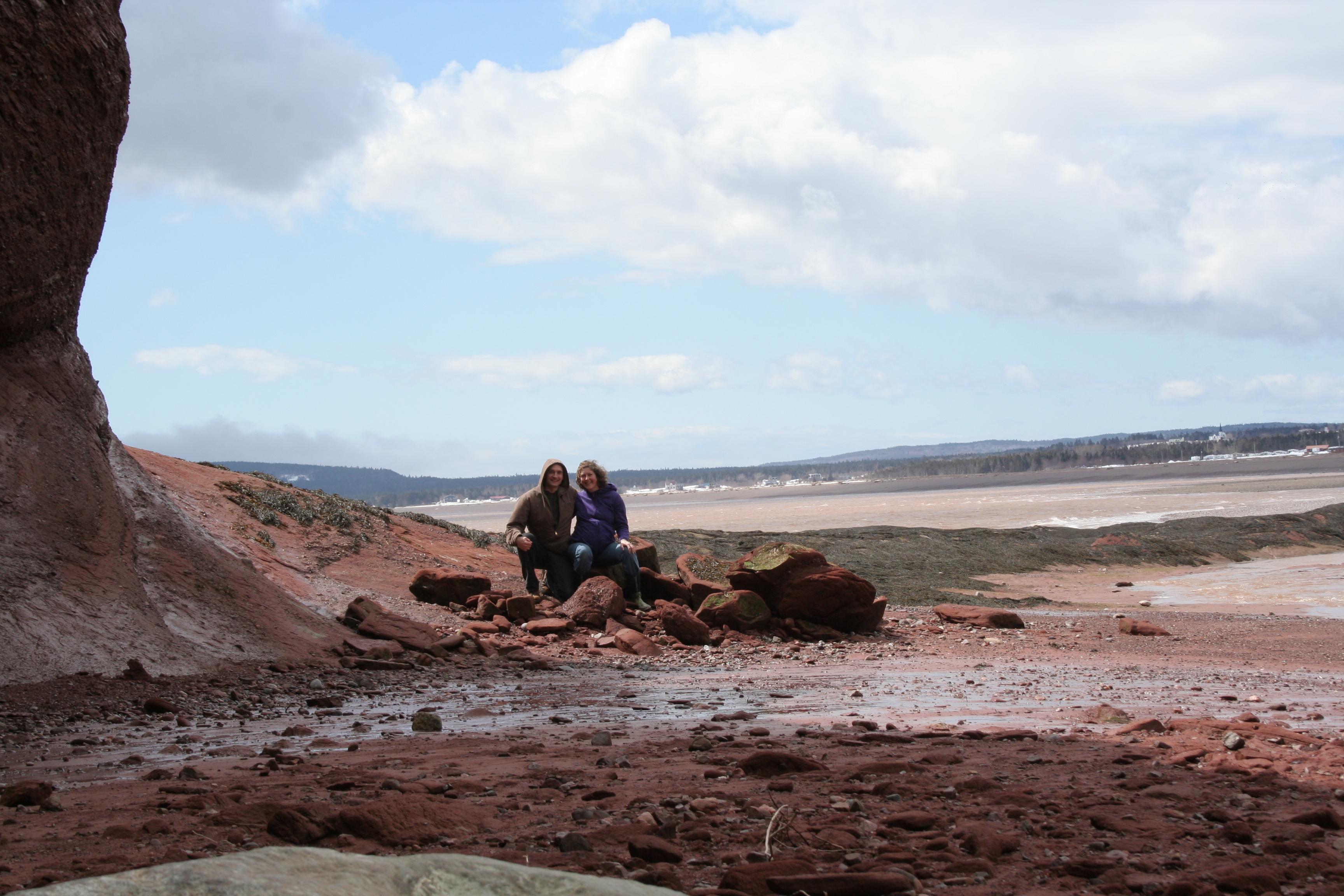
I’ll leave you with a good laugh. With a tendency to take a million photos, I wanted to be sure to have at least one of my husband and me together on our adventures, and an arms-length selfie just wouldn’t cut it. So of course, I set up a timer photo with the plan to run and join my husband for the photo like I always do. After three or four failed attempts, we decided that maybe the one who wasn’t 8 months pregnant should do the running. The first photo is my favorite fail, with the camera set by yours truly. The second photo is the first try with my husband setting the camera, successful with a good second to spare!
I’m linking up with Yvonne’s Thankful Thursday, since I’m thankful for our little escape. Spending time as a couple, while seemingly impossible with little kids, is so essential. I’m so glad we make the time to have together time on a regular basis now! (Did I mention that my husband encouraged me to take my sewing machine with us, and during the relaxing afternoon following our adventure I was able to do some sewing? Talk about gratitude!)