Happy Thanksgiving to those of you in the US (belated, since I spent yesterday with family instead of at the computer)! I have so much to be thankful for this year, and always. Top on my list is always family, immediate and extended, near and far. I am so blessed to be supported and loved by all of my family and wish we all lived closer together. Yesterday I was also particularly grateful for the gorgeous snow AND the fact that we didn’t lose power! Coming into a warm, well-lit house after playing in the snow is so very comforting.
This week’s color inspiration comes from some snowy scenes around our house, since we accumulated a good foot plus of snow overnight.
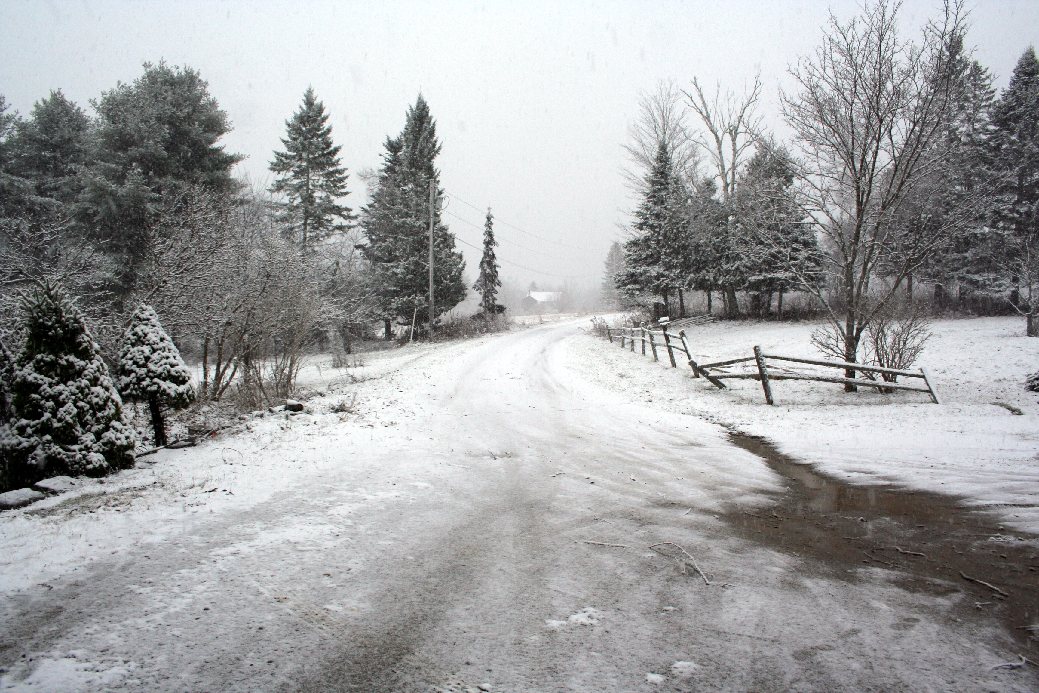
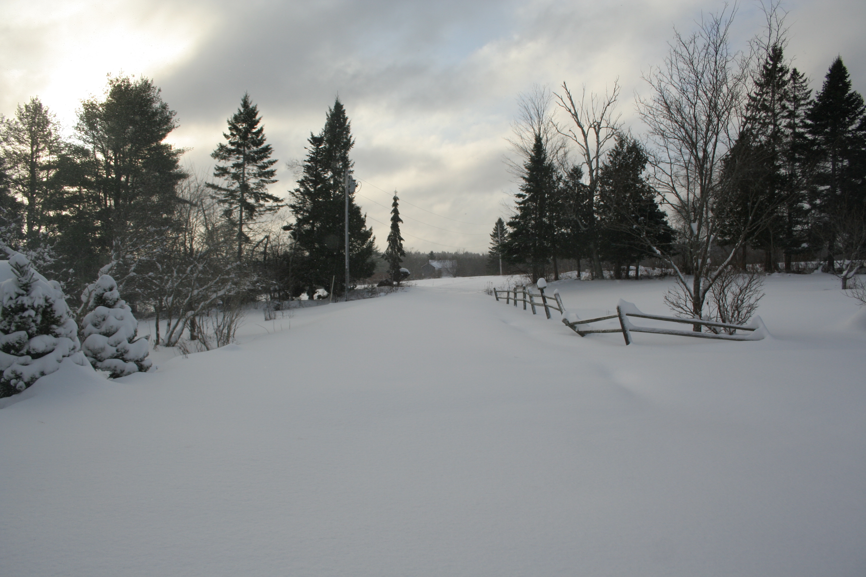
BEFORE: View down our driveway Wednesday afternoon.AFTER: View down our driveway Thursday morning.
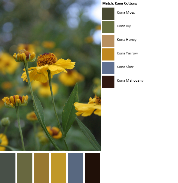
Corresponding Kona cottons from left to right: Titanium, Shadow, Mushroom, Mocha, Mahogany, Cinnemon
I love the smooth flow of colors in today’s palettes. Whites and greys fade to the little pops of color that poke through the snow.
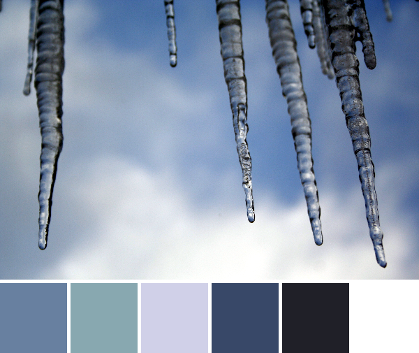
Corresponding Kona cottons from left to right:
Slate, Titanium, Cloud, Cadet, Pepper, White
Corresponding Aurifil thread from left to right:
4140 – Wedgewood
5008 – Sugar Paper
2560 – Iris
1248 – Grey Blue
2785 – V Dk Navy
2024 – White
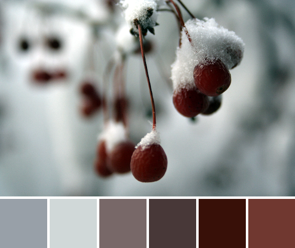
Another smooth flow of color with the gorgeous blues of the sky, both reflected in these dripping icicles and in its own fluffy clouded beauty. I love cold, sunny, snowy days. The sun makes everything glisten and glimmer!
Today I am taking a trip down memory lane for our color inspiration. I admit, I was waiting for the perfect frosty morning to take photos for today’s color inspiration and the day simply did not come; it was cooooold but no gorgeous frost. So, I headed to my photo archives and found a few suitable seasonal nature photos from a family camping trip in November of 2010. My husband and I took our baby Maddie camping in a yurt in Jefferson, Maine, and had a lovely time. Here are some snapshots. Color palettes are made using Play Crafts’ Palette Builder 2.1 and my own photographs, as per usual!
Corresponding Kona cottons from left to right:
O.D. Green, Sky, Iron, Steel, Evergreen, Palm
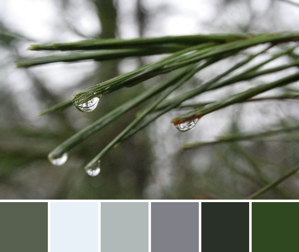
See the world in a drop of water. I love the smooth grey-green of this palette, and the reflections dancing in the raindrops.
Corresponding Kona cottons from left to right:
Coal, Sable, Black, Medium Grey, O.D. Green, Titanium
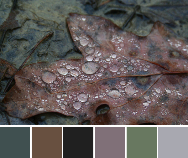
Another raindrop photo; can you tell I like to take photographs of water showing off its awesome surface tension tricks? This palette holds all of the muted earthy tones found in mud. Mmmm!
Corresponding Kona cottons from left to right:
Chestnut, Black, Slate, Ochre, Paprika, Mahogany
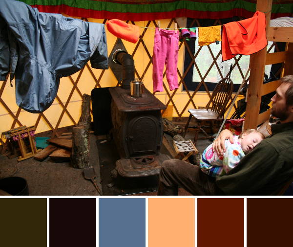
A warm and cheery scene from inside the yurt. My husband holds my peacefully sleeping daughter during nap time, and our hunter-beware clothing dries above the wood stove. This was a cozy camping trip for sure! I like the range of colors in this palette, and I think they play well together.
Corresponding Kona cottons from left to right:
Moss, Black, Caramel, Spice, Gold, Cinnamon
Corresponding Aurifil thread from left to right:
5013 –Asphalt
2692 – Black
2930 – Toast
2385 – Terracotta
2930 – Toast
4012 – Copper Brown
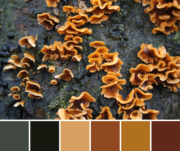
I love this palette. I don’t think I will tire of the bright pop of fungi growing on a tree. The flow from black-greeny-grey to the range of coppery yellows and reds creates such a smooth aesthetic. This might be my favorite palette from this group.
Just one more photo to complete my trip down memory lane: my husband and daughter enjoying an awed experience with the lantern at night. I can’t believe this baby girl is almost 5 years old! We definitely will need to think about another yurt camping trip, maybe this winter!
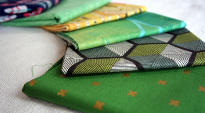
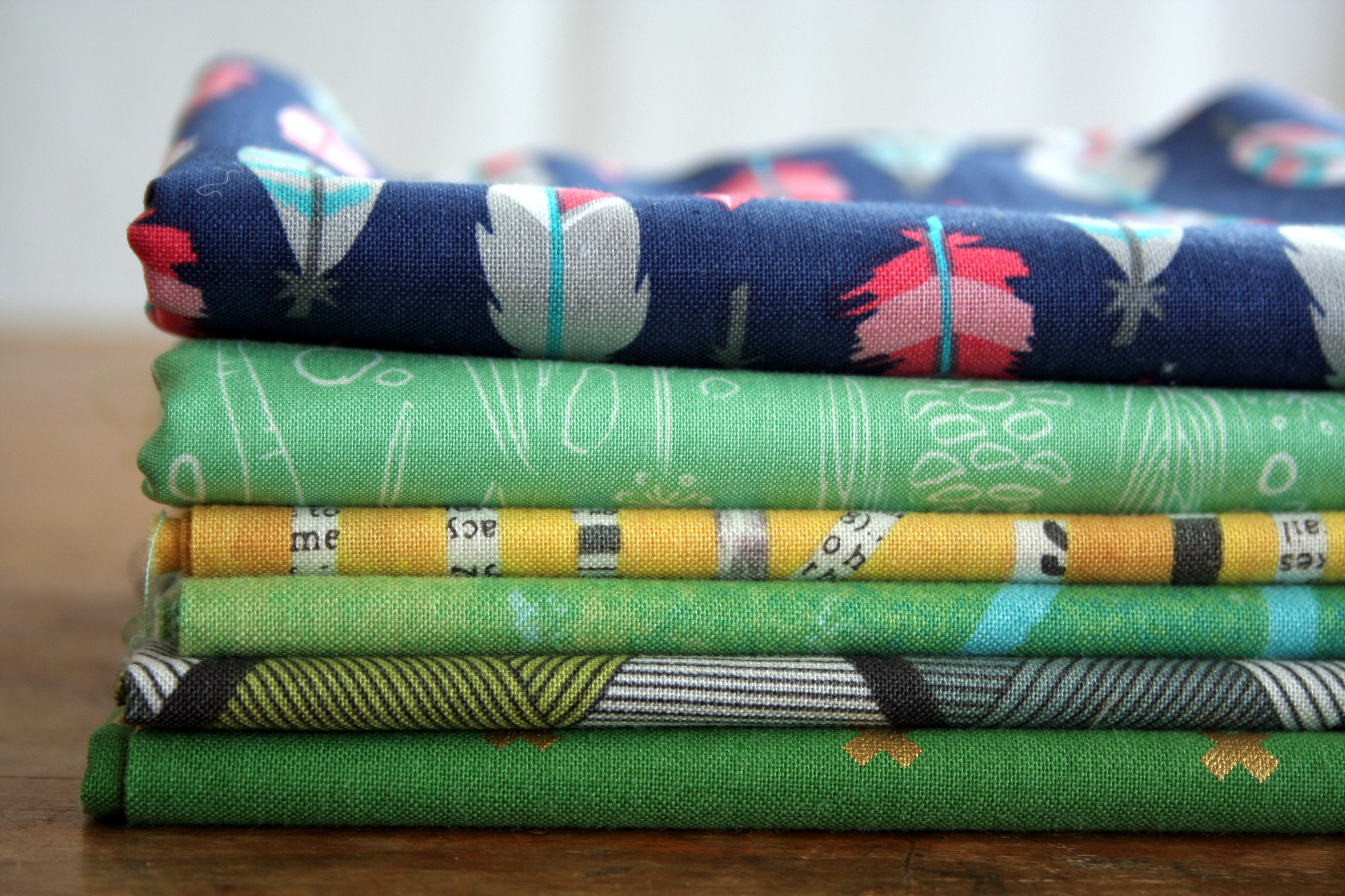
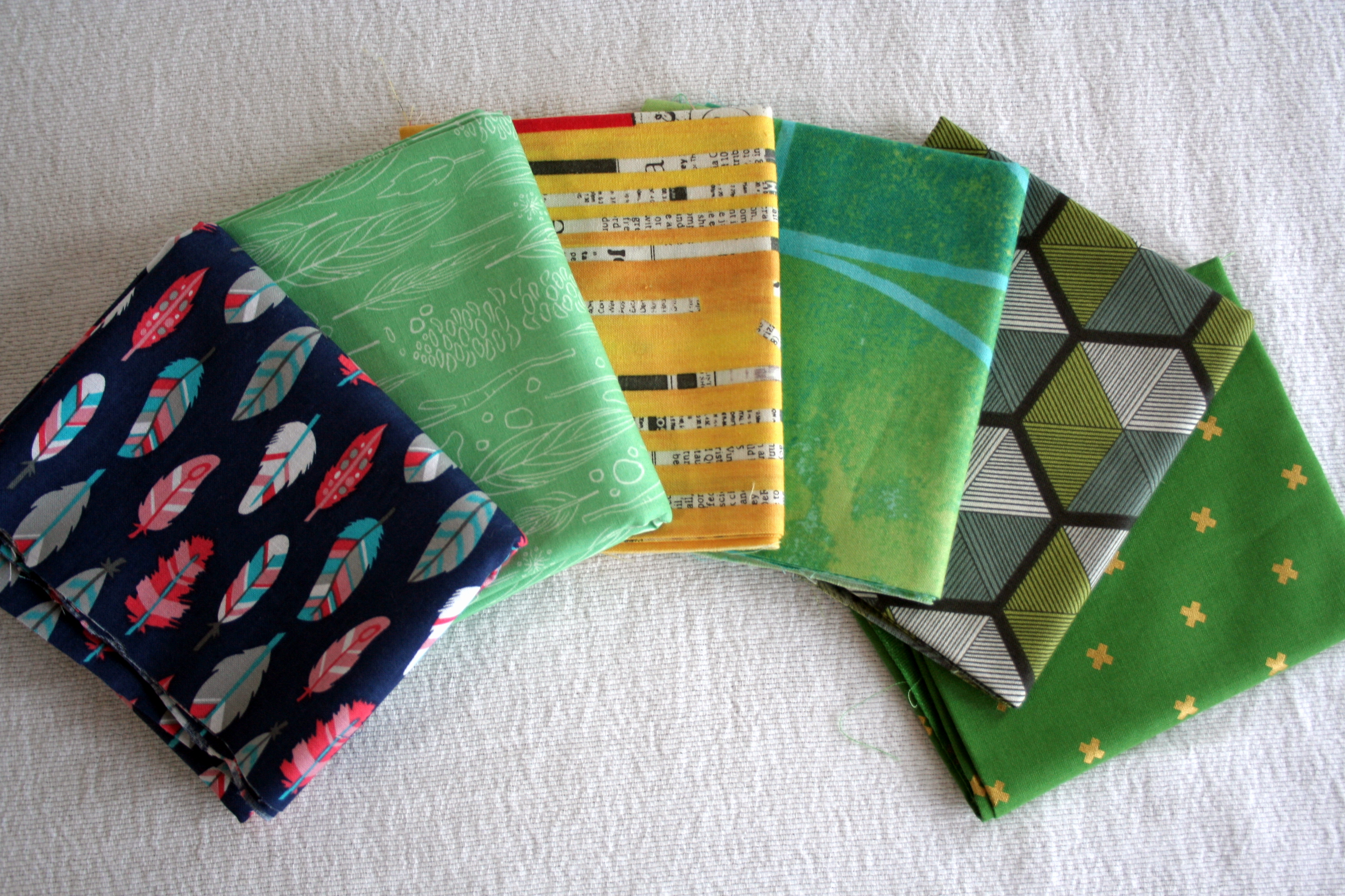
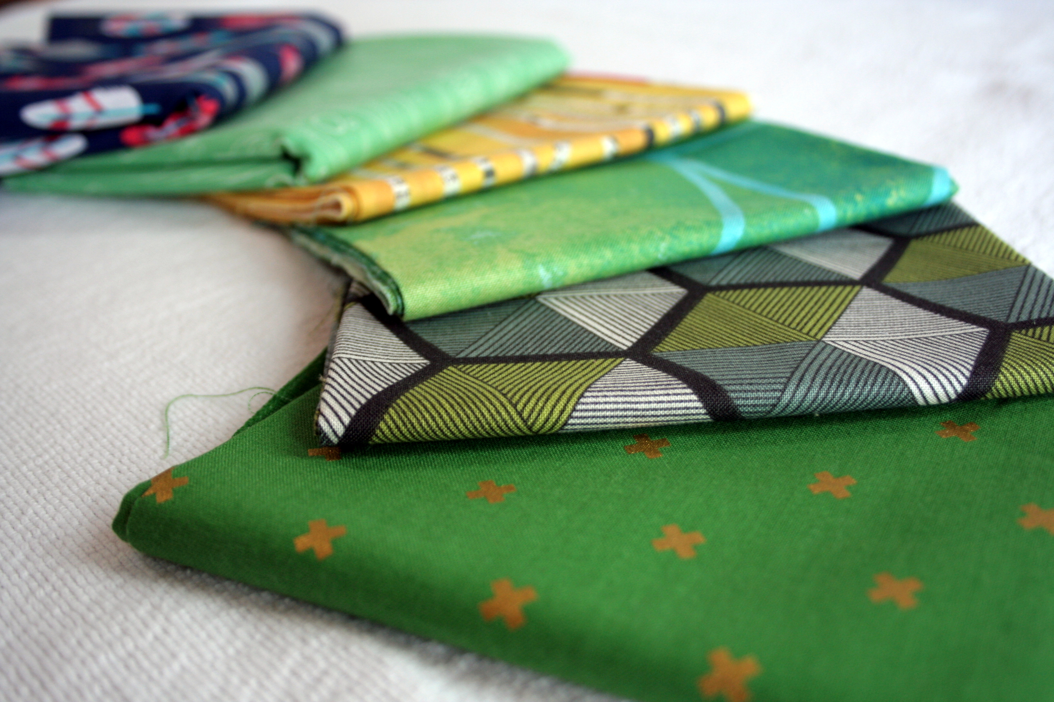
A couple weekends ago, I traveled to one of my favorite “local” fabric shops, Alewives Fabrics, about an hour and a half drive away. I went primarily for the Color for Quilters Class and my first ever Maine Modern Quilt Guild meeting, but also, of course, for the fabric. I knew that in a store like Alewives, I could easily buy enough fabric to fill my trunk, so I went to the class intentionally with the idea of building the greens in my stash, but without a giant fabric shopping list. (If anyone wants to fund my fabric buying budget, I’ll be happy to give you my paypal email address and you can direct deposit as much as your generous heart desires–haha)
I couldn’t resist the feathers on blue or the yellow newsprint fabric, so I let those slide into the mix. I also bought my first ever (gasp) Cotton and Steel. Here’s the (mostly green) fabric goodness I took home with me (from left to right):
1/2 yard of What a Gem by Allison Cole for Eugene Textiles
1/2 yard of Wee Wander by Sarah Jane for Michael Miller Fabrics
and fat quarters of:
Collage “Newspaper Stripe” by Carrie Bloomston of SUCH Design for Windham Fabrics;
Unknown (but awesome) Fibonacci Fabric in green;
Vagabond Parquet Moon Dial by Parson Gray for Free Spirit Fabrics; and,
XOXO in Picnic Gold by Cotton and Steel House Designer for Cotton and Steel
While I was looking through Alewives’ awesome fat quarter bins, I stumbled upon the amazing Fibonacci fabric. Not only was it green (my color of choice for the day) but it is totally math-geek friendly. As a complete closet–or maybe not so closeted–math and science geek, there was no way I was going to leave that shop without buying the Fibonacci Golden Ratio fabric.
I have no idea what I will do with the fabric yet, but I sure am happy to have it in my stash! If anyone knows any of the designer/manufacturer information for this fabric, please let me know.
I’m linking up with Molli’s fabulous Sunday Stash.
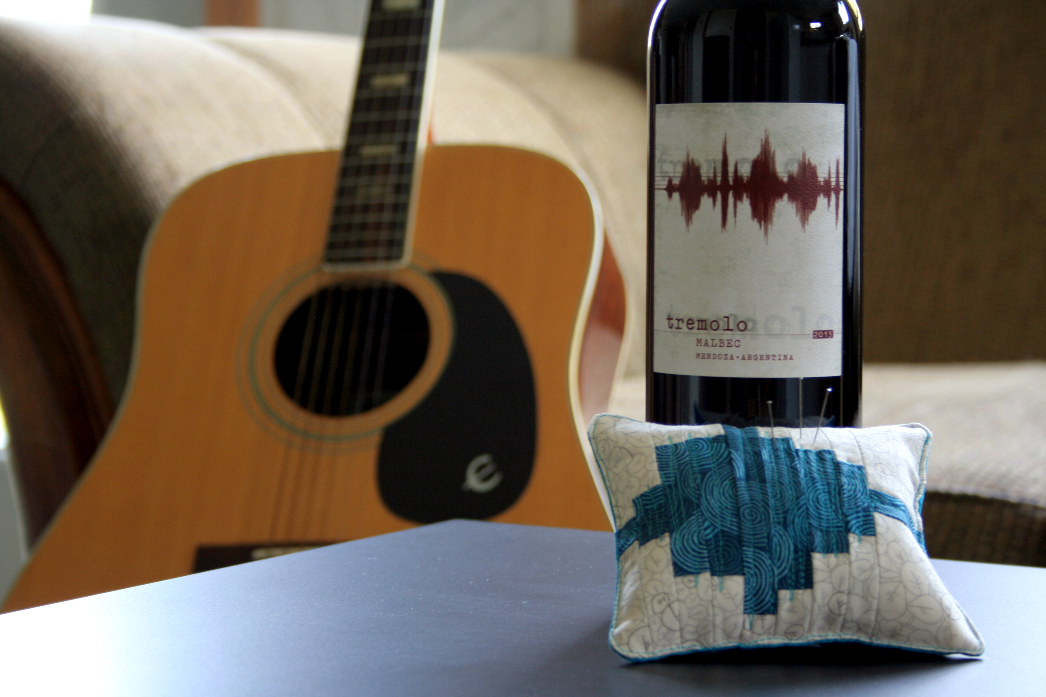
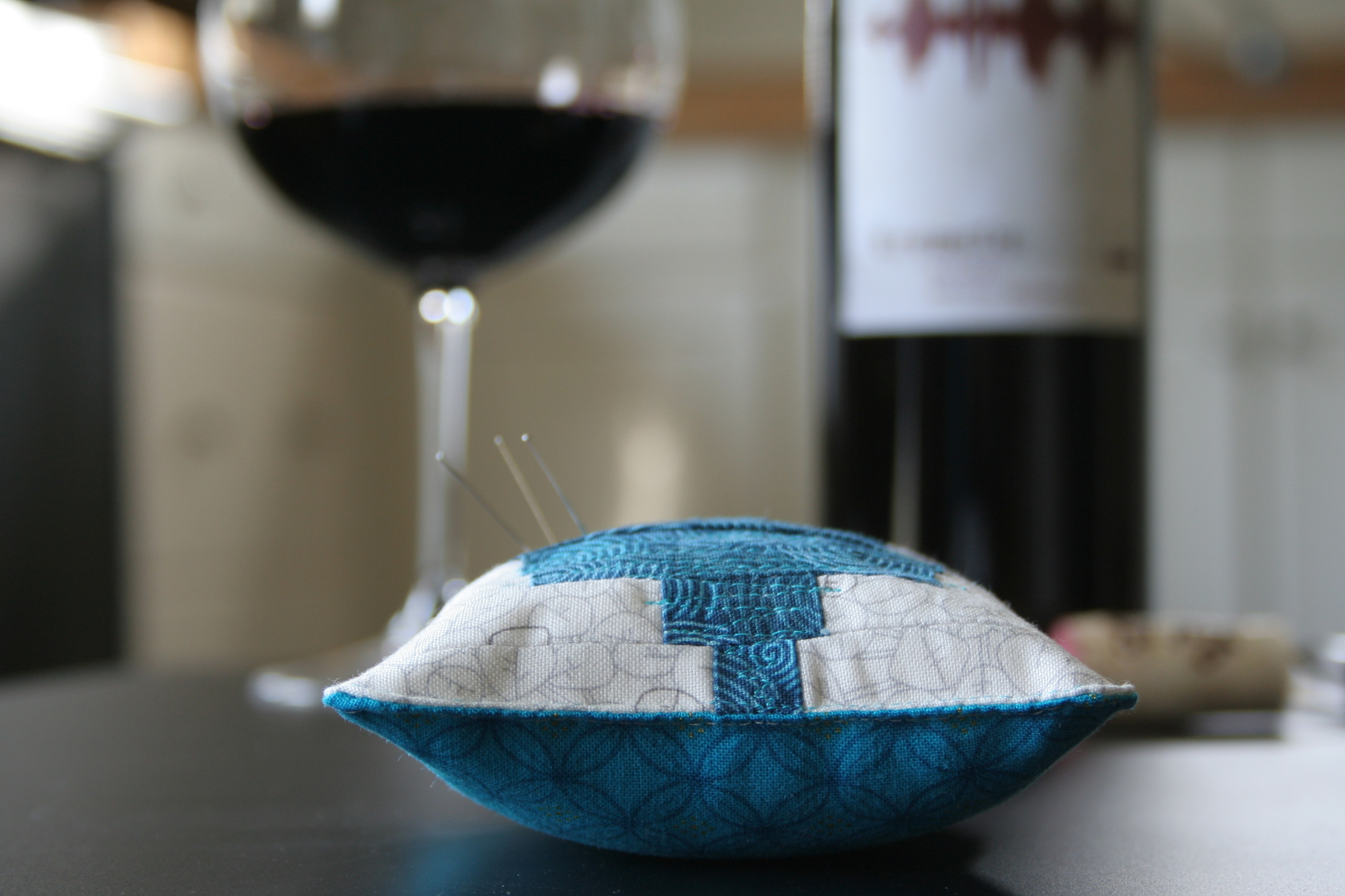
It’s been a while since my last wine and fabric pairing post, and there’s a good reason for it: I’m expecting baby #3 and therefore haven’t been drinking any wine! Now that the cat’s out of the bag, you will understand my relative blogging silence the past few months. The first trimester is exhausting, meaning my late night quilting was replaced by sleeping!
This past week, though, my parents came to visit, and when I saw one of the bottles of wine my dad brought along, I immediately was inspired to make a quilt. Or, in this case, a small pincushion for starters.
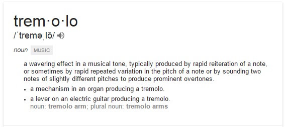
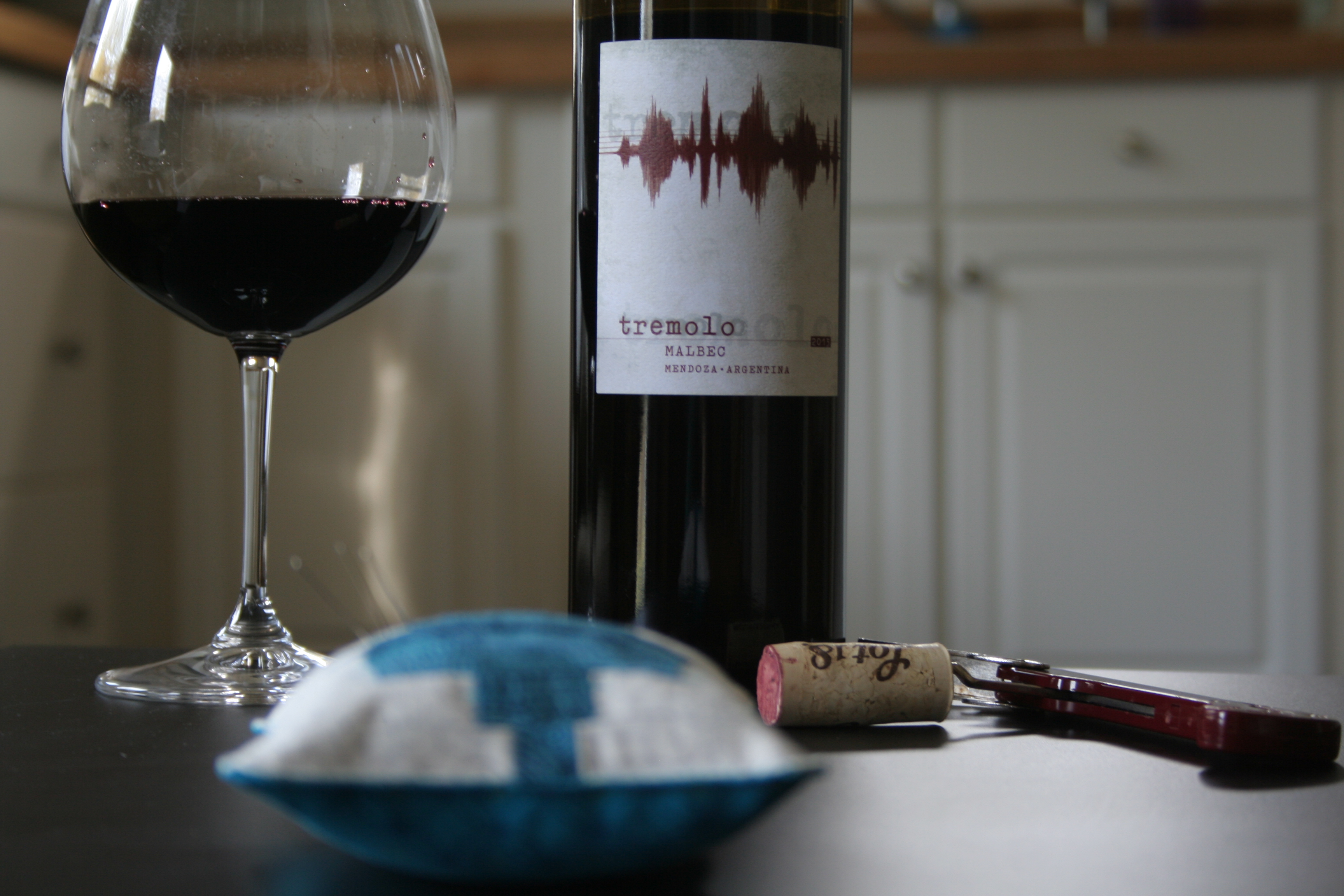
My first thought when I saw the 2013 Tremolo Malbec from Mendoza, Argentina (other than “Man, I wish I could have some wine”) was how the sound waves would make a cool quilt.
Tremolo definition from google
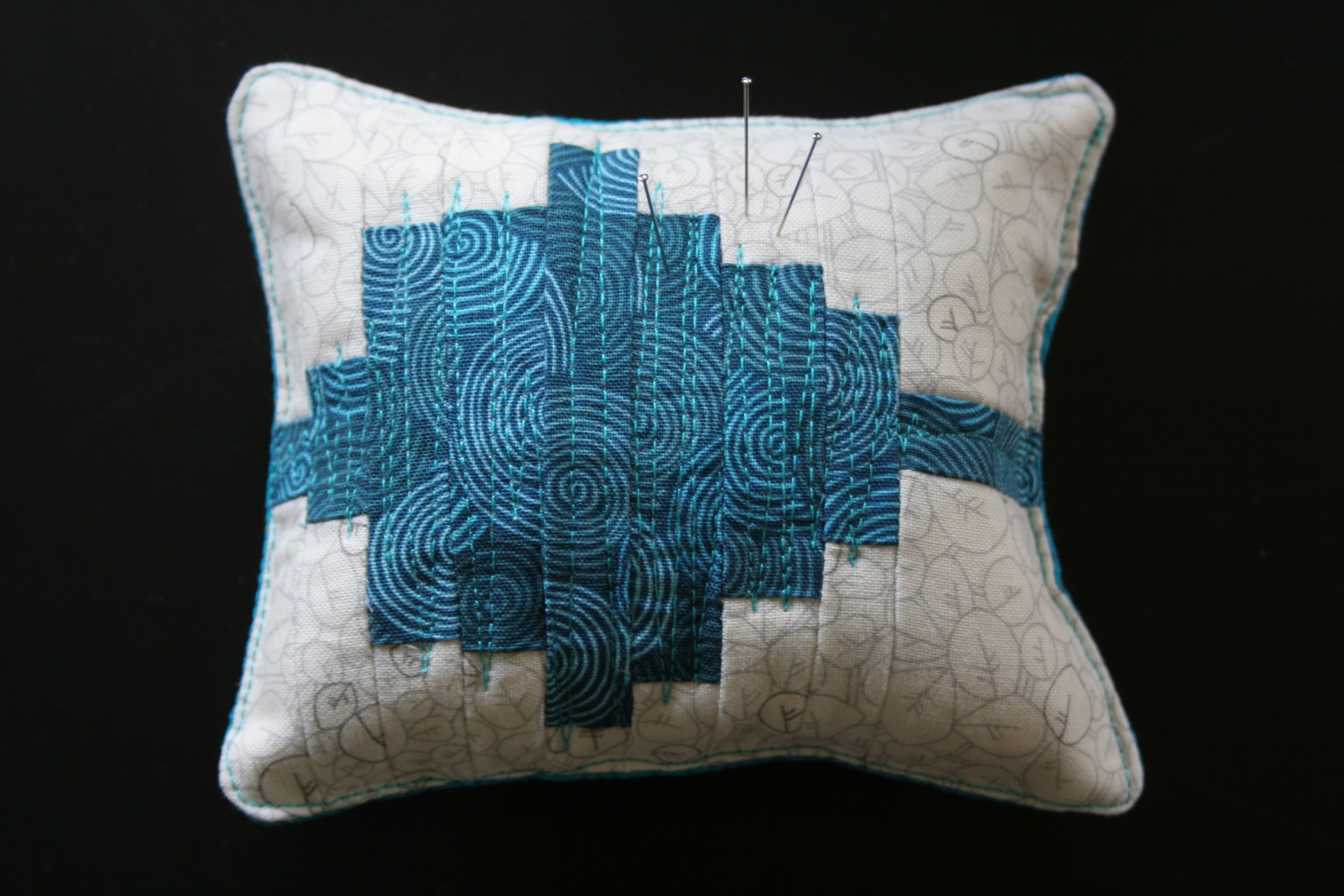
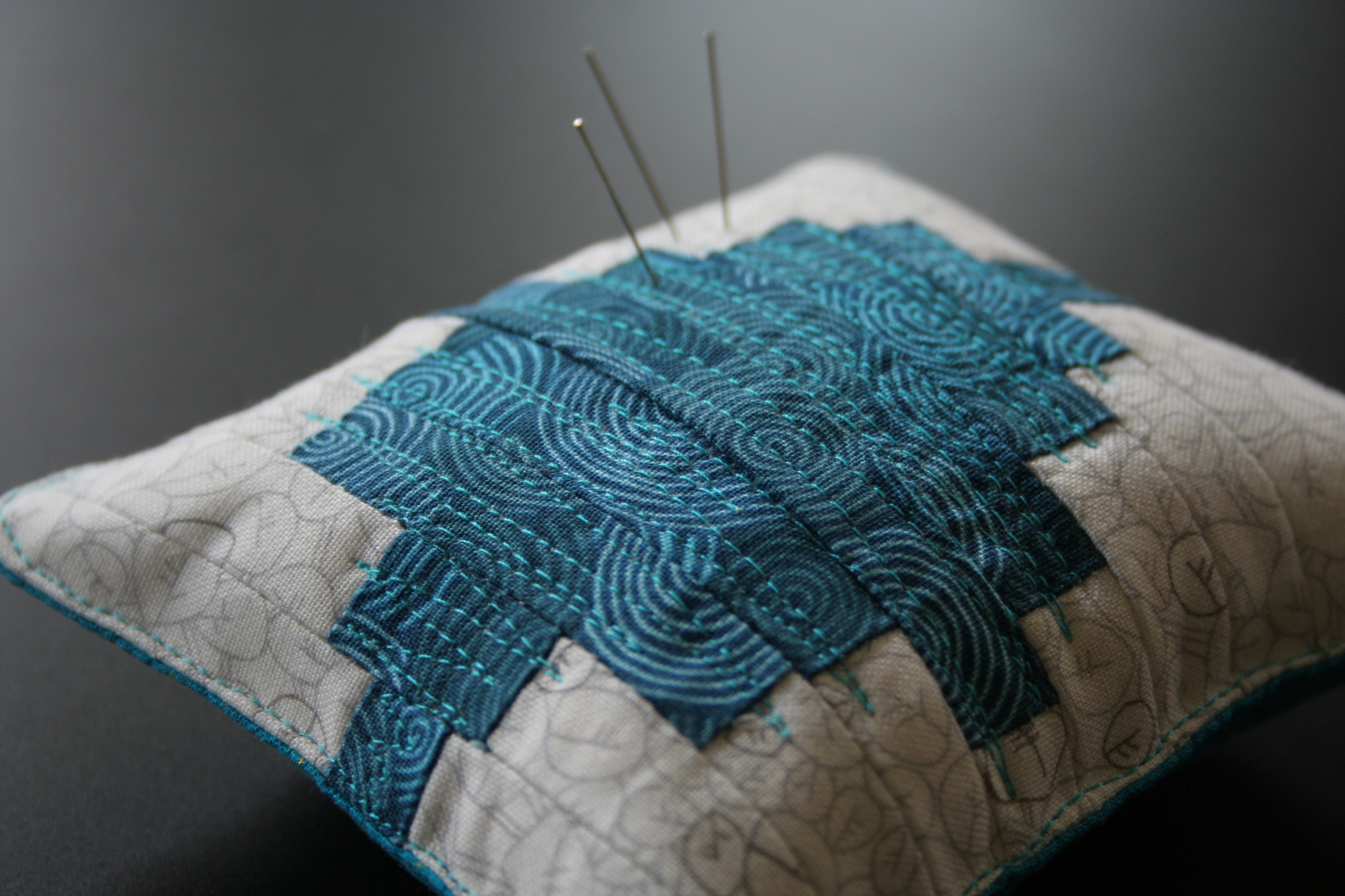
I did a bit of googling to see if I could find any existing sound wave quilts, and then decided to make my own practice version in the form of a pincushion. At first I was going to make it longer with gradating colors from dark to light, but due to time and resulting size I limited myself to just one sound wave.
I used almost entirely scraps, but needed to cut one more 3/4″ strip of Carolyn Friedlander’s beloved botanics fabric for background. I’m mostly happy with how this turned out, but I feel like the strips should could be skinnier. Perhaps on a larger scale (think: pillow or quilt), the strips could be wider and still have the right sound wave generating effect. As it was, 3/4″ strips (finishing at 1/4″) were pretty tiny, and still look too wide for my taste.
I do love the quilting, though!! I jumped right into free motion quilting a sound wave zig-zag right on top. I intentionally bumped out into the background a bit, mimicking the fluctuations of an actual sound wave. I used Aurifil 2810 – Turquoise 50 wt thread, which coordinated with the sound wave, but contrasted enough so that the stitches are very visible (and audible?)
My dad reported that the Tremolo wine is very good, and nice and smooth. The label description says: French-born winemaker Didier DeBono crafted this 100% Malbec from grapes grown on two special, high-elevation vineyard sites in Mendoza. A Tremolo is an aurally pleasing musical effect we were reminded of upon tasting this harmonious, balanced wine. It sounds like my dad agrees, and that the inspiration can be extended visually, to music-inspired quilting!
There you have it: another perfect wine and fabric pairing. Drink Tremolo while you work on your musically-inspired quilt, whether it be a tiny pincushion or a king sized quilt!
The perfect pair:
Fabric
Any music or sound wave-inspired sewing
My mini tremolo pincushion included:
Back (Collection/Designer/Manufacturer):
* Tree of Life/Chong-a Hwang/Timeless Treasures Fabrics
Wine Varietal: Malebec Producer: Tremolo Vintage: 2013 Location: Mendoza, Argentina
Tasting notes from website: Rustic, earthy and even a bit restrained at first, after some air this wine will reveal excellent fruit concentration with notes of dark cherry and blackberry, plus a hint of vanilla and a meaty, earthy finish. It finishes dry and will leave you thirsting for more – especially if you’re having it with grilled meat.
Or if you’re in the middle of an aurally and visually pleasing quilting project. A perfect pair, indeed.
Here are two of my favorite sound wave-esque quilts I found during my google search:
I absolutely love this quilt by Heather Preggers. Visit her blog to read more about her thought process and creation of this quilt. She also has many other variations of this tuning forks quilt, since she’s admitted she is somewhat obsessed with them! They are all gorgeous and resonate with sound and movement.
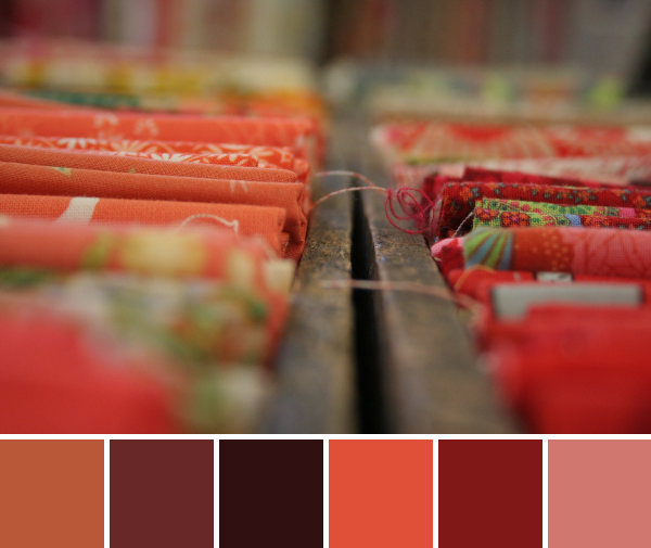
My hope for all of these color inspiration posts is that someone gets their creativity spark ignited and creates a gorgeous quilt or other work of art based upon one of my palettes. Since I and many of you are quilters or other fiber artists, where better to let inspiration strike than the fabric shop? This week’s color inspiration comes from Alewives, a gorgeous fabric shop in Nobleboro, Maine. Palettes are made using my photographs and Play Crafts’ Palette Builder 2.1.
Enjoy some color inspiration eye candy:
Corresponding Kona cottons from left to right:
Steel, Geranium, Rich Red, Crimson, Garnet, Thistle
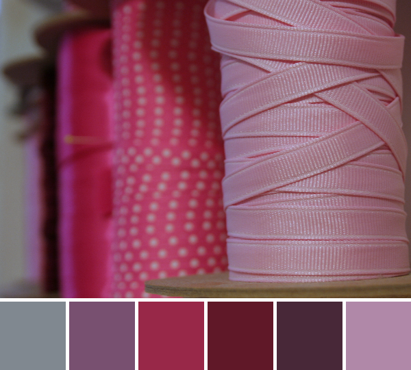
Wooden spools, assorted ribbons, and a lovely palette of pinks and purples.
Corresponding Kona cottons from left to right:
Terracotta, Cinnamon, Mahogany, Lipstick, Paprika, Salmon
Corresponding Aurifil thread from left to right:
2350 – Copper
2245 – Red Orange
5024 – Dark Brown
2215 – Peach
2355 – Rust
2220 – Lt Salmon
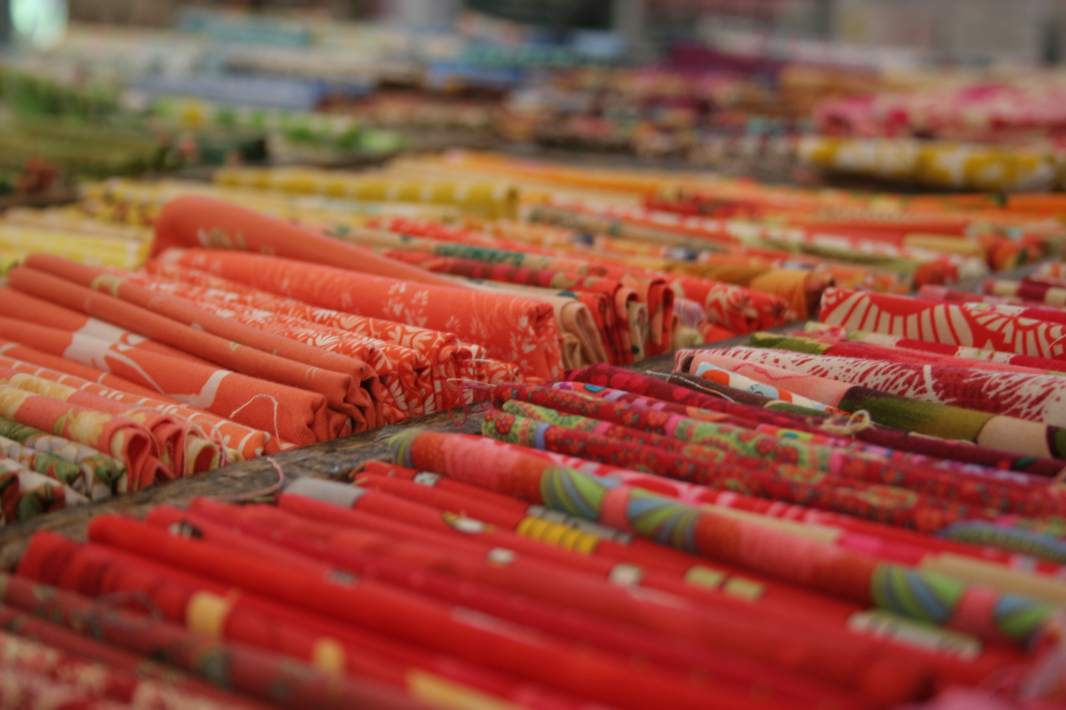
One of my favorite spots in Alewives is the collection of fat quarters in the center of the store. Arranged by color in awesome vintage wooden bins, these fabric bits beg to be touched, gazed upon with wonderment, and then (naturally) purchased. Yum!
Fabric eye candy; how gorgeous is this fat quarter display!?
Corresponding Kona cottons from left to right:
Bark, Med Olive, Med Juniper, Arctic Ice, Peach, Toast
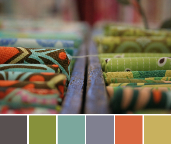
Another gorgeous glimpse of the fat quarter bins. I could see this palette making its way into a lovely gender-neutral baby quilt. Or a soft, autumnal lap quilt or table runner. Or just about anything!
Corresponding Kona cottons from left to right:
Bison, Wine, Cinnamon, O.D. Green, Kelly, Spice
I loved the color and fabric choices for this quilt display. Isn’t it wonderful when you walk into a shop and are not only swooning over the fabric, but are also are inspired by the quilts displayed around the shop?! I think the match of Kona Kelly to that darker teal is off, but you get the idea! Aurifil matches it as 2285 – Med Spruce, which looks like a more accurate match along with the 2850 – Med Juniper match for the Kona O.D. Green.
To see a few more glimpses of quilty beauty from the Alewives shop, visit my post Color for Quilters & the Maine Modern Quilt Guild. If you are ever in or near Nobleboro, Maine, I’d definitely recommend stopping in to Rhea’s shop. Tell her Kitty sent you!
Note: I have no affiliation with Alewives Fabrics; I simply think it is a gorgeous, well stocked and kindly owned local fabric shop and I like to spread the love! Plus, It’s kind of awesome that their minimum fabric purchase online is 1/8 of a yard, AND that they will send you a 1/16 swatch if desired! That is hard to find with online shops! Enjoy browsing.
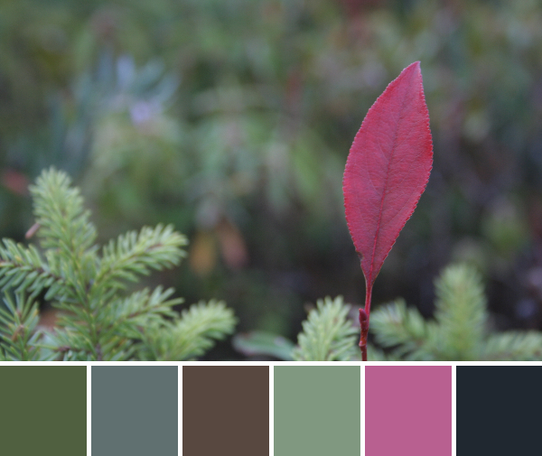
This week’s color inspiration comes again from the bog. There were so many pops of color in that oasis ecosystem that I just had to share more than one week’s worth. Palettes are made using Play Crafts’ Palette Builder 2.1 and my photographs. Enjoy!
Corresponding Kona cottons from left to right:
Avocado, Steel, Sable, Old Green, Plum, Pepper
I love how this little pinkish (Kona Plum) leaf just pops right up with burst of color amongst the evergreens. Getting the leaf in perfect focus was a bit tricky with the wind and fading light, but I think it still works. If nothing else, it makes me smile.
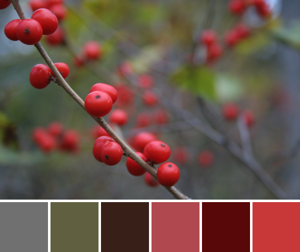
Corresponding Kona cottons from left to right: Steel, Bison, Brown, Ruby, Wine, Lipstick
Corresponding Aurifil thread from left to right:
1246 – Grey
4173 – Dk Olive
5024 – Dark Brown
2230 – Med Peony
2355 – Rust
2265 – Lobster Red
I love this photo. I don’t know if it’s the mirrored red berries all blurred in the background, or the bits of blurred green swirled into the mix, or whether I am just really drawn to the pop of the red berries. Either way, I love the photo and the resulting palette. It makes me *maybe* think I could be ready for snow in a couple months, as long as there are pretty red berries to brighten it up a bit. Maybe.
Rachel at Stitched in Colorinvites you to join a Fabric Mosaic contest sponsored by Intrepid Thread. I first heard about this contest on Yvonne of Quilting Jetgirl‘s blog, and was immediately hooked. I love playing with color and when that color is in the form of gorgeous fabric, with the chance to earn a complete fat quarter set of your mosaic fabrics, plus have the Intrepid Thread create a bundle like yours available for others to buy, I just couldn’t resist. The contest instructions say:
Carefully craft your mosaic of 12 fabrics from among the offerings at The Intrepid Thread. Choose fabrics to express your interpretation of Folksy Fall. Your collection of fabrics can be pretty, funky, dramatic or totally playful. Just make sure to include a variety of colors complimented by some rich fall neutrals – browns, grays or navy blue.
Visit Rachel’s post Folksy Fall {a mosaic contest} for more details on how to enter. Yvonne warned that creating these mosaics is a total time suck–and she’s right! I wish the mosaic maker tool would allow you to drag and move fabrics around while looking at the mosaic, instead of having to go back and cut and paste urls. But it was worth the fun! One tip if you plan to make a mosaic to submit is to keep each individual fabric page open in a different tab. This way, you have links to your fabrics ready when your mosaic is done (thanks to Jennifer for the tip!). I did not do this, which means that once my mosaics were completed to my liking, I had to search through the Intrepid Thread website again to try to track down the names of the fabrics I had chosen. Double the fun, right?! Without further ado, here are my fabric mosaics:
I really wanted to incorporate navy blue into these collections, since it’s a color I rarely use but is such a strong, solid color reminiscent of the night sky closing in early during fall. The word “folksy” elicits images of bright colors and playful shapes. Add the splash of goldenrod for fall, and this collection is juuust right. To me, it reminds me of a folksy fall party, bright colors and shapes dancing and crafting long into the autumn night.
Again, beginning with a foundation of navy blue, this palette grew and blossomed with colors I rarely use. Lime green and orange make a star showing in this collection, anchored by navy blue and teal. I love the way the lime green plays with the teal and navy blue, and was astounded that there was not a single lime green and orange print (time to design fabric, perhaps?). This fabric collection reminds me again of harvest time, gathering the last green and orange fruits (squash, pumpkins, etc) by the harvest moon. The final autumn harvest definitely warrants a folksy fall celebration!
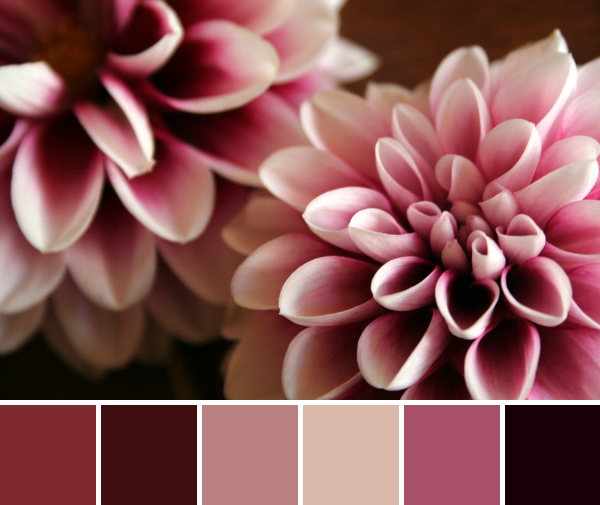
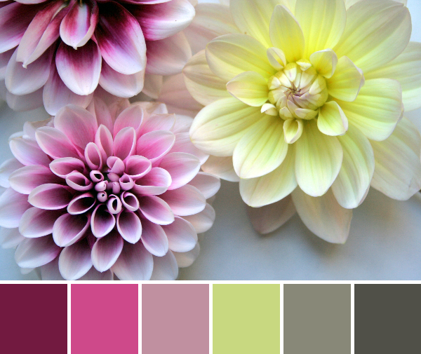
Honestly, I thought I was ready to move on to autumn. But then we had a stretch of warm, sun-filled days without frosts at night, and my dahlias went wild. Can you ever get enough dahlias? I know I can’t. So here, again, is a color inspiration post thick with dahlia’s. I’ve created color palettes using Play Crafts’ Palette Builder 2.1 and some of my photographs, and I’ve included a few additional palette-less dahlia photos for added inspiration. I truly can’t get enough dahlias!
Corresponding Kona cottons from left to right:
Wine, Cocoa, Taupe, Tan, Deep Rose, Black
These first photos were taken on my dining room table, resulting in a rich and shadowy capture of the dark colors within the dahlias. After some photos on the table, I decided to change it up and move to directly in front of a window, with the dahlias on top of a white piece of paper. It’s amazing how much a move of five feet and a different backdrop changes the photo!
Corresponding Kona cottons from left to right:
Iron, Smoke, Coal, Green Tea, Artichoke, Herb
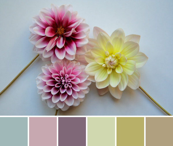
The added light brings out the pastels within the dahlias. Gorgeous, soft, gentle.
Corresponding Kona cottons from left to right:
Bordeaux, Honeysuckle, Corsage, Zucchini, Stone, Moss
Get a little closer, and pop! Here comes some more of that bold and vibrant color. I just love the balance and aesthetic perfection of dahlias. Nature amazes me every. single. day.
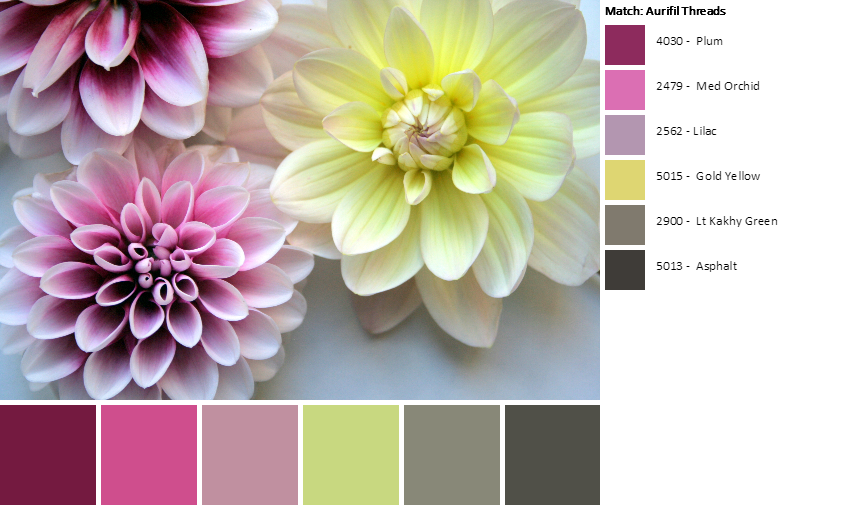
While creating these palettes, I made an exciting discovery! The Palette Builder now matches not only Kona cottons, but also Aurifil thread (my favorite!) and Hex values. My computer programming husband informed me that Hex values are for using the colors in a web format.
Corresponding Aurifil thread from left to right:
4030 Plum 2479 Med Orchid
2562 Lilac
5015 Gold Yellow
2900 Lt Kakhy Green
5013 Asphalt
I personally love Aurifil, and I am now even more inspired to choose a palette (maybe even this one!?) and order the exact Robert Kaufman Kona cottons and exact Aurifil threads and make a lovely, gorgeous, completely coordinating quilted creation!
Today’s color inspiration is noticeably autumnal, as the garden shifts from colorful abundance to the muted tones of the tail end of the growing season. Palettes, as usual, are created using Play Crafts’ Palette Builder 2.1 and my photographs.
Corresponding Kona cottons from left to right: Peridot, Pewter, Geranium, Coal, Titanium, Slate
To be honest, this color palette surprised me. It seems so soft and pastel, when I was expecting a more bold, red and green-led palette. I debated playing around with the color dots to change the palette to fit my expectations, but decided to leave it as is. It’s a very gentle, soft palette that would work well in just about any quilt.
Corresponding Kona cottons from left to right: Citrus, Wasabi, Palm, Bonsai, Kelly, Yarrow
Here’s another sunny palette created from some lingering flowers. I love the combinations of yellow and green paired with a pop of blue and orange. I’m not sure how accurate the Kelly kona match would be; I think Everglade would match better. It’s fun that the Wasabi kona cotton makes an appearance here, though!
I absolutely love the fact that the Palette Builder 2.1 matches the corresponding kona cottons for each palette. It’s always fun to see where each kona color appears in the photograph. I think the time is nearing for me to choose one of my palettes and create a quilt from it and its kona cottons.
I don’t always enter giveaways on Instagram since I don’t want my feed to be swamped with reposts, but every once in a while there’s one so gorgeous that I just can’t help but enter. A couple weeks ago, I reposted, tagged, and followed @fabricshoppejody in the hopes of winning this lovely Carried Away bundle. And I actually won! Carried Away was designed by Zoe Ingram for Robert Kaufman Fabrics and features some of my favorite colors, not to mention feathers!
Thus, my fabric stash grew a little bit last week when the lovely bundle arrived in the mail. Thank you so much to Jody from the Fabric Shoppe for this awesome giveaway, and for adding the very first feather fabric to my stash–I know, hard to believe I haven’t bought any feather fabric yet!
This weekend, we finally had a somewhat sunny day on which I attempted to capture its beauty.
Of course I had my usual helpers around, and my son wanted to be in the thick of the action more than usual.
I just love the feather prints and I’m trying to decide what to make out of this bundle. I’m dreaming of finally attempting a Sew Together Bag, but I’m also terrified. Four zippers?! How many pockets?! A BAG!? I’ve only really attempted quilts and one extremely basic, somewhat flimsy shoulder bag. We shall see. Either way, I’m super excited to add this bundle to my slowly growing stash.
What would you make with this bundle?
I’ll leave you with one last photo of my little helper, since he’s awfully cute. Then again, I’m biased.
My helpful little builder.
I grab a needle and thread once the kids are in bed


 Corresponding Kona cottons from left to right: