Tag Archives: inspiration

Color Inspiration Thursday {35}

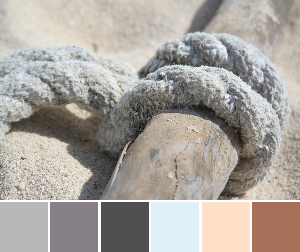
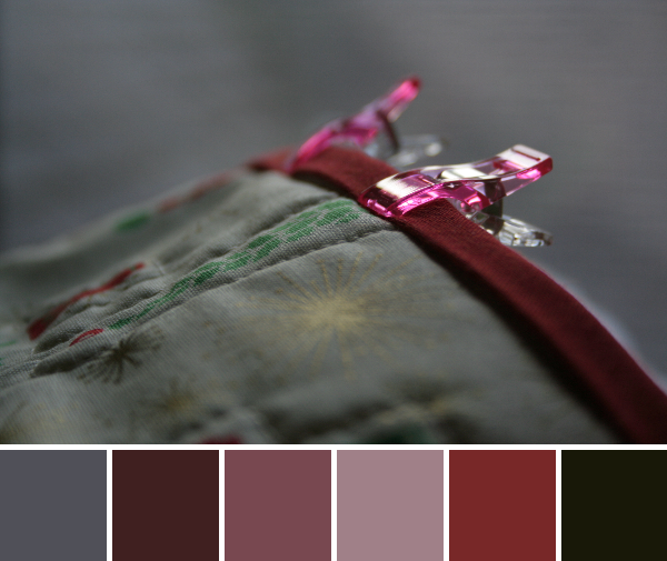
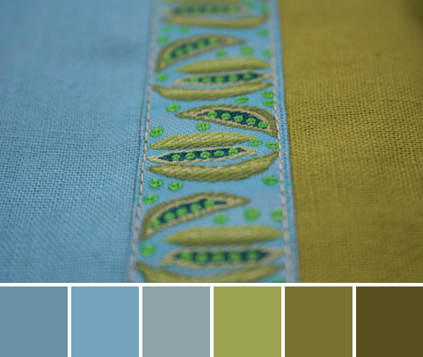
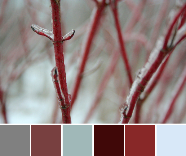
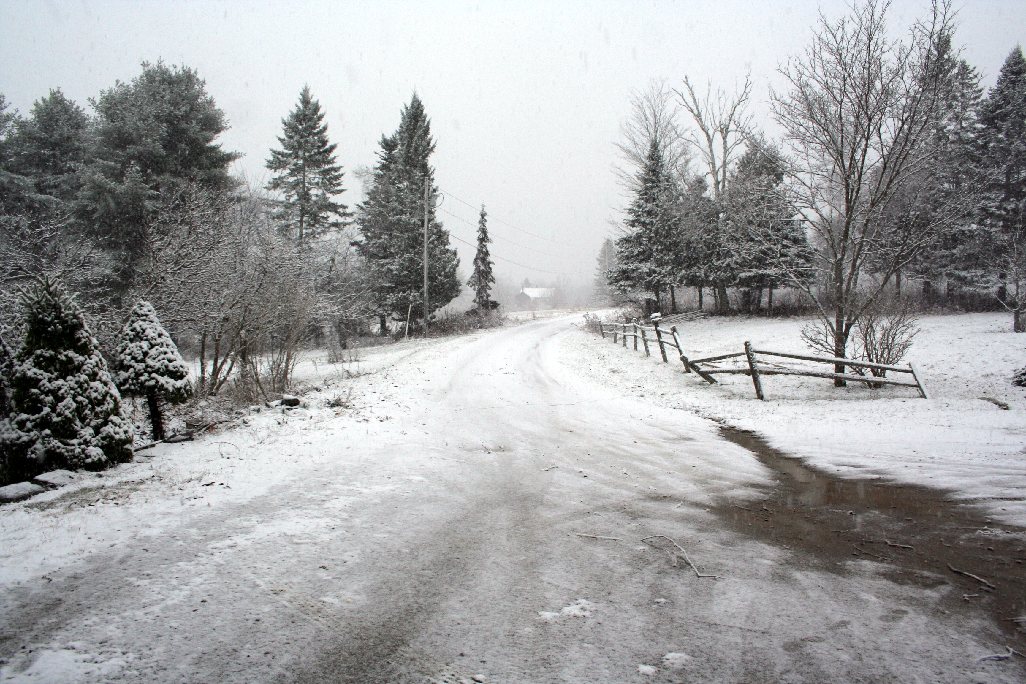
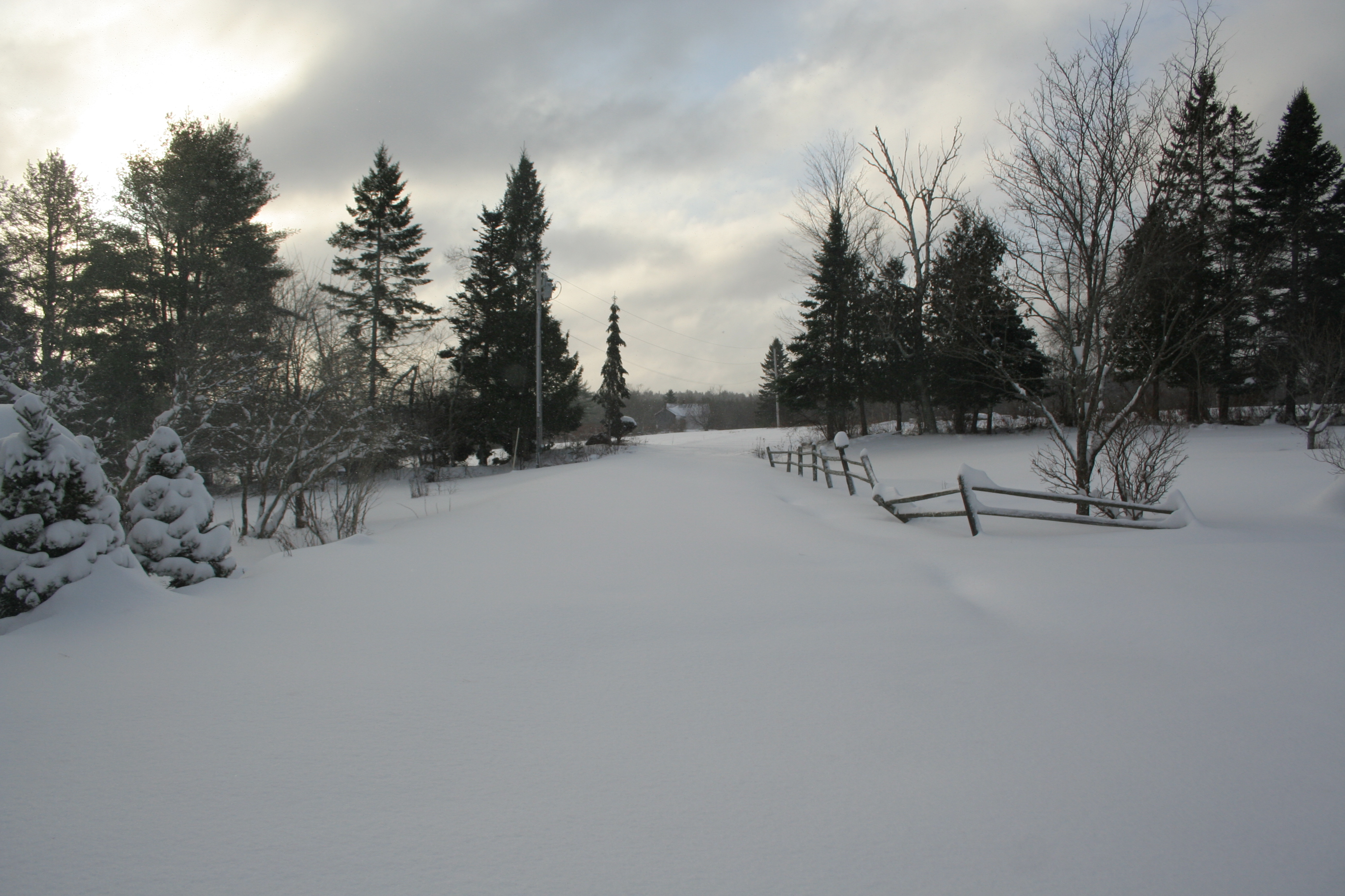
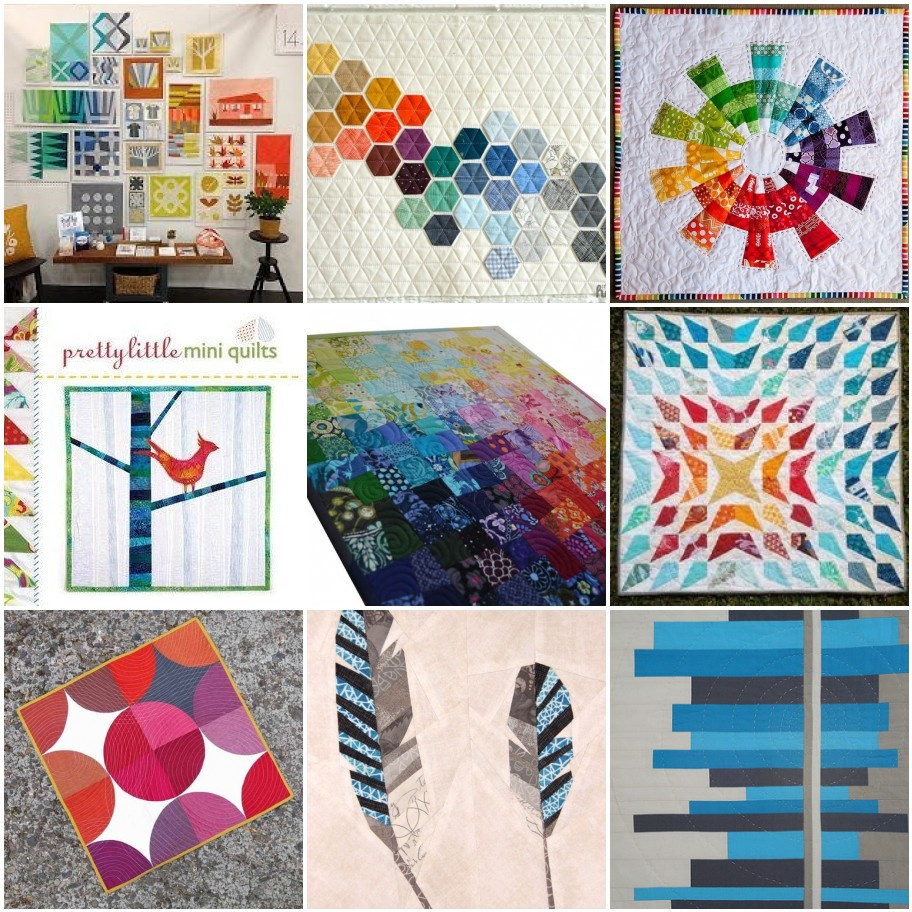
The landscape here is pure white, after Juno dropped about two feet of snow early this week. It’s sunny  today, so it’s glistening and glimmering like only a huge blanket of fresh snow can. With more snow coming this weekend (forecast says a foot or more, potentially) and temperatures in the single digits, I thought it would be a fine time to revisit the tropics. Today’s color inspiration palettes feature palm trees (sigh) and beach life. You can’t go wrong with a reminiscent trip to the hot sandy beach! Palettes are made using Play Crafts’ Palette builder 2.1 and my photographs.

palm tree texture color palette

Corresponding Kona cottons from left to right:
Forest, O.D. Green, Charcoal, Snow, Dresden Blue, Blue

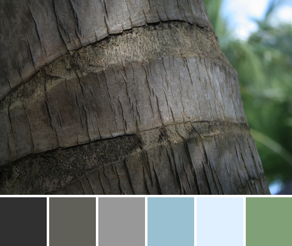
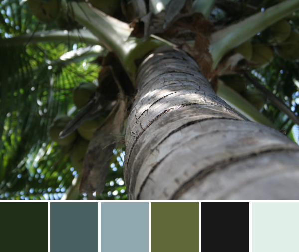
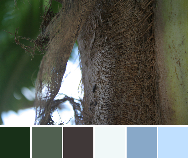
I have to include another detail of the texture found on palm trees. Just look at that texture!! If there’s anything in nature that is reminiscent of fabric, this is it. I love the subdued resulting color palette, too. Those blues are so soothing.

palm tree color palette

Corresponding Kona cottons from left to right:
Forest, Avocado, White, Seafoam, Sprout, Steel

Corresponding Aurifil thread from left to right:
5021 – Light Grey
5023 – Medium Green
2024 – White
2845 – Lt Juniper
2908 – Spearmint
2625 – Arctic Ice

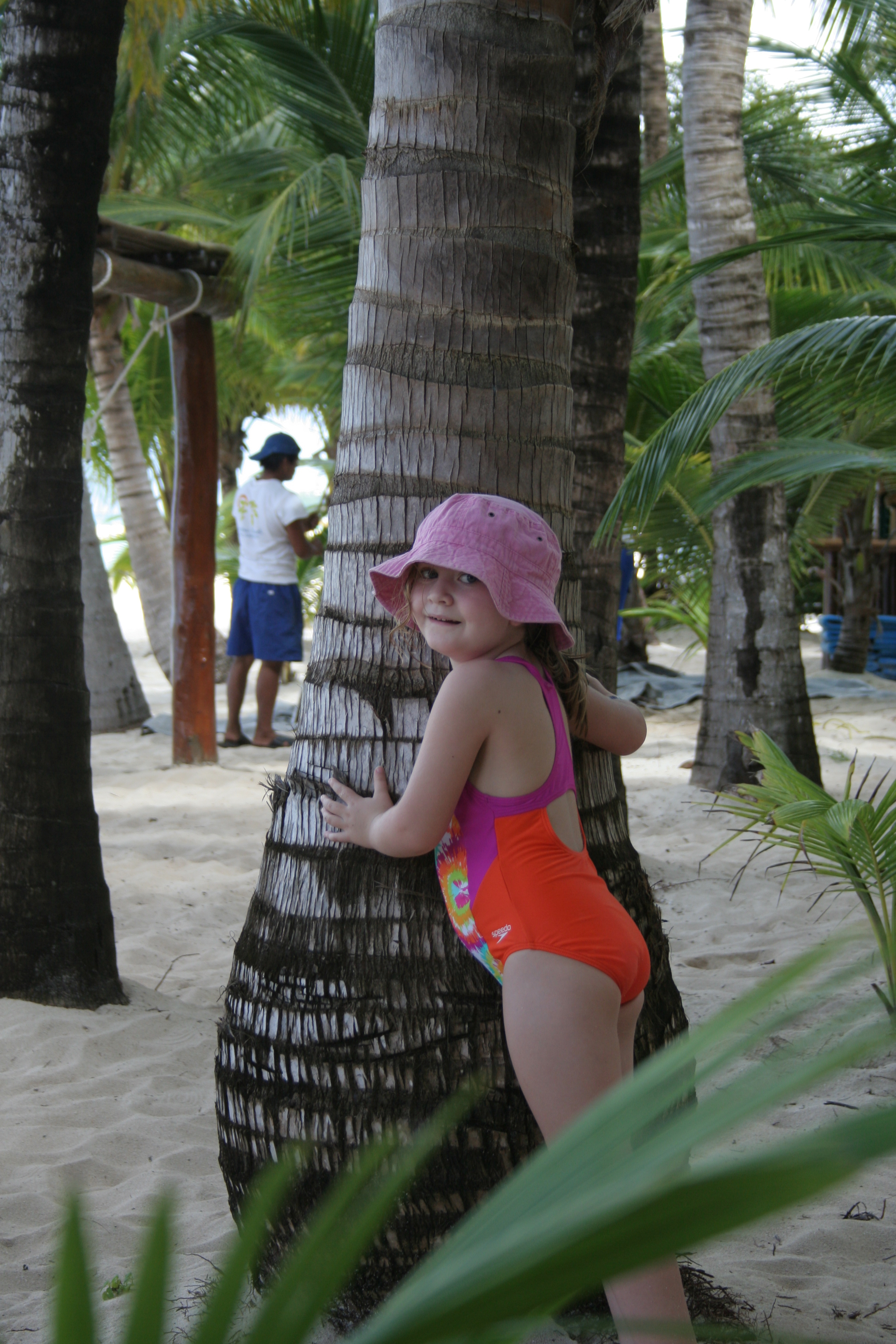
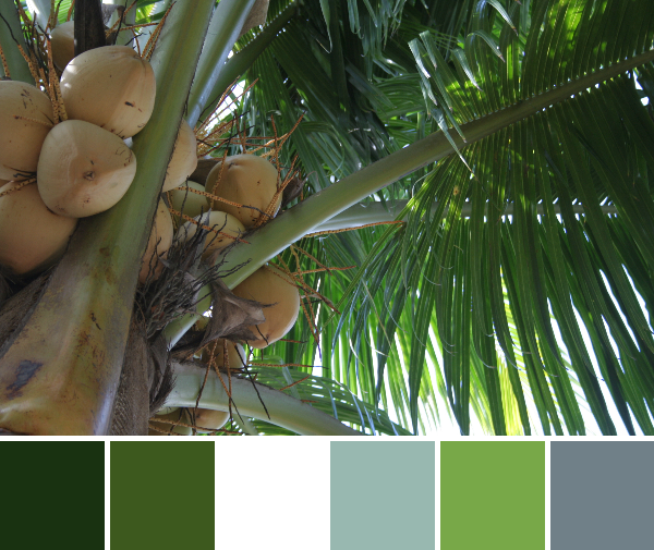
Put the lime in the coconut and drink it all up! No palm tree photo collection is complete without some of those delicious coconuts. We were able to drink coconut water from a coconut in Belize, which was a memory I really wanted to create for my kids. I remember a few very clear moments from my trip to Puerto Rico when I was four years old, and one of those is drinking out of a coconut!

tropical water color palette

Corresponding Kona cottons from left to right:
Graphite, Niagra, Sage, Glacier, Teal Blue, Everglade

Corresponding Aurifil thread from left to right:
1126 – Blue Grey
2810 – Turquoise
2815 – Teal
4093 – Jade
1310 – Med Blue Grey
4182 – Med Turquoise

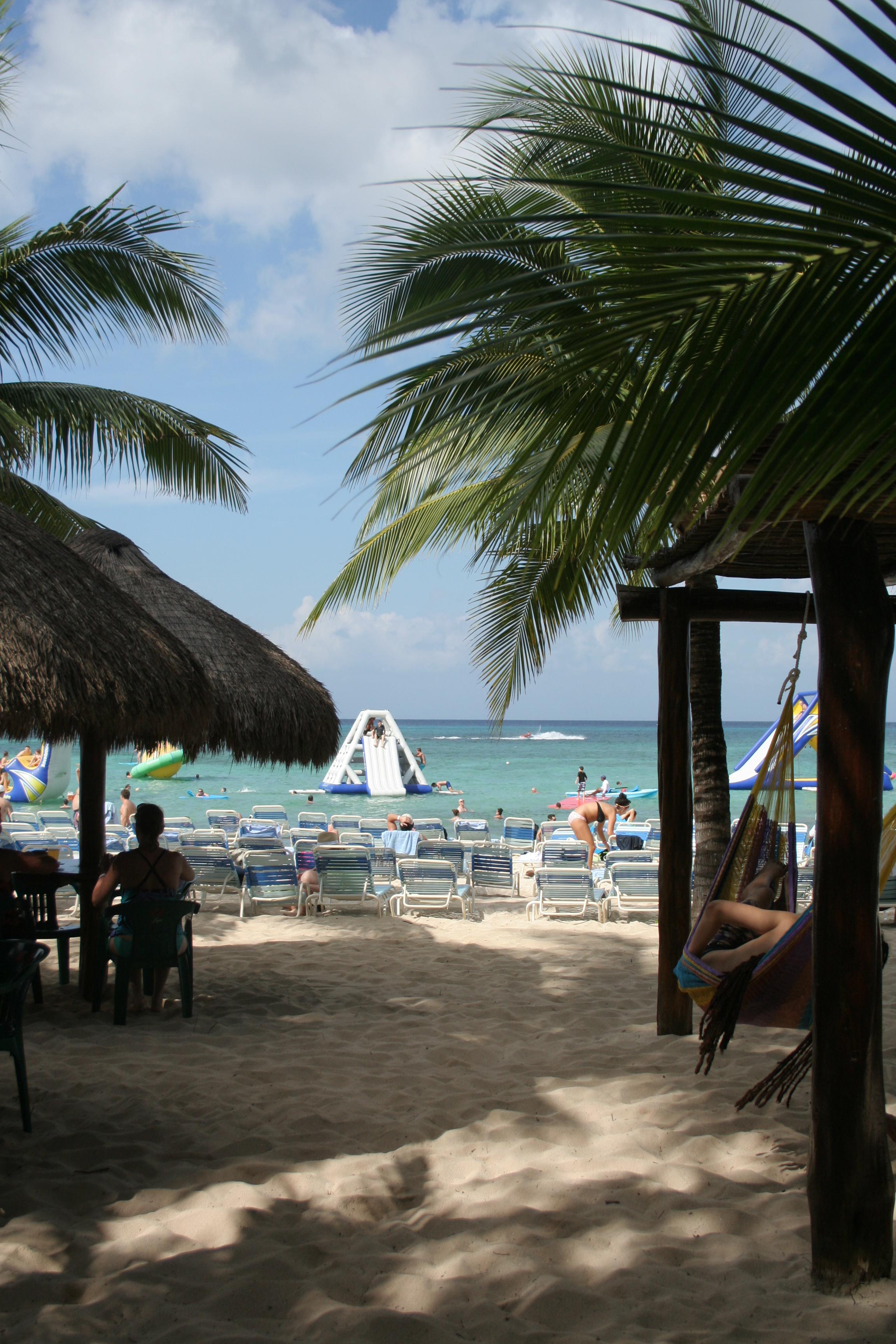
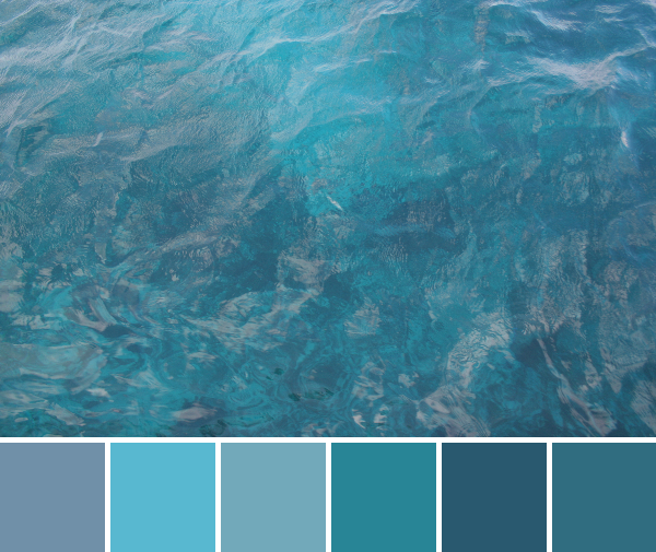
“The color of the ocean in the tropics” has long been my favorite color. Sure, you could call it turquoise if you want, but that one word, as eloquent and beautiful as it is, just doesn’t fully express the gorgeousness of the tropical ocean. This color palette grabs all of the subtle differences that make the ocean as blissfully beautiful as it is.

Enjoy!

Color Inspiration Thursday {34}

Are you ready for another fantasy trip to the tropics?! I know I am! It’s still hovering in the single and barely-double digits here in Maine, so I am going to savor these tropical palettes today. As per usual, color palettes are created with Play Crafts’ Palette Builder 2.1 and my photographs. Matching Kona cottons and Aurifil thread are awesomely provided with the palette builder. Today’s photographs were taken in Cozumel, Mexico.

palm tree texture color palette

 Corresponding Kona cottons from left to right:
Charcoal, Mushroom, Pewter, Fog, Sky, Spring

Corresponding Aurifil thread from left to right:
4241 – V Dk Grey
2370 – Sandstone
2605 – Grey
6720 – Slate
2710 – Lt Robins Egg
2850 – Med Juniper

I’ll start off with another palm tree photograph since I’ve already established my love of palm trees. I love the texture in this photographic study of the alternating bark pattern on the trunk of a palm tree. The splash of blues and green paired with the color gradient of grays is just icing on the cake. Thinking about texture and quilting makes me think about Doe. I was recently reflecting on Carolyn Friedlander’s new fabric line Doe, and realized that one of the big reasons I love her fabrics so much is the diverse and intense texture in each one. Texture and color play so well together, and Carolyn manages to design fabrics that convey a strong texture, either while playing delightfully with color or in the wonderfully all-purpose low volumes for which she is so well known.

catamaran sail boat color palette

Corresponding Kona cottons from left to right:
Titanium, Coal, Silver, Cadet–or–Charcoal, Ruby, Taupe

Corresponding Aurifil thread from left to right:
2610 – Lt Blue Grey
1246 – Grey
2615 – Aluminum
2606 – Mist
2230 – Med Poppy
4012 – Copper Brown

Since we are voyaging to the hot and sunny beach in the tropics. it only seems right to include a catamaran to take us out snorkeling–or just sail us around on a breezy, sun-bathing booze cruise–at least those of us who are not currently with-child (come pick me up in July)!. The color palette resulting from this photo is a quintessential nautical palette, in my opinion. You’ve got your blues and grays, with those shining stars navy blue and a pop of red. Go ahead and sail away… but come back soon!

I’m linking up with #ThankfulThursday on Yvonne aka Quilting Jetgirl’s blog since I’m ALWAYS thankful for the color all around us, and that I can see it. I’m also thankful for the hot memories from Cozumel to help warm me on this frigid winter’s day!

thankful-thursday


Color Inspiration Thursday {33}

Weather in Maine this past week has varied between -20 degrees F and a balmy 20 degrees, but I’m still dreaming of the hot 88 degree sun in Cozumel. This week’s color inspiration is your first little taste of the tropics, care of my vacation photographs and Play Crafts’ Palette Builder 2.1. No worries; If you don’t get your fill of the tropical warmth with these palettes, I have enough to last through all of the frigid northeast’s winter month of January.

Take a little trip with me. Imagine you’re here, just getting off your catamaran to spend the rest of the morning on a soft, warm beach…

cozumel beach mexico

beach cozumel mexico

Ah, the warm, white sand!

beach cozumel color palette

Corresponding Kona cottons from left to right:
Ash, Medium Grey, Coal, Sky, Sand, Taupe

Corresponding Aurifil thread from left to right:
2600 – Dove
2625 – Arctic Ice
1158 – Med Grey
2024 – White
2205 – Flesh
2335 – Lt Cinnamon

The beach at Cozumel was so glorious. Between the warm white sand, the huggable green palm trees, and the perfectly turquoise water, I was in heaven. After getting off the boat, it seemed it was only right to flop down in the sand and get a closer look. This rope tied around a piece of driftwood seemed like a perfect place to start with the warm color inspiration. The combination of textures paired with the soft, soothing colors makes this a lovely palette that makes me dream of the beach in the summertime.

palm tree cozumel color palette

 Corresponding Kona cottons from left to right:
Evergreen, Coal, Titanium, Ivy, Black, PFD Bleach White

Corresponding Aurifil thread from left to right:
5021 – Light Grey
1158 – Med Grey
5008 – Sugar Paper
4173 – Dk Olive
2692 – Black
2843 – Lt Grey Green

Who doesn’t love to hug a palm tree? Seriously. Is it just me, or is it literally impossible to walk by a palm tree without hugging it? Maybe it’s just me, but either way, the view up the trunk into the tropical fronds is worth the extra hug. No coconuts fell on my head during the taking of this photograph, so no worries!

maddie hugging palm tree cozumel mexicoAt least my girl Maddie agreed with me. She’s a girl after my own heart!

So seriously, you hug palm trees, too, right?!


Color Inspiration Thursday {32}

Thursday has come and gone, and here I am without a color inspiration post up yet. I spent the day yesterday sewing up a storm while my mother-in-law played with my son and my daughter was in preschool. After school was full-on family time. It’s the time of year where family and holiday projects and deadlines come first, and I’ve decided I officially will be taking a little break from this blog after today. Between my daughter’s birthday, Christmas, traveling, and other obligations, it’s just the right thing for me to do. I plan to return the week of January 12th, 2015, refreshed, renewed, and with a stockpile of fabulous photographs for posts in the new year. Wild! I still will be posting to Instagram (probably, although with less regularity and probably more random content), so I’d love to see you there. I wish you all a wonderful holiday and happy new year, and look forward to returning to this amazing and supportive blogospheric quilt guild!

With that, here is the color inspiration for the week! Hopefully it will hold you over for the next few weeks. Palettes are made with Play Crafts’ Palette Builder 2.1 and my photographs.

ice color palette

Corresponding Kona cottons from left to right:
Slate, Charcoal, Baby Blue, Stone, White, Parchment or Limestone

This amazingly intricate and fractured ice palace was on top of a mud puddle in our driveway. Yes, a mud puddle! Nature is amazing, and these little pockets of icy beauty are no exception! I began with a plan to post another frosty-filled color palette post, since we have had some wonderful frosty and icy days. But then I decided I really wanted to add in some color. Thinking about where I see the most color these days, I realized the answer was probably my sewing projects! So the next two palettes are pulled straight from some of my sewing sneak peek photographs.

IMG_7473-palette

Corresponding Kona cottons from left to right:
Coal, Burgundy, Crimson, Pewter, Wine, Espresso

Corresponding Aurifil thread from left to right:
1158 – Med Grey
1130 – V Dk Bark
2468 – Dk Wine
2562 – Lilac
2355 – Rust
5024 – Dark Brown

This gorgeous palette of reds and pinks and the glisten of the clover clip make me think of Christmas. So pretty!

IMG_7482-palette (1)

Corresponding Kona cottons from left to right:
Graphite, Dresden Blue, Titanium, Olive, Ivy, Avocado

Corresponding Aurifil thread from left to right:
1126 – Blue Grey
2815 – Teal
5008 – Sugar Paper
2910 – Med Olive
1318 – Dk Sandstone
4173 – Dk Olive

A bright sweet pea palette ranging through teals and lime greens, a sneak peek at a secret holiday project. Oh, I have so much to show you when I return from my little vacation! Have wonderful holiday and new year!

Color Inspiration Thursday {31}

Shortly after the inaugural People Palette post featuring a colorful selfie by Joshua Helms of Molli Sparkles, another Instagrammed quilty selfie caught my eye. It’s high time it take center stage for our second-ever People Palette, a special edition of my weekly Color Inspiration Thursday. Without further ado, here’s the luminous Zoe Ingram, in her gorgeous and bright selfie.

zoe ingram from instagram people palette

 Corresponding Kona cottons from left to right:
Shadow, Coffee, Taupe, Latte, Honey, Peony

Corresponding Aurifil thread from left to right:
2600 – Dove
5034 – Dark Brown
1140 – Bark
2315 – Pale Flesh
2335 – Lt Cinnamon
2410 – Pale Pink

Can you totally see why I had to make this photo into a color palette!? The resulting palette is so smooth, yet bright, and a wonderful combination of taupe and ranges of brown–with delicious Kona cotton names like Coffee, Latte, and Honey–and a splash of Peony pink!

I first became aware of Zoe Ingram when I won a bundle of her gorgeous fabric line Carried Away. I quickly blogged about my fortuitous stash building and not long thereafter, Zoe contacted me asking if she could use my photographs of her fabric on her blog. It was an absolute star-struck moment, and of course I agreed. I love photographing fabric and all things fiber (and all things in general, actually), and would LOVE to expand my repertoire to “fabric photographer” or something along those lines. This was a fun peek into that world.

My photograph of Zoe's fabric on Zoe's website. *starstruck*
My photograph of Zoe’s fabric on Zoe’s website. *starstruck*

Anyway, back to Zoe. Since my first introduction, I’ve been following Zoe’s Daily Journal (visual diary) posts on Instagram, as well as her newest endeavor, Project Adelaide. Project Adelaide is a year long collaboration between Adelaide artists, Kate Mason & Zoe Ingram in which they are capturing hidden gems of beautiful Adelaide, Australia through their drawings.  As someone who heavily finds inspiration in visual things, I have loved watching these daily drawings by Kate & Zoe emerge. In addition to designing fabric, Zoe creates gorgeous, fresh works of art and recently has added some of her daily journal works to her shop in the form of prints, bags, note cards, and even pillows.

One of my favorite's: A tote bag featuring Zoe's original artwork, available in her Etsy shop.
One of my favorite’s: A tote bag featuring Zoe’s original artwork, available in her Etsy shop.

I asked Zoe to answer three short questions to help the world get to know the color inspiration star of the week a little more intimately:

Where do you fit into the worldwide family tree of quilting?
I design bolt fabric for the quilting industry with Robert Kaufman Fabrics.

What is the #1 most played song on your iPod?
At the moment it’s Budapest by George Ezra

What is your least favorite mode of transportation?
Bus

If you could choose anyone, who would you choose as your mentor?
Lilla Rogers

You can follow Zoe and see more of her work here:

Are you a quilter, fabric designer, or other pillar in the quilting world? Do you like to take colorful selfies? Would you like to be a color inspiration rockstar? If you answered yes to any of these questions, drop me a line or tag me @nightquilter on Instagram with your selfie! People Palettes will pop up every so often in my Color Inspiration posts from now on. Thank you for the inspiration, Zoe!

– – – – – – – – – – – – –

All color palettes are created using Play Crafts’ Palette Builder 2.1.

Color Inspiration Thursday {30}

Sometimes, just sometimes, your iPhone photo comes out better than the ones you take with your “real” camera. This week was one of those times. I had a blast outside photographing beauty after an ice storm, and put up a quick Instagram photo just for fun. I came home and uploaded the photos from my camera, and while I got some shots I’m happy with, the particular photo I posted on Instagram wasn’t even close to rivaled. And so, this week, the final photo is indeed an iPhone photo. C’est la vie.

All color palettes are created using Play Crafts’ Palette Builder 2.1 and my photographs.

icy evergreen color palette

  Corresponding Kona cottons from left to right:
Graphite, Evergreen, Black, Old Green, Dresden Blue, Blue Bell

This palette elicits peace and stillness. Maybe it’s the fact that the fine pine needles are trapped, frozen still in the ice. Maybe it’s the presence of calming light greens and blues. Either way, I could see this palette in a little boy’s baby quilt, or a lap quilt for a rustic living room.

red osier dogwood color palette

Corresponding Kona cottons from left to right:
Steel, Crimson, Iron, Brick, Cayenne, Sky

Corresponding Aurifil thread from left to right:
2625 – Arctic Ice
2245 – Red Orange
2845 – Lt Juniper
2345 – Raisin
2355 – Rust
2710 – Lt Robins Egg

The botanist/naturalist in me loves this photo, since it is such a classic example of red osier dogwood (Cornus sericea) in winter. The opposite branching and bright red bark are dead giveaways to the species. I also love the shades of red paired with light blue and greys that appear in the resulting color palette.

icy queen anne's lace color palette

Corresponding Kona cottons from left to right:
Steel, Charcoal, Coal, Windsor, Amethyst, Shale

This is my favorite from my Canon Rebel XT photos of this particular ice-bejeweled Queen Anne’s Lace (Daucus carota) remnant. I love the movement and the muted, subdued tones. But lo, the photo I took with my iPhone captures the light better and thus shines even brighter:

Instagram icy blues color palette

Corresponding Kona cottons from left to right:
Dresden Blue, Blue, Charcoal, Indigo, Amethyst, Regal

Corresponding Aurifil thread from left to right:
5008 – Sugar Paper
2560 – Iris
2606 – Mist
2785 – V Dk Navy
4140 – Wedgewood
2783 – Med Delft Blue

This photo glistens, doesn’t it? I love the resulting palette, too, although it is no secret that I’m a blue girl. Okay, and a magenta and turquoise girl. So maybe I’m just a color-in-general girl. Either way, I love this palette. I think I may actually use this palette for a future quilt. I need to make a Storm at Sea quilt one day, and these blues and stormy grey might be just the perfect shades.

What color do you find the most in your quilts?

Color Inspiration Thursday {29}

Happy Thanksgiving to those of you in the US (belated, since I spent yesterday with family instead of at the computer)! I have so much to be thankful for this year, and always. Top on my list is always family, immediate and extended, near and far. I am so blessed to be supported and loved by all of my family and wish we all lived closer together. Yesterday I was also particularly grateful for the gorgeous snow AND the fact that we didn’t lose power! Coming into a warm, well-lit house after playing in the snow is so very comforting.

This week’s color inspiration comes from some snowy scenes around our house, since we accumulated a good foot plus of snow overnight.

snow in maine
BEFORE: View down our driveway Wednesday afternoon.
snow maine
AFTER: View down our driveway Thursday morning.

Color palettes are made using Play Crafts’ Palette Builder 2.1 and my photographs.

snowy red berries color palette

 Corresponding Kona cottons from left to right:
Titanium, Shadow, Mushroom, Mocha, Mahogany, Cinnemon

I love the smooth flow of colors in today’s palettes. Whites and greys fade to the little pops of color that poke through the snow.

blue sky icicles color paletteCorresponding Kona cottons from left to right:
Slate, Titanium, Cloud, Cadet, Pepper, White

Corresponding Aurifil thread from left to right:
4140 – Wedgewood
5008 – Sugar Paper
2560 – Iris
1248 – Grey Blue
2785 – V Dk Navy
2024 – White

Another smooth flow of color with the gorgeous blues of the sky, both reflected in these dripping icicles and in its own fluffy clouded beauty. I love cold, sunny, snowy days. The sun makes everything glisten and glimmer!


Color Inspiration Thursday {28}

Today I am taking a trip down memory lane for our color inspiration. I admit, I was waiting for the perfect frosty morning to take photos for today’s color inspiration and the day simply did not come; it was cooooold but no gorgeous frost. So, I headed to my photo archives and found a few suitable seasonal nature photos from a family camping trip in November of 2010. My husband and I took our baby Maddie camping in a yurt in Jefferson, Maine, and had a lovely time. Here are some snapshots. Color palettes are made using Play Crafts’ Palette Builder 2.1 and my own photographs, as per usual!

see the world in a drop of water color palette

Corresponding Kona cottons from left to right:
O.D. Green, Sky, Iron, Steel, Evergreen, Palm

See the world in a drop of water. I love the smooth grey-green of this palette, and the reflections dancing in the raindrops.

drip drop leaf brown color palette

Corresponding Kona cottons from left to right:
Coal, Sable, Black, Medium Grey, O.D. Green, Titanium

Another raindrop photo; can you tell I like to take photographs of water showing off its awesome surface tension tricks? This palette holds all of the muted earthy tones found in mud. Mmmm!

colorful yurt color palette

Corresponding Kona cottons from left to right:
Chestnut, Black, Slate, Ochre, Paprika, Mahogany

A warm and cheery scene from inside the yurt. My husband holds my peacefully sleeping daughter during nap time, and our hunter-beware clothing dries above the wood stove. This was a cozy camping trip for sure! I like the range of colors in this palette, and I think they play well together.

slime mold color palette

Corresponding Kona cottons from left to right:
Moss, Black, Caramel, Spice, Gold, Cinnamon

Corresponding Aurifil thread from left to right:
5013 –Asphalt
2692 – Black
2930 – Toast
2385 – Terracotta
2930 – Toast
4012 – Copper Brown

I love this palette. I don’t think I will tire of the bright pop of fungi growing on a tree. The flow from black-greeny-grey to the range of coppery yellows and reds creates such a smooth aesthetic. This might be my favorite palette from this group.

night time lantern fun

Just one more photo to complete my trip down memory lane: my husband and daughter enjoying an awed experience with the lantern at night. I can’t believe this baby girl is almost 5 years old! We definitely will need to think about another yurt camping trip, maybe this winter!

Schnitzel and Boo Mini Quilt Swap: I’m in!

When I first began quilting, I had no idea about the vast network of social quilting that happens over the internet. Now that I’ve been quilting and “in” the quilting blogosphere, Facebook world, Instagram, etc. for a while, I’m realizing that there are SO many ways to quilt socially over the internet. Just to name a few of the social quilting modes I’ve seen so far beyond the network of conversation and support found on blogs and Facebook, there are quilting bees, round robins, mystery quilts, friendship quilt swaps, and mystery quilt swaps. I’m sure there are many more to which I’m not yet privy. But this week, I did it: I joined my very first quilt swap!

schnitzel and boo mini quilt swap round 3

Very early in my quilting days, I saw Instagram posts about the first two rounds of the Schnitzel and Boo Mini Quilt Swap, and have to say I was a little bit jealous of the fun back-and-forth, inspiration sharing, progress peek photos, and of course the gorgeous finished mini quilts being mailed around the world to unsuspecting recipients. When I saw people begin to post about joining in on Round 3, I bit the bullet and signed up! Now I’m proud to say that I am among the Makers of Awesome, and have already started plotting the quilt I will be making for my secret partner.

I’ve also put together a mosaic of quilts I love to help the secret partner who will be making a mini quilt for me.

mini quilt swap inspiration board
Inspiring quilts by (from top left to right): 1. Carolyn Friedlander 2. Modern Handcraft 3. Brooke from Pitter Putter Stitch, 4. Modern Cozy, 5. The Sewing Chick, 6. Simple Sewendipity, 7. Jen from Bettycrockerass, 8. Shape Moth, 9. The Charming Needle

I’m building up my inspiration board as I see more quilts I love, so you can see it as it grows by following the board on Pinterest.

Most of the communication with this swap is happening on Instagram, which is really fun since it’s such a visual platform. It’s a bit confusing to me (so far) to be addressing a mystery partner, and half of the time in reference to the person for whom I’m making a quilt, and the other half of the time be referring to the person who is making a quilt for me. I’m sure I’ll get the hang of it eventually, though. I’ve already decided what quilt I will be making for my partner, and I’ll show a few sneak peeks along the way. If you want to follow along with my (and almost 1,000 other quilters worldwide) progress, follow me @nightquilter on Instagram, or browse the hashtags #schnitzelandboominiquiltswap and #makeaquiltmakeafriend.

This is going to be fun! Any advice for a newbie quilt swapper?

Color Inspiration Thursday {27}

Flash back to fall! All color palettes are created using Play Crafts’ Palette Builder 2.1 and my photographs.

pumpkin ladybug autumn color palette

Corresponding Kona cottons from left to right:
Biscuit, Earth, Forest, Ivy, Spice, Gold

While I’m resigned to the fact that winter is here, I’m still cherishing the little bits of life that still brighten our garden. This little ladybug was relaxing on one of our almost-ripe pumpkins a couple weeks ago. The muted tones of the resulting color palette speak volumes of fall. Many of the corresponding Kona cotton colors also scream fall: ivy, spice, gold… Yum!

flower autumn color palette

Corresponding Kona cottons from left to right:
Evergreen, Gold, Coal, Paprika, Pickle, Ivy

Corresponding Aurifil thread from left to right:
5013 –Asphalt
2330 – Lt Chestnut
1246 – Grey
4012 – Copper Brown
2910 –Med Olive
1318 – Dk Sandstone

While beginning to put my gardens “to bed”, I was overjoyed to see a few last Calendula flowers holding on, with bright sun-ray petals dancing circles around them. Those last flowers in fall make me so happy! There’s something about the intricacy and color play that naturally occurs in flowers that makes me marvel at the ever-present beauty in nature. Color is everywhere!