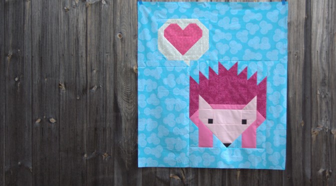
I went easy on myself this month for A Lovely Year of Finishes (ALYoF) and set my April goal at finishing the quilt top for my sister-in-law’s baby shower yesterday. I made a totally pinkalicious Hazel Hedgehog quilt featuring a giant sized hazel and a fun heart speech bubble I created just for this project. Did I meet my goal? Yes!
Even with the heart speech bubble addition, I was able to finish the flimsy (quilt top) before the baby shower. Since I finished this flimsy in the midst of a rare “full mommy sew day” when my mother-in-law took the kids for a play day, I decided to forge ahead and start basting and quilting little (giant) Hazel.
After a particularly late night and early morning quilting/binding session, I managed to quilt the entire background and speech bubble, AND make and attach the binding. Normally, I would complete all of the quilting before binding, but since I really wanted a presentable quilt for my sister-in-law Stephanie’s baby shower, and since the unquilted portion is completely enclosed in quilted background, I decided to get a little cheeky and bind the quilt before completely quilting.
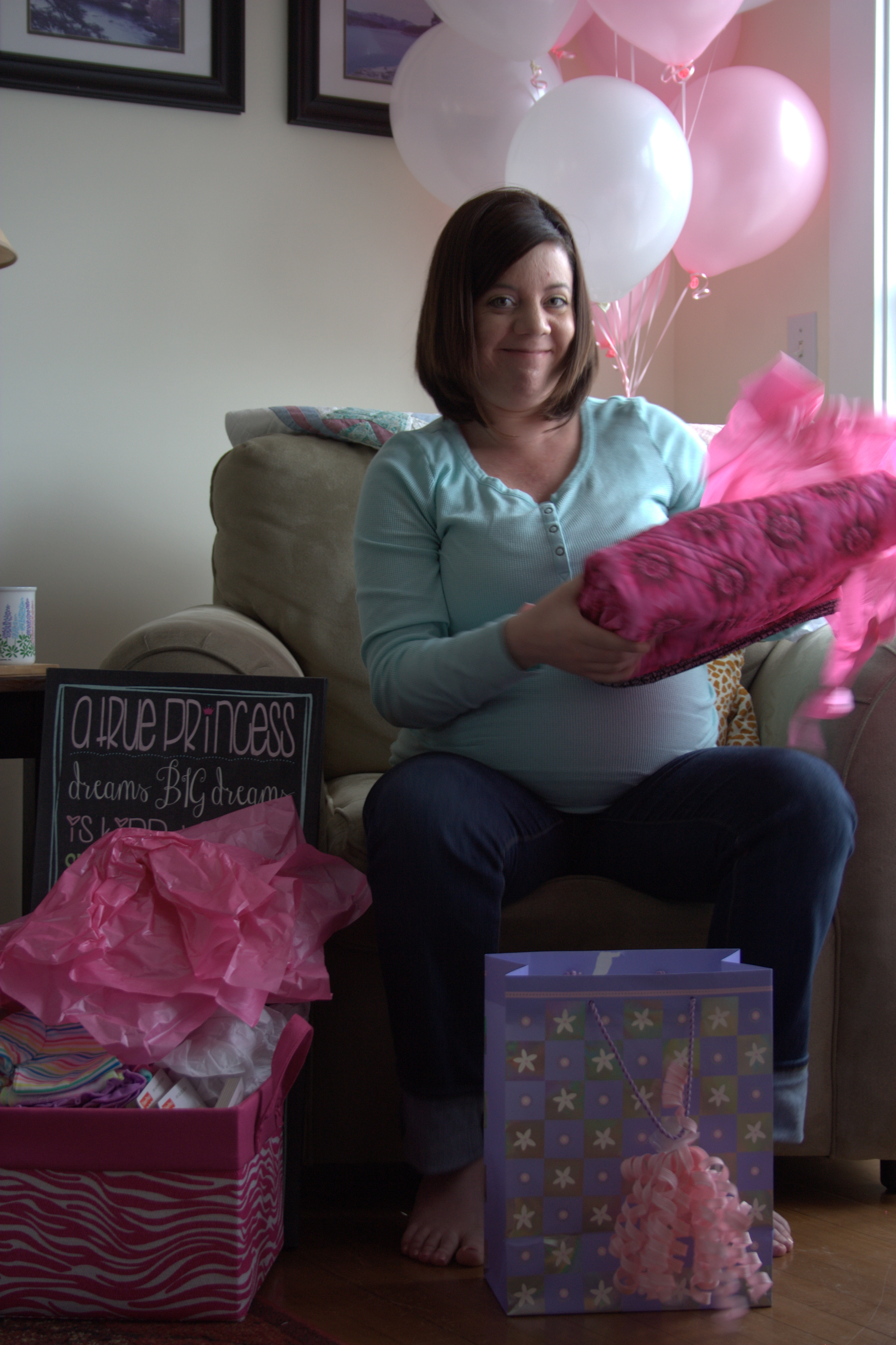
The purple bag with pink tissue and ribbon on the left contains the quilt.
With the quilt bound, I was able to roll it, wrap it nicely in tissue paper and a ribbon-bound bag, and gift the quilt with no worries of fray.
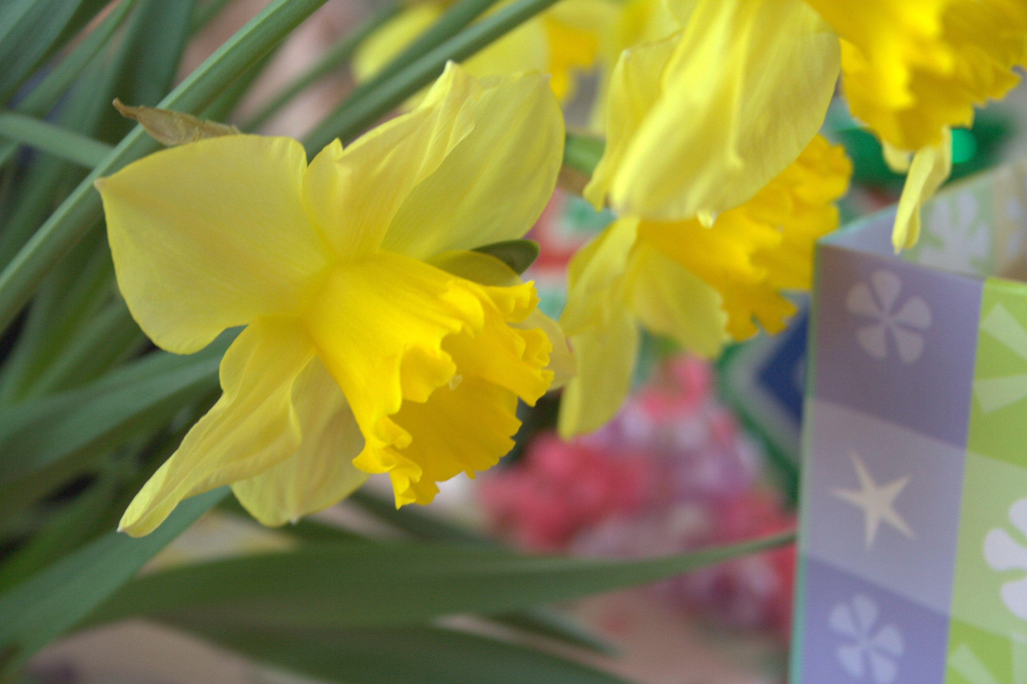
Spring baby shower gift table decor–so alive!
My sister-in-law LOVED it, so mission accomplished! Even with a few basting pins still in Hazel and the heart, which will be quilted as soon as the color matched Aurifil thread arrives, it was fun to get to give this gift. Just think: hidden behind this quilt are two big baby bumps–cousins destined to be rolling around on top of this fun quilt (Stephanie is due a couple weeks after I am).
I will share more detail photos of the quilting and finishing in a later finish post once the quilt is completely finished (this will help keep the fire lit under my bum so that I actually finish it before baby time!) But for now, here’s a closer look at the speech bubble heart I’m calling “Hello, Love”. I’m planning on writing up a pattern for this block, since it’s such a perfect block to add to any of Elizabeth Hartman’s giant creatures, and I could definitely go for a speech bubble heart pillow!
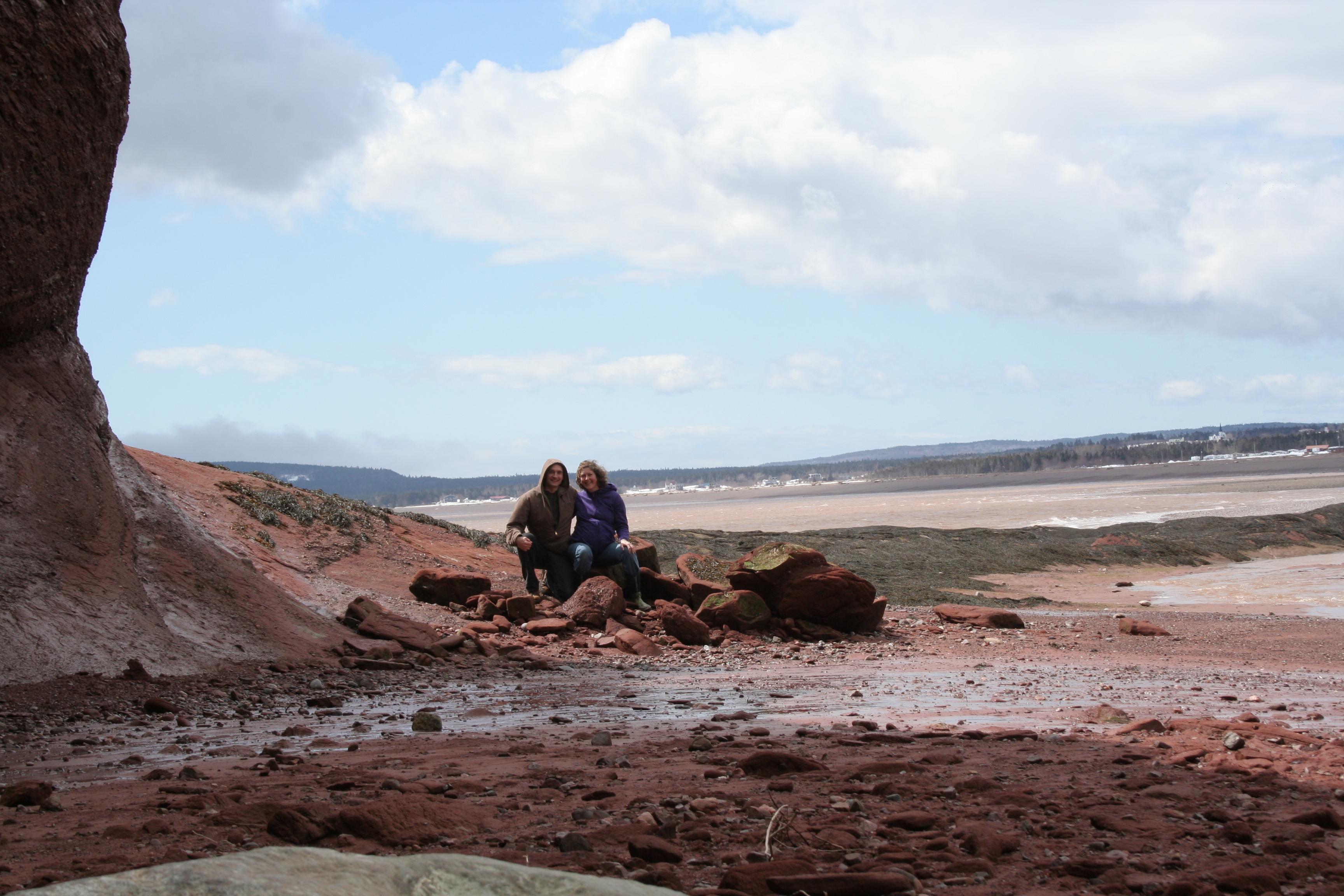
This past weekend, my husband and I escaped for a long weekend getaway to the Bay of Fundy. It was our first trip alone together since our almost 5 1/5 year old daughter was born, and with another baby expected in the next month or so, it was most likely our last for another couple of years. A babymoon, if you will. We made the most of it and adventured more than we would be able to with little kids in tow, and relaxed more than we would be able to with little kids in tow. It’s all about balance.
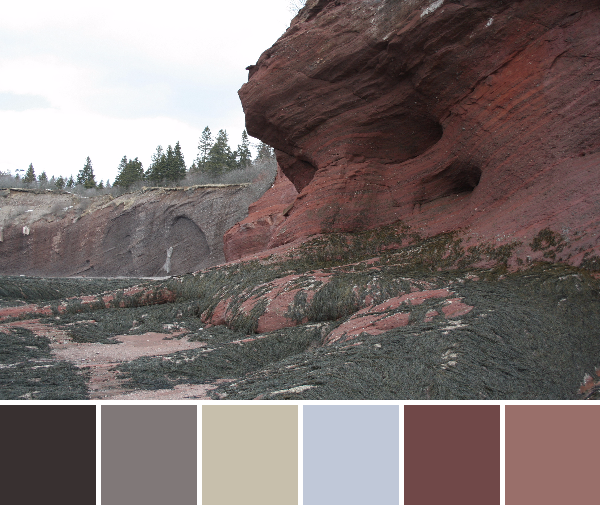
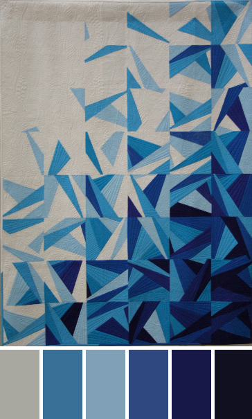
The Bay of Fundy is known for having the highest tidal range in the world. I’ve wanted to travel to the Bay of Fundy in Canada since my estuarine ecology studies in college. There’s something about 40 foot tides and vast mud flats that makes me happy. Our short timeframe and my 8 months pregnant body didn’t really allow for as much exploring as I’d have liked, but we had a great time anyway. Today I’ll be sharing some color palettes from photographs taken on our trip, created with Play Crafts’ Palette Builder 2.1.
Corresponding solids from left to right: Kona Lake, Bella Etchings Charcoal, Kona Slate, Bella Navy, Kona Black, Bella Dusty Jade
Corresponding Aurifil thread from left to right:
2715 – Robins Egg
1158 – Med Grey
4140 – Wedgewood
2784 – Dk Navy
2692 – Black
2845 – Lt Juniper
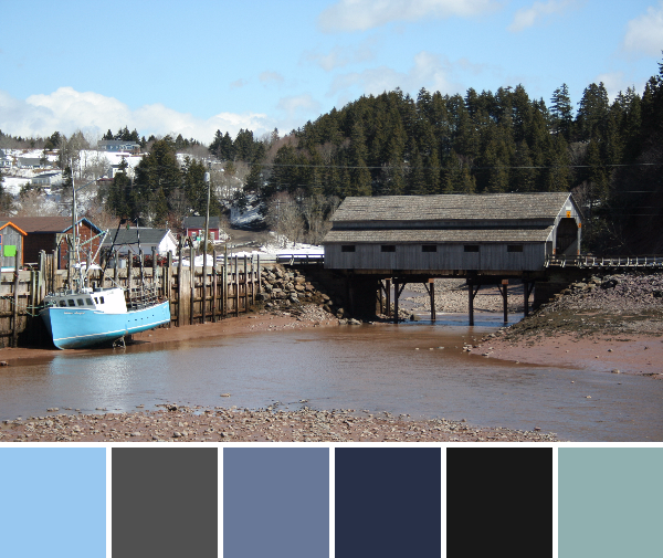
Low tide on the Bay of Fundy means boats are grounded, many feet below the dock. I loved how the blue of the boat hull matched the sky.
Corresponding solids from left to right: Bella Soft Finish Black, Bella Etchings Slate, Bella Tan, Bella Platinum, Kona Mocha, Kona Taupe
Corresponding Aurifil thread from left to right:
1285 – Med Bark
2625 – Arctic Ice
5011 – Rope Beige
2560 – Iris
2468 – Dk Wine
2375 – Antique Blush
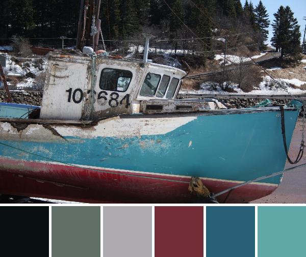
Corresponding solids from left to right: Kona Black, Bella Lead, Bella Stone, Kona Crimson, Kona Teal Blue, Bella Caribbean
Corresponding Aurifil thread from left to right:
2692 – Black
1246 – Grey
2606 – Mist
2345 – Raisin
1310 – Med Blue Grey
2850 – Med Juniper
This boat has seen better days, but never have I seen one more full of character! I think because of the drastic change in tide each day, the sides of the boats moored to the dock get a beating. It’s still gorgeous, though!
Not only did color abound, but there was plenty of texture and pattern to be enjoyed as well.
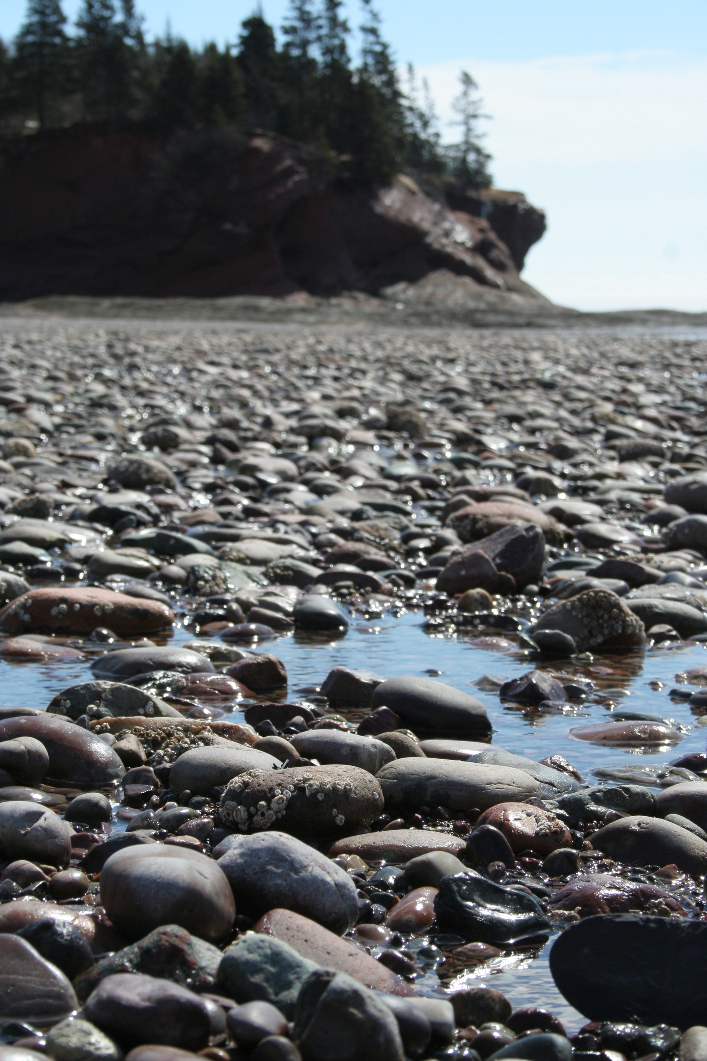
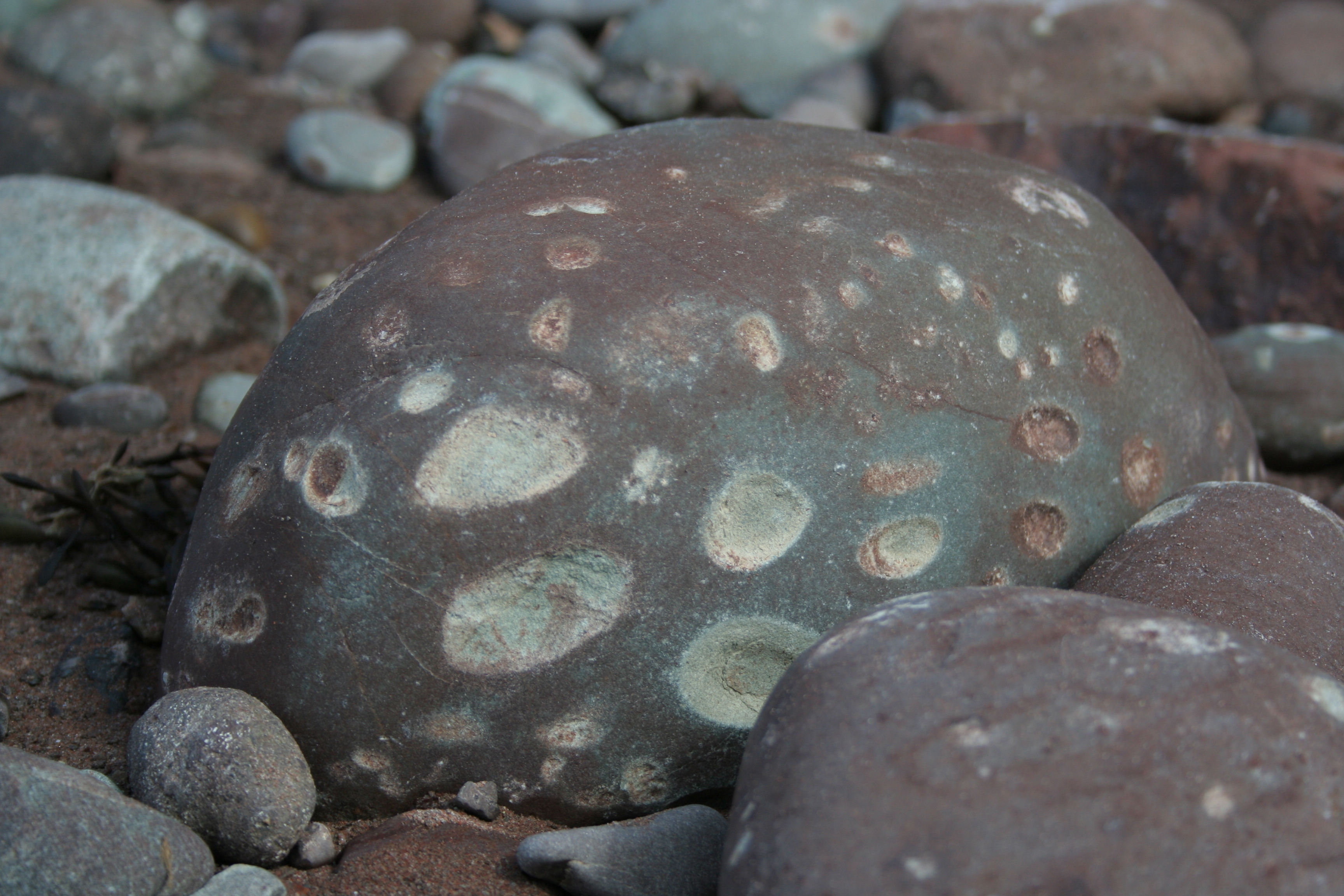
Rocks as pocked and battered as this one littered the beach. I suppose this is what happens when 40 feet worth of tides come in and out each day, rolling and bashing the rocks against each other.
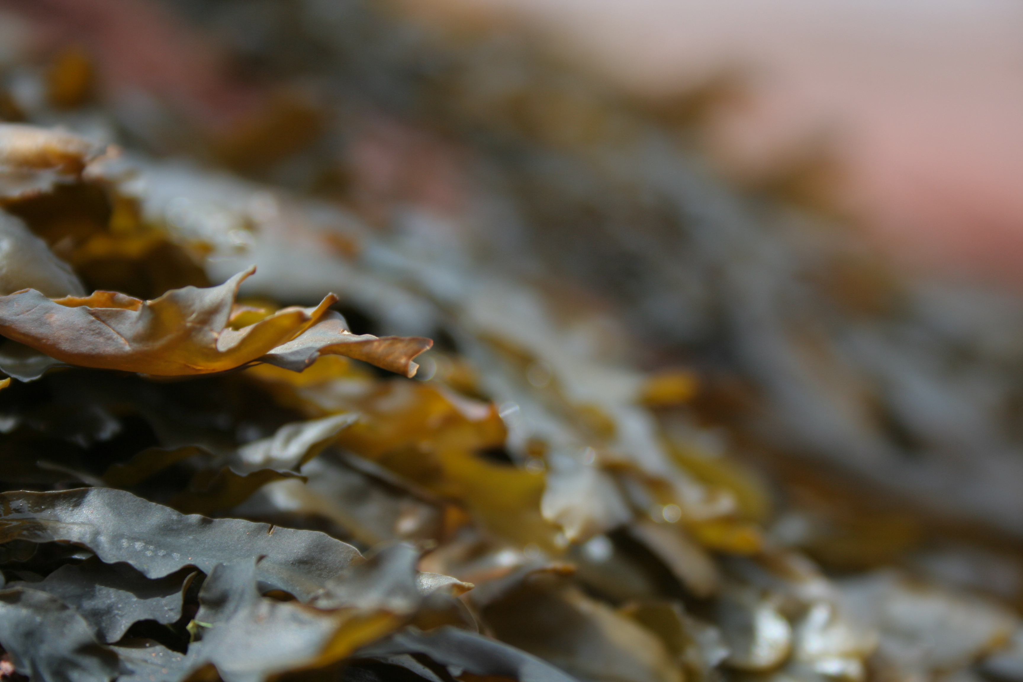
Seaweed. Gorgeous. This feathery seaweed covered the exposed rocks, creating a seascape of brown-green-red as far as the eye could see.
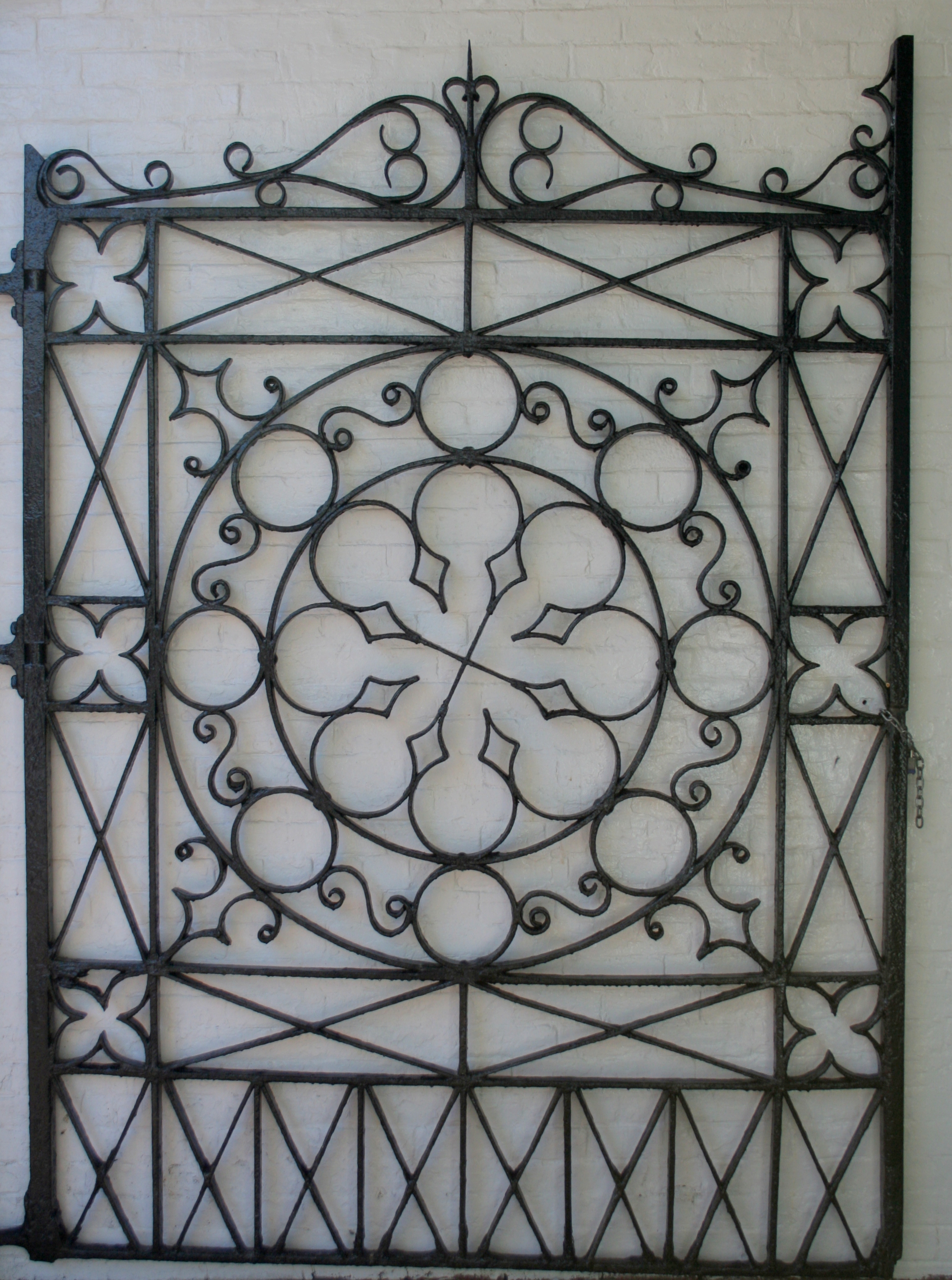
I loved the gate at City Market in St. John’s. It’s a lovely balance of geometry and balanced aesthetic. Quilt inspiration is everywhere!
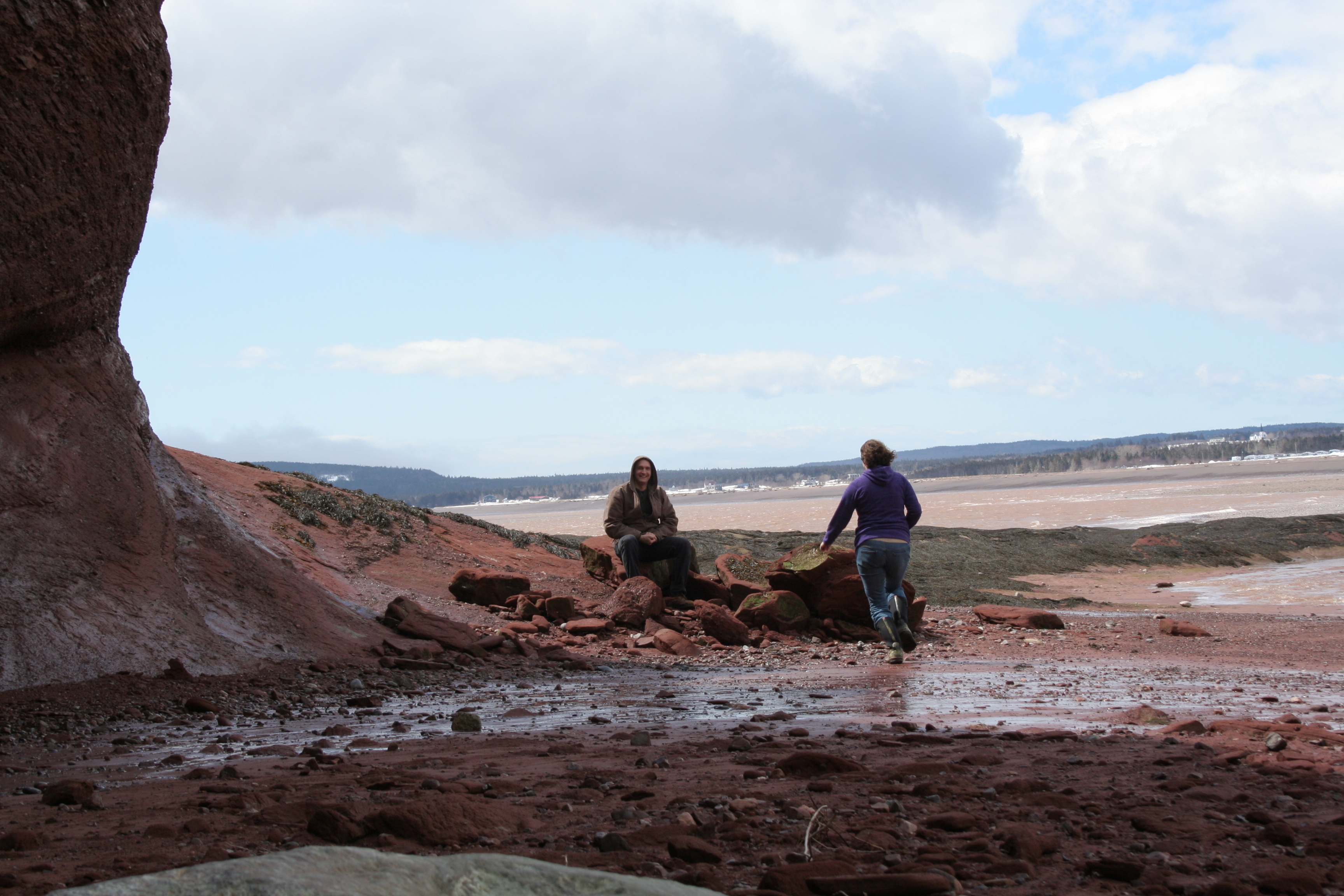
I’ll leave you with a good laugh. With a tendency to take a million photos, I wanted to be sure to have at least one of my husband and me together on our adventures, and an arms-length selfie just wouldn’t cut it. So of course, I set up a timer photo with the plan to run and join my husband for the photo like I always do. After three or four failed attempts, we decided that maybe the one who wasn’t 8 months pregnant should do the running. The first photo is my favorite fail, with the camera set by yours truly. The second photo is the first try with my husband setting the camera, successful with a good second to spare!
I’m linking up with Yvonne’s Thankful Thursday, since I’m thankful for our little escape. Spending time as a couple, while seemingly impossible with little kids, is so essential. I’m so glad we make the time to have together time on a regular basis now! (Did I mention that my husband encouraged me to take my sewing machine with us, and during the relaxing afternoon following our adventure I was able to do some sewing? Talk about gratitude!)
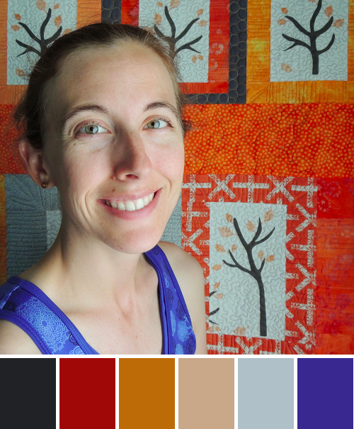
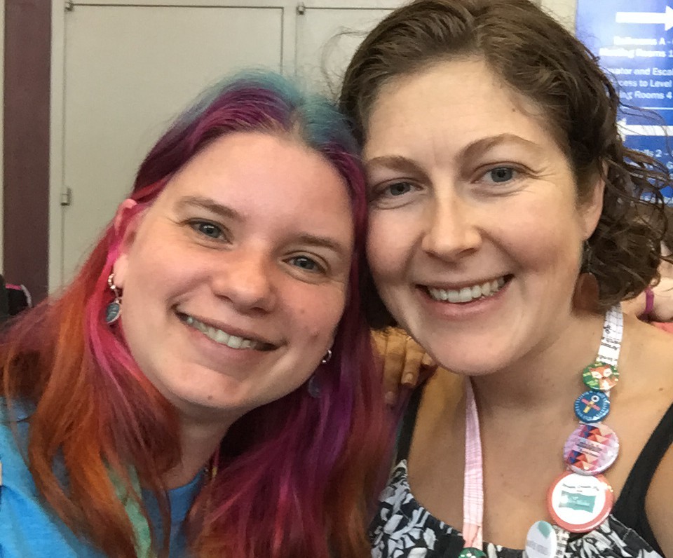
Meet Yvonne Fuchs, known as Quilting Jetgirl. I first met Yvonne in the New Quilt Bloggers Blog Hop hosted by Beth at Plum & June about a year ago. Since then, through blog comment exchange and other quilty interaction, we’ve become friends. I was fortunate enough to spend time with Yvonne in person at QuiltCon and I’m looking forward to many more quilting hang outs in our future, despite the fact that we live a country-width apart.
Corresponding solids from left to right:
Kona Pepper, Kona Tomato, Bella Longhorn, Kona Straw, Bella Pastel Blue, Kona Surf
Corresponding Aurifil thread from left to right:
4241 – V Dk Grey
2395 – Pumpkin Spice
2155 – Cinnamon
2320 – Lt Toast
2612 – Arctic Sky
2740 – Dk Cobalt
Today’s People Palette features Yvonne in front of her quilt Namibia Trees. The color play is fabulous, since who doesn’t want to pair bright reds & golds with royal blue!? Great choice in attire, Yvonne!
Yvonne is a big proponent of building and embracing the online quilting community, which is one of the many awesome things about her. She’s also not afraid to be real, and opens philosophical discussions about all things quilting and beyond. As she says on her blog, “Quilting is more than just a creative outlet for me. I want to pause and reflect on larger ideas to cultivate a community of discussion and insight.” You can read her philosophy discussion posts HERE. I particularly recommend The Four Agreements and Creativity and Time.
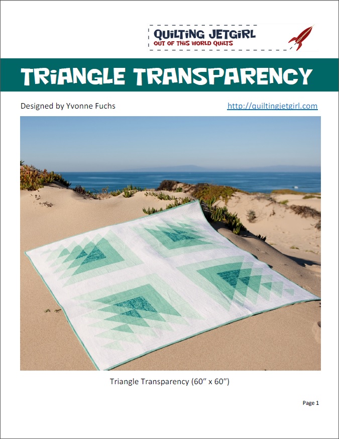
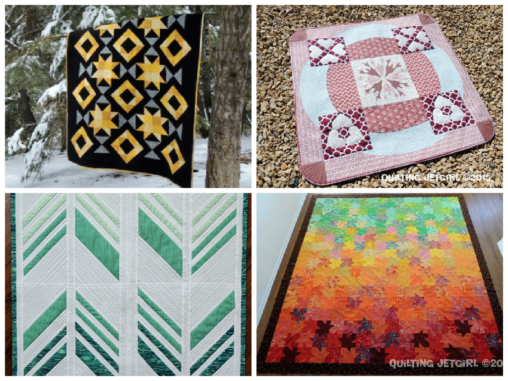
Yvonne both creates custom quilts and designs quilt patterns, and recently released a gorgeous pattern called Triangle Transparency, which is currently available for sale in her Craftsy, Etsy, and Payhip stores for $6 through Sunday, April 12th, which is a savings of 33% off of its regular price. Here are some more of my favorites from her recent quilts:
I asked Yvonne to answer three short questions to help the world get to know the color inspiration star of the week a little more intimately:
Where do you fit into the worldwide family tree of quilting? I define my branch as the introverted, cat lady, quilter, blogger. I think I span between traditional and modern quilts in terms of style, but left to my own devices (aka with no commissioned quilts), I would lean heavier on the modern aesthetic.
What is the #1 most played song on your iPod? I don’t know about song, but my favorite bands are Coldplay, Linkin Park, and Chevelle, and their songs are featured heavily in my music playlists. 🙂
What is your least favorite mode of transportation? What an interesting question! That is really hard for me to answer. I love to walk, and I am amazed by cars, trains, and planes. I can get a bit motion sick in cars and boats, but a bit of planning ahead almost always solves that issue. I have only ridden a horse twice in my life, but both times were enjoyable experiences. Can I say riding a camel just because I never have (but I’d be willing to try!)?
I confirmed with Yvonne that she was choosing riding a camel as her least favorite mode of transportation, since she talked a lot about enjoyable transport, and she confirmed: I know it said LEAST favorite, and I guess I vote for riding a camel as least favorite (they spit, right?). I guess I just am super thankful I can still walk comfortably and I am amazed at modern contraptions to get me places faster than that.
Spit, they do! Thank you so much, Yvonne, for being my People Palette star!
You can find Yvonne in the bloggy quiltiverse here:
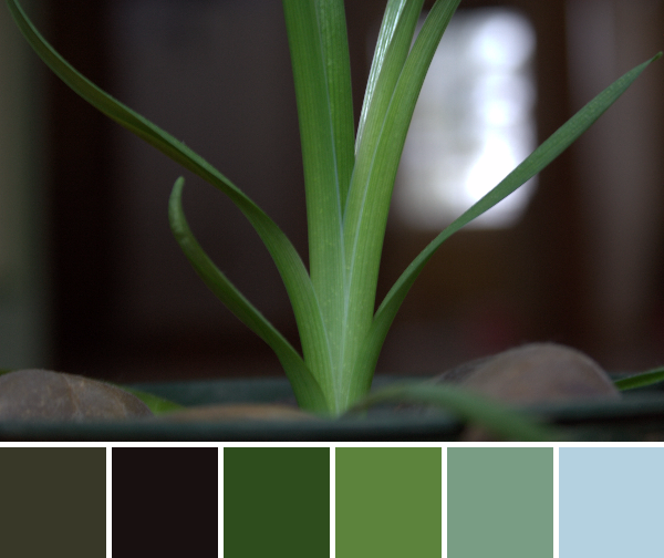
Green, I need green! While the weather has been warming and mud season is almost officially upon us (yes, it’s a real season in Maine–it falls right between winter and spring), there is still a dire lack of green or signs of new life out in the world around us. So today I gathered all the green life I could find and had a little photo shoot. Sure, they are potted, but here is some springy green and life-filled color for your inspiration pleasure. Color palettes are created using Play Crafts’ Palette Builder 2.1 and my photographs.
Corresponding solids from left to right:
Bella Betty’s Brown, Kona Black, Kona Basil, Kona Grass Green, Kona Old Green, Kona Baby Blue
Corresponding Aurifil thread from left to right:
5013 – Asphalt
2692 – Black
5023 – Medium Green
5018 – Grass Green
2850 – Med Juniper
2612 – Arctic Sky
Green, glorious green!
Corresponding solids from left to right:
Kona Coal, Bella Cloud, Kona Pewter, Bella Peacoat, Bella Brick Red, Kona Black
Corresponding Aurifil thread from left to right:
1140 – Bark
2612 – Arctic Sky
2610 – Lt Blue Grey
1130 – V Dk Bark
2566 – Wisteria
5024 – Dark Brown
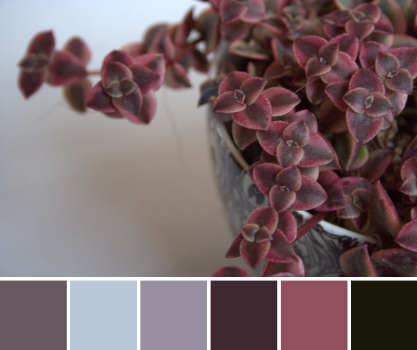
This may not be green, but it’s alive and beautiful. This lovely succulent is on top of the trends, since I dare say it’s sporting the lovely Pantone color of the year, marsala. Am I right? Even if there isn’t a solid that matches perfectly, I think if you mix Bella Peacoat with Bella Brick Red, that would land nicely on Marsala.
Corresponding solids from left to right:
Kona Coal, Kona Basil, Bella Fresh Grass, Kona Celadon, Kona Medium Grey, Kona Sky
Corresponding Aurifil thread from left to right:
1158 – Med Grey
5021 – Light Grey
2890 – Dk Grass Green
2845 – Lt Juniper
2625 – Arctic Ice
2560 – Iris
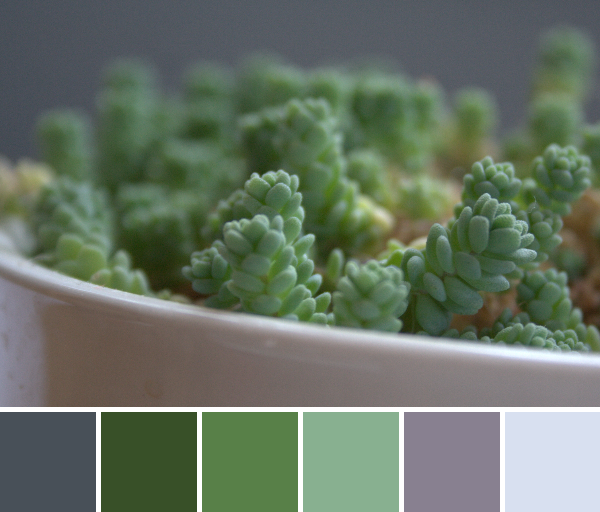
Glorious green. This succulent has seen better days, but I’m hoping that once the sun begins to shine more regularly, the temperatures warm, and perhaps I figure out the best succulent watering schedule for success, it will shine. I’m sure of it. For now, it offers promises for the days to come where green sprouts will be all around us!
Did anyone else notice that despite all the life in these palettes, “Arctic Sky” or “Arctic Ice” made an appearance in every palette!? I just have to laugh at that!
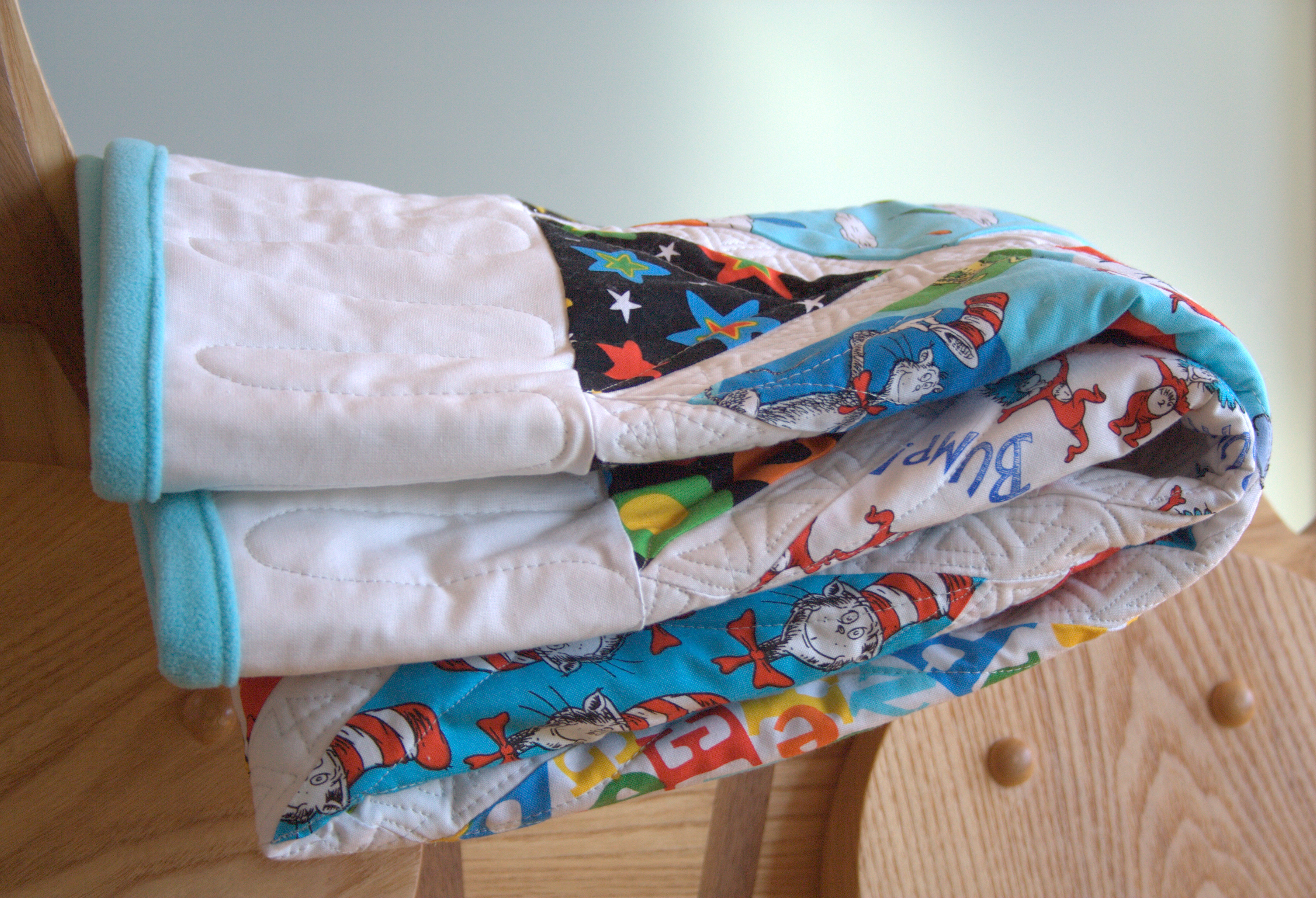
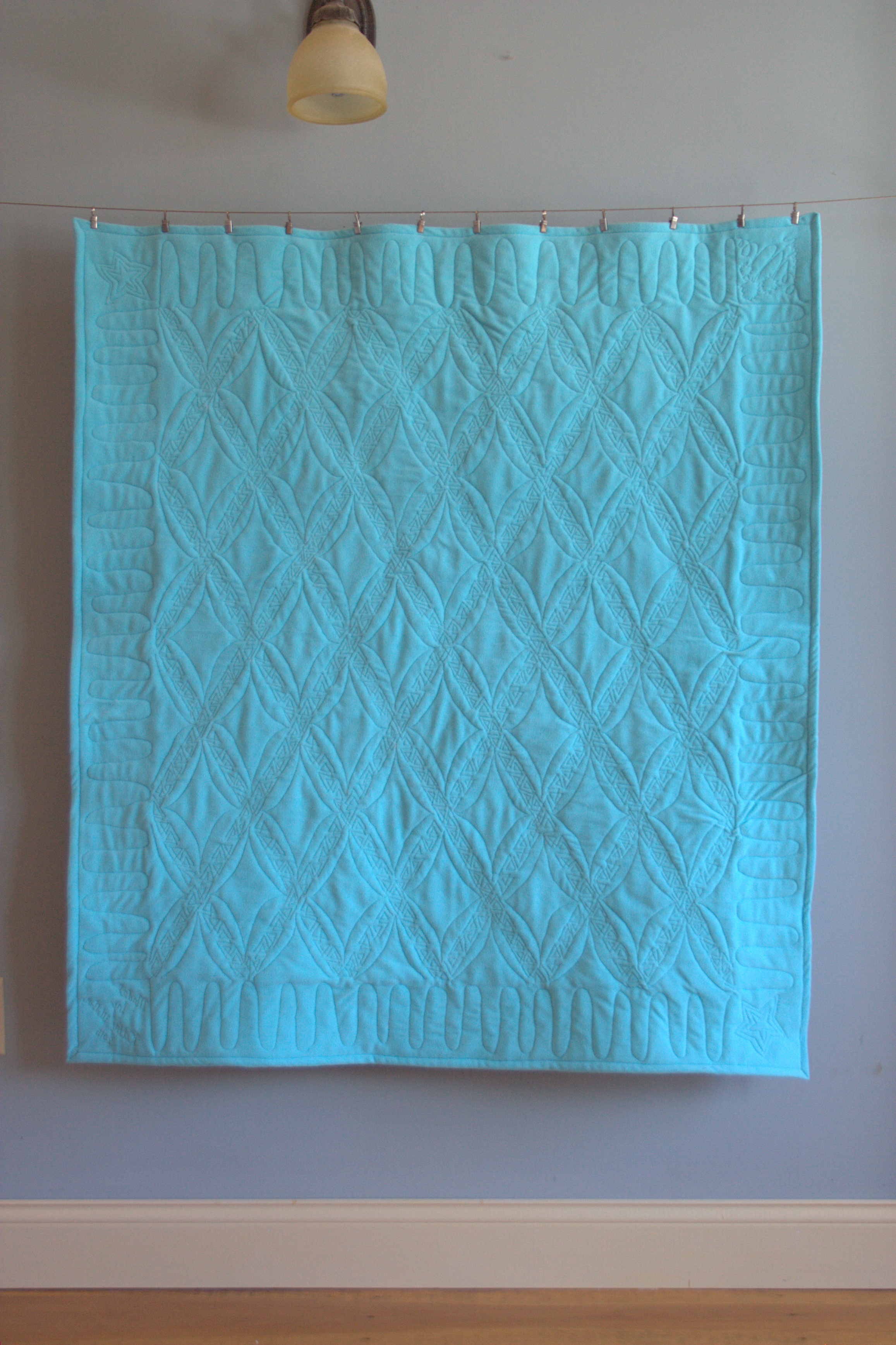
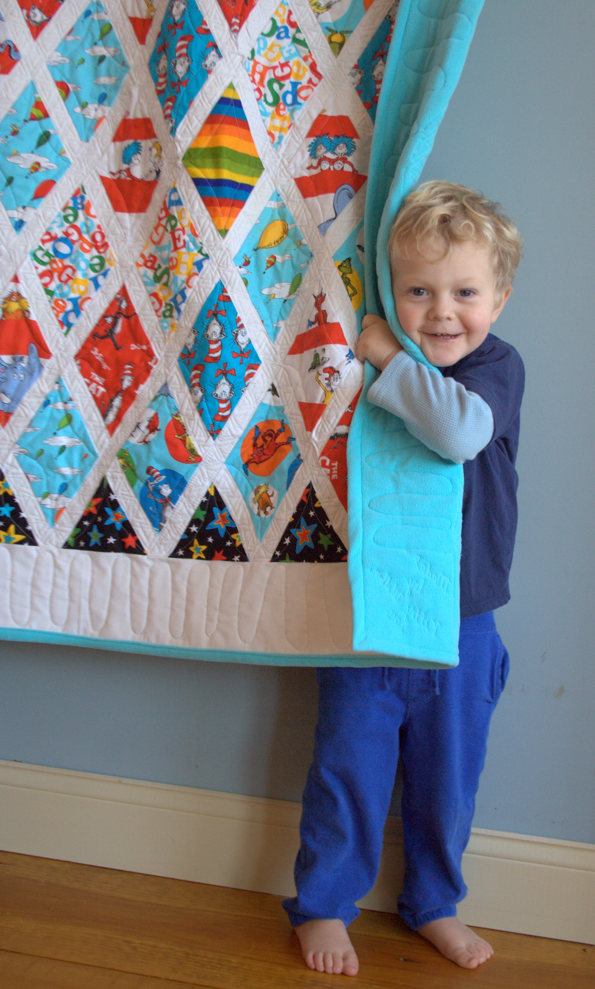
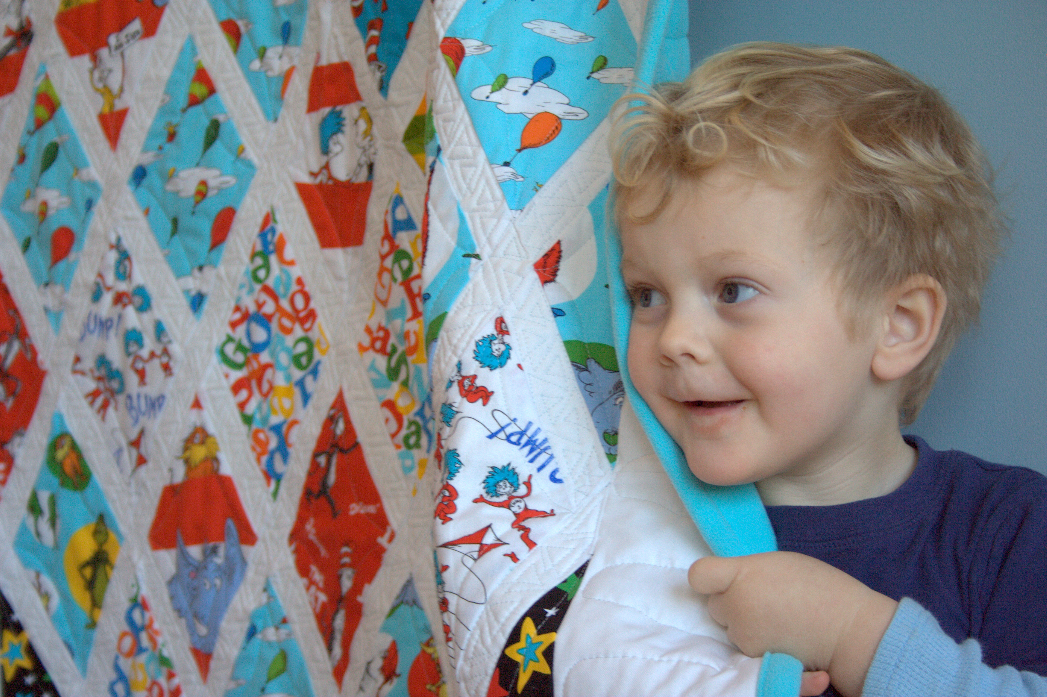
Just in the nick of time, I finished the Dr. Seuss quilt for my daughter’s preschool fundraiser. As I mentioned in previous blog posts When Duty Calls: Dr. Seuss Raffle Quilt and Dr. Suess Flimsy Finish, this quilt was created from an old work in progress for a fundraiser raffle at our local elementary school. Every bit of fabric used was already in my stash, with the exception of the polar fleece backing. I am really happy with how the quilt came out, and finishing at 44″x51″, it is a decent snuggle size for a child to curl up under while reading a book.
Before I go into the details of this finish, I want to extend a huge heartfelt thank you to everyone who commented on my previous Flimsy Finish post. You helped me to realize the true joy in giving that is involved in donation quilts, and to feel entirely positively about the whole experience. What matters most is that this quilt will be loved by a child, and that I have donated my time, skill, and materials to a cause in which I believe. Hopefully the school and PTO will earn a good sum thanks to the addition of this quilt to the raffle basket, but even if not, the joy that it brings to a child–and really, to me for having the ability to donate such a labor of love–is what matters in the end. So THANK YOU!
Now, the quilt!!
Mr. Cat in the Hat likes it, too!
I backed this quilt with gorgeous turquoise polar fleece so that it is extra snuggly, and decided to use that same polar fleece backing to bind the quilt. I wanted the binding to be extra wide, since it is so snuggly, so I trimmed the backing so that it extended 1.5″ from every side, then folded in half and then folded over the front of the quilt to make a 3/4″ binding, top stitched on the front. It was surprisingly smooth and easy, and I love the finished look!
The free motion quilting shows nicely on the solid polar fleece back, and I almost like the back of the quilt as much as the front!
Free motion quilting detail on the back of the quilt.
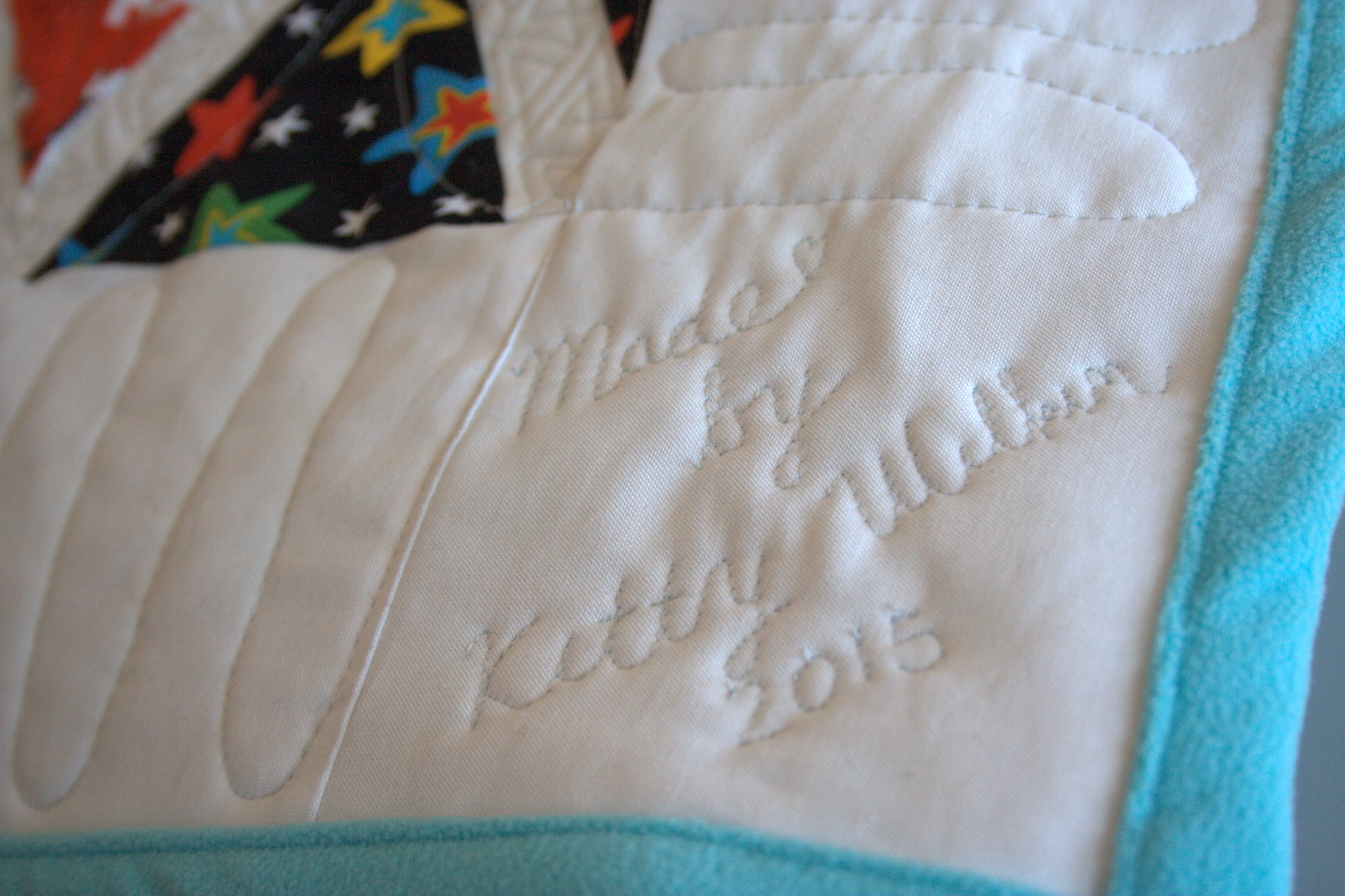
My free motion quilting (FMQ) is far from perfect, but I think it was an excellent design for this quilt layout. The wonky Seussical triangles I quilted on the narrow sashing crossed fairly smoothly, and the simple orange peel-esque diamonds hold it together nicely. I used a wide wiggle on the wide white borders (can you tell I’m a total FMQ newbie? “wide wiggle”!? haha), and couldn’t resist the urge to do a bit of free form Dr. Seuss FMQ in the corners. I roughly quilted three Truffala trees with “Unless” written beneath in one corner, two Seussical stars in two opposite corners, and I quilted my “tag” into the final corner, since I didn’t want to mar the beautiful back with a cotton label.
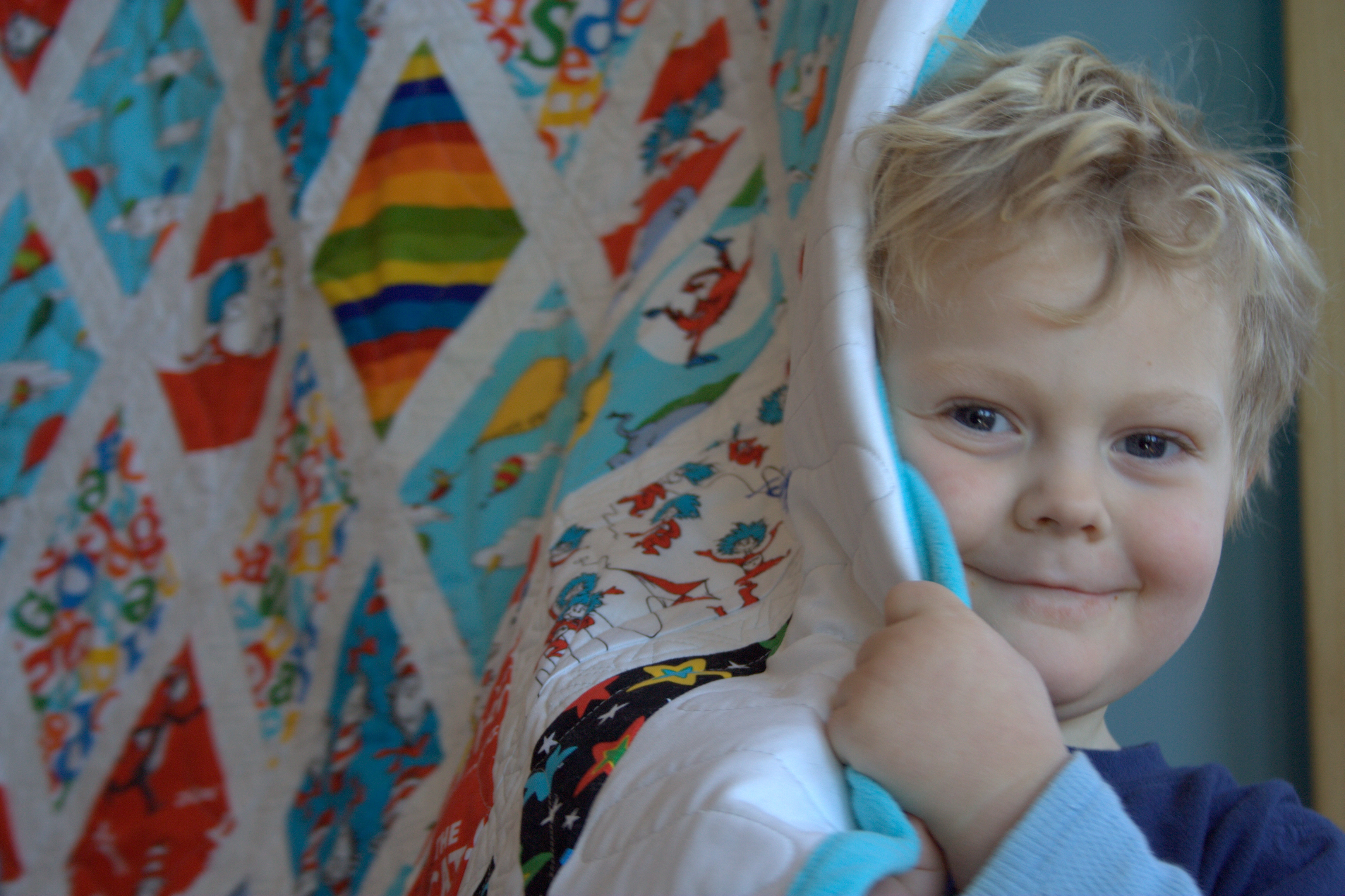
I had my usual helper, Mr. Max, who couldn’t resist snuggling behind this quilt. Just a few cameos of my cutie pie helper and then I’ll share the official quilt stats
Peek a boo!
Quilt Stats
Pattern: Must Stash (Diamond Quilt) from the book Modern Designs for Classic Quilts by Kelly Biscopink and Andrea Johnson. *Amazon affiliate link*
Size: 44″x51″
Fabric: Front: Dr. Seuss fabric by Robert Kaufman Fabrics with Kona White sashing and borders. Back & Binding: Turquoise polar fleece
Batting: 100% cotton Warm & Natural batting
Thread: Aurifil 50wt 2615 – Aluminum & 2600 – Dove
Quilting: Free motion quilted on my domestic Bernina Artiste 730
Time:
Cutting diamonds (rough approximation): 3 hours
Layout and cutting of supplemental diamonds: 45 minutes
Piecing the top–aka sewing sashing: 7 hours
Squaring, layering, and basting: 1 hour
Quilting: 6 hours
Finishing (trimming to size, clipping threads): 45 minutes
Binding: 1 hour Total: Approx. 19 hours 30 minutes
I’m linking up with TGIFF. I’m also going to link up with Yvonne’s Thankful Thursday since I’m truly thankful for you awesome quilting community, who helped me see the light about donation quilts. It’s all about the giving!
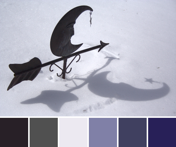
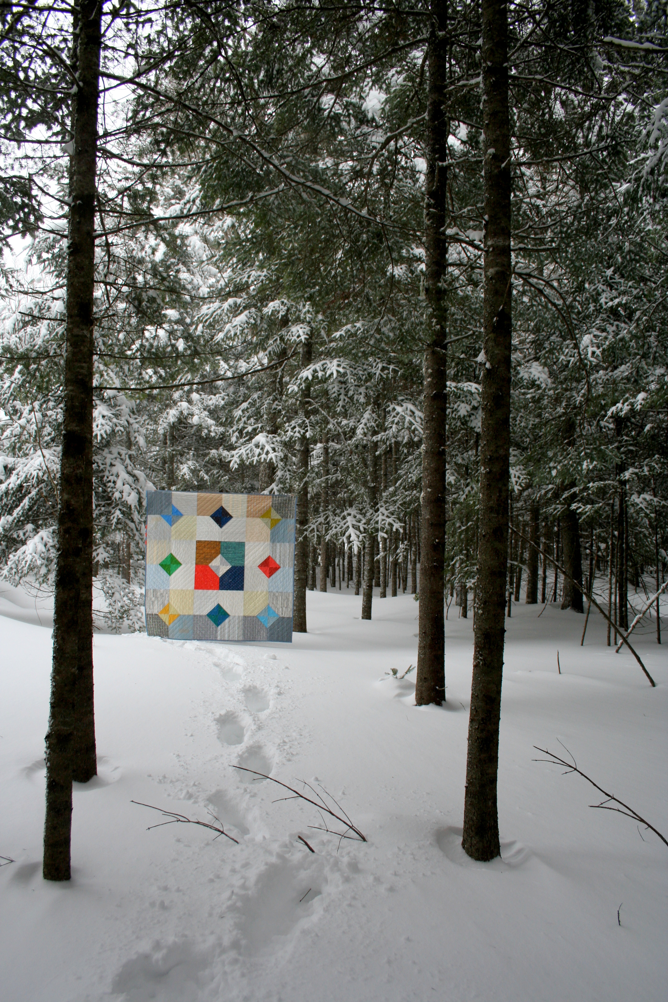
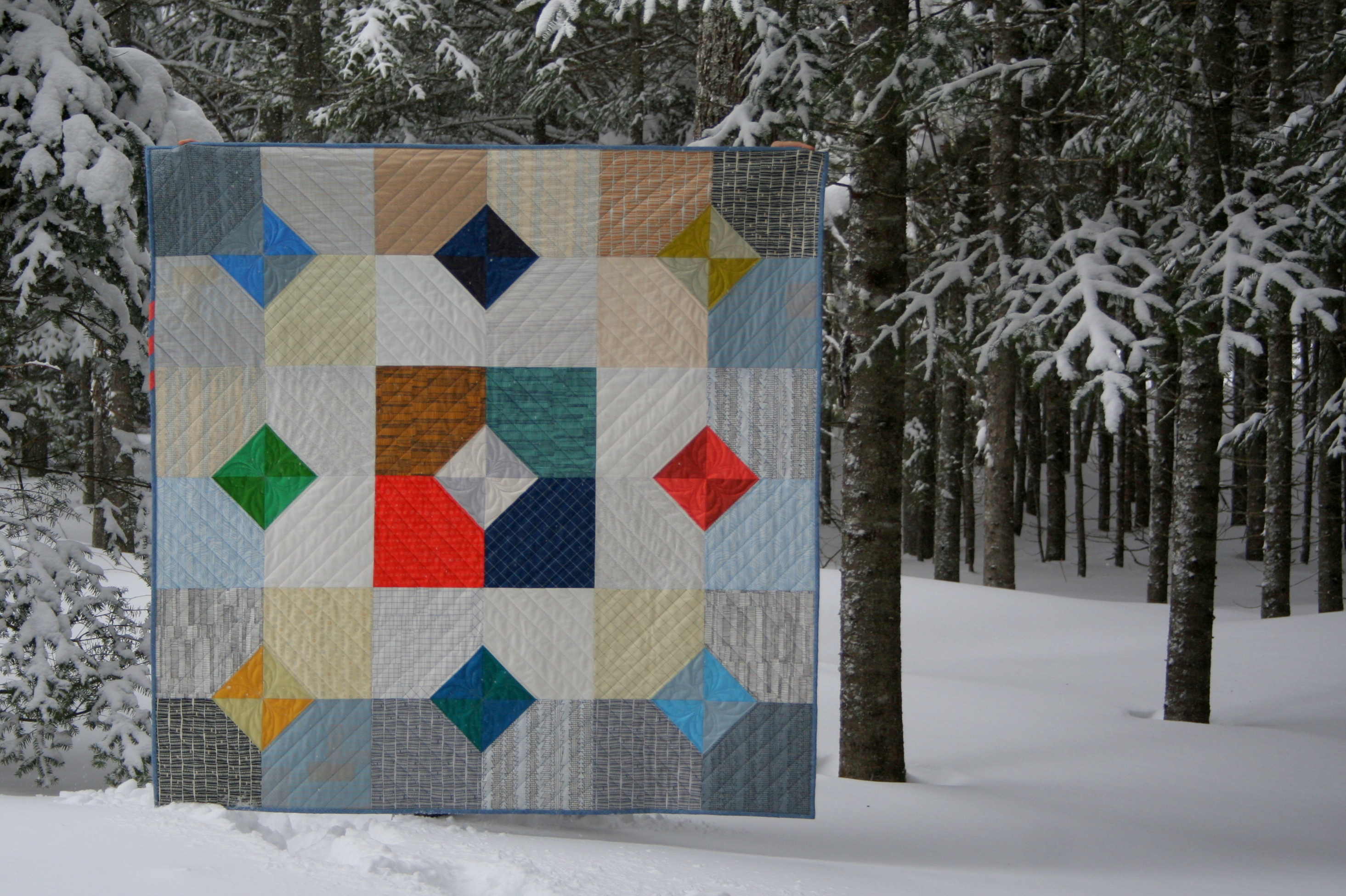
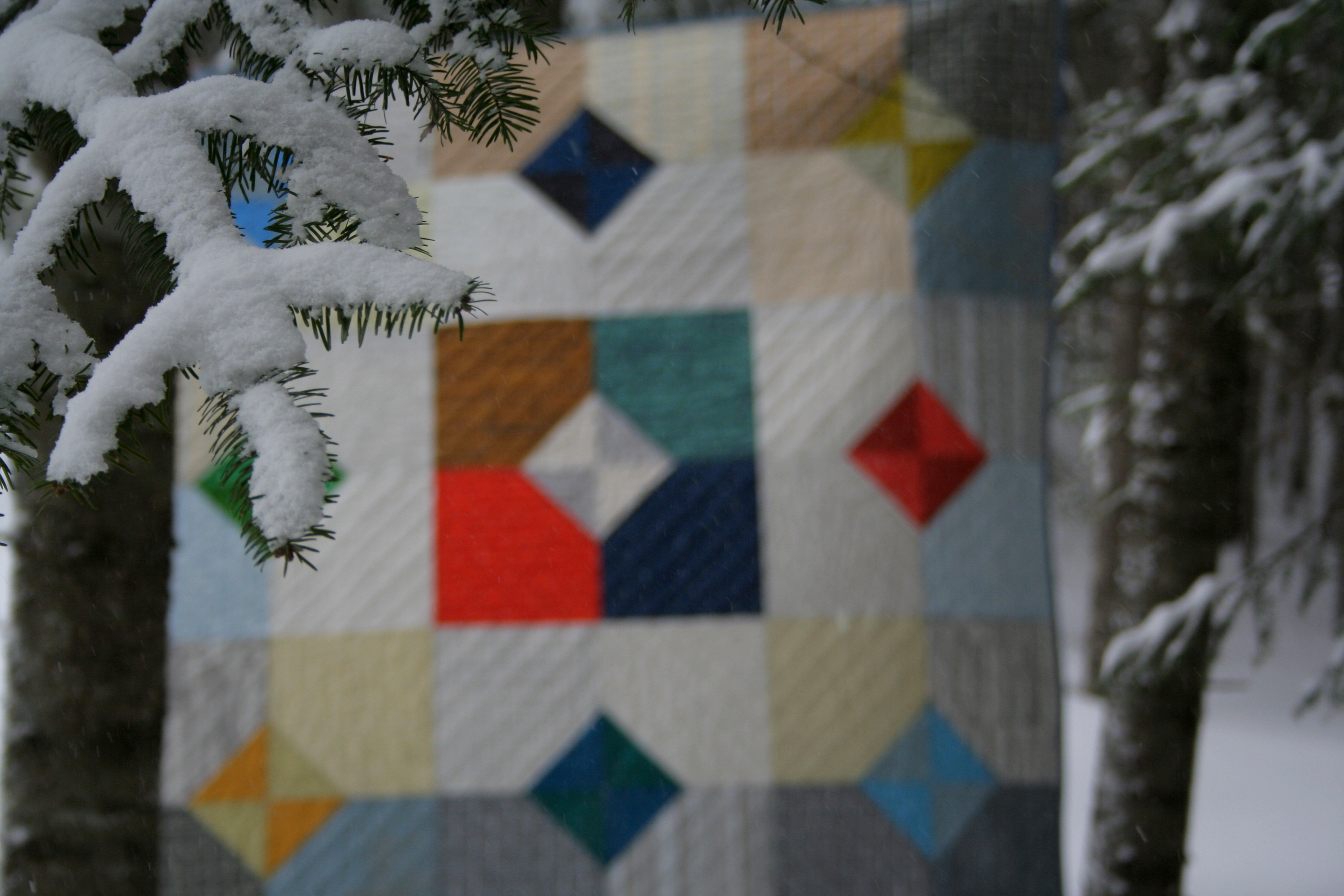
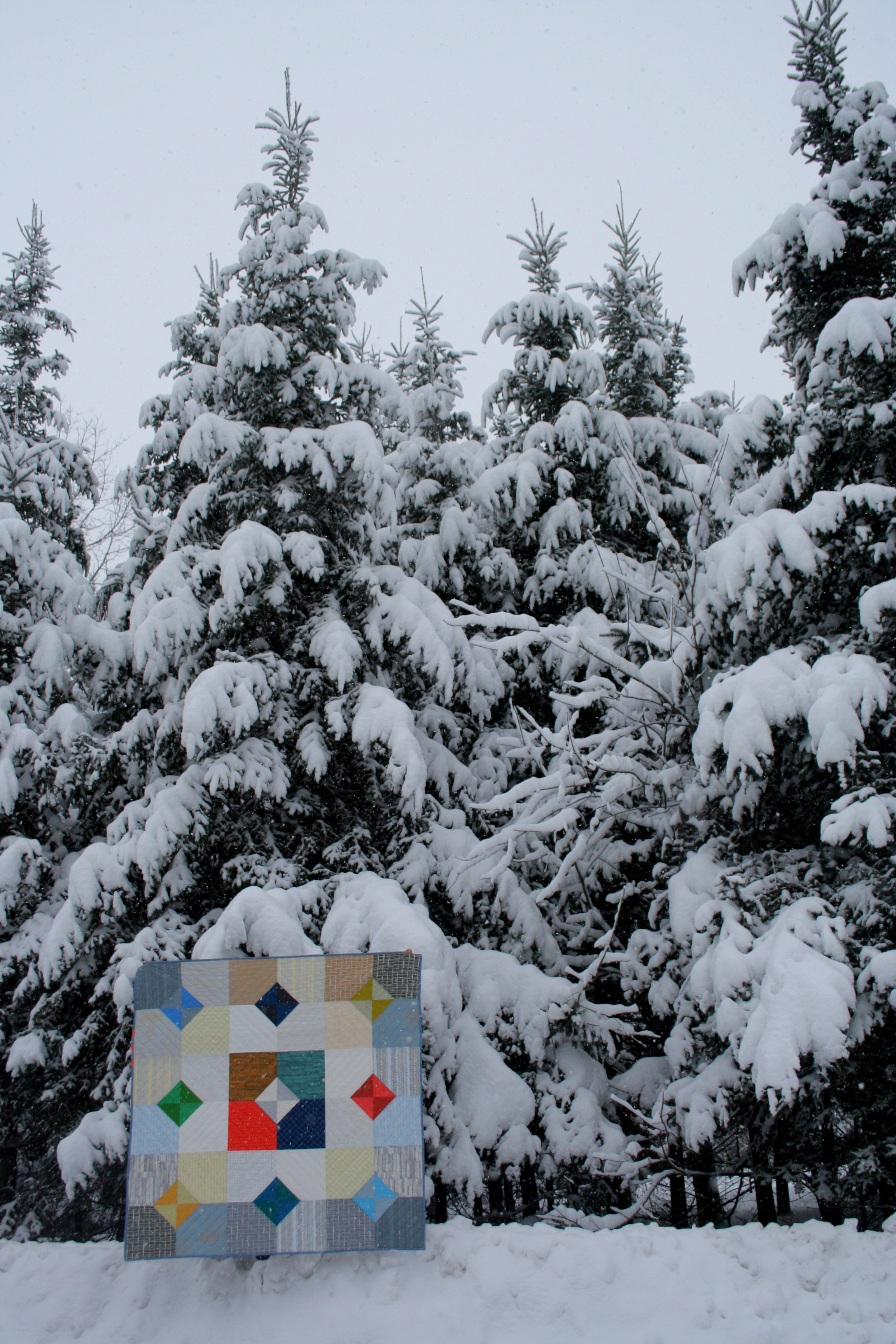
You would think that by now, nearly to April, I would have a few signs of spring to share in this week’s color inspiration. But lo, Maine has not yet gotten the memo that spring begins officially tomorrow and the temperatures have been in the teens, with a rare high of 30. So I decided to embrace the winter for a little longer, and showcase some more of nature’s frigid beauty. Color palettes are created using Play Crafts’ Palette Builder 2.1 and my photographs.
Corresponding solids from left to right:
Bella Peacoat, Bella Etchings Charcoal, Kona Silver, Bella Periwinkle, Kona Windsor, Kona Nightfall
Corresponding Aurifil thread from left to right:
2785 – V Dk Navy
1158 – Med Grey
2615 – Aluminum
2524 – Grey Violet
1248 – Grey Blue
2581 – Dk Dusty Grape
Believe it or not, this cute little weather vane sits atop quite a large cupola that we removed from the chicken coop roof while winterizing it. The snow is still a good 3-4′ deep, but the beauty of the whimsical moon pointing toward spring with sunny shadows cast on the deep snow had to make its way into a palette. As cold as it is, I personally love this palette. Blues and greys will definitely become a Storm at Sea quilt one of these days. Perhaps I’ll use this palette for planning!
Corresponding solids from left to right:
Bella Bunny Hill Blue, Kona Pewter, Bella Fir, Kona Biscuit, Bella Lead, Kona Moss
Corresponding Aurifil thread from left to right:
2560 – Iris
2610 – Lt Blue Grey
2372 – Dk Antique Gold
2335 – Lt Cinnamon
2370 – Sandstone
2905 – Army Green
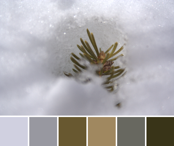
A little pine branch, nestled in the icy depths. I was really hoping for a bit more green to read through, but really, the season for green is not *yet* upon us. This instead is an earthy, neutral palette, with just a touch toward green with that final Moss-Army Green.
Corresponding solids from left to right:
Bella Moda U Brown, Kona Mushroom, Bella Lt Blue, Bella Mauve, Kona Blue Jay, Kona Slate
Corresponding Aurifil thread from left to right:
2630 – Pewter
2370 – Sandstone
2560 – Iris
2566 – Wisteria
4140 – Wedgewood
1310 – Med Blue Grey
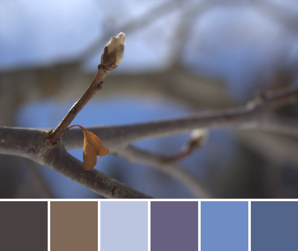
Shhh don’t tell anyone that these magnolia buds are on the tree all winter long. I’m pretending it’s a sign of new life! Spring! Blue skies at the very least are peeking through. The warm sun shines, and surely, SURELY spring must not be too far behind. Right!?
What season are you experiencing right now? Are you eager for the next, or enjoying the current weather? I find it easy to enjoy winter until those first teaser warm days. Then my mind is on planting seeds, raising chicks, digging in the earth, and spending our days outside. Our entryway may be full of potting soil in the very near future!
Walking around the vendor booths at QuiltCon, there was such a delightful array of color. Color everywhere, as fabric, quilts, notions, signs, or quilts. As I said earlier, I took a surprisingly small number of photographs, but I still have a few colorful ones to share. Color palettes are created using Play Crafts’ Palette Builder 2.1 and my photographs.
Corresponding solids from left to right:
Bella Dark Teal, Bella Turquoise, Kona Bahama Blue, Bella Shocking Pink, Bella Bunny Hill Pink, Bella Home Town Sky
Corresponding Aurifil thread from left to right:
4182 – Med Turquoise
4093 – Jade
1148 – Lt Jade
2215 – Peach
2314 – Beige
2600 – Dove
The Aurifil booth did not disappoint when it comes to color. With this gorgeous display of colorful large spools of Aurifil thread, I had to stop and take a gabillion photos. I am wishing I had a tripod and another 20 minutes, but even with a few quick hold-my-breath-to-steady photos, I was able to get one suitable clear one. That front and center turquoise variegated thread is one I’ve had my eye on for quite some time but haven’t yet used. I think I may have to remedy that soon. Gorgeous colors of this, my favorite silky smooth thread! The palette reminds me of the beach, for some reason. The summery feel is much appreciated this time of year!
Corresponding solids from left to right:
Bella Stone, Bella Sea, Bella Glacier, Bella Sapphire, Kona Regal, Kona Nautical
Corresponding Aurifil thread from left to right:
5011 – Rope Beige
4140 – Wedgewood
5008 – Sugar Paper
1248 – Grey Blue
2581 – Dk Dusty Grape
2785 – V Dk Navy
This palette is created from one of my top favorite quilts at the show, Icy Waters by Amy Garro. The color palette includes a gorgeous range of blues, which could be part of why I am so drawn to this quilt. Icy Waters is from Amy’s new book, Paper Pieced Modern*, which I really can’t wait to get my hands on. I am quite drawn to paper piecing but also to modern style, and Amy’s patterns are SUCH a fabulous melding of the two. I discovered her book during the book release blog hop, and was lucky enough to meet and have dinner with Amy while in Austin. Not only is she a fabulous designer, she’s sweet and fun to hang out with, too.
To share a somewhat unrelated side story from QuiltCon, after an evening of getting appetizers and drinks (for the non preggo ones in attendance) in a typical dimly lit and loud wine bar, Amy did something that really showed what a sincere and thoughtful person she is. As some of you know, I’m severely hard of hearing, so do best face to face where I can “read” lips. In a dark, loud restaurant in a group setting, it is a challenge for me to catch conversation, so I jump in where I can and just deal with missing out on the bulk of conversation. This particular evening, Stephanie was with us, so she took the time to fill me in with a bit of ASL signing here and there so that I could better participate in the conversation. As we were parting ways and hugging as old friends who just met do, Amy signed “Good to meet you” as she said farewell. My response? “Did you just SIGN to me!?” I learned that she had learned sign language quite a number of years ago, but still remembered some. It may seem like a tiny insubstantial thing, but it really stuck with me and made me appreciate my quilty friends more. So yeah, I like Amy 🙂
I will share more reflections about the quilts at QuiltCon in a future post, but Amy’s fabulous Icy Waters is a great example of the innovative, aesthetically flowing, modern quilts that hung in the show. There is SO much talent out there!
In the spirit of QuiltCon decompression, this week’s color inspiration will feature photos from my travels. To be honest, I took FAR less photos than I typically do (hundreds or thousands less, in reality), since I was so caught up in meeting and conversing with people and seeing everything there was to see. I wish that I could have borrowed a Duplicator from Calvin & Hobbes (or maybe the Transmogrifier if I wanted to be a photographer lizard) to make four of myself: one to meet and converse with people; one to see and fully take in all of the amazing quilts; one to visit the booths and talk with admired fabric and pattern designers, fabric shop owners, and company figureheads; and one to photographically document the entire event. But lo, I am only one person, and one completely gobsmacked, overwhelmed, perma-grinning person at that. So here you go, your color inspiration pulled from the few gems I found in Austin during QuiltCon 2015. But first–did I mention that I got to meet Anne from Play Crafts, the creator of the beloved Palette Builder 2.1!?
Don’t mind the fact that I didn’t figure out where to look on the phone to actually look AT the photo until the very end of QuiltCon. Im not a selfie person!
The following color palettes are created using my (on the right) photographs made into color palettes using Play Craft’s (on the left) Palette Builder 2.1. Now you have a visual of the faces behind these weekly posts!
Corresponding solids from left to right:
Bella Gray, Bella Home Town Sky, Kona Graphite, Bella Leaf, Kona Goldfish, Kona Sangria
Corresponding Aurifil thread from left to right:
2324 – Stone
2847 – Lt Grey Green
1126 – Blue Grey
5018 – Grass Green
2318 – Cachemire
2230 – Med Peony
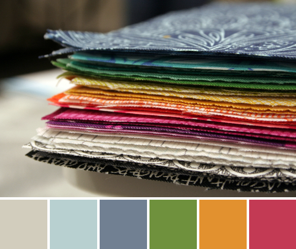
This lovely stack is my pre-cut 7″ squares for Cheryl Arkison‘s Value class before she kindly suggested that we match value without looking at color at all (followed by a long sidelong glance in my direction–what!? is it that obvious that I’m totally hooked on color in rainbow order!? hah). I’ll talk much more about this in a future post, but Cheryl’s class was fabulous at making me stretch out of my comfort zone. I learned a ton, and am looking forward to playing with value more in coming projects. And color. Of course I can’t let go of color.
Corresponding solids from left to right:
Kona Charcoal, Bella Admiral Blue, Bella French Blue, Bella Rust, Cotton Gold, Bella Tan
Corresponding Aurifil thread from left to right:
2570 – Aubergine
1310 – Med Blue Grey
5008 – Sugar Paper
2385 – Terracotta
2930 – Toast
5010 – Beige
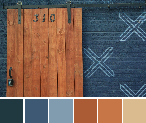
This fabulous structure was right across from the Conference Center hosting QuiltCon. The building is called “Textile”, which is just so appropriate for its gorgeous aesthetic. I could not pass by this terracotta/rust colored door paired with the admiral blue walls with french blue Xs without photographing it profusely. Sure, I may have lost the group of amazing women with whom I was walking, but being left behind for the sake of getting a great photo is nothing new for me–did I ever tell you about the time I almost got left in the Mexican jungle because I was photographing hearts in a palm leaf?–Anyway, this is my favorite photo from Austin (and I was able to finally catch up with and join my friends after snapping it). I only wish I lived nearer to Austin so that this could become a quilt photo backdrop!
If you went to QuiltCon, did you take any stellar photos? I’d love to see them!
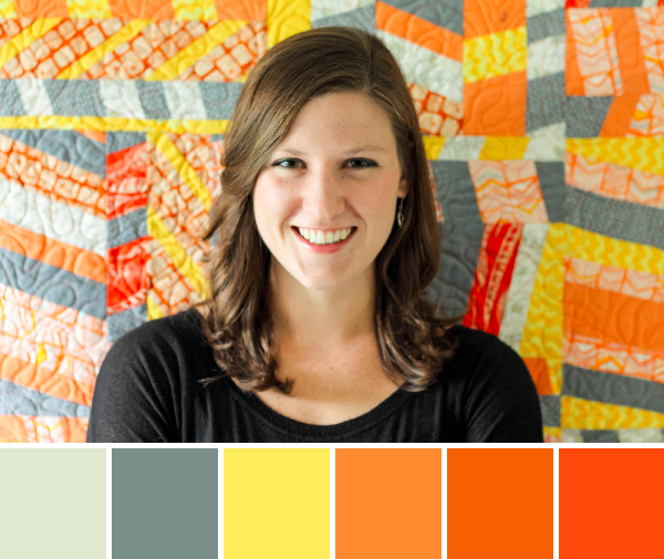
It seems the online quilting world has become a swarm of buzzing bees in preparation for QuiltCon. Either we are frantically prepping for our classes, making our handmade accessories, and plotting the long journey, or we are vicariously living through all of the other ubiquitous Instagram and blog posts about QuiltCon. I admit, I’m one of those bees. I’m super excited to be attending QuiltCon, my first ever quilting event, and am definitely caught up in the energy and excitement. This buzz of excitement around QuiltCon got me thinking about color inspiration, and I thought it was the perfect time for another People Palette. Stage left, enter the Modern Quilt Guild email introducing their new staff members, with the bright and colorful Riane Menardi introductory photo. Viola! Our next People Palette:
Corresponding solids from left to right:
Bella Etchings Stone, Bella Pond, Bella Lemon, Bella Amelia Orange, Kona Kumquat, Kona Tangerine
Corresponding Aurifil thread from left to right:
5020 – Light Military Green
2850 – Med Juniper
1135 – Pale Yellow
2150 – Pumpkin
5009 – Medium Orange
1154 – Dusty Orange
Meet Riane (pronounced Ree-ann). She’s the new Communications Manager at the Modern Quilt Guild (MQG). Trust me, she’s great at what she does! I contacted her yesterday morning asking if she would be interested in this last minute whirlwind People Palette moment of stardom (I’m a busy bee preparing for QuiltCon, remember? I’m drinking the last-minute-nectar this week!), and by noon all the photos were sent, questions answered, and communication clearly and efficiently handled. Awesome.
For a little bit of background, here is an excerpt from her MQG intro:
My background is in journalism, but I’ve done just about everything under the sun in communications. I worked for ReadyMade magazine before it was put to rest (R.I.P.), and then went on to help indie handmade companies do promotions, events and social media. I also worked as a community builder for a startup handmade marketplace (not Etsy, but close). And for the past year, I’ve been with an agency, helping clients run marketing campaigns and communications. I also contribute words, designs and project management to Fresh Quilts from time to time.
I’m based in the sweet, sweet heartland of Des Moines, Iowa, and when I’m not sewing or writing, you can find me sipping craft beer, doing yoga or cycling (but only in weather over 50 degrees).
The quilt behind Riane is one that she designed, and which was featured in Fresh Quilts magazine. The pattern is available in the most recent issue (though a new one is due out soon, so you may have to backorder it).
I asked Riane to answer three short questions to help the world get to know the color inspiration star of the week a little more intimately:
Where do you fit into the worldwide family tree of quilting? I love this question. Right now, I would say that I’m that independent, fun-loving niece who’s trying to learn as much as possible from the amazing, crazy and inspirational women in her life (aunts, grandmothers, cousins, etc.). I’m like a sponge — trying new things, going new places and developing my personal style, but all while remembering the lessons and wisdom learned from my quilt family.
My favorite branches to swing from, however, are the ones where we play with modern minimalism, neutral linens and the sweet, sweet joys of hand-quilting (especially sashiko).
-and if you want to get technical-
I am the new Communications Manager for the MQG and a contributor and project editor for Fresh Quilts magazine.
What is your least favorite mode of transportation? Walking in heels. I love heels, but I always seem to encounter a TON of unexpected walking when I’m in my highest get-ups. And while I generally rely on my trusty (Kia Soul) steed to get me from here to there, my favorite mode of transportation would probably be via camel, if I had that option. They’re such badasses!
If you could choose anyone, who would you choose as your mentor? Dustin Hoffman, hands down. Have you ever seen the movie Stranger Than Fiction? Ever since I first watched it, Dustin Hoffman has been my spirit animal. Even though he’s (probably?) not a quilter, I’d like him to guide me through life with his calm, quirky wisdom.
You can find Riane in the bloggy quiltiverse here:
Or you can say hi in person at QuiltCon. I can’t wait to meet Riane next week and welcome her to the MQG family. Say hi if you see her! She’ll be the one riding a badass camel (maybe?)!
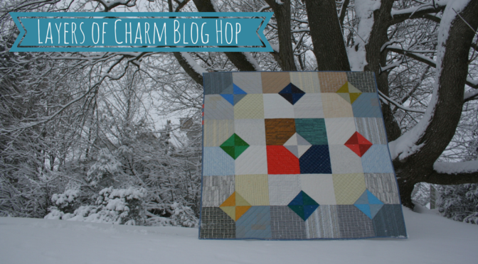
When Fat Quarter Shop contacted me about quilting along with their newest shortcut quilt pattern, I immediately decided I wanted to make the quilt out of Carolyn Friedlander‘s newest fabric line Doe. Thus the seed was planted that grew into the Doe Layers of Charm Quilt.
Remember this sneak peek?
Well, here it is!
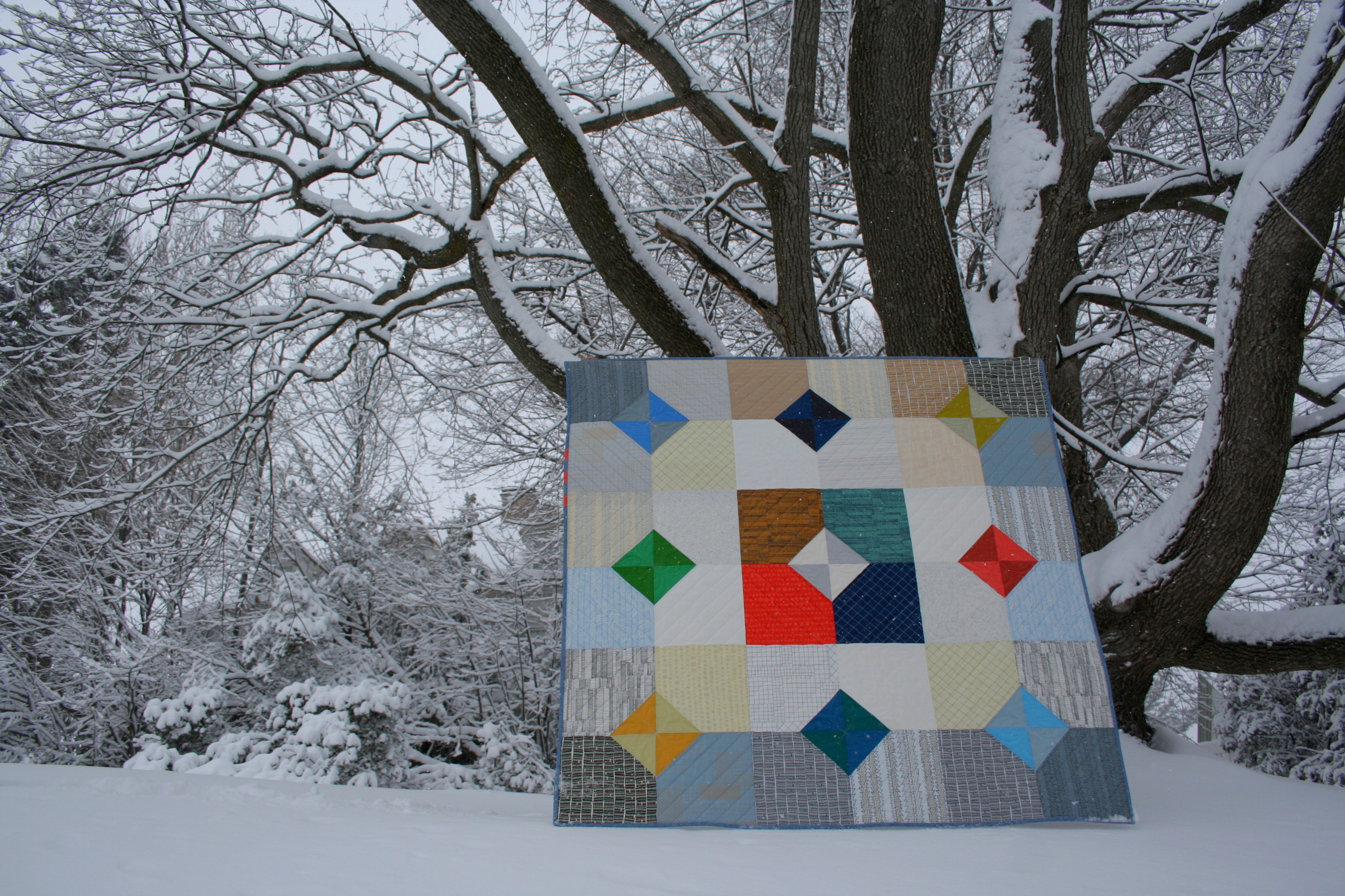
Layers of Charm
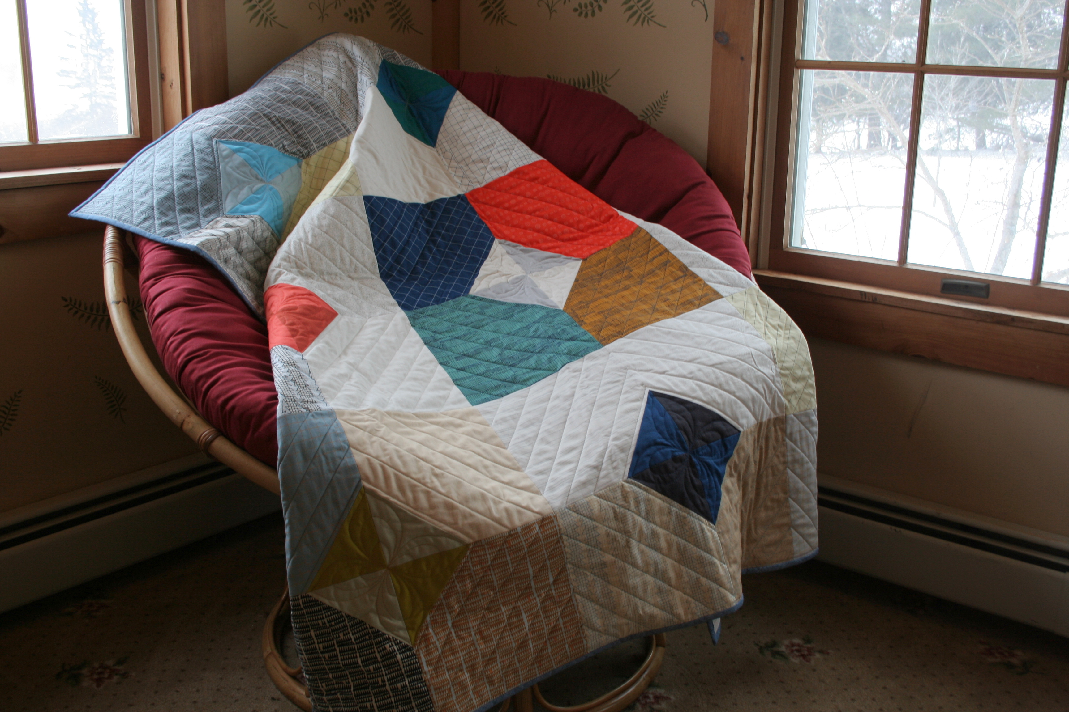
Layers of Charm is Fat Quarter Shop’s newest Short Cut Quilt pattern, complete with a free downloadable pdf and video. The pattern uses a layer cake and charm square pack, so I used a Doe layer cake (with two cameos by Botanics) and the coordinating Kona cotton solids charm pack. When I started this quilt, Doe wasn’t yet available in the US so Robert Kaufman Fabrics was kind enough to send me what I needed in advance (Thank you!). The part of the process that took the longest was deciding on a layout that I liked. I ultimately decided on one that I feel embodies the Doe fabric line well, with the focus on low volumes and amazing texture, with just a pop of color. Piecing the 57 1/2″ x 57 1/2″ lap sized top took me only 6 hours (andI’m a meticulous, seam-ripping-until-perfect kind of sewist).
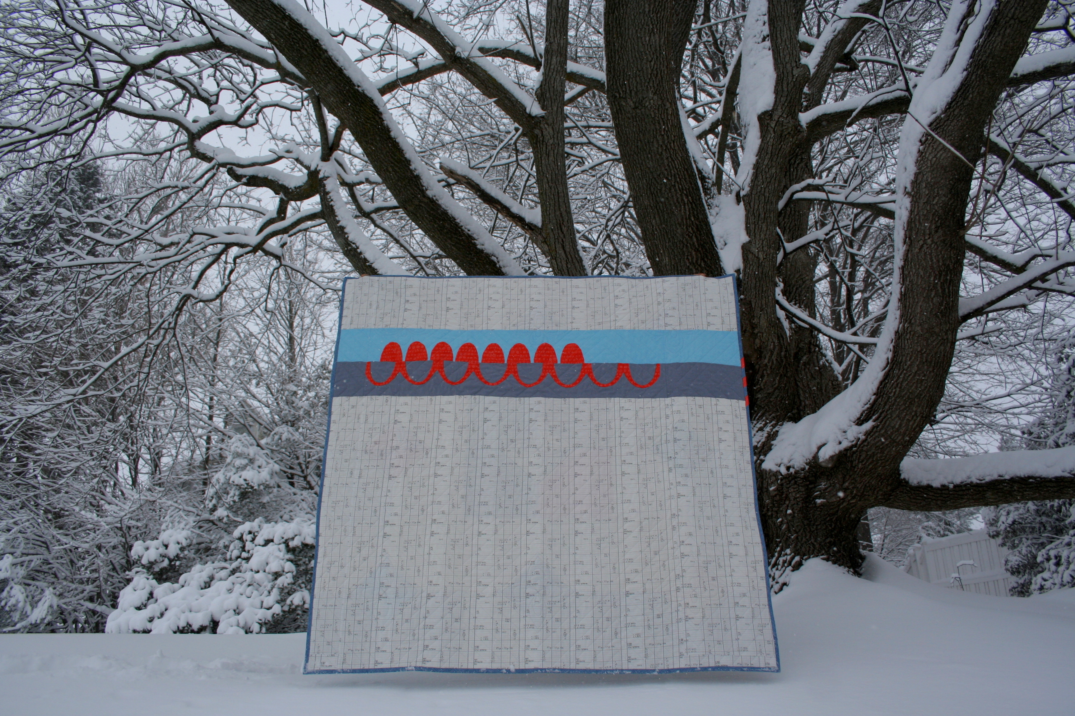
For the back, I chose to sew one row from Carolyn’s Catenary pattern on an Architextures Ledger backing. The Catenary was my first time attempting needle-turn applique, and even with a time crunch, I truly savored each stitch! All three of Carolyn’s fabric lines are represented in this quilt, and I absolutely love it.
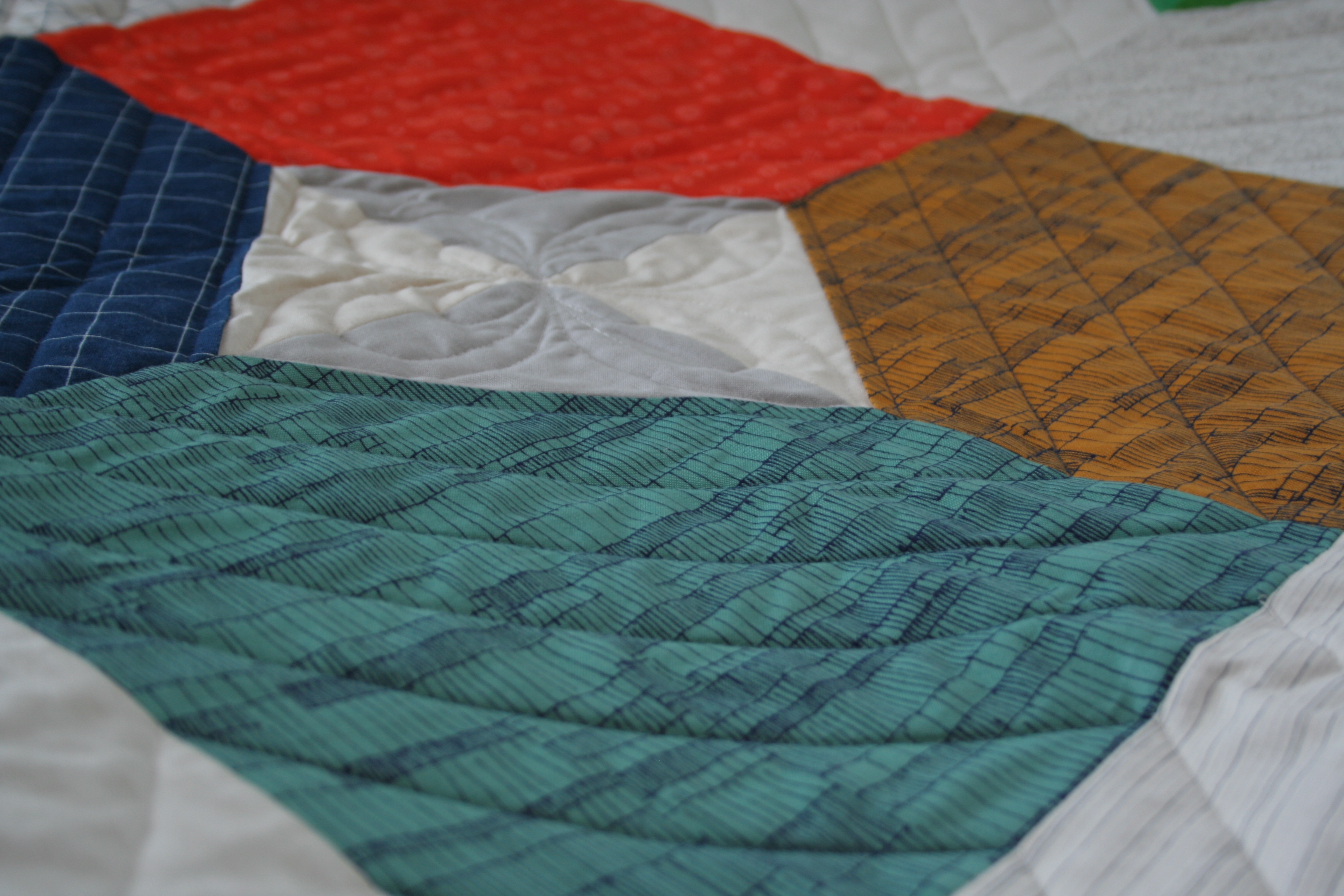
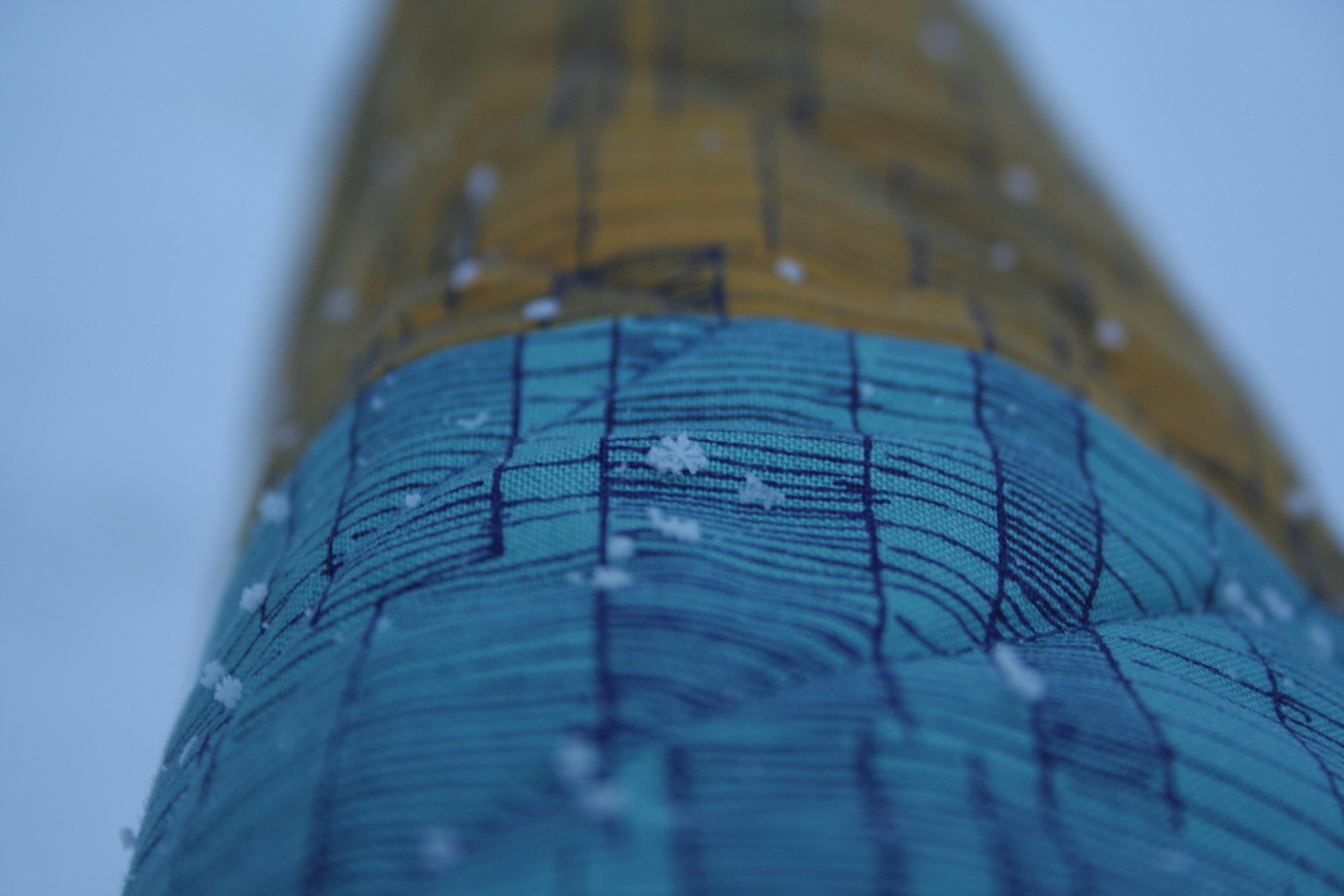
I decided to use a combination of straight-line quilting and free motion quilting, all of which I did on my domestic Bernina sewing machine.
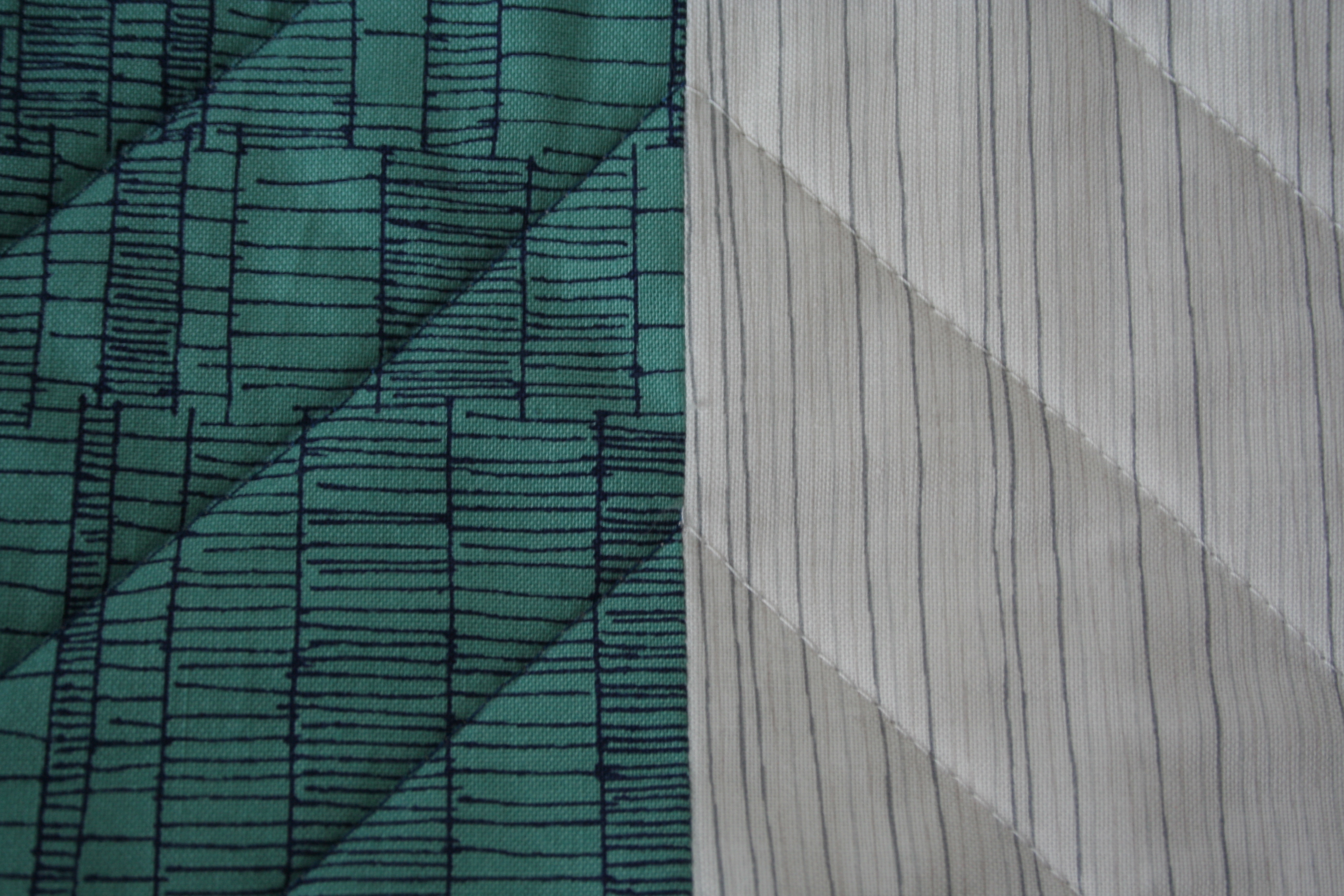
Two quilting thread colors converge.
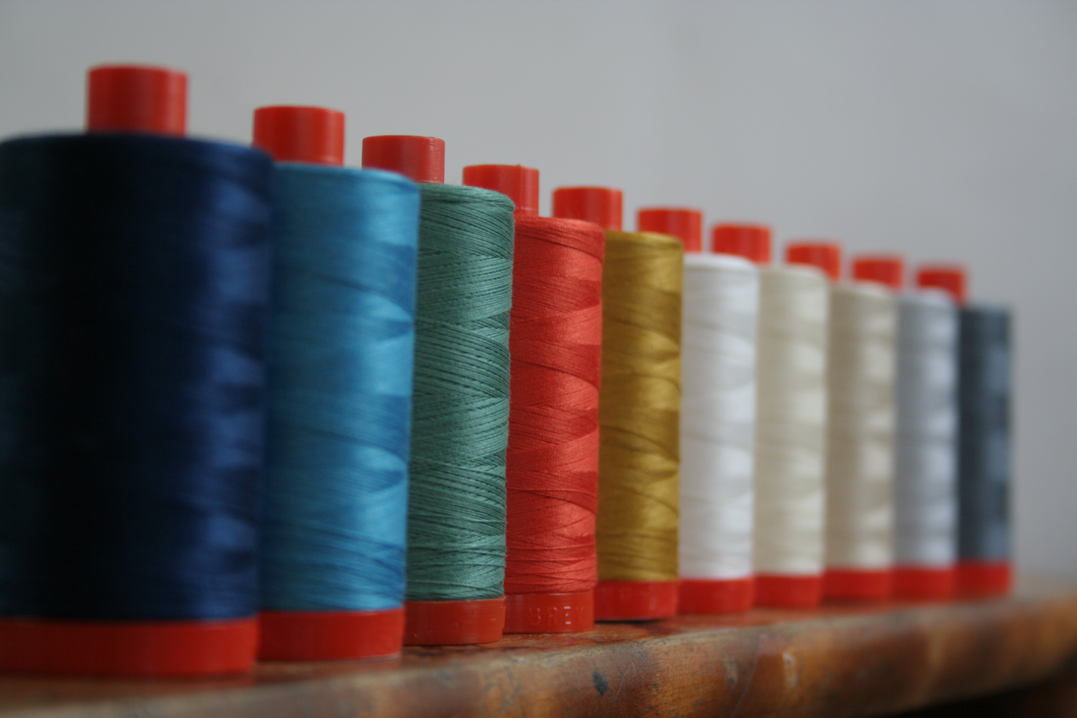
When inquiring about a coordinating Doe Aurifil thread set, Alex Veronelli from Aurifil said that there was not yet such a set, but offered to send me coordinating threads of my choice (Thank you, Alex & Aurifil!). I chose:
2783 – medium delft blue
1320 – medium teal
2850 – medium juniper
1154 – dusty orange
5022 – mustard
2021 – white
2026 – chalk
2310 – light beige
2600 – dove
1246 – grey
Look at them shine (and comment below for a chance to win small spools of all these colors)!
My chosen quilting pattern left a TON of thread ends to bury (3 hours worth!) but I’m really happy with the outcome. Changing threads to coordinate with each section of the quilt really helps emphasize the varied values and textures in Carolyn’s Doe line. The Layers of Charm pattern is a great pattern that lets the fabric do the talking.
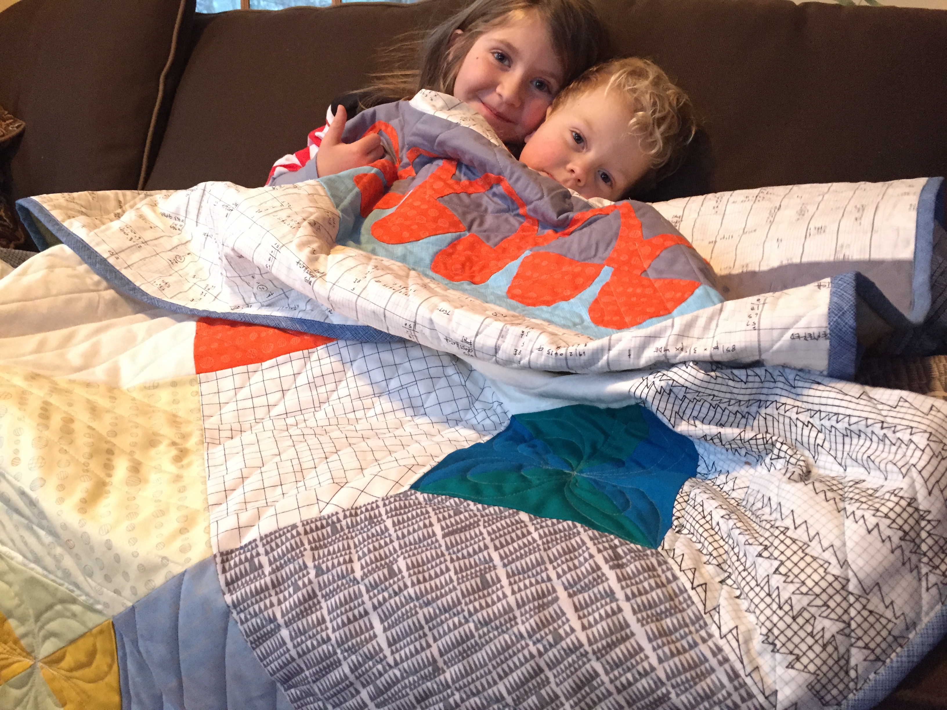
My family helped me photograph the completed quilt during one of our recent blizzards (there seems to be one every few days). We had a little bit too much fun, as you can see.
Size: lap sized: 57 1/2″ x 57 1/2″ (pattern includes table runner, crib, lap, queen, and king sizes)
Fabric (all by Carolyn Friedlander for Robert Kaufman Fabrics): Front: layer cake of Doe with two squares from Botanics, charm square pack of Doe coordinating Kona cottons. Back: Architextures Ledger in Grey with Catenary pattern in Doe Droplet in Carrot on Kona Med Grey and Architextures crosshatch in Niagara Binding: Architextures crosshatch in Navy with an accent of Poppy
Batting: 100% cotton Soft n’ Crafty batting
Thread: Aurifil 50wt in coordinating colors: 2783 – medium delft blue, 1320 – medium teal, 2850 – medium juniper, 1154 – dusty orange, 5022 – mustard, 2021 – white, 2026 – chalk, 2310 – light beige, 2600 – dove, and 1246 – grey
Time:
Piecing the top: 6 hours
Piecing the back: 4 hours
Squaring, layering, and basting: 45 min
Quilting: 7 hrs 45 min
Finishing (thread burying): 3 hours
Binding: 1 hr 30 min Total: Approx. 23 hours
While I always seem to take the long road, this quilt could easily be whipped up in a weekend (or a day, if you’re quick). I am already thinking of making a baby-sized version with all black and white (heavy on the black) 10-squares and a bright pop of color solid charm pack.
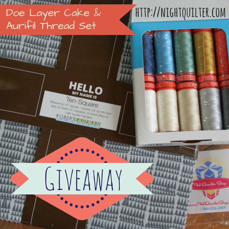
Now, for a giveaway!
To celebrate the launch of the Layers of Charm pattern, I’m hosting a giveaway. One lucky winner will win a layer cake (ten-square) of Doe by Carolyn Friedlander (thanks to the Fat Quarter Shop) and a set of small spools of coordinating Aurifil threads* (thanks to Aurifil). You can enter by leaving two comments:
What would you make with your winnings?
If you follow me, Night Quilter, let me know how–or visit my right toolbar to follow me if you don’t already, then tell me how! (e-mail, WordPress, Bloglovin’, Instagram, Twitter, Craftsy)
The giveaway will be open until Monday, February 16th 12noon EST. I’ll select one winner randomly from the comments below. Good luck!
*Note: The coordinating Aurifil thread set is not an “official” Doe coordinating set. I personally chose ten colors that I feel compliment and coordinate with the Doe fabric line.
After entering the giveaway, head over to the Fat Quarter Shop’s blog the Jolly Jabber to see the other version of this quilt in the blog hop. Meanwhile, we’ll be snuggling in this lovely Doe quilt.
I grab a needle and thread once the kids are in bed


 My sister-in-law LOVED it, so mission accomplished! Even with a few basting pins still in Hazel and the heart, which will be quilted as soon as the color matched Aurifil thread arrives, it was fun to get to give this gift. Just think: hidden behind this quilt are two big baby bumps–cousins destined to be rolling around on top of this fun quilt (Stephanie is due a couple weeks after I am).