

 I recently finished and gifted this mini quilt to a fellow quilting friend as part of a small private swap, and now that it has been received, I can tell you all about it! I entitled it, “Let Your Heart Shine True”, and it’s meant to be a visual representation of the fact that the goodness in your heart shines through, despite any missteps, mistakes, wrong words, or other things we personally may feel will tarnish or cloud our good intentions. It was made for Yvonne of Quilting Jetgirl, who often reflects on her introverted personality and how it influences her day to day, both quilting and non. The design inception came after Yvonne posted a number of articles about the struggles of attempting social interaction as an introverted person. The articles mentioned a desire to have people understand your good intentions, even if the words or actions that emerged as a result of an uncomfortable social interaction as an introvert may have been less than smooth. I think we are all familiar with foot in mouth syndrome; at least I am!
 This is my first attempt at a “statement quilt”, per se. My thought was that the quilt would show the large pieces on top as representing “people”, and the rippled reflection below being the public perception of the person. When mistakes are made, things are said in a not so clear way, or even just general awkward social interactions happen, those are the ripples that cause the reflection to be jarred and shaken. Yet despite the ripples and the jolted reflection, the heart remains intact and unbroken. If you lead with the heart, your good intentions ultimately must become known, no matter how many times you need to back pedal or rephrase things to clarify your meaning. I thought creating a statement quilt for Yvonne was fitting, since she has created a number of quilts as part of her Reclamation Project, which she describes as “a project series to explore discomfort in [her] life with the hope that [she] can reclaim and redefine.” I primarily create quilts as things of beauty, but I thought it would be fun to try to create one that is both beautiful and meaningful.
 The construction of this mini quilt was a fun multi-step process. I began by needle-turn appliquéing the rounded pieces onto panels of background fabric. I cut the bottom pieces with an identical free-style rounded top, but with much longer length since I planned to cut and resew it many times. Once they were appliquéd onto the background fabric, I cut random, varied width strips from the bottom ones, off-set it enough to wobble but not extend beyond the width of the finished panel, and resewed it. Each one was cut and re-sewn six or seven times to create the rippled effect. Let me tell you–that first cut into the needle-turned mound was a bit nerve-wracking! It was another one of those times I just had to trust that the vision in my head would translate well to reality.
 After rippling all three reflections, I squared each panel and sewed them together creating a horizon with a very narrow, approximately 1/8″ strip of solid orange fabric (Kona Persimmon, I think!). Yvonne’s favorite colors are blue and orange, which clearly influenced my fabric selection. I used some of our mutual favorite oranges from Carolyn Friedlander, and added some sketch by Timeless Treasures and an unknown solid from my early quilting days stash. I bound it in blue Mercury by Alison Glass, including a bit of framing while adding a bit from another mutually adored fabric designer.
For quilting, I knew I wanted to matchstick quilt the background, but have the lines become gradually further apart in the bottom half, similar to ripples becoming less dense the further from the source they extend. I matchstick quilted the background of the top portion with 50wt Aurifil 1320-Medium Teal. To keep my rows evenly spaced, I used a stitch length of 3.0 on my Bernina 560, and I carefully moved two stitches (with a three-stitch gap thrown in here and there for interest) between rows. For the bottom portion, I first matchstick quilted with the same 1320-Medium Teal 50wt Aurifil, but instead of making the rows two stitches apart like I did for the top portion, I increased the number of stitches by one between each row. I moved one stitch between the first and second rows, two stitches between the second and third rows, three stitches between the third and fourth rows, etc., all the way to the bottom of the mini quilt. I think at the bottom, each row was 19 or 20 stitches away from the previous row. Yes, it got a bit trickier to keep my quilting lines straight, but I eyeballed it and it turned out well. Organic lines were my goal, after all.
 After that, the quilt begged for some more quilting, so I added random rows in yellow, gold, and orange for interest (40 wt 1135-Pale Yellow, 50 wt 5022-Mustard, and 50 wt 1154-Dusty Orange respectively). Both the top and bottom ended up pretty thoroughly matchstick quilted, but I really like the addition of the yellow, gold, and orange thread in the bottom, as well as the added interest of using a slightly heavier weight thread as the yellow. It reminds me of light reflecting off the ripples in a pond, which is perfect given the intention of the quilt.
After matchstick quilting this mini, I can certainly see why people are so drawn to dense quilting. It creates a whole new textural element to the quilt!


I’m really happy with the final result of this mini quilt–it pretty much looks exactly like I imagined. Yvonne is also happy with it, even though it took months for me to finally finish each part and mail it, so that makes for one happy exchange! The true joy in quilting is in the giving, and it feels really great to have been able to create a little daily visual reminder for Yvonne that as long as you lead with your heart, joy will be found.
I’m linking up with Crazy Mom Quilts Finish it up Friday, Needle and Thread Thursday, and TGIFF. I hope you have a joyful day!

 Corresponding solids from left to right:
 Inside near a bright window = dancing shadows
 Outside in direct bright sunlight = garishly bright with dark shadows
 Outside in a shady spot without direct sun = gentle and flat, and with a little bit of lightening in a photo editor, it creates the bright photo with soft shadows that was used to create the color palette above.
 Corresponding solids from left to right:
 Corresponding solids from left to right:

 As an extra special incentive, if you buy the bundle from me, you will also be entered to win a Quilter’s Planner 2017 Starter Kit, which includes a 2017 Quilter’s Planner as well as pens, stickers, and highlighters to help you stay organized, productive, and inspired! (Note: The winner will receive the starter kit as soon as it’s available, expected to be shipping in October). Congratulations to Sharon, the winner of the Quilter’s Planner Starter Kit!
 You will get immediate digital download of all of the patterns shown above, plus:
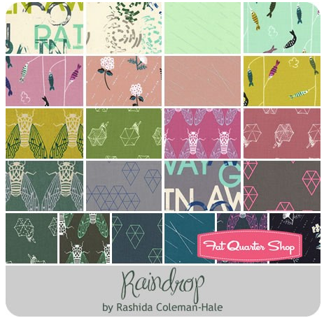 Thanks to the
 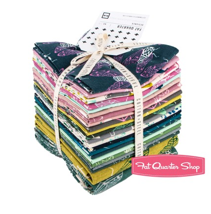 To enter the giveaway today, tell me what you like to do on rainy days. Leave a comment and make sure I’m able to get ahold of you if you win. For an additional entry,
 Corresponding solids from left to right:
 Corresponding solids from left to right:

 I’m also joining in with a talented group of pattern designers to bring you a great Christmas in July pattern bundle in a couple of weeks. Mark your calendars for July 11th, since the sale will kick off at 3pm EST and will run for only 72 hours! I can assure you won’t want to miss this bundle, since it includes a great variety of both holiday themed and general purpose patterns of all sorts. I’ll be including my two best selling foundation paper pieced patterns, Lupine & Love Struck in the bundle. There will be prizes to be won, AND every person who buys the bundle from me will be entered into the running for a Quilter’s Planner 2017 Starter Kit, which includes a 2017 planner as well as pens, clips, & highlighters to help you stay organized.
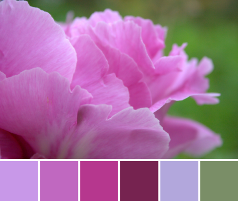
 This mini quilt finishes at 24″ square, and its creation coincided with the fabulous bloom of peonies in our garden. It features a new die called
 The colors of the peonies and the colors in the quilt meld so beautifully together! I really could not help but take a million photos of this quilt with the gorgeous color gradient of peonies from my garden, but since it’s Thursday, I figured a combination of Color Inspiration Thursday and a heads-up about my Sizzix tutorial would be perfectly acceptable.
 Ahhh peonies! Such an inspiration!
 Corresponding solids from left to right:
 I love the natural ombres and vibrant colors found in nature and thoroughly enjoy combining natural inspiration with quilty projects. It is so fun to try to stitch the beauty around me into the quilts in my hands!
 I’m nearing the finish line with this little one. It features some of my favorite Carolyn Friedlander fabrics, with a goal of playing with transparency in a cyclic way. I created a mini 2″ square foundation paper pieced pattern for each quarter of this mini mini, resulting in about a 4″ square. I used the template I designed for accurate piecing of the center spokes, and then have used different methods for sewing the outer curves.
 One of the fun perks of dragging projects out over obscene lengths of time (chuckle with me for a minute, here) is that it becomes a documentation of skill development. Two of the four curves were pieced using traditional curved sewing, and the wobbly, puckery wonk is indicative of my amateur curve abilities a few months ago. In fact, my original plan includes a needle-turn appliqué element over the curve, since I knew that it would most likely be something I would need to mask a bit (possibly a lot bit).
 You can see on the green quadrant that there is another dark curved piece added on top of the curve. That is needle-turned and does a fabulous job of covering the little inconsistencies of my tiny curved stitching. Use the method that works best for you, right!?
 However, since completing the first two quadrants of this mini mini, I have learned and conquered the
  I am currently contemplating the quilting for this mini mini, and am leaning toward some simple, large, hand stitching to secure the layers and add just a bit of interest. I also have some travel plans coming up, so as long as I can get the top prepared and layered, hand stitching might be just the thing to take with me on my trip. I’m really happy with how this is progressing, though, and I’m grateful as always for the patience of my quilty friends as I slowly process, evolve and execute my plans for their personalized mini minis. I’ll be sure to share the finished mini mini once I finally complete it.
 If you still want to support my making and blogging in a tangible way, you can purchase my patterns on
 Corresponding solids from left to right:
 Corresponding solids from left to right:
 Isn’t it amazing how simply moving insanely close to a flower changes the entire aesthetic!? I feel like I say it almost every time, but it’s a whole new, beautiful world in there!