Over the past two weeks, we’ve been searching for colors rarely seen in my previous color palettes, namely white, grey, blue, and purple. Last week, we attempted some white palettes and settled for white with a pop of color. This week, I’m sharing a couple of palettes addressing the purples and blues. We tried something a bit new for the second palette, but I don’t think it will be the last time we try it! Color palettes were created using Play Crafts’ Palette Builder 2.1 and my photographs, with conveniently matched cotton solids and Aurifil threads in case a palette so inspires you to sew!
Corresponding solids from left to right: Kona Black, Kona Shadow, Bella Baby Blue, Bella Aubergine, Kona Storm, Bella Betty’s Blue
Corresponding Aurifil thread from left to right: 2692 – Black 2615 – Aluminum 2562 – Lilac 2566 – Wisteria 2745 – Midnight 4140 – Wedgewood
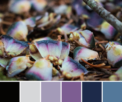
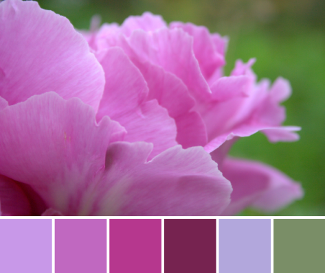
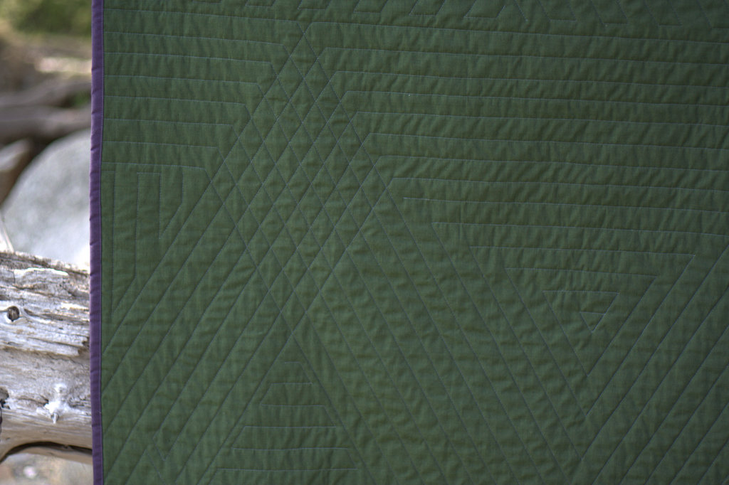
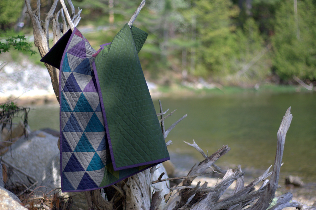
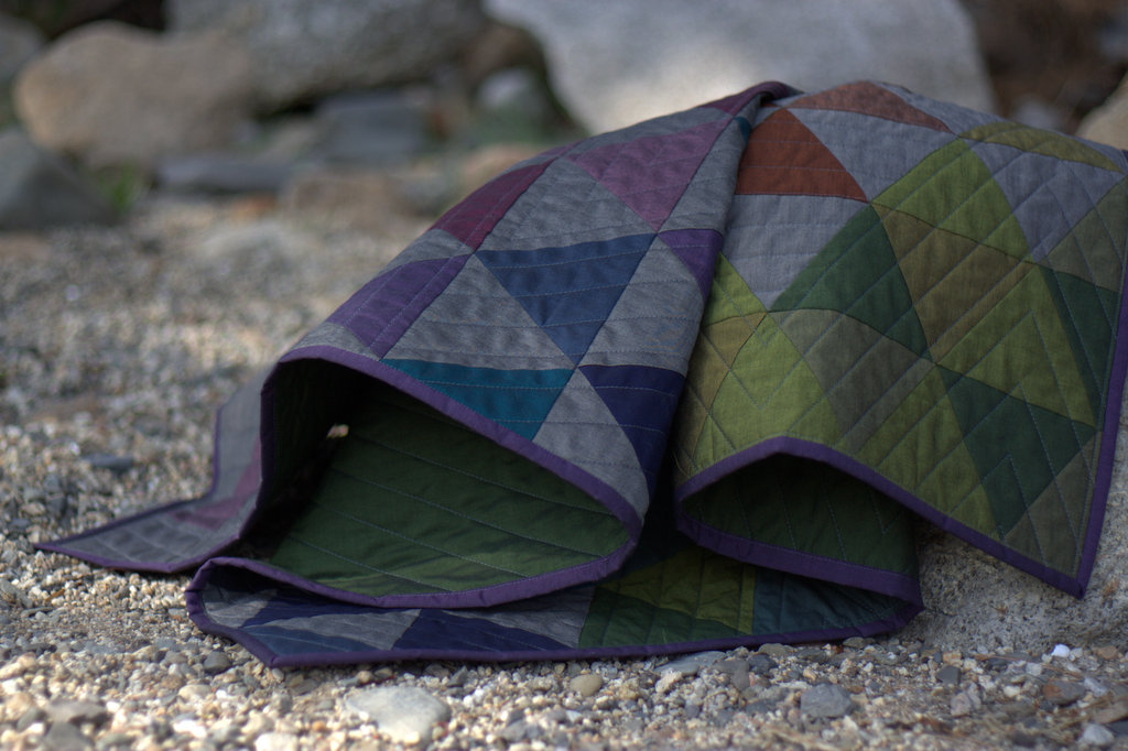
Purple, lovely purple! Literally one, maybe two days after deciding to seek less frequent colors in nature, one of my kids spotted this pinecone refuse left by some critter alongside a hiking path. I went to investigate in response to, “What’s this, mama?” and viola! Purple! and a bit of blue! I love when my kids find little treasures out in the natural world, since that spark of wonder is what makes the world go ’round! I certainly will do all I can to keep it going as long as I have a speck of influence, and will cherish the treasures found.
Corresponding solids from left to right: Bella Stone, Kona Surf, Kona Ocean, Kona Copen, Kona Periwinkle, Kona Blueberry
Corresponding Aurifil thread from left to right: 2605 – Grey
2525 – Dusty Blue Violet 2780 – Dk Delft Blue 2725 – Lt Wedgewood 2720 – Lt Delft Blue 2770 – V Lt Delft
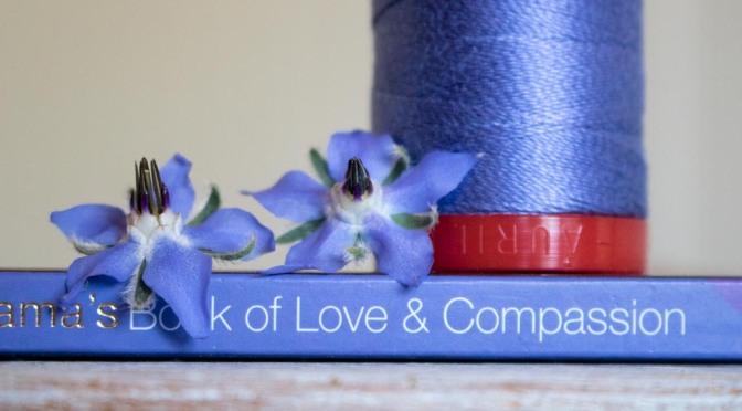
For this palette, we tried something a bit different. There are bits of blue appearing around our gardens–blueberries are beginning to ripen, the blue bachelor button buds are ready to pop any day, and the borage is flowering its fuzzy blue blooms. But no where is there a strongly dominant blue; it is mixed in with the rest of the colorful bits of beauty but alone would not hold its own in a color palette.
To combat that, I decided to try a reverse color scavenger hunt. I picked a couple of borage flowers and gave my oldest the challenge of finding things in the house that matched the color perfectly. Borage is a tricky color–a blueish violet that’s very soft and subtle, but she managed to find one book that was an absolute perfect match: a little book called the Dali Lama’s Book of Love & Compassion, a sweet little collection of positive reflections that was a gift from my husband way back before we were even engaged. Everything else we tried was either too blue or too purple, so I headed up and grabbed some blue-violet Aurifil spools to see if we could get lucky. Sure enough, 2525-Dusty Blue Violet is the perfect match! If you look at the matching Aurifil threads pulled from the palette, the second coordinating color is exactly that! Once again, Aurifil has the perfect match.
It has been fun to seek the rarer colors, and I still have yet to find a convincingly grey palette, nor have I fully succeeded with a white one, so I will keep looking! I challenge you to spot some odd colors in the world around you this week–where do you see blue? purple? or any other unusual colors that stand out to you? Let me know in the comments, or link to a photo!
I have had some fun this week searching out some of the colors in nature less commonly seen in my color palettes, as you helped me name last week: white, grey, blue, and purple. I have also been getting more comfortable with a new camera, since I very recently upgraded our nearly 10 year old Canon with a newer version. Upon reading up on editing RAW photo files in preparation for the big Quilter’s Planner photo shoot, I also made the executive decision to begin a trial version of Photoshop and Lightroom just last night (or should I say, early this morning?). Combine all of those three things together, and that makes for a lot of late nights and fun photo experimentation. AND some really fun color palettes! All color palettes were created using Play Crafts’ Palette Builder 2.1 and my photographs.
Corresponding solids from left to right: Kona Sky, Kona Silver, Kona Cloud, Bella Baby Blue, Bella Petal Pink, Kona Zucchini
Corresponding Aurifil thread from left to right: 2024 – White
2560 – Iris
2606 – Mist
2564 – Pale Lilac
2562 – Lilac
5015 – Gold Yellow
Since low volume fabrics are among my favorites, I decided to begin by searching for white. I enlisted the help of my big kids and we gathered all of the white and light grey flowers and treasures we could find around our yard and garden. Since I wanted to emphasize the white, we laid them out on a big white poster board. Through this whole search for white-rich color palettes, I’ve discovered that it is quite difficult to find a palette created from nature without the green, yellow, or pinks sneaking in. For the palette above, I ignored the green in creating the palette, even though, for me, the green jumps out at you in the photo.
Since I am getting the hang of a new camera, I wanted to experiment with the quality of light in different places, so before photographing in earnest, I took simple top-down photos in a few different locations: inside near a bright window, outside in direct bright sunlight, and outside in a shady spot. It’s amazing how simply moving the location of the photo subject changes the quality of the color so drastically. Here are my unedited photos in each location, to show you the differences:
Inside near a bright window = dancing shadows
Outside in direct bright sunlight = garishly bright with dark shadows
Outside in a shady spot without direct sun = gentle and flat, and with a little bit of lightening in a photo editor, it creates the bright photo with soft shadows that was used to create the color palette above.
I decided to try my favorite, macro photography, to see if I could isolate some fully white-spectrum photos. Lo, once again, this just proved that pink and yellow love to sneak into the whites! I also discovered that it is quite difficult to get true white to pull from a photograph. Greys and beige, yes. But white? No such luck.
Corresponding solids from left to right: Kona Blue Bell, Kona Silver, Bella Saffron, Bella Longhorn, Kona Cheddar, Kona Limestone
Corresponding Aurifil thread from left to right: 5008 – Sugar Paper
2560 – Iris 2318 – Cachemire 2930 – Toast 6010 – Toast 2324 – Stone
I knew that the golden center of this flower would pull through just as strongly if not more so than the white, but how could I resist? Such a gorgeous bloom, and a soothing palette. In quilting, I love good contrast and a crisp aesthetic, which often is aided by using a low volume/white or dark/black background fabric. This palette is one that I could definitely see myself using, perhaps in a gender neutral baby quilt, or summery pillow. I probably would drop the Stone and pick up pure White, though, even though it didn’t push through in the actual photo.
Corresponding solids from left to right: Bella Lt Blue, Kona Thistle, Kona Lupine, Kona Plum, Kona Cloud, Kona Sky
Corresponding Aurifil thread from left to right: 2612 – Arctic Sky
2510 – Lt Lilac
2566 – Wisteria
4030 – Plum
2560 – Iris
2710 – Lt Robins Egg
Ahh Thistle, Lupine, Plum; what gorgeous colors! This is a palette that appears in my creations often, although usually with some other colors joining ranks. Again, despite the attempt to find a fully white-grey palette, this was another no-go. Clearly, Mother Nature likes color, too! I still love the photos and resulting palettes, even if they don’t quite fulfill the request for low volume color palettes. I will keep hunting, and look forward to sharing my finds with you next week!
****
Reminder!! The Christmas in July Pattern Bundle Sale ends today at 3pm EST!! It’s your last chance to get a fabulous deal on 23 versatile patterns from some of your favorite designers, including Meadowmist Designs, Quilting Jetgirl, Quiet Play, Blossom Heart Quilts, Live Love Sew, 13 Spools, and many more! At the end of the sale, this bundle of patterns will no longer be available, so get it while you can! As an added bonus, everyone who buys it HERE is entered to win a Quilter’s Planner 2017 Starter Kit. Creativity overload (in a totally great way!)! **The sale is now over!
Also, my giveaway for the Raindrop fat quarter bundle by Rashida Coleman-Hale for Cotton + Steel Fabrics, sponsored by Fat Quarter Shop ends tonight at 8pm! Comment on my post HERE to enter to win if you haven’t already!
My garden is in a very temporary visual lull at the moment, with the first burst of blooms dying out and the next round not quite flowering yet, but I have a good stockpile of photographs from earlier this year for color inspiration posts in the meantime. This week features a few of my garden beauty favorites, with color palettes made using Play Crafts’ Palette Builder 2.1. I hope you find inspiration from the detailed intricacies provided by Mother Nature, by the color bursts and combinations found naturally all around us, or by the gorgeous matching quilting solids and Aurifil threads listed beneath each palette!
Corresponding solids from left to right: Kona Dahlia, Kona Violet, Bella Berrylicious, Bella Boysenberry, Kona Thistle, Bella Prairie Green
Corresponding Aurifil thread from left to right: 2520 – Violet
5003 – Wine 2535 – Magenta 4030 – Plum 2510 – Lt Lilac 2850 – Med Juniper
Ahhhh! Peonies are long gone at this point in the year, but their full beauty lives on in these photographs (and my memory). I did not get dahlias in the ground in time this year; otherwise I would be eagerly awaiting their blooms to step into the vacant space left by the passing of the peonies. Time will tell which bloom will steal my heart next. It’s fun how more or less the same flowers bloom each year, since our garden is a perennial garden, yet it is always a surprise when a flower first begins to bloom.
Corresponding solids from left to right: Bella Bunny Hill Blue, Bella Petal Pink, Bella Boysenberry, Kona Bordeaux, Kona Azalea, Kona Herb
Corresponding Aurifil thread from left to right: 2600 – Dove
2445 – Victorian Rose 4030 – Plum 1103 – Burgundy 2530 – Blossom Pink 5019 – Military Green
One of my favorite aspects of our garden is the wide variety of subspecies that are planted of each flower. There are least ten different species of Columbine, from daintily elegant to full and regal. You can see one of the other species featured in a past color inspiration post here. I don’t remember seeing this red species before this year, but it must have been there, hiding amidst the other copious blooms. I fully enjoyed it this year, and love the rich color palette that results.
In looking through my color inspiration posts, there is a definite trend toward pinks, maroons, orange/golds, greens, and earthy tones. I suppose that’s to be expected when the majority of the photos come from the garden around me. I was thinking it might be fun to have a color scavenger hunt, though, and specifically seek some of the colors more rarely found in nature. I’m taking suggestions for color themes–the harder the better (I love a challenge)! What color should I search for first? Blue? Purple? White? I’d love to hear your thoughts!
I recently had some fun playing with a new Sizzix die and a color/value gradient from dark purple to light pink. Today I’m sharing a tutorial over on the Sizzix blog so that you can make your own Geese Crossing mini quilt. Since the colors and the peonies from my garden are serendipitously paired, I created a color inspiration palette to share, too!
This mini quilt finishes at 24″ square, and its creation coincided with the fabulous bloom of peonies in our garden. It features a new die called Geese Crossing, designed by Victoria Findlay Wolfe and released at Quilt Market last month. It’s a very versatile die and allows for lots of design, color, and value play.
Tips for getting perfect points!
In my tutorial, I share information that will be helpful for all quilting projects, including:
– Tips for creating a successful value gradient in a fabric pull;
– How to get perfect points when sewing geese or other triangles; and,
– Tips to prevent bunching when sewing on an angle.
You can read the full tutorial and see more photos of my project process on the Sizzix blog, here.
The colors of the peonies and the colors in the quilt meld so beautifully together! I really could not help but take a million photos of this quilt with the gorgeous color gradient of peonies from my garden, but since it’s Thursday, I figured a combination of Color Inspiration Thursday and a heads-up about my Sizzix tutorial would be perfectly acceptable.
Ahhh peonies! Such an inspiration!
Corresponding solids from left to right: Kona Dusty Blue, Bella Pewter, Bella Petal Pink, Kona Plum, Kona Cerise, Kona Eggplant
Corresponding Aurifil thread from left to right: 2560 – Iris
2564 – Pale Lilac
2425 – Bright Pink
2479 – Med Orchid
4030 – Plum
2582 – Dk Violet
This color palette was created using Play Crafts’ Palette Builder 2.1 as per usual, and the matching Aurifil threads and Kona & Moda Bella solids are particularly useful! I will certainly be getting a few of those threads for quilting! We actually had dark magenta peonies that would have matched the darkest purple fabric, but they are the early variety that met their end during a thunderstorm a few weeks ago. Still, our garden provided a lovely fade from the palest pink to a bright magenta with the peonies blooming now.
I love the natural ombres and vibrant colors found in nature and thoroughly enjoy combining natural inspiration with quilty projects. It is so fun to try to stitch the beauty around me into the quilts in my hands!
Where in nature do you find the most inspiration? Flowers? Colors in general? Textures? or simply through the endless variety of growth and new life that appears before our eyes daily?
Ahhhh, summer is here! The garden has been cranking full speed ahead, cycling through blooms as only nature can. This time of year is a strong reminder to appreciate the moment, since if you don’t stop to smell the flowers, before you know it they are gone and being quickly replaced by different ones! Today’s color inspiration palettes come from photos of some flowers in my garden, but with a slightly different perspective. You know how I love to get up close and personal; well today, I took it one step further. I played with the easy macro band my husband gifted to me for Christmas, and using my iPhone, took some seriously macro (super duper close!) photos of some familiar beauties. Color palettes are made using Play Crafts’ Palette Builder 2.1.
Corresponding solids from left to right: Kona Cerise, Kona Bright Pink, Kona Violet, Bella Amelia Green, Bella Amelia Purple, Kona Hibiscus
Corresponding Aurifil thread from left to right: 1100 – Red Plum
2450 – Rose 5003 – Wine 2882 – Lt Fern 1243 – Dusty Lavender 1240 – V Dk Eggplant
This first flower was featured in a color inspiration post last year, as part of a pink/purple color lay. It’s the one on the far left, the purple spray-like flowers. I believe it’s a Mountain Bluet (Centaurea montana). This year, I went straight to the heart of the flower, and I love the blurred depth of field and soft, rich color. This Mountain Bluet heart reminds me of improv quilting, gorgeously random yet cohesive.
Corresponding solids from left to right: Kona Magenta, Bella Amelia Lavender, Bella Pewter, Bella Baby Pink, Bella Daffodil, Bella Longhorn
Corresponding Aurifil thread from left to right: 2520 – Violet
2524 – Grey Violet 2606 – Mist 2405 – Oyster 5001 – Ocher Yellow 2145 – Yellow Orange
Any guesses as to what flower this may be? I absolutely love the soft palette that resulted from this fuzzy view down the gullet of an iris (did you guess it?!). Just for scale, here’s a “regular” photo of the same flower:
Isn’t it amazing how simply moving insanely close to a flower changes the entire aesthetic!? I feel like I say it almost every time, but it’s a whole new, beautiful world in there!
A bit more about the Easy Macro band; it’s really simple to use and costs just over $10. I’m not an affiliate or anything, but it’s such a clever little tool, I thought I’d share more information. It looks like a big rubber band with a little round lens on it, and you simply stretch it over your phone, lining up the lens with the lens on the phone’s camera. One tip to getting great photos–get far closer than you think is possible, tap the screen to focus, then slooooooowly back the camera up until you find the focus you want. Take the picture! It’s really fun, and you certainly will be seeing more of these easy macro color palettes. I think the narrow perspective helps you focus more on the color than the subject, which is perfect for color palettes!
Do you prefer macro (super close up) photos, or more landscape/scene photos? I am definitely in the macro camp, but I know there’s a place for both styles of photography!
Today I’m taking part in yet another fun, quick sew along hosted by Fat Quarter Shop. Kimberly from FQS teamed up with Sherri McConnell once again to bring you a video tutorial for a really simple and cute pin cushion, which is being released today. I definitely will be making more of these!
I really love clear video tutorials since I am very much a visual learner. Seeing each step helps make the process smooth and easy to complete without hang up or confusion. That, to me, is a big win!
I decided to make my pin cushion with a range of warm Alison Glass Sun Prints 2015 and 2016, and once it was finished, it begged to be photographed out in the garden with the peonies. Such vibrant colors need to be in colorful company.
I used a Tula Pink ribbon I won in a giveaway from Renaissance Ribbons a year or so ago as the ribbon detail, top stitched with Aurifil 40wt 2230-Medium Peony (so fitting!). I topped the pin cushion with Robert Kaufman Quilter’s Linen, which is a fabulous all-purpose blender fabric that happened to coordinate wonderfully. Aurifil 50wt 5022-Mustard was the perfect thread for hand stitching the opening in the Quilter’s Linen closed, too. I just love when perfectly coordinating fabrics and thread can be found in my stash.
I backed the pin cushion in Ex Libris Bookplate in Charcoal by Alison Glass (Andover Fabrics), and really would be tempted to use the pin cushion upside down every so often, it’s so pretty. This pin cushion is not for me, though, so the recipient can do with it as she pleases!
This is the first pin cushion I’ve stuffed entirely with crushed walnut shell, at Sherri’s suggestion, and I really like the sturdiness and ease with which pins go into it. I bought the crushed walnut shell from a quasi-local, fabulous quilt shop, Clementine in Rockland, Maine months ago but had not yet had a chance to use it. Leah at Clementine suggested the crushed walnut shells since the oils from the nut shells help keep the pins and needles sharp and rust free. They also provide a nice, sturdy base for your pins and needles.
Check out the video below and make your own pin cushion if you want! There’s no such thing as too many pin cushions, right?
Be sure to visit the other bloggers in the hop to help spark your inspiration and see what they did with this pin cushion:
Ahh! Summer is upon us! My daughter has mere days left of school before summer break is officially here! That means all three kids home all day, every day, which in turn means time to take lots of day trip adventures! Summer also means lots more opportunity for slow stitching, and a need to have some hand stitching available at all times. We all know that the day I forget my handwork will be the day all three kids somehow fall asleep in the car on the way to some adventure!
My portable hand stitching kit this summer consists primarily of English Paper Piecing (EPP) hexies and some experimental embroidery-quilting projects.
After a lull in my Carolyn Friedlander modern hexies project progress, I’m ready to pick it up again and baste more hexies! While 2 1/2″ squares work just fine for EPP hexagons, I really enjoy the neatness that starting with a hexagon of fabric provides.
Nine (9) charm squares lined up on top of the Sizzix 1 1/2″ hexagon die. Pass it through….Viola – 18 hexagons ready for basting
This is another time when the Sizzix die cutting machine comes in handy. It doesn’t take long to cut a whole bunch of fabric and cardstock hexagons for slow stitching on the go. I use the BigZ Hexagons with 1 1/2″ sides die to cut fabric and BigZ Hexagons with 1″ sides die to cut cardstock hexies and I’m ready to roll.
A lovely stack of fabric hexagons ready to baste. I need to cut a few more cardstock templates, but this will do for now!
I am also continuing to add embroidery quilting to my Rainbow Hex Star mini, as well planning a couple small embroidery quilting experimental projects. My goal is to find a way to get the back to look as neat as the front. Practice, right?
Slow stitching on the go is not the only slow stitching I’m looking forward to this summer! I’m also officially registered for the Slow Stitching Retreat hosted by Sam at A Gathering of Stitches this August. I can’t wait to slow down and sew with Sam, Chawne Kimber, and Alison Glass. I’m doubly excited since I will also be leading yoga on the retreat! Just imagine… slowing down, breathing deeply, stretching out, learning from amazingly talented and inspirational quilters, and slowly stitching in the sun, rocking on the rocking chairs out on the porch in the calm, cool woods of Maine. You can read about my experience dropping in on a day of this retreat last summer HERE. I am very much looking forward to spending the full four days rejuvenating my soul with some slow stitching in inspired creative company. Are you coming!? I sure hope so!
Today I’m excited to be a part of the Oakshott Lipari blog hop, your final stop for those of you who have been following along. So many fabulous projects have been made with the fat eighths bundle of the new Lipari line, so I encourage you to also check out the others along the hop, linked at the bottom of this post. Many thanks to Lynne and Michael at Oakshott for including me in the hop!
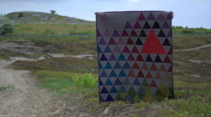
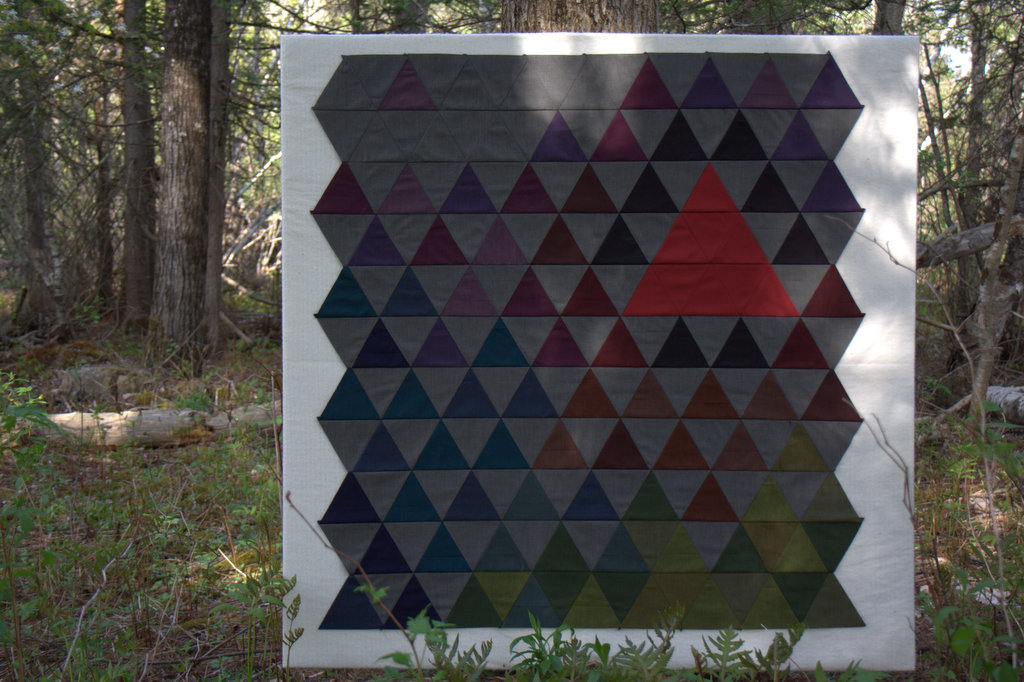
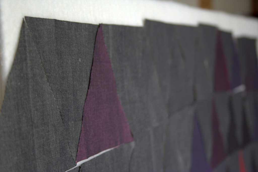
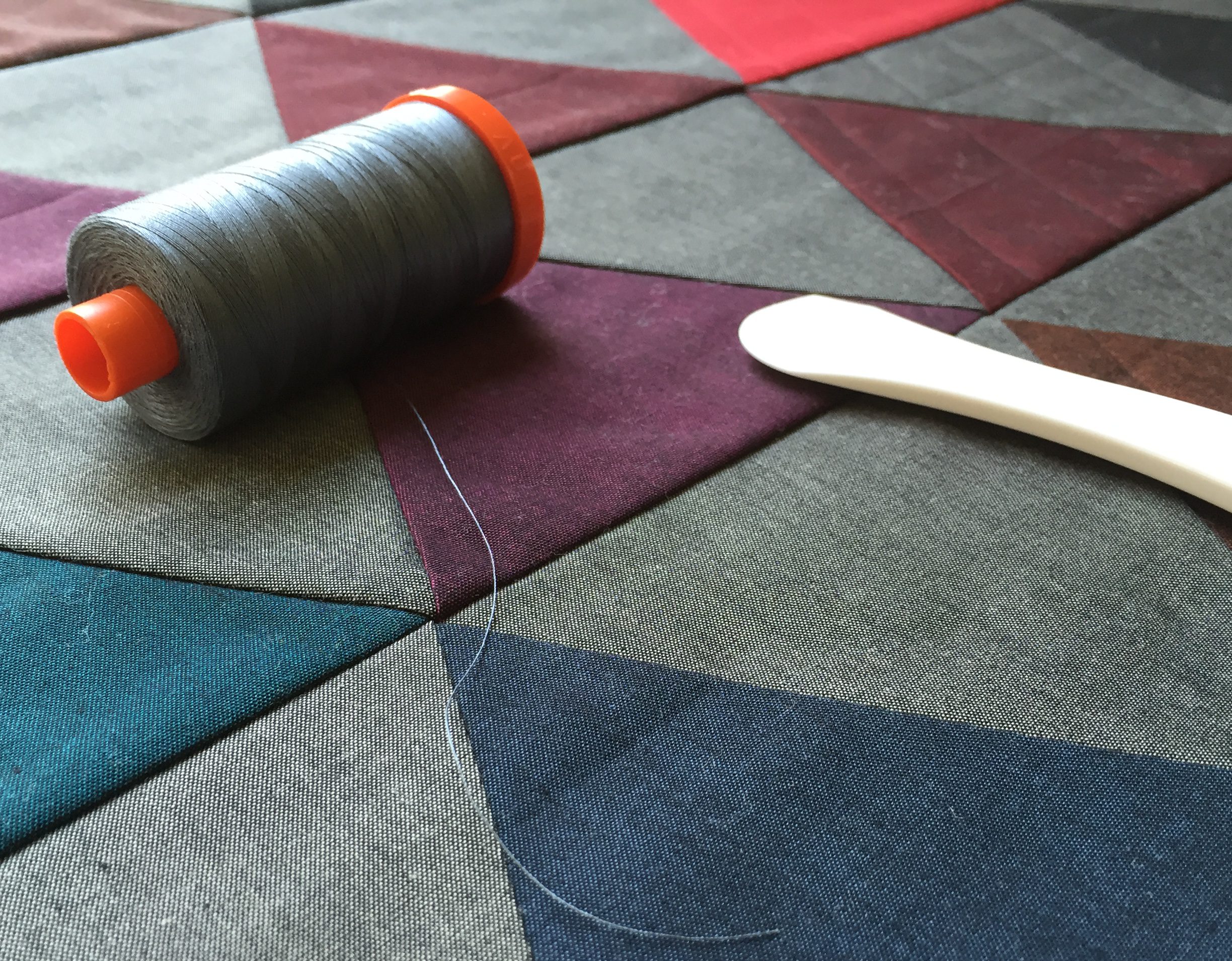
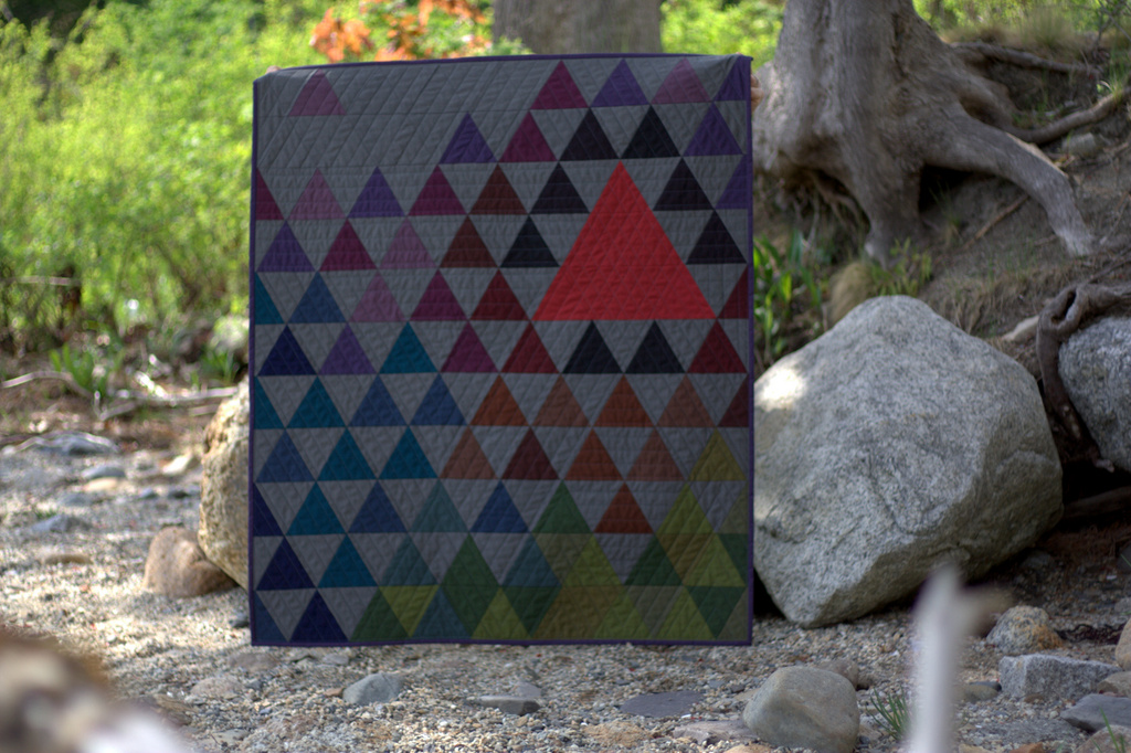
This was my first time working with Oakshott fabrics, and they are so luxurious! They are a woven fabric and feel almost silky to the touch. They feel more substantial than other shot cottons I’ve used, and the Lipari line looks iridescent since the warp is black and the weft is a bright jewel tone. These fabrics come to life when you see them in person–photos truly don’t do them justice. The Lipari line was inspired by volcanoes and the description from Oakshott says it best: “Lipari perfectly captures the primordial beauty of the Aeolian islands. Its luminous colours mirror cobalt seas, lush greenery, pink bougainvillea and shimmering sun; a beauty shot through with dark, fine-grained volcanic rock and black sand.” As soon as I read this description, I knew my quilt had to be a reflection of this volcanic inspiration. Thus, my Vesuvius quilt was born.
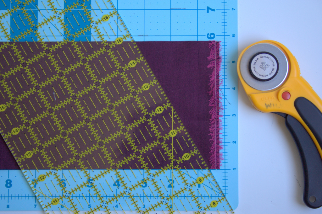
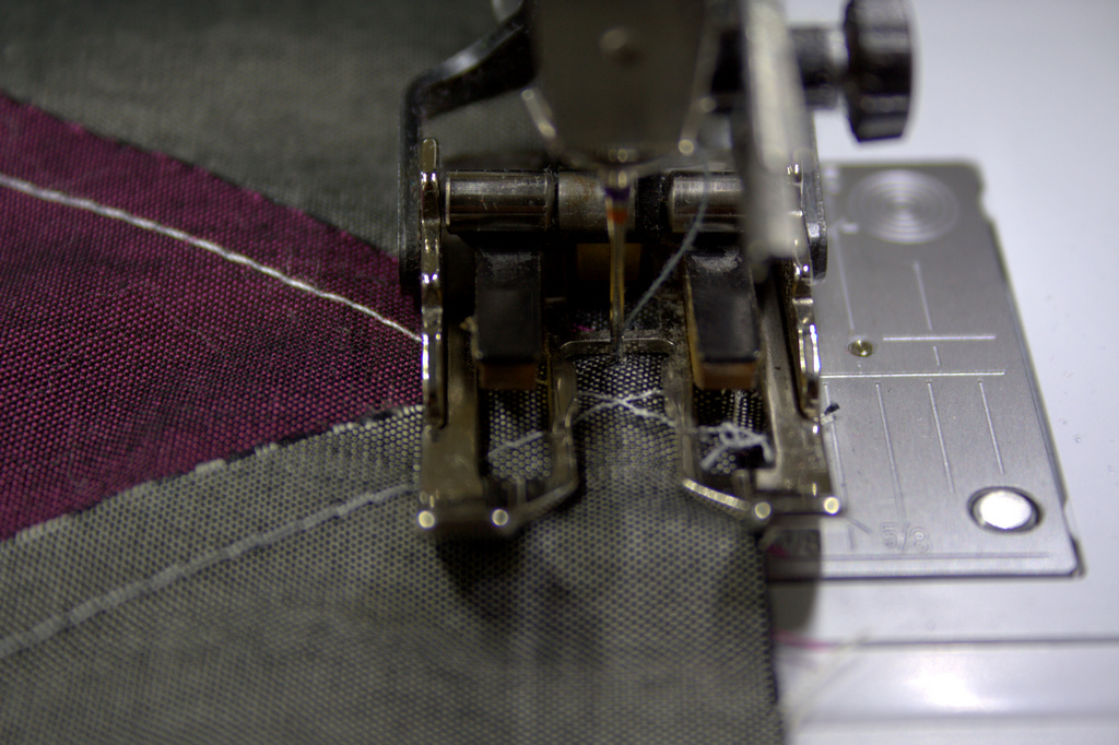
I made my Vesuvius quilt with 60 degree triangles, to elicit the sharp peaks of the mountainous volcanoes. I pulled in some Ruby Red – Toledo for the molten focal triangle, and let the Lipari steal the show. I used my Sizzix die cutting machine to speed up the cutting process. I really wanted to photograph this quilt next to a volcano, but I had to settle for some blueberry barrens and a Maine coast beach.
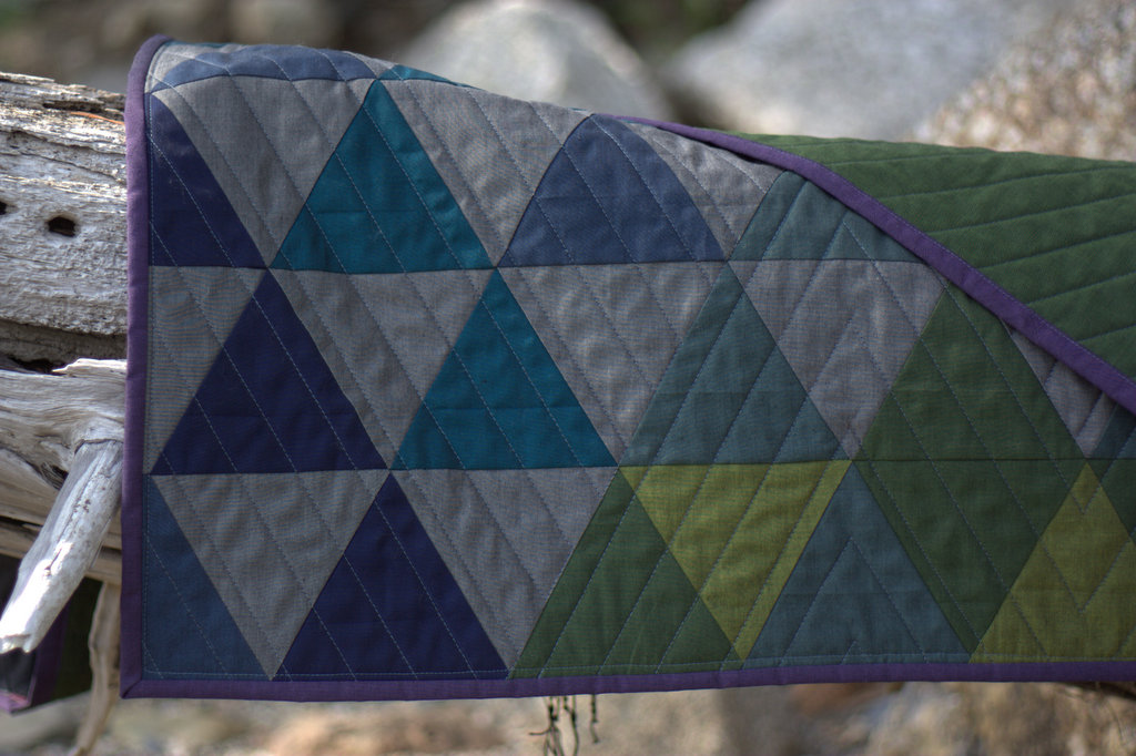
I quilted Vesuvius with 50 wt Aurifil thread 1246-Grey, which blended wonderfully with the Lipari Pollara (grey) I used as a background color. I used the walking foot on my domestic Bernina 560 to quilt straight lines 1″ apart, switching up directions in various sections of the quilt to provide movement and added interest. I LOVE how it turned out!
The Lipari Porticello (dark green) backing shows the quilting wonderfully, although it’s tough to get the full effect through photos!
I was torn on what color to use as the binding, but decided that Lipari Gallina (purple) frames it nicely.
This quilt finishes at 36″x43″ so would make a wonderful wall hanging or sophisticated baby quilt. You could also add borders to make it larger.
Tutorial
Here’s how to make your very own Vesuvius quilt! (Note that Oakshott Lipari fabric is 54″ wide. Typical quilting cotton is approximately 42″ wide, so plan accordingly)
Materials
A fat eighths bundle of Oakshott Lipari
1/8 yard of Oakshott Ruby Red Toledo
3/4 yard additional Lipari Pollara (grey)-negative space
1 1/4 yards Lipari Porticello (dark green)-backing
1/3 yard Lipari Gallina (purple)-binding
42″ x 50″ piece of batting
Sizzix die cutting machine
Sizzix XL Triangle, Equilateral 4 3/4″ x 5 1/2″ unfinished die
–OR–
Rotary cutter, cutting mat with 60 degree lines, and ruler
Thread (I used Aurifil 50wt 1246-Grey for both piecing and quilting)
Sewing machine with a walking foot (I use a Bernina 560)
Rotary cutter
Hera marker
Pins
Small thread snip scissors
Cutting
Using your method of choice (see below for instructions for each method), cut the following number of triangles from each fabric:
88 grey (Lipari Pollaro)
9 red (Ruby Red Toledo)
From fat eighth Lipari bundle:
20 purples
27 greens/yellows
12 browns
19 blues
4 black-red
8 black
Using a Sizzix die cutting machine
I used my Sizzix Fabi and BigZ Triangle, Equilateral 4 3/4″ x 5 1/2″ unfinished die to speed up the cutting process.
When using your sizzix, cut 5″ x width of fat eighth strips of fabric of each color, fold them over the die blade in the Sizzix cutting sandwich (bottom cutting pad, die with the blade face up, fabric, top cutting pad), and cut 9 triangles at a time. Note that the Oakshott fat eighths are 10″ x 27″, which are larger than a typical quilting cotton 9″ x 21″ fat eighth.
After passing each strip of fabric through the Fabi die cutting machine, you can reposition the remaining fabric and cut triangles from the “scraps”.
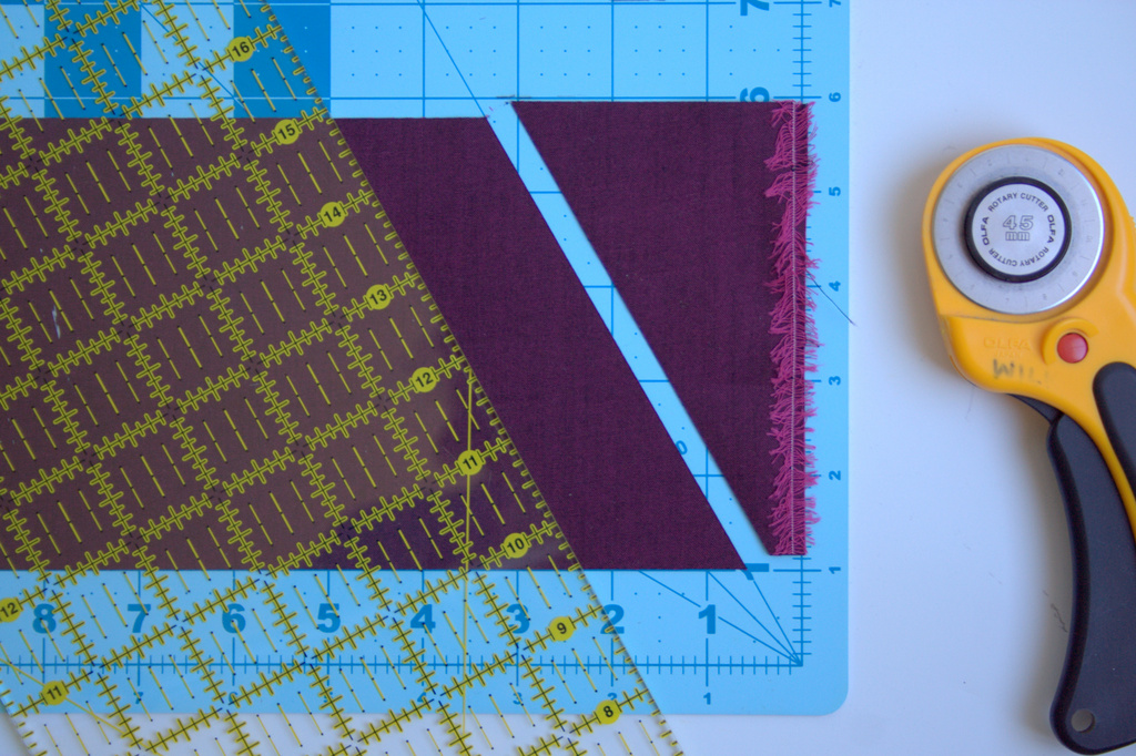
If you don’t have a Sizzix, read on to find out how to cut 60 degree triangles with your rotary cutter, using the lines on your cutting mat.
Using a rotary cutter and the lines on your cutting mat
First, cut strips 4 3/4″ by width of fabric. *Note: You can leave the fabric strip folded in half or doubled up if you’re using the width of fat eighth strips, allowing you to cut two triangles at a time!
Find the 30 degree line on your cutting mat. Yes, we are making 60 degree triangles by cutting along the 30 degree line (You have a 90 degree square to begin, trim off 30 degrees, then you’re left with 60 degrees!)
Align the bottom of your fabric strip along the 1-inch line. I use the 1-inch line so that you can see where the 30 degree line extends above and below the fabric. Place the edge of your ruler along the 30 degree line.
Using your rotary cutter, cut your fabric on the ruler angle.
Flip your fabric strip over, then align the bottom edge with the 1-inch line on your mat, so that the bottom point of your cut is on the 30 degree line.
Again, place the edge of your ruler along the 30 degree line. Using your rotary cutter, cut your fabric on the ruler angle. You now have your 60 degree triangle, or two (2) if you kept your fabric strip folded in half. Cut as many as you need.
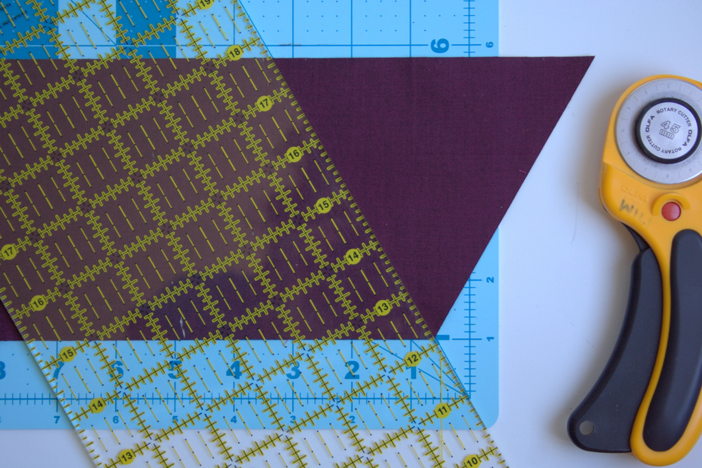
Piecing the Quilt Top
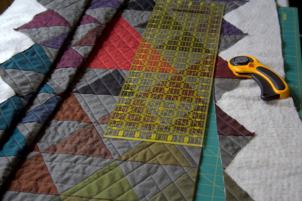
Once your pieces are cut, lay them out as shown. A piece of batting wrapped around a large wall board works well, but I have been often known to use my design floor to help with layout, too! (SizingNote: if you want a larger quilt, you could add a row of grey (Lipari Pollara) triangles to the right and left sides before sewing the rows together to maintain the outer triangle points when adding borders. Then, trim square and add rectangular borders to the desired size.)
Be sure to keep the grain of fabric running top to bottom (the woven texture of the Oakshott Lipari makes this easy to do since the grain is clearly visible when the fabric is held up to the light). Once your pieces are laid out as desired, it’s time to sew them together! Chain piecing helps the process go quickly and smoothly. Here’s how to set it up.
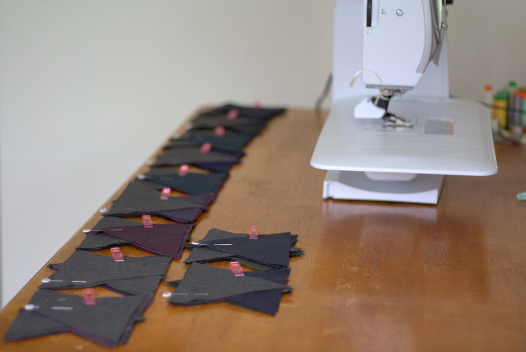
Label each horizontal row. I began with 1 on the top and ended with 11 on the bottom and used pins to label the first piece in each row (Note that I labeled each row after stacking, so the pins aren’t visible in these photos).
Carefully stack the triangles from each row, with the far left piece on top, and keeping the triangles facing the proper direction (this will help you keep them straight while piecing). For example, for row one, you will have the labeled first triangle piece from the far left on top, and carefully pick up each triangle across the row, adding it to the bottom of the stack.
Once you have your row stacked, use a clover clip or similar device to hold the stack together.
Gather all of your rows in this manner.
Lay them out in order, making a clear mental note of what row is located where. You could label a sticker on the table next to each stack to help, although simply keeping them in chronological order works well for me. Let’s sew! (Note that a table next to you works better than having the stacks this close to the sewing machine. As you add pieces, your strips will drag your stacks around if you keep them here as shown!)
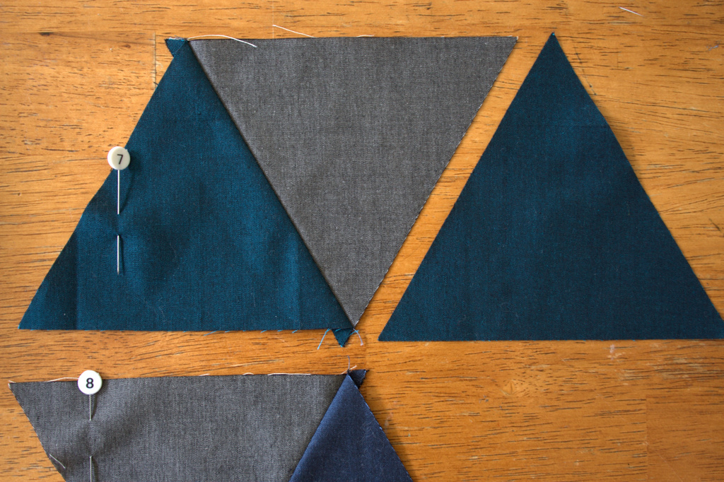
To speed up the process, we will be chain piecing (sewing without stopping) the first piece to the second piece from every row. Note: Be sure to keep the pin labeling each row in the first block at all times!!
Once you have all of your first pieces sewn to your second pieces, trim the threads to separate, and press. All these bias edges means this is a great time to practice pressing, and NOT ironing. Press: up, down, up. Great!
Alternate which side you press your seam for each row. I pressed odd rows (1, 3, 5, etc.) to the left and even rows (2, 4, 6, etc.) to the right. Pressing open also works well!
Next, add the next triangle to each row, chain sewing again. You’ll be sewing the third triangle (which is now on top of each stack) to each row. Double check the number pin on the sewn row before adding the next triangle, since you want to be sure to keep your gorgeous layout intact.
Continue chain piecing, trimming, pressing, and chain piecing again until all of your rows are assembled. As you add each triangle, stack those corners and everything will be right in line!
Sew all of the rows together, pressing seams up toward the grey triangles. I like to pin about 1/8″ after each point where the triangle points will be matching up, and aim to sew *right* through the center of the seam-cross to make sure you don’t cut off any points when sewing the rows together.
Quilting & Finishing
Once your quilt top is pieced, baste as desired. I decided to quilt my quilt before squaring it up because of all of the bias edges. I used 505 basting spray and spray basted for the first time! I used Christa Watson’s design wall spray basting tutorial and can see why people love it.
I decided to quilt my quilt with straight lines 1″ apart using the walking foot on my Bernina 560. I used a hera marker and a long quilting ruler to mark lines 1/2″ from some seams, and then 1″ apart from there. I sectioned the quilting in a few different sections, using straight lines 1″ apart but changing directions in each section. Lines intersect in the Ruby Red triangle, “exploding” out to the sides (like a volcanic eruption!?). The quilting lines don’t intersect anywhere else in the quilt. I really love the finished effect.
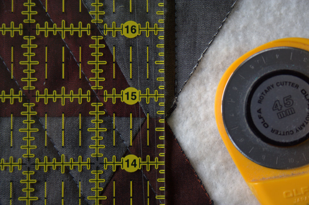
After quilting, it’s time to square up the quilt. Using a long, straight edge, trim 1/4″ away from the outer points so that you don’t lose any points when you sew on the binding. Use at least two sets of points to make sure your ruler is straight before cutting.
Square up your quilt, trimming off the excess, then bind!
Viola! Enjoy your Vesuvius Quilt, and please use #vesuviusquilt and tag me @nightquilter if you decide to make one.
Many thanks, again, to Oakshott for providing the fabrics for this project, and for including me in the hop. Make sure to check out the rest of the amazing Lipari projects:
*BREAKING NEWS* Volcanic action alert
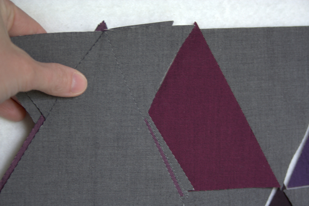
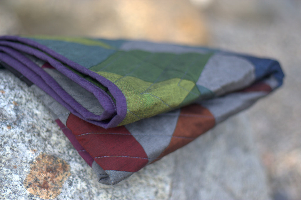
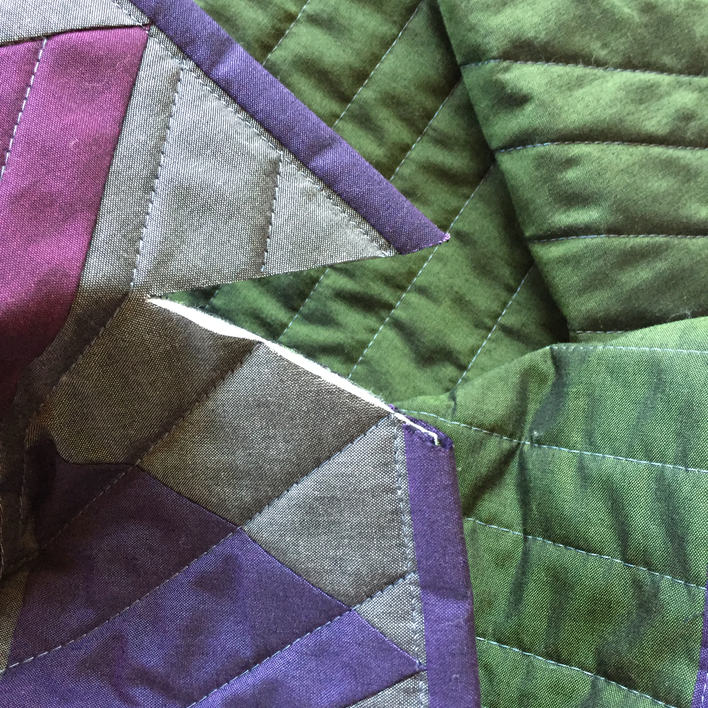
For those of you who follow me on Instagram, you may have seen the heart-wrenching fate of this quilt, that I so unknowingly aptly named “Vesuvius”: my nearly-four year old son cut into it in three places (along with a trail of destruction that included my Machinger quilting gloves cut into pieces and cuts into a big chunk of fusible fleece). With the great outpouring of support, commiseration, and suggestions offered by the fantastic community on IG, I’ve decided to make the cuts an added design element, another chapter in the story of the quilt, and sew either black or red patches over the cuts, making them into “fault lines”.
One of three cuts, now called “fault lines”, made into the edge of this quilt by my nearly-four year old son.
For now, though, I will put the quilt aside until I can dive into the repair with chuckles and reminiscence instead of lingering tears and frustration. I know that my son did not cut into my quilt maliciously, but it still is a difficult experience. I have made it known that if he ever wants to cut fabric again, he can tell me and I will help him make a quilt. We’ll see where it goes. For now, my Vesuvius Quilt (aka Max’s Fault Lines) is smoking and being buried by ash for a bit. It will rise again some day in the future.
**Note: I wrote this post four (4) weeks ago and between other scheduled tutorials and family sickness, it has yet to be posted. I’m finally scheduling it to post so that it goes up no matter what goes down on the homestead. Spring is in full swing here in Maine, now, so just pretend it is a month ago while reading this!**
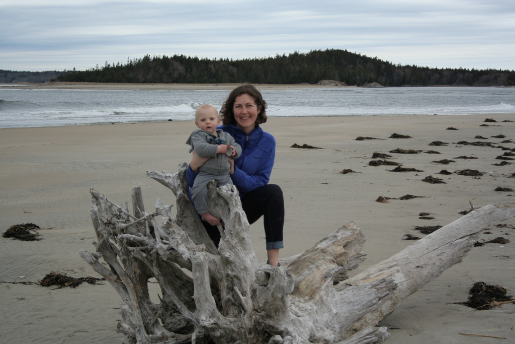
Warm, sunny, peeks-at-summer days are popping up here and there, intermingled with some below freezing nights and a bout of snow a couple of days ago. Ahh, spring in Maine! We were able to escape on one last grand adventure as a family of three before my big kids returned from their vacation two weeks ago, and today’s color inspiration comes from our adventures at Popham Beach in Phippsburg, Maine. It’s a bit of a drive away at just over 2 hours, but somehow the stars aligned and Finn slept the entire drive down, making our day joyful and smooth. And such, “beaching it” is the theme of the week; color palettes were created using Play Crafts’ Palette Builder 2.1.
Corresponding solids from left to right: Kona Pewter, Bella Bunny Hill Blue, Bella Prairie Green, Bella Pistachio, Kona Parchment, Bella Etchings Charcoal
Corresponding Aurifil thread from left to right: 2606 – Mist
2560 – Iris 5010 – Beige 5016 – Olive Green 2326 – Sand 1140 – Bark
As soon as we began along the path to the beach, I was drawn to the sea grasses that grew along the dunes. Such perfect little spikes of green popping up through the fine sand, it’s amazing to think that they alone hold the shifting sands in place during the strongest storms. Yet another reminder of Mother Nature’s simple complexity. The soft greens of the grasses and beige tones of the sand give a quiet feel to this palette.
This grass-covered dune was gorgeous as a whole, too, and I was happy to see a nice solid fence and signage clearly explaining the importance of looking without touching (or walking).
Corresponding solids from left to right: Bella Peacoat, Kona Pewter, Kona Medium Grey, Bella Nautical Blue, Kona Spice, Kona Latte
Corresponding Aurifil thread from left to right: 2785 – V Dk Navy
2605 – Grey 1126 – Blue Grey 1310 – Med Blue Grey 4012 – Copper Brown 5010 – Beige
Great color combinations can be found in the most unexpected of places, like this old, rusty lobster trap that was washed up on the beach and almost entirely covered by sand. I am wishing I took a photo of this from further away, since you might not notice the intricacies of texture and color unless you take a closer look. Lovely rust! I actually have a quilt in the wayyyy beginning phases of planning using a rusty color palette like this. It might become a reality in a year or two!
Here are a couple more photos from our expedition, just for fun:
Check out that amazing driftwood!!
Here’s to another color inspiration post next week, featuring some of the gorgeous spring flowers that are finally filling our gardens! Enjoy your week!
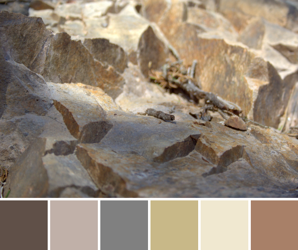
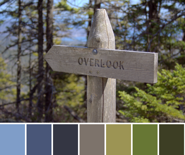
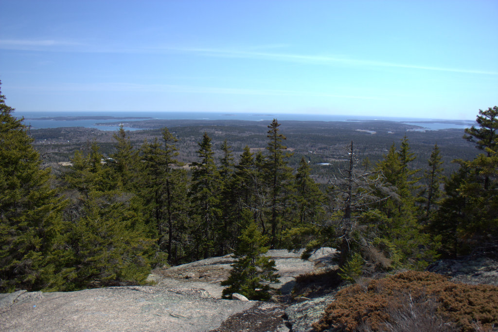
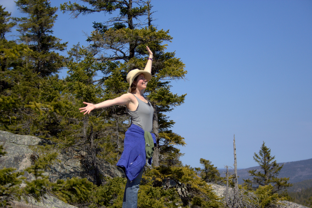
This past weekend, my husband and I sought out a new trail to hike, and aimed to find one that we would not be able to tackle with a 3 and 6 year old in tow. Our big kids had just left for a grand adventure–a week in NJ with Grandma & Pop Pop, flying solo for the first time ever. With Finn in a carrier, we were aiming to hike up a mountain and get some much desired fresh air, burning muscles, and a view. We found exactly what we were seeking in the Mansell Mountain Trail in Southwest Harbor, Maine. We found it by watching 1 Minute Hikes with Aislinn, and you can watch her video of the hike here (watching it again, I’m realizing we hiked the trail backwards). It’s a pretty neat tool for those looking for new hikes in Maine (although I don’t really know why it’s called “1 minute hikes” since the hike certainly didn’t take us one minute, and the video is longer than a minute… but still, a useful tool!) This week’s color inspiration hails from photos I took along the hike. Color palettes were made using Play Crafts’ Palette Builder 2.1, and the matching Kona cotton and Moda Bella solids and Aurifil threads are my favorite perk of using the Palette Builder.
Corresponding solids from left to right: Bella Chocolate, Bella Stone, Bella Etchings Slate, Kona Scone, Bella Snow, Bella Paper Bag
Corresponding Aurifil thread from left to right: 1140 – Bark
5011 – Rope Beige 2625 – Arctic Ice 5010 – Beige 2311 – Muslin 2335 – Lt Cinnamon
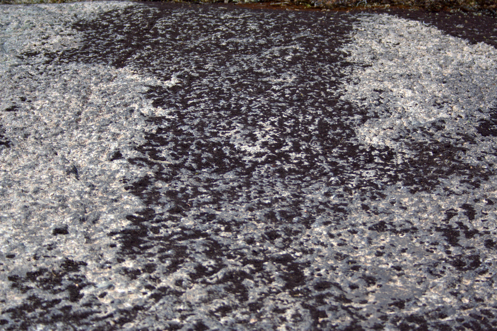
The climb up Mansell Mountain was very steep, so my gaze was often on the ground right in front of my face, finding hand-holds in some cases. I marveled in the variations of texture and color as we climbed up the mountain, and this one spot in particular caught my eye. I love the play of shadow in the crevasses, and could even see this transcribed into a full quilt. It reminds me of barren desert cliffs, and without the tiny twig for perspective, I’d almost think I were overlooking some barren landscape.
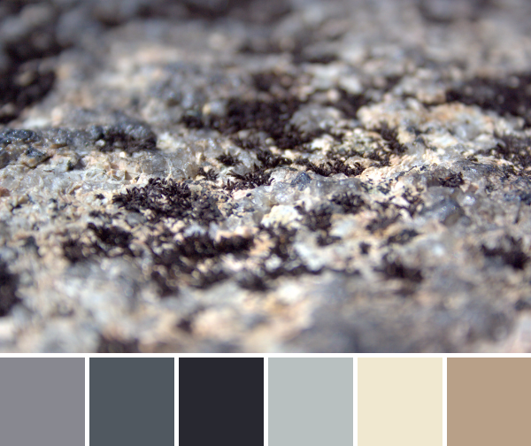
Corresponding solids from left to right: Bella Graphite, Kona Coal, Kona Charcoal, Bella Zen Grey, Bella Snow, Kona Cobblestone
Corresponding Aurifil thread from left to right: 5004 – Grey Smoke
1158 – Med Grey
2785 – V Dk Navy
2600 – Dove
2311 – Muslin 2375 – Antique Blush
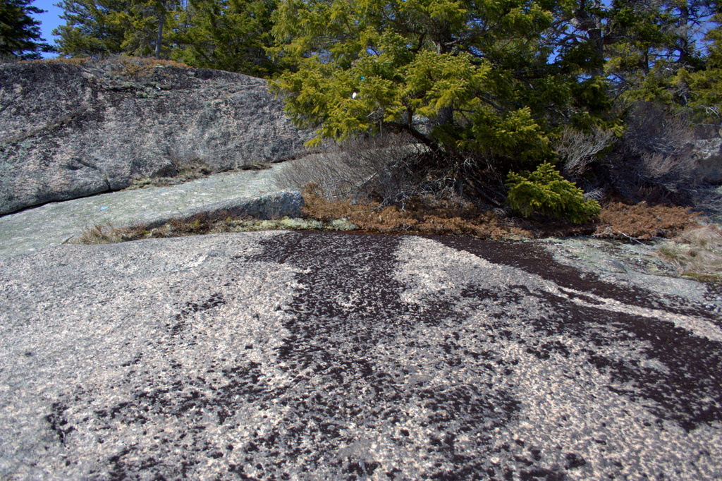
I love this photo and palette since it’s a perfect example of the benefit of taking a *really* close look at the world around you. These tiny almost crystalline bits of lichen could have easily been tromped over without a second glance. Looking closely, though, you see it’s a beautiful little varied world full of greys, beige, and a hint of peach. Call me weird, but I think it’s quite beautiful.
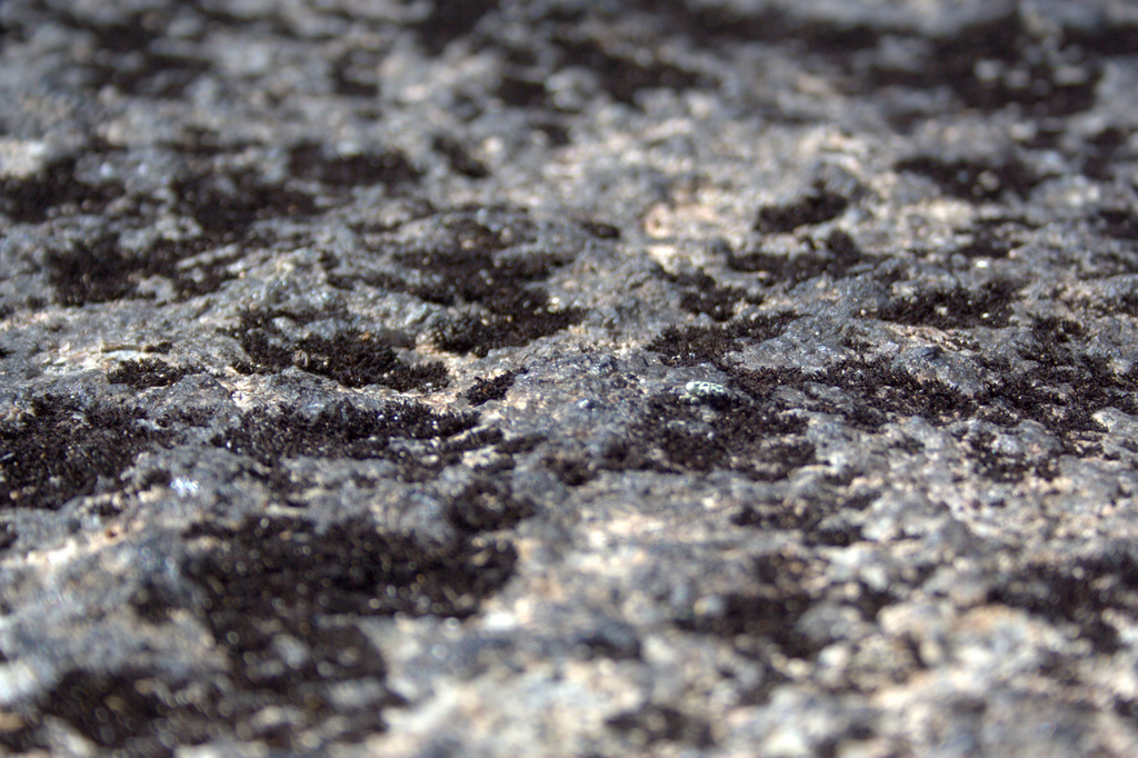
To give you some perspective, here is a series of photos showing you a lengthening view of what you see in the color palette above. If you take a step backward, you see this:
Take one step back…
Take another step back and you see:
Take two steps back….
With one more step back, here’s what you would see as you’re hiking along the trail:
Three steps back…
It’s amazing how the appearance of the world changes as you take a closer look! This “dirty rock” is actually a tiny world of beauty. Amazing!
Corresponding solids from left to right: Kona Cotton Candy Blue, Bella Admiral Blue, Bella Washed Black, Bella Etchings Slate, Bella Fig Tree Olive, Bella Evergreen, Kona Moss
Corresponding Aurifil thread from left to right: 2770 – V Lt Delft
1310 – Med Blue Grey
2630 – Pewter
2325 – Linen
5010 – Beige
2887 – Olive
2905 – Army Green
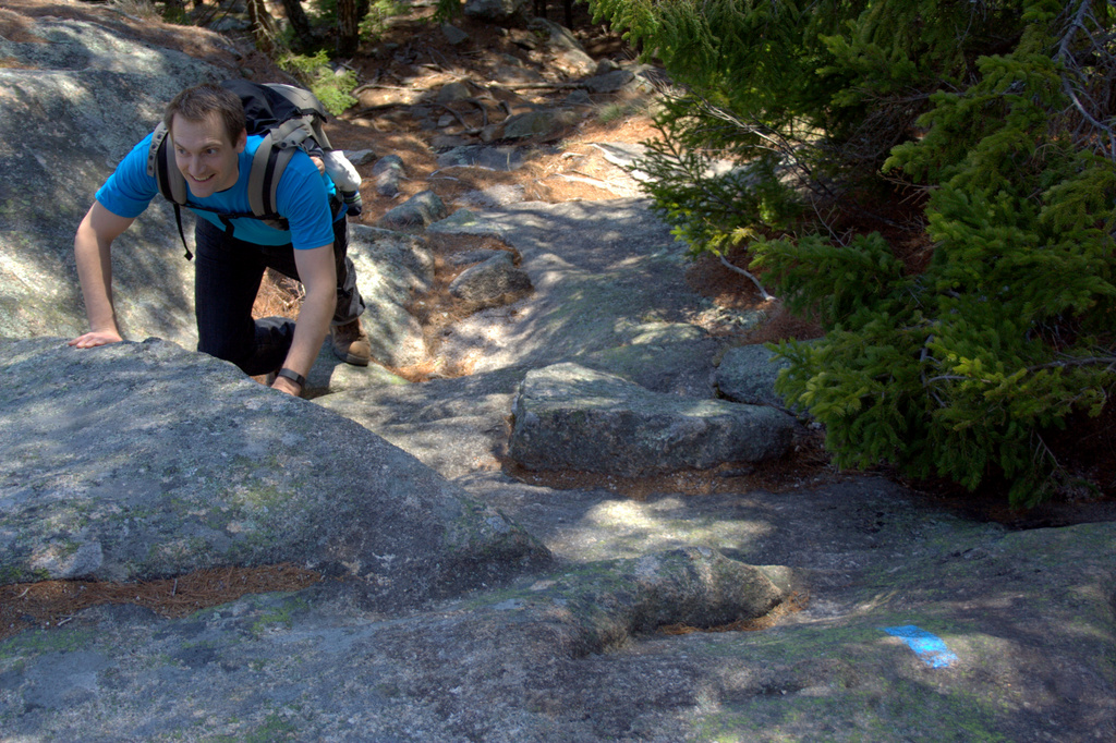
We were seeking great views, and we found them indeed. Photos don’t do the hike justice at all, but I’ll include some more below. A mountain face of stone stairs, wooden slats across wet areas, pristine babbling streams winding along next to the path, sun on our backs, and a view that just cannot be portrayed. It was a lovely day!
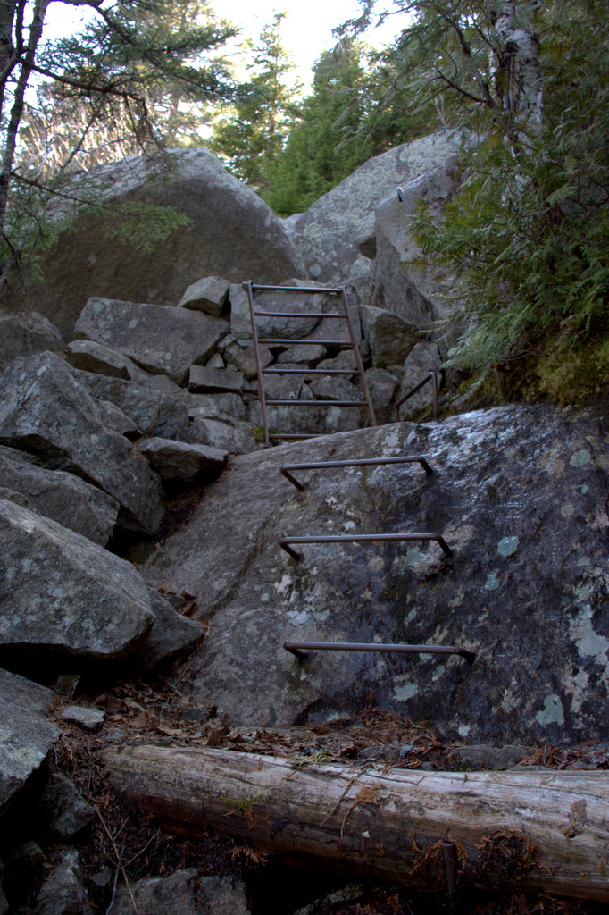
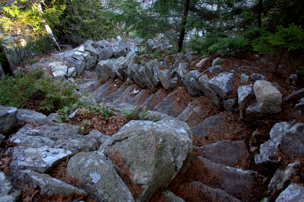
Climbing up Mansell Mountain with a baby on his back. He’s a keep-ah!The view from one of the lookouts on Mansell Mountain.It was THIS gorgeous!I love trails with actual metal ladders!Pretty much the entire trail down the mountain consisted of these gorgeously crafted stone stairs. 900+ foot elevation traversed on stairs!My sweet and handsome hiking buddies!
I grab a needle and thread once the kids are in bed

 Corresponding solids from left to right:
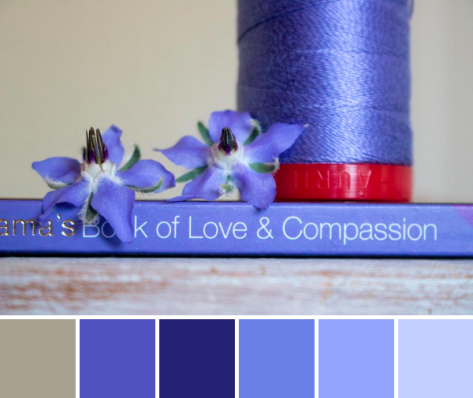 Corresponding solids from left to right:
 Corresponding solids from left to right:
 Inside near a bright window = dancing shadows
 Outside in direct bright sunlight = garishly bright with dark shadows
 Outside in a shady spot without direct sun = gentle and flat, and with a little bit of lightening in a photo editor, it creates the bright photo with soft shadows that was used to create the color palette above.
 Corresponding solids from left to right:
 Corresponding solids from left to right:
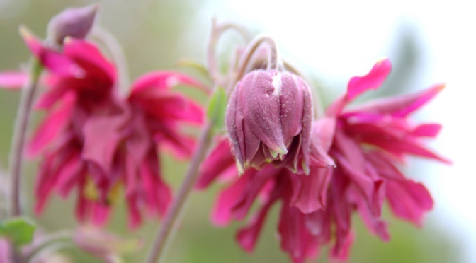
 Corresponding solids from left to right:
 Corresponding solids from left to right:
 This mini quilt finishes at 24″ square, and its creation coincided with the fabulous bloom of peonies in our garden. It features a new die called
 The colors of the peonies and the colors in the quilt meld so beautifully together! I really could not help but take a million photos of this quilt with the gorgeous color gradient of peonies from my garden, but since it’s Thursday, I figured a combination of Color Inspiration Thursday and a heads-up about my Sizzix tutorial would be perfectly acceptable.
 Ahhh peonies! Such an inspiration!
 Corresponding solids from left to right:
 I love the natural ombres and vibrant colors found in nature and thoroughly enjoy combining natural inspiration with quilty projects. It is so fun to try to stitch the beauty around me into the quilts in my hands!
 Corresponding solids from left to right:
 Corresponding solids from left to right:
 Isn’t it amazing how simply moving insanely close to a flower changes the entire aesthetic!? I feel like I say it almost every time, but it’s a whole new, beautiful world in there!
 I really love clear video tutorials since I am very much a visual learner. Seeing each step helps make the process smooth and easy to complete without hang up or confusion. That, to me, is a big win!
 I decided to make my pin cushion with a range of warm Alison Glass Sun Prints 2015 and 2016, and once it was finished, it begged to be photographed out in the garden with the peonies. Such vibrant colors need to be in colorful company.
 I used a Tula Pink ribbon I won in a giveaway from
  I backed the pin cushion in Ex Libris Bookplate in Charcoal by Alison Glass (Andover Fabrics), and really would be tempted to use the pin cushion upside down every so often, it’s so pretty. This pin cushion is not for me, though, so the recipient can do with it as she pleases!
 This is the first pin cushion I’ve stuffed entirely with crushed walnut shell, at Sherri’s suggestion, and I really like the sturdiness and ease with which pins go into it. I bought the crushed walnut shell from a quasi-local, fabulous quilt shop,
  Check out the video below and make your own pin cushion if you want! There’s no such thing as too many pin cushions, right?
 My portable hand stitching kit this summer consists primarily of English Paper Piecing (EPP) hexies and some experimental embroidery-quilting projects.

 A lovely stack of fabric hexagons ready to baste. I need to cut a few more cardstock templates, but this will do for now!
 I am also continuing to add embroidery quilting to my
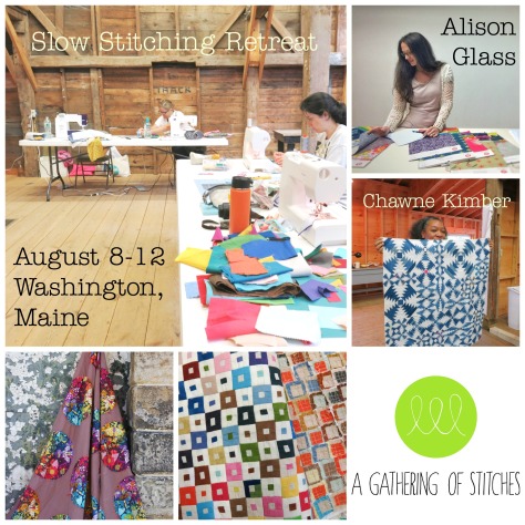


 Corresponding solids from left to right:
 This grass-covered dune was gorgeous as a whole, too, and I was happy to see a nice solid fence and signage clearly explaining the importance of looking without touching (or walking).
 Corresponding solids from left to right: