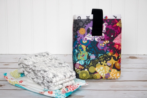
Sometimes you just need a quick finish. Something small and beautiful that you made with your own hands, but that takes only hours (instead of days) to create. When Yvonne announced her Quilting Jetgirl Alison Glass Challenge as an incentive for the rest of us to get one of our Alison Glass fabric makes into the finished pile, I had a few different ideas of which of my many Alison Glass-influenced projects I should finish first. At first I thought I’d focus on the table runner I started late last year using the Insignia and Seventy-Six fabric lines, but then thought it might be the perfect boost to finally finish Max’s Eye Spy quilt that has a dominance of bright Alison Glass prints from across the years. Then I gave myself a reality check and decided to select something small. I have two big deadline projects to finish within the next month, so to be real I decided to pull a diaper pouch project off of my WIPs shelves and finish it up. I’m so glad I did!!
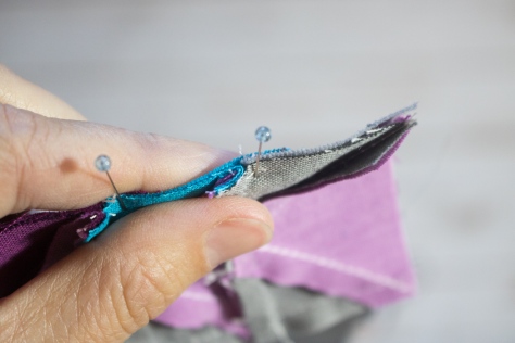
I made this Diaper Pouch using a free tutorial by Anna Graham of Noodlehead, found here. It took me about two (2) hours to make, start to finish, which is pretty awesome as far as projects go.
I used my all time favorite Alison Glass Print, the Art Theory Panel from her Ex Libris line as the outer panel, and lined it with Artifact in Charcoal from her Abacus line (Andover Fabrics). I was lucky enough to buy all of these fabrics, AND the cotton webbing strap from my local quilt shop Fiddlehead Artisan Supply.
I used my go-to 50wt Aurifil thread 2600-Dove for all the piecing and 50wt 2692-Black for sewing on the velcro so that the stitches would not stand out. I love that Fiddlehead also carries a good selection of Aurifil threads! One stop shopping for the win!
Of course I had to plan it so that the rainbow star from Artifact was visible right on the top. I should have given myself a tiny bit more space in that seam, but I’m not losing sleep over it. It’s gorgeous anyway!
Now instead of having a purse filled with diapers and wipes floating every which way, I can have a beautiful and function space to store them compactly, not only making the inside of my purse a bit more organized, but also making it easy for me to visually check that I have a diaper for my little one before I head out!
Since pens are another item I’m often digging for in the chaos within my gorgeous bag, I decided to store two of my favorite micron pens tucked in the corner of the diaper pouch, so that they are easily found when I think of something to add to my Quilter’s Planner Mini–my traveling to-do list, grocery list, and inspiration keeper. Pst… you can now order the Quilter’s Planner Minis individually, here. Just a PSA for the day!
This pouch also perfectly coordinates with the amazing Alison Glass fabric bag my husband bought me for my birthday last year, made by the ever talented Kristy at Rock Baby Scissors. There’s no such thing as too much Alison Glass fabric, right?! No way!! What next?…. I’m thinking a few zip pouches to help organize the other contents of my purse. What’s your favorite simple zip pouch pattern? (Noodlehead’s Open-Wide Zippered Pouch is a fab one, but should I know about others?)
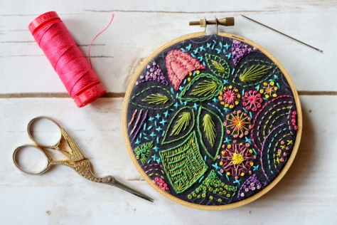
The finish I’m sharing today measures only 4″ across, but probably took more hours of work and provided more peaceful moments than most of my other projects. I’m relatively new to embroidery, with really only my Dropcloth Color Wheel sampler and the embroidery stitching I did on a mini quilt a while back as projects under my belt, but when Alison Glass sent me some of her Stitched fabric, part of her new Seventy Six fabric line for Andover Fabrics, it begged to be… well, stitched.
I’m so happy I obliged, because I just love this little hoop!
Here’s my Instagram post from the wee beginnings of this hoop, about 12 weeks ago.
When the Stitched fabric arrived, I had just completed my Ocean Path quilt for our big Quilt Theory debut, and I was in the final push stage of finishing a quilt that will be in the February issue of Love, Patchwork and Quilting magazine, so picking up a small, no pressure, no purpose, no pattern hoop of Stitched and my 12wt Aurifil thread stash was the perfect brain palate cleanser.
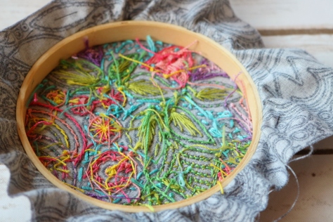
Here’s the back of my finished hoop—see! I am totes a novice! I think this looks fun, though, crazy as ever!
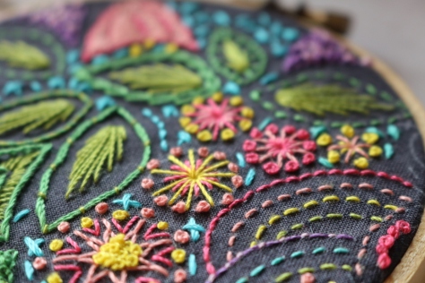
This was back in September, according to my good ole’ Instagram feed, and since that time, ending just a couple of days ago, I’ve picked this little hoop up for 1-20 minute intervals (and 20 minutes might be leaning on the long end) every here and there: a quiet moment when the kids were all playing nicely together, a few seconds here while having a minute lax time while cooking dinner, or just because I needed to MAKE and had not yet had a chance that particular day.
I stitched whatever I wanted, wherever I wanted, and tried many different stitches.
I used Aurifil 12wt thread from my stash, in colors (left to right from photo above): 2530-Blossom Pink, 2435-Peachy Pink, mystery orange–the only Aurifil tag that has ever fallen off a spool!, 2120-Canary, 1147-Light Leaf Green, 2884-Green Yellow, 5005-Medium Turquoise, 2540-Medium Lavender, and 2515-Light Orchid. I used a single strand for all except the turquoise x’s, for which I use two strands. If I were to do it again, I would probably stick with a single strand since I love the crisp aesthetic that results.
Toward the end, I went a little crazy with french knots, but I do love them so and they make a great “filler” around the edges.
Since the pattern is printed on the fabric, there was no actual end, so it was up to me to decide how close to the edges to stitch. At first I thought I’d leave a bit open, but I just couldn’t stop stitching. As it is, most stitches extend to the absolute edge of the hoop. I kind of love it.
I finished it using the methods (minus the plan-ahead phase, since I didn’t plan ahead lol) shared in this tutorial on Sew Mama Sew. I stitched the running stitch around the excess fabric, pulled it tight, knotted and tied it, then trimmed off the extra fabric. Next I cut a 4″ wool felt circle using my Sizzix machine and stitched it onto the back with coordinating 12wt Aurifil thread and a blanket stitch. I’m quite happy with the finish, and definitely plan to make more. In fact, I very well might aim to always have a free-form brain palate cleanser embroidery hoop laying around, since it really worked wonders for helping me get back into a better mental place during especially hectic, crazy kid, too many (mostly self-imposed) expectations-filled days. Making works magic, doesn’t it?
My favorite colors! Flying geese! Curves! Precision delicately dancing with improv! Yessssss, this block has all of those things and I’m excited to share a detailed tutorial with you today. This new block was designed for the New Block Blog Hop sponsored by Cloud9 Fabrics and hosted by Yvonne at Quilting Jetgirl, Cheryl at Meadowmist Designs, and Stephanie at Late Night Quilter. Today is day three of the hop, which means that 46 new block tutorials have already been shared, and 23 more are being shared today. Amazing!
I’m calling my block Steady On, which just seemed fitting for such a classic made-by-me block. Those of you who know me know that I cannot keep anything simple, and this is a perfect case in point. This block has double improv curves, twenty (20) tiny flying geese, an hourglass block, and quite a few points that should match *just* so, all in the 12 1/2″ unfinished square block. But fear not, this tutorial has detailed photos and instructions on how to make each component of the block, and breaking it down into manageable chunks makes this block come together quite smoothly (Spoiler: we can make some of the flying geese 4 at a time!). There’s something about the determined light colored geese headed bravely into the dark and improvy unknown that urges me to encourage them… Steady on, now! That same encouragement goes for you, since I would LOVE to see you tackle this block and come out victorious (tag @nightquilter and #steadyonquilt when you do!). This is going to be fun, so let’s get started!
Gather your materials:
Fat quarter (FQ) of each of the five (5) fabrics generously provided by Cloud9: Amazon, Sky, Shadow, Lilac, and Iris. (There will be fabric left over–enough for a second block or more depending on how frugally you cut your scraps!).
Clover hera marker and/or other fabric marking tool
fabric scissors
washable school glue (I use Elmers)
Fine glue tip (optional but helpful)
rotary cutter & mat
quilting ruler with 1/4″ and 1/8″ markings (I use Omnigrid rulers)
sewing machine (I have a Bernina 560)
thread (I use Aurifil 50wt 2600-Dove for nearly all of my piecing)
Press your fabrics and use spray starch or Flatter by Soak to help stabilize them before cutting.
If you are really attune to detail, you may notice that the smallest squares and rectangles are a bit too small in this photo–you’re right, but I corrected the measurements for the tutorial! No worries. Steady on…
Then cut the following pieces from each fabric:
Iris:
– (8) 1 7/8″ squares (for geese 4 at a time)
– (4) 1 1/2″ squares (for single geese)
– (4) 5 1/2″ squares (for curved quadrants)
Lilac:
– (1) 3 1/4″ square (for geese 4 at a time)
– (6) 1 1/2″ x 2 1/2″ rectangles (for single geese)
– (1) 3 1/4″ square (for hourglass block)
Now, we will break down the block into manageable pieces, and make a component at a time. Let’s start with the curved quadrants!
Making Double-Curved Quadrants
For this step, you will need your 5 1/2″ squares of Iris, Amazon, and Sky, washable school glue and tip, a marking pen or pencil, scissors, and an iron and pressing surface. To make the double-curved quadrants for this block, follow my tutorial on easy curved piecing using a visual layering approach and glue basting HERE. Go ahead and read it now, I’ll wait for you. When you’ve read through it once and have a grasp on the general technique, grab three of your 5 1/2″ squares, one each of Iris, Amazon, and Sky. For this block, the Iris is the bottom layer, the Sky is the middle layer and the Shadow is the top layer.
Since this method begins from the bottom up, start with Iris and Amazon. Mark the Amazon square 2 1/4″ up along both sides from the bottom right corner. Make sure your mark extends 1/4″ in from the edges before beginning the curve. This will be your sew line, not your cut line, so by measuring the 2 1/4″ we are ensuring our seams will match up, even though the flying geese are exact and the curves can be improv. (Note here that if you are using fabric with a right and wrong side, you want to be marking the wrong side of the fabric. With the Cloud9 Cirrus Solids that’s not important).
Draw an improv curve from marked point to point, or trace a perfect curve using the edge of a small plate or glass. Make sure your curve begins and ends at your marked points 2 1/4″ up from the corner.
Using the drawn line as your sew line, follow the steps in my curved piecing tutorial here to sew your first curve. Beautiful, right!?
Next, grab your Shadow 5 1/2″ square and mark 3 1/4″ up both sides from the bottom right corner. Again, draw your curve as desired, connecting from marked point to marked point, and using that line as the sew line.
Make four quadrants, measuring 2 1/4″ up on the Amazon square and 3 1/4″ up on the Shadow square for two of them, and measuring 3 1/4″ up on the Amazon and 4 1/4″ up on the Shadow square for the other two. Admire your smooth curves, and set those blocks aside for later!
Making Flying Geese 4 at a Time
Next we will crank out as many flying geese as we can, using the technique of making 4 at a time found in the Reference Section of the Quilter’s Planner. I use my Quilter’s Planner daily, and it sure did save some time with this block! Here’s how:
Place two 1 7/8″ Iris squares in the top right and bottom left corners of a 3 1/4″ Sky square as shown. Using your fabric marking tool of choice, draw a diagonal line from the top right corner to the bottom left corner. I love my Hera marker since it doesn’t actually mark the fabric, but makes a clear guide line.
Sew 1/4″ from either side of the drawn line. Press with a hot iron to set the seam (notice that I didn’t do this step? tsk tsk).
Cut along the drawn line.
Press the small Iris triangles outward, with seams pressed toward the dark fabric. Then place another 1 7/8″ Iris square in the corner of each unit, and mark a diagonal line as shown above.
Again, carefully sew 1/4″ from either side of the drawn line. Cut along drawn line.
Press open, with seams toward darker fabric.
Trim to 1 1/2″ x 2 1/2″ and set aside.
Repeat instructions above using the remaining 1 7/8″ Iris squares and a 3 1/4″ Lilac square to make four Lilac geese with Iris corners.
Making Single Flying Geese
The remaining flying geese must be made one at a time since the corner colors are mixed up to flow into your improv curved quadrants.
Grab your 1 1/2″ squares and 1 1/2″ x 2 1/2″ rectangles and lay them out to help plan which corners should be positioned on each rectangle. Use the finished flying geese above to help plan before you start sewing.
To make a flying geese block (or would it be flying goose?), position a 1 1/2″ square right sides facing the right top corner of a 1 1/2″ x 2 1/2″ rectangle. Draw a diagonal line as shown above.
Sew along the line and then trim a 1/4″ seam allowance.
I like to get mine all paired and drawn so that I can chain piece each side.
Repeat with the other 1 1/2″ square on the top left side of the block. Press seams open or up toward the corner.
Time saving tip: I cut my 1/4″ seam allowances with scissors while pressing. As long as you are accurate with a pair of scissors, it takes much less time than rotary cutting, at least for me.
Square your flying geese to 1 1/2″ x 2 1/2″ rectangles, making sure that your goose point is a perfect 1/4″ (or slightly further) from the top edge. Set aside.
Making Center Hourglass Block
Finally, let’s make that center hourglass block. Grab your 3 1/4″ Lilac and Sky squares.
Place right sides together and mark a diagonal line. I like to pin my pieces together since we are working with such a small scale. If you’d prefer some wiggle room, you can begin with 3 1/2″ squares and trim to size when you’re finished!
Sew 1/4″ from either side of the drawn line. Cut along the drawn line.
Press toward darker fabric. You will have two half square triangles (HST).
Place HSTs right sides together, with the Lilac half of one facing the Sky half of the other, and nesting the seams.
Draw a diagonal line perpendicular to the existing seam line, again pinning to keep the pieces in place while you sew.
Sew 1/4″ on either side of the drawn line. Then, cut along drawn line.
Press seams open. You will have two hourglass blocks, but will only need one for this block. Save the other one for your next Steady On block!
Trim to 2 1/2″ square. Set aside.
Assembling the Block
Now that you’ve made all of the components, it’s time to sew the block together! Arrange all of your pieces as shown above, paying careful attention the positioning of the flying geese in relation to the large and small curves on your curved quadrants. There should be two Iris flying geese corners next to small curves and three Iris flying geese corners next to large curves.
Sew the top five and bottom five groupings of geese together, and sew the center horizontal strip of geese and center hourglass block together.
Perfect points tip:When sewing the flying geese together, keep the piece with the goose point on top. As you’re sewing, make sure your sewing machine needle sews exactly through the “x” that marks the point of the goose, or if anything, slightly to the right (above) the point. This way you won’t lose any points!
Next, sew the top left and top right curved quadrants to the top grouping of geese, pinning just after each seam that needs to match.
Press seams toward the less bulky side (toward the curved quadrants).
When aligned properly, the geese corners should flow into the curved piece perfectly–that’s why we so carefully marked our curve starting distances with our improv curves!
Finally, sew the top and bottom panels to the center horizontal strip, again pinning just after each important seam match. Press toward the less bulky sides (the curved quadrants), and viola! Steady on…
I am really excited about how this block turned out, and I’m eager to play around with different color placements and curve arrangements. I’d love to see if you sew up this block, too, so please tag me @nightquilter#steadyonquilt when you do!
Thank you for visiting and I hope you found this tutorial helpful! Check out all of the other new block tutorials shared today, all of which will be combined to make one big gorgeous charity quilt:
Today’s color inspiration brings us into my vegetable garden. From afar it looks like a fenced in plot of weeds and wildflowers. Pass through the gate, wade through the grasses and clover, though, and you will see three little somewhat tended garden beds, gleefully holding a bunch of delicious veggies. Get a little bit closer, and you have the photos shared here today. Want to sing “oh, how beautiful!” while we sit in the shade and enjoy today’s color inspiration? Let’s! This year my garden is severely neglected, but has been weeded just enough for it to do its job: produce food for our family. Balance and nurture, right? Color palettes are made using Play Crafts’ Palette Builder 2.1 and my photographs, craftily taken at such a scale so as to crop out the weeds!
Corresponding solids from left to right: Kona Limestone, Bella Clover, Bella Terrain Cactus, Kona Basil, Kona Grass Green, Kona Black
Corresponding Aurifil thread from left to right: 2324 – Stone
5010 – Beige
5024 – Dark Brown
5021 – Light Grey
5018 – Grass Green
2692 – Black
Our first stop is with the hardy, delicious, and dare I say–GIANT–kale. We eat kale in egg scrambles, as kale chips, in soups and stews, stir-fries, and more. Kale does amazingly well in our garden and climate, so each plant grows about 3 1/2 feet tall and 2 feet across. Each leaf is as big as my son’s head. One of these years, I’ll realize that even with our family of five, we only need two kale plants, not eight. In the meantime, kale abounds! I love how intricately frilly each leaf is! The range of greens is amazing, too, including everything from earthy subdued to vibrant and fresh. Mmm!
Corresponding solids from left to right: Kona Forest, Bella Dill, Bella Thistle, Kona Smoke, Bella Parfait Pink, Kona Pearl Pink
Corresponding Aurifil thread from left to right: 2892 – Pine
2890 – Dk Grass Green
1140 – Bark 2606 – Mist
2515 – Lt Orchid
2405 – Oyster
Next up we have Yarrow. Honestly, when I ordered these seeds from our local organic seed company Johnny’s Seeds, I thought the yarrow would be white or yellow. To my pleasant surprise, it bloomed this beautiful pink! Yarrow is a great companion plant to many vegetables and is one of those plants you should feel free to plant all over your garden. It repels soil nematodes, aphids, bean beetles, and many more. I planted mine near my brussel sprouts, kohrabi, and kale and it is doing its job well so far!
Corresponding solids from left to right: Kona Hunter Green, Bella Betty’s Teal, Bella Green Tea, Bella Fig Tree Cream, Bella Paper Bag, Bella Etchings Charcoal
Corresponding Aurifil thread from left to right: 4026 – Forest Green
2850 – Med Juniper
5014 – Marine Water
5020 – Light Military Green
2375 – Antique Blush
1140 – Bark
Finally, onions. Onions are my garden pride and joy (very quickly followed by carrots!). After experimenting with a few different varieties of onions, trying seeds vs. sets, I finally discovered the type of onion that thrives well in our area: Copra onions. These are storage onions that I will soon pull, cure in the dry, sunny garden bed, then braid to hang in my kitchen. I learned all of this from a local friend, since I saw a braid of huge gorgeous onions hanging in her kitchen a few years ago and asked if she would teach me everything she knew. She did, and I’m so grateful. I grew less onions this year than last, but they should still last me far into the frigid snowy days of winter. And that earthy color palette that results just embraces the richness of a garden, doesn’t it!?
*Note that this was mostly written before last week’s Slow Stitching Retreat. It still holds true, just add a week of slow stitching to the list of adventures that have been keeping me busy!*
I feel like I’ve been overly absent from this space these past few weeks. I have been wrapping up SO many projects and making things happen behind the scenes, but I promise I will return to more regularly posting here soon. Most of my time lately has been spent going on grand adventures to the coast of Maine with my trusted and ever-able assistant (also known as my husband) and a giant chest full of quilts to photograph for the Quilter’s Planner.
I’m excited, relieved, happy, and have I mentioned excited?… that I have officially finished the photography for this year’s planner and I couldn’t be happier with it and the fantastic planner Stephanie and her graphic designer Lindsie are putting together this year. I will definitely be sharing much more about the Quilter’s Planner 2017, so I will hold back the excitement just a little bit for now. However, this week’s color inspiration comes from photographs taken along the coast of Maine, during our photo shoot adventures. As always, color palettes were created using Play Crafts’ Palette Builder 2.1 and my photographs. Maybe you find even a fraction of the inspiration these natural details bring me!
Corresponding solids from left to right: Kona Pearl Pink, Bella Platinum, Kona Medium Grey, Kona Coal, Kona Pepper, Kona Black
Corresponding Aurifil thread from left to right: 2405 – Oyster
2606 – Mist
2625 – Arctic Ice
1158 – Med Grey
2785 – V Dk Navy
2692 – Black
This first one fills that final gap in “colors that don’t often star in color palettes” in getting ALL the greys. Barnacles are such gorgeous tiny creatures, both dainty and tough as nails all at once. They also provide a gorgeous aesthetic randomly arranged on a tide-swept stone. These beauties were underfoot as I photographed Rita from Red Pepper Quilts‘ contribution to the planner (recently revealed on IG), so before hustling off to the next photo location, I had to give them a private photo shoot. Gorgeous greys!
Corresponding solids from left to right: Bella Lead, Bella Etchings Stone, Kona Cobblestone, Bella Rust, Bella Burgundy, Bella Kansas Green
Corresponding Aurifil thread from left to right: 1246 – Grey
5011 – Rope Beige 2375 – Antique Blush 2335 – Lt Cinnamon 4012 – Copper Brown 2370 – Sandstone
This vibrant rusty chain was sitting right next to the barnacles on the beach in Bar Harbor! Again, a tiny detail that when seen closer simply jumps out at you, begging to be captured in photo. I love the subtle neutrals on the stony beach, with just a few tinges of green from seaweed, boldly divided by a lone rusty chain. I’m holding onto summertime as long as I can, but this palette has an air of autumn to it. Shhh, let’s not talk about that.
Back to berry-picking, lake splashing, sun-kissed summer bliss! Enjoy your day!
Over the past two weeks, we’ve been searching for colors rarely seen in my previous color palettes, namely white, grey, blue, and purple. Last week, we attempted some white palettes and settled for white with a pop of color. This week, I’m sharing a couple of palettes addressing the purples and blues. We tried something a bit new for the second palette, but I don’t think it will be the last time we try it! Color palettes were created using Play Crafts’ Palette Builder 2.1 and my photographs, with conveniently matched cotton solids and Aurifil threads in case a palette so inspires you to sew!
Corresponding solids from left to right: Kona Black, Kona Shadow, Bella Baby Blue, Bella Aubergine, Kona Storm, Bella Betty’s Blue
Corresponding Aurifil thread from left to right: 2692 – Black 2615 – Aluminum 2562 – Lilac 2566 – Wisteria 2745 – Midnight 4140 – Wedgewood
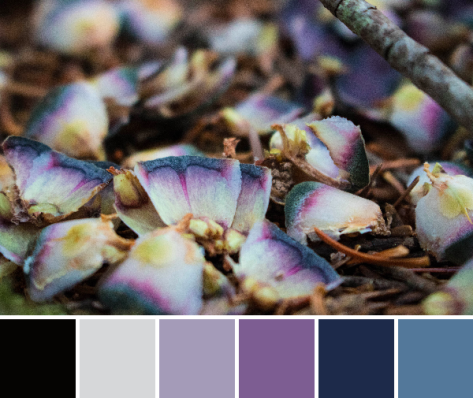
Purple, lovely purple! Literally one, maybe two days after deciding to seek less frequent colors in nature, one of my kids spotted this pinecone refuse left by some critter alongside a hiking path. I went to investigate in response to, “What’s this, mama?” and viola! Purple! and a bit of blue! I love when my kids find little treasures out in the natural world, since that spark of wonder is what makes the world go ’round! I certainly will do all I can to keep it going as long as I have a speck of influence, and will cherish the treasures found.
Corresponding solids from left to right: Bella Stone, Kona Surf, Kona Ocean, Kona Copen, Kona Periwinkle, Kona Blueberry
Corresponding Aurifil thread from left to right: 2605 – Grey
2525 – Dusty Blue Violet 2780 – Dk Delft Blue 2725 – Lt Wedgewood 2720 – Lt Delft Blue 2770 – V Lt Delft
For this palette, we tried something a bit different. There are bits of blue appearing around our gardens–blueberries are beginning to ripen, the blue bachelor button buds are ready to pop any day, and the borage is flowering its fuzzy blue blooms. But no where is there a strongly dominant blue; it is mixed in with the rest of the colorful bits of beauty but alone would not hold its own in a color palette.
To combat that, I decided to try a reverse color scavenger hunt. I picked a couple of borage flowers and gave my oldest the challenge of finding things in the house that matched the color perfectly. Borage is a tricky color–a blueish violet that’s very soft and subtle, but she managed to find one book that was an absolute perfect match: a little book called the Dali Lama’s Book of Love & Compassion, a sweet little collection of positive reflections that was a gift from my husband way back before we were even engaged. Everything else we tried was either too blue or too purple, so I headed up and grabbed some blue-violet Aurifil spools to see if we could get lucky. Sure enough, 2525-Dusty Blue Violet is the perfect match! If you look at the matching Aurifil threads pulled from the palette, the second coordinating color is exactly that! Once again, Aurifil has the perfect match.
It has been fun to seek the rarer colors, and I still have yet to find a convincingly grey palette, nor have I fully succeeded with a white one, so I will keep looking! I challenge you to spot some odd colors in the world around you this week–where do you see blue? purple? or any other unusual colors that stand out to you? Let me know in the comments, or link to a photo!
I recently finished and gifted this mini quilt to a fellow quilting friend as part of a small private swap, and now that it has been received, I can tell you all about it! I entitled it, “Let Your Heart Shine True”, and it’s meant to be a visual representation of the fact that the goodness in your heart shines through, despite any missteps, mistakes, wrong words, or other things we personally may feel will tarnish or cloud our good intentions. It was made for Yvonne of Quilting Jetgirl, who often reflects on her introverted personality and how it influences her day to day, both quilting and non. The design inception came after Yvonne posted a number of articles about the struggles of attempting social interaction as an introverted person. The articles mentioned a desire to have people understand your good intentions, even if the words or actions that emerged as a result of an uncomfortable social interaction as an introvert may have been less than smooth. I think we are all familiar with foot in mouth syndrome; at least I am!
This is my first attempt at a “statement quilt”, per se. My thought was that the quilt would show the large pieces on top as representing “people”, and the rippled reflection below being the public perception of the person. When mistakes are made, things are said in a not so clear way, or even just general awkward social interactions happen, those are the ripples that cause the reflection to be jarred and shaken. Yet despite the ripples and the jolted reflection, the heart remains intact and unbroken. If you lead with the heart, your good intentions ultimately must become known, no matter how many times you need to back pedal or rephrase things to clarify your meaning. I thought creating a statement quilt for Yvonne was fitting, since she has created a number of quilts as part of her Reclamation Project, which she describes as “a project series to explore discomfort in [her] life with the hope that [she] can reclaim and redefine.” I primarily create quilts as things of beauty, but I thought it would be fun to try to create one that is both beautiful and meaningful.
The construction of this mini quilt was a fun multi-step process. I began by needle-turn appliquéing the rounded pieces onto panels of background fabric. I cut the bottom pieces with an identical free-style rounded top, but with much longer length since I planned to cut and resew it many times. Once they were appliquéd onto the background fabric, I cut random, varied width strips from the bottom ones, off-set it enough to wobble but not extend beyond the width of the finished panel, and resewed it. Each one was cut and re-sewn six or seven times to create the rippled effect. Let me tell you–that first cut into the needle-turned mound was a bit nerve-wracking! It was another one of those times I just had to trust that the vision in my head would translate well to reality.
After rippling all three reflections, I squared each panel and sewed them together creating a horizon with a very narrow, approximately 1/8″ strip of solid orange fabric (Kona Persimmon, I think!). Yvonne’s favorite colors are blue and orange, which clearly influenced my fabric selection. I used some of our mutual favorite oranges from Carolyn Friedlander, and added some sketch by Timeless Treasures and an unknown solid from my early quilting days stash. I bound it in blue Mercury by Alison Glass, including a bit of framing while adding a bit from another mutually adored fabric designer.
For quilting, I knew I wanted to matchstick quilt the background, but have the lines become gradually further apart in the bottom half, similar to ripples becoming less dense the further from the source they extend. I matchstick quilted the background of the top portion with 50wt Aurifil 1320-Medium Teal. To keep my rows evenly spaced, I used a stitch length of 3.0 on my Bernina 560, and I carefully moved two stitches (with a three-stitch gap thrown in here and there for interest) between rows. For the bottom portion, I first matchstick quilted with the same 1320-Medium Teal 50wt Aurifil, but instead of making the rows two stitches apart like I did for the top portion, I increased the number of stitches by one between each row. I moved one stitch between the first and second rows, two stitches between the second and third rows, three stitches between the third and fourth rows, etc., all the way to the bottom of the mini quilt. I think at the bottom, each row was 19 or 20 stitches away from the previous row. Yes, it got a bit trickier to keep my quilting lines straight, but I eyeballed it and it turned out well. Organic lines were my goal, after all.
After that, the quilt begged for some more quilting, so I added random rows in yellow, gold, and orange for interest (40 wt 1135-Pale Yellow, 50 wt 5022-Mustard, and 50 wt 1154-Dusty Orange respectively). Both the top and bottom ended up pretty thoroughly matchstick quilted, but I really like the addition of the yellow, gold, and orange thread in the bottom, as well as the added interest of using a slightly heavier weight thread as the yellow. It reminds me of light reflecting off the ripples in a pond, which is perfect given the intention of the quilt.
After matchstick quilting this mini, I can certainly see why people are so drawn to dense quilting. It creates a whole new textural element to the quilt!
One of my dedicated helpers. He really wanted his picture taken with this mini!My other dedicated helper, who helped by not crawling *too* far into the lake while we were photographing this quilt.
I’m really happy with the final result of this mini quilt–it pretty much looks exactly like I imagined. Yvonne is also happy with it, even though it took months for me to finally finish each part and mail it, so that makes for one happy exchange! The true joy in quilting is in the giving, and it feels really great to have been able to create a little daily visual reminder for Yvonne that as long as you lead with your heart, joy will be found.
I have had some fun this week searching out some of the colors in nature less commonly seen in my color palettes, as you helped me name last week: white, grey, blue, and purple. I have also been getting more comfortable with a new camera, since I very recently upgraded our nearly 10 year old Canon with a newer version. Upon reading up on editing RAW photo files in preparation for the big Quilter’s Planner photo shoot, I also made the executive decision to begin a trial version of Photoshop and Lightroom just last night (or should I say, early this morning?). Combine all of those three things together, and that makes for a lot of late nights and fun photo experimentation. AND some really fun color palettes! All color palettes were created using Play Crafts’ Palette Builder 2.1 and my photographs.
Corresponding solids from left to right: Kona Sky, Kona Silver, Kona Cloud, Bella Baby Blue, Bella Petal Pink, Kona Zucchini
Corresponding Aurifil thread from left to right: 2024 – White
2560 – Iris
2606 – Mist
2564 – Pale Lilac
2562 – Lilac
5015 – Gold Yellow
Since low volume fabrics are among my favorites, I decided to begin by searching for white. I enlisted the help of my big kids and we gathered all of the white and light grey flowers and treasures we could find around our yard and garden. Since I wanted to emphasize the white, we laid them out on a big white poster board. Through this whole search for white-rich color palettes, I’ve discovered that it is quite difficult to find a palette created from nature without the green, yellow, or pinks sneaking in. For the palette above, I ignored the green in creating the palette, even though, for me, the green jumps out at you in the photo.
Since I am getting the hang of a new camera, I wanted to experiment with the quality of light in different places, so before photographing in earnest, I took simple top-down photos in a few different locations: inside near a bright window, outside in direct bright sunlight, and outside in a shady spot. It’s amazing how simply moving the location of the photo subject changes the quality of the color so drastically. Here are my unedited photos in each location, to show you the differences:
Inside near a bright window = dancing shadows
Outside in direct bright sunlight = garishly bright with dark shadows
Outside in a shady spot without direct sun = gentle and flat, and with a little bit of lightening in a photo editor, it creates the bright photo with soft shadows that was used to create the color palette above.
I decided to try my favorite, macro photography, to see if I could isolate some fully white-spectrum photos. Lo, once again, this just proved that pink and yellow love to sneak into the whites! I also discovered that it is quite difficult to get true white to pull from a photograph. Greys and beige, yes. But white? No such luck.
Corresponding solids from left to right: Kona Blue Bell, Kona Silver, Bella Saffron, Bella Longhorn, Kona Cheddar, Kona Limestone
Corresponding Aurifil thread from left to right: 5008 – Sugar Paper
2560 – Iris 2318 – Cachemire 2930 – Toast 6010 – Toast 2324 – Stone
I knew that the golden center of this flower would pull through just as strongly if not more so than the white, but how could I resist? Such a gorgeous bloom, and a soothing palette. In quilting, I love good contrast and a crisp aesthetic, which often is aided by using a low volume/white or dark/black background fabric. This palette is one that I could definitely see myself using, perhaps in a gender neutral baby quilt, or summery pillow. I probably would drop the Stone and pick up pure White, though, even though it didn’t push through in the actual photo.
Corresponding solids from left to right: Bella Lt Blue, Kona Thistle, Kona Lupine, Kona Plum, Kona Cloud, Kona Sky
Corresponding Aurifil thread from left to right: 2612 – Arctic Sky
2510 – Lt Lilac
2566 – Wisteria
4030 – Plum
2560 – Iris
2710 – Lt Robins Egg
Ahh Thistle, Lupine, Plum; what gorgeous colors! This is a palette that appears in my creations often, although usually with some other colors joining ranks. Again, despite the attempt to find a fully white-grey palette, this was another no-go. Clearly, Mother Nature likes color, too! I still love the photos and resulting palettes, even if they don’t quite fulfill the request for low volume color palettes. I will keep hunting, and look forward to sharing my finds with you next week!
****
Reminder!! The Christmas in July Pattern Bundle Sale ends today at 3pm EST!! It’s your last chance to get a fabulous deal on 23 versatile patterns from some of your favorite designers, including Meadowmist Designs, Quilting Jetgirl, Quiet Play, Blossom Heart Quilts, Live Love Sew, 13 Spools, and many more! At the end of the sale, this bundle of patterns will no longer be available, so get it while you can! As an added bonus, everyone who buys it HERE is entered to win a Quilter’s Planner 2017 Starter Kit. Creativity overload (in a totally great way!)! **The sale is now over!
Also, my giveaway for the Raindrop fat quarter bundle by Rashida Coleman-Hale for Cotton + Steel Fabrics, sponsored by Fat Quarter Shop ends tonight at 8pm! Comment on my post HERE to enter to win if you haven’t already!
My garden is in a very temporary visual lull at the moment, with the first burst of blooms dying out and the next round not quite flowering yet, but I have a good stockpile of photographs from earlier this year for color inspiration posts in the meantime. This week features a few of my garden beauty favorites, with color palettes made using Play Crafts’ Palette Builder 2.1. I hope you find inspiration from the detailed intricacies provided by Mother Nature, by the color bursts and combinations found naturally all around us, or by the gorgeous matching quilting solids and Aurifil threads listed beneath each palette!
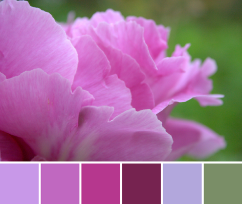
Corresponding solids from left to right: Kona Dahlia, Kona Violet, Bella Berrylicious, Bella Boysenberry, Kona Thistle, Bella Prairie Green
Corresponding Aurifil thread from left to right: 2520 – Violet
5003 – Wine 2535 – Magenta 4030 – Plum 2510 – Lt Lilac 2850 – Med Juniper
Ahhhh! Peonies are long gone at this point in the year, but their full beauty lives on in these photographs (and my memory). I did not get dahlias in the ground in time this year; otherwise I would be eagerly awaiting their blooms to step into the vacant space left by the passing of the peonies. Time will tell which bloom will steal my heart next. It’s fun how more or less the same flowers bloom each year, since our garden is a perennial garden, yet it is always a surprise when a flower first begins to bloom.
Corresponding solids from left to right: Bella Bunny Hill Blue, Bella Petal Pink, Bella Boysenberry, Kona Bordeaux, Kona Azalea, Kona Herb
Corresponding Aurifil thread from left to right: 2600 – Dove
2445 – Victorian Rose 4030 – Plum 1103 – Burgundy 2530 – Blossom Pink 5019 – Military Green
One of my favorite aspects of our garden is the wide variety of subspecies that are planted of each flower. There are least ten different species of Columbine, from daintily elegant to full and regal. You can see one of the other species featured in a past color inspiration post here. I don’t remember seeing this red species before this year, but it must have been there, hiding amidst the other copious blooms. I fully enjoyed it this year, and love the rich color palette that results.
In looking through my color inspiration posts, there is a definite trend toward pinks, maroons, orange/golds, greens, and earthy tones. I suppose that’s to be expected when the majority of the photos come from the garden around me. I was thinking it might be fun to have a color scavenger hunt, though, and specifically seek some of the colors more rarely found in nature. I’m taking suggestions for color themes–the harder the better (I love a challenge)! What color should I search for first? Blue? Purple? White? I’d love to hear your thoughts!
Ahhhh, summer is here! The garden has been cranking full speed ahead, cycling through blooms as only nature can. This time of year is a strong reminder to appreciate the moment, since if you don’t stop to smell the flowers, before you know it they are gone and being quickly replaced by different ones! Today’s color inspiration palettes come from photos of some flowers in my garden, but with a slightly different perspective. You know how I love to get up close and personal; well today, I took it one step further. I played with the easy macro band my husband gifted to me for Christmas, and using my iPhone, took some seriously macro (super duper close!) photos of some familiar beauties. Color palettes are made using Play Crafts’ Palette Builder 2.1.
Corresponding solids from left to right: Kona Cerise, Kona Bright Pink, Kona Violet, Bella Amelia Green, Bella Amelia Purple, Kona Hibiscus
Corresponding Aurifil thread from left to right: 1100 – Red Plum
2450 – Rose 5003 – Wine 2882 – Lt Fern 1243 – Dusty Lavender 1240 – V Dk Eggplant
This first flower was featured in a color inspiration post last year, as part of a pink/purple color lay. It’s the one on the far left, the purple spray-like flowers. I believe it’s a Mountain Bluet (Centaurea montana). This year, I went straight to the heart of the flower, and I love the blurred depth of field and soft, rich color. This Mountain Bluet heart reminds me of improv quilting, gorgeously random yet cohesive.
Corresponding solids from left to right: Kona Magenta, Bella Amelia Lavender, Bella Pewter, Bella Baby Pink, Bella Daffodil, Bella Longhorn
Corresponding Aurifil thread from left to right: 2520 – Violet
2524 – Grey Violet 2606 – Mist 2405 – Oyster 5001 – Ocher Yellow 2145 – Yellow Orange
Any guesses as to what flower this may be? I absolutely love the soft palette that resulted from this fuzzy view down the gullet of an iris (did you guess it?!). Just for scale, here’s a “regular” photo of the same flower:
Isn’t it amazing how simply moving insanely close to a flower changes the entire aesthetic!? I feel like I say it almost every time, but it’s a whole new, beautiful world in there!
A bit more about the Easy Macro band; it’s really simple to use and costs just over $10. I’m not an affiliate or anything, but it’s such a clever little tool, I thought I’d share more information. It looks like a big rubber band with a little round lens on it, and you simply stretch it over your phone, lining up the lens with the lens on the phone’s camera. One tip to getting great photos–get far closer than you think is possible, tap the screen to focus, then slooooooowly back the camera up until you find the focus you want. Take the picture! It’s really fun, and you certainly will be seeing more of these easy macro color palettes. I think the narrow perspective helps you focus more on the color than the subject, which is perfect for color palettes!
Do you prefer macro (super close up) photos, or more landscape/scene photos? I am definitely in the macro camp, but I know there’s a place for both styles of photography!
Enjoy your day, and happy sewing!
I grab a needle and thread once the kids are in bed


 I made this Diaper Pouch using a free tutorial by Anna Graham of Noodlehead, found here. It took me about two (2) hours to make, start to finish, which is pretty awesome as far as projects go.
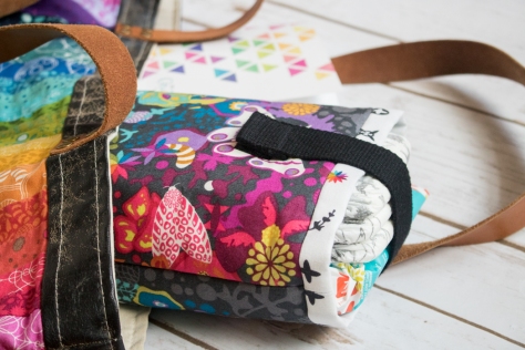 I used my all time favorite Alison Glass Print, the Art Theory Panel from her Ex Libris line as the outer panel, and lined it with Artifact in Charcoal from her Abacus line (Andover Fabrics). I was lucky enough to buy all of these fabrics, AND the cotton webbing strap from my local quilt shop Fiddlehead Artisan Supply.
 Of course I had to plan it so that the rainbow star from Artifact was visible right on the top. I should have given myself a tiny bit more space in that seam, but I’m not losing sleep over it. It’s gorgeous anyway!
 Now instead of having a purse filled with diapers and wipes floating every which way, I can have a beautiful and function space to store them compactly, not only making the inside of my purse a bit more organized, but also making it easy for me to visually check that I have a diaper for my little one before I head out!
 Since pens are another item I’m often digging for in the chaos within my gorgeous bag, I decided to store two of my favorite micron pens tucked in the corner of the diaper pouch, so that they are easily found when I think of something to add to my Quilter’s Planner Mini–my traveling to-do list, grocery list, and inspiration keeper. Pst… you can now order the Quilter’s Planner Minis individually, here. Just a PSA for the day!
 This pouch also perfectly coordinates with the amazing Alison Glass fabric bag my husband bought me for my birthday last year, made by the ever talented Kristy at Rock Baby Scissors. There’s no such thing as too much Alison Glass fabric, right?! No way!! What next?…. I’m thinking a few zip pouches to help organize the other contents of my purse. What’s your favorite simple zip pouch pattern? (Noodlehead’s Open-Wide Zippered Pouch is a fab one, but should I know about others?)
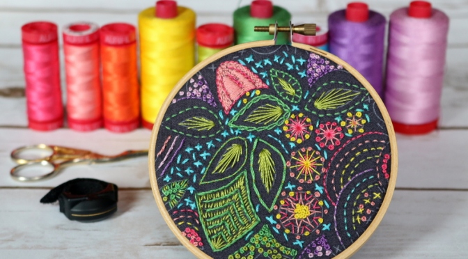
 I’m so happy I obliged, because I just love this little hoop!
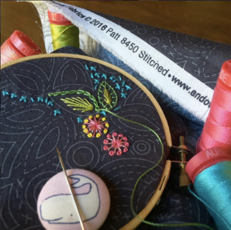
 I stitched whatever I wanted, wherever I wanted, and tried many different stitches.
 I used Aurifil 12wt thread from my stash, in colors (left to right from photo above): 2530-Blossom Pink, 2435-Peachy Pink, mystery orange–the only Aurifil tag that has ever fallen off a spool!, 2120-Canary, 1147-Light Leaf Green, 2884-Green Yellow, 5005-Medium Turquoise, 2540-Medium Lavender, and 2515-Light Orchid. I used a single strand for all except the turquoise x’s, for which I use two strands. If I were to do it again, I would probably stick with a single strand since I love the crisp aesthetic that results.
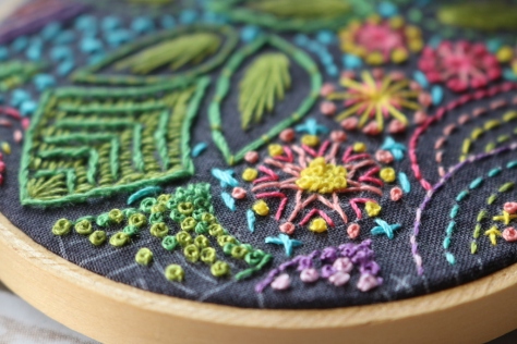 Toward the end, I went a little crazy with french knots, but I do love them so and they make a great “filler” around the edges.
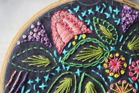 Since the pattern is printed on the fabric, there was no actual end, so it was up to me to decide how close to the edges to stitch. At first I thought I’d leave a bit open, but I just couldn’t stop stitching. As it is, most stitches extend to the absolute edge of the hoop. I kind of love it.
 I finished it using the methods (minus the plan-ahead phase, since I didn’t plan ahead lol) shared in
 I’m calling my block Steady On, which just seemed fitting for such a classic made-by-me block. Those of you who know me know that I cannot keep anything simple, and this is a perfect case in point. This block has double improv curves, twenty (20) tiny flying geese, an hourglass block, and quite a few points that should match *just* so, all in the 12 1/2″ unfinished square block. But fear not, this tutorial has detailed photos and instructions on how to make each component of the block, and breaking it down into manageable chunks makes this block come together quite smoothly (Spoiler: we can make some of the flying geese 4 at a time!). There’s something about the determined light colored geese headed bravely into the dark and improvy unknown that urges me to encourage them… Steady on, now! That same encouragement goes for you, since I would LOVE to see you tackle this block and come out victorious (tag
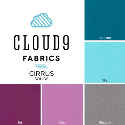

 For this step, you will need your 5 1/2″ squares of Iris, Amazon, and Sky, washable school glue and tip, a marking pen or pencil, scissors, and an iron and pressing surface. To make the double-curved quadrants for this block, follow my tutorial on easy curved piecing using a visual layering approach and glue basting
 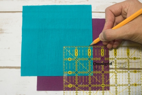 Since this method begins from the bottom up, start with Iris and Amazon. Mark the Amazon square 2 1/4″ up along both sides from the bottom right corner. Make sure your mark extends 1/4″ in from the edges before beginning the curve. This will be your sew line, not your cut line, so by measuring the 2 1/4″ we are ensuring our seams will match up, even though the flying geese are exact and the curves can be improv. (Note here that if you are using fabric with a right and wrong side, you want to be marking the wrong side of the fabric. With the Cloud9 Cirrus Solids that’s not important).
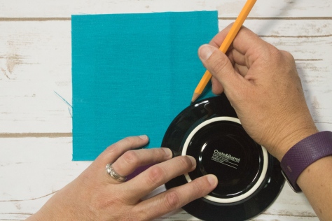 Draw an improv curve from marked point to point, or trace a perfect curve using the edge of a small plate or glass. Make sure your curve begins and ends at your marked points 2 1/4″ up from the corner.
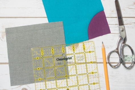 Next, grab your Shadow 5 1/2″ square and mark 3 1/4″ up both sides from the bottom right corner. Again, draw your curve as desired, connecting from marked point to marked point, and using that line as the sew line.
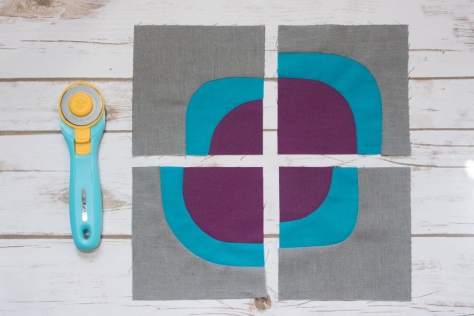 Make four quadrants, measuring 2 1/4″ up on the Amazon square and 3 1/4″ up on the Shadow square for two of them, and measuring 3 1/4″ up on the Amazon and 4 1/4″ up on the Shadow square for the other two. Admire your smooth curves, and set those blocks aside for later!
 Place two 1 7/8″ Iris squares in the top right and bottom left corners of a 3 1/4″ Sky square as shown. Using your fabric marking tool of choice, draw a diagonal line from the top right corner to the bottom left corner. I love my Hera marker since it doesn’t actually mark the fabric, but makes a clear guide line.
 Sew 1/4″ from either side of the drawn line. Press with a hot iron to set the seam (notice that I didn’t do this step? tsk tsk).
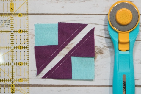 Cut along the drawn line.
 Press the small Iris triangles outward, with seams pressed toward the dark fabric. Then place another 1 7/8″ Iris square in the corner of each unit, and mark a diagonal line as shown above.
 Again, carefully sew 1/4″ from either side of the drawn line. Cut along drawn line.
 Press open, with seams toward darker fabric.
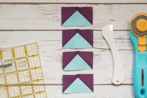 Trim to 1 1/2″ x 2 1/2″ and set aside.
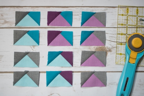 Grab your 1 1/2″ squares and 1 1/2″ x 2 1/2″ rectangles and lay them out to help plan which corners should be positioned on each rectangle. Use the finished flying geese above to help plan before you start sewing.
 To make a flying geese block (or would it be flying goose?), position a 1 1/2″ square right sides facing the right top corner of a 1 1/2″ x 2 1/2″ rectangle. Draw a diagonal line as shown above.
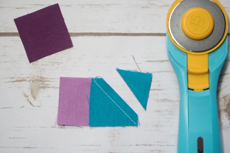 Sew along the line and then trim a 1/4″ seam allowance.
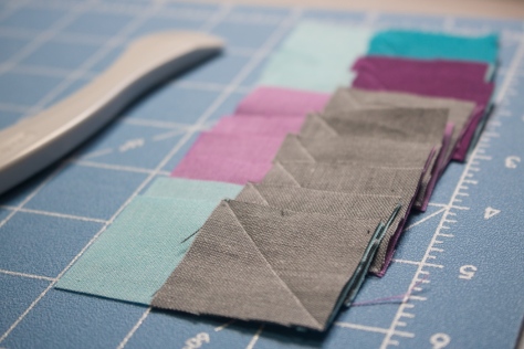 I like to get mine all paired and drawn so that I can chain piece each side.
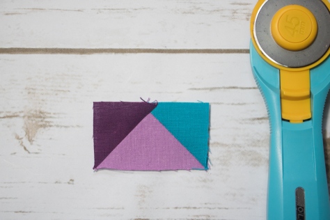 Repeat with the other 1 1/2″ square on the top left side of the block. Press seams open or up toward the corner.
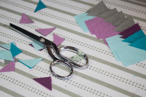 Time saving tip: I cut my 1/4″ seam allowances with scissors while pressing. As long as you are accurate with a pair of scissors, it takes much less time than rotary cutting, at least for me.
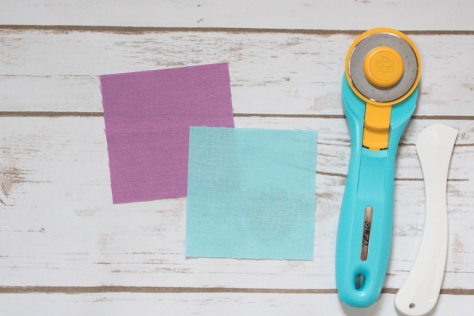 Finally, let’s make that center hourglass block. Grab your 3 1/4″ Lilac and Sky squares.
 Place right sides together and mark a diagonal line. I like to pin my pieces together since we are working with such a small scale. If you’d prefer some wiggle room, you can begin with 3 1/2″ squares and trim to size when you’re finished!
 Sew 1/4″ from either side of the drawn line. Cut along the drawn line.
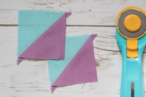 Press toward darker fabric. You will have two half square triangles (HST).
 Place HSTs right sides together, with the Lilac half of one facing the Sky half of the other, and nesting the seams.
 Draw a diagonal line perpendicular to the existing seam line, again pinning to keep the pieces in place while you sew.
 Sew 1/4″ on either side of the drawn line. Then, cut along drawn line.
 Press seams open. You will have two hourglass blocks, but will only need one for this block. Save the other one for your next Steady On block!
 Trim to 2 1/2″ square. Set aside.
 Now that you’ve made all of the components, it’s time to sew the block together! Arrange all of your pieces as shown above, paying careful attention the positioning of the flying geese in relation to the large and small curves on your curved quadrants. There should be two Iris flying geese corners next to small curves and three Iris flying geese corners next to large curves.
 Sew the top five and bottom five groupings of geese together, and sew the center horizontal strip of geese and center hourglass block together.
 Perfect points tip: When sewing the flying geese together, keep the piece with the goose point on top. As you’re sewing, make sure your sewing machine needle sews exactly through the “x” that marks the point of the goose, or if anything, slightly to the right (above) the point. This way you won’t lose any points!
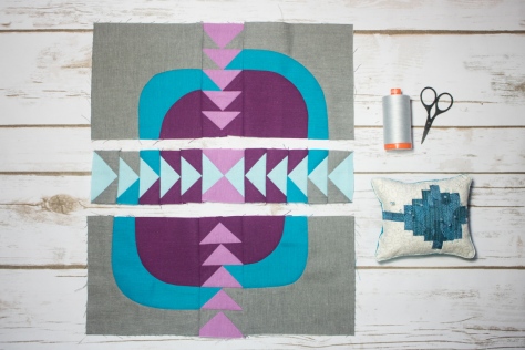
 Next, sew the top left and top right curved quadrants to the top grouping of geese, pinning just after each seam that needs to match.
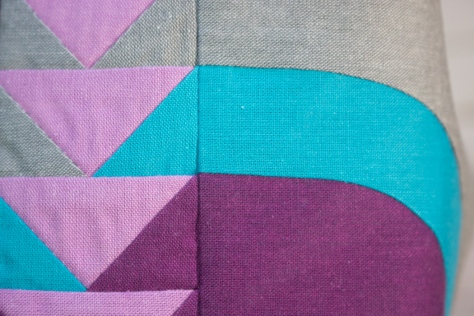 When aligned properly, the geese corners should flow into the curved piece perfectly–that’s why we so carefully marked our curve starting distances with our improv curves!
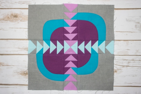 Finally, sew the top and bottom panels to the center horizontal strip, again pinning just after each important seam match. Press toward the less bulky sides (the curved quadrants), and viola! Steady on…
 Corresponding solids from left to right:
 Corresponding solids from left to right:
 Corresponding solids from left to right:
 Corresponding solids from left to right:
 Corresponding solids from left to right:
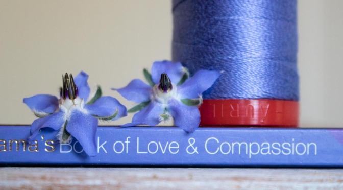
 Corresponding solids from left to right:
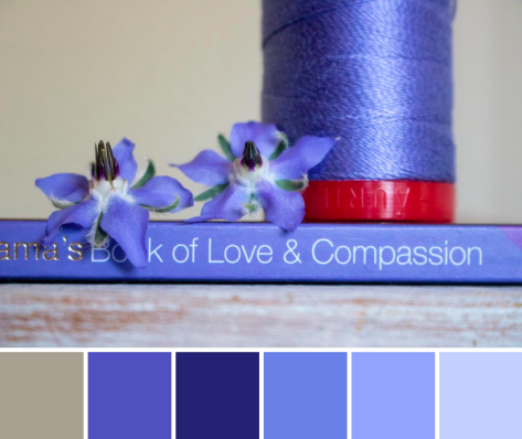 Corresponding solids from left to right:
 I recently finished and gifted this mini quilt to a fellow quilting friend as part of a small private swap, and now that it has been received, I can tell you all about it! I entitled it, “Let Your Heart Shine True”, and it’s meant to be a visual representation of the fact that the goodness in your heart shines through, despite any missteps, mistakes, wrong words, or other things we personally may feel will tarnish or cloud our good intentions. It was made for Yvonne of
  This is my first attempt at a “statement quilt”, per se. My thought was that the quilt would show the large pieces on top as representing “people”, and the rippled reflection below being the public perception of the person. When mistakes are made, things are said in a not so clear way, or even just general awkward social interactions happen, those are the ripples that cause the reflection to be jarred and shaken. Yet despite the ripples and the jolted reflection, the heart remains intact and unbroken. If you lead with the heart, your good intentions ultimately must become known, no matter how many times you need to back pedal or rephrase things to clarify your meaning. I thought creating a statement quilt for Yvonne was fitting, since she has created a number of quilts as part of her
  The construction of this mini quilt was a fun multi-step process. I began by needle-turn appliquéing the rounded pieces onto panels of background fabric. I cut the bottom pieces with an identical free-style rounded top, but with much longer length since I planned to cut and resew it many times. Once they were appliquéd onto the background fabric, I cut random, varied width strips from the bottom ones, off-set it enough to wobble but not extend beyond the width of the finished panel, and resewed it. Each one was cut and re-sewn six or seven times to create the rippled effect. Let me tell you–that first cut into the needle-turned mound was a bit nerve-wracking! It was another one of those times I just had to trust that the vision in my head would translate well to reality.
 After rippling all three reflections, I squared each panel and sewed them together creating a horizon with a very narrow, approximately 1/8″ strip of solid orange fabric (Kona Persimmon, I think!). Yvonne’s favorite colors are blue and orange, which clearly influenced my fabric selection. I used some of our mutual favorite oranges from Carolyn Friedlander, and added some sketch by Timeless Treasures and an unknown solid from my early quilting days stash. I bound it in blue Mercury by Alison Glass, including a bit of framing while adding a bit from another mutually adored fabric designer.
 After that, the quilt begged for some more quilting, so I added random rows in yellow, gold, and orange for interest (40 wt 1135-Pale Yellow, 50 wt 5022-Mustard, and 50 wt 1154-Dusty Orange respectively). Both the top and bottom ended up pretty thoroughly matchstick quilted, but I really like the addition of the yellow, gold, and orange thread in the bottom, as well as the added interest of using a slightly heavier weight thread as the yellow. It reminds me of light reflecting off the ripples in a pond, which is perfect given the intention of the quilt.


 Corresponding solids from left to right:
 Inside near a bright window = dancing shadows
 Outside in direct bright sunlight = garishly bright with dark shadows
 Outside in a shady spot without direct sun = gentle and flat, and with a little bit of lightening in a photo editor, it creates the bright photo with soft shadows that was used to create the color palette above.
 Corresponding solids from left to right:
 Corresponding solids from left to right:
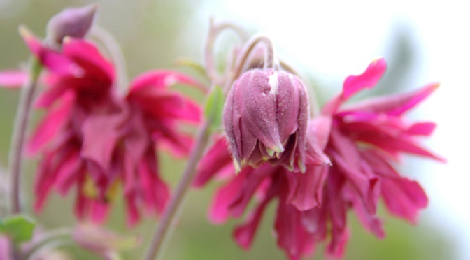
 Corresponding solids from left to right:
 Corresponding solids from left to right:
 Corresponding solids from left to right:
 Corresponding solids from left to right:
 Isn’t it amazing how simply moving insanely close to a flower changes the entire aesthetic!? I feel like I say it almost every time, but it’s a whole new, beautiful world in there!